Blog: Inspiration
The Color Helm

I bought this a couple of weeks ago, purely to go in my moving wheel/dial collection. Little did I know it had so much history.
The Color Helm: Guide to correct color combinations was produced by Ostwald Color Standards in the 1940’s. It was available in Professional, Spectrum, Student (which is the one I have), Womens’s Wearing Apparel and Interior Decorator’s models. Promising to be “Your answer to every color problem”!

It’s based on Ostwald’s Color System developed by Wilhelm Ostwald and “presents the fundamental laws of color and demonstrates them”. It basically shows a full spectrum of colour combinations with tints and darks in the exact percentage chosen. I haven’t quite figured out everything it does yet, but it came in the original box with it’s instructions, so it shouldn’t be too hard to figure out.
It turns out Wilhelm Ostwald has quite a history too... He was a Latvian/German Physical Chemist and natural philosopher, who won the Nobel Prize in 1909 for work on catalysis and chemical equilibrium and originated the process for preparing Nitric Acid.
However he also did outstanding work systemising colour and developed the Ostwald Colour System’. His colour circle consisted of a sequence of 24 hues, divided into 8 groups of 3 (yellow, orange, red, purple, blue, turquoise, seagreen and leaf green) and was first published in 1916 as ‘Die Farbenfibel’ – The Colour Primer. He also published a periodical, 'Die Farbe', which translates simply as, ‘Colour’.
Ostwald tried to standardise colour schemes through measurement and hoped to establish laws of colour harmony that would be adopted by schools, factories and art institutions worldwide.
His colour system was widely used for a few decades, but eventually proved too rigid to incorporate new colours as pigments and dyes of greater saturation were introduced onto the market.
The hunt's now on to find more of the Color Helm models!
https%3A%2F%2Fwww.deliciousindustries.com%2Fthe-color-helm
Delicious+Industries%3A+The+Color+Helm
Classic Logos
The classic Penguin logo we all know and love was originally designed by 21 year old office worker, Edward Young in 1934. He was sent to London Zoo by the publisher, Allan Lane to sketch penguins, which formed the early logo. It was 15 years later (in 1949) that the Jan Tschibold version was created.
British brewery, Bass boast that their red triangle is, 'The World's most famous trademark' and although there is no proof of this, it was the first British Registered Trademark.
Guinness first used the O'Neill harp (or Brian Boru harp) alongside their signature in 1862. It originally had 27 strings, but for design reasons this number was reduced over time first to 18, in the 50's and finally to 10 in the 60's.
When Ireland became an independent nation in 1922 they chose the O'Neil harp as the official Irish symbol, however because of copyright issues they had to reverse their version.
The winged-foot synonymous with Goodyear was originally inspired by a statue of Mercury in founder, Frank A Seiberling's childhood home. It has been their trademark since 1900.
You know how hard it is to come up with names for things, well, French petrol company Elf turned to a computer to choose their name. Elf was chosen from 8,253,000 three, four and five-letter combinations. Their simple, bold logo was then designed by Jean-Roger Rioux in 1966.
For more information about the history and background to classic logos and trademarks, have a look at Marks of Excellence: The history and taxonomy of trademarks. It really is a great book.
All information from Marks of Excellence.
https%3A%2F%2Fwww.deliciousindustries.com%2Fclassic-logos
Delicious+Industries%3A+Classic+Logos
Vintage Valentines

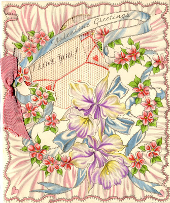

Getting you all in the mood for tomorrow, here are some vintage Valentine's Day cards. They're so delicate, and beautifully decorated with lace, foil and ribbon - I'm guessing they are from the 30's or 40's but not really sure.
I bought them in a little box at a boot sale, along with a couple of handmade cards, and the engagement card and gift tag (below) from the same era.
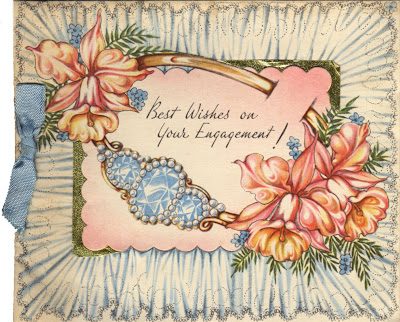

For more vintage design and ephemera have a look through our Reference Box!
https%3A%2F%2Fwww.deliciousindustries.com%2Fvintage-valentines
Delicious+Industries%3A+Vintage+Valentines
Vintage Typewriter Ribbon TIns


Thanks to Ryan at Sell! Sell! for the link to these great old Typewriter Ribbon tins - they are part of Uppercase's collection on Flickr.

They're really gorgeous items that look fantastic as a group - the graphics, typography and bold colours, just make them so interesting.
I'm sure I have some of these somewhere, I'll have to try and route them out!
Images copyright Uppercase.
https%3A%2F%2Fwww.deliciousindustries.com%2Fvintage-typewriter-ribbon-tins
Delicious+Industries%3A+Vintage+Typewriter+Ribbon+TIns
From the reference box #33

From the reference box #33 - War-time grocery bag and Motor Fuel Ration Book. The grocery bag (above) would have been used in local shops to hold small individual items. It's in really good condition and I love the text:
In "War Time" as in "Time of Peace", We aim to give Quality, Service, Satisfaction. The private trader considers you all the time.
It's funny how even back then value and importance of independent shops was being promoted.
In "War Time" as in "Time of Peace", We aim to give Quality, Service, Satisfaction. The private trader considers you all the time.
It's funny how even back then value and importance of independent shops was being promoted.

This Motor Ration Book is not quite as old as the grocery bag and from 1957. Booklets like this were given to customers when they bought a new vehicle and had to be transferred to the new owner if the vehicle was sold.
This booklet contains vouchers to receive free fuel for a motor car with an engine size of 2201cc and over. It has 42 x N vouchers and 21 x L vouchers which were meant to last for 6 months.
I wish I knew what car this originally came with - all I know is that the registration plate was TKL 400 and the booklet was issued on 27 April 1957 in Horsham, UK!
https%3A%2F%2Fwww.deliciousindustries.com%2Ffrom-the-reference-box-33
Delicious+Industries%3A+From+the+reference+box+%2333
Metro Maps of the World

I saw the Washington DC underground map on So Much Pileup the other day and it reminded me of a great book I bought a few years ago, Metro Maps of the World by Mark Ovenden. I know it sounds dull, in fact the guy in the book shop actually laughed when I took it to the counter, but it's a fantastic book full of information and pics about underground (and some overground) maps, their history and who created them.
Above right is the very map that started this train (sorry!) of thought and to it's left the 1962 version, which shows on it proposed sections for expansion that are only this decade being constructed! The current Washington map is one of very few Worldwide to have introduced thick lines, copied only by Baltimore.
The most famous underground map is of course that of our very own London Underground. Designed originally by Harry Beck in 1932 and published in 1933 (below right) it replaced Fred Stingemore's 1925 version (below left) which itself was meant to have improved legibility.

Beck's design is iconic. It uses only horizontal, vertical and 45 degree lines joined with uniform curves and bends to create a simplistic and very easy to follow map - a style still used today (see below) and one that has been copied all over the World.

Another well-known underground map is that of the New York City Subway. The first version emerged in the early 1900's (below) and focused only on Manhattan, but showed all the train operators at the time in a very clean and detailed design, very much based on the grid-like NYC street plan.

By 1948 (below left) the whole of NYC had been added. This was one of the first attempts to show all the individual networks on the same pocket map. Previously each service had produced their own maps. Throughout the late 50's and 60's clearer, more stylistic versions of the combined map developed - a style that remained and is hugely successful in one of my favourite versions, the 1972 design (below right).
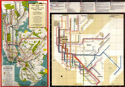
Throughout this decade though, NYC seem to have moved away from this design and returned to a version (below) very similar to that of the 1948 pocket map.
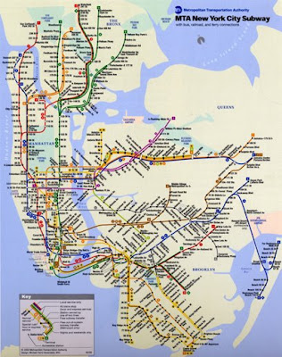
Looking through the book, it was Moscow's fantastic subway maps that stood out the most for me. Early versions (below left) were in black and white due to the restrictions on materials and they were actually designed by Fred Stingemore, the pre-1933 London Underground designer.

Eventually though, the Russians began producing colour maps and with it the design became more European and stylised as seen above right in this 1967 version.
For me though, it's the 80's versions (below) that are the most inspiring and interesting. I love that they have a 50's feel and at a glance look like diagrams of the solar system with their different sized circles and dotted lines.

The dotted lines actually referred to outer stations and the coloured circles indicated station interchanges. The current version developed throughout the 90's and is much more European and as so many others uses the principals demonstrated in Beck's London Underground map, which might be more legible but certainly doesn't have the charm of the 80's ones.
Click on images to view larger versions.
Images copyright Metro Maps of the World.
https%3A%2F%2Fwww.deliciousindustries.com%2Fmetro-maps-of-the-world
Delicious+Industries%3A+Metro+Maps+of+the+World
Space Travel Guide

I wish this was in my reference box! I found it on Ebay yesterday but unfortunately it has a buy-it-now of $99.99 (£73.15) which is a little steep, even though it would be a great addition to my vintage moving dial collection.
It's a Space Travel Guide from 1958. It must have been a free giveaway with something and has an ad for Dellwood Milk & Dairy Products on the reverse. However, it's the dial I love - the wheel turns to reveal each planet one at a time, giving it's relative size and diameter compared to Earth. The illustrations are great too with really bold and vibrant colours.
Hopefully I'll find a much cheaper version at a boot sale some time soon!
Images from Ebay auction - copyright Designartistic.
https%3A%2F%2Fwww.deliciousindustries.com%2Fspace-travel-guide
Delicious+Industries%3A+Space+Travel+Guide
Happy Birthday Apple Macintosh!

24 January 2009 is the 25th anniversary of the Apple Macintosh launch. Of course Apple was going way before this, but Macintosh was the name given to their new breed of computer, launched in 1984.
The Macintosh used an operating system which formed the roots of the OSX systems we use today and it used a mouse, which coined the term MAC - Mouse Activated Computer. It's thought the name Macintosh came from Jef Raskin's (the Apple Macintosh creator's) favourite apple - the McIntosh and the spelling changed to avoid legal problems with an existing company.
Apple launched their new ground-breaking product with a TV ad directed by legendary film-maker, Ridley Scott and aired during the Superbowl on 22 January 1984 - the most expensive ad space in the US. However, unbeknown to many, the ad actually ran for the first time during December 1983 late in the night on a cable channel, in order to qualify for the 1984 creative awards!
Find out more about early Apple computers here.
Image from Business Week.
https%3A%2F%2Fwww.deliciousindustries.com%2Fhappy-birthday-apple-macintosh
Delicious+Industries%3A+Happy+Birthday+Apple+Macintosh%21
Winter Works on Paper

These gorgeous prints are reproduction NY Subway destination scrolls c. 1940. I found them on Winter works on Paper, a great website that has some really unusual, original and reproduction, prints and photography.

Photographer Don Dudenbostel's x-ray pics are definitely worth a look. His collection includes some really beautiful flowers, some sealife and of course, my favourites - the toys.

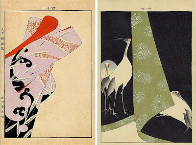
And here's something you don't see everyday - Japanese woodblock prints of Kimono designs from the 1900's. i think they are actually reproductions, but still very beautiful.
Images copyright to the artists, from Winter Works on Paper.
https%3A%2F%2Fwww.deliciousindustries.com%2Fwinter-works-on-paper
Delicious+Industries%3A+Winter+Works+on+Paper
Vintage 60's Zodiac Posters


How gorgeous are these vintage zodiac prints? I just love the colour combinations and the illustrations. Originally designed by Simboli Design in 1969 for Poster Prints, these bold, bright posters, were used more recently by fashion house, Paul Smith Ltd.
All star signs are available here apart from Gemini,which has already sold out! They're 24" x 36" and signed by the artist (Joe or Gerry Simboli).
Via Orange You Lucky.
https%3A%2F%2Fwww.deliciousindustries.com%2Fvintage-60s-zodiac-posters
Delicious+Industries%3A+Vintage+60%26%23039%3Bs+Zodiac+Posters
Congratulations my American friends…

And on the Obama theme, people are already creating info graphics of his speech - I found this 'wordie' on Times Online, showing the words he used most during his inauguration speech.
https%3A%2F%2Fwww.deliciousindustries.com%2Fcongratulations-my-american-friends
Delicious+Industries%3A+Congratulations+my+American+friends%26%238230%3B
The Little Library of Record Sleeves


Record Envelope: The Little Library of Record Sleeves is illustrator Kavel Rafferty's website for her fantastic collection of vintage 45rpm record sleeves.
All the sleeves are great designs, with bold, bright colours and are categorised into sections such as one & two colour print, animals, circles, typography and photographic.
Via Sell! Sell!
All images copyright Record Envelope.
https%3A%2F%2Fwww.deliciousindustries.com%2Fthe-little-library-of-record-sleeves
Delicious+Industries%3A+The+Little+Library+of+Record+Sleeves
Reclaimed SALE sign
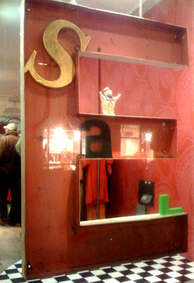
Wandering through Covent Garden last night I saw this SALE sign in a shop window. My camera phone pic doesn't really do it justice, but you get the idea.
It was 4 reclaimed signage letters composed in and around a giant 'E' to read 'SALE'. After passing shop upon shop with sale signs in the window, it was refreshing to see one showing a bit originality.
https%3A%2F%2Fwww.deliciousindustries.com%2Freclaimed-sale-sign
Delicious+Industries%3A+Reclaimed+SALE+sign
Saks Fifth Avenue hire Shepard Fairey!

Saks Fifth Avenue have hired Shepard Fairey and Studio Number One employee Cleon Peterson to design their Spring marketing campaign. In true Fairey style it has more than a touch of Constructivism about it and although the propaganda style ads have been seen many times before, I think it works.
It's bold, striking and straight to the point, the exact requirements of any marketing campaign and poster design. The image is strong and the style carries through well to the packaging.

How clever (and ballsy) of Saks to get Fairey on board after the success and free publicity generated by his recent Obama poster campaign and for putting their faith in what he could do for them. Terron E. Schaefer, the senior vice president for marketing at Saks told the NY Times, “What we do every day, really, is propaganda”.
I hope it's sucessful and encourages other companies to take a more inspiring marketing route and put themselves out there a bit more. If nothing else, it gets you noticed!
Images copyright Saks Fifth Avenue, from NY Times.
Via Notcot.
https%3A%2F%2Fwww.deliciousindustries.com%2Fsaks-fifth-avenue-hire-shepard-fairey
Delicious+Industries%3A+Saks+Fifth+Avenue+hire+Shepard+Fairey%21
More about Design

Adi Wickramaratne from the Design Council kindly emailed me on Friday regarding the Design magazine post to tell me where I could find more information and view some of the publications archives online.
Brighton University’s Art Faculty has a massive archive of Design’s old photos, magazines and promotional material. Some of that information is online here, but there are more scanned and uploaded images on the Visual Arts Data Service website. It’s quite hard to navigate but I found a few pages of images here, here and here which give a great insight into the Exhibition of Britain and the design industry 40/50 years ago.


I have to confess that finding the Design magazines was a reminder to me about the Design Council. I always knew who they where, but never really looked into what they do. But after my email from Adi and the information he gave me I went over to their website and had a good look around. It’s actually a great resource, packed full of articles, discussions, links, research and case studies to help designers of all disciplines. You can also read issues of the current Design Council Magazine, DCM, which is every bit as good as Design used to be.
So if you fancy some design-related reading while you’re having a coffee break, pop over there and have a look around yourself!
All images copyright the Design Council.
Big thanks to Adi Wickramaratne.
https%3A%2F%2Fwww.deliciousindustries.com%2Fmore-about-design
Delicious+Industries%3A+More+about+Design
Welcome
Welcome to the Delicious Industries blog. We're an independent design studio based in Brighton, UK and this is our scrapbook packed full of design, illustration, photography & typography inspiration. Check out our work here.
Links
DELICIOUS FRIENDS
DELICIOUS FAVOURITES
- 50 Watts
- Acejet 170
- Grain Edit
- It's Nice That
- National Geographic Found
- Notcot
- Pretty Clever
- Retronaut
- So Much Pileup
- We Love Typography
- Another Mag


