art direction, design + typography
Blog: Found typography
Alphabets, Letters & Numbers
Pin this on Pinterest
 View large image
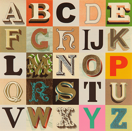
Appropriated Alphabet no.7 (2013) © Peter Blake. Courtesy CCA Gallery, London
Peter Blake at the De La Warr Pavilion.
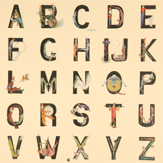
Blake has personally curated Alphabets, Letters and Numbers to showcase three series of editions: Alphabet (1991) a 26 piece series of silk screen prints with a print for each letter of the alphabet - I is for Idols ("a collage of screen legends, artists and musicians"), An Alphabet (2007) a series of found ephemera, illustration and handwritting collages - one for each letter of the alphabet. , and Appropriated Alphabets (2013) a series consisting of 12 individually collated alphabets.
"Throughout his long and prestigious career Blake has created several series of works based around the alphabet related to his enduring interest in childhood innocence and nostalgia, and Victorian and Edwardian graphic illustration. Using vintage cards, magazines, books and other found ephemera, he assembles collages that are at once whimsical, humorous and fascinating. He began using found letters and commercial lettering in the 1950s and, as a young artist, allied himself with decorators, sign painters and commercial artists."
The exhibition is free and runs until Sunday 27 November 2016. You know it's also the rule when you visit the De La Warr that you have to have a cream tea sat out on the terrace!
Mon 10 Oct 2016
Posted under: Design , Typography , Ephemera , Prints , Things to buy , Illustration , Exhibition , Found typography
https%3A%2F%2Fwww.deliciousindustries.com%2Falphabets-letters-numbers
Delicious+Industries%3A+Alphabets%2C+Letters+%26amp%3B+Numbers
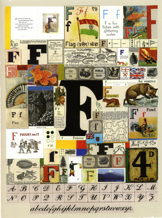
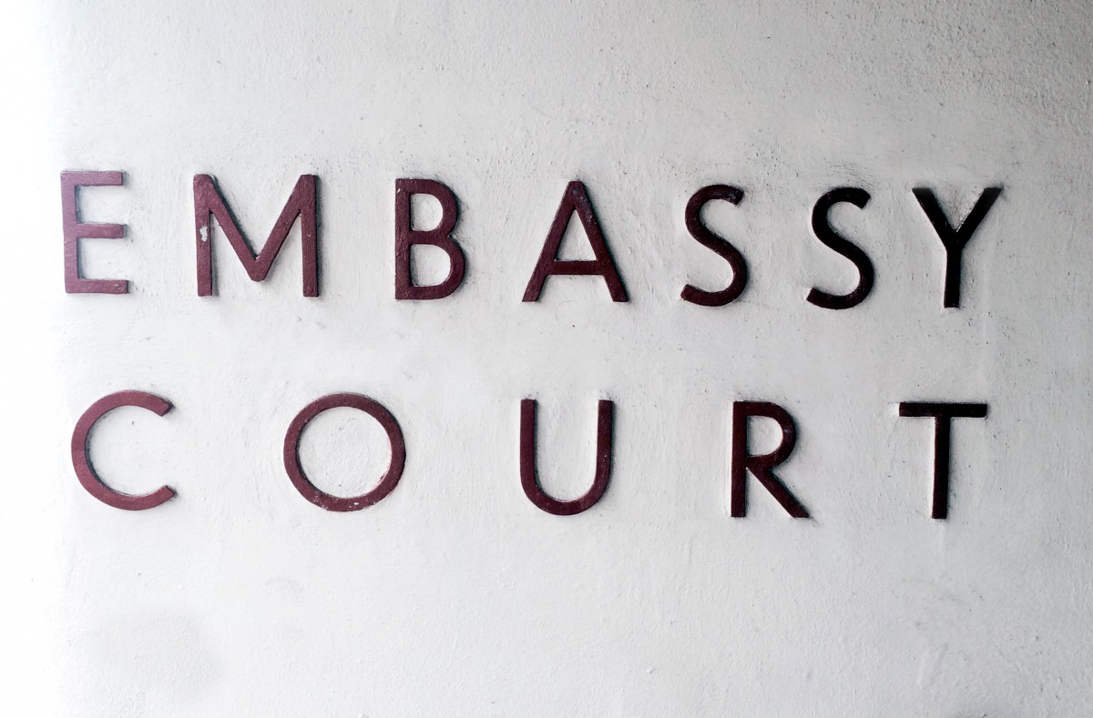
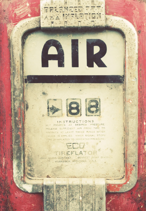
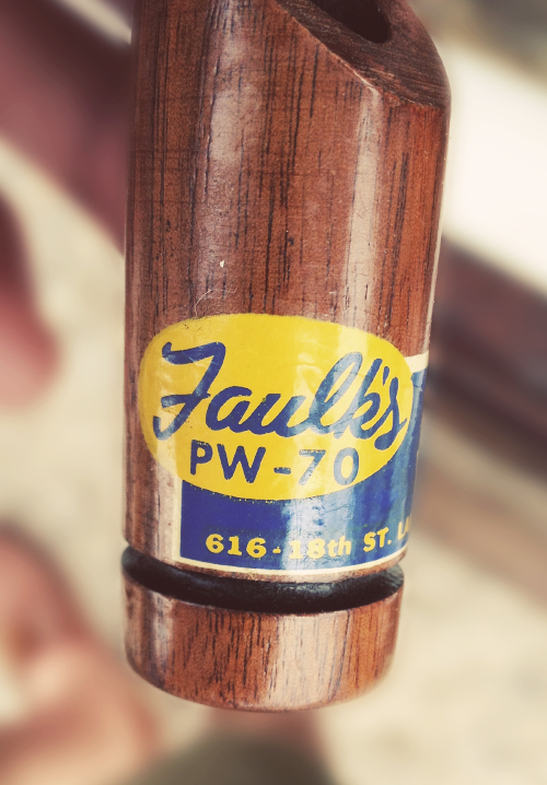
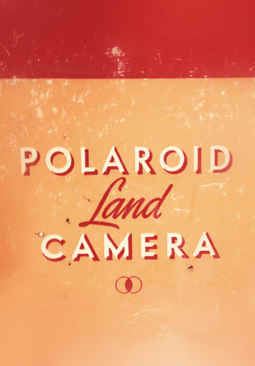
Found Type #7
More fabulous lettering and typography snapped in the wild over the last year.
Have a look through the rest of our Found Type here.
https%3A%2F%2Fwww.deliciousindustries.com%2Ffound-type-7
Delicious+Industries%3A+Found+Type+%237
Found Type #6
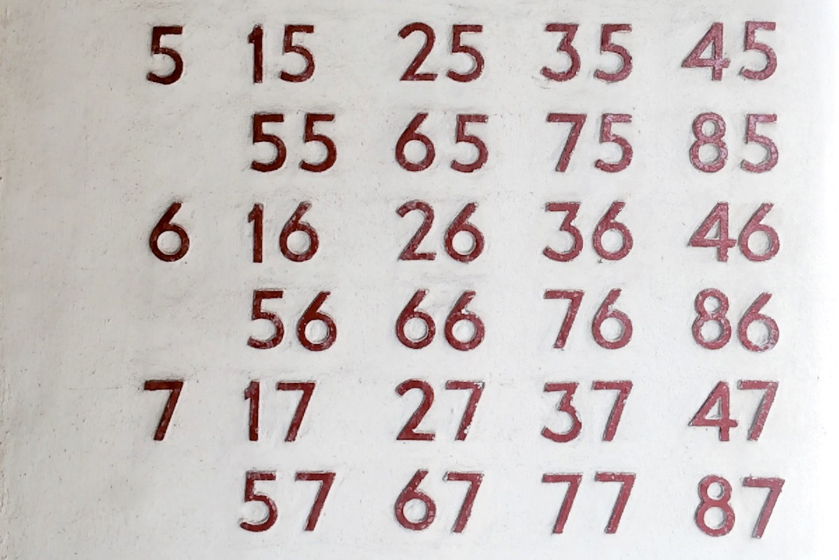
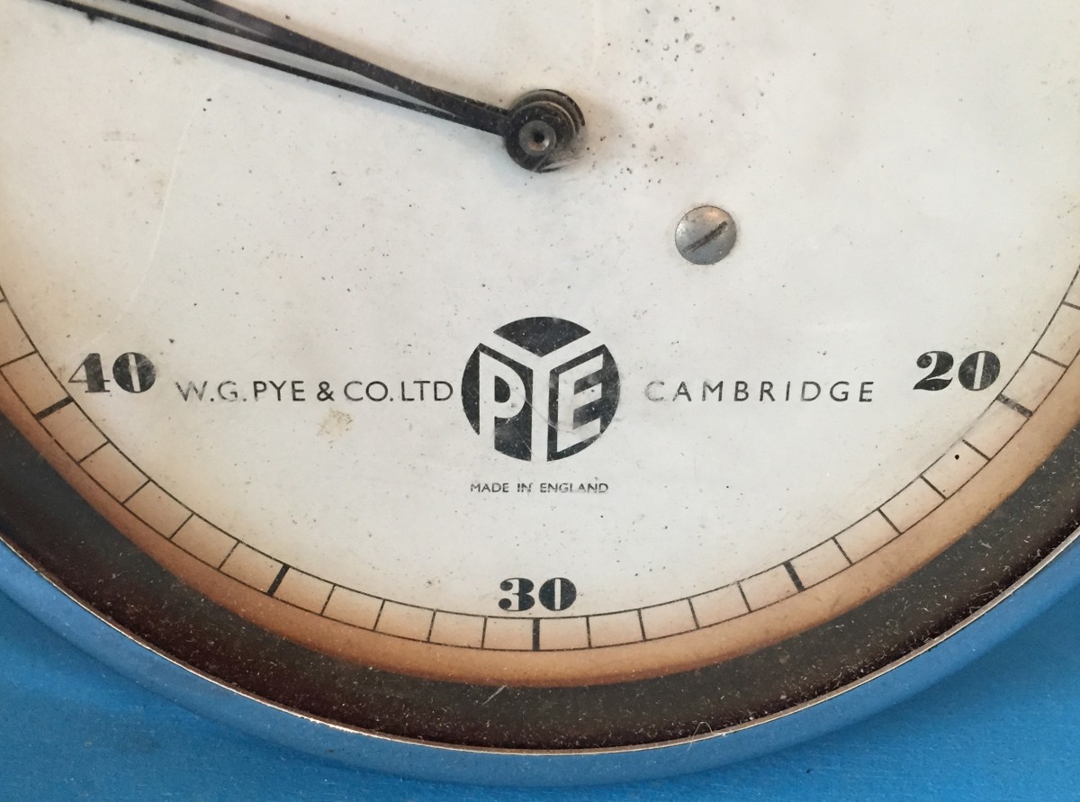
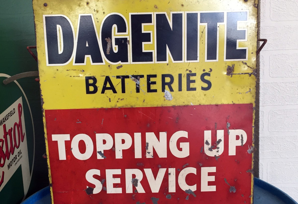
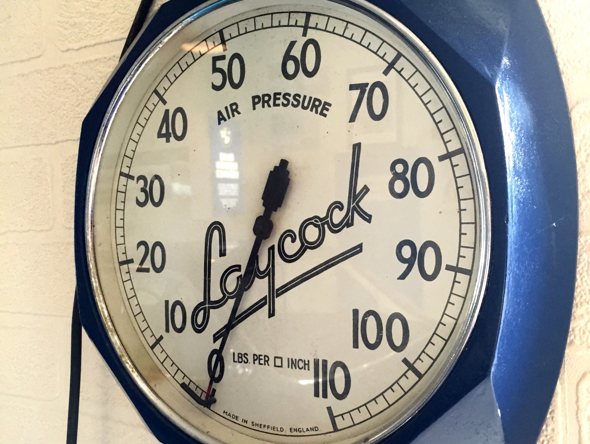
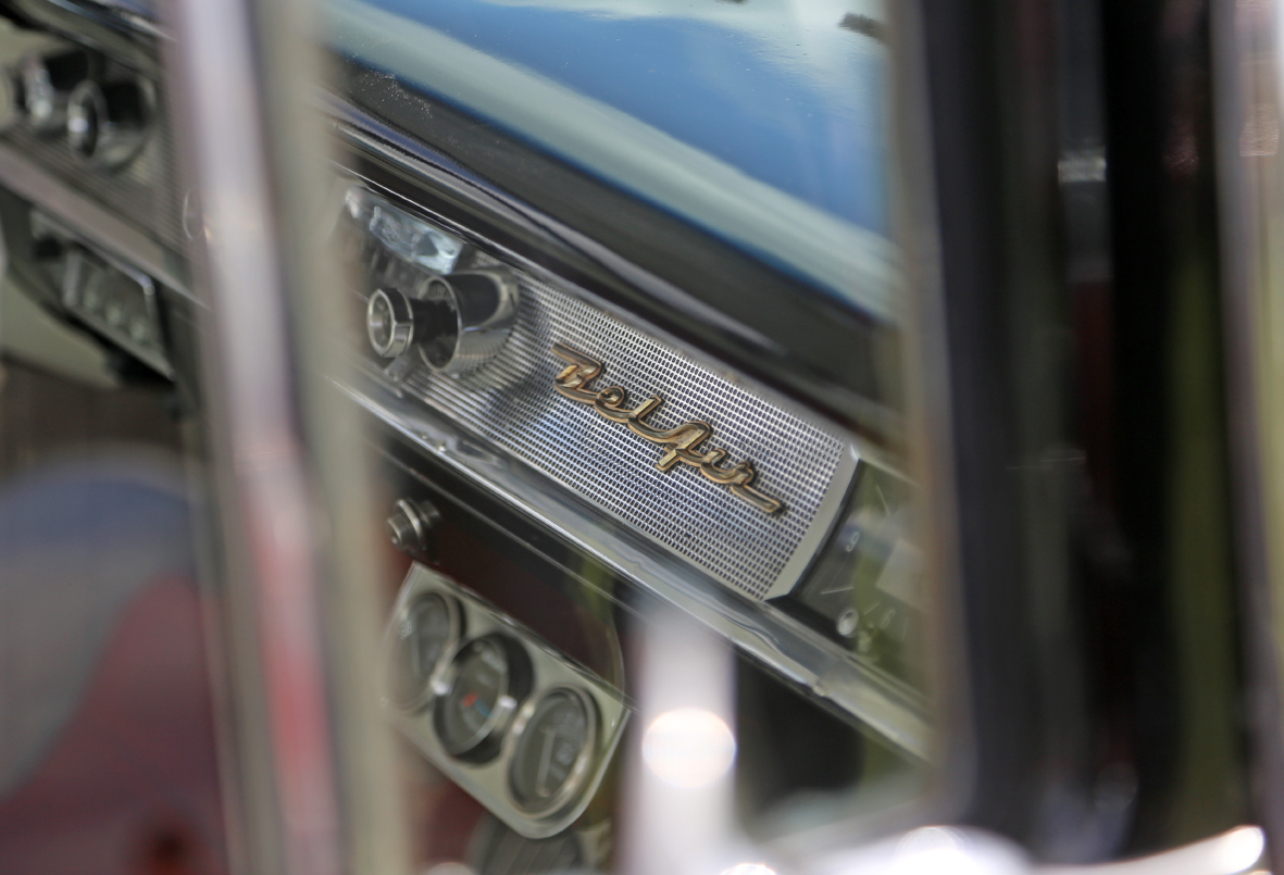
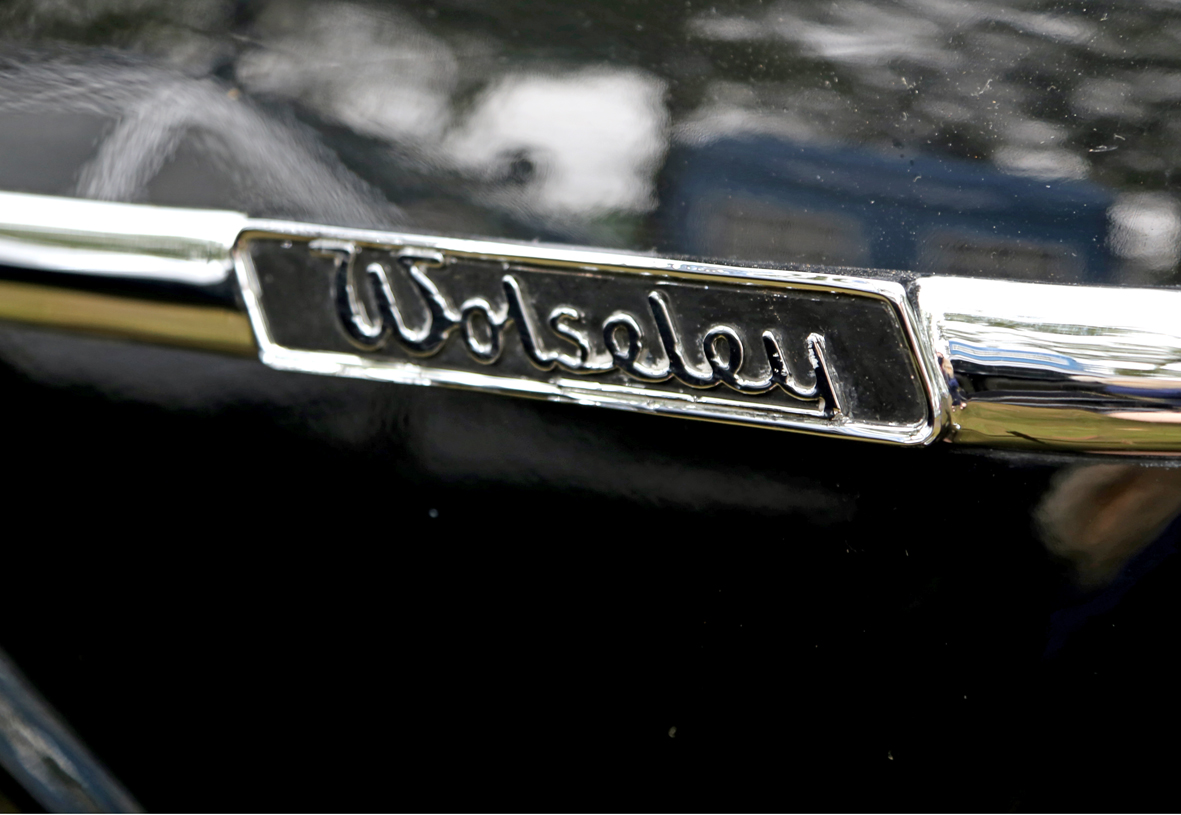
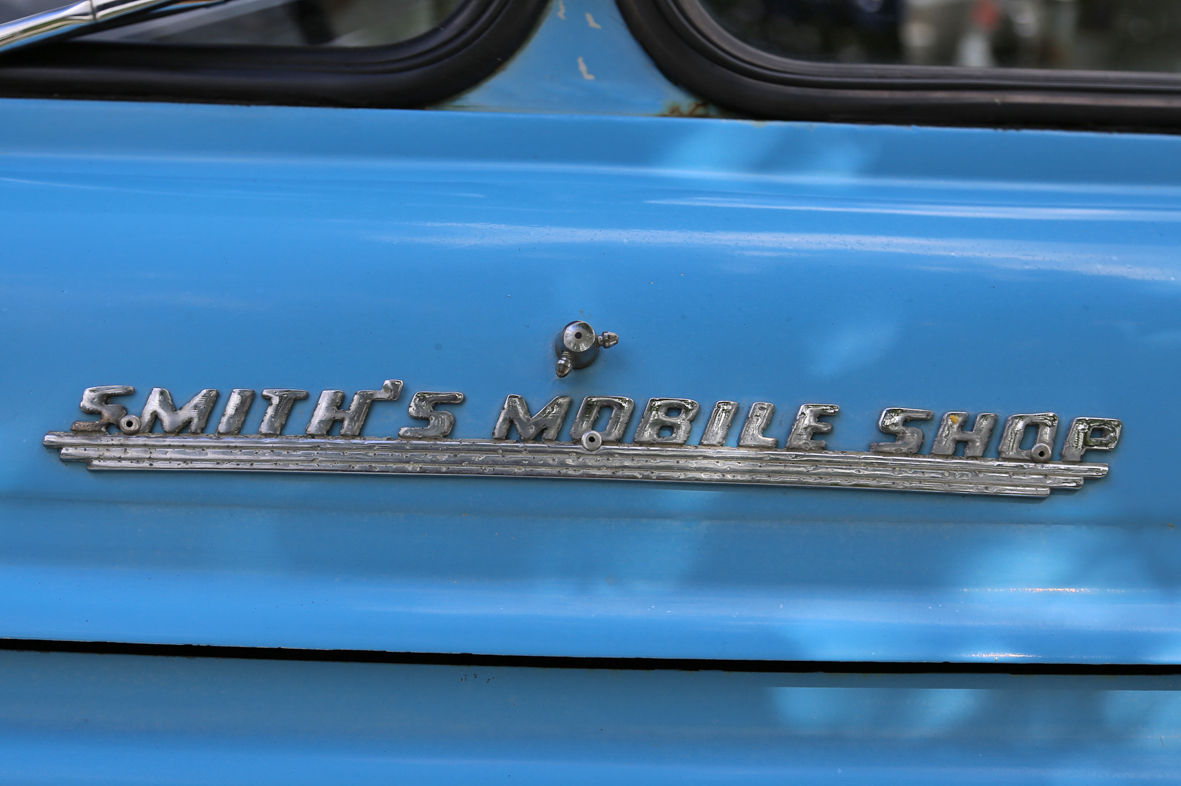
It's been a while since I've posted up some random type loveliness snapped in the wild.
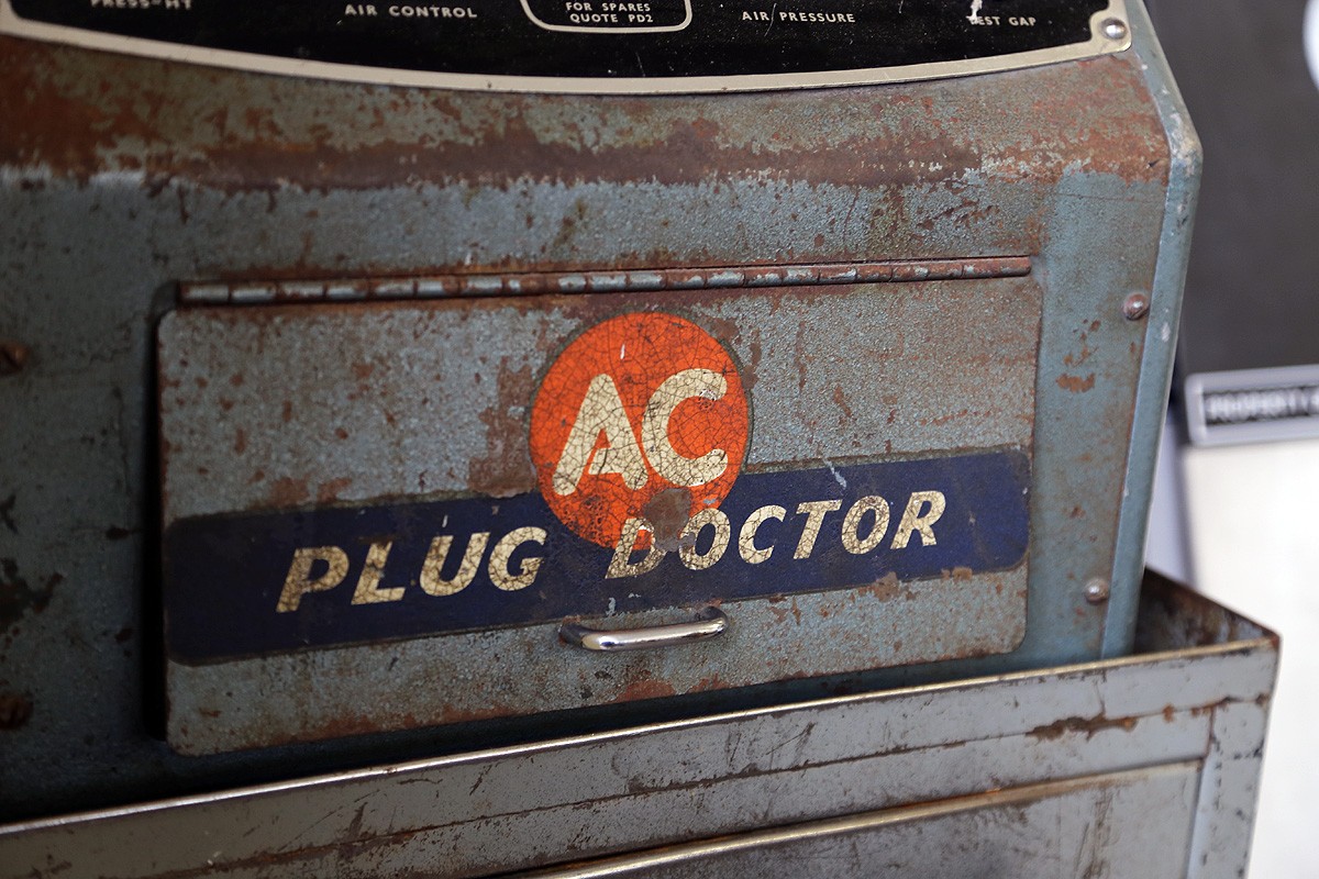
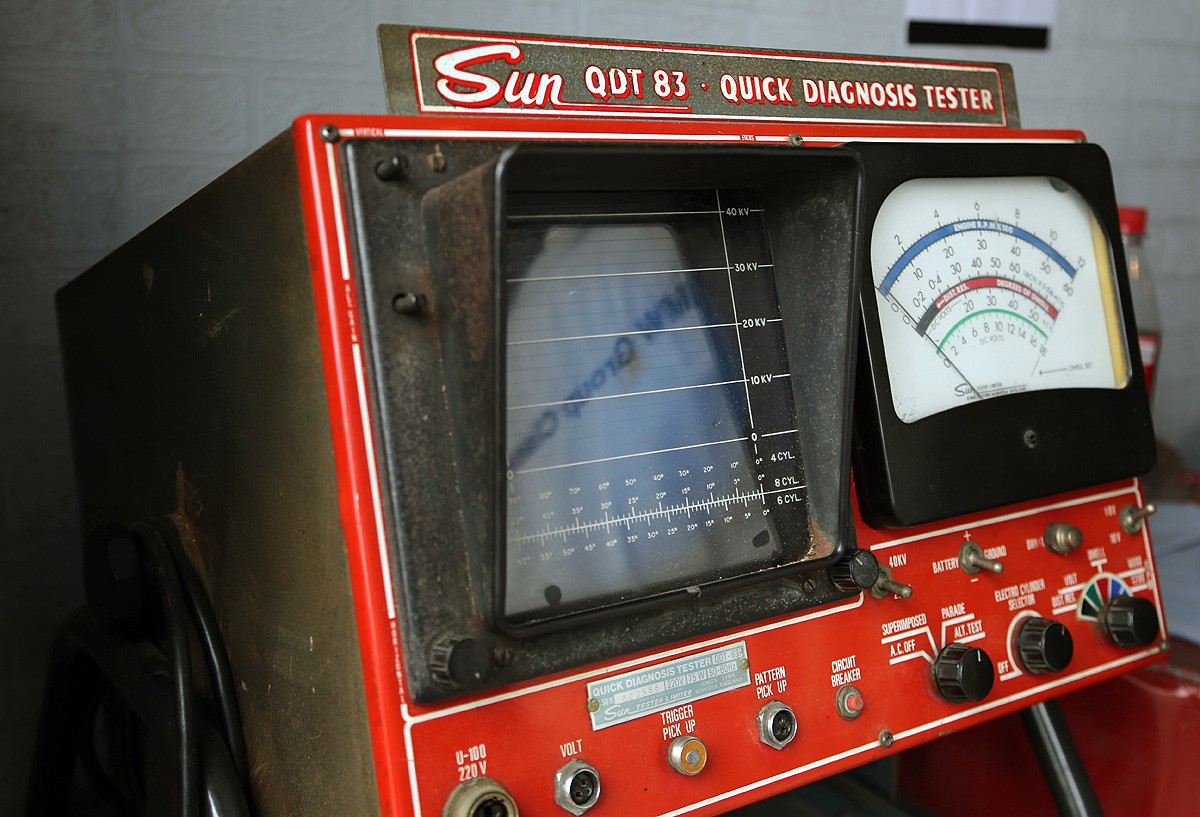
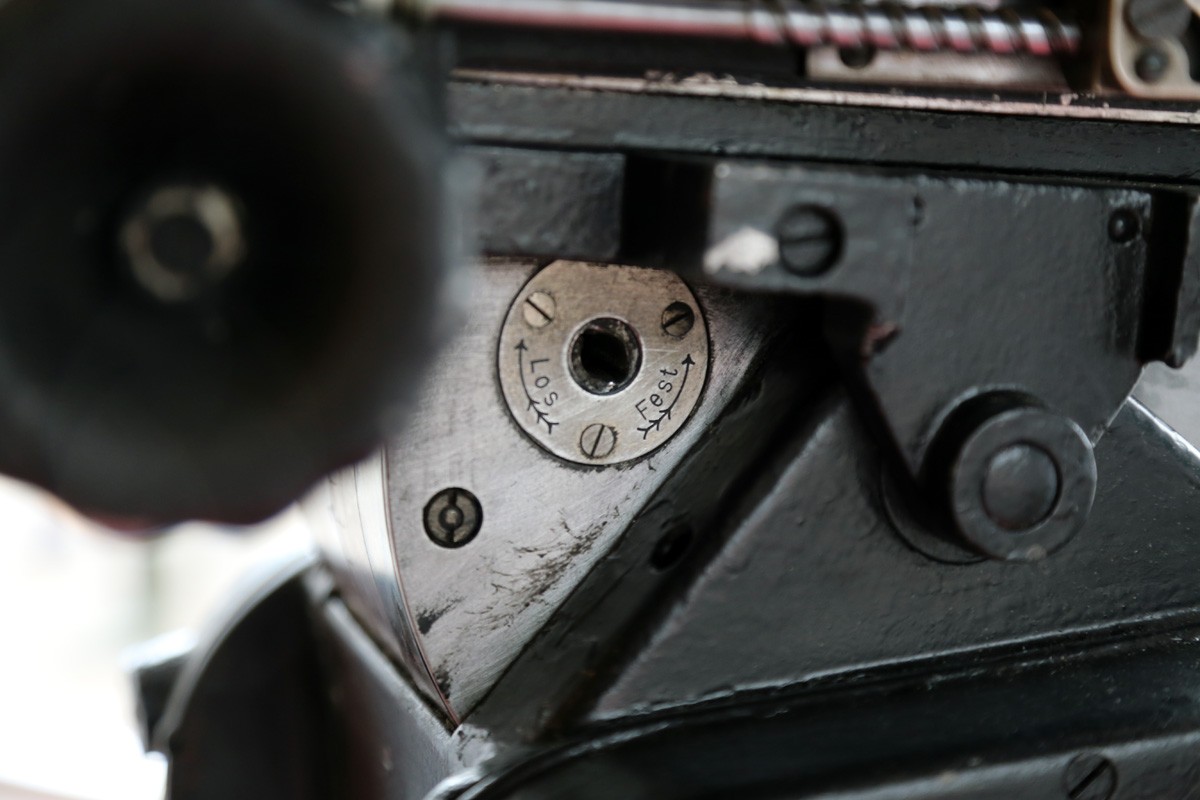
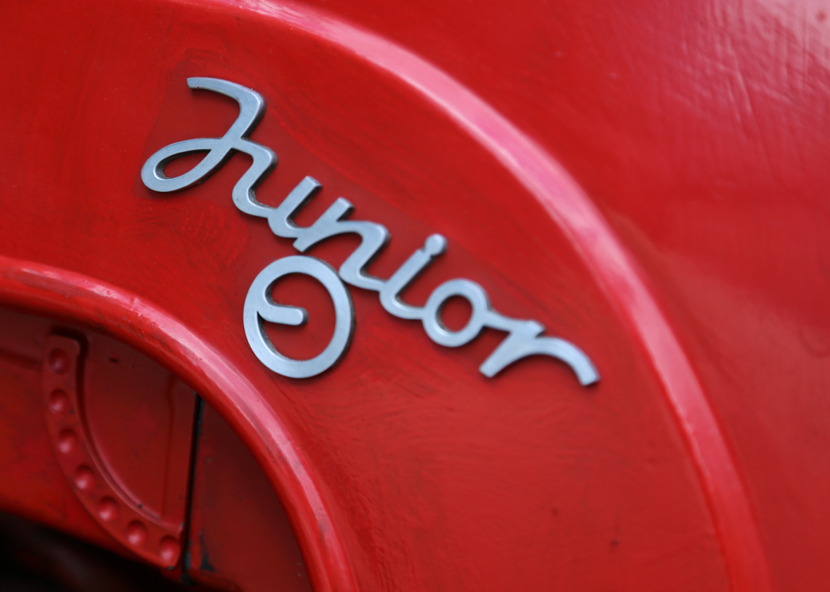
These delightful specimens were spotted at Goodwood Revival 2014 in some of the vintage garage displays.
https%3A%2F%2Fwww.deliciousindustries.com%2Ffound-type-6
Delicious+Industries%3A+Found+Type+%236
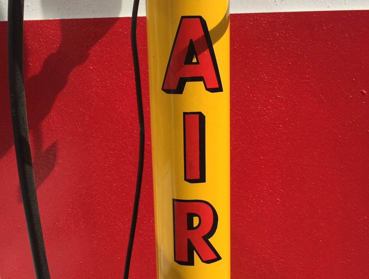
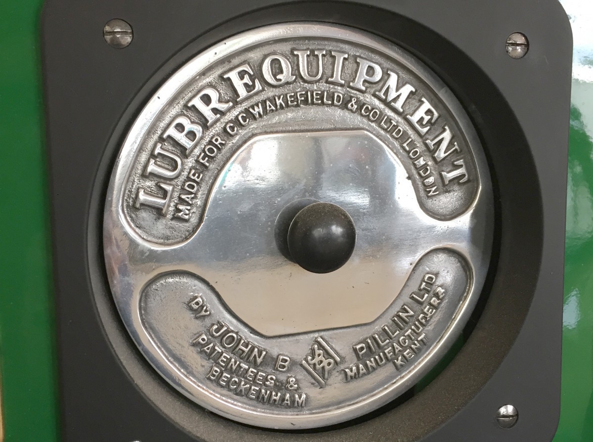
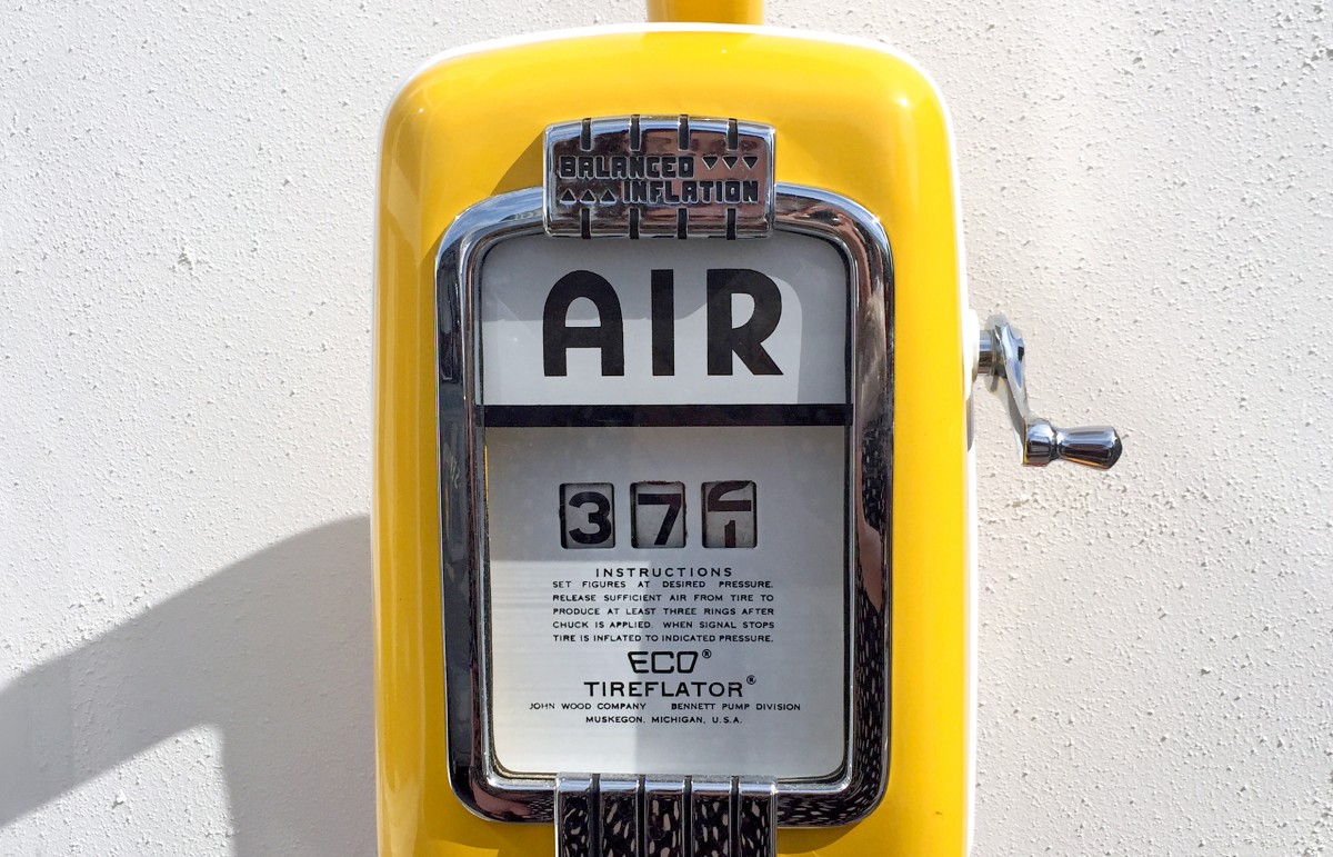
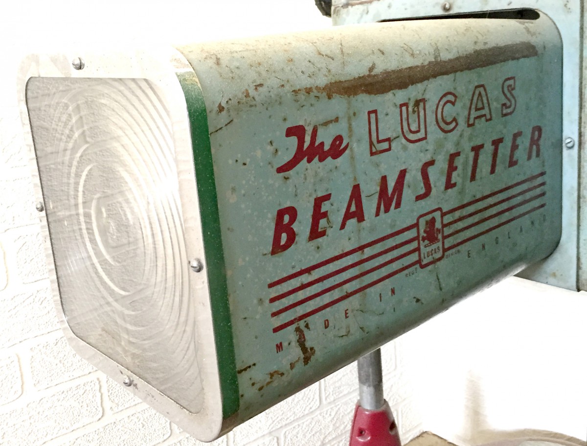
Auto Type XXVXV
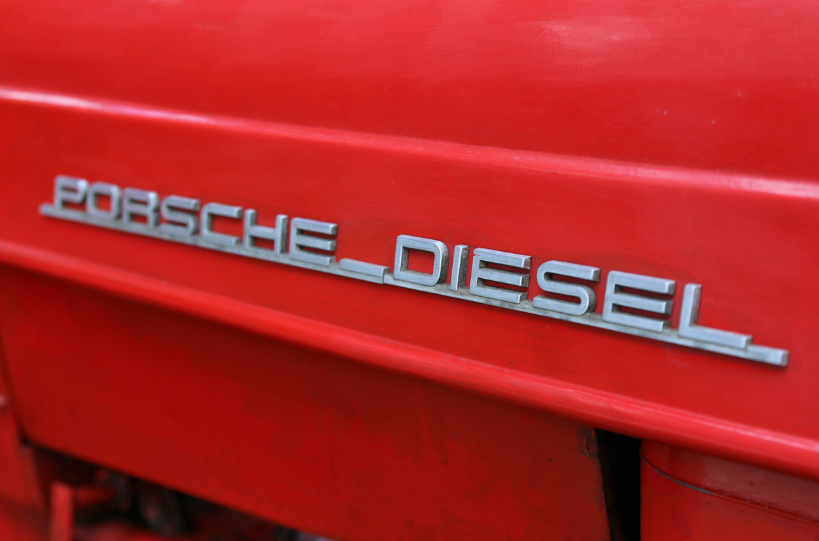
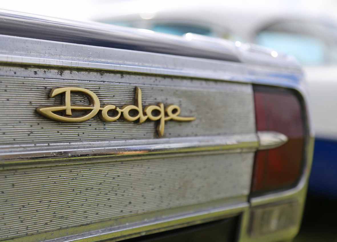
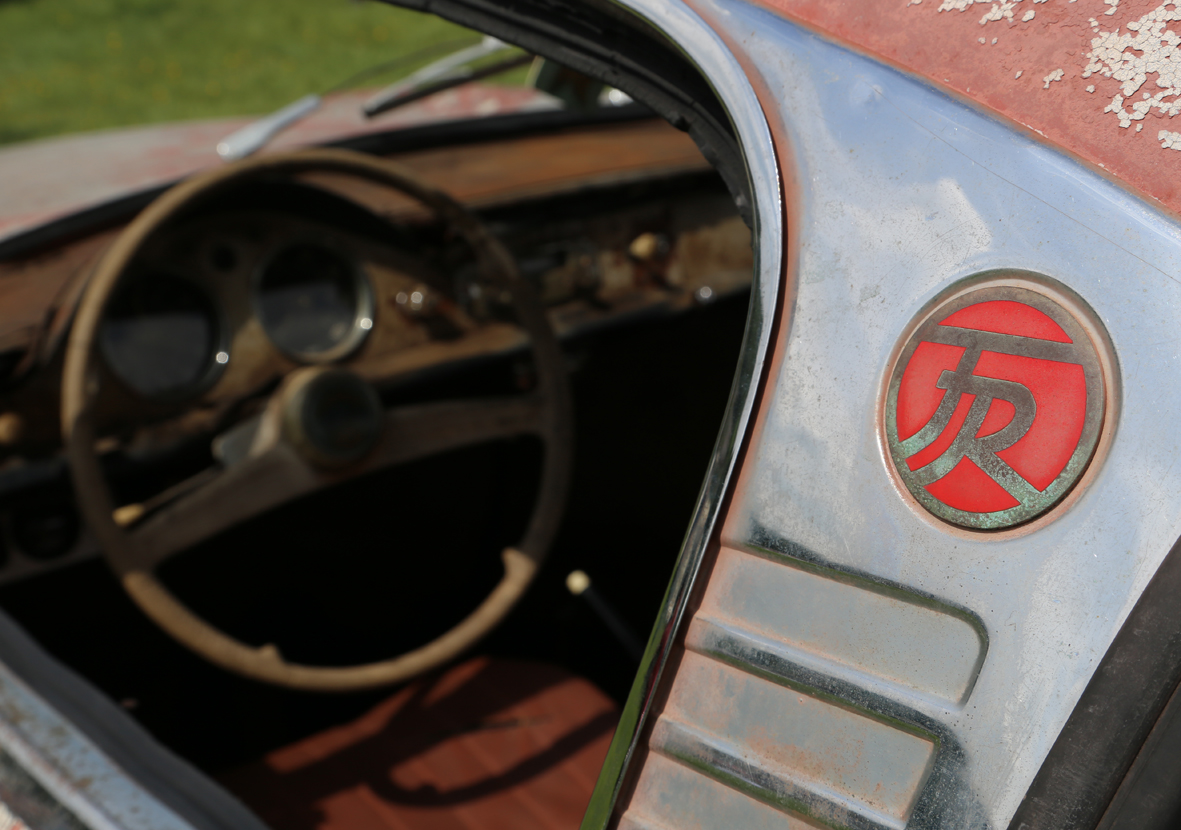
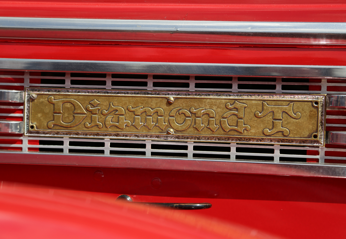
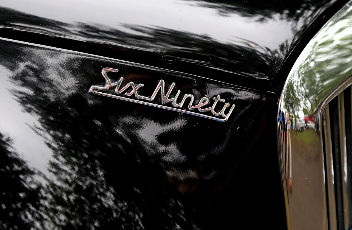
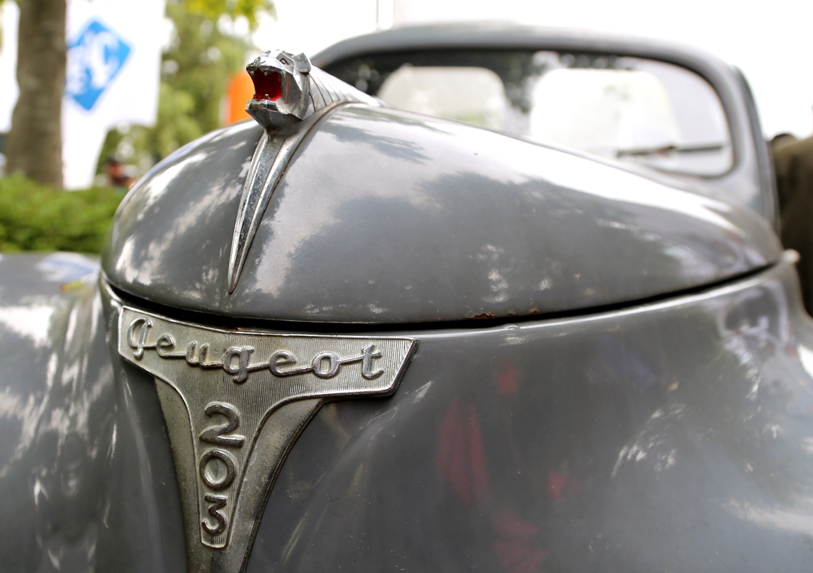
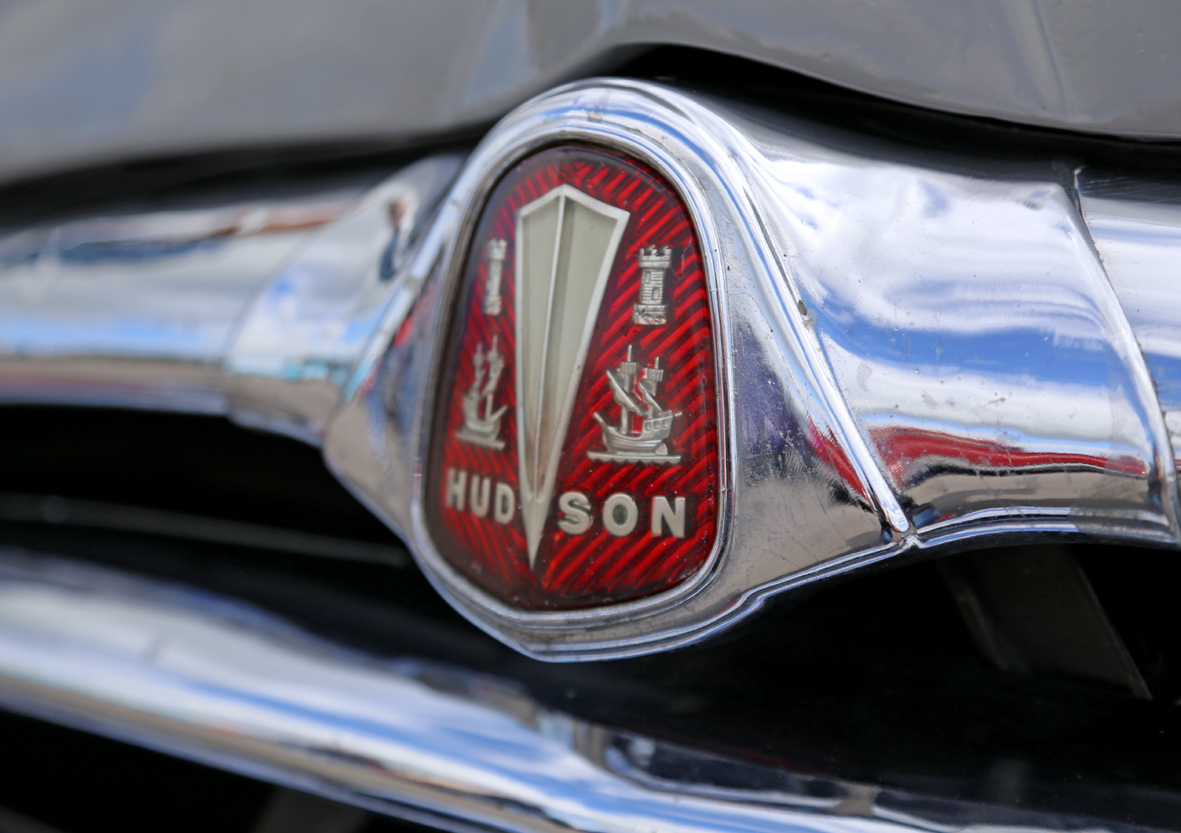
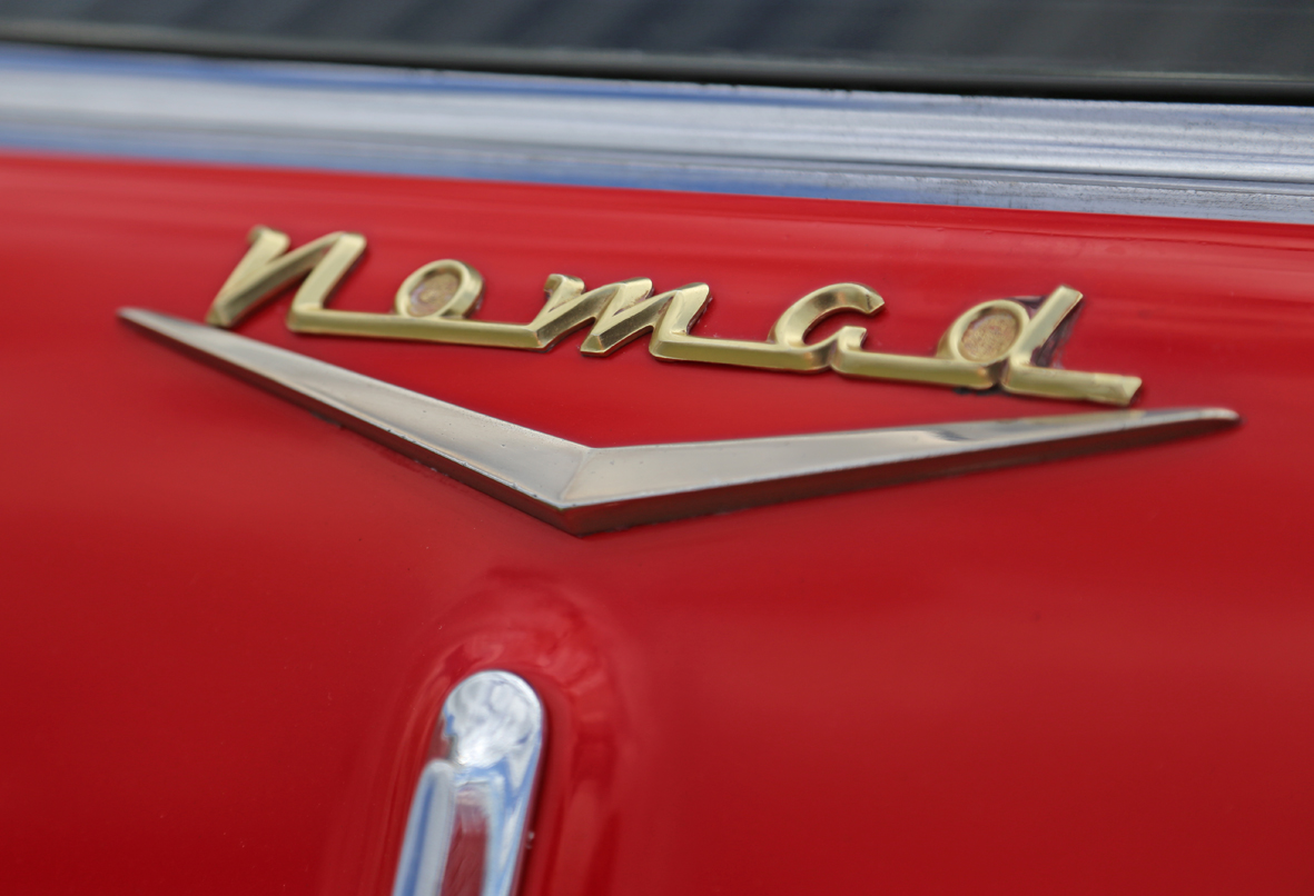
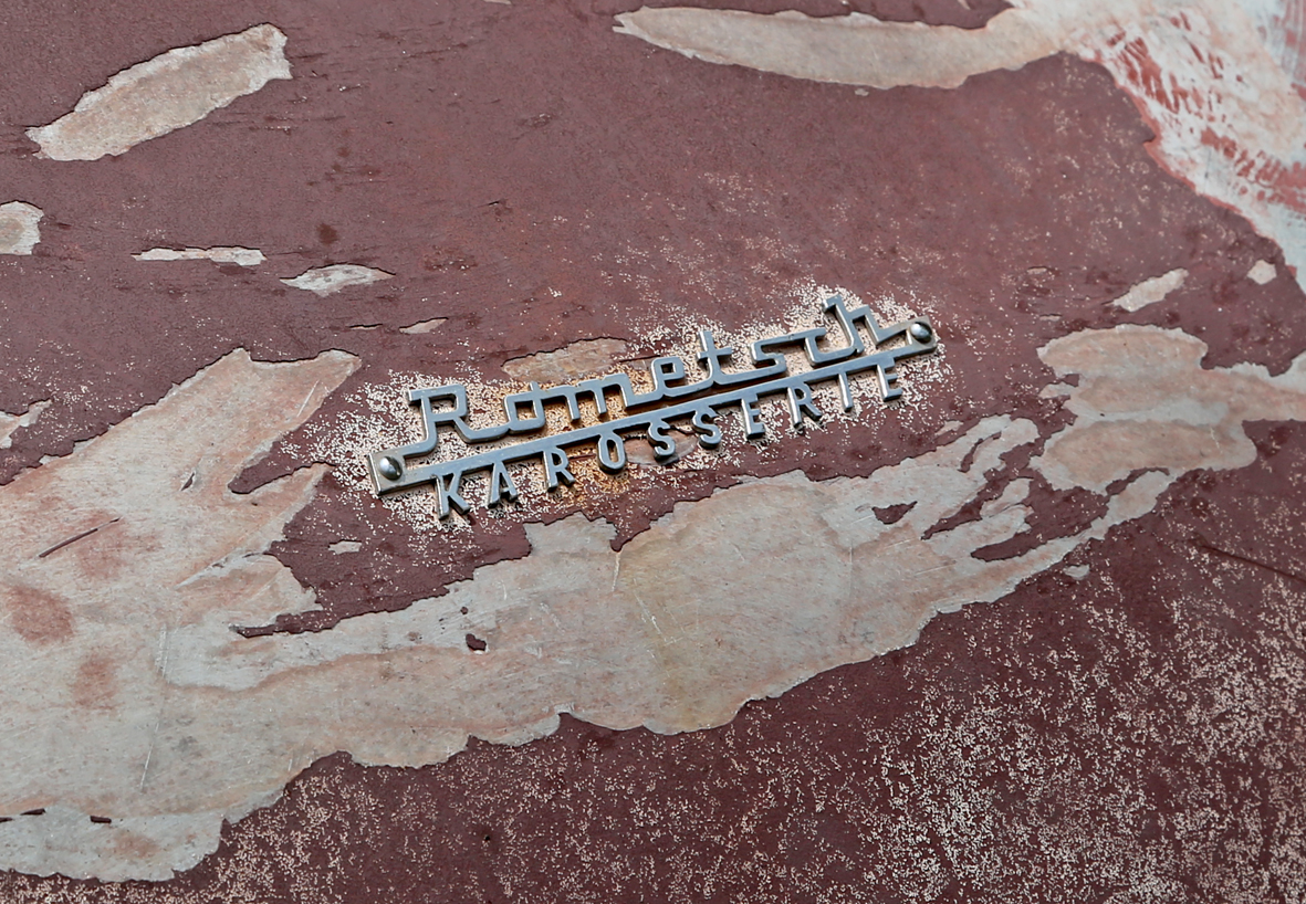
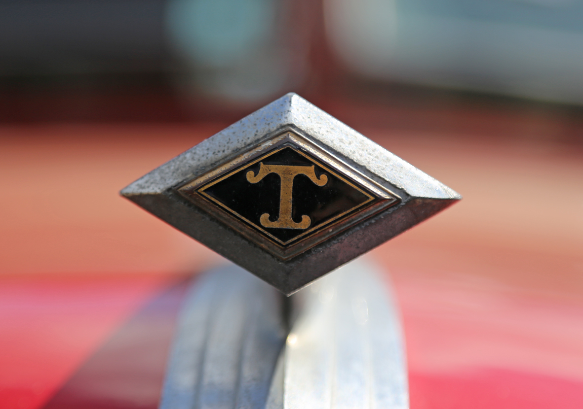
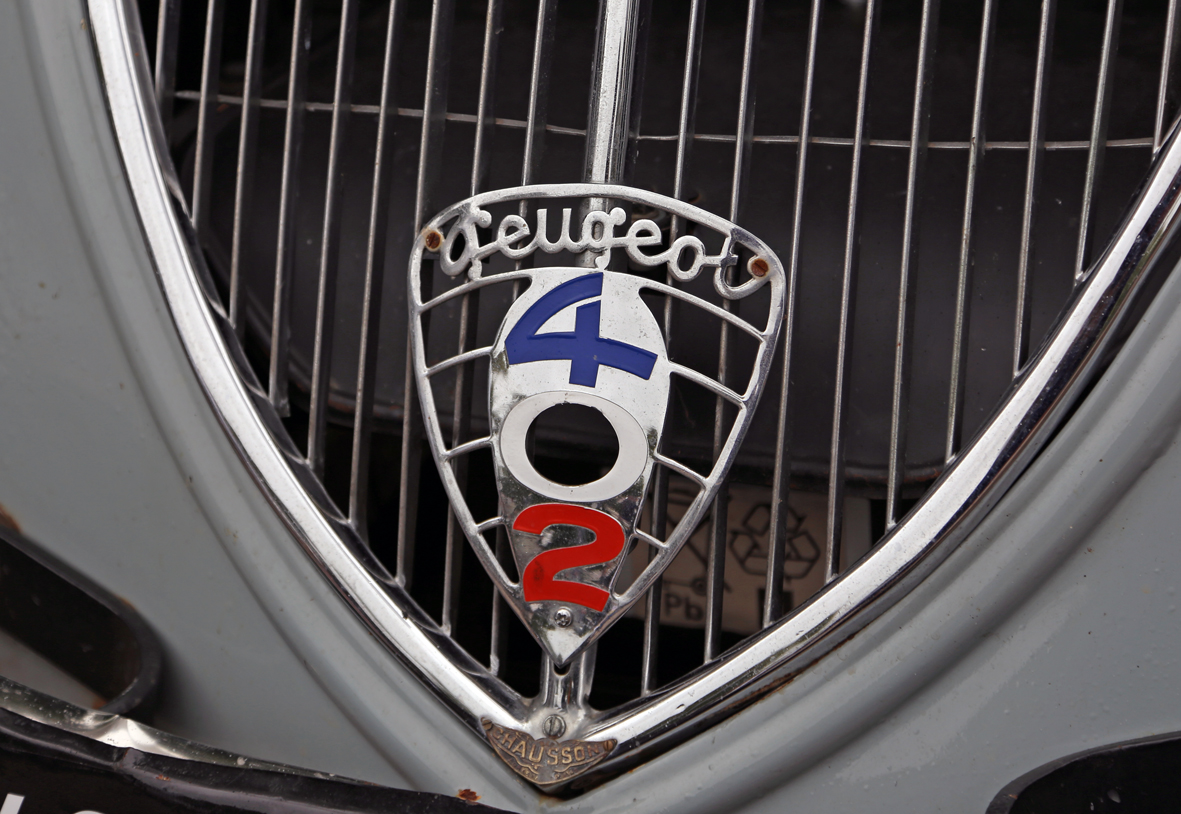
More fabulous auto lettering and emblems.
Show season is upon us again so the auto type will be coming thick and fast over the next few months.
In this lovely bunch we have some 1940s and 1950s Americana alongside some very rare German loveliness. If only they all belonged to me!
You can see our ever-growing collection of Auto Type here.
https%3A%2F%2Fwww.deliciousindustries.com%2Fauto-type-xxvxv
Delicious+Industries%3A+Auto+Type+XXVXV
Type Hunting
Type Hunting have a great selection of type and lettering images on their Tumblr. Some very good mid-week inspiration.
Makes me think I should pull all my found type images together and create a Found Type Tumblr. Watch this space!
Via Sell! Sell! Blog.
https%3A%2F%2Fwww.deliciousindustries.com%2Ftype-hunting
Delicious+Industries%3A+Type+Hunting
Australian Art Deco & Art Deco Style Signage


I'm lucky that Brighton has many wonderful examples of Art Deco architecture & signage, but when you see them so regularly it's easy to take them for granted. I often think about taking the camera out and shooting them properly, but I never seem to find the time. These pics have inspired me to finally do it though, so watch this space.
Images copyright Truffle Pig.
Via Notcot.
https%3A%2F%2Fwww.deliciousindustries.com%2Faustralian-art-deco-art-deco-style-signage
Delicious+Industries%3A+Australian+Art+Deco+%26amp%3B+Art+Deco+Style+Signage
Don't drain my anti-freeze!

"Don't drain my anti-freeze it protects my engine, winter and summer"
I snapped this Shell sticker last Summer - the cute little chappie was on the front screen of a very old car and by the looks of it, he'd been there for quite some time.
If found type/old signage is your thing, check out previous posts here.
https%3A%2F%2Fwww.deliciousindustries.com%2Fdont-drain-my-anti-freeze
Delicious+Industries%3A+Don%26%23039%3Bt+drain+my+anti-freeze%21
Found Type #5


Some lovely found type from around the Delicious studio (top to bottom; 50's 'break glass' fire alarm, 'D' marked weight, vintage 'Halfords' oil can, vintage metal 'Shell' sign and nameplate from 50's/60's Vandome & Hart Ltd. scales)
See more found type posts here.
https%3A%2F%2Fwww.deliciousindustries.com%2Ffound-type-5
Delicious+Industries%3A+Found+Type+%235
TypArchive


I came across a great site, TypArchive totally by accident yesterday and what a joy! It's a collection of found type and signage, focusing mainly on hand-painted signage from around the world but also includes quite a lot of auto type and neon.
The idea, "is to amass a comprehensive global collection of a high-quality images and produce hard-copy volumes". I hope it works out - that would be one cool reference book!
If signage is your thing, chances are you'll find this, this and this rather interesting too.
Images copyright the individual photographers. All from TypArchive.
https%3A%2F%2Fwww.deliciousindustries.com%2Ftyparchive
Delicious+Industries%3A+TypArchive
Neon Boneyard


Neon Boneyard is a great collection of images by photographer Pam Sattler over on Icon-ology of the old, decaying signs that once lit up the strip and casinos in Vegas. I'm sure I've posted about the neon graveyard in the past, but I can't find it!
Pam's photos show the shabby chic beauty of the signs and their faded glory really well - they look amazing. See the full collection here.
Images copyright Pam Sattler.
Via Notcot.
https%3A%2F%2Fwww.deliciousindustries.com%2Fneon-boneyard
Delicious+Industries%3A+Neon+Boneyard
Found Type #4


It's been a while since we had some found type, so here's a selection from vintage packaging to bus numbers. Enjoy...
Look at more delicious found type here.
https%3A%2F%2Fwww.deliciousindustries.com%2Ffound-type-4
Delicious+Industries%3A+Found+Type+%234
Found Type #3


See more found type here and here, or if you prefer have a look at some Auto type here and here.
https%3A%2F%2Fwww.deliciousindustries.com%2Ffound-type-3
Delicious+Industries%3A+Found+Type+%233
Reclaimed SALE sign

Wandering through Covent Garden last night I saw this SALE sign in a shop window. My camera phone pic doesn't really do it justice, but you get the idea.
It was 4 reclaimed signage letters composed in and around a giant 'E' to read 'SALE'. After passing shop upon shop with sale signs in the window, it was refreshing to see one showing a bit originality.
https%3A%2F%2Fwww.deliciousindustries.com%2Freclaimed-sale-sign
Delicious+Industries%3A+Reclaimed+SALE+sign
Auto Type


https%3A%2F%2Fwww.deliciousindustries.com%2Fauto-type
Delicious+Industries%3A+Auto+Type
Found Typography #2


A few pics of distressed type; a mini cab office in Kings Cross London, Litter bin in Chester Zoo, 'Station' sign in Brighton and a TV/Radio rental & repair hand-painted mural on the side of a building in Brighton. All seen better days, but all the more interesting because of it.
https%3A%2F%2Fwww.deliciousindustries.com%2Ffound-typography-2
Delicious+Industries%3A+Found+Typography+%232
Welcome

Welcome to the Delicious Industries blog. We're an independent design studio based in Brighton, UK and this is our scrapbook packed full of design, illustration, photography & typography inspiration. Check out our work here.
Links
DELICIOUS FRIENDS
DELICIOUS FAVOURITES
- 50 Watts
- Acejet 170
- Grain Edit
- It's Nice That
- National Geographic Found
- Notcot
- Pretty Clever
- Retronaut
- So Much Pileup
- We Love Typography
- Another Mag