Blog: Web
Four Virtual Exhibitions
 View large image
Andy Warhol, Tate Modern, London, Elvis I and II 1964 © 2020 The Andy Warhol Foundation for the Visual Arts, Inc. / Licensed by DACS, London.
 View large image
MoMA The Museum of Modern Art, NY, Composition of Circles and Overlapping Angles,1930 © Sophie Taeuber-Arp
 View large image
Design Museum, London, Road Works Margaret Calvert: Women at Work Exhibition © Margaret Calvert
 View large image
Mexico City, Museo Frida Kahlo (Las Casa Azul) © Museo Frida Kahlo
For anyone missing day trips to galleries and wandering around exhibitions, there are some great virtual tours and guides online to help you get that culuture fix.
Ok, it's not quite the same thrill as seeing the work in person, nor do you have the delight of tea and cake in the cafe at the end, but there's something rather lovely about sitting with a cuppa (and cake) in the comfort of your own home whilst taking a virtual tour (they also have webshops if you miss the exit through the gift shop).
Here are four of my favourites available now;
Andy Warhol, Tate Modern, London
It's been almost 20 years since the last Andy Warhol retrospective at Tate Modern, so don't miss the opportunity to see some of his iconic, pop art alongside rarely seen works from his Ladies and Gentlemen' series.
Sophie Taeber-Arp, MOMA, NY
“a central figure in many of the most important avant-garde movements of the first half of the twentieth-century”
Enjoy the work of artist, sculptor, dancer, teacher, writer, interior and textile designer, Sophie Taeber-Arp including her wonderful Dada heads.
Margaret Calvert: Women at Work, Design Museum, London
Celebrating the launch of Network Rail's new custom typeface, Rail Alphabet 2 created by Margaret Calvert, this exhibition also looks at Calvert's other work including the UK's renowned road-signing system which she co-designed.
Museo Frida Kahlo, Mexico City
Take a stroll around the brightly coloured home of Mexican artist Frida Kahlo – ‘La Casa Azul’ (The Blue House) in Mexico City. The birthplace and home of the artist for many years is now a museum of her life and work.
Vintage Poster Resource
They're not 'free' to use, only to download as they don't own the copyrights to the posters or the images but none-the-less I think it's worth a bookmark. Enjoy...
Via Notcot.
Happy New Year!
2013 is set to be an exciting year for Delicious what with a new website, blog & shop launching very soon and some fun print commissions, so Happy New Year - lets hope it's a cracker!
Shop at number 57
These gorgeous vintage prints are from a selection in the newly opened Shop at number 57, a virtual shop full of wonderful vintage prints and eclectic objects. In their own words it's a shop of, "industrial vintage style & all things British. Our range is a mix of old, new & re-purposed items".
I guarantee there'll be something on there that you cannot live without - be warned!
Images copyright Shop at number 57.
Via Kickcan & Conkers.
The Movie Title Stills Collection


The Movie Title Stills Collection is a fantastic online resource for movie titles and end frames. Collated by designer Christian Annyas, the collection ranges from the early 1920's to the present day and can be viewed by decade or by 'Western' and 'Film Noir' genres.
There's plenty to look through - some are old classics, others are more obscure, some are bold and minimal, others are charmingly ornate, but they all have great typography. Enjoy.
Via our friends, Sell! Sell!
Images copyright The Movie Title Stills Collection.
Castor + Pollux web shop

Our lovely friends at Castor + Pollux have just launched their new website and online shop with a great selection of limited edition prints, books, jewellery, stationery and pottery from artists including Rob Ryan, Paul Catherall, Charley Harper and Jonathon Adler.
Buy online before 21 December 2010 and receive a £10 gift voucher for every £50 you spend!
New Sell! Sell! Website


Our friends over at Sell! Sell! have just finished their new website and it’s definitely worth a look. As you can see it’s not what you will have come to expect from a creative agency, but since they write as much as they design & create I think it’s a refreshing idea and one that pushes the value of copy to the fore.
The copy is written in a way that keeps you reading without realising it - there’s also a more immediate navigation for the more traditionalists, but I quite enjoyed the journey through the site via the copy. It’s a very bold approach, but I think it really works and obviously I can’t help but love the big bold type!
Take a look here.
Web Museum of Wood Types & Ornaments


The lovely people at Unicorn Graphics have put together a fantastic Web Museum of Wood Types & Ornaments showcasing a selection of specimen catalogues, borders, cuts and engraved woodblocks.
Their mission is to, "gather, save, preserve, and interpret wood types and information about them" to educate future generations, "on the beauties of wood types and engraved blocks".
They've already succeeded in educating me - I'm a massive fan of wood type blocks, but had never really considered the circumstances in which they first came about, but now I know: "As the demand for broadsides increased during first years of the nineteenth century, the need for the process of producing large letters cheaply arose. Wood was a logical material choice because of its ready availability, lightness, and proven printing qualities. In 1827, Darius Wells of New York City first found the means to mass produce wood letters. In March of 1828, first wood type catalogue was published by Wells".
It's an amazing resource and I can't wait to go through all the content, so far I've only had enough time to look through a couple of the catalogues. That's my weekend planned out!
Images copyright Unicorn Graphics.
Look for the Union Label


I just saw these over on Sell! Sell!, they're a collection of North American, classic and contemporary Union Labels from Look for the Union Label, an online exhibition celebrating Union logos and Emblems. They have been collected together by Jeff Rosen and Susan Parker Sherwood from the Labor Archives and Research Center at San Francisco State University.
"The union label is an imprint or design fixed in plain view on any item, as evidence that is was produced by union labor". The first national Union Label was first adopted in 1880. Seeing a Union Label on a product is, “emblematic of a high standard of living, of tolerable conditions of employment, of those conditions surrounding working men and women which makes for a higher and better standard of living”.
I love to see black and white logos and the detail on some of these is fantastic. Take a look at the full collection here along with some ephemera and some advertising.
Images copyright Look for the Union Label.
Via Sell! Sell!
Golden Gems
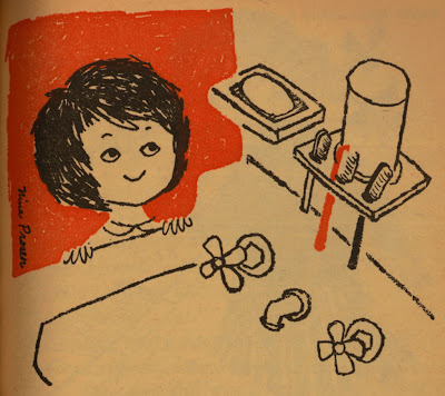
I discovered Golden Gems quite recently and I love it! It's an inspirational blog packed full of modern & vintage illustration along with a selection of Little Golden Books.
All the books have been lovingly scanned for our pleasure. I really love the illustrations from the 1961 'Humpty Dumpty's Magazine' (above and below), especially the animals with their speech bubbles.
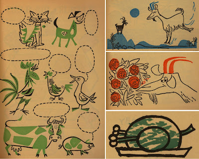
Check out the rest of this book and many, many more here.
Images copyright Golden Gems.
Congratulations Sell! Sell!

Our friends at Sell! Sell! are celebrating their blogs 1st birthday this week. It's a great resource of design/illustration and photography tip bits mixed up with some interesting thoughts on the world of advertising - here's to another successful year!
FoneGloo Infomercial from Sell! Sell!
Just saw this over at Sell! Sell! - it's their excellent new infomercial for FoneGloo:
"FoneGloo is the latest innovation in mobile phone retention - a sticky gloop that will stick your mobile to your face so that you don't lose it on one of those boozy nights out."
Vintage Packaging
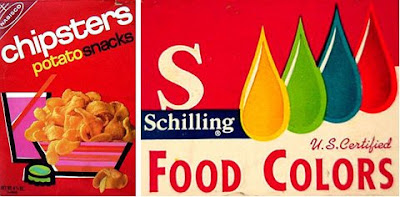

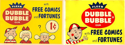
Today I found a fantastic website jam packed with vintage packaging, advertising and store displays, mainly for food and drink products. It's a brilliant resource and must have taken years to compile.
I love the product ranges that have characters - which seem to be mainly drink sachets...

There's a whole section on Funny Face Drink Mix packages showing the development of the characters and design from the early 60's through to the late 70's...

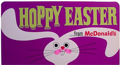
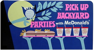
These McDonalds signs from the 60's, were my favourite find, they're really well designed with fun typography and great illustrations - not at all what I imagined!

All images copyright The Imaginary World and Tick Tock Toys.
Via the wonderful Found in Mom's Basement.
Ed Lives Here

Thanks to Lizy Gershenzon at Froeter Design for sending me the link to Ed Lives Here, “Ed’s your friendly educator for all things paper, printing and design. He's here to help you communicate your ideas, on-press and on paper. He's your source for information - and inspiration”.
Basically, this is a great resource for anyone wanting to familiarise themselves with the print process. Experienced designers will probably know most of what’s here, but it’s good to have a reference to hand just in case. I think graduates will find it a really useful guide as the production side of being a designer is rarely covered in detail when studying and is a bit of a blackhole for many fledgling designers in their first job.

The diagrams and charts are really well designed and simplifying the information, making it easier to understand. On many occasions during the past few months this website would have helped me explain a process or print technique easily, to a client. For example trying to explain the differences between printing presses, what spot and process colours are and why they are not always identical, what a foil block or an emboss is and the old favourite – why monitor and printed colours are different.
Here are some other examples from the site:
Retouching

Printing presses

It's a really interesting site, with loads of information and if you don’t believe me, take a look for yourselves here.
Images taken from Ed Lives Here. Sponsored by NewPage.
Kids with Cameras


Kids with Cameras was founded by NY photographer Zana Briski in 2002 as a result of her work teaching photography to the children of Calcutta's red light district. She realised that photography ignited their imagination and helped to build their confidence - ultimately it had the power to transform their lives.
In 1997 Zana went to Calcutta to photograph the real lives of the prostitutes there. During her stay she became familiar with the children, and their interest in her camera inspired her to teach them photography to see the world through their eyes. From 2000 to 2003 she ran photography workshops teaching the children basic techniques and giving them a safe place to learn and enjoy themselves. The images produced where fantastic and gave a unique account of Bengali life. Kids with Cameras raises money and awareness for these children through print sales, world-wide exhibitions, film festivals and a book of their work, published in 2004.
The story of these children and their new found photography skills was documented by Zana and filmmaker, Ross Kauffman to create the film, 'Born into Brothels', which won 25 major awards including the 2005 Academy Award for Best Documentary Feature.
To date, successful workshops have been developed in Jerusalem, Haiti and Cairo. For more information about the current projects, events and exhibitions or to buy prints of the children's images visit Kids with Cameras.
Images copyright Kids with Cameras.
Welcome
Welcome to the Delicious Industries blog. We're an independent design studio based in Brighton, UK and this is our scrapbook packed full of design, illustration, photography & typography inspiration. Check out our work here.
Links
DELICIOUS FRIENDS
DELICIOUS FAVOURITES
- 50 Watts
- Acejet 170
- Grain Edit
- It's Nice That
- National Geographic Found
- Notcot
- Pretty Clever
- Retronaut
- So Much Pileup
- We Love Typography
- Another Mag


