Blog: February 2013
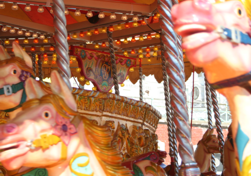
Horse Meat Not Rationed!
Image via Retronaut.
https%3A%2F%2Fwww.deliciousindustries.com%2Fhorse-meat-not-rationed
Delicious+Industries%3A+Horse+Meat+Not+Rationed%21
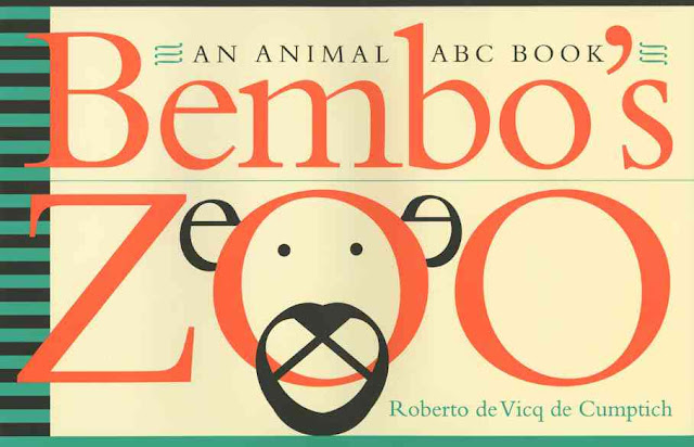
Bembo's Zoo
I just saw this lovely little ABC book over on Brain Pickings. It was designed by Roberto de Vicq de Cumptich and published in 2000 so it's been around a while but it's typographic illustrations have definitely stood the test of time.
Roberto wanted an ABC book he could use to teach his daughter both English and Portugese so it needed animal names that started with the same letter in each language. After an unsuccessful search he created his own version, Bembo's Zoo using the typeface Bembo as a basis for all the typographic illustrations...
You can see more of Roberto's beautiful typography here.
All images and illustrations copyright of Roberti de Vicq de Cumptich
https%3A%2F%2Fwww.deliciousindustries.com%2Fbembos-zoo
Delicious+Industries%3A+Bembo%26%23039%3Bs+Zoo
Who made the Pantone chip?
“God created the world in seven days, and on the eighth day, he called Pantone to put color into it.” Lawrence Herbert
Many of us use the Pantone colour system pretty much everyday, but do any of you know it's origins - who created it, how and why?
No? Neither did I until today when I read this great little article in The NY Times.
Via the lovely @MaraidDesign on Twitter.
https%3A%2F%2Fwww.deliciousindustries.com%2Fwho-made-the-pantone-chip
Delicious+Industries%3A+Who+made+the+Pantone+chip%3F
From the reference box #135
#135 - The County of London Plan, published by Penguin Books in 1945. This lovely little booklet is packed full of beautifully graphic maps (which I'll do a separate post about) showing the County of London and the surrounding London areas.
It covers current and proposed land use residential and commercial (this was immediately after the war and much of the city needed re-development), looks at traffic & public transport solutions, population density problems and shows plans for the Thames riverside re-development. All of which are illustrated with these wonderful infographics...
The booklet credits the British Council for use of the illustrations, so I'm afraid the artist is unknown.
For more delightful ephemera have a dig around the rest of our reference box here.
https%3A%2F%2Fwww.deliciousindustries.com%2Ffrom-the-reference-box-135
Delicious+Industries%3A+From+the+reference+box+%23135
Poster Art 150: London Underground's Greatest Designs
Metropolitan Railway, unknown artist, 1886
Constancy, Julius Klinger, 1929 & By Underground to fresh air, Maxwell Ashby Armfield, 1915
Epping - Central line extension, K G Chapman, 1949 & Winter sales, Edward McKnight Kauffer, 1921
To summer sales by Underground, Horace Taylor, 1926 & London Zoo, Abram Games, 1976
Cycle and Motor Cycle Show, Charles Burton, 1930
Brightest London is best reached by Underground, Horace Taylor, 1924 & Avoid the wet - travel Underground, Kathleen Stenning, 1925
London Underground is continuing it's 150 year anniversary celebrations with Poster Art 150: London Underground's Greatest Designs - an exhibition showcasing 150 of the greatest ever Underground posters selected from their collection of over 3300 posters.The last major exhibition of these posters was way back in 1963 to celebrate it's centenary so it really will be worth a look. Alongside letterpress posters from the late nineteenth century, there will be designs from Edward McKnight Kauffer, Paul Nash and Man Ray.
The exhibition runs until October 2013 so there's plenty of time to see it. But if you can't get over there don't worry, the exhibition sponsors, Siemens are running an online vote for your favourite poster so you can see them all (and vote for them) here.
All images copyright London Transport Museum.
https%3A%2F%2Fwww.deliciousindustries.com%2Fposter-art-150-london-undergrounds-greatest-designs
Delicious+Industries%3A+Poster+Art+150%3A+London+Underground%26%23039%3Bs+Greatest+Designs
Quad Royal Daphne Padden Screen Prints
When Daphne died in 2009 these unused collages were discovered in her studio and with the permission of her estate have been turned into screen prints by Quad Royal.
"Daphne Padden was one of the best designers of her generation. Working from the late 1950s until the 1970s, at the same time as artists such as Tom Eckersley and Abram Games, her work is only now being recognised. She created not only posters - for British Railways, Tillings Coaches and commercial companies - but also packaging for companies like Lux and Marks & Spencers. Her trademark style combines simplicity with a touch of humour typical of the mid-century."
Images copyright Quad Royal.
https%3A%2F%2Fwww.deliciousindustries.com%2Fquad-royal-daphne-padden-screen-prints
Delicious+Industries%3A+Quad+Royal+Daphne+Padden+Screen+Prints
Auto Type XXVIII
Auto Type XXVIII - some fine additions to the auto type collection from a glorious New Year's Day meet at the historic Brooklands Museum. From buses, to Messerschmitt this show had it all!
You can see our full Auto Type collection here or take a look through other auto related posts here.
https%3A%2F%2Fwww.deliciousindustries.com%2Fauto-type-xxviii
Delicious+Industries%3A+Auto+Type+XXVIII
Girlynomics now on Kindle
"Harness the power of Girlynomics to set your budget, balance your personal income and live within your means. In these hard times this book is the perfect answer to help you live your life without having to keep left over bits of lemon in the freezer! Girlynomics will give you new insight in how to make your student loan, weekly wage or salary last for year, month or week".
We're biased as we did the cover & chapter titles (above) for Kate, but it's a great book, a real wealth of information, resources and ideas to help make a girl's finances stretch that bit further. The perfect read for those cold, dark February evenings!
https%3A%2F%2Fwww.deliciousindustries.com%2Fgirlynomics-now-on-kindle
Delicious+Industries%3A+Girlynomics+now+on+Kindle
Welcome

Welcome to the Delicious Industries blog. We're an independent design studio based in Brighton, UK and this is our scrapbook packed full of design, illustration, photography & typography inspiration. Check out our work here.
Links
DELICIOUS FRIENDS
DELICIOUS FAVOURITES
- 50 Watts
- Acejet 170
- Grain Edit
- It's Nice That
- National Geographic Found
- Notcot
- Pretty Clever
- Retronaut
- So Much Pileup
- We Love Typography
- Another Mag


