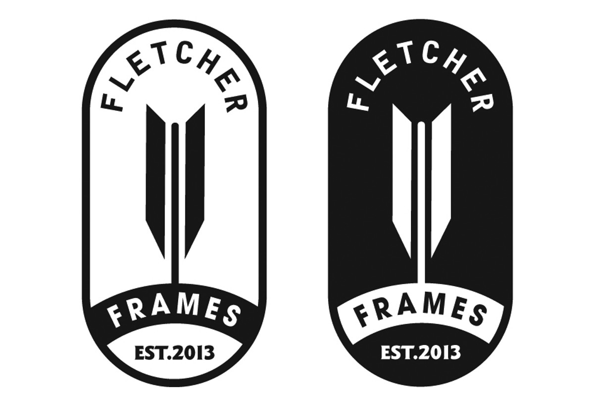
art direction, design + typography
Four Virtual Exhibitions
Pin this on Pinterest
 View large image
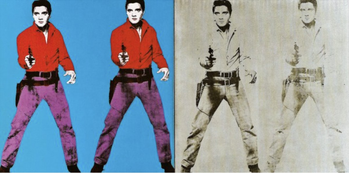
Andy Warhol, Tate Modern, London, Elvis I and II 1964 © 2020 The Andy Warhol Foundation for the Visual Arts, Inc. / Licensed by DACS, London.
Pin this on Pinterest
View large image
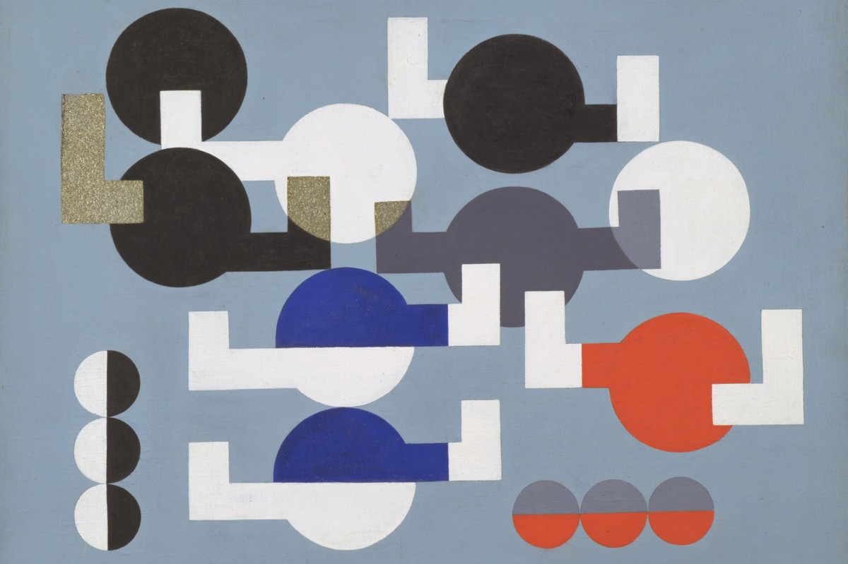
MoMA The Museum of Modern Art, NY, Composition of Circles and Overlapping Angles,1930 © Sophie Taeuber-Arp
Pin this on Pinterest
View large image
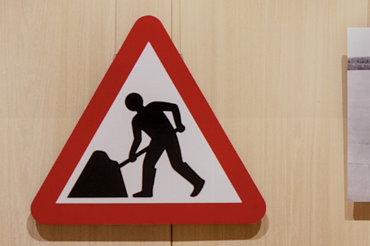
Design Museum, London, Road Works Margaret Calvert: Women at Work Exhibition © Margaret Calvert
Pin this on Pinterest
View large image
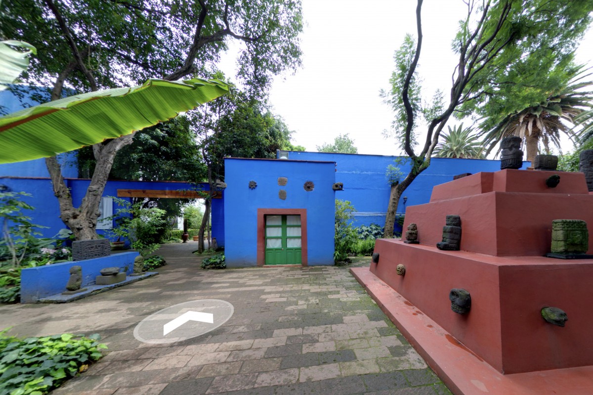
Mexico City, Museo Frida Kahlo (Las Casa Azul) © Museo Frida Kahlo
For anyone missing day trips to galleries and wandering around exhibitions, there are some great virtual tours and guides online to help you get that culuture fix.
Ok, it's not quite the same thrill as seeing the work in person, nor do you have the delight of tea and cake in the cafe at the end, but there's something rather lovely about sitting with a cuppa (and cake) in the comfort of your own home whilst taking a virtual tour (they also have webshops if you miss the exit through the gift shop).
Here are four of my favourites available now;
Andy Warhol, Tate Modern, London
It's been almost 20 years since the last Andy Warhol retrospective at Tate Modern, so don't miss the opportunity to see some of his iconic, pop art alongside rarely seen works from his Ladies and Gentlemen' series.
Sophie Taeber-Arp, MOMA, NY
“a central figure in many of the most important avant-garde movements of the first half of the twentieth-century”
Enjoy the work of artist, sculptor, dancer, teacher, writer, interior and textile designer, Sophie Taeber-Arp including her wonderful Dada heads.
Margaret Calvert: Women at Work, Design Museum, London
Celebrating the launch of Network Rail's new custom typeface, Rail Alphabet 2 created by Margaret Calvert, this exhibition also looks at Calvert's other work including the UK's renowned road-signing system which she co-designed.
Museo Frida Kahlo, Mexico City
Take a stroll around the brightly coloured home of Mexican artist Frida Kahlo – ‘La Casa Azul’ (The Blue House) in Mexico City. The birthplace and home of the artist for many years is now a museum of her life and work.
https%3A%2F%2Fwww.deliciousindustries.com%2Ffour-virtual-exhibitions
Delicious+Industries%3A+Four+Virtual+Exhibitions
The birth of Windfall magazine
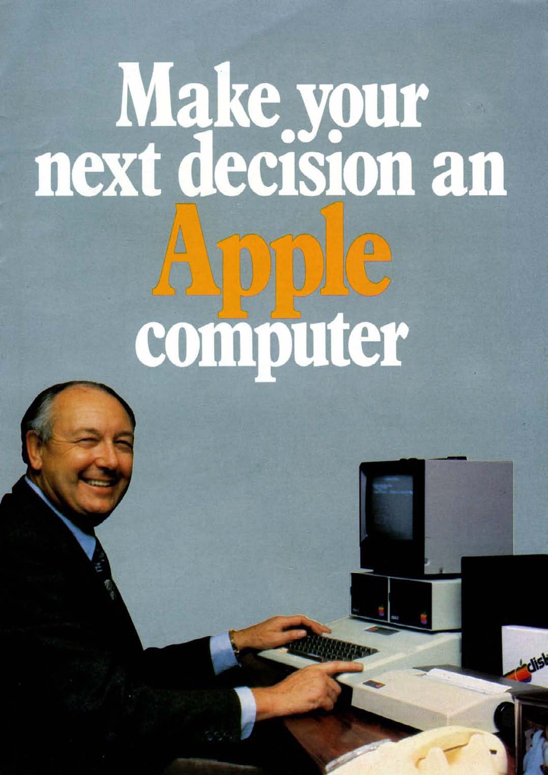
Back in 2008 I posted about Windfall magazine (the predecessor to Apple User) after finding a few copies on a boot sale. The post sparked comments from quite a few of the original Windfall editorial team adding their recollections. Fast-forward to earlier this year and I had the pleasure of receiving an email from Peter F Bramfeld, sharing with me his memories of the birth of Windfall magazine, the people involved in its early development and some of his collection of early Apple marketing.
Here's the story in Peter's own words...
Hello all,
I have just stumbled across this thread and feel that I can add some background to what has already been quoted above [comments on the original post], as I am 75 years old I thought I should attempt to make this contribution before life takes its natural course.
Early 1980 whilst I was working as an experimental officer at UMIST, I received funding to purchase a personal computer. Everyone else had gone for Commodore pets, but I was attracted by the ease of interfacing external devices to the Apple 2, so I use my funding to buy an Apple.
At that time there was a national Commodore user's club, but there was no such organisation for the users of Apple, so I decided that I would start one, the Manchester Evening News got hold of the activity, via the PR department of the University, which resulted in the rather grandiose headline in the evening news "Manchester University shows American company how to use their technology".
I decided that I would advertise for Apple users to attend an evening meeting at the University so we could have a meeting of minds, at that meeting I suggested a subscription of £10 a year to the user group, for which each member would receive a monthly magazine.
The initial meeting far exceeded our expectations, and it was attended by over 200 people, at the end of the meeting I had loads of money, but an obligation to publish a magazine.
I was supported in my endeavours by my good friend and fellow university employee, Max Parrott, Max and I struggled to write the first couple of monthly magazines. In the audience had been one Derek Meakin, he approached us and said he would produce the magazine for nothing if we would supply the editorial, well this was Manna from Heaven, in addition we were both offered a fee of £100 a month for our trouble, life is too good to be true!
In the fullness of time I left the university, and joined Derek making as editor-in-chief, and from the beginning of Windfall grew a computer specific magazine stable of I think seven titles.
As to who deserves the accolade of the person responsible for the magazine, I feel that belongs to myself, and my colleague Max Parrott. David was the first editor and indeed was responsible for setting the editorial tone which was very successful in ensuring the magazine appealed to a wide readership.
If anyone would like to contact me as a consequence of this posting I would love to hear from them.
Peter F Brameld
If any of the original team wish to contact Peter, please get in touch with me and I will pass along his details as he has requested.
https%3A%2F%2Fwww.deliciousindustries.com%2Fthe-birth-of-windfall-magazine
Delicious+Industries%3A+The+birth+of+Windfall+magazine
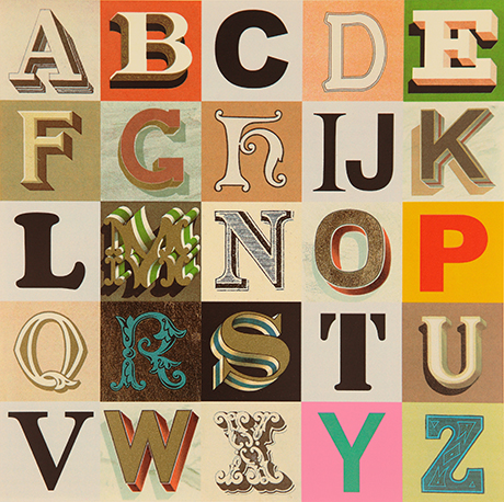
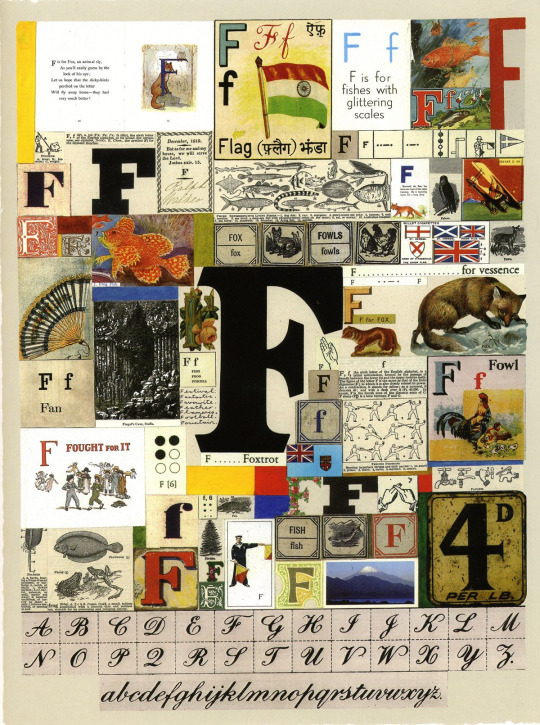
Alphabets, Letters & Numbers
Pin this on Pinterest
View large image
Appropriated Alphabet no.7 (2013) © Peter Blake. Courtesy CCA Gallery, London
Peter Blake at the De La Warr Pavilion.
Blake has personally curated Alphabets, Letters and Numbers to showcase three series of editions: Alphabet (1991) a 26 piece series of silk screen prints with a print for each letter of the alphabet - I is for Idols ("a collage of screen legends, artists and musicians"), An Alphabet (2007) a series of found ephemera, illustration and handwritting collages - one for each letter of the alphabet. , and Appropriated Alphabets (2013) a series consisting of 12 individually collated alphabets.
"Throughout his long and prestigious career Blake has created several series of works based around the alphabet related to his enduring interest in childhood innocence and nostalgia, and Victorian and Edwardian graphic illustration. Using vintage cards, magazines, books and other found ephemera, he assembles collages that are at once whimsical, humorous and fascinating. He began using found letters and commercial lettering in the 1950s and, as a young artist, allied himself with decorators, sign painters and commercial artists."
The exhibition is free and runs until Sunday 27 November 2016. You know it's also the rule when you visit the De La Warr that you have to have a cream tea sat out on the terrace!
Mon 10 Oct 2016
Posted under: Design , Typography , Ephemera , Prints , Things to buy , Illustration , Exhibition , Found typography
https%3A%2F%2Fwww.deliciousindustries.com%2Falphabets-letters-numbers
Delicious+Industries%3A+Alphabets%2C+Letters+%26amp%3B+Numbers
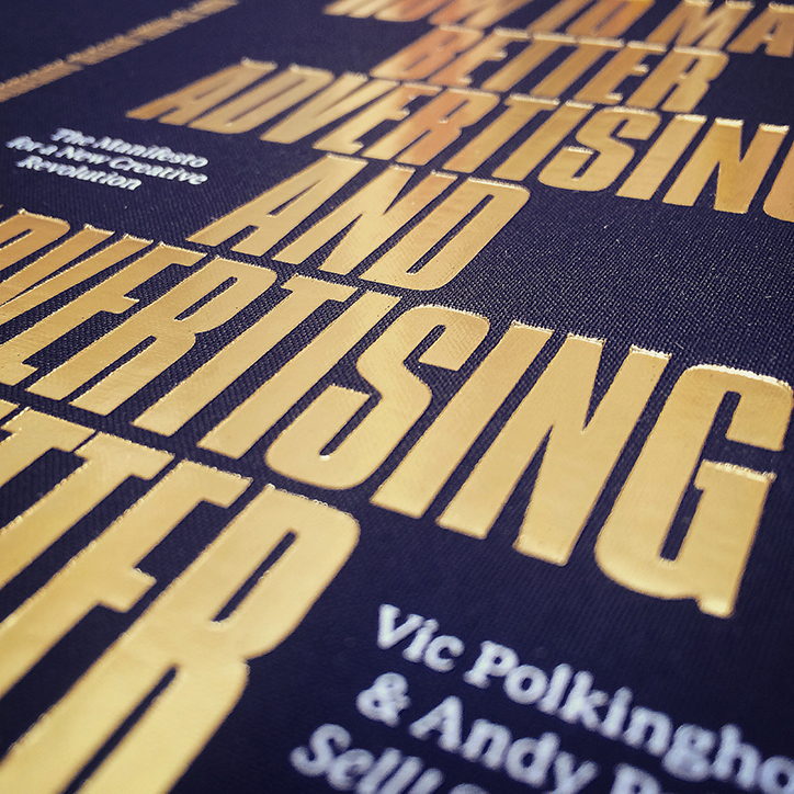
How to Make Better Advertising and Advertising Better
How To Make Better Advertising and Advertising Better – is the new book from our friends, creative agency Sell! Sell!.
Written by Vic Polkinghorne and Andy Palmer after two decades in the business and ten years running their agency 'The Manifesto for a New Creative Revolution’ outlines their no-nonsense approach to the industry:
Bullshit-free
Advertising and marketing people need to lose the jargon. A culture of business bullshit has slowly polluted the commercial world. Engagement, low-hanging fruit, synergy, media-neutral, content-led, always-on, ideation, adcepts, holistic approach, storytelling, user-generated content, leverage, realtime 24/7, cultural currency, the list goes on (and on). This language is symptomatic of a move towards the unnecessary complication of the world of advertising and marketing.
These terms allow people to hide behind them, and mask flimsy thinking. They confuse and conceal, where the aim of the advertising process should always be to simplify and clarify. And they make the rest of the business world even more sceptical about advertising and marketing. Let’s drive the bullshit and the bullshitters out of the process, use plain speaking, and always simplify.
Their beautifully produced book is available exclusively at the Design Museum, get your copy here.
Wed 13 Apr 2016
Posted under: Advertising , Delicious things , Things to buy , Books , Marketing , Writing
https%3A%2F%2Fwww.deliciousindustries.com%2Fhow-to-make-better-advertising-and-advertising-better
Delicious+Industries%3A+How+to+Make+Better+Advertising+and+Advertising+Better
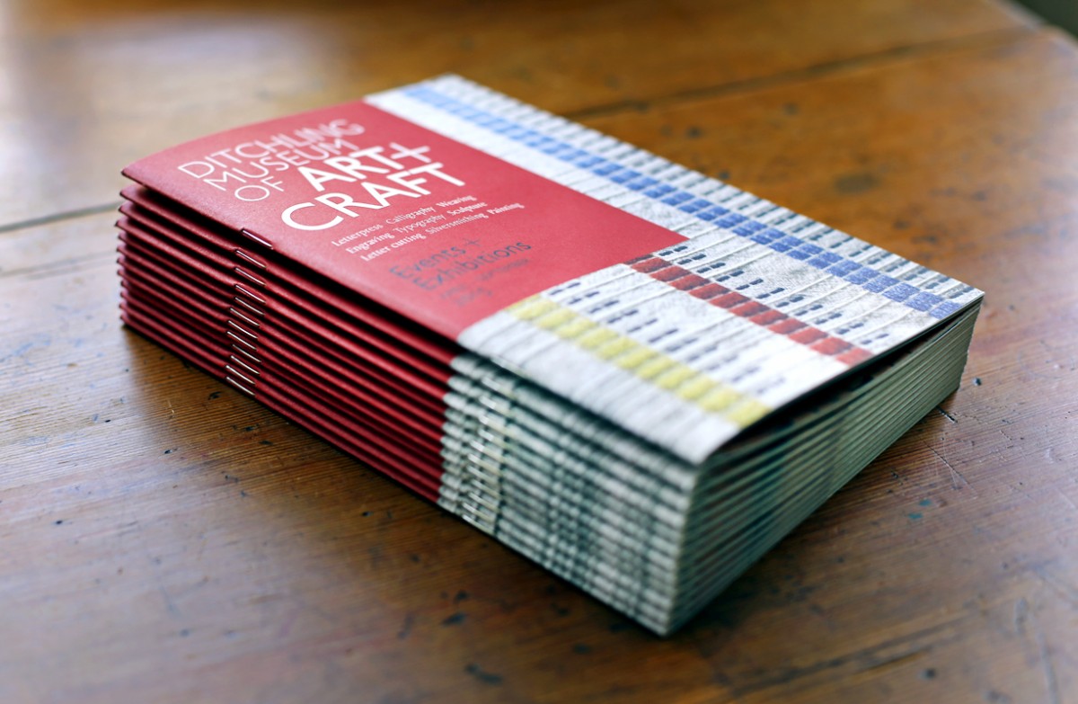
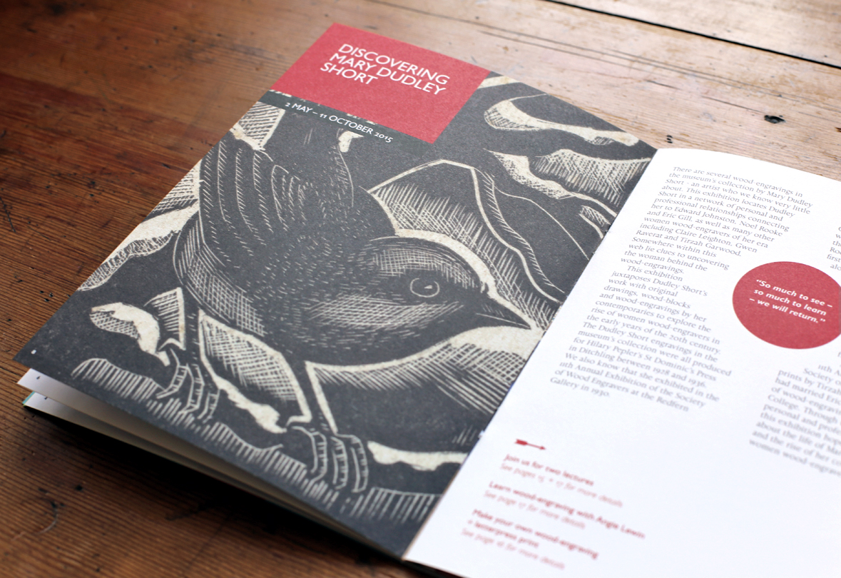
Interrobang - call for submissions
Calling all letterpress artists and designers!
Our friends at Ditchling Museum of Art & Craft are currently running an open submission for their forthcoming exhibition, Interrobang: an international showcase of letterpress print. The exhibition will be curated by the museum for The Village of Type, part of the Brighton Festival and the Artists’ Open House trail.
The Village of Type will be a season of exhibitions, workshops, lectures, residencies and printing events celebrating the centenary of the London Underground typeface, created by Edward Johnston when he lived in the village.
Publishers Random Spectacular will also be drawing on entries for a new publication looking at letterpress from around the world to accompany the exhibition.
Interested? Find out more and enter online here.
Entry closes on 14 February 2016. One submission per entry fee. All work must be printed using letterpress (although entries are to be submitted digitally), pieces can be created specifically for Interrobang or be existing work. Size is not limited, but pieces must be 2D and as this is a selling exhibition, you must have at least 5 copies of any submission.
https%3A%2F%2Fwww.deliciousindustries.com%2Finterrobang-call-for-submissions
Delicious+Industries%3A+Interrobang+-+call+for+submissions
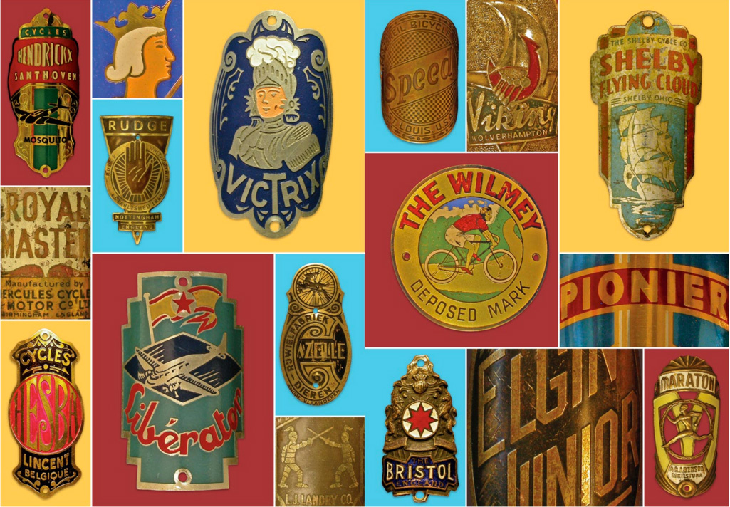
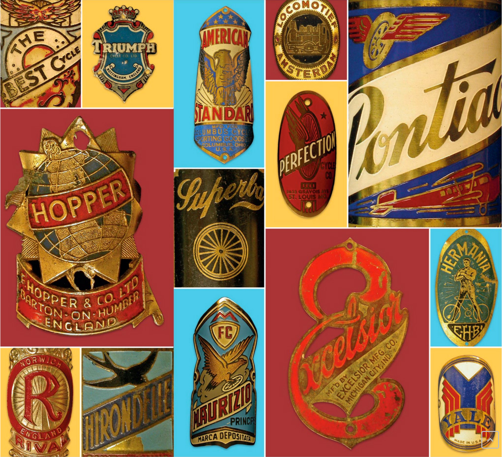
A Cycling Lexicon
Beautiful lettering, beautiful graphics and beautifully aged - what's not to like about this collection of bicycle headbadges?
I've had a slight obsession recently with vintage beach cruiser bikes and I particularly love the graphics, so imagine my delight when I heard about 'A Cycling Lexicon' - a book filled with an A-Z of glorious bicycle headbadges. The badges are a selection from the collection of cycling enthusiast Jeff Conner, Professor of Biology at Michigan State University curated by Carter Wong design who also designed the book.
You can buy the book here.
Images copyright A Cyclling Lexicon via Boneshaker.
https%3A%2F%2Fwww.deliciousindustries.com%2Fa-cycling-lexicon
Delicious+Industries%3A+A+Cycling+Lexicon
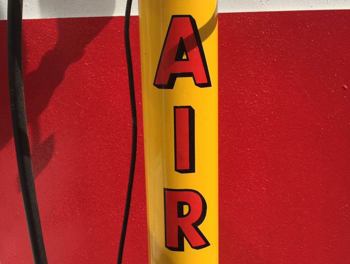
Found Type #7
More fabulous lettering and typography snapped in the wild over the last year.
Have a look through the rest of our Found Type here.
https%3A%2F%2Fwww.deliciousindustries.com%2Ffound-type-7
Delicious+Industries%3A+Found+Type+%237
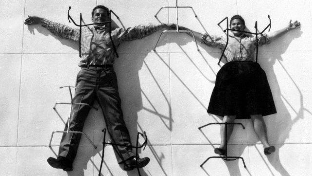
Well Hello 2016!
Pin this on Pinterest
View large image
Charles and Ray Eames posing with chair bases Eames Office LLC
Happy New Year.
It feels like only yesterday I was saying that at the start of 2015 - last year flew by for us and our poor blog was (once again) left unloved for far too long but I promise this year will be different.
For starters, here are two exhibitions in London right now that are guaranteed to bring a little happiness to you in this dreary month;
The EY Exhibition: The World goes Pop
"Whaaam! Pop! Kapow! This is pop art, but not as you know it."
The Tate Modern is showcasing lesser-known international artists from the pop-art movement in the 1960s and 70s, exhibiting together more than 200 works from Latin America, the Middle East and Europe. Previously considered a western phenomenon, the exhibition demonstrates just how far globally this bright and bold movement spread and how it became a, "subversive international language of protest".
Showing until 24 January 2016 on Level 3 at Tate Modern, London.
The World of Charles and Ray Eames
Design icon alert! Over 380 "personal letters, photographs, drawings and artwork, products, models, multi-media installations and furniture", exhibits by Charles and Ray Eames are currently showing at the Barbican. The World of Charles and Ray Eames explores over 40 years of their pioneering and often experimental work, looking at their collaborators and their influences on 20th century architecture and design.
Showing until 14 February 2016 at The Barbican Gallery, London.
https%3A%2F%2Fwww.deliciousindustries.com%2Fwell-hello-2016
Delicious+Industries%3A+Well+Hello+2016%21
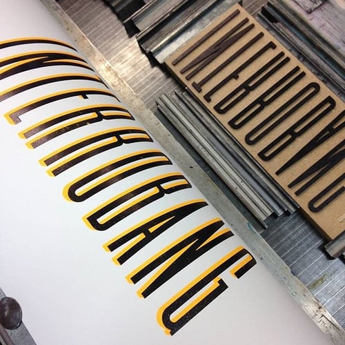
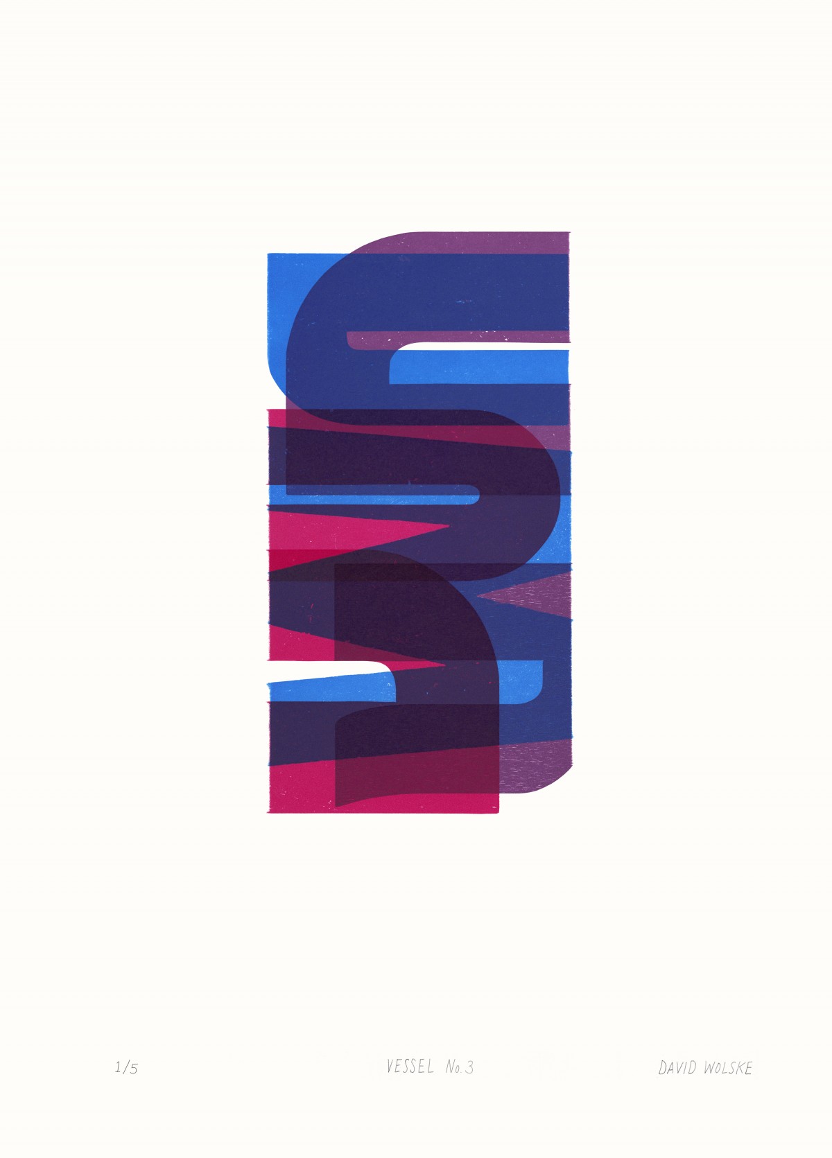
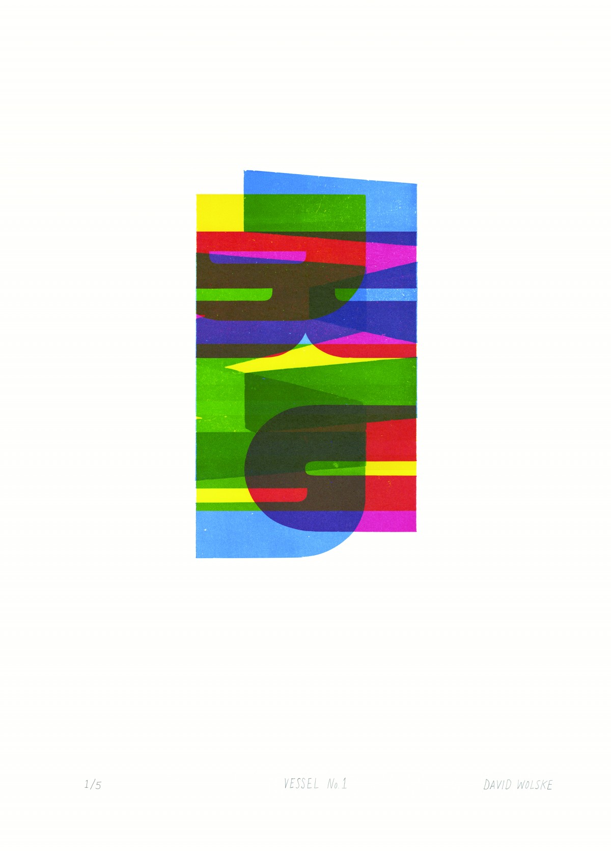
David Wolske: Abstract Letterpress
Letterpress on a whole new level! Drop into Ditchling Museum of Art + Craft to see the “stunning, and purely abstract” letterpress compositions of American artist, David Wolske - 14 to be exact. His bold and mostly colourful, relief letterpress prints use woodblock letters overprinted to create beautifully graphic patterns and shapes.
The exhibition runs until 3 January 2016, so there’s plenty of time to plan a trip to this fantastic museum in the beautiful village of Ditchling. And if that's not a good enough reason to take a trip out there, they also have delicious cake, a shop packed with design books and products from local and international artists.
Mon 07 Sep 2015
Posted under: Design , Typography , Prints , Things to buy , Exhibition , letterpress
https%3A%2F%2Fwww.deliciousindustries.com%2Fdavid-wolske-abstract-letterpress
Delicious+Industries%3A+David+Wolske%3A+Abstract+Letterpress
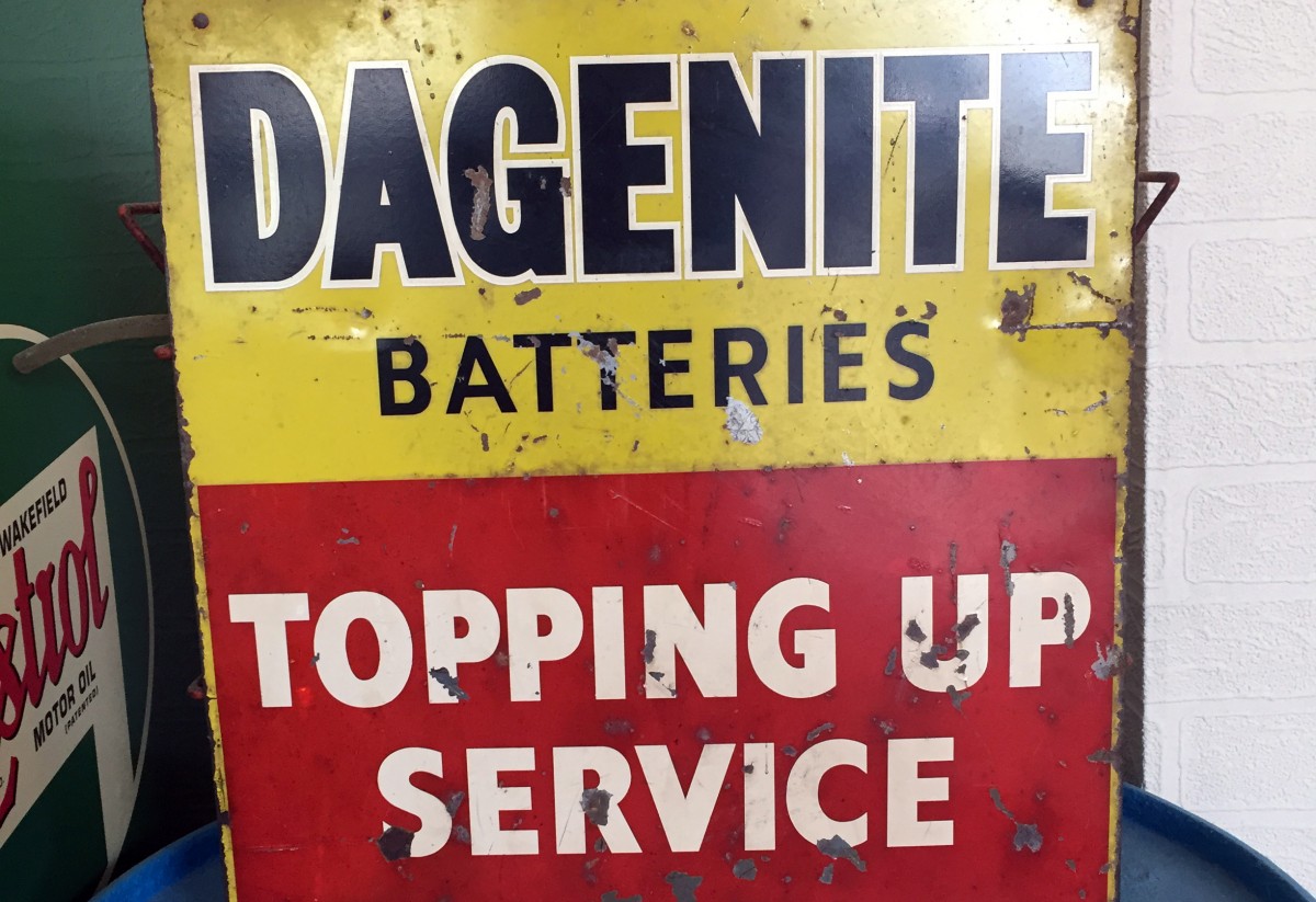
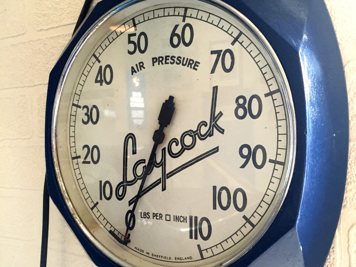
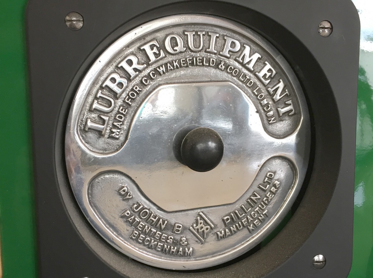
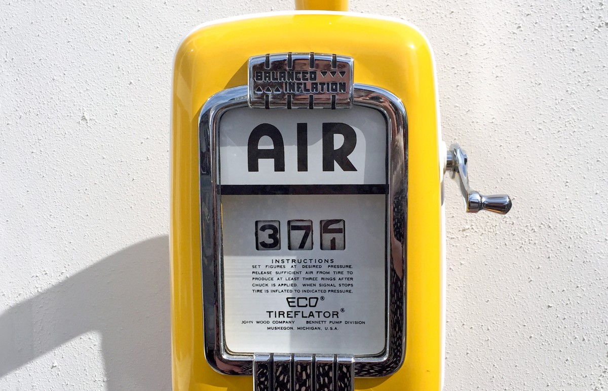
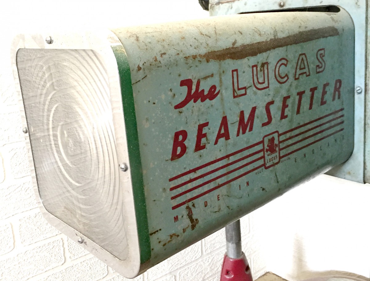
Found Type #6
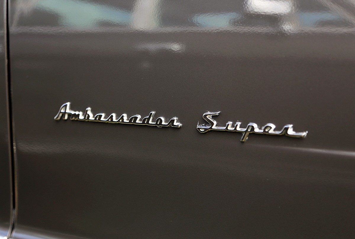
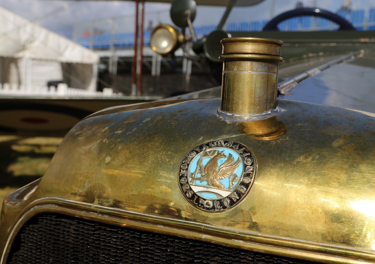
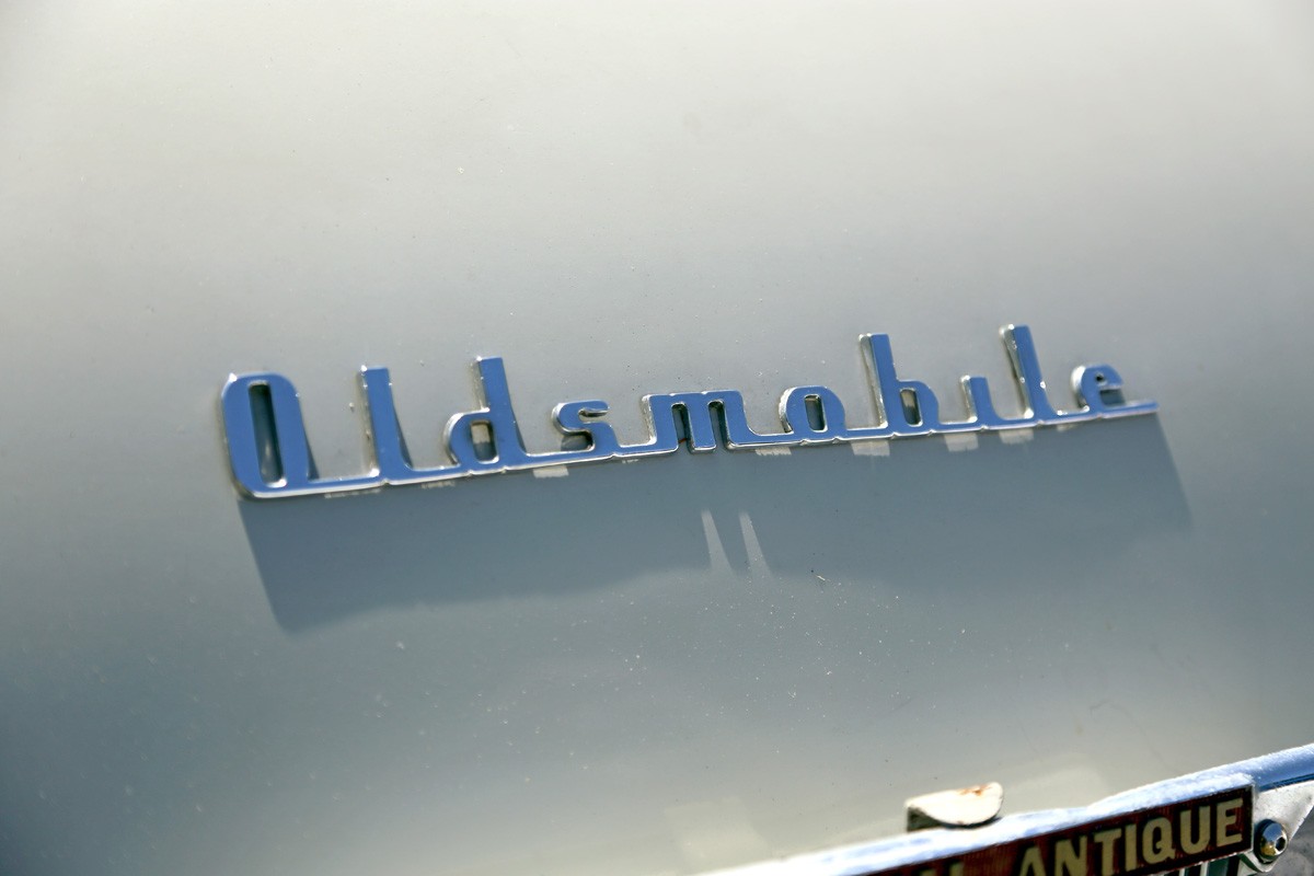
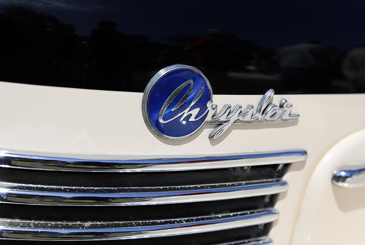
It's been a while since I've posted up some random type loveliness snapped in the wild.
These delightful specimens were spotted at Goodwood Revival 2014 in some of the vintage garage displays.
https%3A%2F%2Fwww.deliciousindustries.com%2Ffound-type-6
Delicious+Industries%3A+Found+Type+%236
Three reasons to visit the De La Warr Pavillion this weekend
1. Bridget Riley - The Curve Paintings 1961 - 2014
Not long left now to see this wonderful exhibition of paintings and studies spanning Bridget Riley’s 50 year career all, “illustrating the artist’s close dedication to the interaction of form and colour by looking at a single motif” - the curve.
The exhibition coincides with the start of celebrations marking 80 years of the Pavillion becoming the first public modernist building in the UK and has been curated to “directly connect with the building’s elegant architecture, opening out the interior space towards the sea”.
The exhibition runs until 6 September 2015 (free entry).
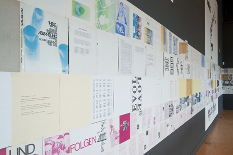
2. Towards an alternative history of graphic design: Schmuck, POP, bRian, Assembling
A slice of graphic design history from the late 60s to the mid 70s, shown through the development of four innovative publications; Schmuck, POP, bRian and Assembling - all created by artists with no design or typographic training, who embraced technological developments and exploited them to publish their own content.
“Artists were now in control of content and the form of a publication could be explored, creating a new energy and enthusiasm for print.”
The exhibition runs until the 4 October 2015 (free entry).
3. The Cream Teas
As gallery cafes go, this one is pretty special. There’s nothing better than one of their homemade scones, a bit of clotted cream, a dollop of jam and a lovely pot of tea sat out on their first floor terrace overlooking the sea.
https%3A%2F%2Fwww.deliciousindustries.com%2Fthree-reasons-to-visit-the-de-la-warr-pavillion-this-weekend
Delicious+Industries%3A+Three+reasons+to+visit+the+De+La+Warr+Pavillion+this+weekend
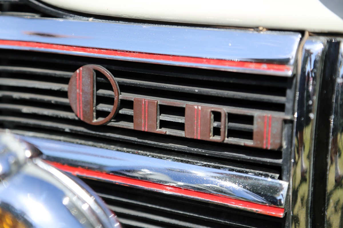
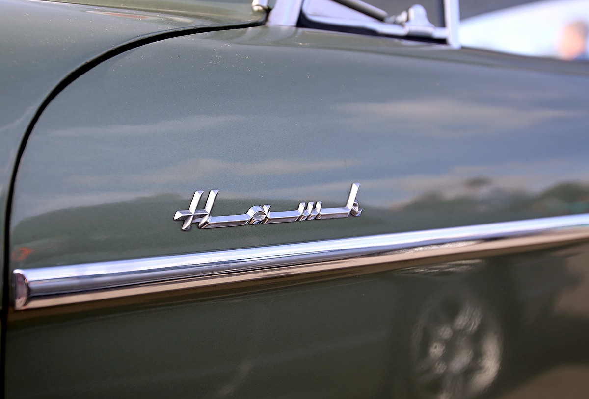
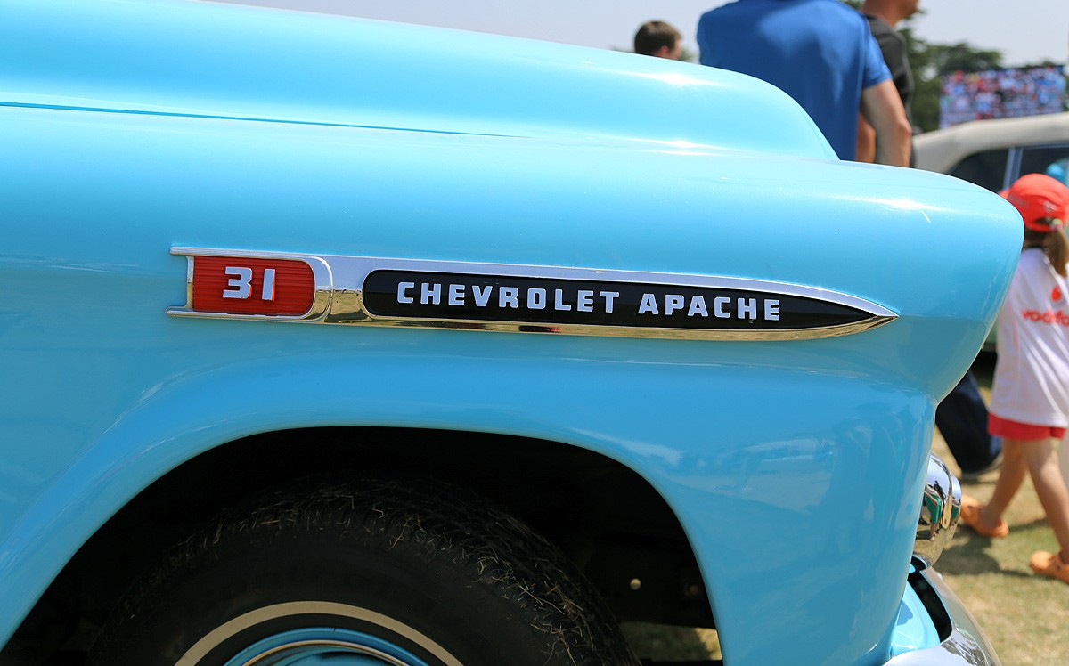
Autp Type XXVXVII
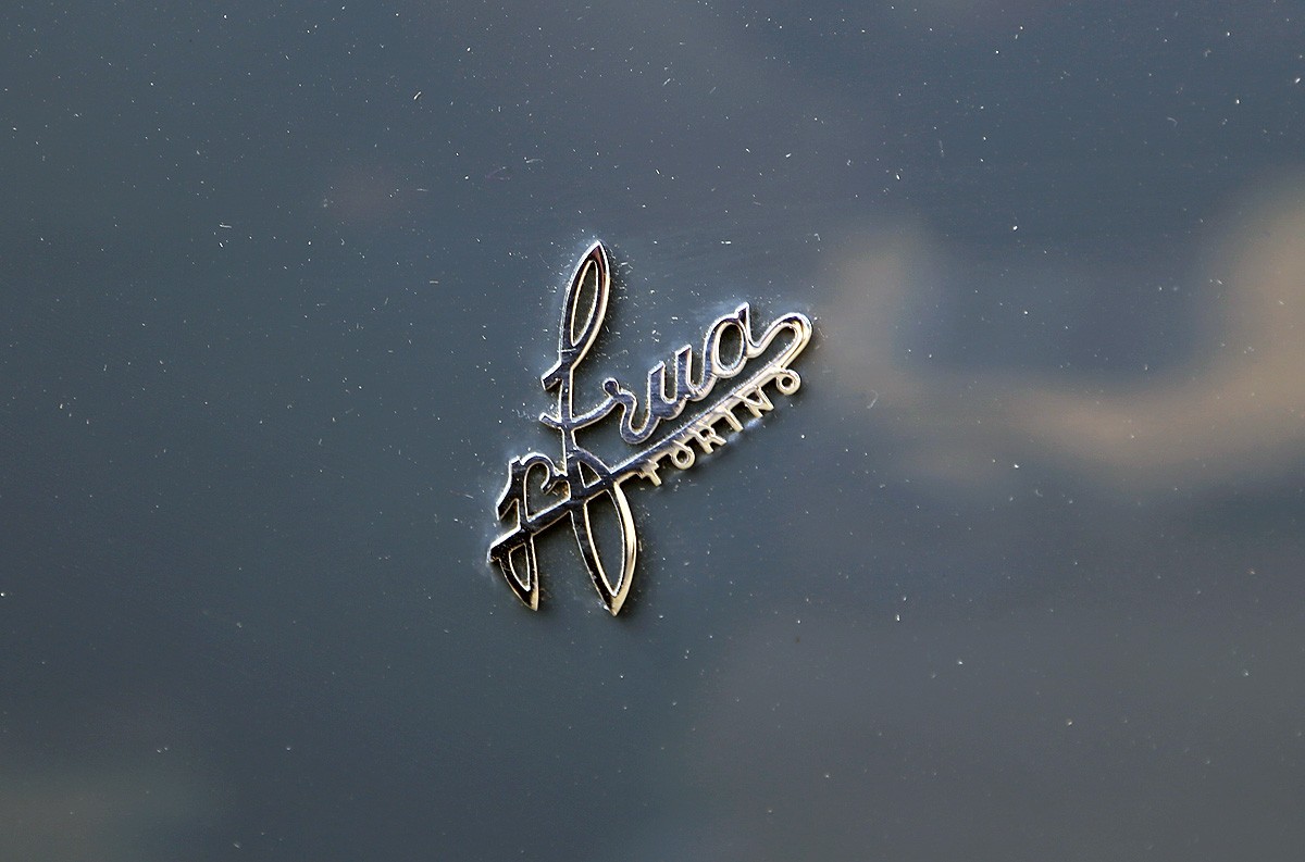
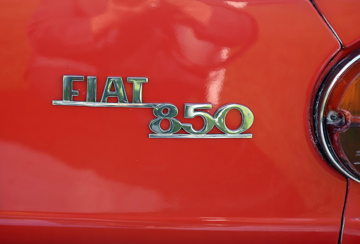
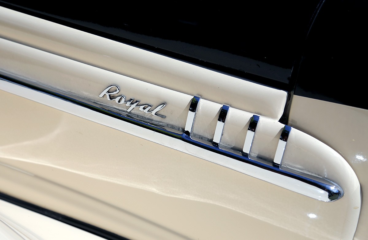
https%3A%2F%2Fwww.deliciousindustries.com%2Fautp-type-xxvxvii
Delicious+Industries%3A+Autp+Type+XXVXVII
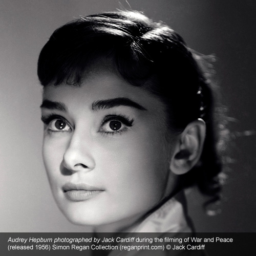
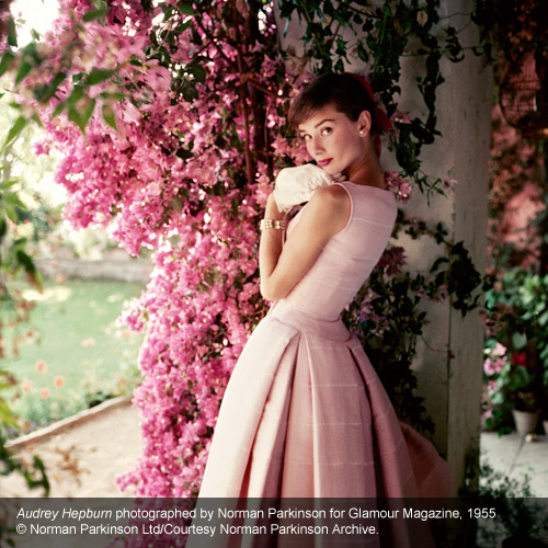
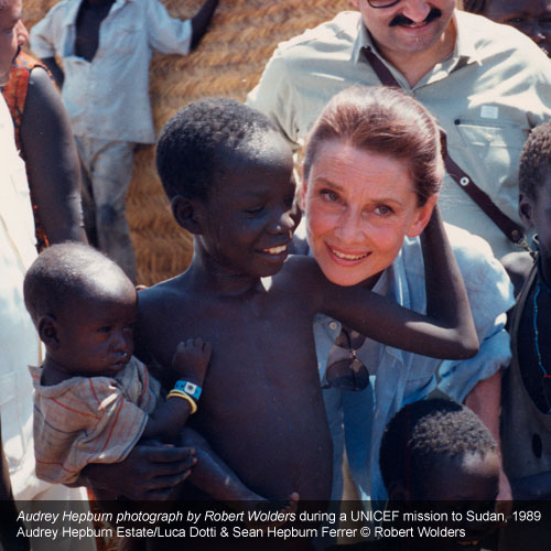
Audrey Hepburn: Portraits of an Icon
The National Portrait Gallery are currently showing a wonderful collection of Audrey Hepburn images documenting her life (1929-1993) from chorus girl to international actress, iconic fashionista and overseas aid worker.
“A selection of more than seventy images will define Hepburn’s iconography, including classic and rarely seen prints from leading twentieth-century photographers such as Richard Avedon, Cecil Beaton, Terry O’Neill, Norman Parkinson and Irving Penn. Alongside these, an array of vintage magazine covers, film stills, and extraordinary archival material will complete her captivating story.”
The exhibition runs until 18 October 2015 (entry is £10) so plenty of time to catch it and if that’s not enough to tempt you, the National Portrait Gallery also has a great cafe with delicious cake! If you can’t make it though, worry not as there’s an accompanying book by the same title (exclusive to the gallery) available here.
https%3A%2F%2Fwww.deliciousindustries.com%2Faudrey-hepburn-portraits-of-an-icon
Delicious+Industries%3A+Audrey+Hepburn%3A+Portraits+of+an+Icon
New Work
It's been a busy Summer at Delicious!
Here's a little peak at the projects we've been working on recently - to see them in full click here.
https%3A%2F%2Fwww.deliciousindustries.com%2Fnew-work
Delicious+Industries%3A+New+Work
Brighton i360 getting a lick of (spray) paint
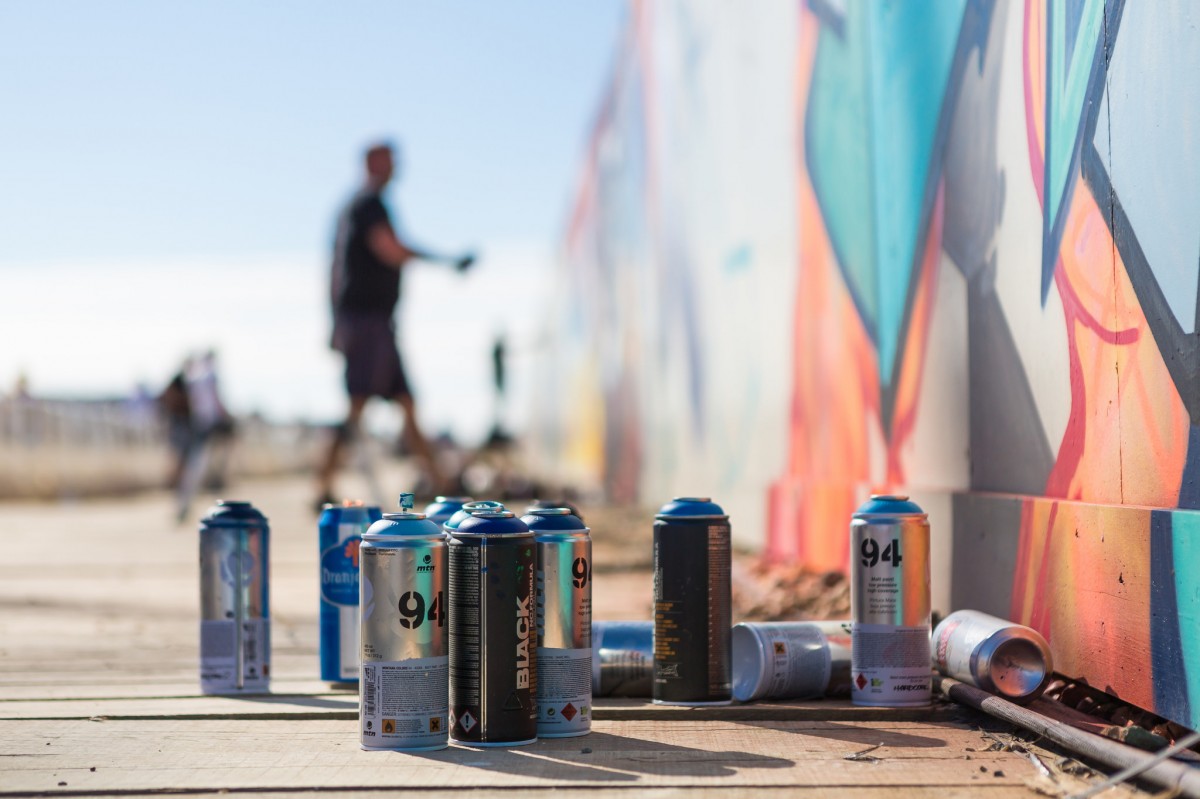
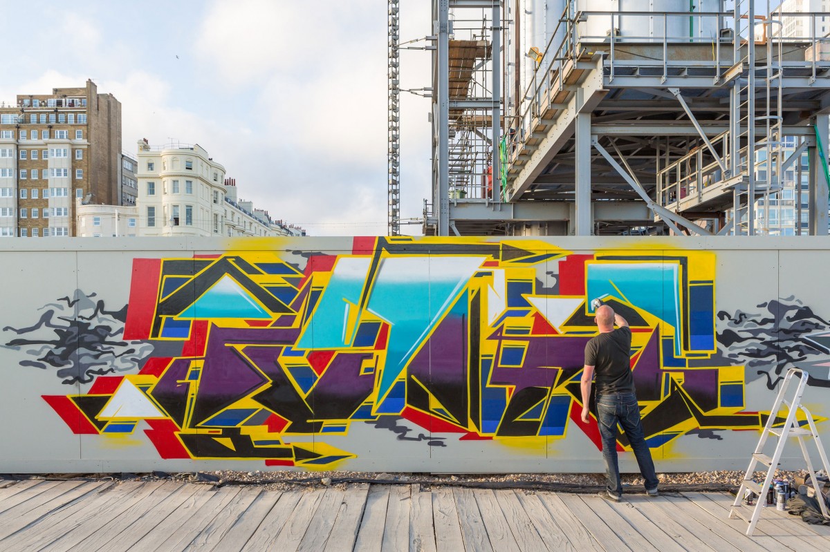
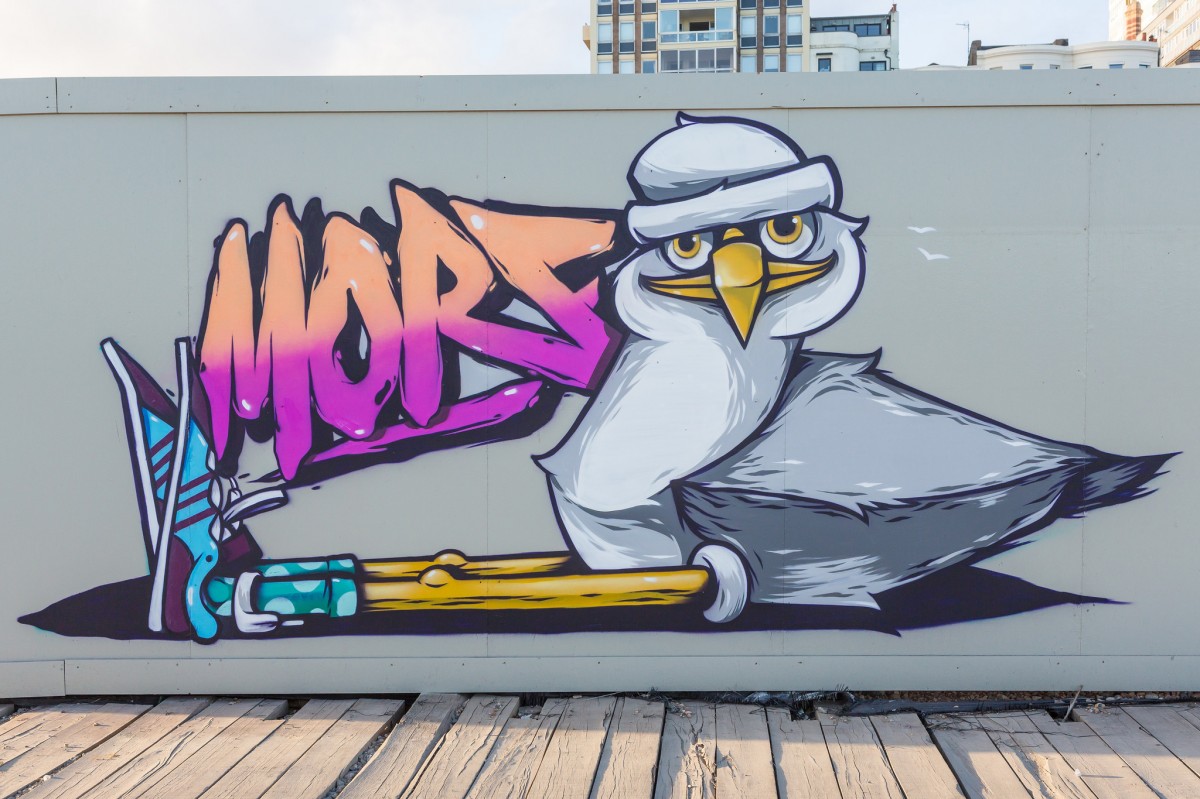
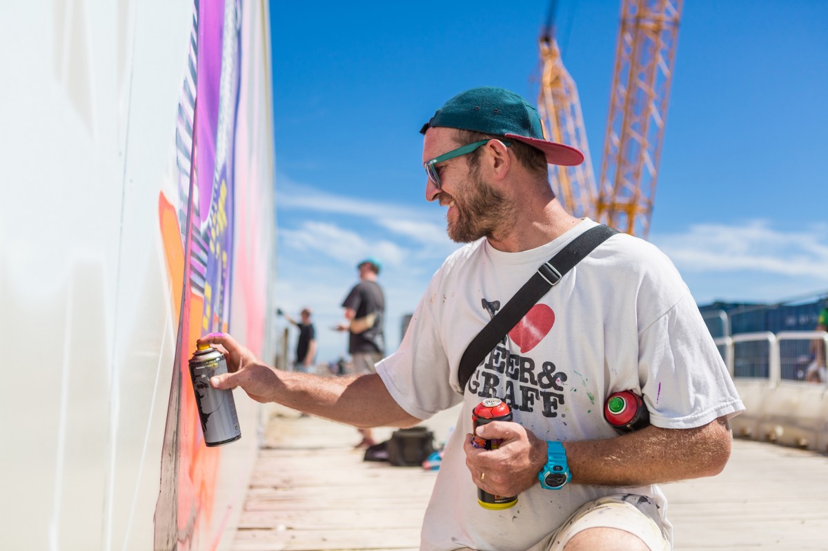
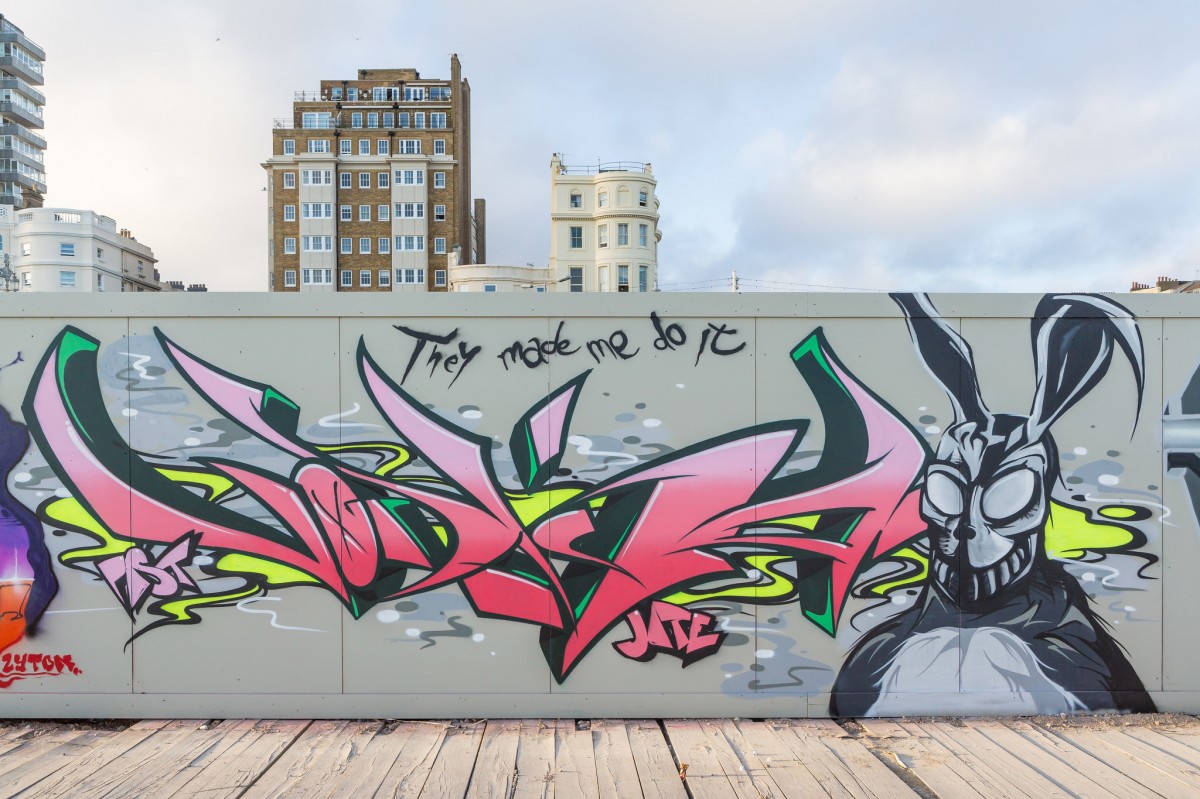
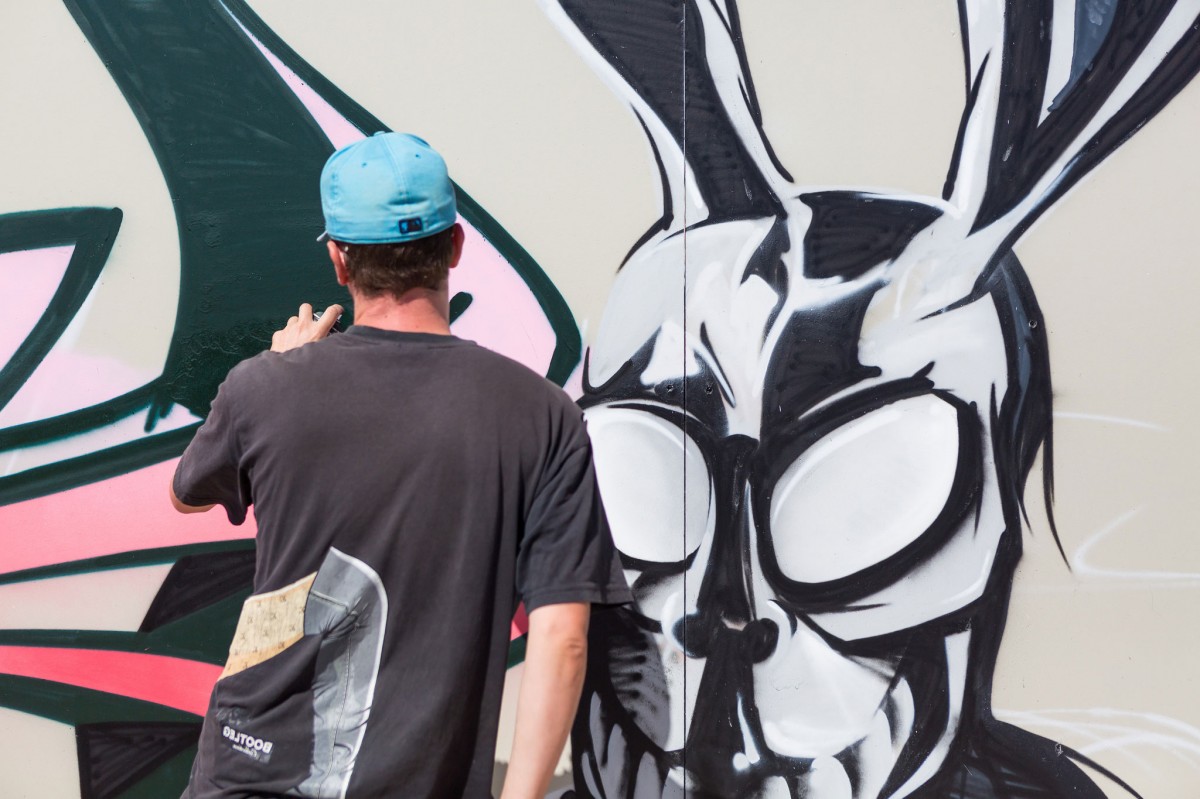
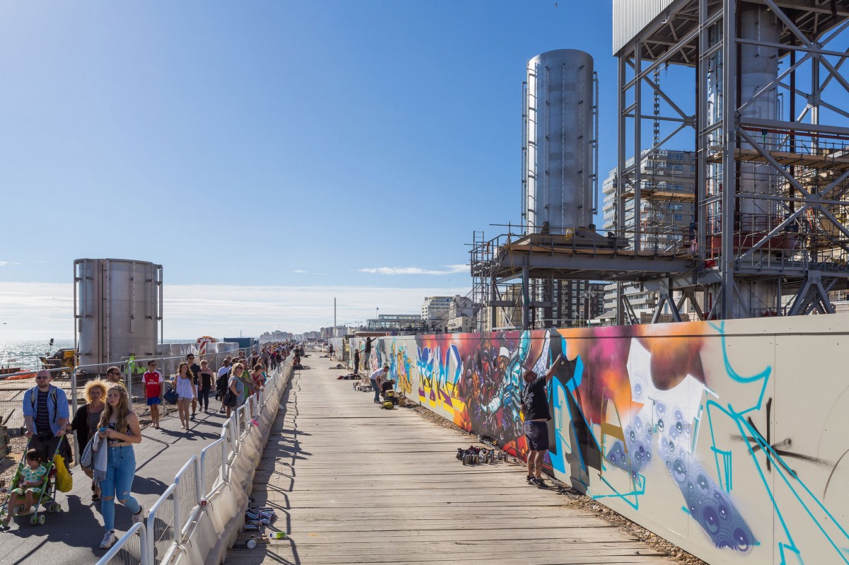
Last weekend the hoarding around Brighton's i360 site was treated to a colourful makeover. The site was originally painted by graffiti artist Aroe and his buddies Gary, Rebus and Radios last year adding some much needed colour to the construction site and highlighting this area of the seafront as the 'Creative Quarter'.
This year, the original artists were joined by a selection of hugely talented local and UK based graffiti artists; Jiroe, Vodka, Morf, Warg, Ster and Past, as well as Yes B, Rench, Alert, Twesh and Relay. The brief was completely open-ended and their mission was simply to cover as much of the 100 metre hoarding as possible in just one day.
So what did they come up with? A giant doughnut hotel, a seagull, a gorilla and a Donnie Darko inspired rabbit no less. I think you'll agree they did a cracking job, so next time you are down on the seafront pop along and have a look.
Find out more about the project and the amazing i360 build here.
All images copyright Brighton i360.
https%3A%2F%2Fwww.deliciousindustries.com%2Fbrighton-i360-getting-a-lick-of-spray-paint
Delicious+Industries%3A+Brighton+i360+getting+a+lick+of+%28spray%29+paint
Welcome

Welcome to the Delicious Industries blog. We're an independent design studio based in Brighton, UK and this is our scrapbook packed full of design, illustration, photography & typography inspiration. Check out our work here.
Links
DELICIOUS FRIENDS
DELICIOUS FAVOURITES
- 50 Watts
- Acejet 170
- Grain Edit
- It's Nice That
- National Geographic Found
- Notcot
- Pretty Clever
- Retronaut
- So Much Pileup
- We Love Typography
- Another Mag