Blog: Inspiration
Saul Bass: Making money v's Quality work
Words of wisdom from the wonderful Saul Bass - Monday inspiration!
More Saul Bass inspiration here and here.
Copyright Prof. Archie Boston.
Via Hero Design Studio.
https%3A%2F%2Fwww.deliciousindustries.com%2Fsaul-bass-making-money-vs-quality-work
Delicious+Industries%3A+Saul+Bass%3A+Making+money+v%26%23039%3Bs+Quality+work
A Collection a Day, 2010


Artist and illustrator Lisa Congdon has started A Collection a Day 2010, a blog showcasing random objects from her personal or imagined collections. Lisa is going to post a collection everyday for exactly one year - quite a task!
"Since I was a young girl, I have been obsessed both with collecting and with arranging, organizing and displaying my collections. This is my attempt to document my collections, both the real and the imagined".
It's a great idea for a blog - I love collections. There are already some interesting items up there, so hopefully it will become a good source of inspiration on a daily basis.
Images copyright A Collection a Day, 2010.
Via the wonderful Kickcan and Conkers.
https%3A%2F%2Fwww.deliciousindustries.com%2Fa-collection-a-day-2010
Delicious+Industries%3A+A+Collection+a+Day%2C+2010
Hobo Symbology


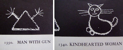
I love these hobo symbols, they form such a basic signage system, simple and effective. It was developed by hobos in the 1950's who communicated with each other by drawing these images on the street in chalk.
You may remember a reference to them in Mad Men when a Hobo drew the 'Dishonest Man' symbol on the gate of the young Don Draper's house in a flashback scene.
The whole set can be seen over on World Famous Design Junkies.
Images copyright World Famous Design Junkies.
Via Notcot.
https%3A%2F%2Fwww.deliciousindustries.com%2Fhobo-symbology
Delicious+Industries%3A+Hobo+Symbology
Enzo Mari's Nature Series
They're simple, graphic, bold and bright - typical of Mari's work. I saw them recently in a local design store and they are fantstic at full scale, but they can be bought online here.
Enzo Mari is an iconic product, furniture & puzzle designer, artist, writer and teacher born in Italy in 1932. To find out more about this wonderful Italian designer, there's a great biography here.
Images copyright Enzo Mari.
https%3A%2F%2Fwww.deliciousindustries.com%2Fenzo-maris-nature-series
Delicious+Industries%3A+Enzo+Mari%26%23039%3Bs+Nature+Series
60's Porsche Service Books


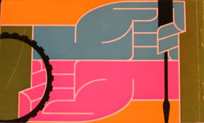
I'm loving the colour palettes and graphics on these Porsche Service Books from the 60's - such an unexpected source of inspiration!
In fact most of the Porsche marketing materials from this era were really well designed. Grain Edit recently posted these fantastic Porsche posters designed by Erich Strenger and Volz...
Service Book images from Old Auto Radio.
Top poster from AUSmotive all other posters from VP Racing - via Grain Edit.
https%3A%2F%2Fwww.deliciousindustries.com%2F60s-porsche-service-books
Delicious+Industries%3A+60%26%23039%3Bs+Porsche+Service+Books
Vintage UNO!
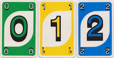
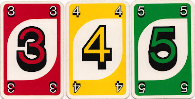


Well, maybe not vintage yet, being from 1985, but well on it's way! I bought this game of UNO a few weeks back because I loved it's goofy numbers with their thick black outlines and shadows against the white leaf shape. They look more 70's than 80's to me, but maybe the design just hadn't changed much since the late 1970's.
https%3A%2F%2Fwww.deliciousindustries.com%2Fvintage-uno
Delicious+Industries%3A+Vintage+UNO%21
Web Museum of Wood Types & Ornaments


The lovely people at Unicorn Graphics have put together a fantastic Web Museum of Wood Types & Ornaments showcasing a selection of specimen catalogues, borders, cuts and engraved woodblocks.
Their mission is to, "gather, save, preserve, and interpret wood types and information about them" to educate future generations, "on the beauties of wood types and engraved blocks".
They've already succeeded in educating me - I'm a massive fan of wood type blocks, but had never really considered the circumstances in which they first came about, but now I know: "As the demand for broadsides increased during first years of the nineteenth century, the need for the process of producing large letters cheaply arose. Wood was a logical material choice because of its ready availability, lightness, and proven printing qualities. In 1827, Darius Wells of New York City first found the means to mass produce wood letters. In March of 1828, first wood type catalogue was published by Wells".
It's an amazing resource and I can't wait to go through all the content, so far I've only had enough time to look through a couple of the catalogues. That's my weekend planned out!
Images copyright Unicorn Graphics.
https%3A%2F%2Fwww.deliciousindustries.com%2Fweb-museum-of-wood-types-ornaments
Delicious+Industries%3A+Web+Museum+of+Wood+Types+%26amp%3B+Ornaments
International Design Reference


Yesterday I came across a Alki1 (Maryellen McFadden's) fantastic Flickr photostream and could easily have spent all day looking through it.
It's one of the largest collections of International design reference I've seen in one place; Cuban design (above), Russian, Italian, American, Japanese, British, Swiss and Polish (below) design alongside iconic examples of DaDa, Constructivist, Bauhaus and Modernist design.

There really is something here for everyone and I can't wait to sit down over the weekend and have a really good look. Thanks so much Maryellen McFadden for sharing all this.
Images Alki1.
https%3A%2F%2Fwww.deliciousindustries.com%2Finternational-design-reference
Delicious+Industries%3A+International+Design+Reference
Race numbers


This weekend I had a fabulous time at Goodwood Revival watching vintage motor racing. I love classic cars and seeing them race is amazing, but I always find myself looking at the race numbers and wondering how/why they choose particular fonts. Above are a selection of my favourites.
I have more Auto type posts here, here and here.
https%3A%2F%2Fwww.deliciousindustries.com%2Frace-numbers
Delicious+Industries%3A+Race+numbers
Polish Book Covers


I found this great collection of Polish book covers over on the wonderful A Journey Round My Skull. The graphics, typography and colours are fantastic. I love the 'KASK' type (it reminds me a bit of A Clockwork Orange) and the swallow illustration which reminds me of Charley Harper's style.
Images copyright A Journey Round My Skull.
https%3A%2F%2Fwww.deliciousindustries.com%2Fpolish-book-covers
Delicious+Industries%3A+Polish+Book+Covers
Pirelli
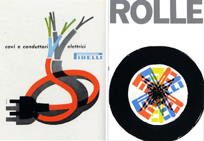
Whilst searching for Stile Industria covers for our previous post I stumbled across the inspirational Flickr group of Pop Design. Laura's collection of Italian graphics is definitely worth a look, she has some great work from iconic Italian designers.
I particularly like the Pirelli marketing, all the items are so well designed and really striking, but these are my favourites; 'cavi e conduttori elettrici', an ad designed by Bonini in 1957 advertising Pirelli cables (above left) and a poster designed by Bob Noorda in 1959 (above right) advertising Pirelli tyres.
Images copyright Pop Design.
https%3A%2F%2Fwww.deliciousindustries.com%2Fpirelli
Delicious+Industries%3A+Pirelli
Stile Industria

I first saw a copy of Italian design magazine, Stile Industria at Modernism 101 (issue 2) and have since searched for more cover examples. The only ones I found were the ones above; issue 1 (left) and issue 21 (right), but where are the rest?
Stile Industria was published in conjunction with Domus magazine to promote Italian industrial design and establish an international reputation. It was edited throughout it's relatively short life (1954 - 63) by iconic designer Alberto Rossell which explains the great covers.
Images from Pop Design (left) and Grain Edit (right).
https%3A%2F%2Fwww.deliciousindustries.com%2Fstile-industria
Delicious+Industries%3A+Stile+Industria
Alan Heighton

These wonderful illustrations are the work of the very talented, Doncaster based illustrator and designer Alan Heighton.
Since graduating from the University of Salford in 2001 he has produced work for Dazed & Confused, The Arctic Monkeys, Arkitip, Financial TImes and is a regular contributor to The Guardian.
Alan describes his work as, "between a childs, an adult and the fashion world, often with mixed messages peppered with wit". I love the fun, playful feel to his illustrations, they make you smile at a glance, but make you smile more the longer you look and the more details you take in.


Follow the 'life and times' of Alan and his work on his great blog.
Images copyright Alan Heighton.
https%3A%2F%2Fwww.deliciousindustries.com%2Falan-heighton
Delicious+Industries%3A+Alan+Heighton
Futurama - Ride into tomorrow!

This is a brochure produced in 1963 to stimulate interest in the General Motors-sponsored, 'Futurama' exhibit at the 1964/5 New York World's Fair.
It was actually Futurama II, an updated version of the popular 'Futurama' ride and exhibit at the 1939/40 event. It promised visitors a "ride into tomorrow" and portrayed what life would be like in 2004. I love the artists impressions of the exhibits and rides - I wonder if it actually looked this way when completed??
I found this on the wonderful Kickcan and Conkers, but if you fancy it for your ephemera collection it can be bought over at PaperHistory.


Images copyright PaperHistory.
Via Kickcan and Conkers.
https%3A%2F%2Fwww.deliciousindustries.com%2Ffuturama-ride-into-tomorrow
Delicious+Industries%3A+Futurama+-+Ride+into+tomorrow%21
Look for the Union Label


I just saw these over on Sell! Sell!, they're a collection of North American, classic and contemporary Union Labels from Look for the Union Label, an online exhibition celebrating Union logos and Emblems. They have been collected together by Jeff Rosen and Susan Parker Sherwood from the Labor Archives and Research Center at San Francisco State University.
"The union label is an imprint or design fixed in plain view on any item, as evidence that is was produced by union labor". The first national Union Label was first adopted in 1880. Seeing a Union Label on a product is, “emblematic of a high standard of living, of tolerable conditions of employment, of those conditions surrounding working men and women which makes for a higher and better standard of living”.
I love to see black and white logos and the detail on some of these is fantastic. Take a look at the full collection here along with some ephemera and some advertising.
Images copyright Look for the Union Label.
Via Sell! Sell!
https%3A%2F%2Fwww.deliciousindustries.com%2Flook-for-the-union-label
Delicious+Industries%3A+Look+for+the+Union+Label
Welcome
Welcome to the Delicious Industries blog. We're an independent design studio based in Brighton, UK and this is our scrapbook packed full of design, illustration, photography & typography inspiration. Check out our work here.
Links
DELICIOUS FRIENDS
DELICIOUS FAVOURITES
- 50 Watts
- Acejet 170
- Grain Edit
- It's Nice That
- National Geographic Found
- Notcot
- Pretty Clever
- Retronaut
- So Much Pileup
- We Love Typography
- Another Mag


