Blog: Inspiration
I Love Your Blog Award!

Big thanks to Kate at Make Do & Mend, who nominated us for an, 'I Love Your Blog' award, we are very honoured!
We've given it a bit of a facelift for the design fraternity and in the spirit of the award would like to give it to fellow bloggers: Dirty Mouse, Grain Edit, Inspire Me Now, Sell Sell , Swissmiss, The Serif and last, but not least, Ultimate Deluxe.
https%3A%2F%2Fwww.deliciousindustries.com%2Fi-love-your-blog-award
Delicious+Industries%3A+I+Love+Your+Blog+Award%21
Stamps at Present & Correct

Animal Stamp Block, 1967, Amsterdam

Fairytale Stamp Block, 1973, Amsterdam

Beetroot Stamp Block, 1971, Holland
These beautiful sheets of stamps are available to buy over at Present & Correct. I'm loving the bright colours and bold graphics.
Images copyright Present & Correct.
https%3A%2F%2Fwww.deliciousindustries.com%2Fstamps-at-present-correct
Delicious+Industries%3A+Stamps+at+Present+%26amp%3B+Correct
Stunning Eastern Design

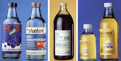
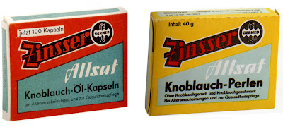


Now normally I spend my book budget on out-of-print books, but this caught my eye the other day, "Stunning Eastern Design 1949 - 1989" by Ralf E Ulrich and Ernst Hedler and I just had to have it. It's published by Taschen as part of their 25th Anniversary collection, so a bargain at £7.99!
It's packed full of fantastic products and some really wonderful packaging. Above are some of my favourites; I particularly like the tablet boxes at the top - so clean and minimal with nice use of colour accross the range.
The products formed part of an exhibition in 1989, "SED - Schöchnes Einheitsdesign" at the Galerie Habernall, Dreieich, near Frankfurt giving an insight into the consumer culture of former East Germany. Unfortunately though after the fall of the Berlin Wall and the currency union many of these products could not compete in a worldwide market and fell by the wayside. Collections like this are the only places they can still be seen.
Images taken from the book and copyright Ernst Hedler.
https%3A%2F%2Fwww.deliciousindustries.com%2Fstunning-eastern-design
Delicious+Industries%3A+Stunning+Eastern+Design
Advertising Greatness

I'm loving the series of Advertising Greatness over on the Sell Sell blog - this week it's the David and Goliath story of Avis, the car rental company and last week it was all about the adorable Nauga. Looking forward to the next one already!
https%3A%2F%2Fwww.deliciousindustries.com%2Fadvertising-greatness
Delicious+Industries%3A+Advertising+Greatness
MAD branding in NY


Pentagram have designed the new identity for the Museum of Arts and Design (formerly the American Craft Museum) in New York which has just re-opened in its new location at 2 Columbus Circle.
The MAD graphic is from a typeface created specifically for the Museum, based on the geometric shapes of the building and its environment, “the circles and squares present in the building’s shape; its location, on Columbus Circle; and the building’s iconic “lollipop” columns retained in the redesign”.
The MAD monogram is simple and fun, it looks modern and at the same time reminds me of the pattern and illustration found in arts and crafts, which is where the origins of the Museum lie. The bold shapes of the letters look great on the advertising and promotional material because they stand out, not only due to the density of the letters, but also because of the bright colours on black backgrounds.
It’s refreshing to see a creative identity, one that has reason behind it and has been created through good research. I’m not saying that taking the counters out of letters hasn’t been done before, but in this case it works and creates an identity system that is versatile and can be manipulated to work in any way the Museum requires.
You can read more about the development of the MAD branding here and find out more about MAD here.
Images copyright Pentagram.
Via Aisle One.
https%3A%2F%2Fwww.deliciousindustries.com%2Fmad-branding-in-ny
Delicious+Industries%3A+MAD+branding+in+NY
From the reference box #24
How gorgeous are these ice cream containers? I'm guessing they're from the 50's, but have never been used, so apart from a little discolouring they're in tip top condition!
For more fab packaging have a look here and here.
#24 a new addition - 1950's ice cream containers
https%3A%2F%2Fwww.deliciousindustries.com%2Ffrom-the-reference-box-24
Delicious+Industries%3A+From+the+reference+box+%2324
From the reference box #23


More wonderful matchbook covers! To see more of my collection click here.
#23 - More matchbook covers
https%3A%2F%2Fwww.deliciousindustries.com%2Ffrom-the-reference-box-23
Delicious+Industries%3A+From+the+reference+box+%2323
Logo development

I stumbled upon a collection of classic logos and their development today, some of which I haven't seen before and others I recognise from Neatorama's collection that I posted about a few months ago. It's always interesting to see how a logo has changed over time and to see just how long some of these companies have been around!
I'm pleased to see they included Fiat, who I applaud for returning to their old 'Fiat' typeface and the simplistic bonnet badge of the 1920's - it just looks so classic.
Via Inspire Me Now.
https%3A%2F%2Fwww.deliciousindustries.com%2Flogo-development
Delicious+Industries%3A+Logo+development
Ed Lives Here

Thanks to Lizy Gershenzon at Froeter Design for sending me the link to Ed Lives Here, “Ed’s your friendly educator for all things paper, printing and design. He's here to help you communicate your ideas, on-press and on paper. He's your source for information - and inspiration”.
Basically, this is a great resource for anyone wanting to familiarise themselves with the print process. Experienced designers will probably know most of what’s here, but it’s good to have a reference to hand just in case. I think graduates will find it a really useful guide as the production side of being a designer is rarely covered in detail when studying and is a bit of a blackhole for many fledgling designers in their first job.

The diagrams and charts are really well designed and simplifying the information, making it easier to understand. On many occasions during the past few months this website would have helped me explain a process or print technique easily, to a client. For example trying to explain the differences between printing presses, what spot and process colours are and why they are not always identical, what a foil block or an emboss is and the old favourite – why monitor and printed colours are different.
Here are some other examples from the site:
Retouching

Printing presses

It's a really interesting site, with loads of information and if you don’t believe me, take a look for yourselves here.
Images taken from Ed Lives Here. Sponsored by NewPage.
https%3A%2F%2Fwww.deliciousindustries.com%2Fed-lives-here
Delicious+Industries%3A+Ed+Lives+Here
From the reference box #22


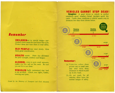
This is a new addition to the reference box, but a very worthy one. A 1954 copy of The Highway Code. The diagrams are great - I like the cross shading and the stopping distance graphic. It's so much nicer than the modern booklets.
#22 - The Highway Code, 1954
https%3A%2F%2Fwww.deliciousindustries.com%2Ffrom-the-reference-box-22
Delicious+Industries%3A+From+the+reference+box+%2322
The Great Lance Wyman



I read a comment about Lance Wyman’s zoo graphics yesterday, and realised it’s been ages since I’ve seen them. His Mexico Olympic ’68 and his zoo graphics where the first pieces of design that I fell in love with. Their simplicity and impact are just fantastic.
Wyman specialises in directional, signage systems and branding. Early on in his career he created the identity, signage systems & symbols, for the Mexico ’68 Olympics and the Mexico ’70 World Cup, as well as developing a system for the Mexico City Metro.
In 1971 Wyman teamed up with Bill Cannan to form, Wyman & Cannan. A New York studio where they worked successfully creating iconic signage systems, including the above one for the Minnesota Zoo (one of my personal favourites), until 1979 when Wyman started his own studio, Lance Wyman Ltd.
There is a great interview with Wyman on Web Esteem where he discusses his design process and thoughts on his work.Also, if you want to see more of his graphics check out his website which true to form, is simple and informative. His graphics look even better small and in black and white – the ultimate test of a good logo.
PS. Lance, if you are reading this - we need a retrospective exhibition in the UK - please!
All images and graphics copyright Lance Wyman Ltd.
https%3A%2F%2Fwww.deliciousindustries.com%2Fthe-great-lance-wyman
Delicious+Industries%3A+The+Great+Lance+Wyman
We heart infographics


I picked up a copy of the International Designers Network (Vol.15 No.4) at the weekend and it's a great issue with a really good article on infographics (Signs of the Times) featuring 10 designers who specialise in this area, enjoying the challenge, and ultimately, the satisfaction in this type of design; Catalogtree, Dave Bowker, Nicholas Felton, Lamosca, Number27, Plusminus, Polar, SPVZ, Timm Kekeritz and Troikart.
It's not a publication I normally buy, but I will definitely be seeking it out again. The print quality is really good - this issue has a matt laminate, spot varnish and a foil on the cover which is extravagant, but looks good. Inside it uses a few different kinds of paper which gives it a really nice feel, has fold out pages to accomodate some of the larger infographics and is packed with interesting and up-to-date content. To top it all, the design throughout is great, not all to my taste, but interesting, experimental and relevant to the content. Oh, and this issue came with a free DVD of goodies including, the Diesel 'Liquid' Fashion Show and some behind the scenes footage of Bjork's Wonderlust video.
https%3A%2F%2Fwww.deliciousindustries.com%2Fwe-heart-infographics
Delicious+Industries%3A+We+heart+infographics
Banks & Miles


I didn’t know when I bought them, but the Consumers’ Association, Which? Magazines were designed by Colin Banks and John Miles, co-founders of Banks & Miles, and designers of some great British design.
Colin Banks studied at both Rochester & Maidstone Schools of Art, and it was at Maidstone that he first met John Miles, “amidst a sea of printers”. Banks was passionate about typography and went on to freelance at London Typographical Designers and work as an assistant to Ernest Hoch, who had a great influence on his future work. He set up his own business in 1956 for 2 years before joining with Miles to found Banks & Miles in 1958.
John Miles was also passionate about typography. He has been quoted saying, "We took up typography because we thought we'd make the world a better place". On leaving Maidstone School of Art, Miles became assistant to Hans Schmoller at Penguin Books until the start of Banks & Miles.
Banks & Miles built its reputation early on with their work for the Zoological Society London and on the Consumers’ Association, Which? Magazine, that they worked on for 29 years, between 1964 and 1993. It had it’s heyday in the 70’s and 80’s, with blue chip clients like the Royal Mail, British Telecom and the London Underground. The duo designed the familiar Royal Mail/ Post Office double-lined typeface and identity in 1972, a project which ran for 11 years, the British Telecom ‘T’ logo after it was instituted in 1981, logos for Her Majesty's Stationery Office, City & Guilds and Lancaster University. Along with employee, Eiichi Kono they restyled the UK telephone directories in 1989 saving forests of paper and winning numerous accolades from environment groups and re-designed, Johnston, Edward Johnston’s underground typeface, to create New Johnston.
In 1996 Banks & Miles disbanded their joint venture to persue individual projects. John Miles was adviser to the Dutch banknote printers Enschedé, The Monotype Corporation and HMSO and is still a practising designer today. Colin Banks traveled India and Europe teaching his socially responsible approach to design, which earned him some significant commissions and awards, but sadly in 2002 he died after a long battle with cancer, leaving behind a great legacy of work.
Both together and individually they have created some of the most ground-breaking and most iconic work of the 20th Century, and as Banks often said, “good design doesn't date” and I couldn’t agree more.
BT Van pics copyright David Cott.
https%3A%2F%2Fwww.deliciousindustries.com%2Fbanks-miles
Delicious+Industries%3A+Banks+%26amp%3B+Miles
1972 Munich Olympics Design Exhibition


'Spiele: Olt Aicher's Olympic Graphic design' is currently showing at the Natalie and James Thompson Art Gallery in the San Jose State University. The exhibition includes posters, signage systems, brochures and uniforms, in fact all the design elements of the event designed by Otl Aicher. I'm not sure this body of work has been seen together since the actual 1972 Olympics.
The Munich Olympic design, 'perfectly embodies his philosophy and is the definitive example for today's graphic identity and branding programs'.
If you are lucky enough to live in the area, get over here and see it, it might be your only chance to see them together - I am so jealous!
Images from the Natalie and James Thompson Art Gallery website.
Found via the wonderful, Grain Edit.
https%3A%2F%2Fwww.deliciousindustries.com%2F1972-munich-olympics-design-exhibition
Delicious+Industries%3A+1972+Munich+Olympics+Design+Exhibition
Paul Rand: A Tribute
How good was Paul Rand! This tribute is a nice little reminder of his work and his design philosophy. If this has got you yearning to see more check out the Paul Rand website which is packed full of all his work; identities, advertising, posters and books etc... as well as an extensive biography, lots of interviews and articles and some of his best quotes/philosophies;
"Simplicity is not the goal. It is the by-product of a good idea and modest expectations".
For those of you stateside, you lucky people are going to have the opportunity to see this iconic design in the flesh at the 'Paul Rand: Modernist Design in Context' exhibition, October 16 - December 13 2008, in the Center for Art, Design and Visual Culture at the University of Maryland Baltimore County. The exhibition curator is Franc Nunoo-Quarcoo, author of 'Paul Rand: Modernist Design' and Professor & Chair of Visual Arts at UMBC. Somebody please bring it to the UK, pretty please!!
I couldn't let this post go, without posting some of his amazing work...


Tribute created by J Neeley, found on Rubbishcorp.
Images copyright Paul Rand.
https%3A%2F%2Fwww.deliciousindustries.com%2Fpaul-rand-a-tribute
Delicious+Industries%3A+Paul+Rand%3A+A+Tribute
Welcome
Welcome to the Delicious Industries blog. We're an independent design studio based in Brighton, UK and this is our scrapbook packed full of design, illustration, photography & typography inspiration. Check out our work here.
Links
DELICIOUS FRIENDS
DELICIOUS FAVOURITES
- 50 Watts
- Acejet 170
- Grain Edit
- It's Nice That
- National Geographic Found
- Notcot
- Pretty Clever
- Retronaut
- So Much Pileup
- We Love Typography
- Another Mag

