art direction, design + typography
Blog: Typography
Four Virtual Exhibitions
Pin this on Pinterest
 View large image
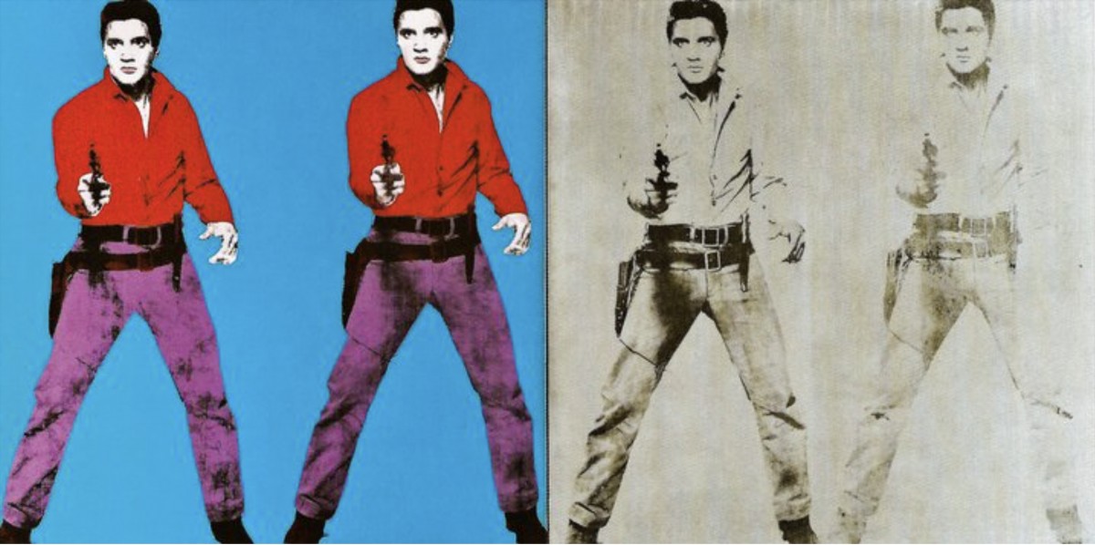
Andy Warhol, Tate Modern, London, Elvis I and II 1964 © 2020 The Andy Warhol Foundation for the Visual Arts, Inc. / Licensed by DACS, London.
Pin this on Pinterest
View large image
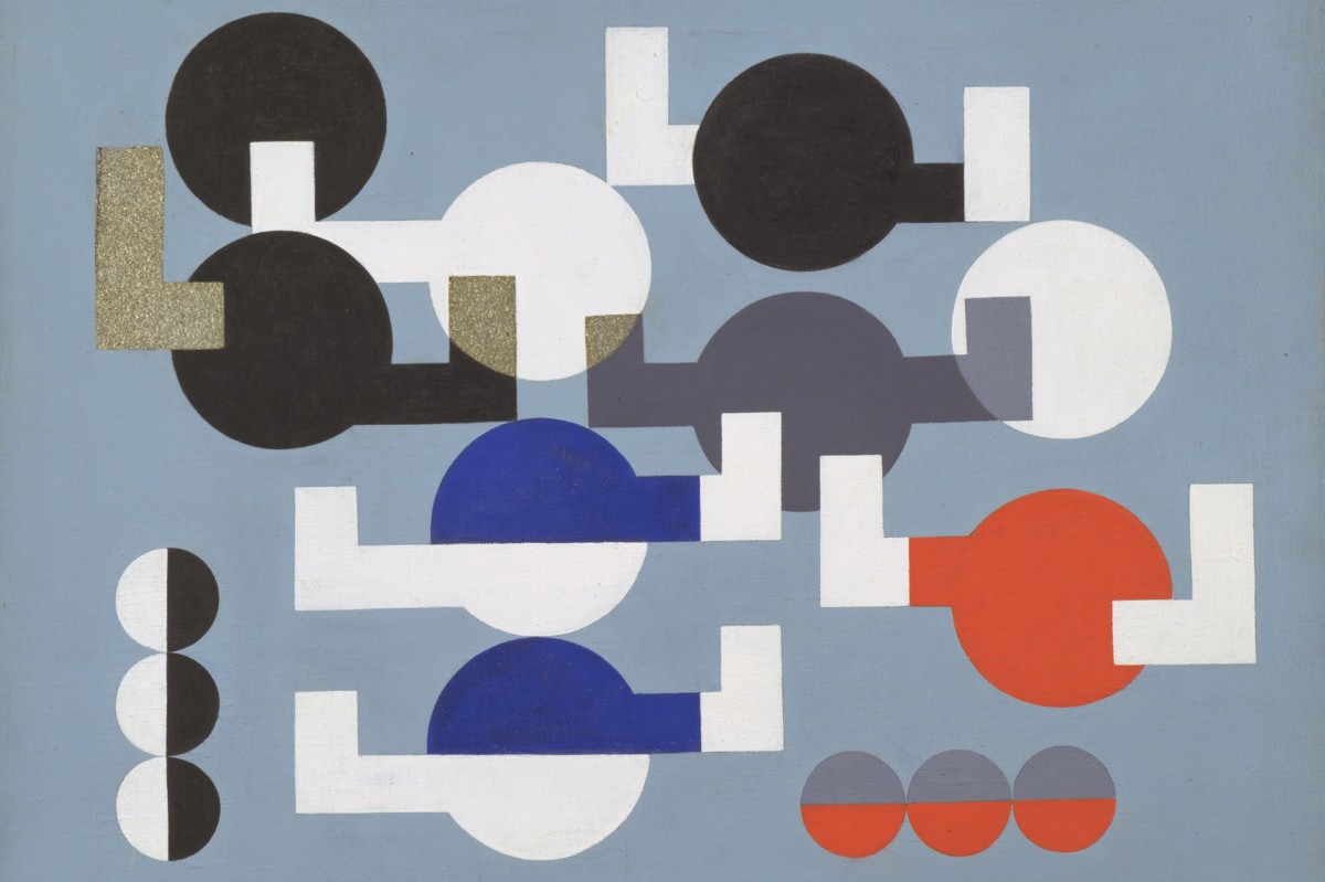
MoMA The Museum of Modern Art, NY, Composition of Circles and Overlapping Angles,1930 © Sophie Taeuber-Arp
Pin this on Pinterest
View large image
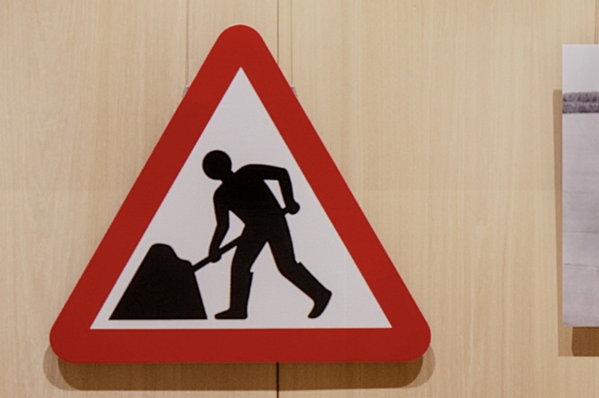
Design Museum, London, Road Works Margaret Calvert: Women at Work Exhibition © Margaret Calvert
Pin this on Pinterest
View large image
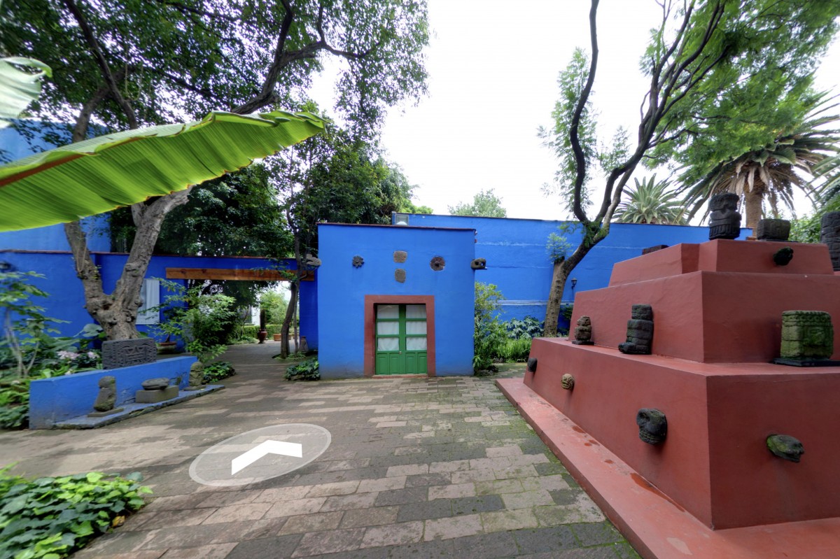
Mexico City, Museo Frida Kahlo (Las Casa Azul) © Museo Frida Kahlo
For anyone missing day trips to galleries and wandering around exhibitions, there are some great virtual tours and guides online to help you get that culuture fix.
Ok, it's not quite the same thrill as seeing the work in person, nor do you have the delight of tea and cake in the cafe at the end, but there's something rather lovely about sitting with a cuppa (and cake) in the comfort of your own home whilst taking a virtual tour (they also have webshops if you miss the exit through the gift shop).
Here are four of my favourites available now;
Andy Warhol, Tate Modern, London
It's been almost 20 years since the last Andy Warhol retrospective at Tate Modern, so don't miss the opportunity to see some of his iconic, pop art alongside rarely seen works from his Ladies and Gentlemen' series.
Sophie Taeber-Arp, MOMA, NY
“a central figure in many of the most important avant-garde movements of the first half of the twentieth-century”
Enjoy the work of artist, sculptor, dancer, teacher, writer, interior and textile designer, Sophie Taeber-Arp including her wonderful Dada heads.
Margaret Calvert: Women at Work, Design Museum, London
Celebrating the launch of Network Rail's new custom typeface, Rail Alphabet 2 created by Margaret Calvert, this exhibition also looks at Calvert's other work including the UK's renowned road-signing system which she co-designed.
Museo Frida Kahlo, Mexico City
Take a stroll around the brightly coloured home of Mexican artist Frida Kahlo – ‘La Casa Azul’ (The Blue House) in Mexico City. The birthplace and home of the artist for many years is now a museum of her life and work.
https%3A%2F%2Fwww.deliciousindustries.com%2Ffour-virtual-exhibitions
Delicious+Industries%3A+Four+Virtual+Exhibitions
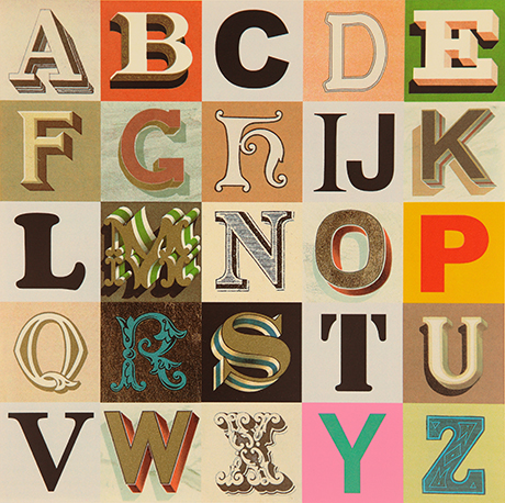
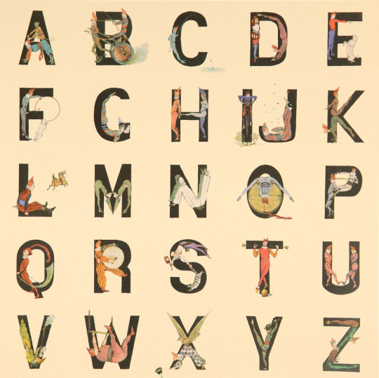
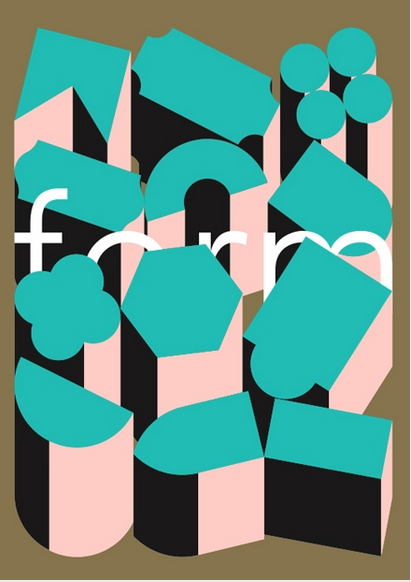
Alphabets, Letters & Numbers
Pin this on Pinterest
View large image
Appropriated Alphabet no.7 (2013) © Peter Blake. Courtesy CCA Gallery, London
Peter Blake at the De La Warr Pavilion.
Blake has personally curated Alphabets, Letters and Numbers to showcase three series of editions: Alphabet (1991) a 26 piece series of silk screen prints with a print for each letter of the alphabet - I is for Idols ("a collage of screen legends, artists and musicians"), An Alphabet (2007) a series of found ephemera, illustration and handwritting collages - one for each letter of the alphabet. , and Appropriated Alphabets (2013) a series consisting of 12 individually collated alphabets.
"Throughout his long and prestigious career Blake has created several series of works based around the alphabet related to his enduring interest in childhood innocence and nostalgia, and Victorian and Edwardian graphic illustration. Using vintage cards, magazines, books and other found ephemera, he assembles collages that are at once whimsical, humorous and fascinating. He began using found letters and commercial lettering in the 1950s and, as a young artist, allied himself with decorators, sign painters and commercial artists."
The exhibition is free and runs until Sunday 27 November 2016. You know it's also the rule when you visit the De La Warr that you have to have a cream tea sat out on the terrace!
Mon 10 Oct 2016
Posted under: Design , Typography , Ephemera , Prints , Things to buy , Illustration , Exhibition , Found typography
https%3A%2F%2Fwww.deliciousindustries.com%2Falphabets-letters-numbers
Delicious+Industries%3A+Alphabets%2C+Letters+%26amp%3B+Numbers
Interrobang - call for submissions
Calling all letterpress artists and designers!
Our friends at Ditchling Museum of Art & Craft are currently running an open submission for their forthcoming exhibition, Interrobang: an international showcase of letterpress print. The exhibition will be curated by the museum for The Village of Type, part of the Brighton Festival and the Artists’ Open House trail.
The Village of Type will be a season of exhibitions, workshops, lectures, residencies and printing events celebrating the centenary of the London Underground typeface, created by Edward Johnston when he lived in the village.
Publishers Random Spectacular will also be drawing on entries for a new publication looking at letterpress from around the world to accompany the exhibition.
Interested? Find out more and enter online here.
Entry closes on 14 February 2016. One submission per entry fee. All work must be printed using letterpress (although entries are to be submitted digitally), pieces can be created specifically for Interrobang or be existing work. Size is not limited, but pieces must be 2D and as this is a selling exhibition, you must have at least 5 copies of any submission.
https%3A%2F%2Fwww.deliciousindustries.com%2Finterrobang-call-for-submissions
Delicious+Industries%3A+Interrobang+-+call+for+submissions
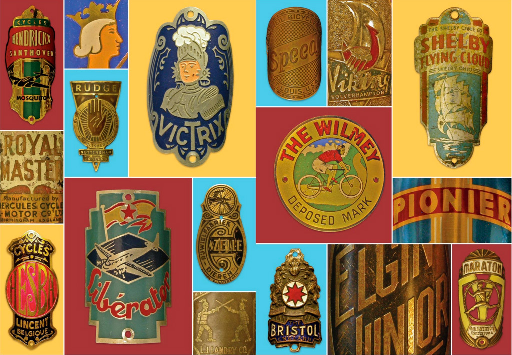
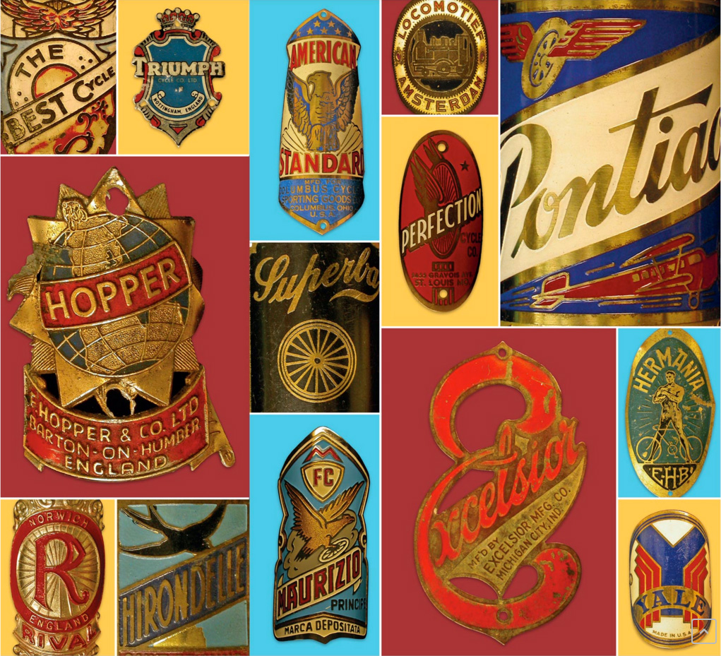
A Cycling Lexicon
Beautiful lettering, beautiful graphics and beautifully aged - what's not to like about this collection of bicycle headbadges?
I've had a slight obsession recently with vintage beach cruiser bikes and I particularly love the graphics, so imagine my delight when I heard about 'A Cycling Lexicon' - a book filled with an A-Z of glorious bicycle headbadges. The badges are a selection from the collection of cycling enthusiast Jeff Conner, Professor of Biology at Michigan State University curated by Carter Wong design who also designed the book.
You can buy the book here.
Images copyright A Cyclling Lexicon via Boneshaker.
https%3A%2F%2Fwww.deliciousindustries.com%2Fa-cycling-lexicon
Delicious+Industries%3A+A+Cycling+Lexicon
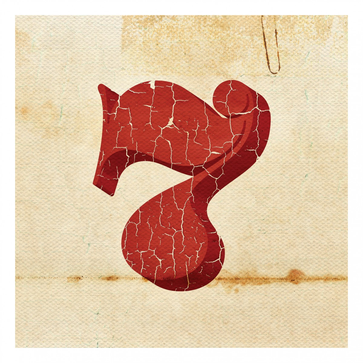
Found Type #7
More fabulous lettering and typography snapped in the wild over the last year.
Have a look through the rest of our Found Type here.
https%3A%2F%2Fwww.deliciousindustries.com%2Ffound-type-7
Delicious+Industries%3A+Found+Type+%237
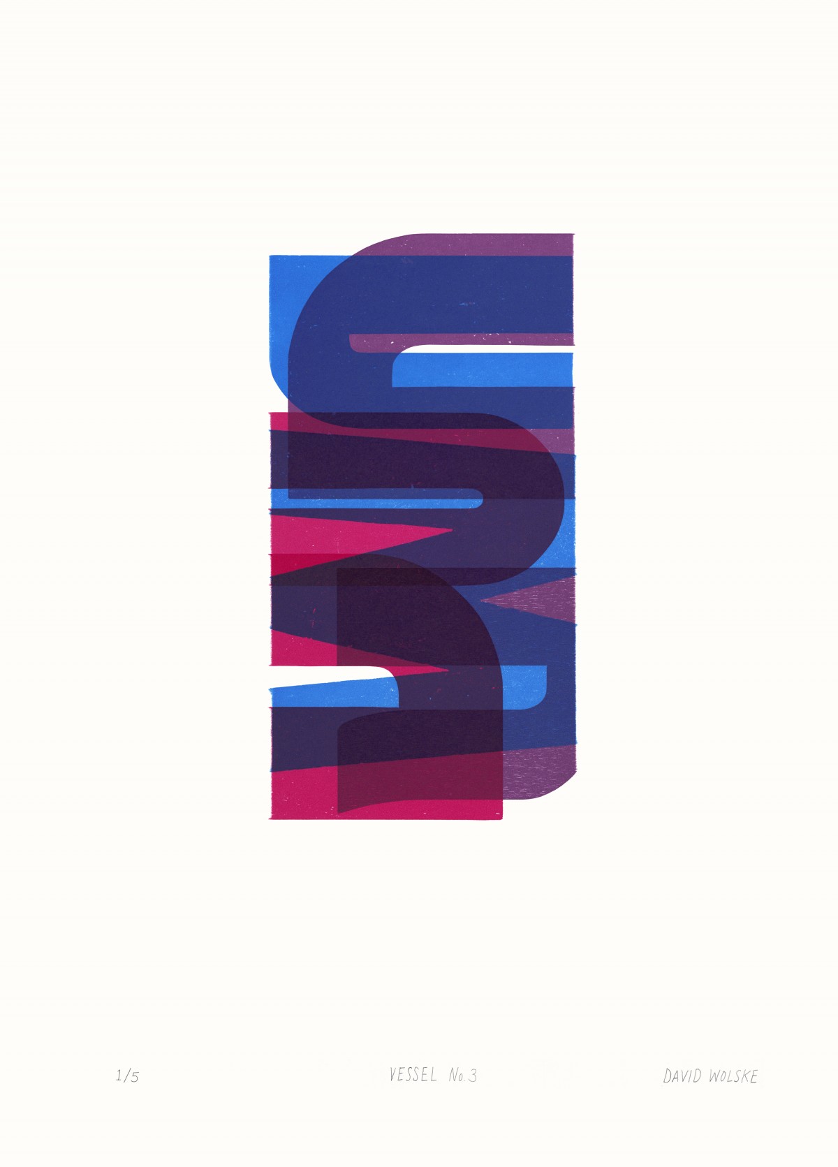
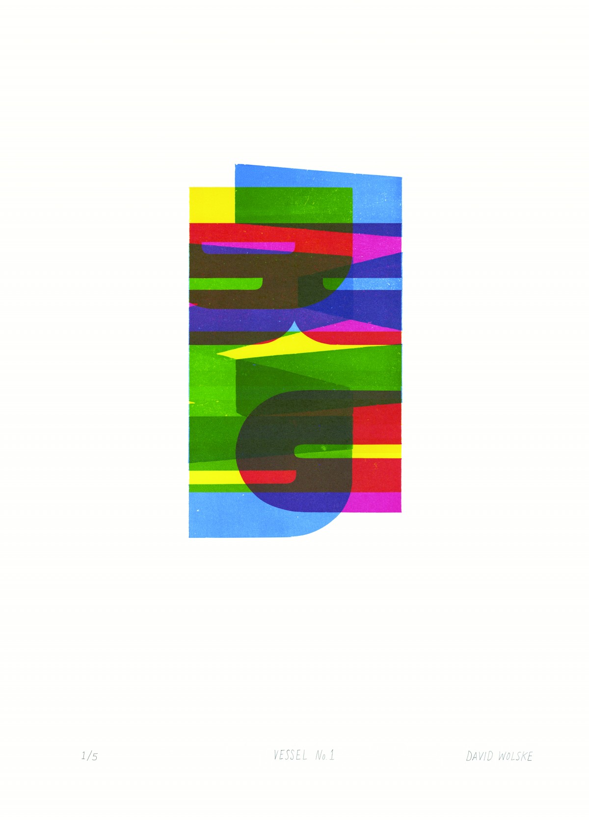
David Wolske: Abstract Letterpress
Letterpress on a whole new level! Drop into Ditchling Museum of Art + Craft to see the “stunning, and purely abstract” letterpress compositions of American artist, David Wolske - 14 to be exact. His bold and mostly colourful, relief letterpress prints use woodblock letters overprinted to create beautifully graphic patterns and shapes.
The exhibition runs until 3 January 2016, so there’s plenty of time to plan a trip to this fantastic museum in the beautiful village of Ditchling. And if that's not a good enough reason to take a trip out there, they also have delicious cake, a shop packed with design books and products from local and international artists.
Mon 07 Sep 2015
Posted under: Design , Typography , Prints , Things to buy , Exhibition , letterpress
https%3A%2F%2Fwww.deliciousindustries.com%2Fdavid-wolske-abstract-letterpress
Delicious+Industries%3A+David+Wolske%3A+Abstract+Letterpress
Found Type #6
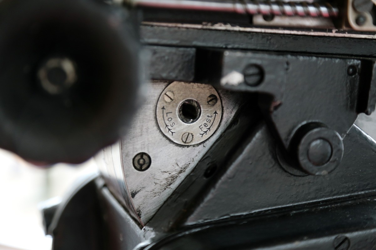
It's been a while since I've posted up some random type loveliness snapped in the wild.
These delightful specimens were spotted at Goodwood Revival 2014 in some of the vintage garage displays.
https%3A%2F%2Fwww.deliciousindustries.com%2Ffound-type-6
Delicious+Industries%3A+Found+Type+%236
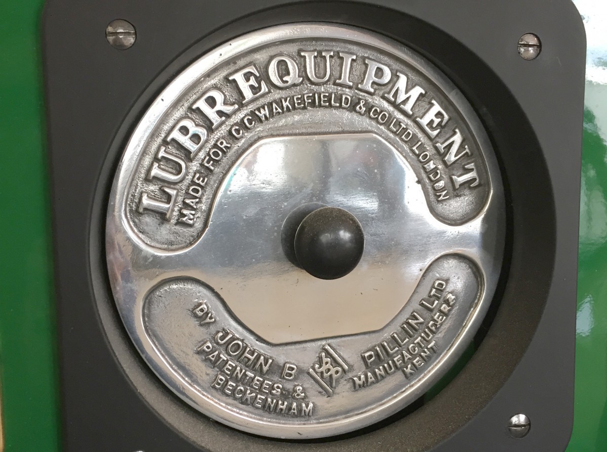
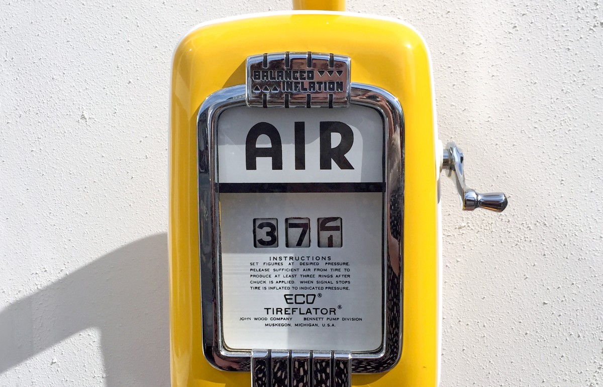
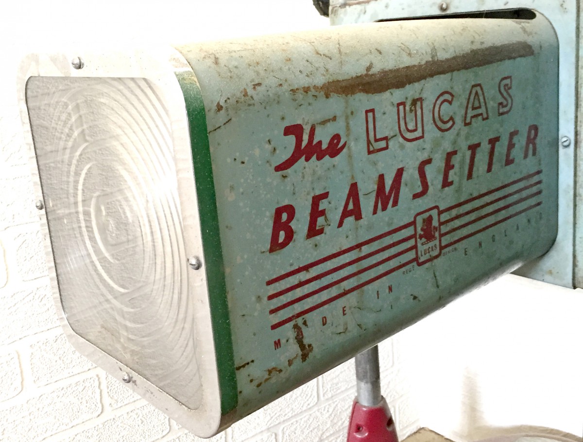
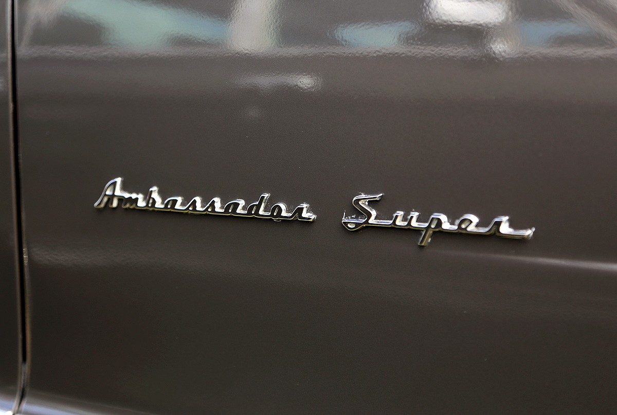
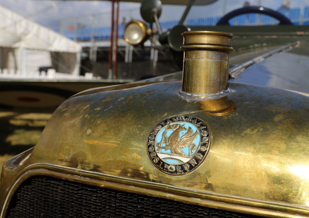
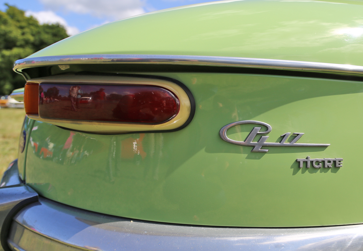
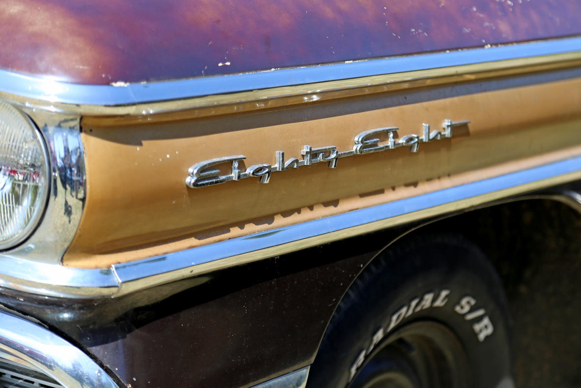
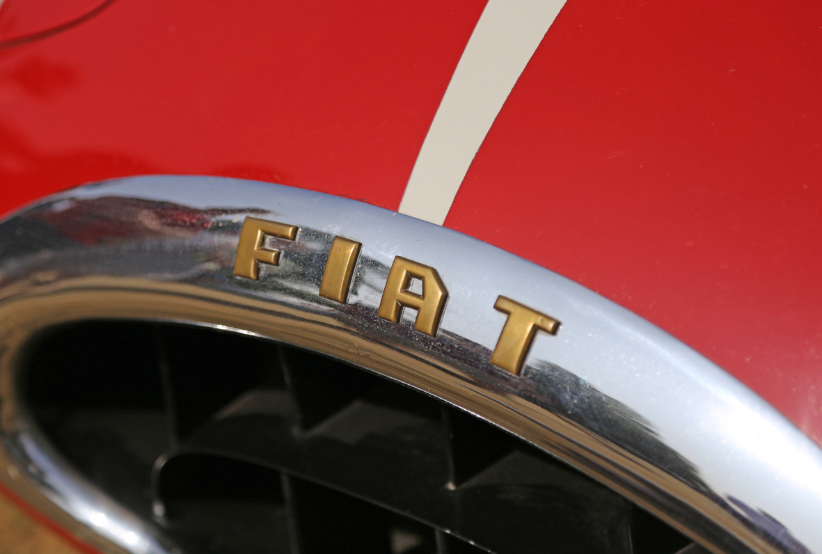
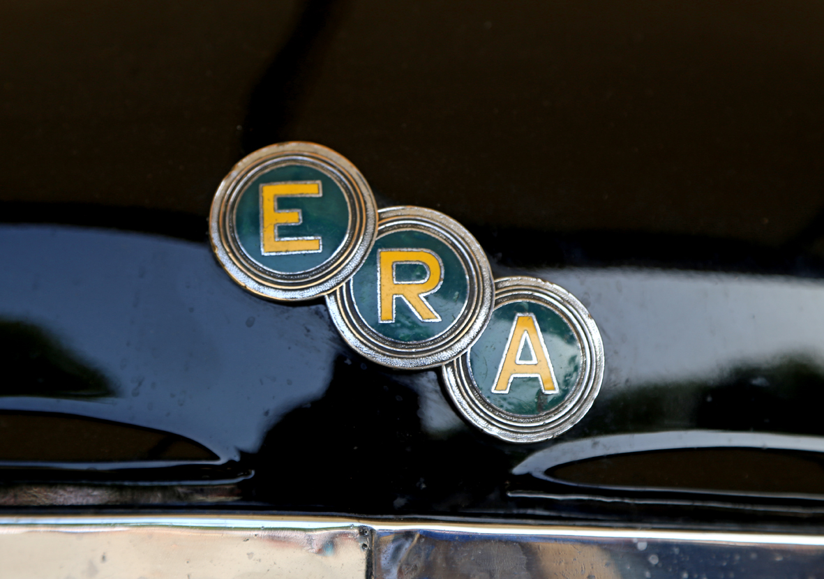
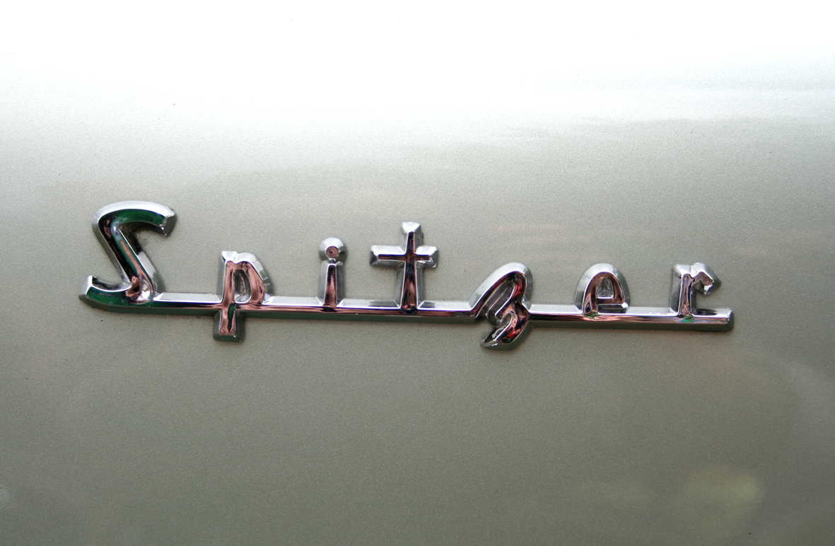
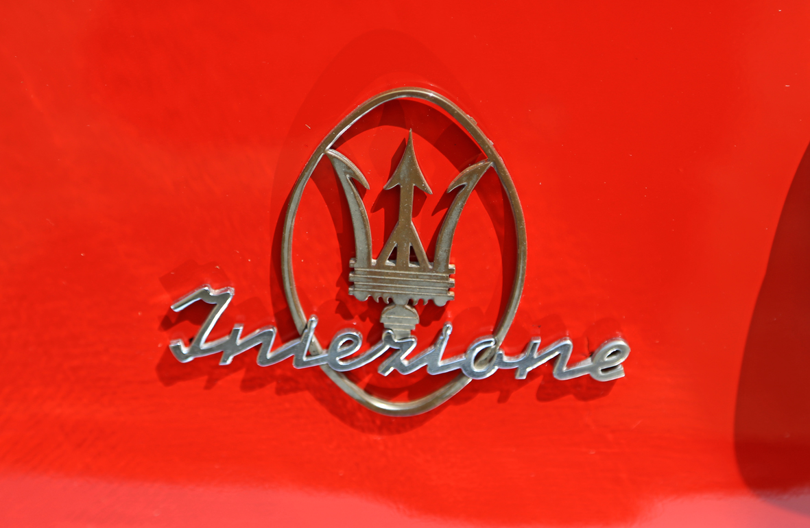
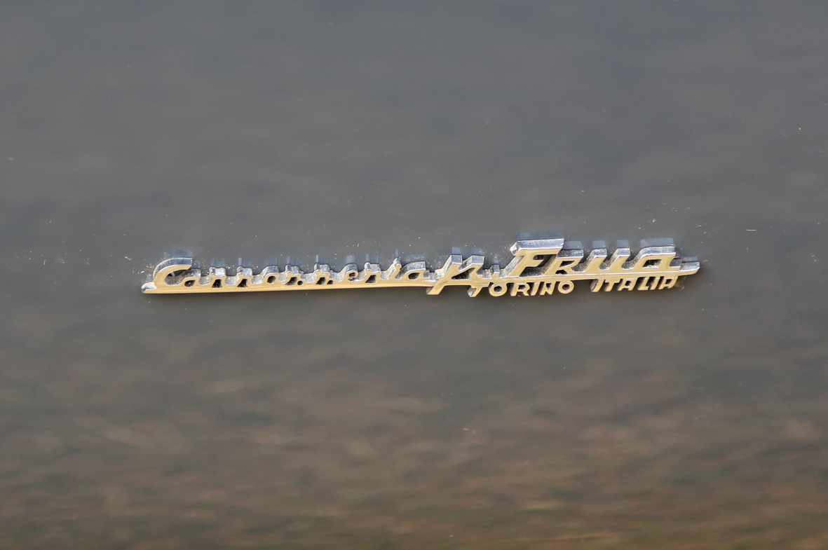
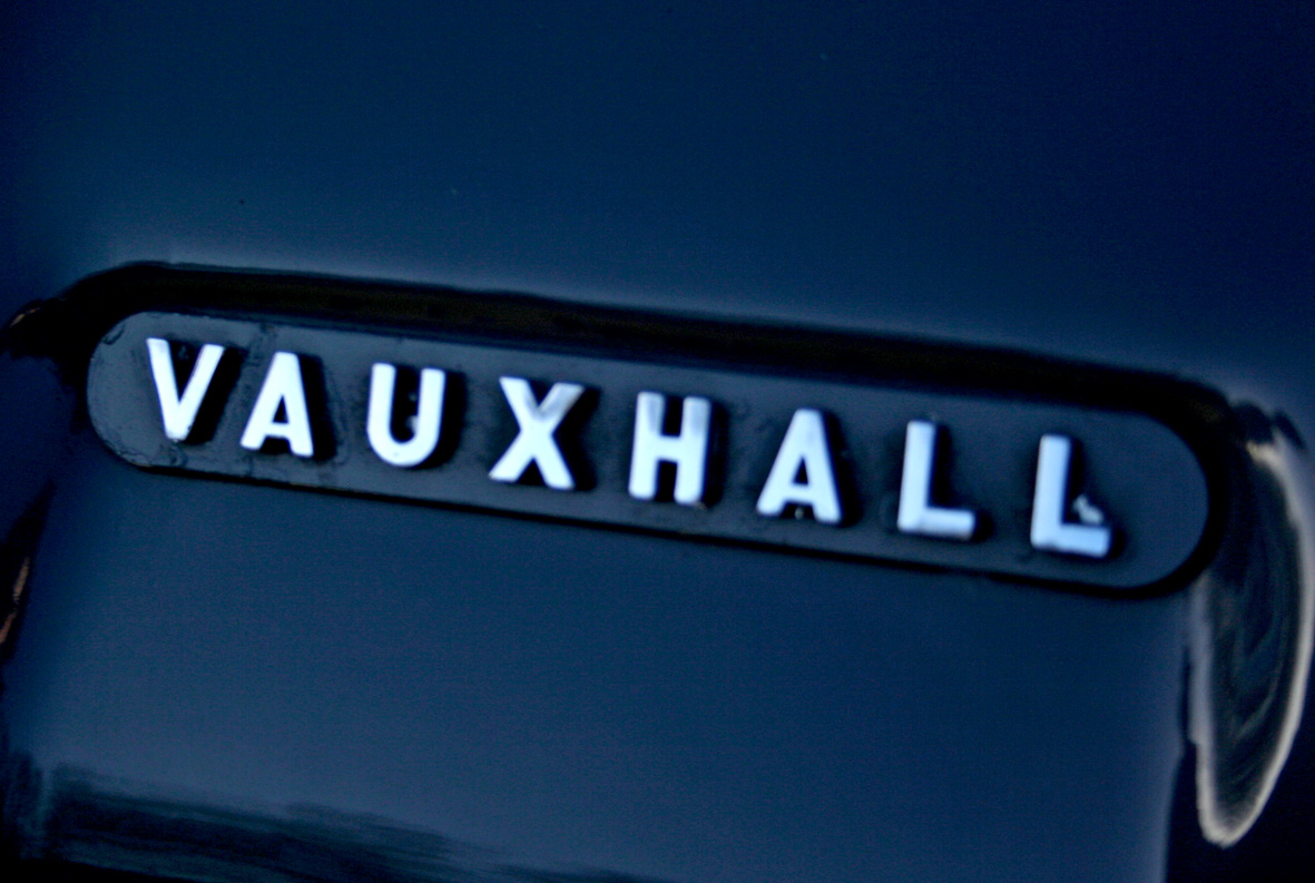
Autp Type XXVXVII
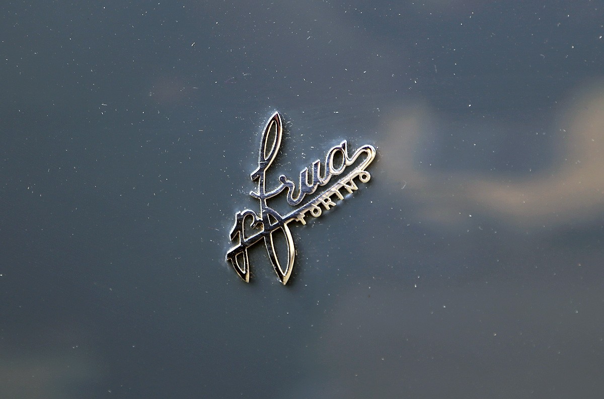
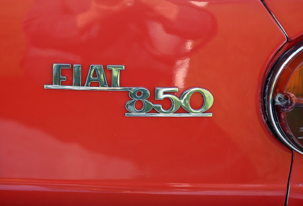
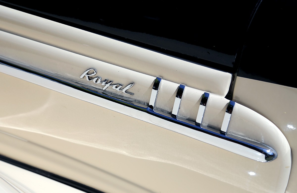
https%3A%2F%2Fwww.deliciousindustries.com%2Fautp-type-xxvxvii
Delicious+Industries%3A+Autp+Type+XXVXVII
Four Play at Unlimited, Brighton
As part of Brighton's Fringe Festival and off the back of it's Box Park success, our friends at Unlimited have given over their shop and gallery to their Four Play exhibition - a collaboration between the Unlimited design studio and 40 of their artists, illustrators and designers.
"All 40 participants have been given a FOUR letter word to illustrate in their own distinctive visual style using a fixed palette of FOUR spot colours. Unlimited design studio are then incorporating their word into each artwork, creating a unique typographic response for each and an exciting collaborative final piece."
So, 40 playful and typographic prints by 40 artists in editions of 100 - what are you waiting for, get on over there before 31 May and check them out.
Thu 14 May 2015
Posted under: Design , Typography , Delicious things , Prints , Things to buy , Exhibition
https%3A%2F%2Fwww.deliciousindustries.com%2Ffour-play-at-unlimited-brighton
Delicious+Industries%3A+Four+Play+at+Unlimited%2C+Brighton
Pick Me Up 2015
Pick Me Up 2015 is currently in full swing at Somerset House, London showcasing a huge selection of illustration, design and print for the sixth year running and proving to be a successful platform for both emerging and established artists to promote their work.
London’s biggest graphic arts is not only a chance to engage with artists and designers about their work. Throughout the 12 days there’s a comprehensive programme of talks, debates, interactive workshops, demonstrations, the chance to create your own piece of print (with help) and the opportunity to purchase some wonderfully affordable art.
As we’re about half way through the festival I thought I’d share with you the very talented motley crew I’m showing alongside with BEST this year.
First up, our Brighton buddies hello DODO - ‘husband and wife team of playful printmakers’ brightening up the world with their colourful animal and pun-tastic screenprints.
Tattoo artist and printmaker, Alex Binnie. Normally found in his Brighton tattoo shop, Alex creates beautifully intricate wood and lino cuts inspired by his tattoo work and his past as a medical illustrator.
Another pal of ours, illustrator and 80s toy collector Carlos Garde-Martin whose wonderfully detailed illustrations were seen all over Brighton last year as part of the Brighton Fringe Festival branding.
The lovely designer and illustrator Matt Jeffs (aka Nimbws - think ‘Nimbus’ but in Wesh) popping his exhibiting cherry at Pick Me Up with his quirky ‘cartoon Picasso’ style prints.
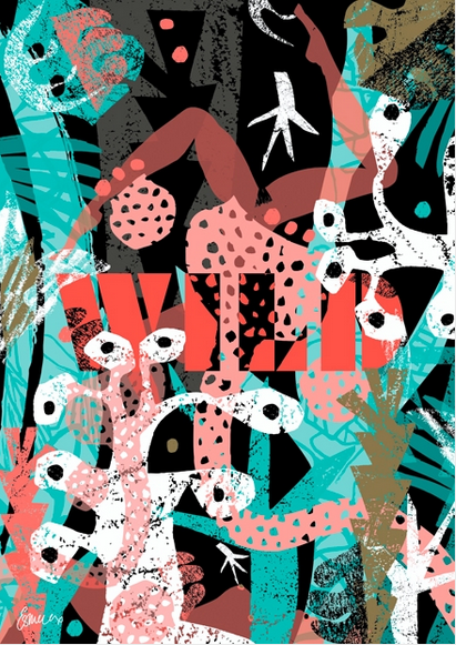
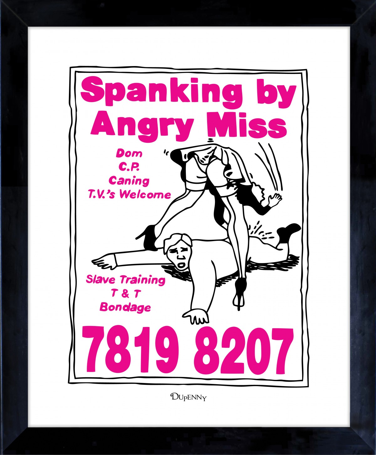
Dupenny, the brainchild of Brighton gal, Emily Dupenny brings a little cheekiness and vintage glamour to the party with her wonderful burlesque patterns and designs.
London based graffiti artists and designer Josh Stika (aka Stika) inspiring us with his great lettering and filling out our space with a giant (and I do mean giant) 3D ‘S’ - it lights up and everything!
Vinyl guru and king of perspex Curly Mark is back for a second year with more skulls, pop art style loveliness and laser-cut wooden jewellery.
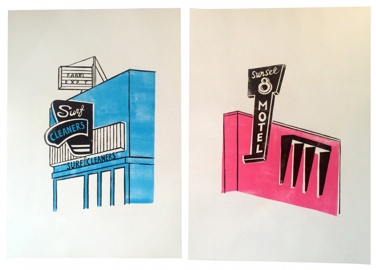
Sam Egarr, designer, photographer and lover of all things typographic has joined us this year with her old shop signage inspired range of letter and number prints.
And last but not least, the lovely lady who had the vision and herded us all together Niki Best, former owner of BEST - the best shop in the world selling graffiti art, screenprints and limited edition art back when no-one even knew the name Banksy. Niki is selling off some of her very own collection at the show so grab the chance to own a classic Kozik smoking bunny, an Obey ‘André the Giant’ or an authentic Faile screenprint.
Pick Me Up runs until Monday 4 May. It’s open everyday 10am - 6pm and until 10pm tonight and tomorrow so come by and say hello.
Wed 29 Apr 2015
Posted under: Design , Typography , Art , Delicious things , Delicious work , Prints , Things to buy , Exhibition , letterpress
https%3A%2F%2Fwww.deliciousindustries.com%2Fpick-me-up-2015
Delicious+Industries%3A+Pick+Me+Up+2015
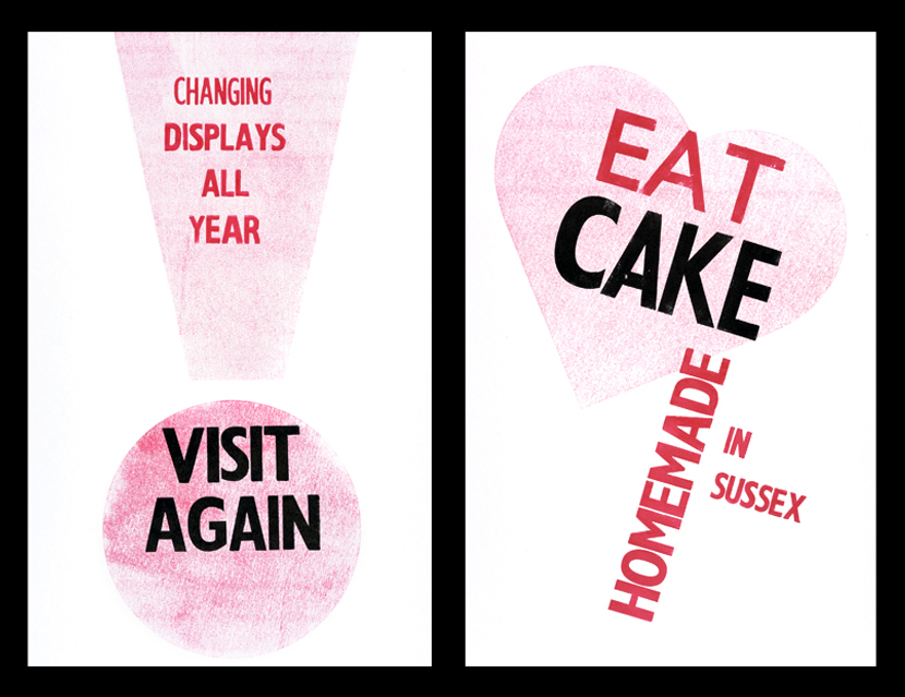
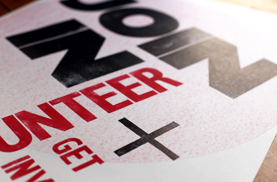
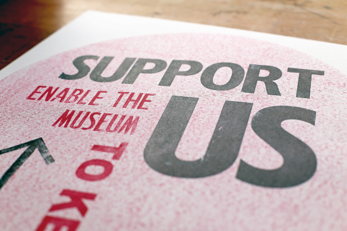
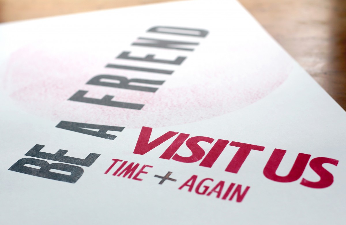
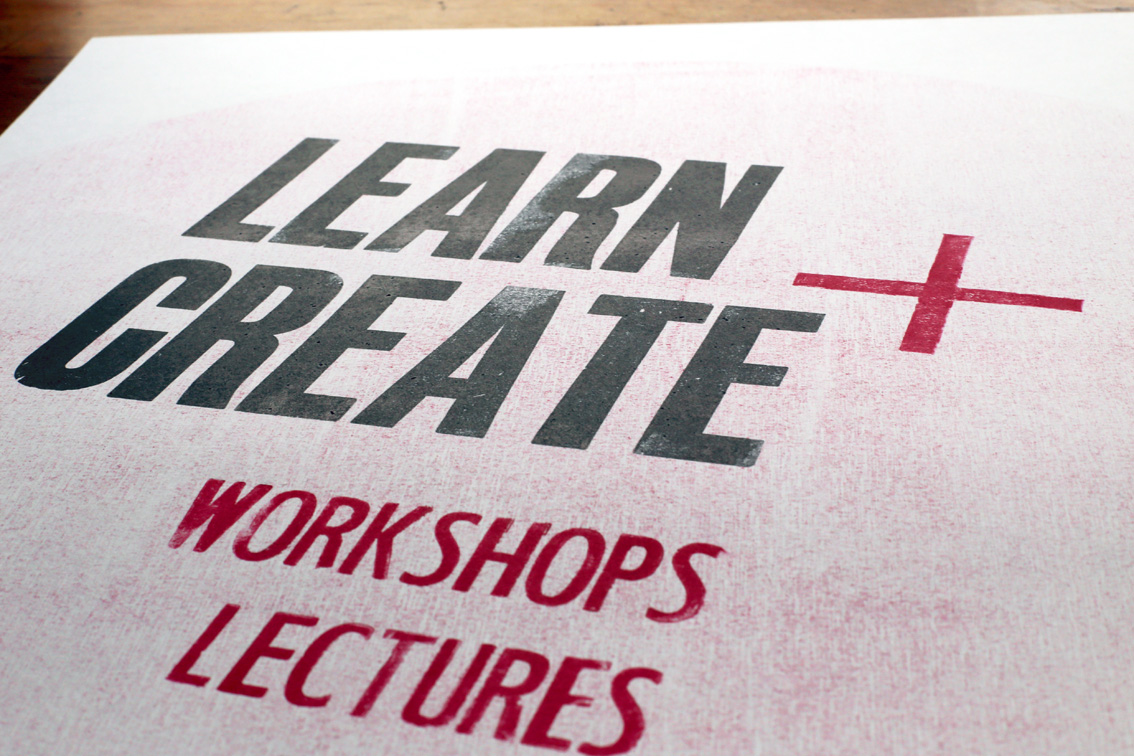
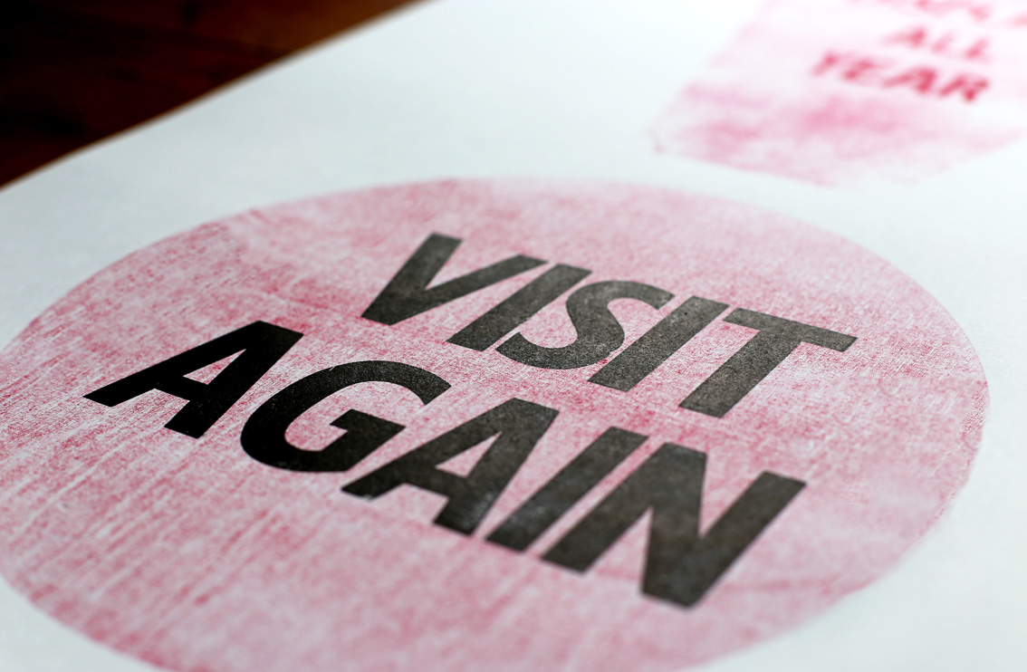
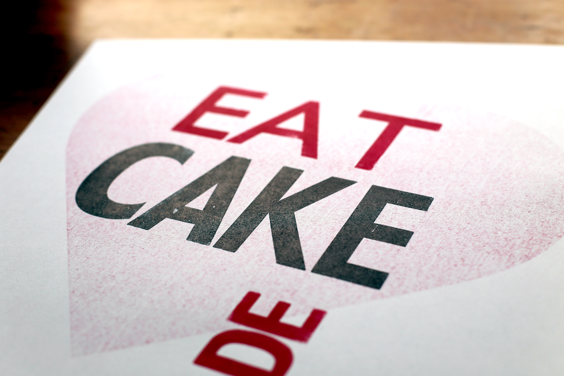
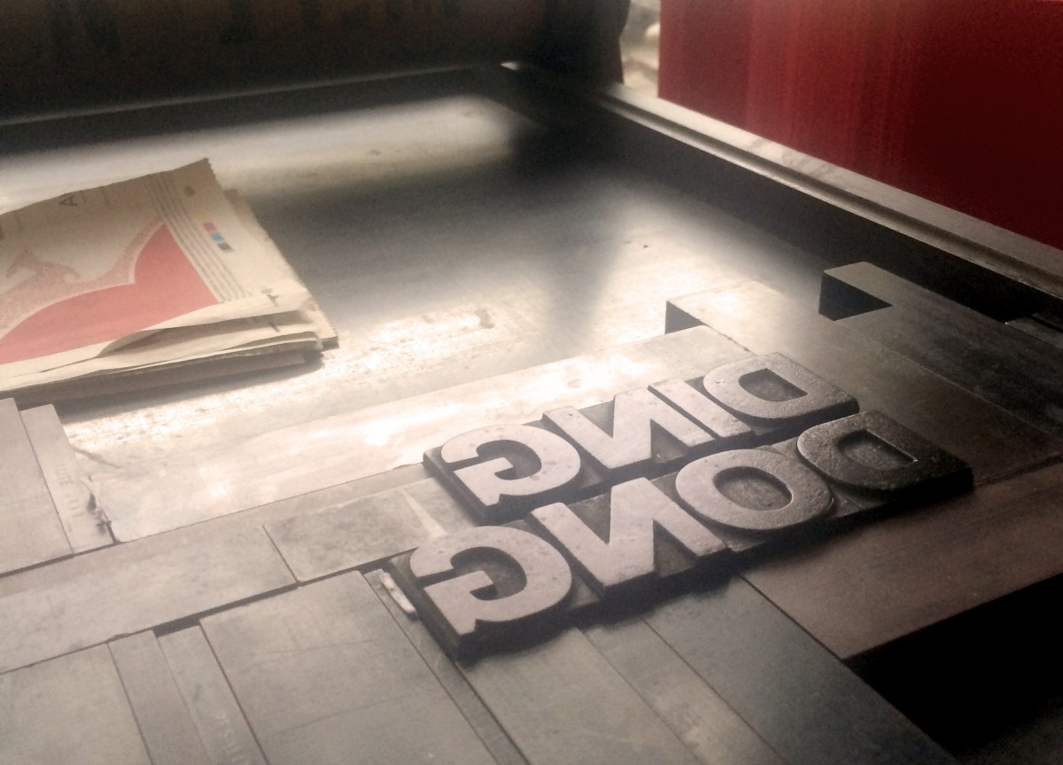
Ditchling Museum of Art + Craft Letterpress poster series
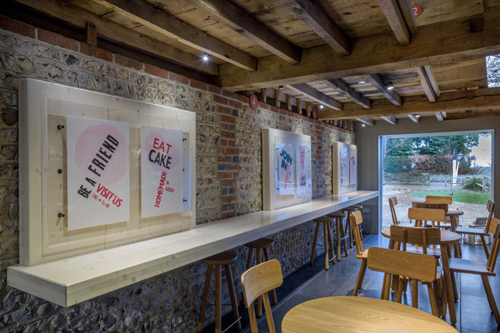
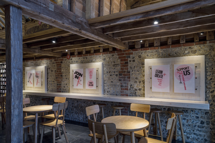
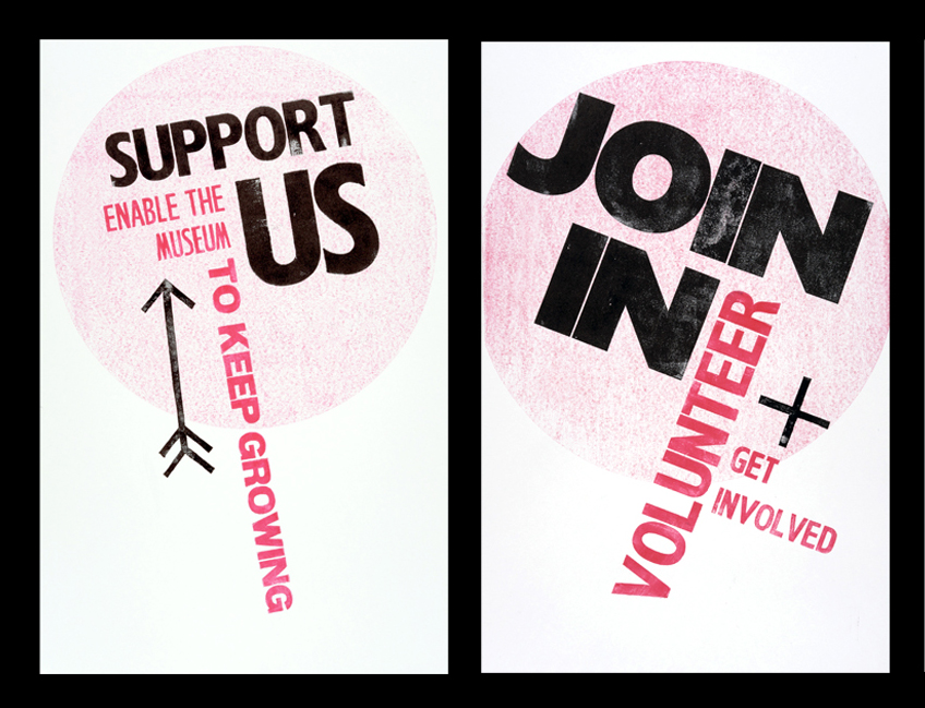
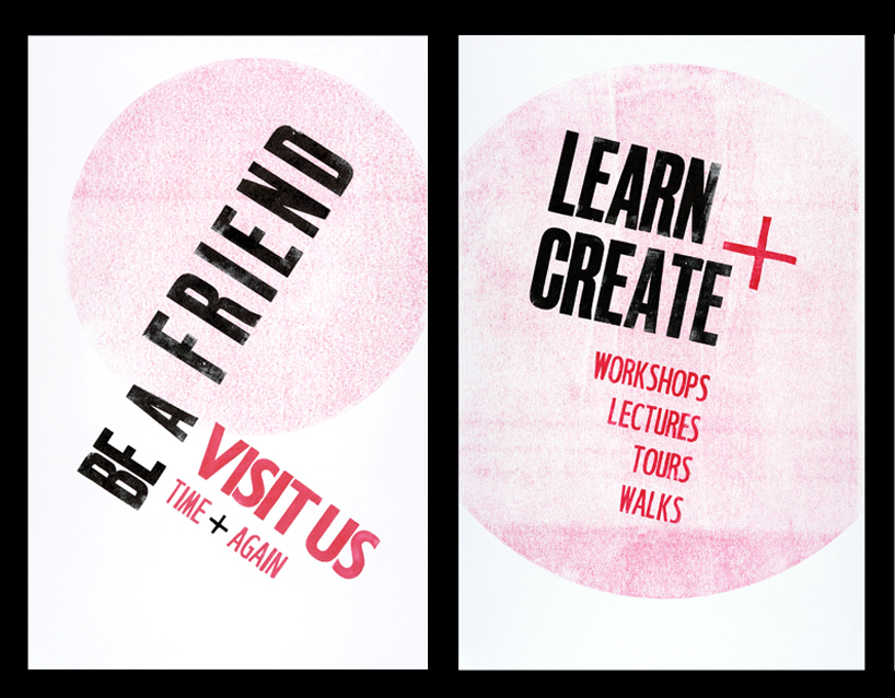
I’m very excited to announce that the series of six letterpress posters I designed and hand-printed for Ditchling Museum of Art + Craft are now on display in the museum’s converted, 18th Century cart lodge - home of their shop and café.
The posters highlight key messages to museum visitors. Using a conscious mix of traditional techniques and modern design they reflect the attitude and direction of the museum – with bold, dynamic compositions, whilst remaining sympathetic to the museum’s identity.
The Print Room is my favourite part of the museum, so it was an honor not only to be commissioned to create these posters, but also to print them using the museum’s collection of beautiful wood block letters.
Renowned for its collection of work by artists and craftspeople once based in the village (including type-designers Eric Gill and Edward Johnston), Ditchling Museum of Art + Craft has a rich heritage of print and typography and for a few months Delicious Industries is a little part of that too!
https%3A%2F%2Fwww.deliciousindustries.com%2Fditchling-museum-of-art-craft-letterpress-poster-series
Delicious+Industries%3A+Ditchling+Museum+of+Art+%2B+Craft+Letterpress+poster+series
Merry Christmas
Thank you to everyone who has shown support and encouragement, visited our blog, worked with us and for us. It's been a crazy year, but a good one.
With lots of exciting plans and projects in the pipline, here's to a fabulous 2015!
Eat, drink and be very merry.
https%3A%2F%2Fwww.deliciousindustries.com%2Fmerry-christmas1
Delicious+Industries%3A+Merry+Christmas
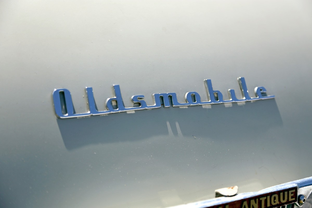
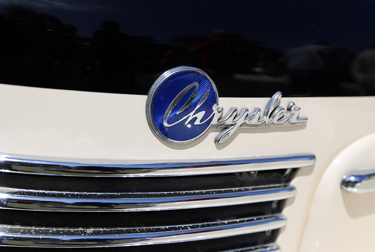
Auto Type XXVXVI
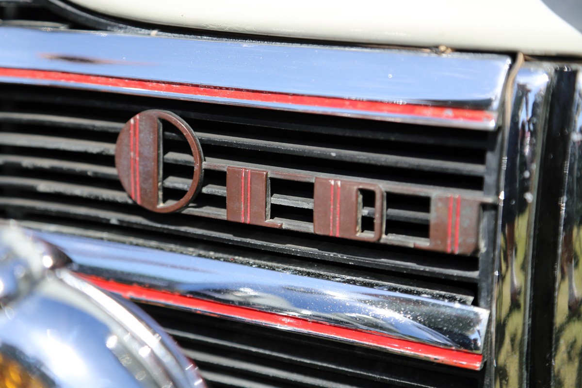
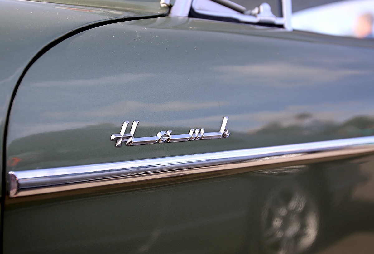
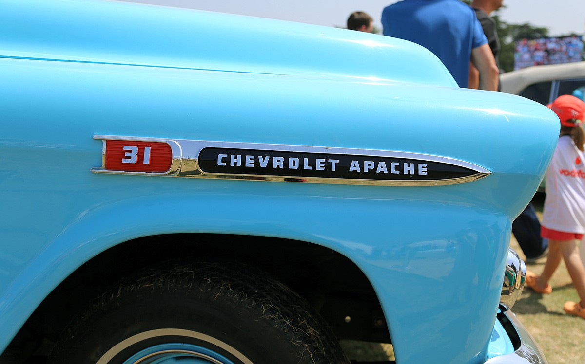
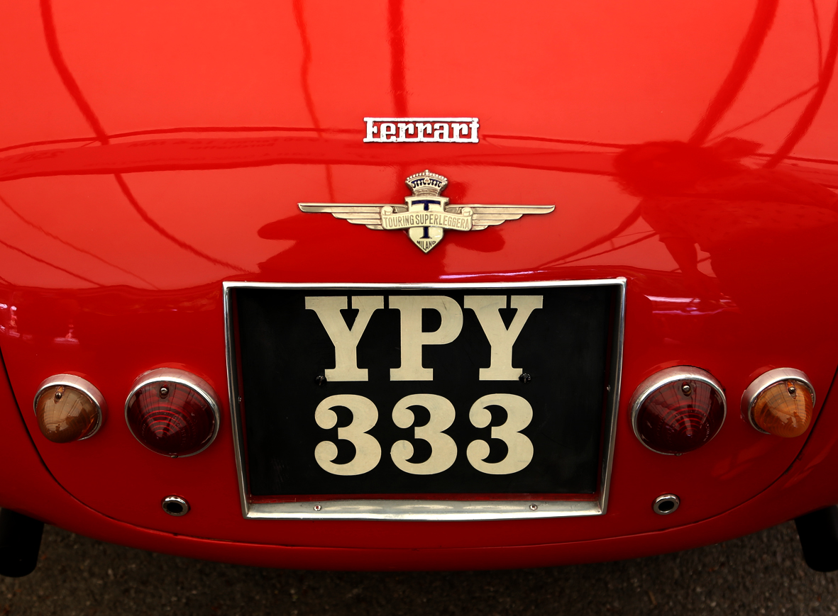
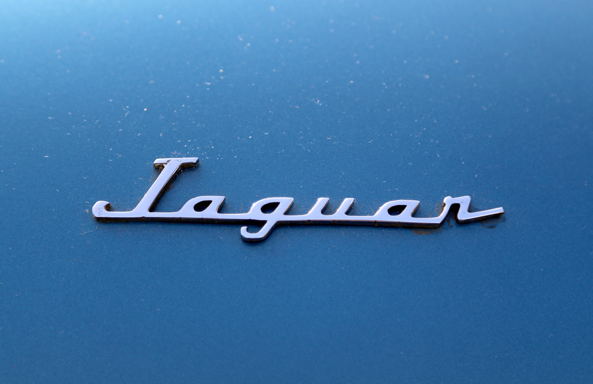
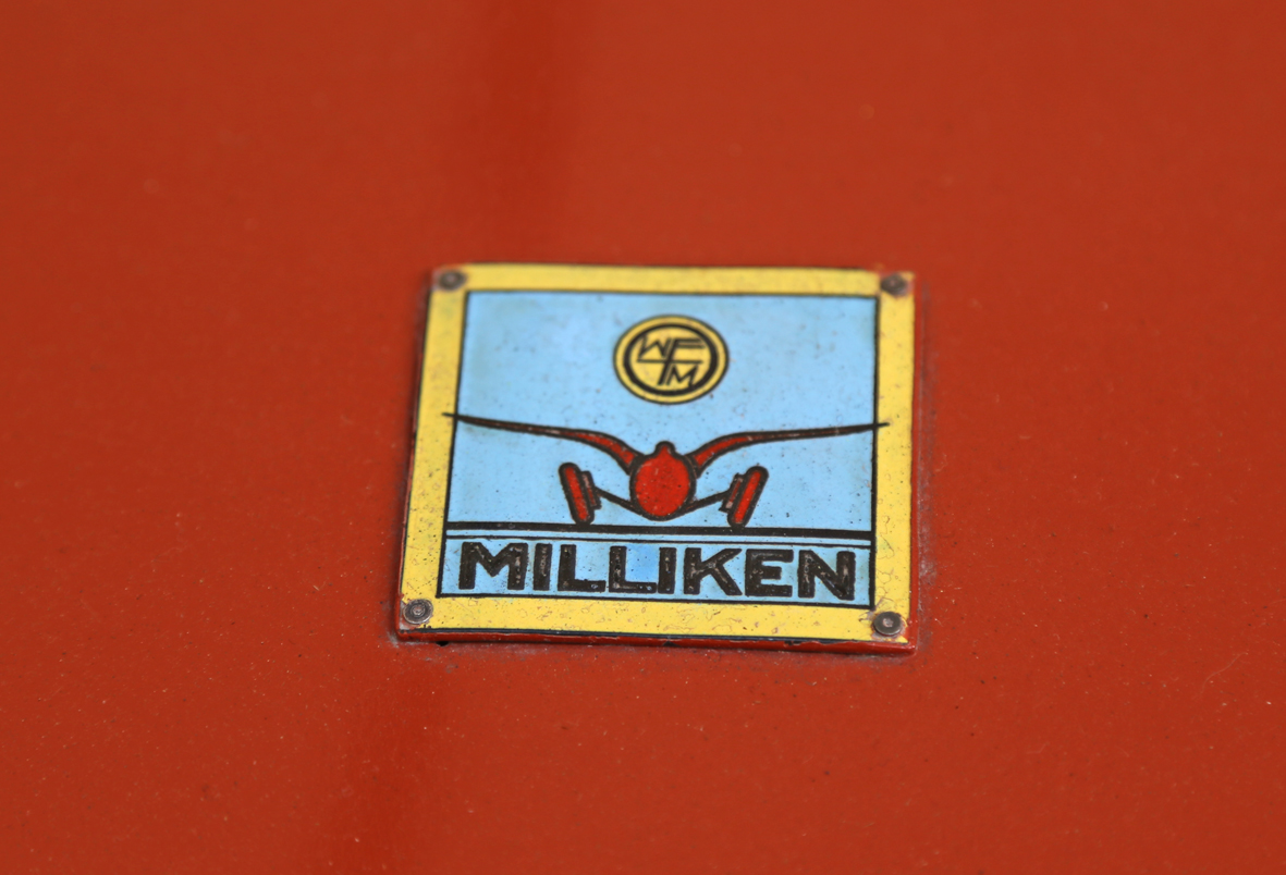
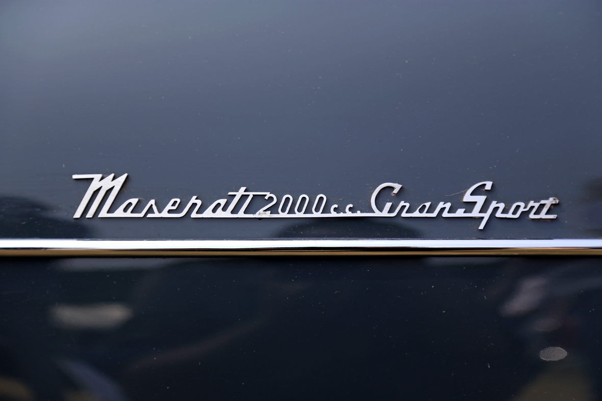
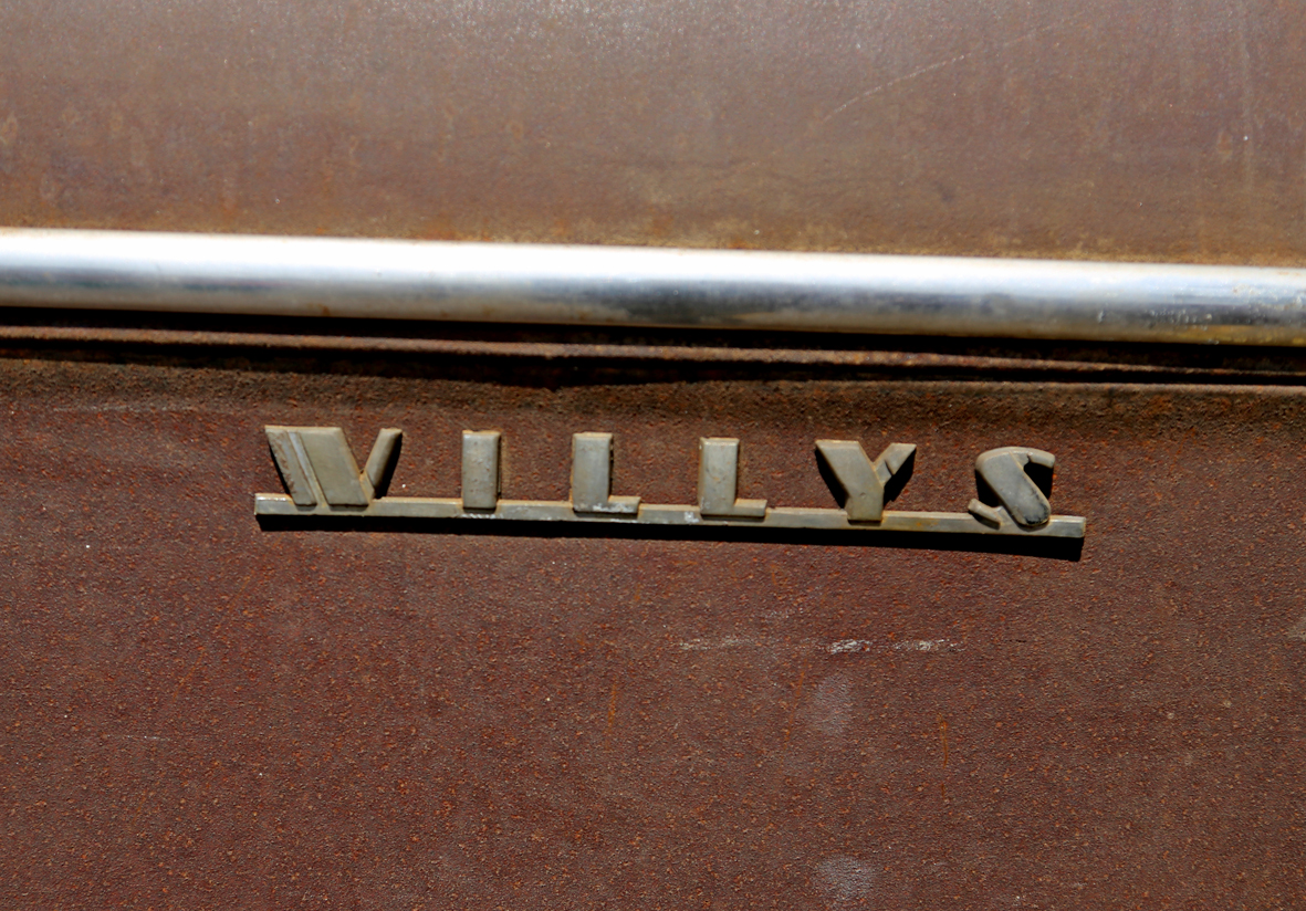
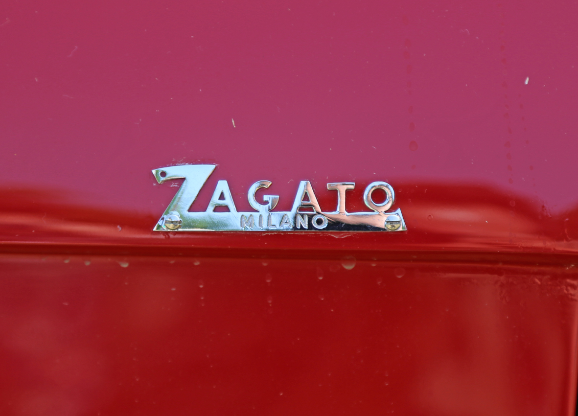
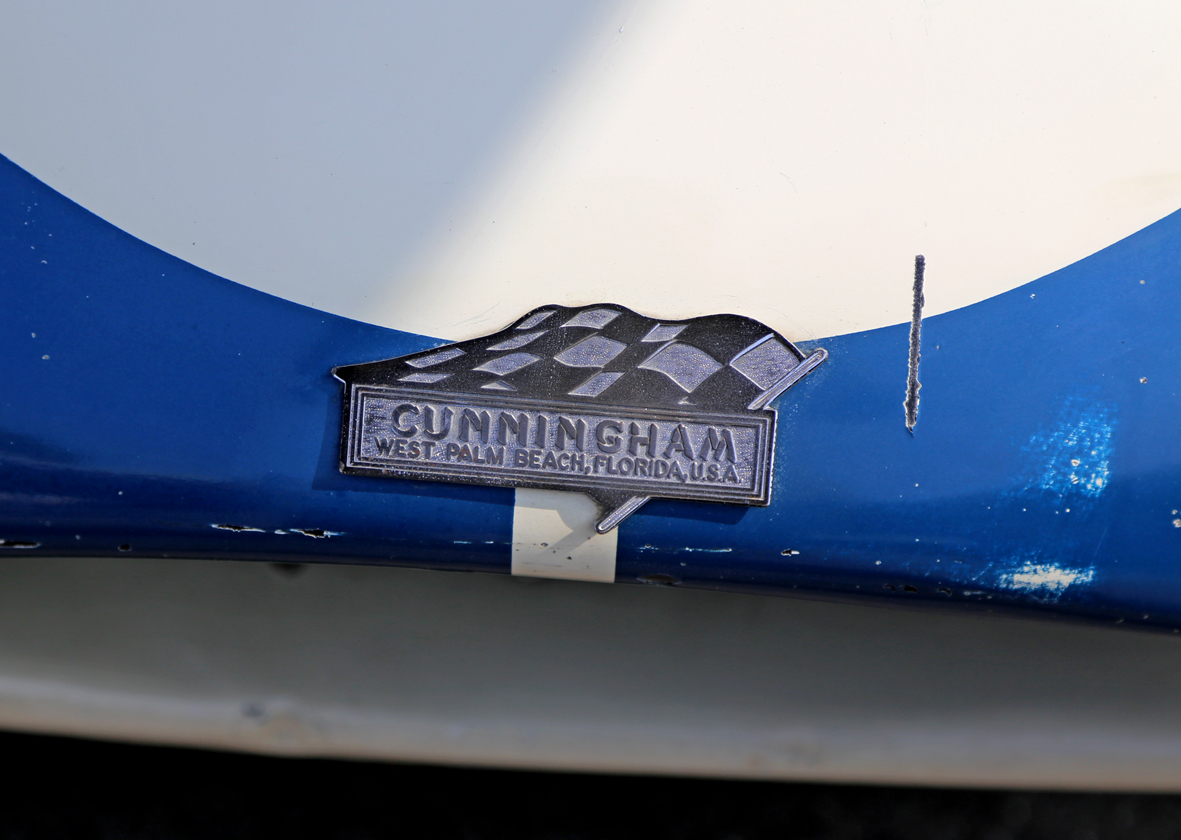
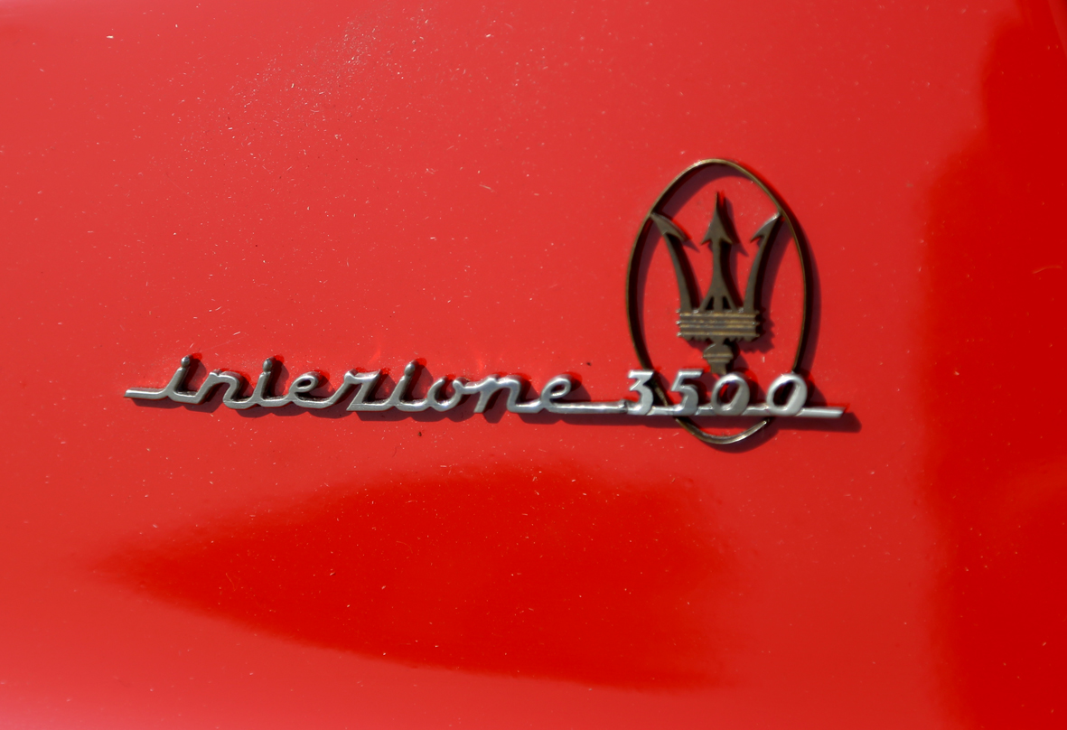
It's been a while since we've had some Auto Type on the blog, so here's a mighty fine selection to brighten your day.
From Italian stallions to European racers and American muscle, we have it all in our Auto type archives, check it out here.
https%3A%2F%2Fwww.deliciousindustries.com%2Fauto-type-xxvxvi
Delicious+Industries%3A+Auto+Type+XXVXVI
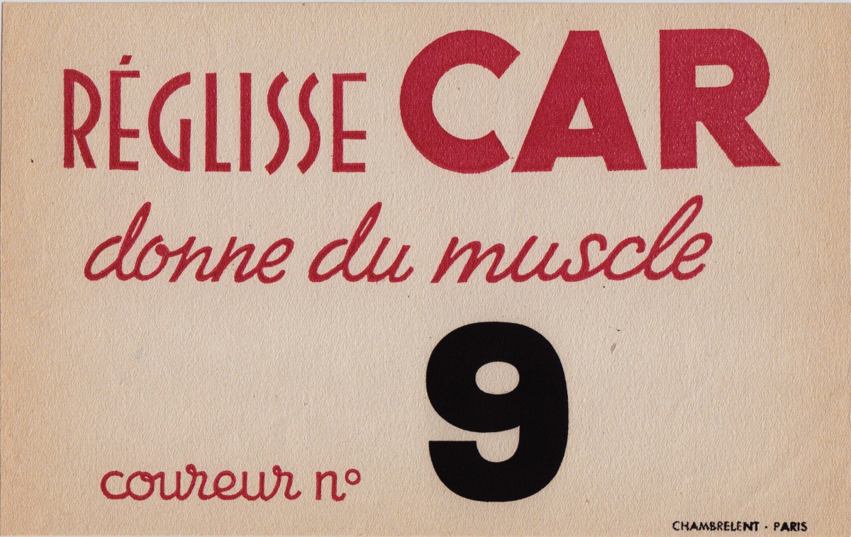
From the reference box #145
#145 - more beautiful Parisian vintage ephemera.
I love the quality of this little card. It's quite a thick, textured stock which, gives the print a lovely texture too and as you can see it is very agedaround the edges but that just adds to it's charm.
With my bad French and the help of Google translate, I think it's some sort of sponsored competitor's card which reads, 'Because liquorice gives muscles. Rider No.9. Chambrelent, Paris', but i could be very, very wrong!
Have a look at some of out other ephemera gems here.
https%3A%2F%2Fwww.deliciousindustries.com%2Ffrom-the-reference-box-145
Delicious+Industries%3A+From+the+reference+box+%23145
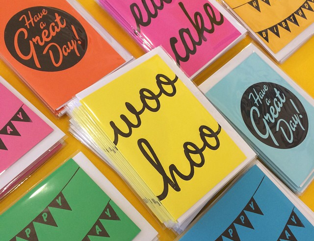
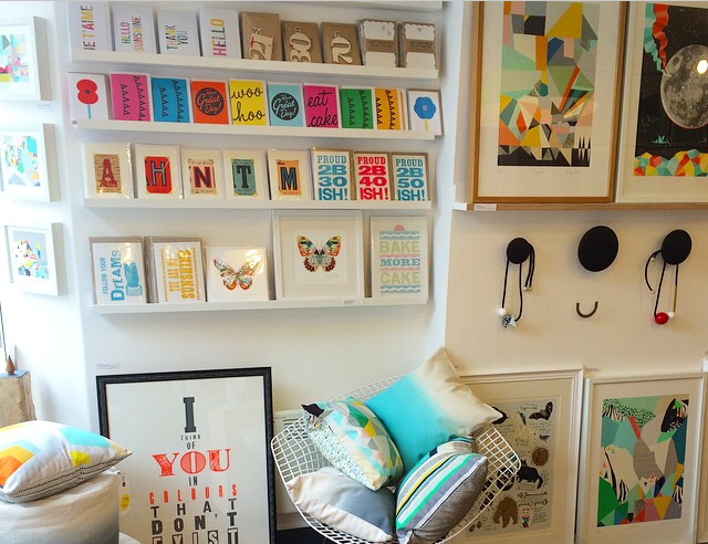
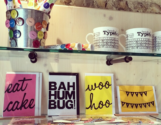
Woo Hoo!
Woo Hoo exactly.
Our cards are now gracing the shelves of Unlimited design shop & gallery, Brighton and Ditchling Museum of Art + Craft.
We're taking over the world with our greetings cards, one fabulous gallery at a time.
https%3A%2F%2Fwww.deliciousindustries.com%2Fwoo-hoo
Delicious+Industries%3A+Woo+Hoo%21
Welcome

Welcome to the Delicious Industries blog. We're an independent design studio based in Brighton, UK and this is our scrapbook packed full of design, illustration, photography & typography inspiration. Check out our work here.
Links
DELICIOUS FRIENDS
DELICIOUS FAVOURITES
- 50 Watts
- Acejet 170
- Grain Edit
- It's Nice That
- National Geographic Found
- Notcot
- Pretty Clever
- Retronaut
- So Much Pileup
- We Love Typography
- Another Mag