art direction, design + typography
Blog: August 2013
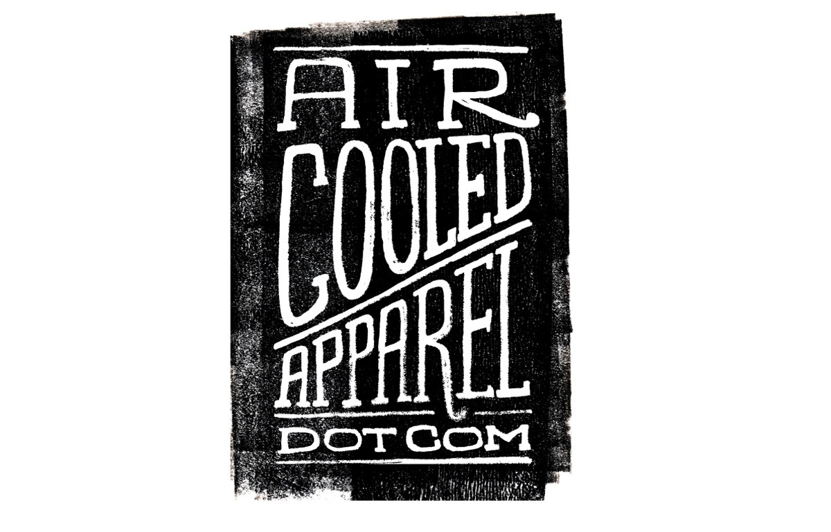
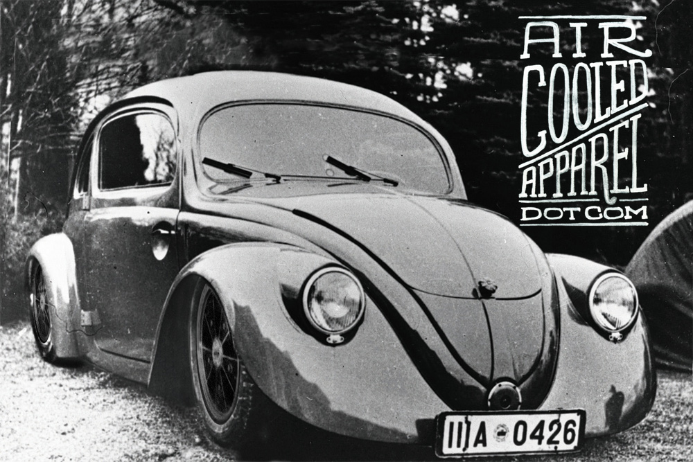
Aircooled Apparel
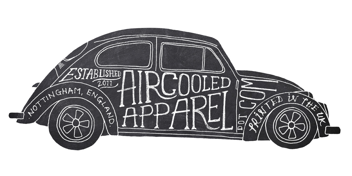
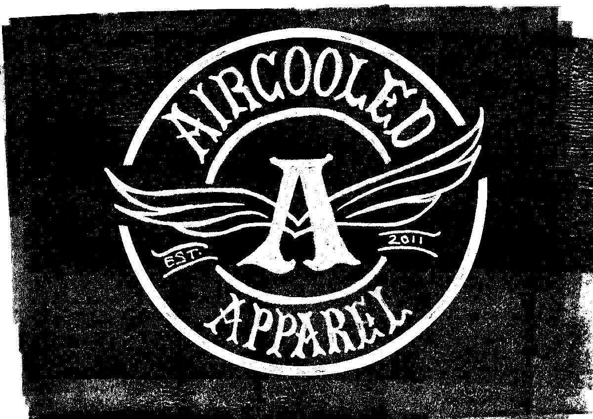
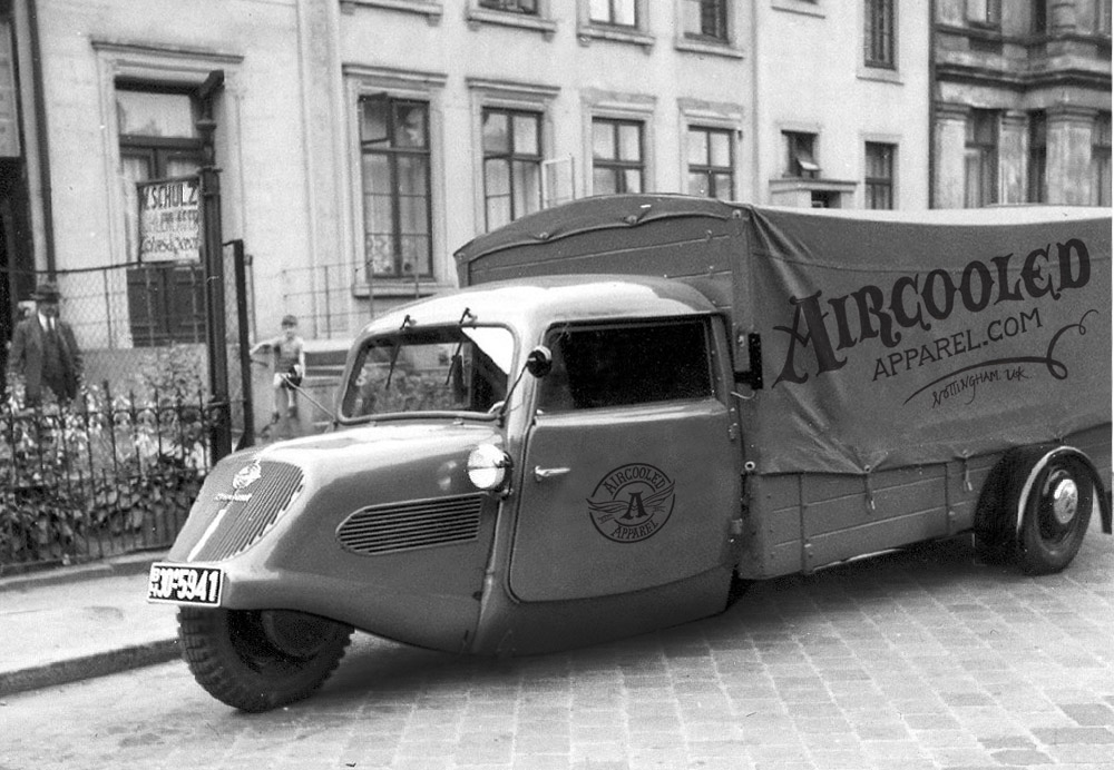
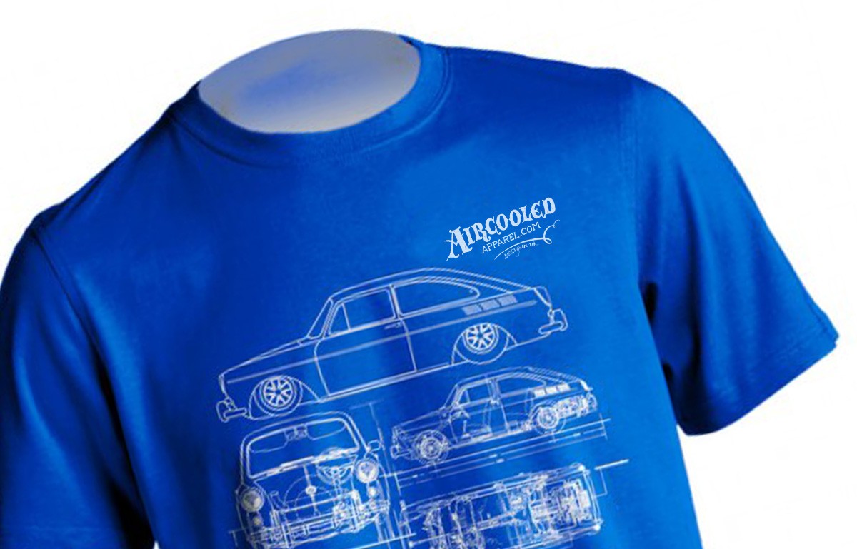
Thought we'd share a fun project we've been working on recently for the guys at Aircooled Apparel - a selection of versatile, hand-lettered graphics that can be used in their marketing and across their clothing & stickers range.
See more of our work here and here.
https%3A%2F%2Fwww.deliciousindustries.com%2Faircooled-apparel
Delicious+Industries%3A+Aircooled+Apparel
Type Hunting
Type Hunting have a great selection of type and lettering images on their Tumblr. Some very good mid-week inspiration.
Makes me think I should pull all my found type images together and create a Found Type Tumblr. Watch this space!
Via Sell! Sell! Blog.
https%3A%2F%2Fwww.deliciousindustries.com%2Ftype-hunting
Delicious+Industries%3A+Type+Hunting
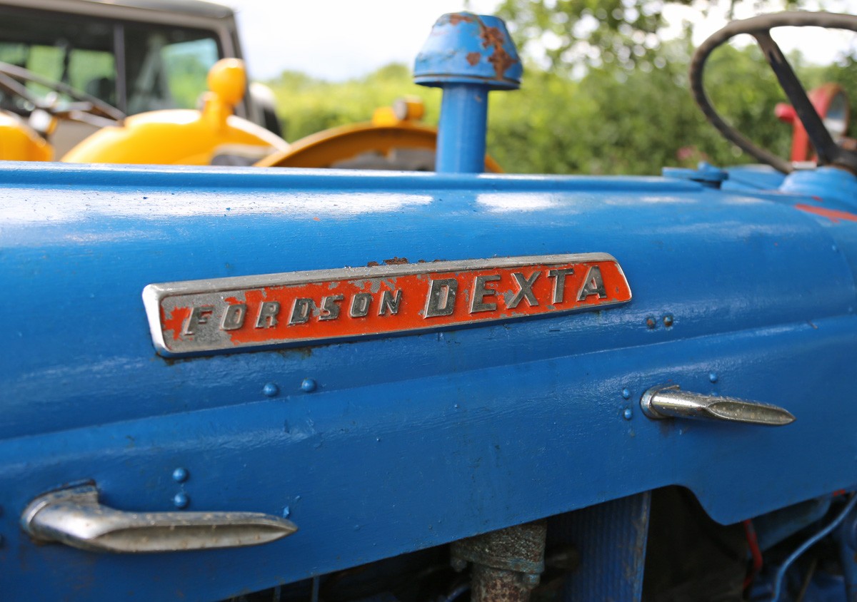
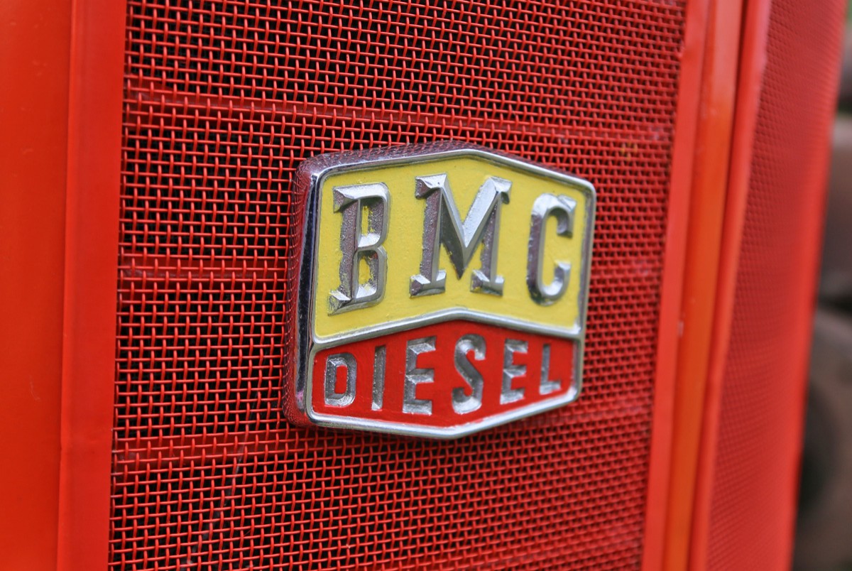
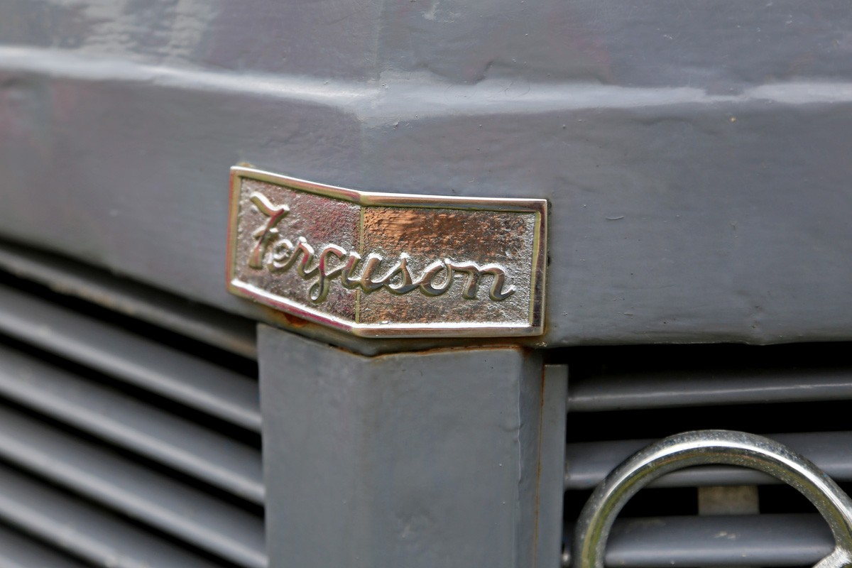
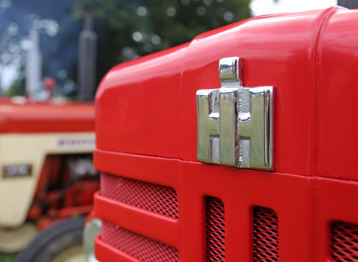
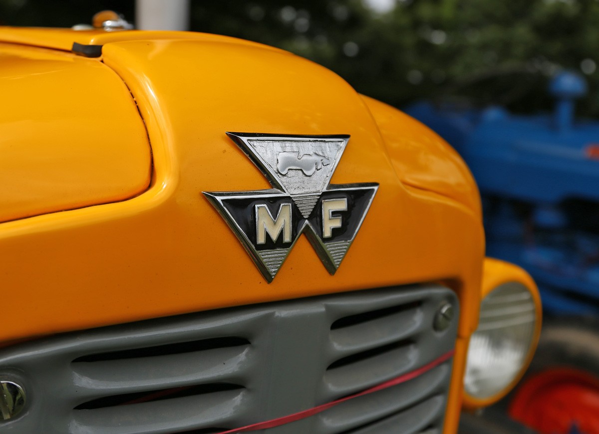
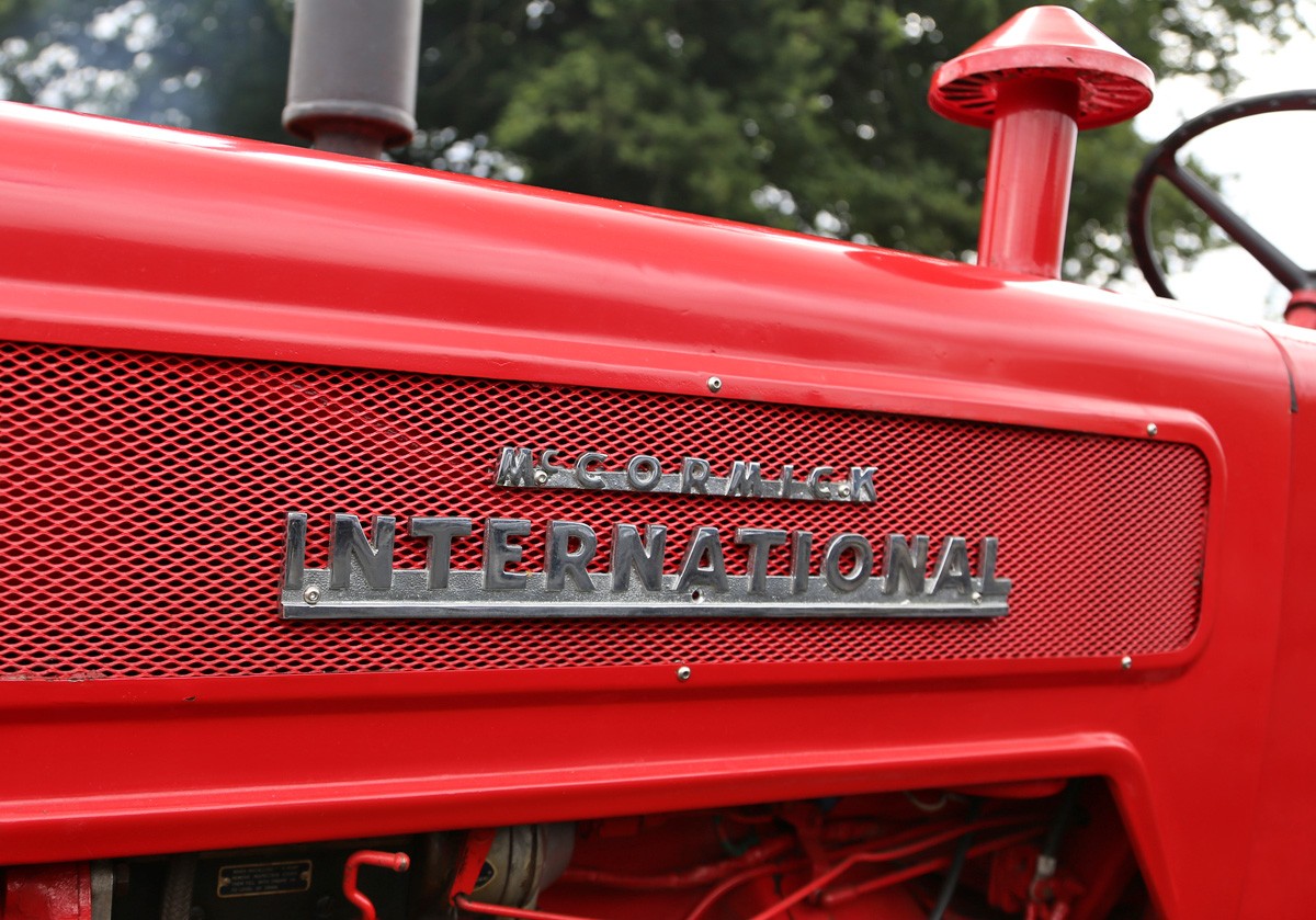
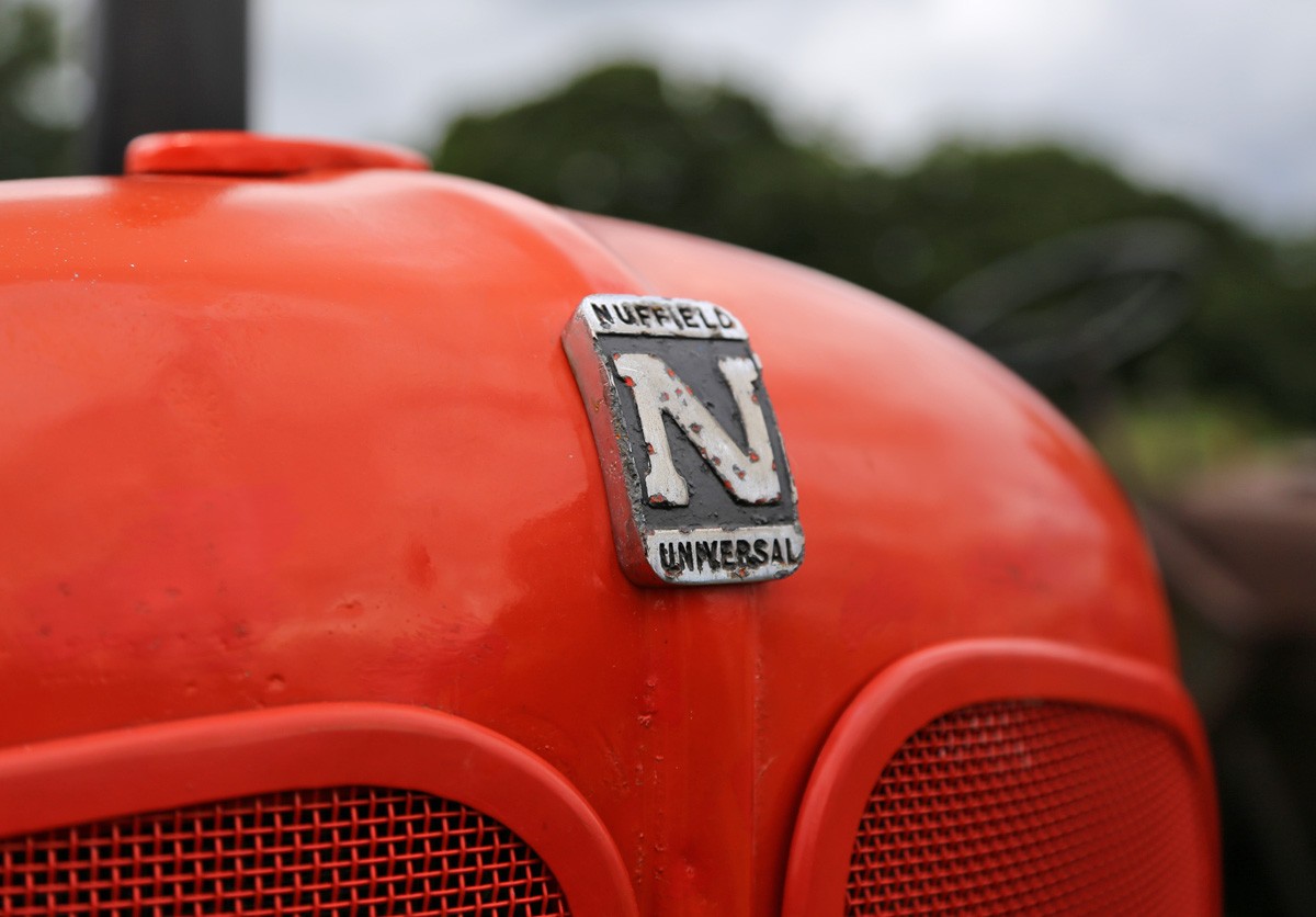
Auto Type Special: Vintage Tractors
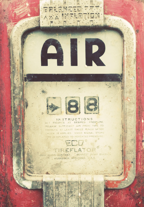
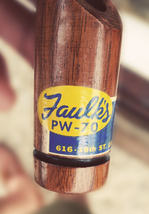
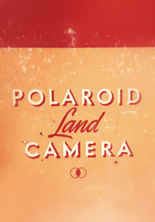
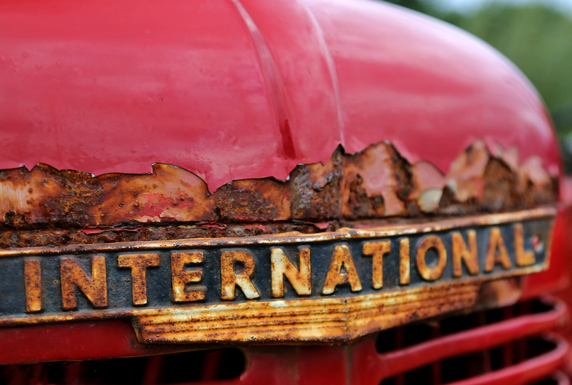
Just look at the fabulous lettering that can be found lurking in barns & farm yards.
There's something about the simplicity and functionality of vintage tractors that I've always found charming, but their appeal doesn't end there. As you can see these work horses also have beautiful hand-lettered emblems.
If Auto Type is your thing or if you need a bit of inspiration, have a look at our complete collection here and here.
https%3A%2F%2Fwww.deliciousindustries.com%2Fauto-type-special-vintage-tractors
Delicious+Industries%3A+Auto+Type+Special%3A+Vintage+Tractors
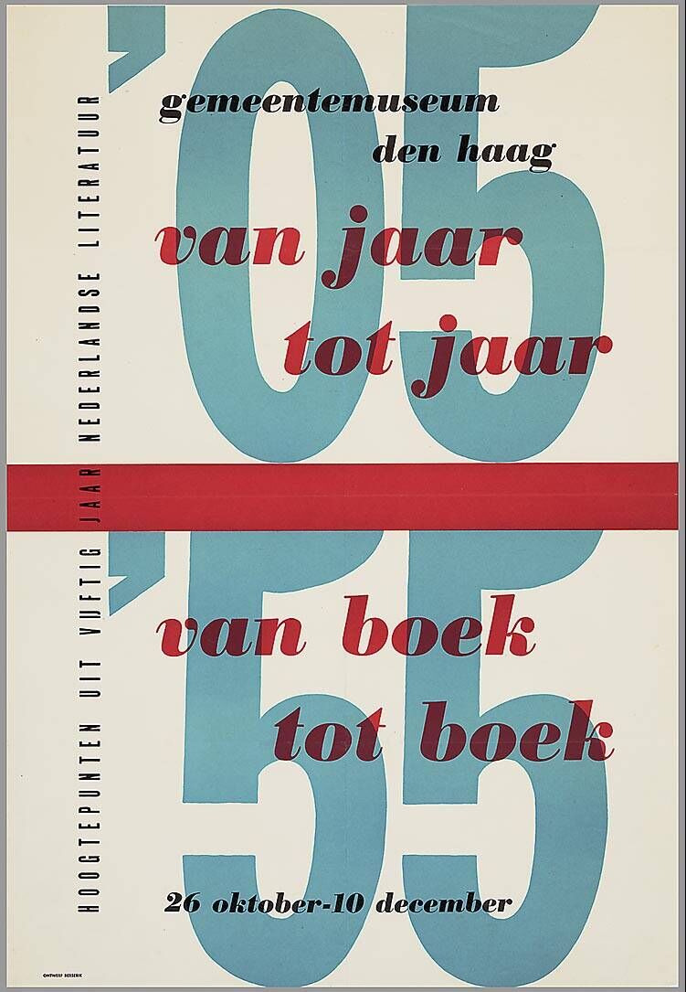
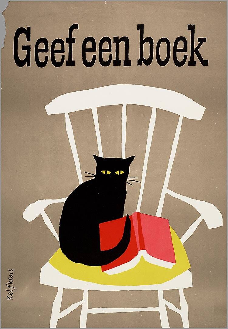
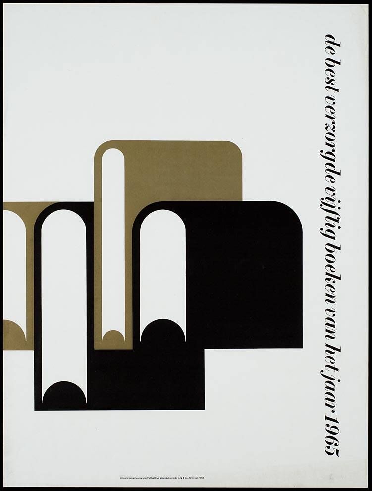
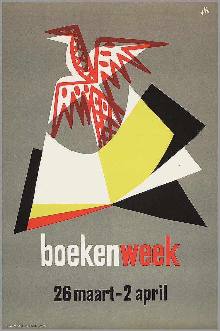
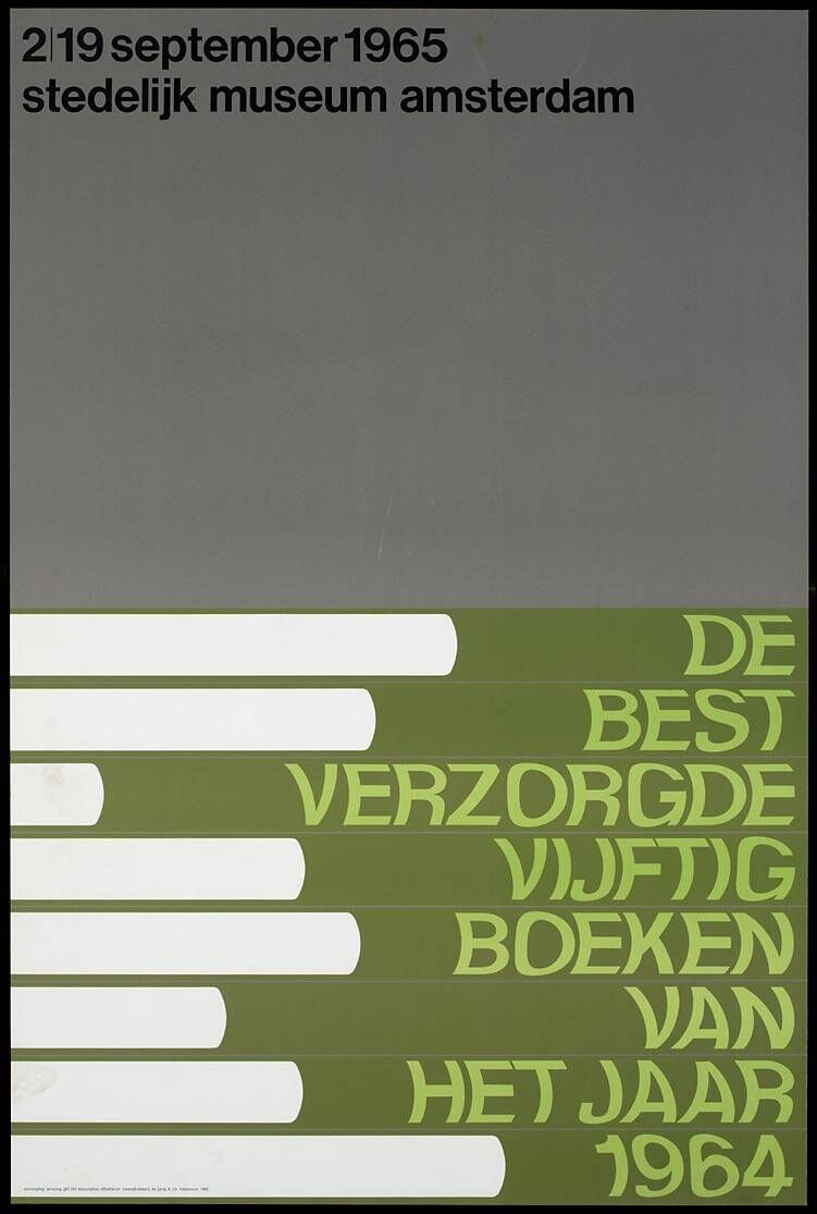
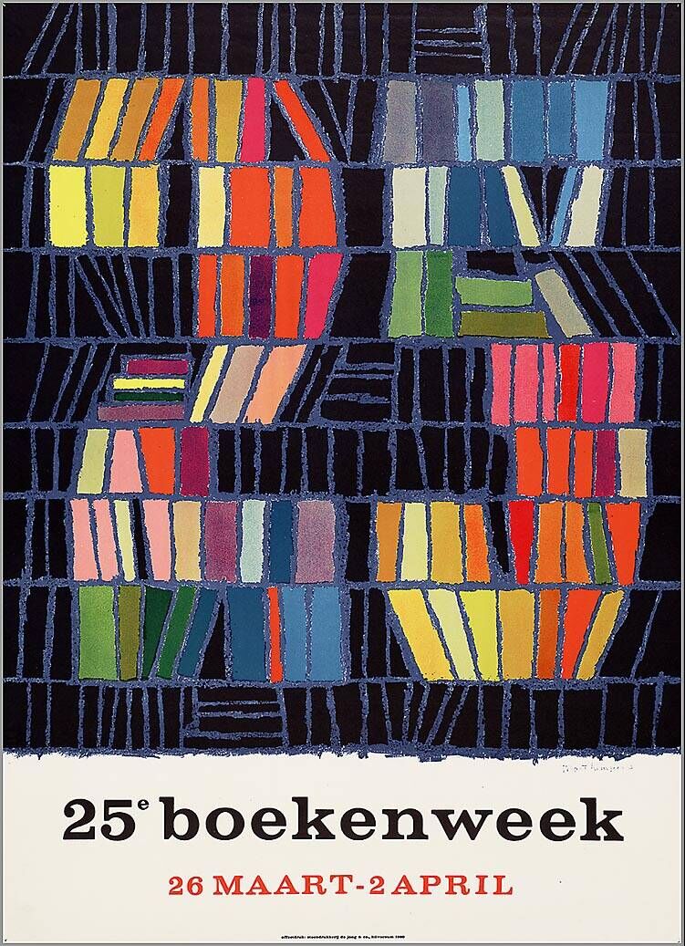
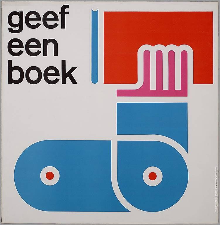
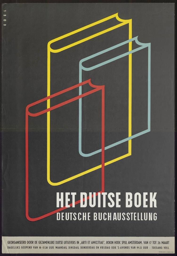
Dutch Book Week Posters
These beautiful vintage posters advertising Book Week (1955 - 1971) and lots, lots more form the Dutch design resource ADVIZ, "a new bilingual (NED / EN) interactive platform for the graphic design industry, the advertising industry and for anyone interested in visual communication".
The two-part website was launched in 2011 to; A. bring together design reference from the collections of the Dutch Archive Graphic Designers (Nederlands Archief Grafisch Ontwerpers - NAGO), the Advertising Arsenal (ReclameArsenaal - RA) and the Poster Museum (Affichemuseum) in Hoorn, and B. to offer a platform for the public to upload their own design collections or portfolios, share design related links and interact with other users.
It's definitely worth a look around, there are some really great vintage posters on there.
Via @presentcorrect
https%3A%2F%2Fwww.deliciousindustries.com%2Fdutch-book-week-posters
Delicious+Industries%3A+Dutch+Book+Week+Posters
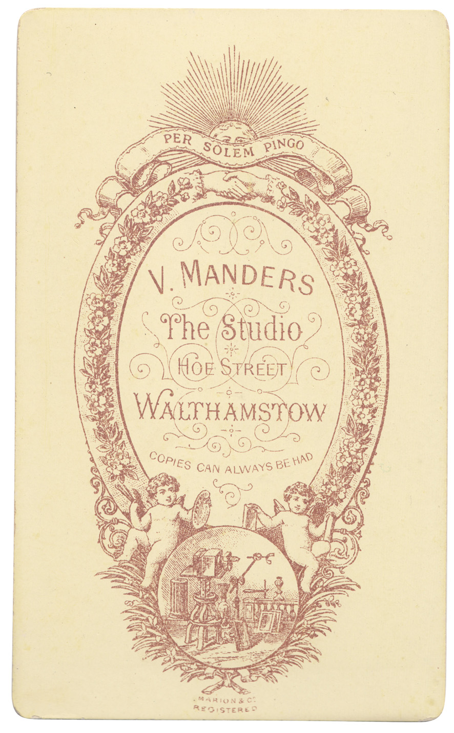
From the reference box #139
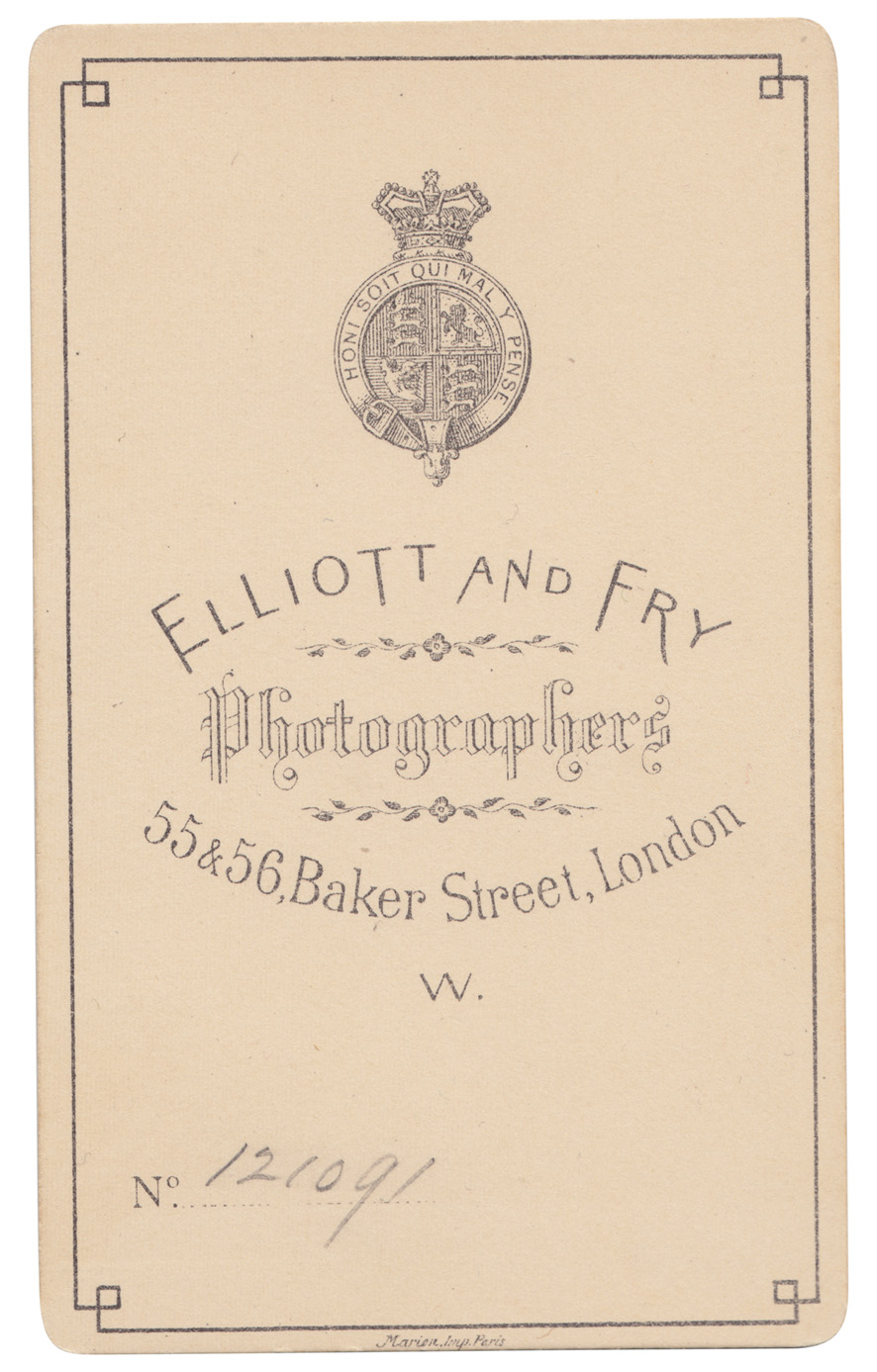
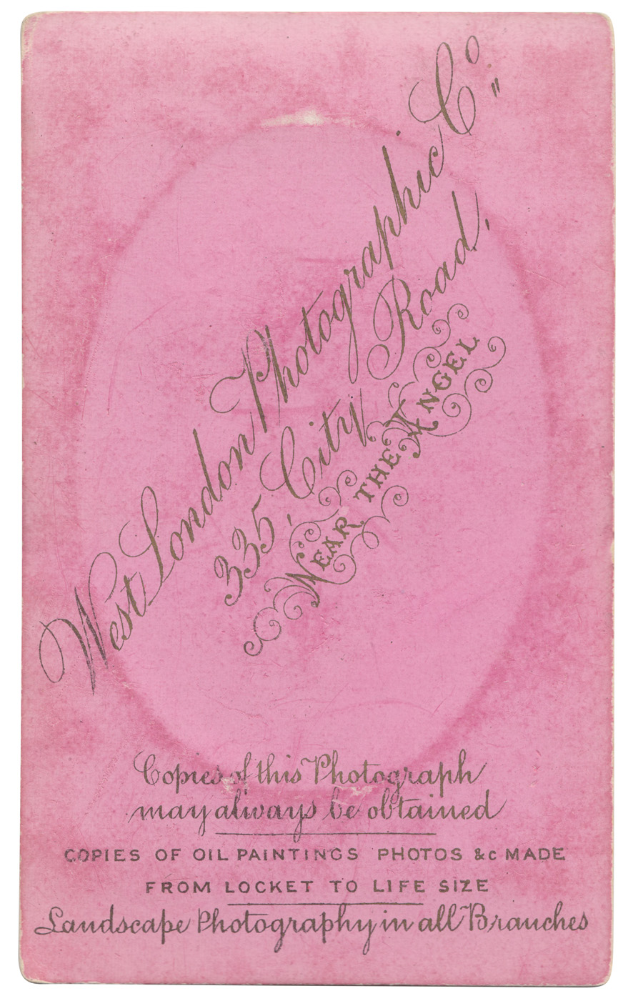
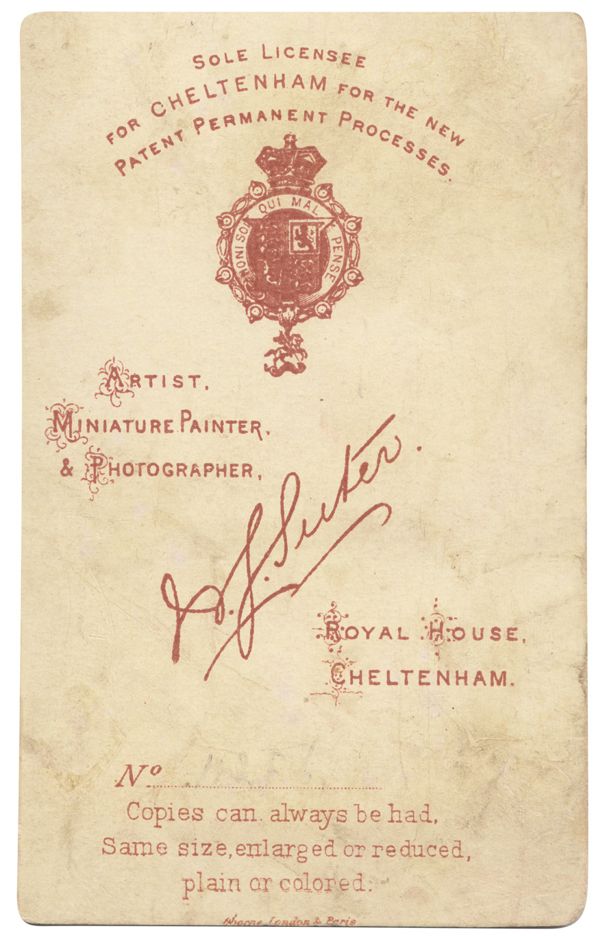
# 139 - Some new additions to the reference box, and to my Carte-de-Visite collection. Cards from four different photographic studios / photographers in the South of England, all beautifully lettered and detailed.
Quite a few of the cards in my collection have 'Marion Imp Paris' or 'Marion & Co Registered' which I assumed to be the printer of the cards, and I was correct. I found this great website all about Carte-de- Visite with a whole section about Marion & Co and how to use their marks to date the cards (and photographs). Check it out here.
See our whole collection here and previous posts about Carte-de-Visite here, here and here. You can find out more about Carte-de-Visite here, an article written by Graham Hudson from the Ephemera Society.
https%3A%2F%2Fwww.deliciousindustries.com%2Ffrom-the-reference-box-139
Delicious+Industries%3A+From+the+reference+box+%23139
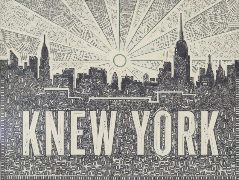
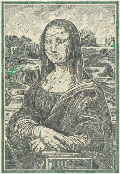
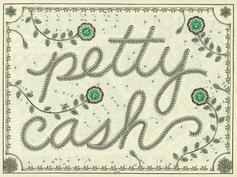
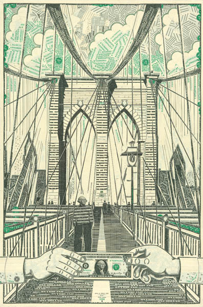
Money, Power, Sex & Mark Wagner
These amazingly intricate currency collages are the work of brooklyn-based artist, writer and book-maker Mark Wagner.
He strives to create, "something bizarre, beautiful, or unbelievable... the foreign in the familiar" and uses only one dollar bills in his masterpieces, what he describes as, "the most ubiquitous piece of paper in America" and "a ripe material: intaglio printed on sturdy linen stock, covered in decorative filigree, and steeped in symbolism and concept".
Watch him at work in this great little stop motion...
If you're lucky enough to be in New York next month you can check out his work in person at the Pavel Noubok Gallery. His next exhibition, 'Money, Power, Sex & Mark Wagner' starts on the 6th September and runs until 5th October 2013.
Images and video copyright Mark Wagner.
Via Colossal.
https%3A%2F%2Fwww.deliciousindustries.com%2Fmoney-power-sex-mark-wagner
Delicious+Industries%3A+Money%2C+Power%2C+Sex+%26amp%3B+Mark+Wagner
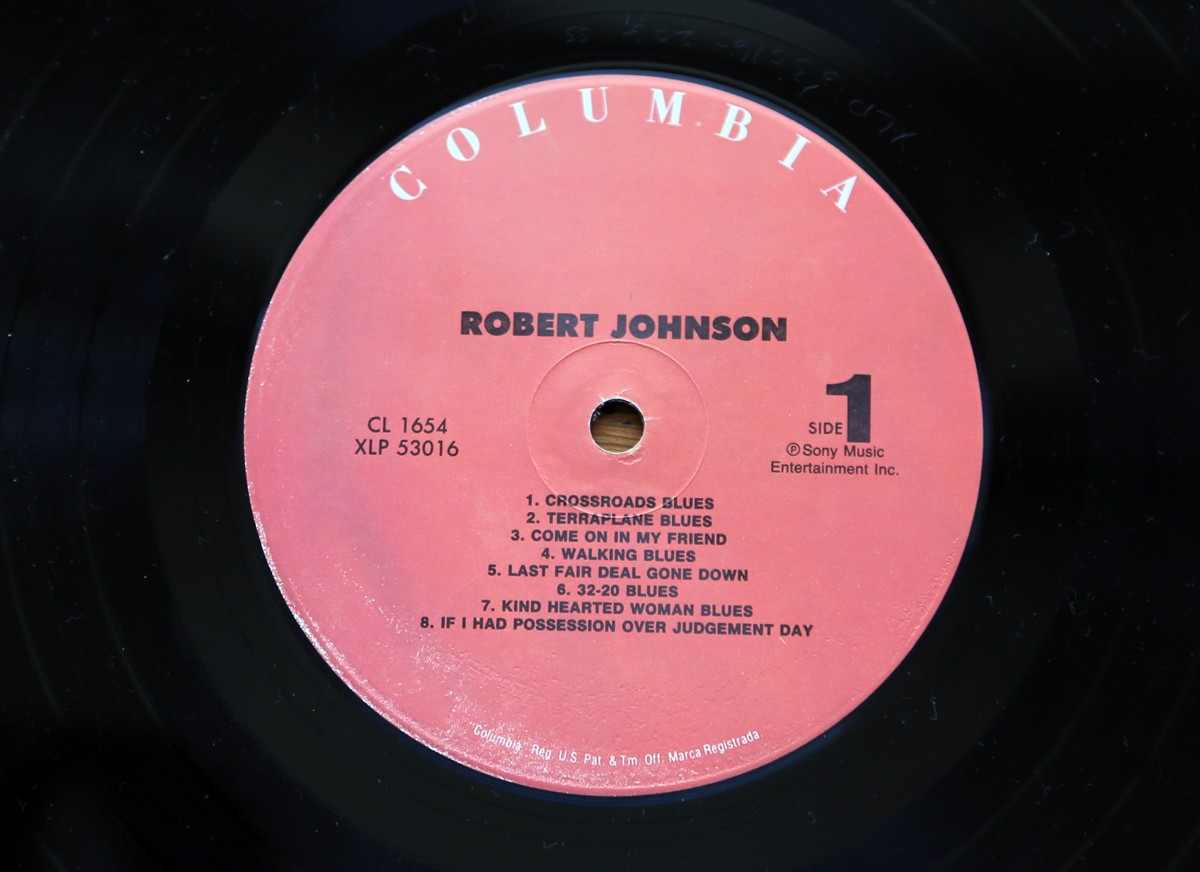
Record Centre Labels - part 2
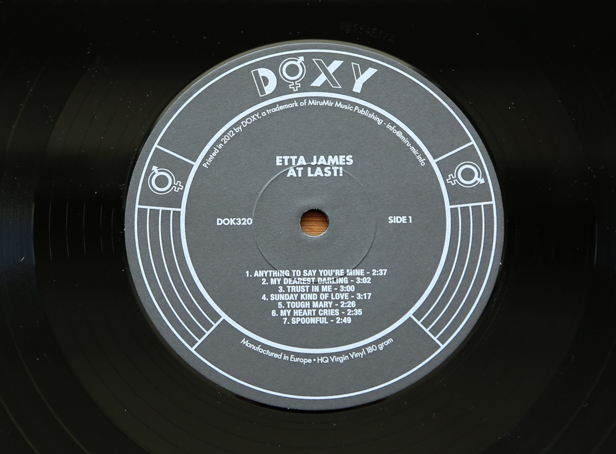
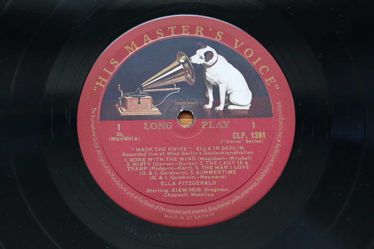
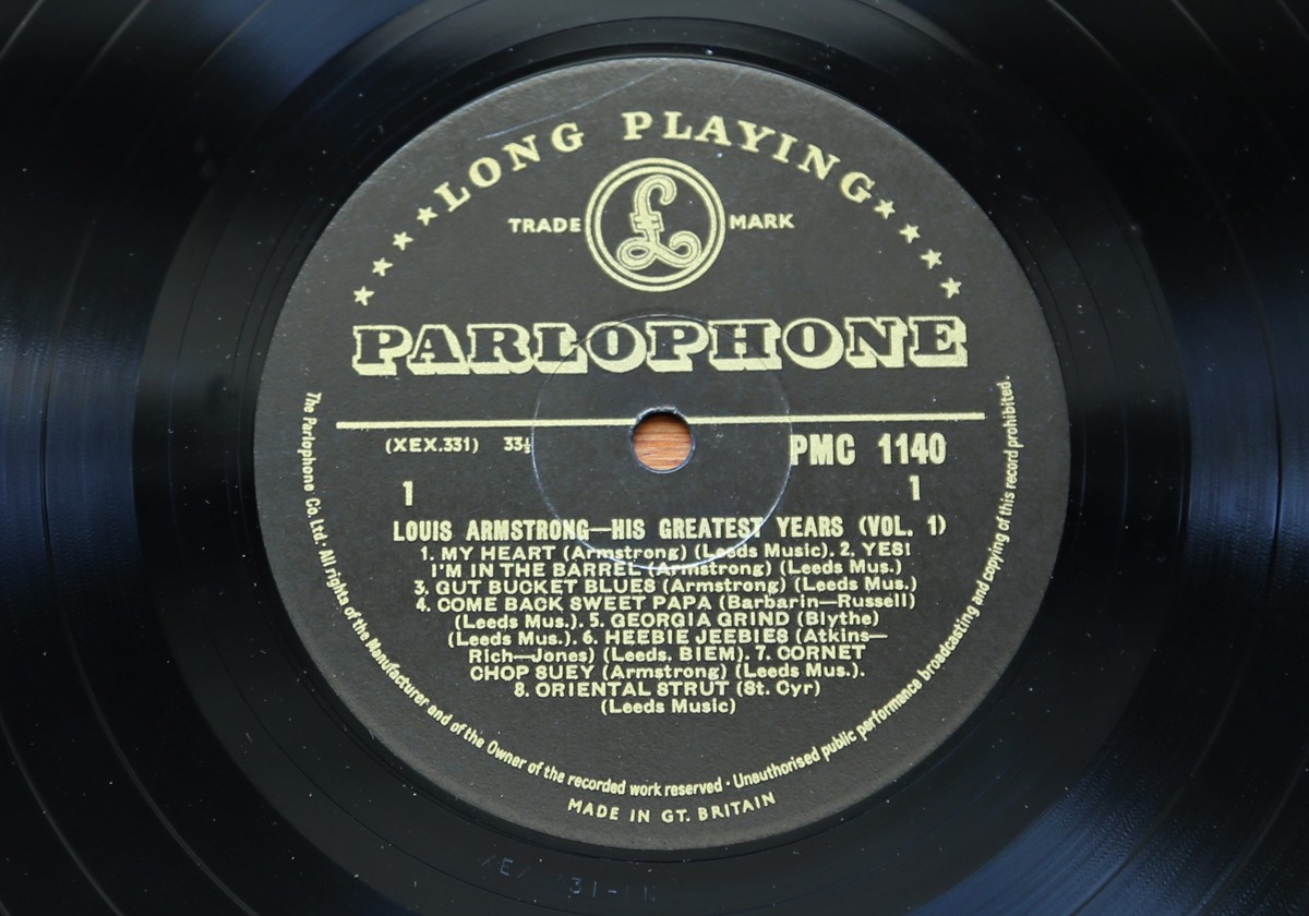
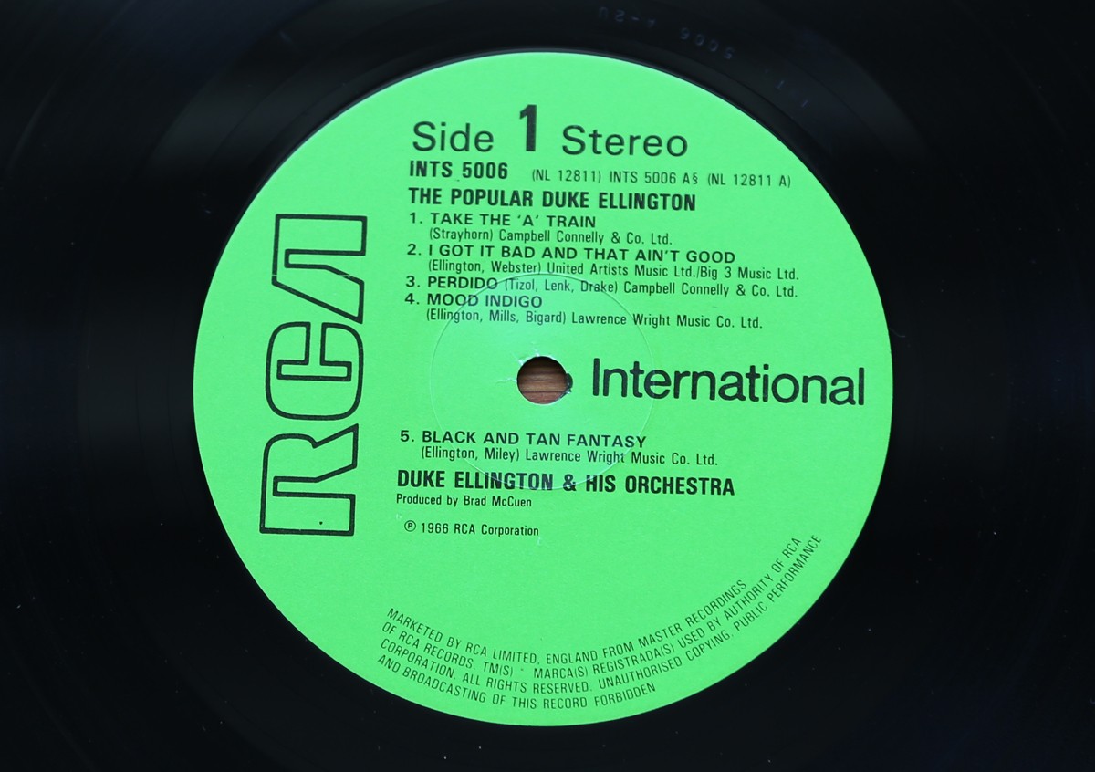
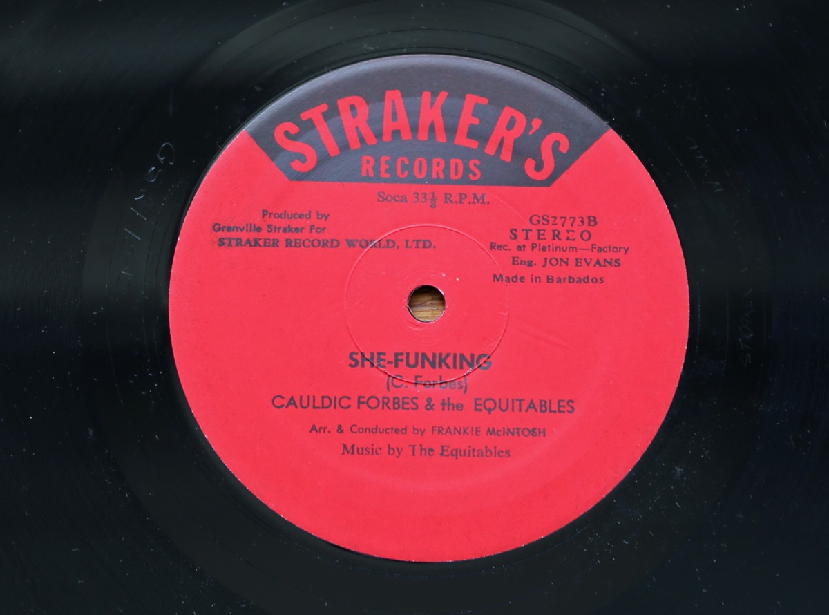
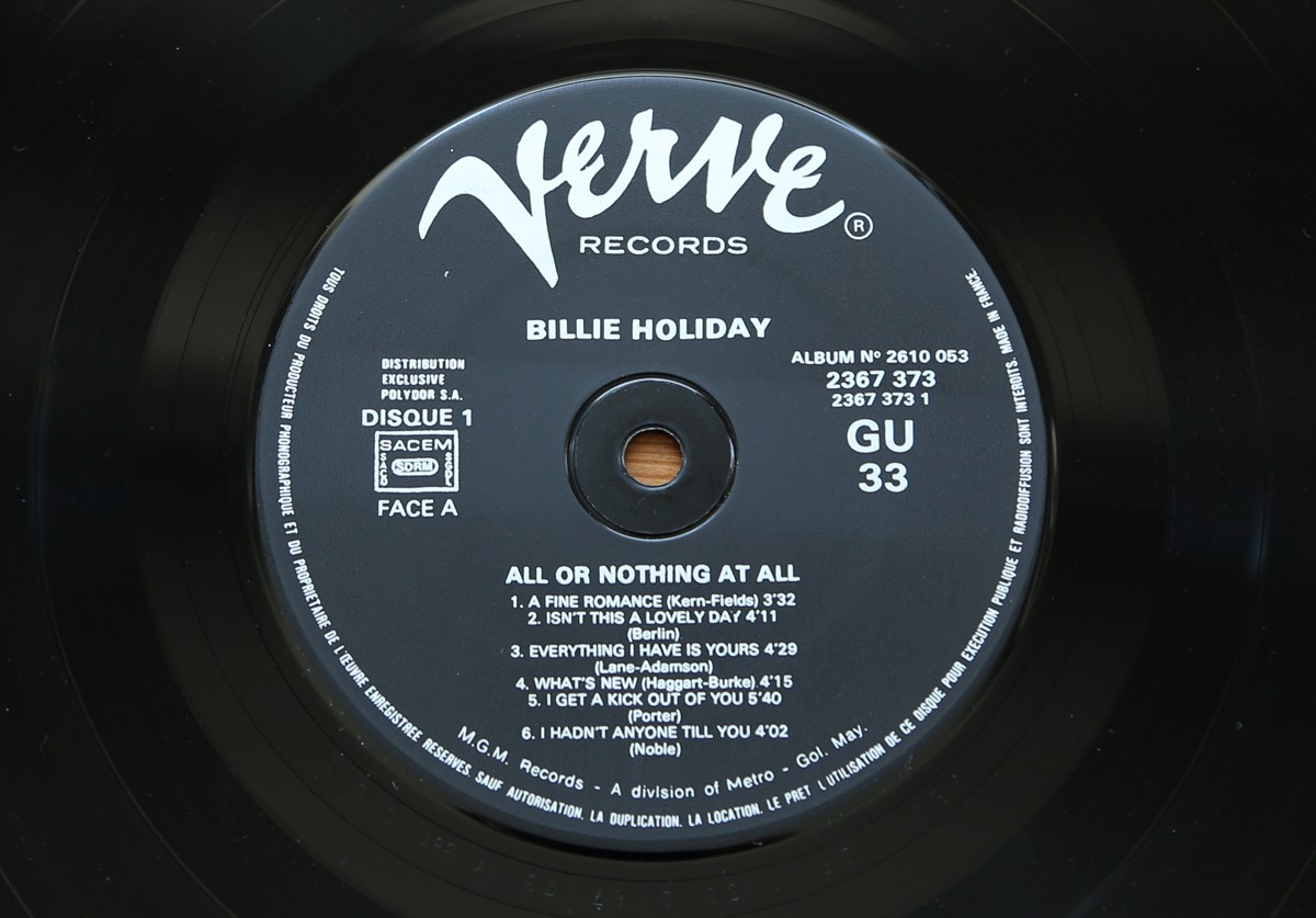
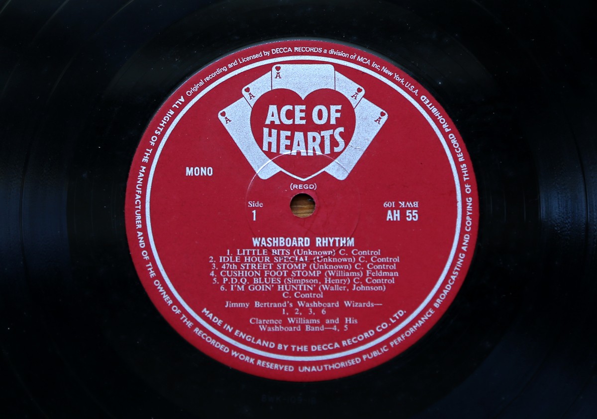
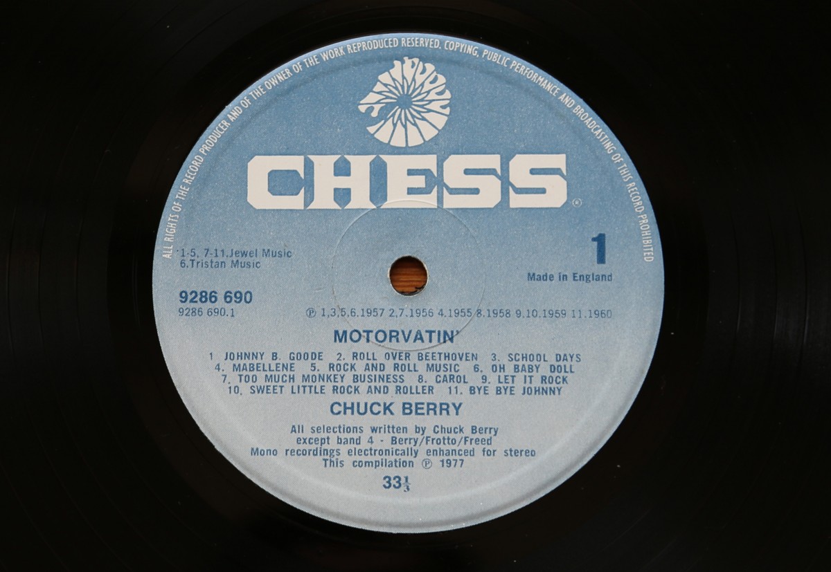
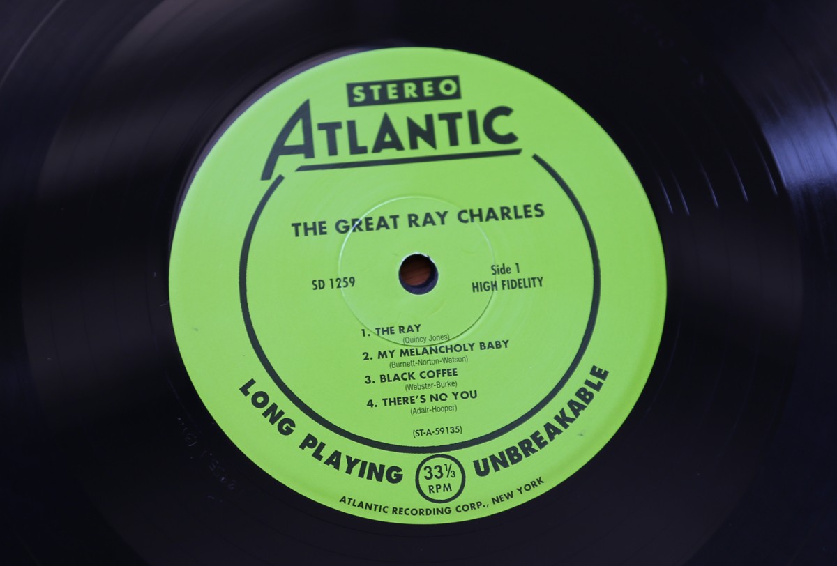
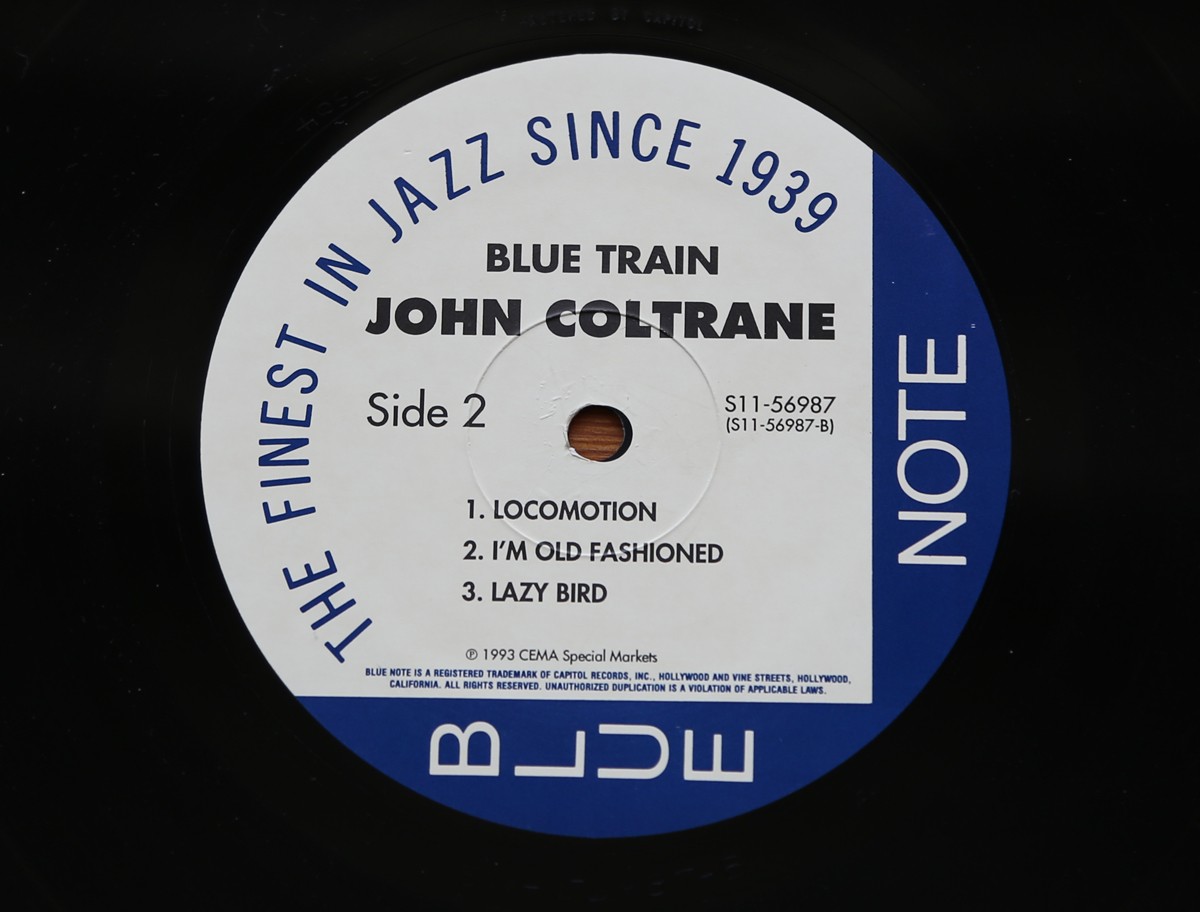
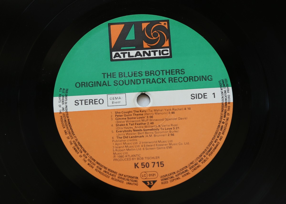
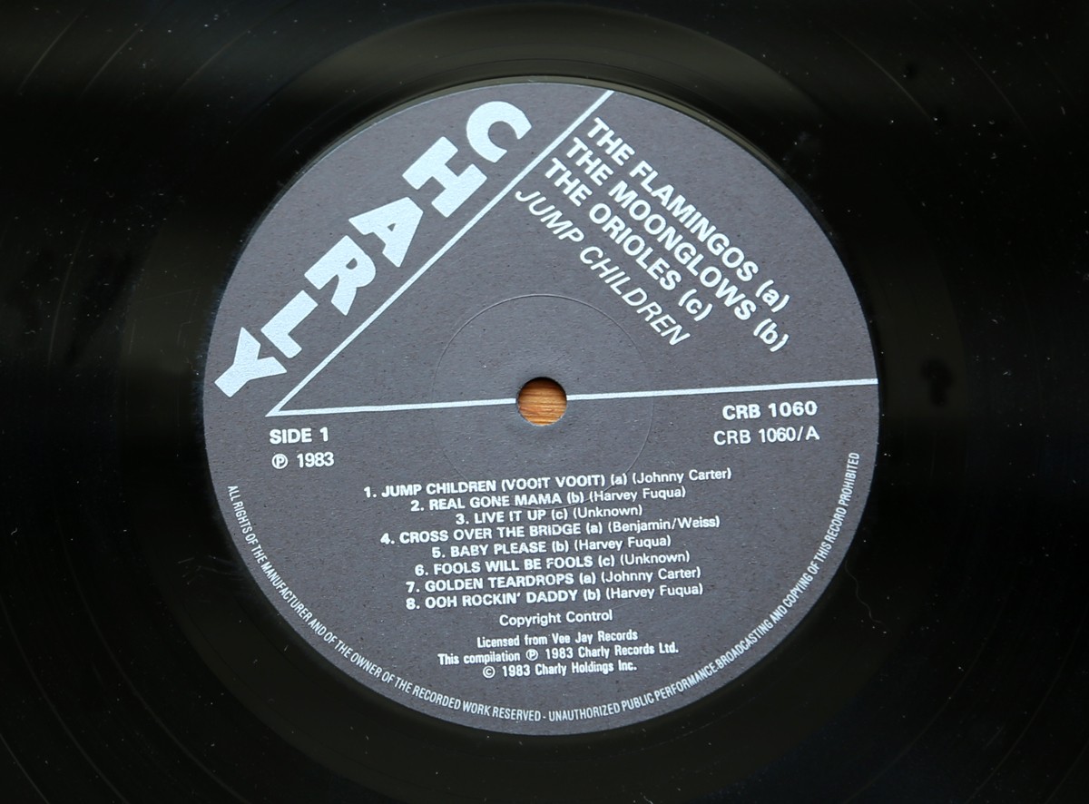
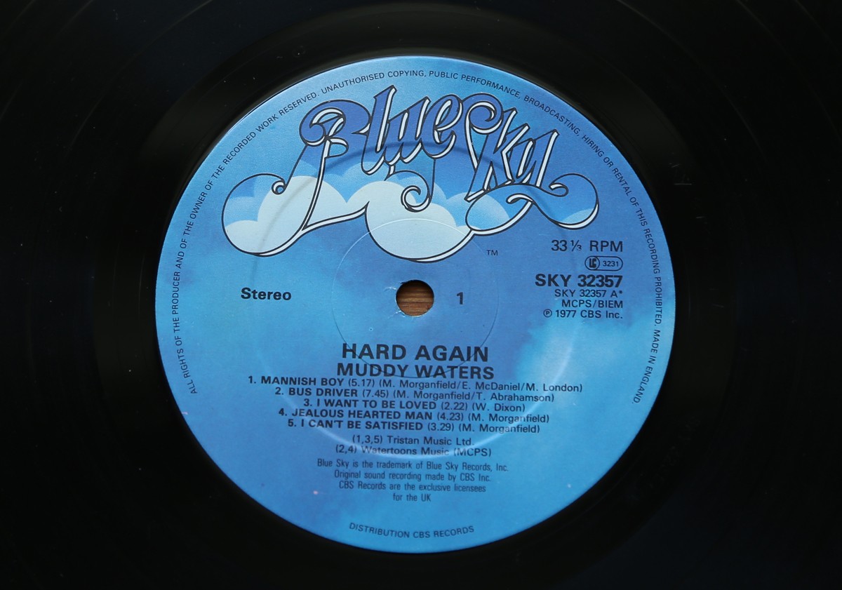
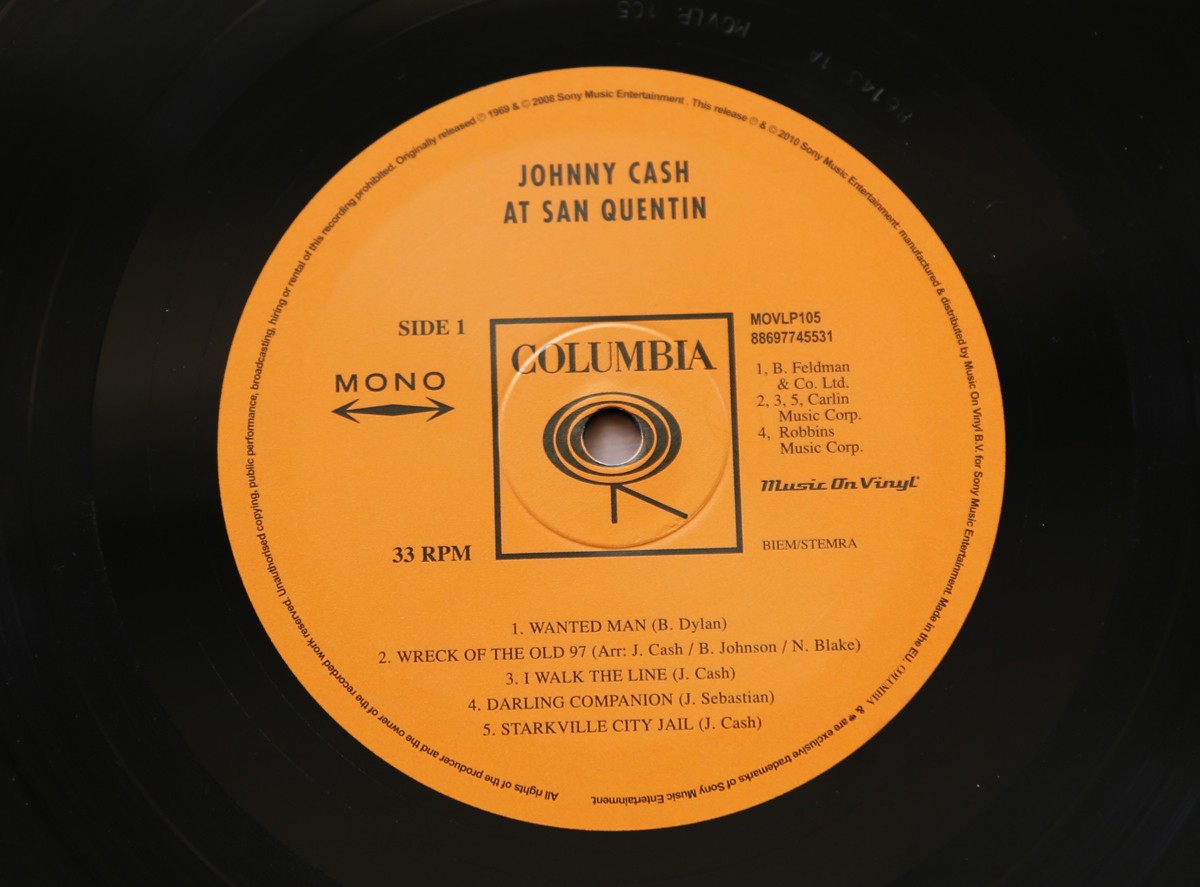
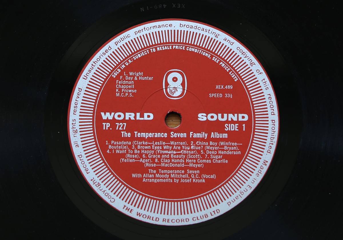
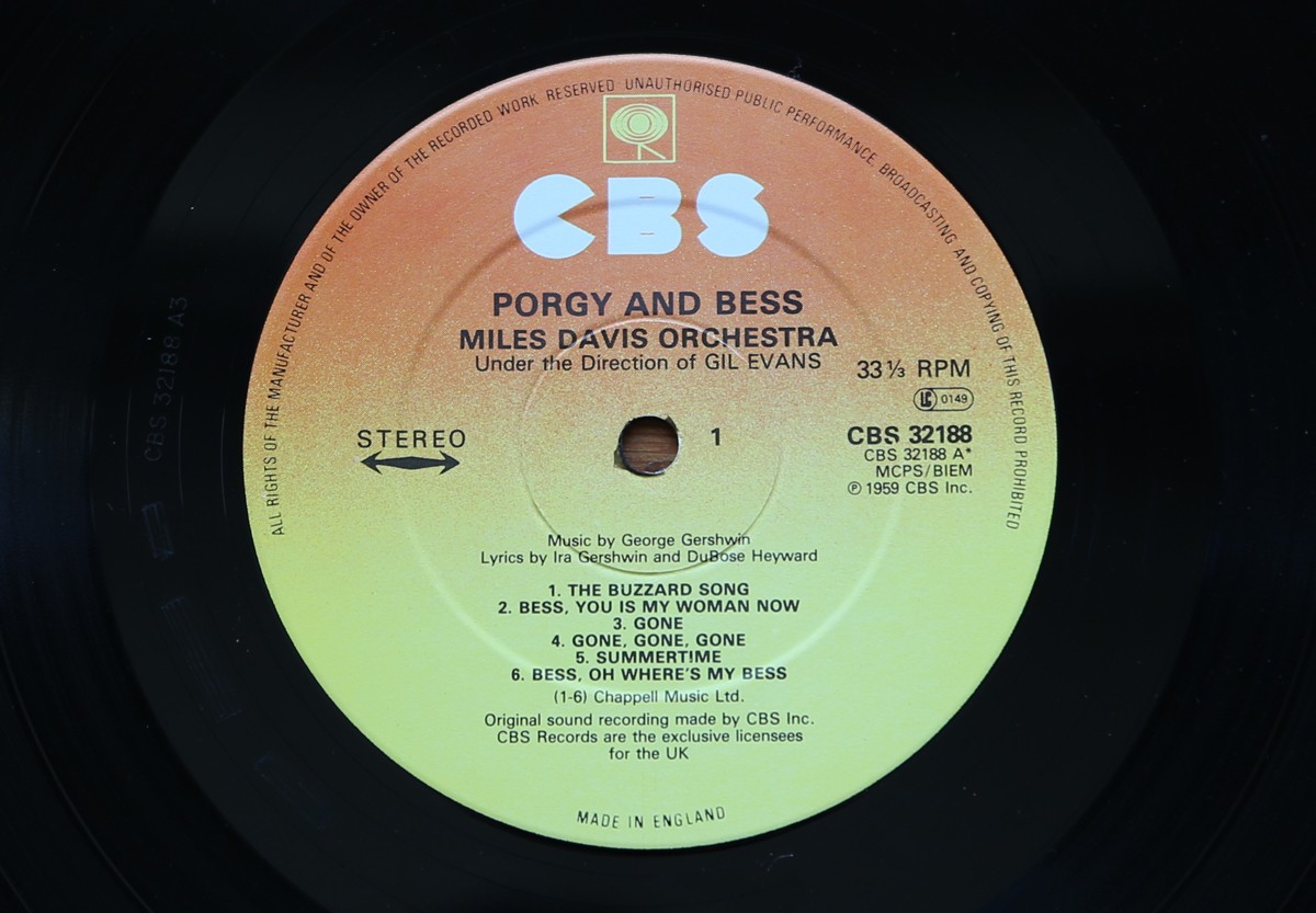
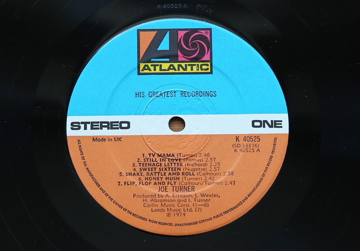
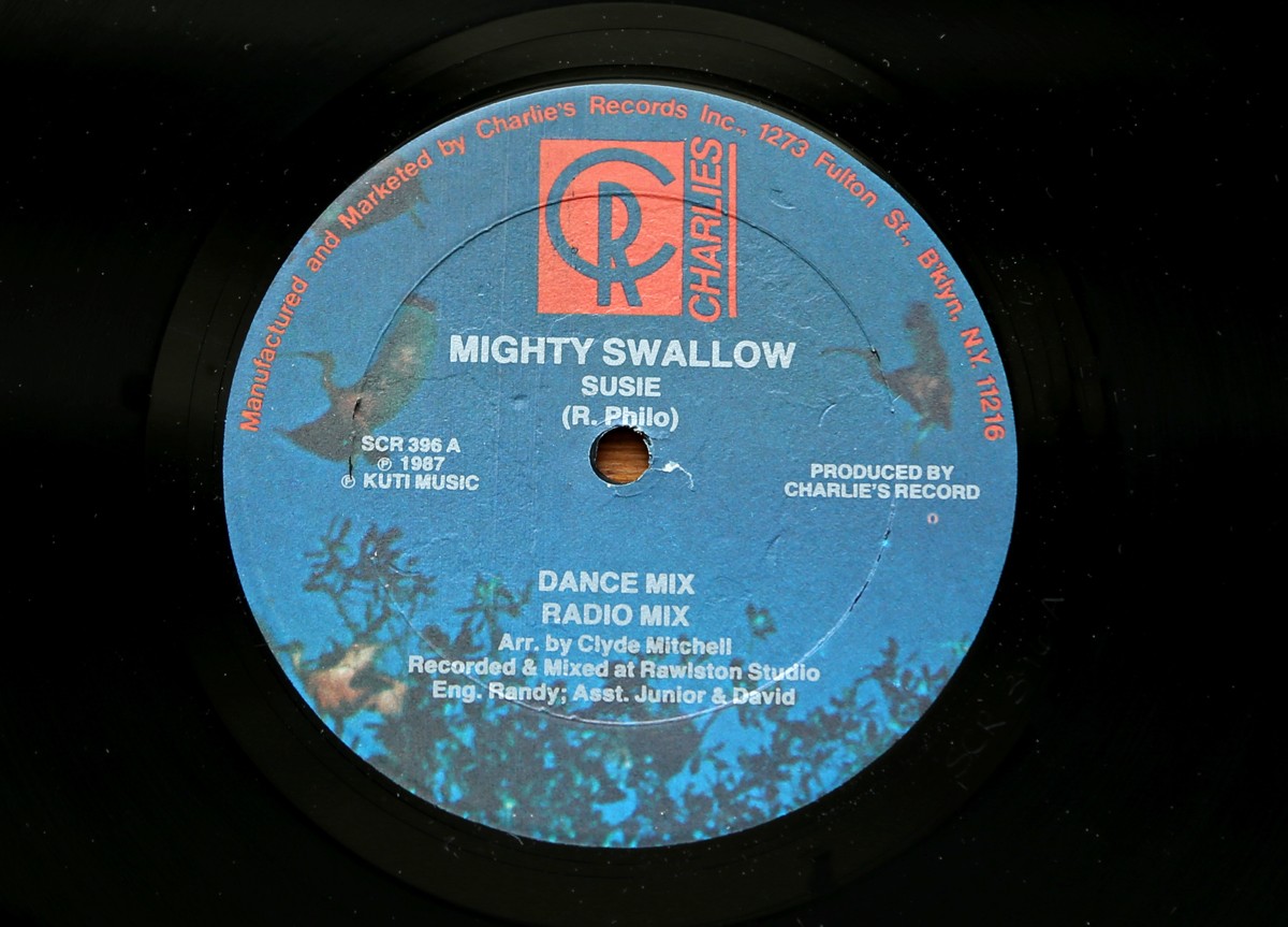
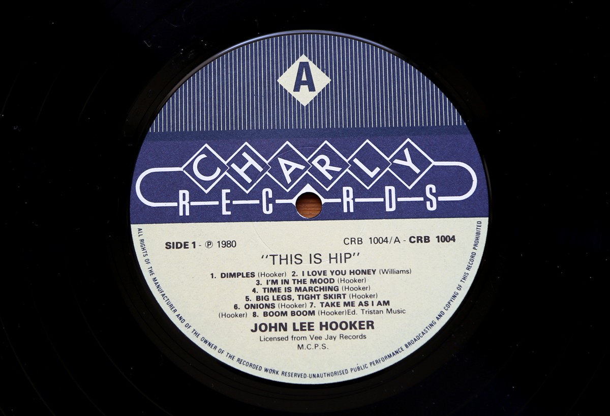
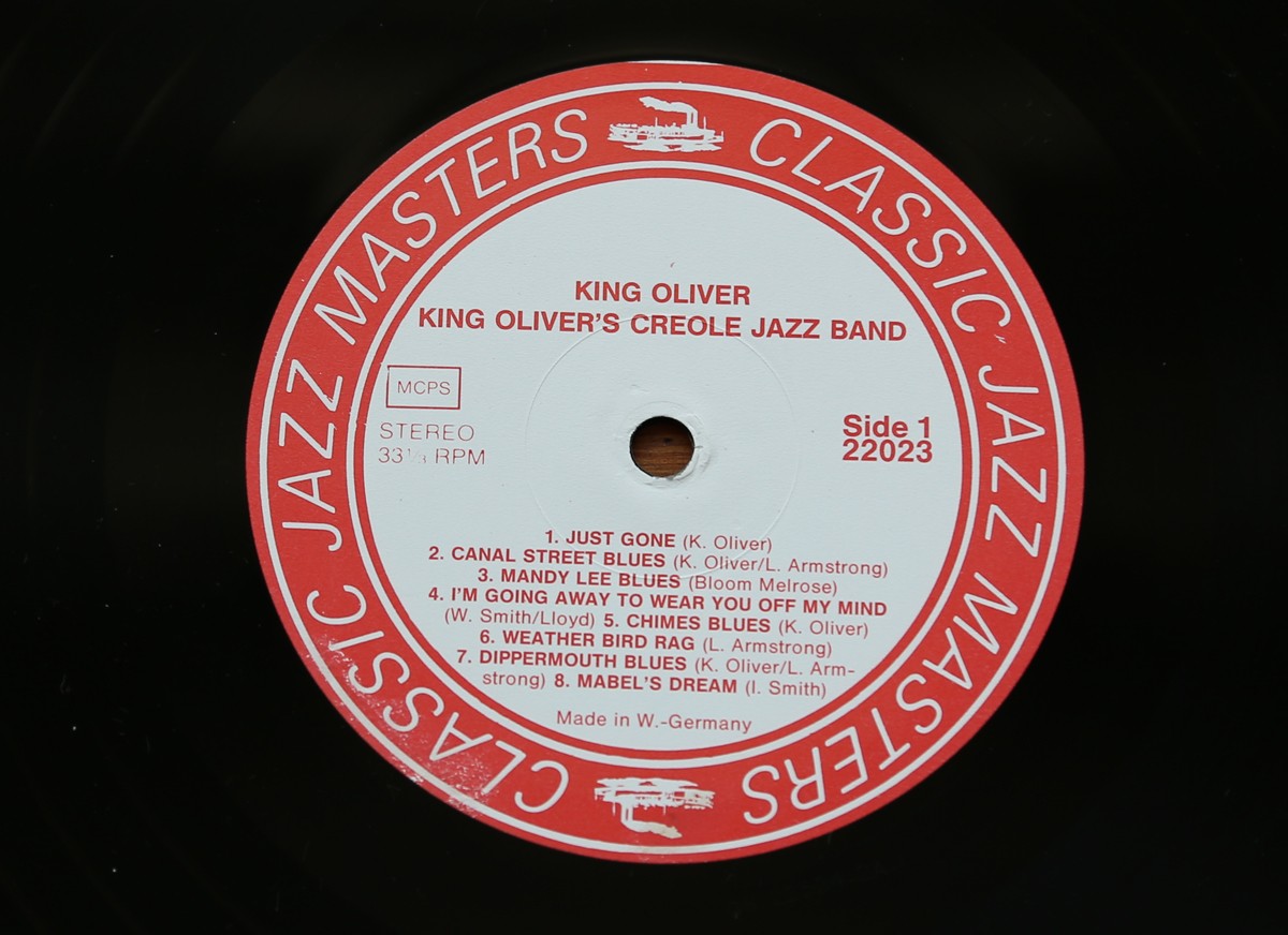
So here it is, part two of my record centre label collection...
They're all great, but I love the simplicity of the Columbia label and the lettering on the Verve label the most.
https%3A%2F%2Fwww.deliciousindustries.com%2Frecord-centre-labels-part-2
Delicious+Industries%3A+Record+Centre+Labels+-+part+2
Patrick Caulfield at Tate Britain
Pin this on Pinterest
 View large image
After Lunch, 1975 © The Estate of Patrick Caulfield. All rights reserved, DACS 2013
Pin this on Pinterest
View large image
Café Interior, 1973 © The Estate of Patrick Caulfield. All rights reserved, DACS 2013
Pin this on Pinterest
View large image
Bishops, 2004 © The estate of Patrick Caulfield. All Rights Reserved, DACS 2013
Pin this on Pinterest
View large image
Pottery, 1969 © The estate of Patrick Caulfield. All Rights Reserved, DACS 2013
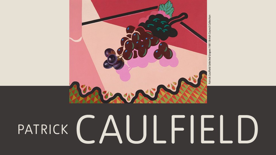
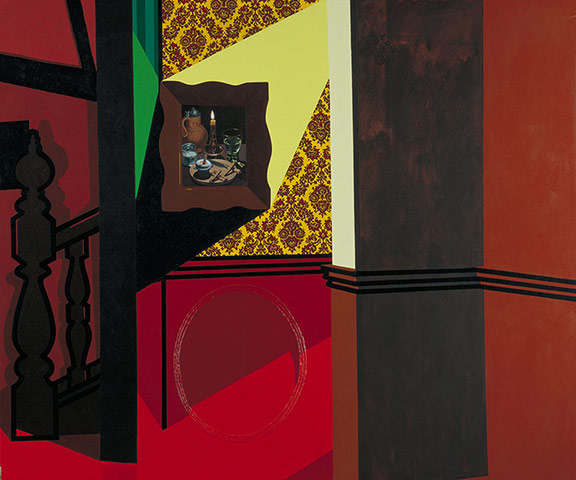
Last week I took a trip over to Tate Britain to see the Patrick Caulfield exhibition and wow, was it worth it. Such amazing work; graphic, colourful, witty and enormous!
The exhibition follows his artistic career chronologically from the early 60s when he left the Royal College of Art through many iconic pieces to some of his last paintings in 2005.
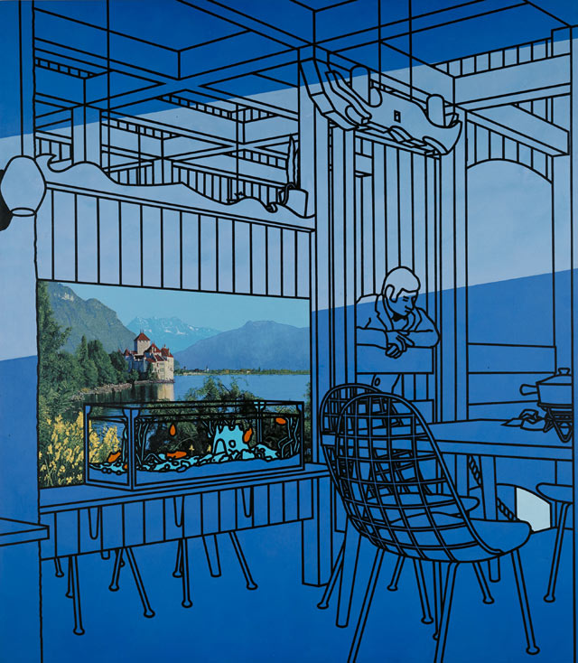
Caulfield's work was influenced by cubism and rather than use traditional painting techniques, he developed a unique graphic style with simplistic shapes, flat colours and black outlines - a style more associated with commercial signwriters. It was great to see this style develop and become perfected as I moved through the exhibition/ years.
Anyone in any doubt over whether he could paint in a more traditional style will be blown away by the realism in some sections of his paintings. For example, take a close look at the landscape picture in After Lunch (above) - you would be forgiven for thinking it was a picture postcard, but it is in fact an extremely detailed landscape painting. The brass door handles in Bishops (above) are another fine example of his traditional painting pedigree.
These areas of detail surrounded by over-simplified objects and flat coloured backgrounds are typical of Caulfields work. They created what he thought was a reflection of how our memories record information, "I find that in treating things in different ways, they become a point of focus. It's the idea that one doesn't encompass everything, and that your eye can look around and see things. I'm not so sure whether it's your eye or whether it's that your memory remembers things in different ways. There seems no reason to treat everything evenly. It's more like a collaged memory of things. Some of the things are in sharp focus, and others, if you like, symbolise the object".
The exhibition runs until 1st September 2013 at Tate Britain.
https%3A%2F%2Fwww.deliciousindustries.com%2Fpatrick-caulfield-at-tate-britain
Delicious+Industries%3A+Patrick+Caulfield+at+Tate+Britain
Record Centre Labels - part 1
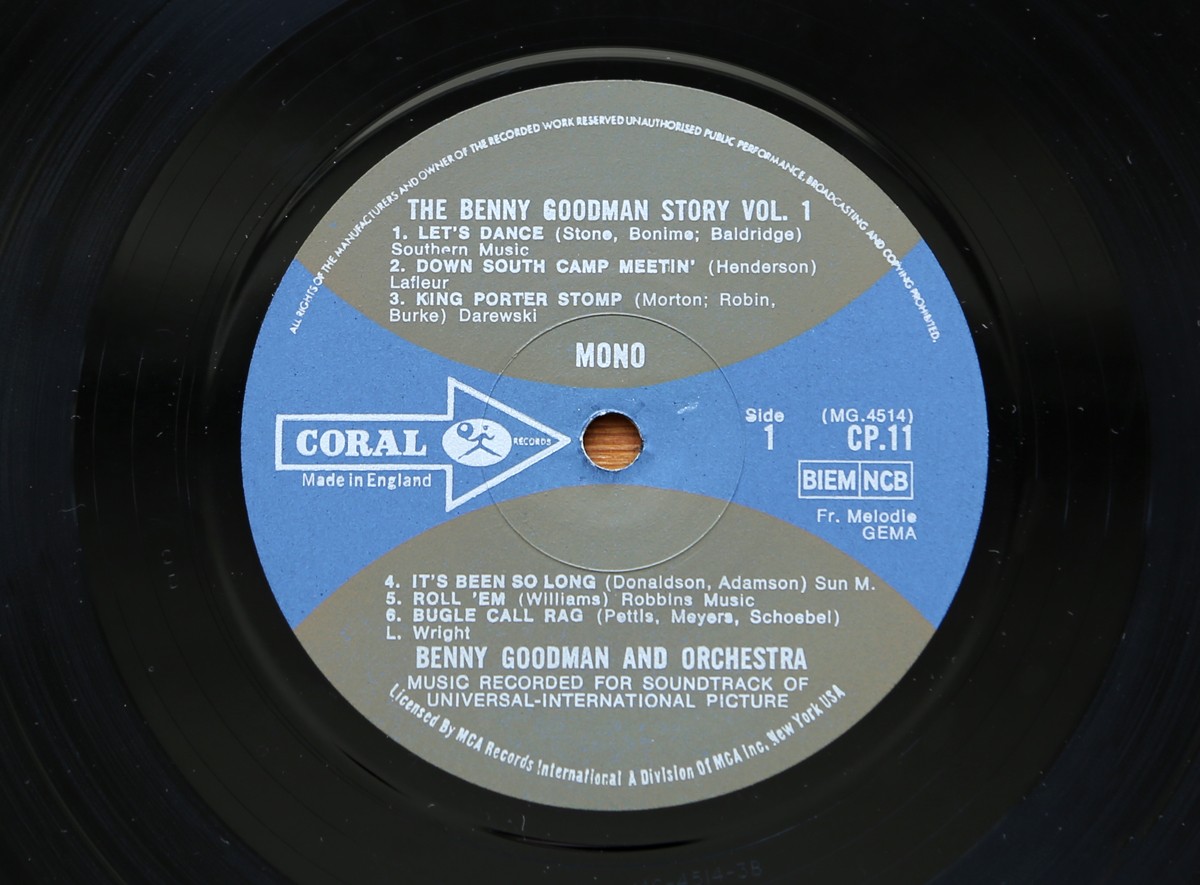
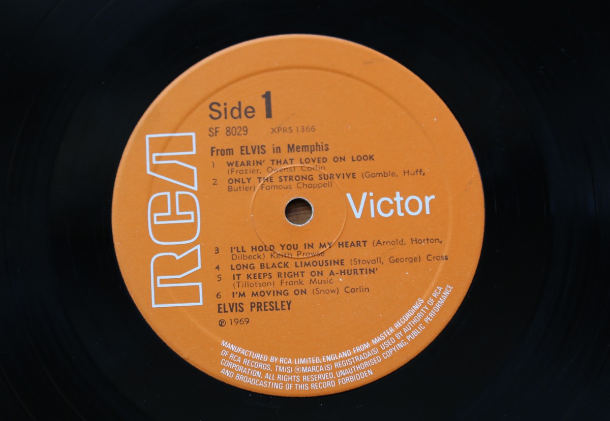
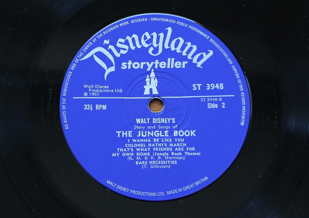
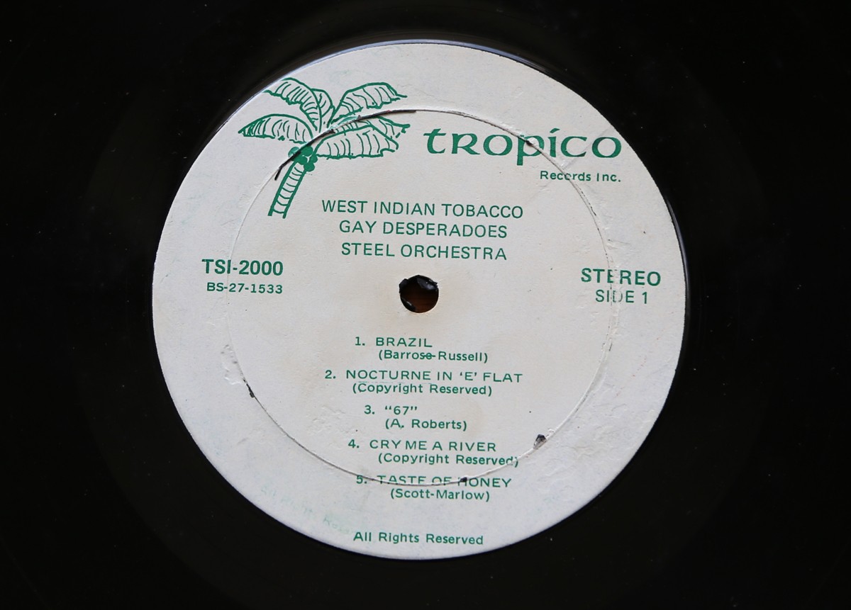
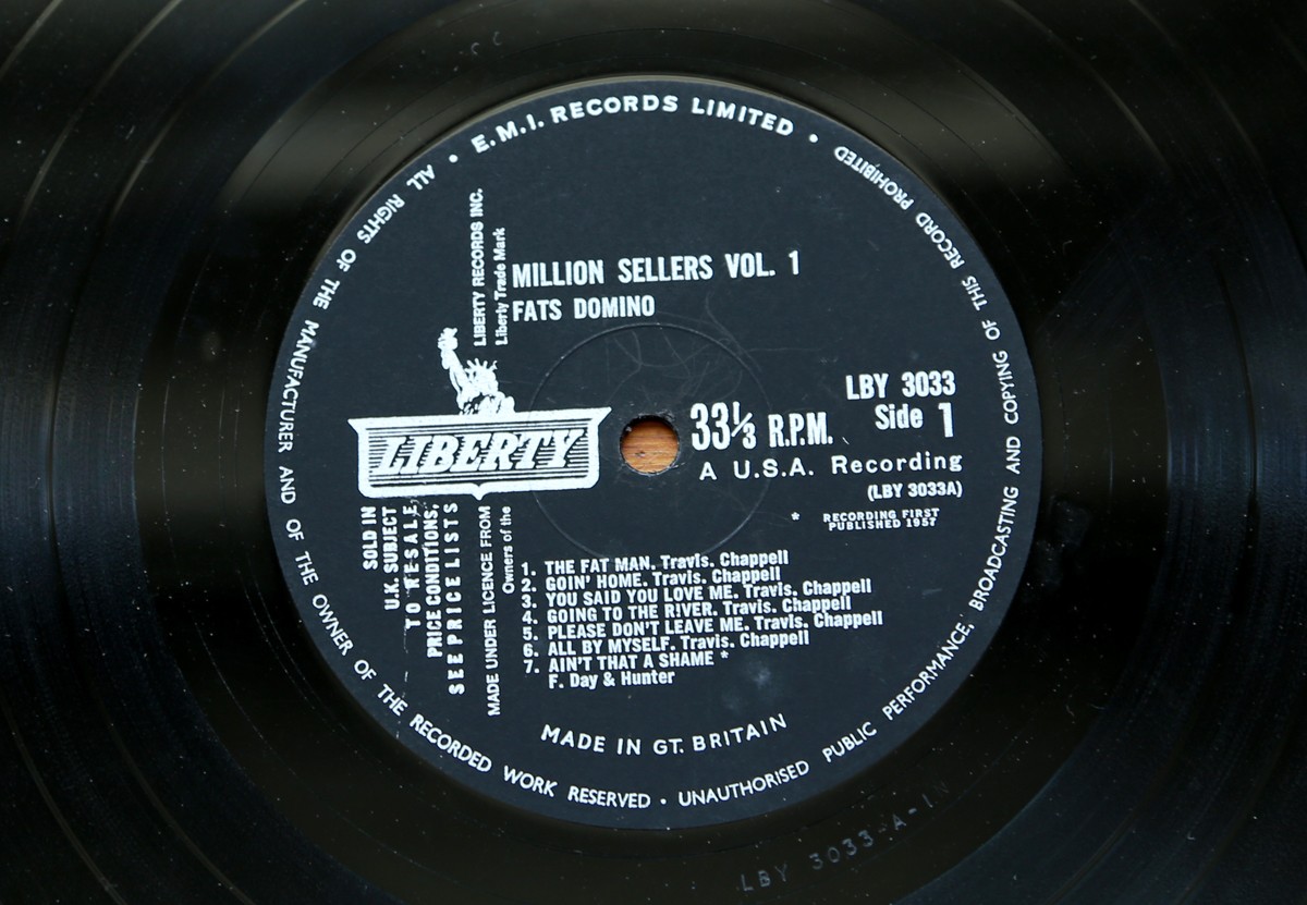
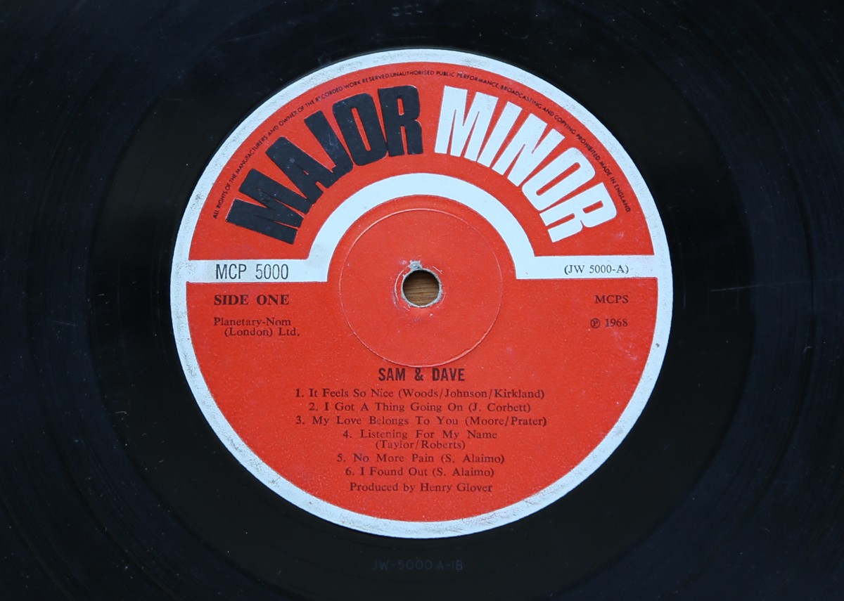
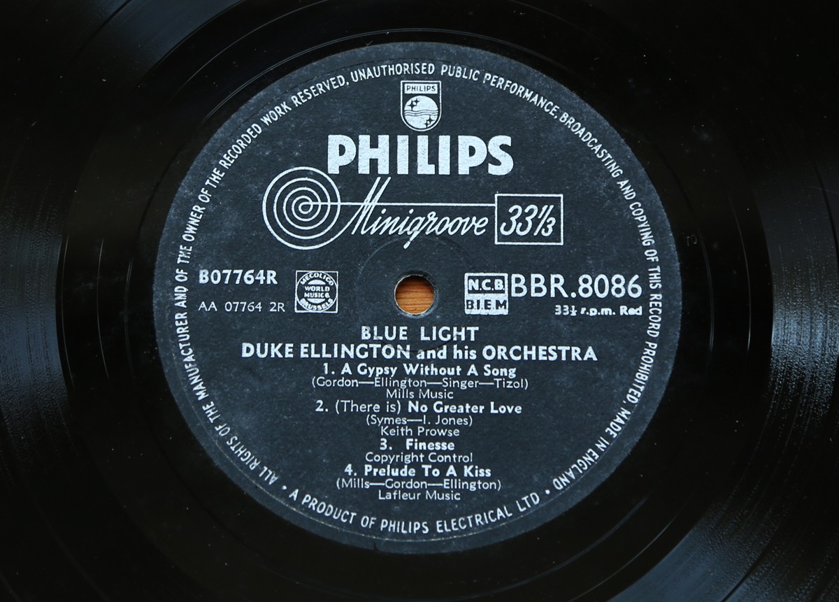
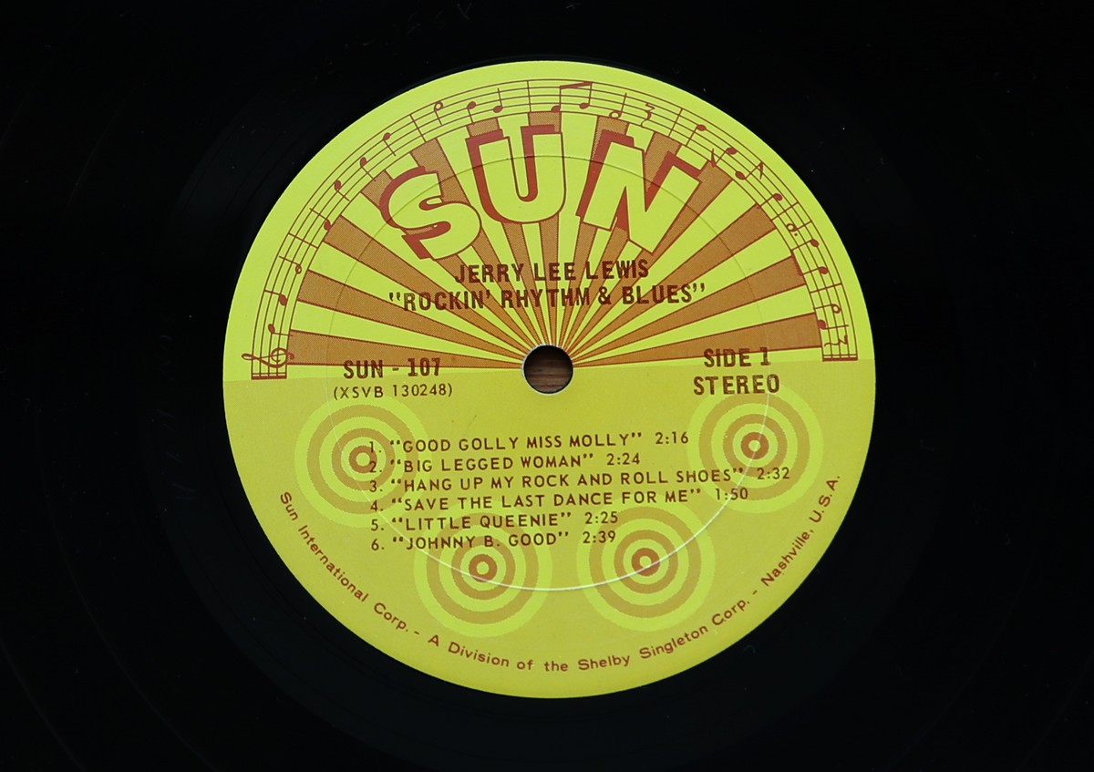
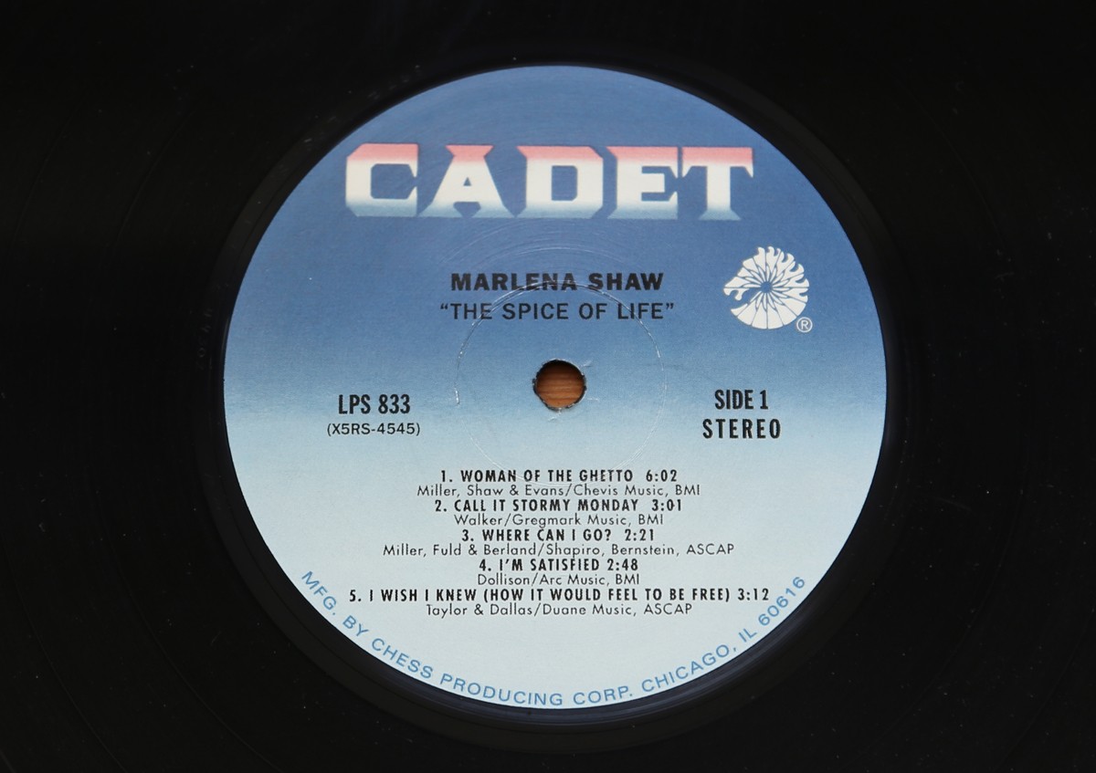
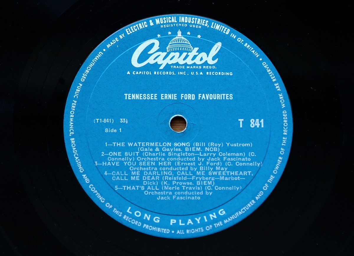
Part one of my record centre label collection.
Most range from the 50s to 70s with the odd later one thrown in for good measure.
When I buy vinyl it's always exciting to see the label - I enjoy the labels almost as much as the music and always more than the covers.
Watch out for part two next week.
https%3A%2F%2Fwww.deliciousindustries.com%2Frecord-centre-labels-part-1
Delicious+Industries%3A+Record+Centre+Labels+-+part+1
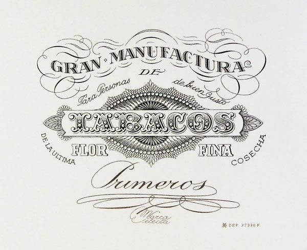
Vintage Cigar Labels
EE9s2ufFjpBR5sVoJ_Tw~~60_57.jpg)
f!~~60_57.jpg)
cE9s4PsNKSBR5sT)tCcQ~~60_57.jpg)
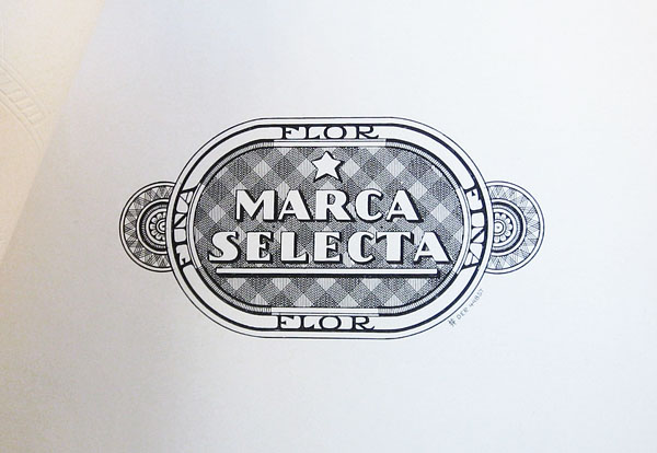
These beautifully detailed and lettered cigar labels are from a collection over on Letterology. It's an interesting post showing the elaborate designs introduced to establish more sophisticated looking brand styles and prevent counterfeits being easily produced. Check out the full post here.
Images copyright Letterology.
https%3A%2F%2Fwww.deliciousindustries.com%2Fvintage-cigar-labels
Delicious+Industries%3A+Vintage+Cigar+Labels
Welcome

Welcome to the Delicious Industries blog. We're an independent design studio based in Brighton, UK and this is our scrapbook packed full of design, illustration, photography & typography inspiration. Check out our work here.
Links
DELICIOUS FRIENDS
DELICIOUS FAVOURITES
- 50 Watts
- Acejet 170
- Grain Edit
- It's Nice That
- National Geographic Found
- Notcot
- Pretty Clever
- Retronaut
- So Much Pileup
- We Love Typography
- Another Mag