Blog: October 2008
Great Beermats / Coasters

Love this beermat on Sell! Sell!, they've posted some of their fine collection, and question - Are beermats under-exploited?
I think they have a good point, because although almost every bar has beermats or coasters, they're rarely designed well and I can't remember the last time I saw one that I wanted to keep.
Anyway at least we can still find gorgeous, vintage ones!
Food Wheels

How cool are these food wheels? They're made by Chew On This a New York company started by chef, Carlin Greenstein and designer, Annie Stranger to educate people on the benefits of eating locally grown produce.
The top left wheel is an Illustrated Guide to Forty Culinary Herbs, designed to help the user identify the most commonly used herbs and gives tips on the reverse for storage and recipes.
The top right wheel is The New York Area Food Wheel, a guide to the best and most widely available, locally grown produce (local to NY that is) at different times of the year.
I absolutely love moving diagrams and charts, so hopefully the kind people at Chew On This will mail to the UK. Not sure the NY Area wheel will be much use to me over here, but it will look great!
Images copyright Chew On This.
Via SwissMiss.
1950's Automotive Industry logos


The Chilton's Motor Age publications not only have great covers but they are packed with great adverts and typography for automotive companies and parts manufacturers. I love how 50's they all are and how great the typography is - above are my favourites, but if I had to only pick one, it would be the top one (Wix).
Happy Birthday Vic!

We would like to wish Vic at Sell! Sell! a very Happy Birthday!
Enjoy your cupcakes!
Sadly we're not too clever in the kitchen, so these delightful cupcakes are from Treacle & Co.
Chilton's Motor Age Covers


Whoo hoo! These arrived today - I bought them a few weeks ago and actually forgot about them, so it was a very nice surprise when they arrived this morning.
They are Chilton's Motor Age covers from 1958. The designs are really modern and graphic. I especially like the gauges on the November cover and the giant 59's used for December's.
Reading some of the articles and seeing no cover price, I get the impression it was a trade publication sent out to mechanics and car dealers (I could be wrong about this so if you know different please let me know).
The great Hans Schleger

Art & Industry covers (colour coded by month), 1950

Manual covers for Fisons Pest Control, 1956-64

Type style and shop posters for Mac Fisheries, 1952-59

Showcards and adverts for W.Raven & co Ltd., 1946-50
I found a copy of 'Zero: Hans Schleger - A Life of Design' last week and have been absorbed in it since - there are just so many truly great pieces of design in it. Schleger's wife and design partner, Pat Schleger collated the book in 2001 as a retrospective of his work.
Schleger was originally from Berlin and became one of the first 'émigré' artists/designers to take the modernist approach of European advertising to the US in the mid 20's. He returned to Berlin briefly in 1929, but emigrated to the UK when Hitler came to power. Pat joined his studio as a designer in 1949 and they married 7 years later. Together as Hans Schleger Associates they created identities and promotional material for high profile clients including Penguin, British Rail and the Edinburgh International Festival. Hans died in 1976 but Pat kept the company going and continued producing fantastic work for the Royal Academy and the BBC Symphony Orchestra.
I particularly love the work they did for the Edinburgh International Festival (below) from 1966, when they designed the first festival logo, through to 1978.


All images copyright Pat Schleger.
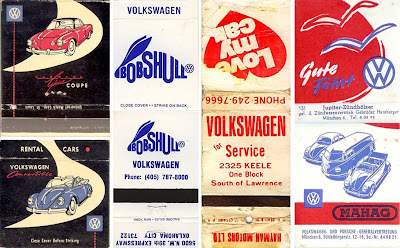
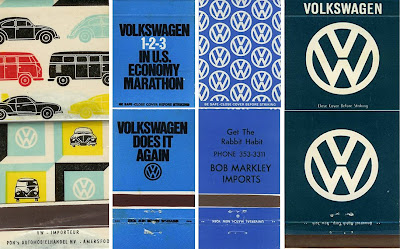
Volkswagen Matchbooks


I found these on the Samba, a US VW forum - VW's and vintage matchbook covers - 2 of my favourite things combined. What a delight! It's a really good collection, ranging from the 50's to the 70's.
More matchbooks here and here.
From the reference box #26


These luggage tags are from the 70's and came in the lot of free ephemera I got from the carboot sale the other week. I love the dense black type and the lovely red numbers on the first one and on the second it's the little, very detailed, plan of the plane that does it for me. If only the baggage handler had been more considerate all those years ago and not stuck a super sticky label over it!!
#26 - 70's luggage flight tags.
Found Type at the De La Warr Pavillion


I saw this lovely type at the weekend on a 1930's beach shop & cafe in Bexhill-on-Sea whilst visiting the magnificant De La Warr Pavillion on the seafront there.
For those that don't know about the De La Warr Pavilion, it's a recently refurbished Grade One listed Modernist building originally commissioned by the 9th Earl De La Warr in 1935 and designed by architects Erich Mendelsohn and Serge Chermayeff.
It was the first public Modernist building in the UK and is simply stunning. All the original features including the iconic corkscrew staircase have been fully restored and the building now houses a cafe/restaurant, shop, auditorium and 2 galleries. You really can't beat a cream tea sat on the balcony overlooking the seafront!


Slow Fashion Movement

Here's a fun little job that came out of the Delicious studio this week - a logo to accompany and brand Make Do & Mend's, 'Slow Fashion' movement (values listed above) that can be downloaded by followers and added to their sites to show support.
1950's Geigy Advertising


Geigy where a world-famous pharmaceutical and chemical company in the 50's and 60's who joined with Ciba in 1970 to form Geigy-Ciba who in turn merged with Sandoz in 1996 to form the pharmaceutical giant Novartis still going strong today.
Back in the 50's though Geigy, a Swiss company, where pioneers in the pharmaceutical industry with their bold, typographic advertising and design style. Their advertising adopted the current trends in Swiss typography and design such as using predominantly sans serif faces (Berthold's Standard Bold being a favourite) and maintaining a minimal, 'clinical' feel to the layout design.
In a somewhat conservative industry, this was a brave step, but very successful, creating an instantly recognisable brand. During the mid 50's they started advertising in the UK using the same design and typographic style (above are a selection of the first British leaflets). The article below, from Print in Britain, January 1958, discusses this wonderful house style, how they introduced it in Britain and how it was received.


Print in Britain


I won these issues of Print in Britain on Ebay last week for next to nothing and they arrived this morning. I can't find much out about the publication other than it was "A monthly magazine for everyone in the printing industry", published on Orange Street in London and art directed by J couper.
The earliest copy I have is from July 1955 which is Volume 3, Number 3 so I'm guessing it started in 1953. Most of the issues are in two colours (black and a bright colour) which are used really well throughout. I like the use of the overlay in the spread below.

At least half of the publication is taken up with advertising - there are ads for printing presses, inks, design, typefaces and paper samples which are all great, but here are my favourites:

I particularly like the big numbers, but that goes without saying!
Alan Aldridge at the Design Museum


The Design Museum is showing the first UK retrospective of illustrator and graphic designer, Alan Aldridge "The Man with the Kaleidoscope Eyes" until January 2009.
Aldridge was born in London, but has lived in LA for 25 years. He became huge in the swinging 60’s with his unique style of psychedelic illustration on the Beatles lyric book and iconic album covers for the Rolling Stones, Elton John and The Who. During this time he was also the Art Director at Penguin and is said to have, “breathed fresh life into modern book cover design”.
The exhibition sounds great, “an elaborate display of complete works as well as sketches, notes, letters and other archival material as well as films; bringing to life the exciting career of Alan Aldridge”, and I can't wait to see it, but for anyone that can’t make it you can checkout his work and buy prints here.
Images copyright Alan Aldridge.
Windfall, the International Apple Computer magazine
Anyone remember Windfall, the International Apple Computer magazine? No I didn’t either, but I found a few issues at the weekend and thought they would be fun to read. Check out the 80's design too:


Windfall started in January 1981 and was the UK’s main Apple specialist magazine.
The main focus of the issues I have is the launch of ‘Lisa’, “the electronic office revolution of tomorrow’ - Apple's innovative micro computer with a unique operating system and a suite of programs allowing the user to word-process, draw, create spreadsheets and graphs and be able to print them all easily. The user-friendly, operating system used a desktop filing system (similar to how we use them today), had icons, went to sleep when not in use and remembered preferences. It was basically the forerunner to the operating systems we know and love today and it was the predecessor to Macintosh.
There are also some great ads for the Apple products with the old logo, and associated products:


In 1984 Windfall changed its name to the more familiar, Apple User - a title I do remember. Here are issues 1 & 2 – note the typo on the February issue covered up with a sticker! Underneath it says ‘January’!

The most interesting thing about these 2 issues is that they introduce the Apple Macintosh, the second in the Lisa family. Here’s the first article about the Apple Mac (Mouse Activated Computer):


Unfortunately by 1987 Apple had decreased in popularity in the UK, having never really found the market here for their advanced 16 bit IIg’s, and publications like Apple User fell by the wayside. Something that seems hard to believe looking at the dominance of Apple products in the UK market today!
The Criterion Collection


I came across The Criterion Collection over on Sell! Sell! this morning. It's a series of classic and contemporary films, re-released on DVD with restored picture and sound quality. Each title also has an original, newly designed cover to complete the package and some of them are really great - above are my favourites.
Welcome

Welcome to the Delicious Industries blog. We're an independent design studio based in Brighton, UK and this is our scrapbook packed full of design, illustration, photography & typography inspiration. Check out our work here.
Links
DELICIOUS FRIENDS
DELICIOUS FAVOURITES
- 50 Watts
- Acejet 170
- Grain Edit
- It's Nice That
- National Geographic Found
- Notcot
- Pretty Clever
- Retronaut
- So Much Pileup
- We Love Typography
- Another Mag

