Blog: May 2011
From the reference box # 108


#108 - Vintage French, Lait En Poudre (powdered milk) tin. This delightful 300g tin of powdered milk was produced by the Société France-Lait in St Martin Belle-Roche.
I love it's 2 colour print and the overprint created by the dark green on the excess pale green around the pale green type and graphics. I also like the little factory graphic on the France graphic.
Too pretty (and big) for the reference box, this one lives happily on the plan chest in the window enjoying admiring glances from passers-by.
See more vintage packaging and ephemera here.
https%3A%2F%2Fwww.deliciousindustries.com%2Ffrom-the-reference-box-108
Delicious+Industries%3A+From+the+reference+box+%23+108
AT Open House - Last Weekend!

AT Open House (42 Hendon St, Brighton) will be opening it's door 12-6pm, Saturday and Sunday for the last weekend of the Artist's Open Houses. We'll be down there tomorrow so if you're in the neighbourhood drop in and say hello.
There's plenty to see (and buy), it's 10 minutes from the seafront and there will be lots of lovely tea and cake - what more could you want from a day out?
Don't worry if you can't make it though, the web shop will remain open for a couple more weeks so you won't totally miss out!
https%3A%2F%2Fwww.deliciousindustries.com%2Fat-open-house-last-weekend
Delicious+Industries%3A+AT+Open+House+-+Last+Weekend%21
Paul Thurlby's Alphabet Book
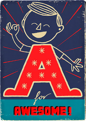
Well, his illustrated Alphabet has taken on a life of it's own since we last posted. The lovely letters are now available as signed/numbered, limited edition Giclee prints, as greeting cards and have just been made into a children's ABC book (below)!
Paul Thurlby's Alphabet will be published by Templar and released on July 1st. I for one can't wait to get my hands on a copy - I think it's going to be as popular with adults as it will with children.
Pre-order your copy here for only £8.69!
Images copyright Paul Thurlby.
https%3A%2F%2Fwww.deliciousindustries.com%2Fpaul-thurlbys-alphabet-book
Delicious+Industries%3A+Paul+Thurlby%26%23039%3Bs+Alphabet+Book
Amelia's Compendium of Fashion Illustration
Amelia is big on the values of social media and it's importance to the fashion industry - I agree and think the same goes for any designers and illustrators. I was amused to realise that I actually knew more about social media than the young, newly graduated fashion students also present, who didn't really know what Twitter was nevermind be on it!
Amelia's Magazine was first published in May 2004 and over the following 4 years Amelia produced 10 successful issues all championing the work of up and coming fashion illustrators, ethical fashion designers and ways to create a more sustainable future for our planet. In 2008, Amelia decided to cease publishing the magazine and concentrate all her efforts on it's fast-growing website, where Amelia's Magazine still lives on.
Amelia's compendium of Fashion follows the success of her first book, Amelia's Anthology of Illustration and "brings together the best illustration from Amelia’s Magazine alongside the best new ethical fashion designers". It showcases the work of 30 illustrators, features interviews about their design practice and profiles almost 50 of the very best ethical fashion designers working today including Fifi Bijoux, Minna, Partimi Prophetik and Ute Decker.
It's a really gorgeous book, packed full of inspiration and ideas - definitely one for the coffee table!
Keep up with Amelia's comings and goings by following Amelia Gregory and Amelia's Magazine on Twitter.
https%3A%2F%2Fwww.deliciousindustries.com%2Famelias-compendium-of-fashion-illustration
Delicious+Industries%3A+Amelia%26%23039%3Bs+Compendium+of+Fashion+Illustration
From the reference box # 107

#107 - 29 Embroidery Stitches, a vintage booklet issued by Clark & Co. of Paisley, Scotland.
In the early 1800's Patrick Clark invented a way of twisting cotton threads together to produce an alternative to silk thread which was unattainable due to the French blockade. Clark & Co. opened their first cotton thread plant in 1812 and went on to offer a range of embroidery threads called 'Anchor Embroidery Threads'.
Clark & Co. merged with J & P Coats in 1952, dating this charming little booklet in the late 40's or very early 50's (I've also read that they merged in 1896, but there is no way this booklet is that old!).
The introduction encourages, "Try out some of the less well-known stitches and you will find a fresh absorbing interest in embroidery". There's a comprehensive guide to the correct threads, fabrics and needle sizes (see below) as well as a lovely illustration demonstrating the correct technique for each of the 29 stitches.


For more fabulous ephemera, have a rummage through out Reference box!
https%3A%2F%2Fwww.deliciousindustries.com%2Ffrom-the-reference-box-107
Delicious+Industries%3A+From+the+reference+box+%23+107
Dana Tanamachi's Chalk Lettering
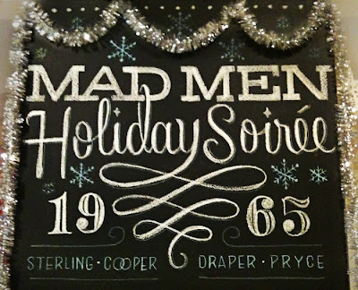
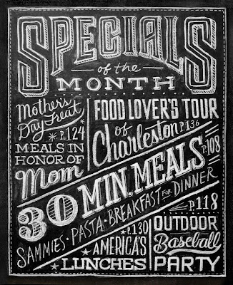
This fantastic chalk lettering is the handy work of Brooklyn based graphic designer, Dana Tanamachi. Her chalky masterpieces have adorned the walls of The Ace Hotel, NY, The Wes Anderson, Brooklyn and Google's NYC offices among many more.
I love her type choices and I'm amazed at the amount of detail and definition she can get from a piece of chalk! As you can see in these time-lapse films she works completely freehand, sketching and re-sketching to get the desired design (see below).
I would be terrified of smudging it right at the end, or of someone else smudging it! Although that vulnerability does add to their charm.
https%3A%2F%2Fwww.deliciousindustries.com%2Fdana-tanamachis-chalk-lettering
Delicious+Industries%3A+Dana+Tanamachi%26%23039%3Bs+Chalk+Lettering
Vintage Circus Posters


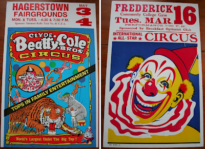

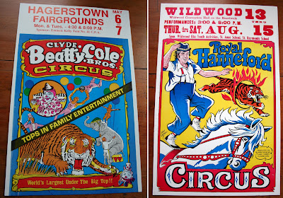
These gorgeous, vintage circus posters have been tucked away here for quite a few years. They're American and mostly from the 60'/70's with the exception of the black, red and yellow, Royal Hanneford Circus one, which is from 1990.
I absolutely love the off-set print on the graphics, the sometime garish colours and the big type. The circus would have lots of the posters printed with blank space at the top or bottom to have the dates printed as and when required.
All the above posters are printed onto a thick card and are approx. 357 x 560 mm in size. They're currently part of the AT Open House at 42 Hendon Street, Brighton and have just been added to their new web shop. Quick, grab yourself a bargain vintage poster!
https%3A%2F%2Fwww.deliciousindustries.com%2Fvintage-circus-posters
Delicious+Industries%3A+Vintage+Circus+Posters
AT Web shop now live!

Alphabet 3. Mark Pavey - £30.
The At Open House web shop is now live, so those of you who can't make it down to 42 Hendon Street, Brighton over the next couple of weeks, won't miss out on the wonderful work for sale...

Staffordshire Figures for the clumsy. Alice Pattullo - £15 each.

A Collection of Pointless Miscellanies #2. Jonny Hannah - £3 each.

Owl softies. Snorkus - £15 each.

Don't Worry be Happy print. Delicious Industries - £15 each.

Starlet Brooch. Amanda Fatherazi - £45.
But for those of you who can make it down, we'll be there next Sunday 12-6 enjoying the live performances by Lonny Pop, Deborah Tyler-Bennett, and Josephine Dimbleby - pop in and say hello!
Images copyright AT Open House.
https%3A%2F%2Fwww.deliciousindustries.com%2Fat-web-shop-now-live
Delicious+Industries%3A+AT+Web+shop+now+live%21
New Howdoos in stock


Our new Howdoos have arrived! This latest batch are printed on off-white, beermat stock - a smooth, pulpy board which is slightly thicker than the old grey board and we're really pleased with them, maybe even prefer them to the originals!
Anyway we've been busy bees packing them up and they're now available in our Etsy store.
For more information about our Howdoos, see our original post here.
https%3A%2F%2Fwww.deliciousindustries.com%2Fnew-howdoos-in-stock
Delicious+Industries%3A+New+Howdoos+in+stock
From the reference box # 106


#106 - Vintage Orange Drink labels. Here are the orange drink labels that came in the collection along with the Lime Cordial ones I bought a couple of weeks ago.
They've all got something interesting to me; the Safeway one (top) is actually gold and has great 'orangeade' type - random, but fun. It's the NAAFI logo I like on the middle label and on the Batemans (bottom) it's the little orange graphics.
There are still the Lemonade and Ginger Beer ones to come!
https%3A%2F%2Fwww.deliciousindustries.com%2Ffrom-the-reference-box-106
Delicious+Industries%3A+From+the+reference+box+%23+106
Pics from the AT Openhouse
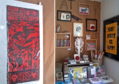
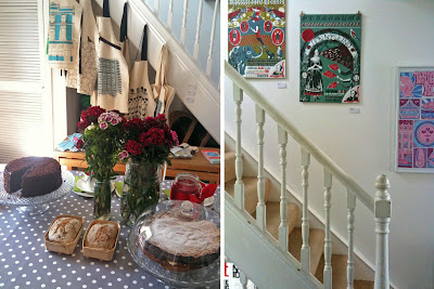
So Saturday afternoon I worked the vintage tearoom at AT Openhouse (complete with vintage pinny) I sliced cake, poured tea and chatted to visitors about the artists/work on show. It's the first Openhouse I've been involved with and although it was only day one, I really enjoyed it.
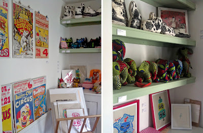
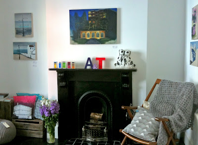
The house looks incredible, April and Tim have completely given their lovely home over to the show - every room, corner and shelf is full to bursting with prints, paintings, vintage clothes, jewellery, soft furnishings and cake from 17 different artists, designers, crafters and print makers.




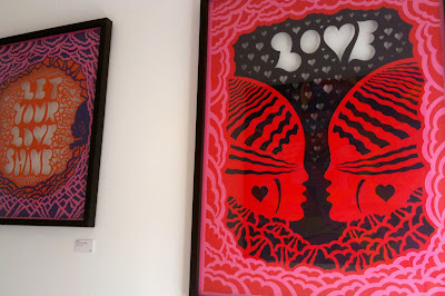

AT Openhouse is at 42 Hendon Street, Brighton BN2
Open throughout May 12-6pm, Saturdays & Sundays.
Keep up to date with AT goings on here.
https%3A%2F%2Fwww.deliciousindustries.com%2Fpics-from-the-at-openhouse
Delicious+Industries%3A+Pics+from+the+AT+Openhouse
AT Openhouse kicks off tomorrow!
AT Openhouse finally throws open it's doors tomorrow for a month of fabulousness!
It really is going to be the best Openhouse, with a terrific mix of artists and designers; a vintage Boudoir, vintage tea room, a knitting room, prints/paper ephemera room and live performances in the garden.
We're selling our Howdoo business cards...

Our Don't Worry letter-pressed prints...
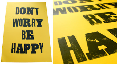
And some vintage circus posters we've been hoarding for years...
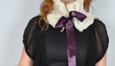
You'll also find button jewellery by Lorna Davies and fabulous knitted creations from Winsome & Saucy...
Some quirky Jonny Hannah illustrations...

Recent work from illustrator Alice Pattullo...

Mr Wingate's printed textiles and home accessories...

Fun prints and vintage fabric cats & owls from Snorkus...

Pinky's psychedelic paintings and paper cuts...
A selection of elephants and badges from Beatty Hallas...

The wonderful Odds and Bobs vintage boudoir...

Stunning paintings from Natalie Martin...

Badges, books and prints from local illustrator, Carlos Garde-Martin...
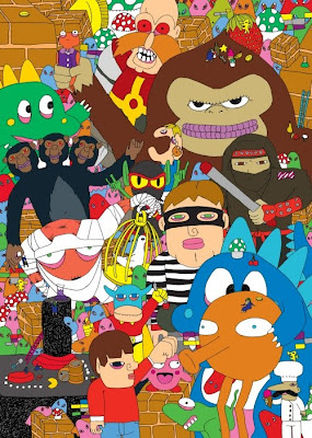
Amanda Fatherazi's glamorous brooches and dolls...

Screenprints, books and letter-pressed prints from Mark Pavey...
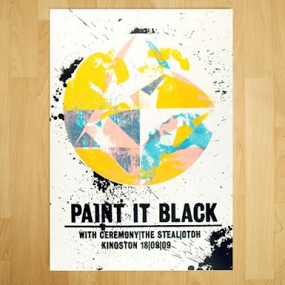
And last, but definitely not least paintings by Rhys Trussler...

So if you find yourself at a loose end over the weekend (or any weekend in May) pop over to 42 Hendon Street and say "hello".
Image copyrights with the individual artsists.
https%3A%2F%2Fwww.deliciousindustries.com%2Fat-openhouse-kicks-off-tomorrow
Delicious+Industries%3A+AT+Openhouse+kicks+off+tomorrow%21
Auto Type XII


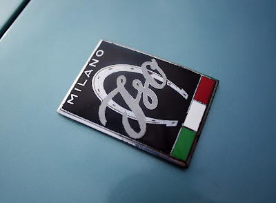
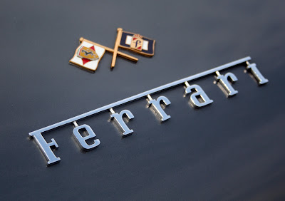


Auto Type XII - Some fine new additions to our collection - loving the quirky Corsair typeface (top).
We've now got quite a collection - if Auto Type does it for you check out the full set here or if the cars themselves are more your bag, hop over to our sister blog Super Ninety.
https%3A%2F%2Fwww.deliciousindustries.com%2Fauto-type-xii
Delicious+Industries%3A+Auto+Type+XII
From the reference box # 105
I love the simplicity of the Sainsbury's one (top) and the overlays on the Hooper Struve graphics (bottom), but those limes on the C&C label (middle) look like they've seen better days!
The collection also includes Orange cordial, ginger beer and lemonade labels from a similar era - watch this space!
https%3A%2F%2Fwww.deliciousindustries.com%2Ffrom-the-reference-box-105
Delicious+Industries%3A+From+the+reference+box+%23+105
Welcome
Welcome to the Delicious Industries blog. We're an independent design studio based in Brighton, UK and this is our scrapbook packed full of design, illustration, photography & typography inspiration. Check out our work here.
Links
DELICIOUS FRIENDS
DELICIOUS FAVOURITES
- 50 Watts
- Acejet 170
- Grain Edit
- It's Nice That
- National Geographic Found
- Notcot
- Pretty Clever
- Retronaut
- So Much Pileup
- We Love Typography
- Another Mag


