Blog: August 2008
From the reference box #20

This is a copy of, 'The Racing Pigeon: The British Pigeon Racing Weekly', 22 April 1967. A funny little newspaper devoted totally to racing pigeons and absolutely packed with information, adverts, stories and articles. Pigeon racing must have been very popular back then to get this much content week after week.
Here are some of the adverts and pictures that made me chuckle, and did you know the term, 'squeaker' refers to a young racing pigeon? See you learn something new everyday!


#20 - The Racing Pigeon, 22 April 1967
https%3A%2F%2Fwww.deliciousindustries.com%2Ffrom-the-reference-box-20
Delicious+Industries%3A+From+the+reference+box+%2320
Auto Type


https%3A%2F%2Fwww.deliciousindustries.com%2Fauto-type
Delicious+Industries%3A+Auto+Type
Paul Rand: A Tribute
How good was Paul Rand! This tribute is a nice little reminder of his work and his design philosophy. If this has got you yearning to see more check out the Paul Rand website which is packed full of all his work; identities, advertising, posters and books etc... as well as an extensive biography, lots of interviews and articles and some of his best quotes/philosophies;
"Simplicity is not the goal. It is the by-product of a good idea and modest expectations".
For those of you stateside, you lucky people are going to have the opportunity to see this iconic design in the flesh at the 'Paul Rand: Modernist Design in Context' exhibition, October 16 - December 13 2008, in the Center for Art, Design and Visual Culture at the University of Maryland Baltimore County. The exhibition curator is Franc Nunoo-Quarcoo, author of 'Paul Rand: Modernist Design' and Professor & Chair of Visual Arts at UMBC. Somebody please bring it to the UK, pretty please!!
I couldn't let this post go, without posting some of his amazing work...


Tribute created by J Neeley, found on Rubbishcorp.
Images copyright Paul Rand.
https%3A%2F%2Fwww.deliciousindustries.com%2Fpaul-rand-a-tribute
Delicious+Industries%3A+Paul+Rand%3A+A+Tribute
Which? Magazine


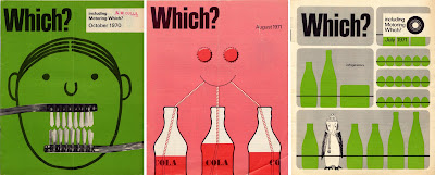
I had a great find at the car boot sale on Saturday - a big box of Which? magazines from 1960 to 1981. There are a couple of years missing and quite a few of the 'Money Which?' and 'Motoring Which?' supplements are missing, but as a collection they are well worth the £10 I paid!
Above are a selection of the covers, they are really great, I personally prefer the more graphic ones, but there are some more photographic and also some which are more illustrative. They are quite text heavy inside, but remain clean and un-cluttered, with some lovely typography. Also because of all the comparisons and tests that they run, almost every issue has a really well-designed chart, graph, diagram or illustration making them valuable reference.


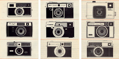
I will eventually scan in all the covers and create a 'Which? Covers' Flickr group, so watch this space!
https%3A%2F%2Fwww.deliciousindustries.com%2Fwhich-magazine
Delicious+Industries%3A+Which%3F+Magazine
Intrastate Commerce


'Intrastate Commerce' is a great Flickr set from Society in Decline that has pages of roadside signs from across America. It's fantastic reference, but there are so many, it takes a while to click through them all!
Via The Serif.
https%3A%2F%2Fwww.deliciousindustries.com%2Fintrastate-commerce
Delicious+Industries%3A+Intrastate+Commerce
From the reference box #19

I'm not exactly sure what this is - I think it's a sales tag that would have been attached to purchased typewriters, but I love the 'Low's' type it's great. The red disc is weighted and engraved on it's metal centre with, '3 in 1 velus quality. The world over. Made in England. N0.100' on both sides. There is a postage stamp on the reverse with a date of 15.06.35 so I'm guessing it originates around that time.
So, #19 - Typewriter sales tag. Circa 1935.
https%3A%2F%2Fwww.deliciousindustries.com%2Ffrom-the-reference-box-19
Delicious+Industries%3A+From+the+reference+box+%2319
Do not disturb

It never occurred to me that 'Do not Disturb' door hangers could be interesting and well designed, until I stumbled upon Michael Lebowitz's fantastic collection on the equally fantastic Grain Edit.
Lebowitz found the collection on the wall of his late grandfather's study - he was a foreign service man and during his travels had collected the door hangers, brought them home and stuck them on the wall of his study, eventually filling the whole wall!
They are really great, all different shapes, sizes and languages. Some are simple and well designed, some have humour and others are just functional, but they are all great pieces of ephemera - thank you Michael for sharing!
Via Grain Edit.
https%3A%2F%2Fwww.deliciousindustries.com%2Fdo-not-disturb
Delicious+Industries%3A+Do+not+disturb
San Francisco Zoo - Critter Quest
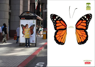

I love these new ads for San Francisco Zoo by BBDO West also in SF. It is such a simple, fun idea - interactive ads in their most basic form!
The campaign is designed to 'get people connected' with the zoo, and the idea is for people to stand in front of the bus shelter posters, get someone to take their pic and then upload it to the website gallery for a chance to have your pic used on a print ad for the zoo. The campaign was only launched at the start of the month and there are already thousands of very funny pics in the gallery...
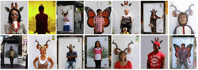
Definitely one of those ideas that I wish was mine!
Images from Coloribus.
https%3A%2F%2Fwww.deliciousindustries.com%2Fsan-francisco-zoo-critter-quest
Delicious+Industries%3A+San+Francisco+Zoo+-+Critter+Quest
The Launch of the Pleasure Bus Tour

The Pleasure Bus Mobile Art Gallery and shop is heading to Art Vinyl, 13 Broadway Market, London on Wednesday 13 August, 5-10pm for Disco, Daftness, Doodling and free Corona!
There'll be limited edition prints, t-shirts and postcards to buy, so if you can't make this stop watch out for the next location.
https%3A%2F%2Fwww.deliciousindustries.com%2Fthe-launch-of-the-pleasure-bus-tour
Delicious+Industries%3A+The+Launch+of+the+Pleasure+Bus+Tour
Betty Crocker's Dinner for Two Cook Book
After trawling the internet I found a first edition, first printing (1958) copy on Ebay and yesterday it arrived. It is in mint condition and the illustrations are all I hoped they would be - simple, kitsch and very elegant!


It is also full of these wonderfully kitsch still life, food photographs which is a bonus!

https%3A%2F%2Fwww.deliciousindustries.com%2Fbetty-crockers-dinner-for-two-cook-book
Delicious+Industries%3A+Betty+Crocker%26%23039%3Bs+Dinner+for+Two+Cook+Book
Wall Letters

These metal letters from Urban Outfitters are fantastic. They are quite large at 6 x 10 x 1" and are available in some cool colours for only $14 each + postage. The have a built-in bracket on the reverse for hanging and the website says they come in different styles, although there is only one style shown.
Now I can find them on the US website, but not on the Uk site?? So maybe they are only available in Uk stores and not online?
You could always have a look in antique shops and on car boot sales to try and find some secondhand signage. Used letters generally have a nice patina which adds character, the only downside is that you can't always get the letters you want in the same style. Here are a couple of mine...

https%3A%2F%2Fwww.deliciousindustries.com%2Fwall-letters
Delicious+Industries%3A+Wall+Letters
Routemasters: Last Stop!


Thanks to photographer, Ralf Obergfell for the info about, 'Routemasters: Last Stop!' a collaborative photography project between himself and Jet. The project is, 'a unique record of the Routemaster's final months. Through a mixture of still lifes, portrait and documentary photography' recently exhibited in the London Transport Museum and now available in a book by the same title.
The Routemaster buses lined London streets for 50 years until they were taken out of service at the end of 2005. Ralf and Jet have spent 18 months on the buses, mainly on the no. 19 and no. 38, capturing the comings and goings of their daily routes; the drivers, the passengers, the conductors and the buses themselves.
Their images are a great record of this design classic, they show the charm and character of these old buses. I can't see anyone being too upset when their replacements - the 'bendy buses' - eventually leave the London streets!
Images copyright Ralf Obergfell & Jet.
https%3A%2F%2Fwww.deliciousindustries.com%2Froutemasters-last-stop
Delicious+Industries%3A+Routemasters%3A+Last+Stop%21
Oh I do like to be beside the seaside…
At this time of year Brighton is in full swing with the seafront and pier, in particular looking fabulously tacky and fun, so I decided to share some seaside inspiration for everyone to enjoy...


https%3A%2F%2Fwww.deliciousindustries.com%2Foh-i-do-like-to-be-beside-the-seaside
Delicious+Industries%3A+Oh+I+do+like+to+be+beside+the+seaside%26%238230%3B
From the reference box #18

This is a Gleem Toothpaste sample pack from the 50's. I didn't know much about Gleem when I bought it, I just like the print and the overlapping to get the brown/dark red colour - very simple, but effective.
I have since found out (through the fountain of knowledge that is Wikipedia) that Gleem was made by Procter & Gamble and was first introduced in 1952 (in the packaging above). 'Compton Advertising Inc.' (now part of Saatchi & Saatchi NY) co-ordinated the advertising for the first Gleem campaign (Ads 1 + 2 below) which was included in the 'League Against Obnoxious TV Commercials' list of 'terrible 10' in May 1963. Needless to say by 1969 the brand was flagging, so the advertising account was moved to 'Wells, Rich, Greene' (Ad 3 below) where it remained until 1976 when it was transferred to 'Leo Burnett', Chicago (Ad 4 below).

As far as I am aware Gleem is still available from some stores in the US, but it never seemed to really hold a big share of the toothpaste market, which is a shame because it packaging at least was great. Below is another sample pack found on Flickr (I think from the 60's) along with the packaging as it stands today.

#18 - 1950's Gleem toothpaste sample pack
https%3A%2F%2Fwww.deliciousindustries.com%2Ffrom-the-reference-box-18
Delicious+Industries%3A+From+the+reference+box+%2318
Eureka Tower Carpark signage


This has to be the best signage I have seen for a long time. It is a way-finding system developed by designer, Axel Peemoeller for Melbourne Carpark, 'Eureka Tower'.
The system works by having giant letters painted on the walls and floor, that appear distorted close up, but when seen from a distance, as you are driving through the carpark, they are perfectly legible. The perspective is carefully calculated to produce the largest, most legible sign from the correct angle.
It reminded me of pavement drawings by Julian Beever I saw a while ago which use perspective and distance in the same way, but in his case to create 3D illusions.


Eureka Tower images copyright Axel Peemoeller
Pavement art images copyright Julian Beever
https%3A%2F%2Fwww.deliciousindustries.com%2Feureka-tower-carpark-signage
Delicious+Industries%3A+Eureka+Tower+Carpark+signage
Welcome

Welcome to the Delicious Industries blog. We're an independent design studio based in Brighton, UK and this is our scrapbook packed full of design, illustration, photography & typography inspiration. Check out our work here.
Links
DELICIOUS FRIENDS
DELICIOUS FAVOURITES
- 50 Watts
- Acejet 170
- Grain Edit
- It's Nice That
- National Geographic Found
- Notcot
- Pretty Clever
- Retronaut
- So Much Pileup
- We Love Typography
- Another Mag

