Blog: June 2008
Found Typography #2


A few pics of distressed type; a mini cab office in Kings Cross London, Litter bin in Chester Zoo, 'Station' sign in Brighton and a TV/Radio rental & repair hand-painted mural on the side of a building in Brighton. All seen better days, but all the more interesting because of it.
https%3A%2F%2Fwww.deliciousindustries.com%2Ffound-typography-2
Delicious+Industries%3A+Found+Typography+%232
Fifty Designers' Current Favourite Typefaces
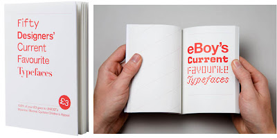
'Fifty Designers' Current Favourite Typefaces' is exactly that, compiled into a neat little book by James West of Create/Reject to raise money for UNICEF's Myanmar (Burma) Cyclone Children's Appeal in the wake of Cyclone Nargis that hit Myanmar on 2nd May 2008.
Contributors include some of the design world's elite; Farrow, Stefan Sagmeister, The Chase, North, Pentagram and The Designers Republic.
You can buy it from Koenig Books in Charing Cross Road, Artwords Bookshop in Shoreditch or here. Cover price is £3, all of which goes to the charity, so for a bit of good Karma, why not sacrifice your latte & muffin on Monday morning and buy this book instead.
Via Reform & Revolution.
https%3A%2F%2Fwww.deliciousindustries.com%2Ffifty-designers-current-favourite-typefaces
Delicious+Industries%3A+Fifty+Designers%26%23039%3B+Current+Favourite+Typefaces
From the reference box #12

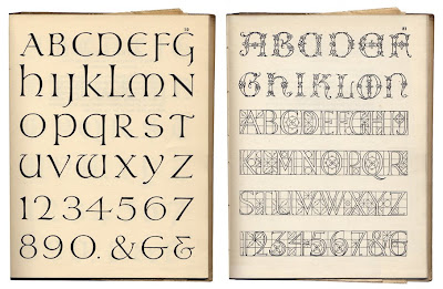
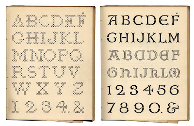
Another new item in the reference box (actually it's on the shelf, but it's still reference) is 'A Book of Lettering' published by A&C Black Ltd. in 1929. It's only 18 pages, but it has some great typefaces that were all hand drawn by Albert Field. Each typeface has with it a description and it's ideal usage, ie. for posters, embroidery, appliqúe, everyday use, woodwork, leather work, carving or printing.
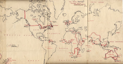
The best thing about this book though, is that it had a couple of hidden extras folded away inside; a hand drawn map of the world showing exports and British colonies and a tea cosy design/pattern - how random!

#12 - A Book of Lettering, 1929.
https%3A%2F%2Fwww.deliciousindustries.com%2Ffrom-the-reference-box-12
Delicious+Industries%3A+From+the+reference+box+%2312
Charles & Ray Eames Commemorative Stamps

A commemorative sheet of 16 stamps honoring Charles and Ray Eames has been issued in Santa Monica, California. Designed by Derry Noyes, they represent the many iconic pieces of design created by the husband and wife team throughout their careers.
The stamp sheets are available to buy from The Postal Store at $6.72 plus postage.
Via Cool Hunting.
https%3A%2F%2Fwww.deliciousindustries.com%2Fcharles-ray-eames-commemorative-stamps
Delicious+Industries%3A+Charles+%26amp%3B+Ray+Eames+Commemorative+Stamps
Seven Songs for Spring
So, here they are, in no particular order, the Delicious Seven Songs for Spring:
1. My Hero - Foo Fighters (The version on the Skin and Bones Album is best IMHO)
2. Fuck me Pumps - Amy Winehouse (Loving early Winehouse at the mo)
3. Hallelujah - Jeff Buckley
4. One Way or Another - Blondie (Great for a sing-a-long anytime of year)
5. The Man Who Sold the World - Nirvana (Bowie cover from Nirvana: MTV Unplugged)
6. Subterranean Homesick Blues - Bob Dylan
7. I Want You So Hard (Boys Bad News) - Eagles of Death Metal
and for anyone who hasn't heard the Nirvana version of 'The Man Who Sold the World', here it is courtesy of you tube (for some reason you can't embed any versions with the original MTV footage!) Enjoy...
Now, we are going to tag, Sell Sell, Rubbishcorp, Dirty Mouse, Grain Edit, Things to look at, Acejet 170 and Form Fifty Five
https%3A%2F%2Fwww.deliciousindustries.com%2Fseven-songs-for-spring
Delicious+Industries%3A+Seven+Songs+for+Spring
A Delicous day out - part 2
Richard Rogers is the influential architect behind the Pompidou Centre in Paris, the Lloyds Building and the Millennium Dome, both in London. His work is dynamic, experimental and always pushing the boundaries. The scale models are fantastic. I love the miniature cars and people - there is always one doing something weird, I guarantee it!


It was the Tim Walker exhibition though, that stole the afternoon, it was wonderful. Tim Walker is a renowned fashion photographer whose images regularly grace the pages of Vogue.
His images are fascinating. They are conceptual and imaginative, some are dreamy and elegant while others are beautiful, but chaotic. My favourites are the pastel animals, in particular the cats. The exhibition also displayed some of the over-sized props from the photoshoots, as well as some of Walker's sketchbooks, showing his thought processes, ideas, references and inspirations which give a real insight into his work.


https%3A%2F%2Fwww.deliciousindustries.com%2Fa-delicous-day-out-part-2
Delicious+Industries%3A+A+Delicous+day+out+-+part+2
A Delicious day out - part 1


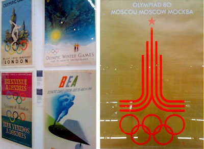
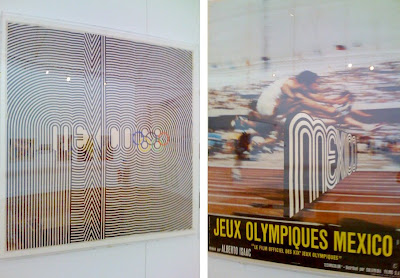

Every now and again I like to take a day off to take in some culture, so yesterday I visited the Museum of Childhood to see the 'Century of the Olympic Poster' exhibition (see my original post about this exhibition here). The posters are fantastic, the exhibition takes you chronologically through the collection, from 1851, to the London bid posters and then finally to the London 2012 logo. Most can be dated by the design alone, in particular the David Hockney and Roy Lichtenstein ones for the Los Angeles 1984 Olympics, as they are sooo 80's.
For me, the best by far is the Mexico'68 Olympic logo and poster. It is one of my all-time favourite pieces of design and it was great to see it in the flesh and especially to see the fluro pink and green version which I had never seen before.
What I found really interesting is the mixture of poster designs for each Games, some Games had 2 or 3 totally different styled posters, as though a different person had designed each one with no consideration of the others, whereas the best years had a very obvious style, even though different artist and designers had been invited to create them.
I hope that the organisers of London 2012 have seen this exhibition and understand that getting a branding company or a big name ad agency is not necessarily the best way to create a successful and memorable Games marketing campaign. Instead inviting people like, Damien Hirst, Banksy, Martin Parr or Bridget Riley - world renowned artists, designers and photographers to create a truly British campaign would create enormous media interest and create a campaign, modern and true to the diversity & creativity of the UK. Because at the moment the 2012 logo would look right at home on the 1984 LA Games posters and does not inspire anything vaguely British or modern.
https%3A%2F%2Fwww.deliciousindustries.com%2Fa-delicious-day-out-part-1
Delicious+Industries%3A+A+Delicious+day+out+-+part+1
From the reference box #11


New to the reference box is this collection of matchbook covers. A great carboot find at the weekend and a snip at £3! After discovering Grain Edit's Flickr group last week I decided to keep a look-out for some of my own, but never expected to find so many and so soon.
They are fantastic and from all over the world, someone has obviously spent a lot of time on this collection and I intend to keep it growing.
So, a new addition, #11 - Collection of Matchbook Covers
https%3A%2F%2Fwww.deliciousindustries.com%2Ffrom-the-reference-box-11
Delicious+Industries%3A+From+the+reference+box+%2311
Graphic Design Materials & Equipment


On the design nostalgia theme, our friends at Site have lent us some 80's design books to reminisce over (thanks Darren!). Above is 'Graphic Design Materials & Equipment' by Jonathan Stephenson, 1987 - a particularly 80's looking book packed full of essential design tools, or what where the essential design tools back then. These days most of the equipment listed is no longer needed; the crazily fine Rotring pens, the Magic Markers and the Letraset are rarely used in a modern design studio.
It's interesting to see how, back then, some companies which now dominate the design world had more competition, for example, colour systems could be Mecanorma or Pantone, Hewlett-Packard, IBM and Apple Macintosh where all used in design studios (although Apple had already begun to dominate) and the main desk-top publishing software was Pagemaker by Aldus (a programme I have a soft-spot for as it was the first computer programme I used on a Mac) with no sign of Adobe anywhere.
I was introduced to an Apple Mac for the first time in the final year of an ND Graphics course, and it was love at first sight - I have never looked back. Yes I sometimes miss the paste-ups, tracing type from Letraset books and buying hundreds of Magic Markers, but would I swop my shiny Apple computer for the chance to do it the old way again - like hell I would!
https%3A%2F%2Fwww.deliciousindustries.com%2Fgraphic-design-materials-equipment
Delicious+Industries%3A+Graphic+Design+Materials+%26amp%3B+Equipment
The World's First Graphic Design Musuem
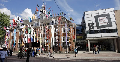
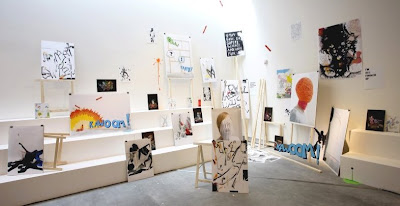
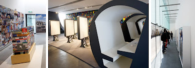
A Graphic Design Museum, said to be the first in the world, opened in Beyerd Breda, in the Netherlands last week. The museum, which will focus solely on Graphic Design, offers established designers an International stage and is, at the same time, a spring-board for new top talent.
The opening 4 exhibits; one aimed at children, one aimed at young adults, one aimed at design professionals and a retrospective, 100 years of Dutch Graphic Design are designed to appeal to the general public and design professionals alike.
Via Design Week.
https%3A%2F%2Fwww.deliciousindustries.com%2Fthe-worlds-first-graphic-design-musuem
Delicious+Industries%3A+The+World%26%23039%3Bs+First+Graphic+Design+Musuem
Floppy disks

After a weekend of much ephemera buying, this morning called for a clearout of the plan chest, and just look what I found nestled at the back of one of the drawers - a floppy disk!
I haven't seen a floppy disk in years and it made me smile. I remember using them with my first computer, an Apple Macintosh Classic. Frightening to think how little they actually hold, in fact the computer itself didn't hold much more - how did we manage??
https%3A%2F%2Fwww.deliciousindustries.com%2Ffloppy-disks
Delicious+Industries%3A+Floppy+disks
Ephemera Society Fair

"The term ‘ephemera’ covers a wide range of documents including leaflets, handbills, tickets, trade cards, programmes and playbills, printed tins and packaging, advertising inserts, posters, newspapers and much more".
Collecting Ephemera is an addiction, it starts with the odd ticket, beermat or invitation and then before you know it you have boxes full of it. I know only too well that desire to find more, so imagine my delight in discovering not only is there an Ephemera Society, but that it's having an 'Ephemera Society Fair' this very Sunday (15th) at the Holiday Inn London Bloomsbury!
The Society was established in 1975 for the conservation, study and presentation of printed and handwritten ephemera. Annual membership is only £20 and members receive a quarterly newsletter, 'The Ephermist' and receive early entry into all the fairs and bazaars held throughout the year - bargain!
Via We Made This.
https%3A%2F%2Fwww.deliciousindustries.com%2Fephemera-society-fair
Delicious+Industries%3A+Ephemera+Society+Fair
Matchbook covers

These fabulous matchbook covers are part of the Flickr group, 'Mid Century Modern - Sticker, Label + Stamp', administered Grain Edit. There are over 700 images in the group, mainly originating from Eastern Europe. The graphics are really simple and have a great print quality. They would definitely be a valuable addition to the Delicious reference box - I need to start a search!
Via Grain Edit.
https%3A%2F%2Fwww.deliciousindustries.com%2Fmatchbook-covers
Delicious+Industries%3A+Matchbook+covers
Extreme cutting and sticking

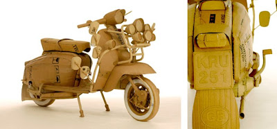
Sculptor Chris Gilmour creates these amazing life-size sculptures out of only cardboard and glue, that's it, no chicken mesh, no framework, just cardboard and glue! The detail is amazing and I love the idea of making crappy old packaging into art.
Via Computer Love.
https%3A%2F%2Fwww.deliciousindustries.com%2Fextreme-cutting-and-sticking
Delicious+Industries%3A+Extreme+cutting+and+sticking
Gilbert Garcin at Arden & Anstruther Gallery

Our favourite photography gallery, Arden & Anstruther are exhibiting the self-portraits of Gilbert Garcin for the next six weeks, and are opening everyday throughout the Petworth Festival (7-21 June). Garcin's images are wonderfully surreal and for me, there is something very Dada about them - I just love them. It is definitely worth a visit.
Image from Arden & Anstruther.
https%3A%2F%2Fwww.deliciousindustries.com%2Fgilbert-garcin-at-arden-anstruther-gallery
Delicious+Industries%3A+Gilbert+Garcin+at+Arden+%26amp%3B+Anstruther+Gallery
Welcome
Welcome to the Delicious Industries blog. We're an independent design studio based in Brighton, UK and this is our scrapbook packed full of design, illustration, photography & typography inspiration. Check out our work here.
Links
DELICIOUS FRIENDS
DELICIOUS FAVOURITES
- 50 Watts
- Acejet 170
- Grain Edit
- It's Nice That
- National Geographic Found
- Notcot
- Pretty Clever
- Retronaut
- So Much Pileup
- We Love Typography
- Another Mag

