Blog: July 2009
Japanese Match Labels
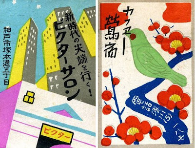
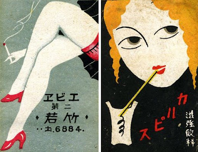
I came across these gorgeous 20's/30's Japanese Match Labels yesterday on Christian Northeast's blog, Lunch Tongue. He has a scapbook full of them and has posted a small selection. I really like them all as the illustration styles are great - but the legs have to be my favourite with the those tiny red heels.
Images copyright Christian Northeast.
https%3A%2F%2Fwww.deliciousindustries.com%2Fjapanese-match-labels
Delicious+Industries%3A+Japanese+Match+Labels
From the reference box #47

#47 - a Swiss letterhead from the 60's. I'm terrible at languages but I think the letter is in German and I'm pretty sure the 'V+S' is a tourist board logo. However I could be totally wrong, so if you have any info please get in touch.
I found it nestled amongst some bits of ephemera I bought a few weeks ago and really loved the logo, it's such a funny choice of typeface for such an official looking letter, but I think it's great. I especially like how the '+' has been reversed out of the 'V' to create the national flag - simple but effective!
If vintage design and ephemera do it for you, check out what else is in our reference box here.
https%3A%2F%2Fwww.deliciousindustries.com%2Ffrom-the-reference-box-47
Delicious+Industries%3A+From+the+reference+box+%2347
Seb Lester Prints
Seb originally studied graphic design at Central Saint Martin's, before specialising in typography and has created typefaces used by Dell, Intel and the New York Times. "Seb is passionate about letterforms which form the basis for his pieces. He brings letters to life with his animated illustration style and bold sense of humour." from the press release for his up and coming exhibition.
You can check out his work in person next month if you're in the Newcastle area as his new exhibition previews at the Electrik Sheep Gallery on 6 August. It should be a cracking show.
Images copyright Seb Lester.
https%3A%2F%2Fwww.deliciousindustries.com%2Fseb-lester-prints
Delicious+Industries%3A+Seb+Lester+Prints
Christian Northeast
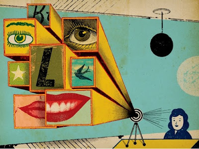

I love the quirky, retro style of Christian Northeast's illustrations and collages. They're a successful mix of strong composition, a touch of the surreal, bold graphics and bright colour. He's got a great collection of typography and lettering pieces in his portfolio too. Check it out here.
Images copyright Christian Northeast.
Via Notcot.
https%3A%2F%2Fwww.deliciousindustries.com%2Fchristian-northeast
Delicious+Industries%3A+Christian+Northeast
Vintage Playing Cards
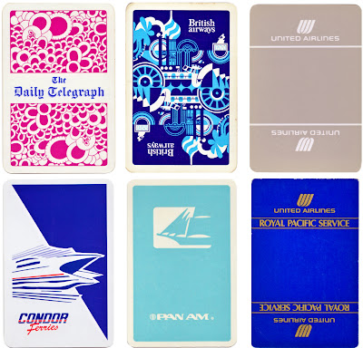
I've just uploaded my fledgling collection of playing cards to Flickr. I've not been collecting them very long so there are only 20, but they've got some great graphics.

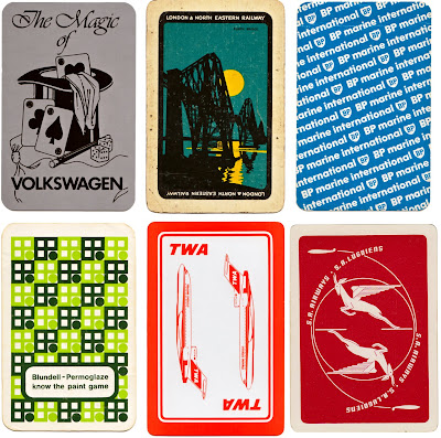
If playing cards are your thing check out older posts here and here.
https%3A%2F%2Fwww.deliciousindustries.com%2Fvintage-playing-cards
Delicious+Industries%3A+Vintage+Playing+Cards
Ephemera Assemblyman

Ephemera Assemblyman has some great vintage posters, photography and ephemera on his blog. There's loads to look at, but be warned once you start trawling through the collections it's hard to stop! Here are a few of my favourites...


Images copyright Ephemera Assemblyman.
https%3A%2F%2Fwww.deliciousindustries.com%2Fephemera-assemblyman
Delicious+Industries%3A+Ephemera+Assemblyman
Another Color Helm!

Remember The Color Helm I posted about a while ago, based on Wilhelm Ostwald's Colour system? Well I've finally come across another one - Mr Bluehaunt of The Haunted Lamp has the one above.
They originally came in Professional, Spectrum, Student, Womens’s Wearing Apparel and Interior Decorator’s models. Mine is the Student version, but this one is different and seems a lot more complicated - I wonder if it's the professional one?
Here's mine again for comparison:

Top image copyright The Haunted Lamp.
https%3A%2F%2Fwww.deliciousindustries.com%2Fanother-color-helm
Delicious+Industries%3A+Another+Color+Helm%21
Paul Rand Book Covers

Paul Rand is one of my favourite designers of all time and I love looking at his work. The last time I ventured over to his commemorative website it was incomplete, but now it's all there in the gallery; logos, posters, advertising, packaging and book covers, there's almost too much to look at!
I love his book cover design and as I'm working on some myself at the minute I thought I'd share my inspiration...


The whole collection of Paul Rand's work can be seen here. It's constantly being updated as more and more examples are found and documented.
Images copyright Paul-Rand.com
https%3A%2F%2Fwww.deliciousindustries.com%2Fpaul-rand-book-covers
Delicious+Industries%3A+Paul+Rand+Book+Covers
From the reference box #46

#46 - Commemorative 'British Textiles' stamps celebrating great British textile designers, designed by Peter Hatch and released in July 1982.
The set of four stamps showcase prints from (left to right); William Morris - 'Strawberry Thief', Steiner & Co. - 'Untitled', Paul Nash - 'Cherry Orchard' and Andrew Foster - 'Chevron'.
Check out more reference box goodies here.
https%3A%2F%2Fwww.deliciousindustries.com%2Ffrom-the-reference-box-46
Delicious+Industries%3A+From+the+reference+box+%2346
Bauhaus-Era Postcard

Had to post this, it's a Bauhaus-era postcard found by jp of Amass Blog on Ebay! The '3' is just gorgeous - the geometric shapes and the orange, I just love it.
Image copyright Amass Blog.
https%3A%2F%2Fwww.deliciousindustries.com%2Fbauhaus-era-postcard
Delicious+Industries%3A+Bauhaus-Era+Postcard
Great giveaways from our lovely friends!

It seems to be the week for great giveaways - our friends over at Sell! Sell! are giving away some of their exclusive(ish) 'F*ck off Jonathan from Spotify' tees. All you have to do is finish the sentence "I need a Sell! Sell! Fuck off Jonathan from Spotify tee shirt because..." and email it to them with your tee size. Simple! Now what's Spotify and who's Jonathan??

Meanwhile our friends across the pond at Hero Design Studio & Boutique are having a Modern Housewares Contest, giving away some great iconic pieces including an Eames Hang-it-All Rack! All you have to do is tell them which homeware you couldn't live without or which of the giveaway items you really NEED! Unfortunately for us though, this ones for US residents only.
https%3A%2F%2Fwww.deliciousindustries.com%2Fgreat-giveaways-from-our-lovely-friends
Delicious+Industries%3A+Great+giveaways+from+our+lovely+friends%21
Natsko Seki

Japanese illustrator Natsko Seki has some really great work on her website - it's wonderfully whimsical and a little surreal. I love how she combines illustration and collage to create a warm, nostalgic feel.

If you love Natsko's work as much as we do you'll be pleased to know that some of her limited edition prints are available over at Design Supremo.
Images copyright Natsko Seki.
https%3A%2F%2Fwww.deliciousindustries.com%2Fnatsko-seki
Delicious+Industries%3A+Natsko+Seki
Hobby Stamp Blocks at Present & Correct
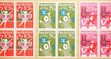

Present & Correct have these gorgeous Dutch stamps from the 70's available in blocks of 4. They have 3 different 'Hobby' themed designs left - painting, music and ballet.
Images copyright Present & Correct.
https%3A%2F%2Fwww.deliciousindustries.com%2Fhobby-stamp-blocks-at-present-correct
Delicious+Industries%3A+Hobby+Stamp+Blocks+at+Present+%26amp%3B+Correct
Typographic jewellery
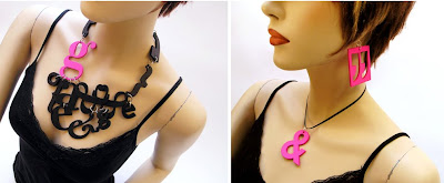
I just came across the work of Berdene du Toit on The Ampersand and I love it - type and jewellery - what's not to like?
Canadian based Berdene handcrafts each letterform out of MDF, sands it down and then sprays or paints it to give the desired finish. Her pieces vary from single letterform earings/necklaces to elaborate multi-piece designs (as above). These long chains (below) are my favourite though, particularly the yellow one with the little dangling 'i'.
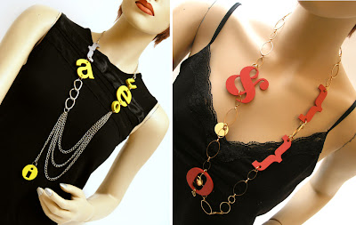
Checkout the full range of Berdene's fabulous jewellery here.
Images copyright Berdene du Toit.
Via The Ampersand.
https%3A%2F%2Fwww.deliciousindustries.com%2Ftypographic-jewellery
Delicious+Industries%3A+Typographic+jewellery
Festival of Britain Guide, 1951
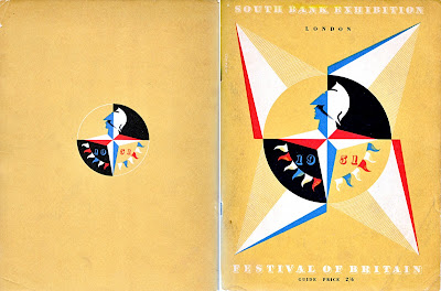
I've seen loads of these Festival of Britain guides for sale in the past, but for some reason they've always had pages or bits of pages hacked out of them. Finally though, I found this one in perfect condition.
The cover's my favourite part of the guide. It's a natural coloured, thick paper with a 4-colour print including white. White litho must have been quite unusual in the early 50's, but it looks great and really helps showcase the Festival logo - an iconic Britannia emblem designed by offical war poster artist, Abram Games (seen above on the cover).
The Festival of Britain was a national festival launched in May 1951 to promote better British design, construction and engineering, to create a national feeling of progress and to boost British moral. It was also a centenary celebration of the Great Exhibition held in 1851.
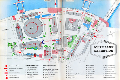
Exhibitions were held throughout the country, but the main venue was on the South Bank in London at a specially designed site developed by architect Hugh Casson and his appointed team. The team aimed to introduce the idea of urban design and showcase the principles intended to be used in the re-building of London; elevated walkways, modernist style architecture and multi-level buildings. Sadly though, only The Royal Festival Hall still remains.
Here's a plan of the South Bank Centre site:
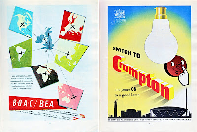
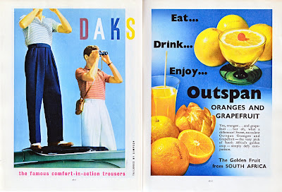
Here's a selection of the adverts throughout the guide - the BOAC/BEA (below) is really great.
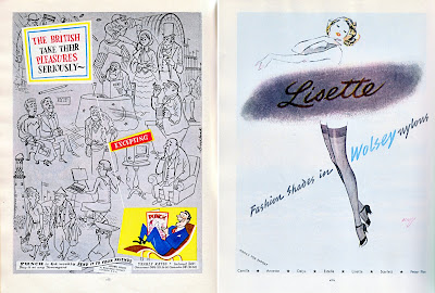
FInd out more about the festival here.
https%3A%2F%2Fwww.deliciousindustries.com%2Ffestival-of-britain-guide-1951
Delicious+Industries%3A+Festival+of+Britain+Guide%2C+1951
Welcome
Welcome to the Delicious Industries blog. We're an independent design studio based in Brighton, UK and this is our scrapbook packed full of design, illustration, photography & typography inspiration. Check out our work here.
Links
DELICIOUS FRIENDS
DELICIOUS FAVOURITES
- 50 Watts
- Acejet 170
- Grain Edit
- It's Nice That
- National Geographic Found
- Notcot
- Pretty Clever
- Retronaut
- So Much Pileup
- We Love Typography
- Another Mag


