Blog: Inspiration
Know Your States!
The dial reveals each US state, what it's noted for, it's flower, population, area in square miles, it's capital and it's nickname. Very informative. Until today I had no idea that Delaware was known as the Diamond state, that Minnesota's flower is the Moccasin or that the capital of Wyoming is Cheyenne!
If like me, you have a thing for dial/wheel contraptions take a look at some of my collection here, here, here and here.
https%3A%2F%2Fwww.deliciousindustries.com%2Fknow-your-states
Delicious+Industries%3A+Know+Your+States%21
Ty i Ja


More great vintage covers, this time, Ty i Ja or 'You and I' magazine, a 64 page Polish publication first published in Warsaw in May 1960.
Ty i Ja was devoted to literature, science, design, poetry, fashion and graphic art and was the only monthly cultural review in Poland at that time. The wonderful Roman Cieslewicz was art director between 1960 - 1963 and comissioned top Polish designers like Lipinski and Tomaszewski to create these striking and graphic covers. Even after leaving the publication he continued designing covers for it until the mid 70's. Unfortunately, due to constant censorship Ty i Ja ceased publishing in the late 80's.
Images from Pan Tu Nie Stal.
https%3A%2F%2Fwww.deliciousindustries.com%2Fty-i-ja
Delicious+Industries%3A+Ty+i+Ja
From the reference box #50

#50 - British Technology Stamps, September 1966 depicting the Jodrell Bank Radio Telescope, British Motor Cars, the SR N6 Hovercraft and Nuclear power (Windscale reactor).
When I first saw this set of stamps I really loved the top two because of how graphic and simple they are, but was confused why the bottom two seemed to be in a totally different style. These days a set of stamps is normally designed by the same people or company, but it seems in the 60's at least, it was common practice for two designers/illustrators to work on two stamps each. In this case, D Gillepie created the 4d and 6d (top two) and J Andrew Restall designed the 1/3 and 1/6 (bottom two).
I find it funny that no attempt was made to keep consistency through the set - the Gillespie ones have no description and have quite large Queen's heads in white compared to Restall's ones, which do have a description and have smaller Queen's heads in black. Even the typefaces they've used are different.
For more stamps, ephemera and random bits of inspiration, take a delve into our reference box.
https%3A%2F%2Fwww.deliciousindustries.com%2Ffrom-the-reference-box-50
Delicious+Industries%3A+From+the+reference+box+%2350
Fortune Magazine Covers


I just came across these great cover designs for Fortune magazine on Covenger + Kester and had to find out more...
Fortune magazine was, and still is a business publication founded by Time founder Henry Booth Luce in 1930. Luce's vision was to create a bold new business journal that would stand out from the dull and uninspiring competition (at the time business periodicals and journals were black & white and full of facts & figures). Fortune had a luxury stock, striking photography and illustrations, it was alive with colour and was written by a team of up and coming writers keen to impress.
The covers I'm most drawn to are the ones above, mostly designed by the late Walter Allner - a German born, student of the iconic Bauhaus school, where he studied typography, design and painting under tutors Paul Klee and Wassily Kandinsky among others.
Allner moved to the US in the late 40's and worked as the art director of Fortune from 1962 - 1974, during which time he personally designed 79 of the covers (his signature is on some covers before this date though, so I can only assume that he was commissioned as a freelance artist prior to his employment). His Modernist style and Bauhaus principles helped him transform Fortune into a contemporary and sophisticated publication.
If you want to see more, there's a huge collection of Fortune covers throughout the decades here.
Images copyright Gono.
Via Ffffound!
https%3A%2F%2Fwww.deliciousindustries.com%2Ffortune-magazine-covers
Delicious+Industries%3A+Fortune+Magazine+Covers
From the reference box #49

#49 - Energy stamps, 1978. These stamps were issued on 25 January 1978 to highlight the importance of Energy in modern life, "our industrial strength and high standard of living depend on it's certain supply", to encourage, "greater efforts in the efficient use of energy and the elimination of wasteful practices" to preserve the resources we have and give, "scientists and technologists time to develop alternative and acceptable energy supplies".

The set of stamps and the First Day Cover (above) were designed by the great British designer, Peter Murdoch FSIAD - known Internationally for his wonderful cardboard furniture designs, his role as Special Projects Director for the 1968 Mexico Olympics (which included designing the collapsible, cardboard display systems, souvenirs and the newspaper kiosks) and for his many collaborations with fellow designer, Lance Wyman (Camino Real Hotel logo /signage and The Red Lion Disco logo in Mexico, Creative Parks Playground in Boston).
Our full collection of reference box items can be rummaged through here.
https%3A%2F%2Fwww.deliciousindustries.com%2Ffrom-the-reference-box-49
Delicious+Industries%3A+From+the+reference+box+%2349
Vintage Playing Cards
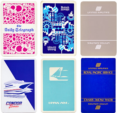
I've just uploaded my fledgling collection of playing cards to Flickr. I've not been collecting them very long so there are only 20, but they've got some great graphics.

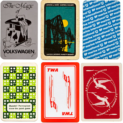
If playing cards are your thing check out older posts here and here.
https%3A%2F%2Fwww.deliciousindustries.com%2Fvintage-playing-cards
Delicious+Industries%3A+Vintage+Playing+Cards
Another Color Helm!

Remember The Color Helm I posted about a while ago, based on Wilhelm Ostwald's Colour system? Well I've finally come across another one - Mr Bluehaunt of The Haunted Lamp has the one above.
They originally came in Professional, Spectrum, Student, Womens’s Wearing Apparel and Interior Decorator’s models. Mine is the Student version, but this one is different and seems a lot more complicated - I wonder if it's the professional one?
Here's mine again for comparison:

Top image copyright The Haunted Lamp.
https%3A%2F%2Fwww.deliciousindustries.com%2Fanother-color-helm
Delicious+Industries%3A+Another+Color+Helm%21
Paul Rand Book Covers

Paul Rand is one of my favourite designers of all time and I love looking at his work. The last time I ventured over to his commemorative website it was incomplete, but now it's all there in the gallery; logos, posters, advertising, packaging and book covers, there's almost too much to look at!
I love his book cover design and as I'm working on some myself at the minute I thought I'd share my inspiration...


The whole collection of Paul Rand's work can be seen here. It's constantly being updated as more and more examples are found and documented.
Images copyright Paul-Rand.com
https%3A%2F%2Fwww.deliciousindustries.com%2Fpaul-rand-book-covers
Delicious+Industries%3A+Paul+Rand+Book+Covers
Bauhaus-Era Postcard

Had to post this, it's a Bauhaus-era postcard found by jp of Amass Blog on Ebay! The '3' is just gorgeous - the geometric shapes and the orange, I just love it.
Image copyright Amass Blog.
https%3A%2F%2Fwww.deliciousindustries.com%2Fbauhaus-era-postcard
Delicious+Industries%3A+Bauhaus-Era+Postcard
Penguin Group Logo Develpment
It's really interesting seeing the development over the 70 years of such iconic logos, so I’ve put them in chronological order to make it easier to see the changes. Amongst them is the initial Penguin logo created by office junior, Edward Young in 1935 taken from his penguin sketches at London Zoo and the versions created by the legendary Jan Tschihold (Head of Design, 1946-49). Enjoy...

1. Penguin, 1935. 33. Penguin, 1935. 26. Pelican, 1937. 48. Penguin, 1937. 18. Pelican, 1937. 8. Penguin, 1938. 31. Penguin, 1938. 45. King Penguin, 1939. 10. Puffin, 1940. 4. Puffin, 1941.

15. Puffin, 1941. 28. Penguin, 1944. 40. Penguin, 1945. 32. Penguin, 1945. 27. Ptarmigan, 1945. 3. Penguin, 1946. 6. Penguin, 1946. 12. Penguin, 1947. 37. Penguin, 1947. 41. Penguin, 1947.

7. Porpoise, 1948. 9. King Penguin, 1948. 11. Pelican, 1948. 17. Pelican, 1948. 20. Penguin, 1948. 34. King Penguin, 1948. 35. Puffin, 1948. 36. Penguin, 1948. 43. Penguin, 1948. 46. Pelican, 1948.

13. Penguin, 1949. 24. Penguin, 1949. 30. Pelican, 1949. 14. Penguin, 1950. 25. Pelican History of Art, 1953. 22. Puffin, c.1959. 44. Peregrine, 1962. 42. Peacock, c.1963. 21. Penguin Education,1967. 5. Allen Lane, 1967.

39. Puffin, 2003. 2. Puffin, 1968. 19. Kestrel, 1970. 47. Kestrel, 1970. 16. Penguin, c.1987. 23. Allen Lane, 2003. 29. Penguin, 2003. 38. Puffin, 2003.
Logos/Trademarks copyright Penguin Group.
https%3A%2F%2Fwww.deliciousindustries.com%2Fpenguin-group-logo-develpment
Delicious+Industries%3A+Penguin+Group+Logo+Develpment
Stefan Kanchev
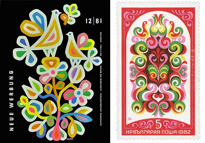
I came across the work of Bulgarian designer Stefan Kanchev through an image posted on Dropular. Once on his website I couldn’t believe how much of his work I was already familiar with from years of flicking through trademark and logo books.
Stefan Kanchev was born in Kalofer, Bulgaria in 1915. He initially studied classically as a mural painter, but throughout his career worked in many different areas of applied graphics. All Kanchev’s work draws inspiration from folk art and traditions - a flowing, organic feel, simple shapes and clean composition.

He is probably best known for his command of logo and trademark design, which was celebrated in 1994 when he was recognised at the 1st International Logo Conference, Ostend, Belgium as one of the ten best masters of logos in the world, ranking alongside the likes of Paul Rand and Saul Bass.


Stefan Kanchev died aged 86 in 2001 leaving behind a an amazing collection of work. There's a dedicated website of his life’s work, and although the English translation isn’t complete yet, there are lots and lots of images and graphics to look through.
Images copyright Stefan Kanchev.
https%3A%2F%2Fwww.deliciousindustries.com%2Fstefan-kanchev
Delicious+Industries%3A+Stefan+Kanchev
1956 Olivetti Advert
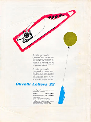
This Olivetti advert designed by Giovanni Pintori is for the portable, Olivetti Lettera 22. I love the dynamic of the illustrations demonstrating it's lightweight, 'portable' qualities.
I found it on the back cover of an Italian Science magazine, 'Scienza e Vita' from 1956 that I've had for years. Shame I didn't buy more of them!
https%3A%2F%2Fwww.deliciousindustries.com%2F1956-olivetti-advert
Delicious+Industries%3A+1956+Olivetti+Advert
Q&A with John Miles
Last week I had the wonderful pleasure of exchanging emails with typographer and designer, John Miles, co-founder of Banks & Miles.
After chancing upon my Which? magazine collection, he emailed to tell me that a full collection of the magazines can be seen at Reading University in the B&M archive and that he was glad I liked them so much as the Consumers' Association were, "a great client to work for". Banks & Miles of course designed all the Which? covers from 1968 to 1988.
I was thrilled to hear from such a great designer and took him up on his offer of more information, by asking a few questions about his time working on the Which? covers:
Where did the inspiration for the covers come from?
At the time you are so absorbed in meeting the deadline that you don't think about where it is all coming from (an experience I am sure we share).
Looking back I don't remember much in the way of inspiration but there were a number of limitations which drove us in a certain direction. We had only black and spot colour so we couldn't rely on full colour or graphic effects.
How did the design process work?
All designs for both cover and text pages had to be agreed with the client using hand-drawn finished roughs which meant we all had drawing skills of some sort.
So really everything depended on the idea in your head which took graphic form through the end of a pencil. Lots of thumbnails which threw up both good and terrible ideas but in the end one usually surfaced and we agreed 'that's it'.
One huge advantage, which I don't think we fully appreciated at the time, was that the magazine was available to members by direct mail only so we were not under pressure to make the covers look like every other magazine competing on the book stalls. And the marketing men weren't blaming the covers if membership numbers fluctuated (In fact during this period the membership was growing steadily).
We worked directly with the editors who were invariably supportive and encouraging and a joy to work with.
Which is your favourite cover?
I am not sure I have a favourite – there are a few I would rather forget – but I always had a soft spot for 'Fly killers' (the fly in a parachute) and 'Sun glasses' (the lady sunbathing with the sunglasses in the bra position).

Hopefully Q&A's will become a regular feature - it's so interesting finding out a bit more about how people work and their inspirations.
So John, if you are reading this, thank you so much for your wonderful insight into the Which? covers and thank you for taking the time to answer my questions. It's been a pleasure!
https%3A%2F%2Fwww.deliciousindustries.com%2Fqa-with-john-miles
Delicious+Industries%3A+Q%26amp%3BA+with+John+Miles
Dick Bruna Stamps

Dick Bruna has designed some fabulous stamps over the years, mainly for Japan and mostly of Miffy, but I really like these Nederland ones released in 1969.
From a little research I think they are either celebrating Childrens' songs or Child welfare. The use of colour in solid blocks is classic Bruna - I love the little red faces of the singing children, although they do look like they could explode at any minute!
More Dick Bruna loveliness here, here, here and here.
https%3A%2F%2Fwww.deliciousindustries.com%2Fdick-bruna-stamps
Delicious+Industries%3A+Dick+Bruna+Stamps
Derek Yaniger
Originally from Arkansas, Yaniger now lives in Georgia designing and printing his own work which is regularly published in Atomic, Barracuda and Car Kulture Deluxe. Over the years he's also created illustrations for companies like Marvel Comics and the Cartoon network.
The exciting news for us is that Yaniger's Wildsville exhibition, is coming to our favourite local gallery, Castor + Pollux on the 26 June and running until 20 July. The exhibition will contain a selection of old and new prints and will have signed copies of his new book, 'Wildsville; the art of Derek Yaniger' available too!
As the man himself says, "Should be a jolly big hoot! Be there if ya’ can, man".
Images copyright Derek Yaniger.
https%3A%2F%2Fwww.deliciousindustries.com%2Fderek-yaniger
Delicious+Industries%3A+Derek+Yaniger
Welcome
Welcome to the Delicious Industries blog. We're an independent design studio based in Brighton, UK and this is our scrapbook packed full of design, illustration, photography & typography inspiration. Check out our work here.
Links
DELICIOUS FRIENDS
DELICIOUS FAVOURITES
- 50 Watts
- Acejet 170
- Grain Edit
- It's Nice That
- National Geographic Found
- Notcot
- Pretty Clever
- Retronaut
- So Much Pileup
- We Love Typography
- Another Mag


