art direction, design + typography
Blog: Map
Abstract City Maps
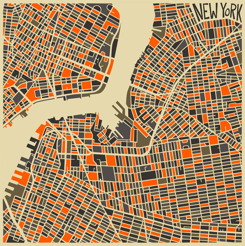
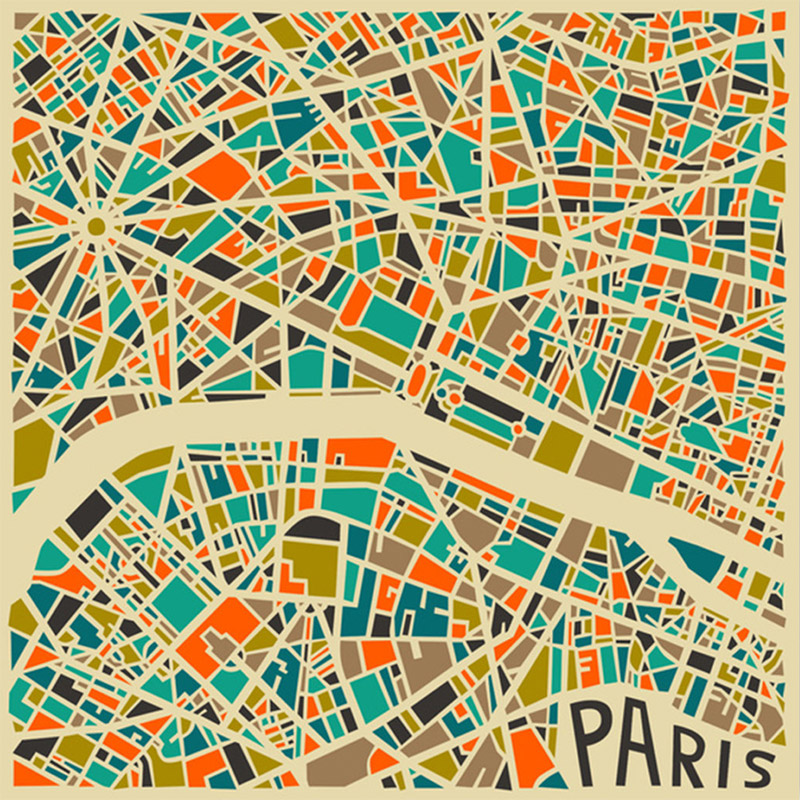
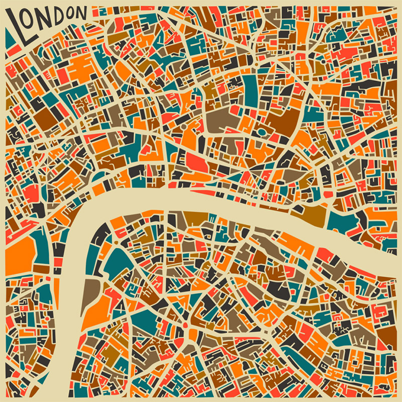
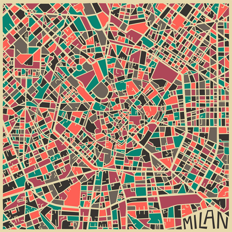
I do like a map and these abstract city maps by Jazzberry Blue are no exception with their blocks of colour and graphic shapes they're definitely ticking all the right boxes.
It's really interesting to see the street plans in such a simple form. I love how crazy and random the London streets are compared to the others and the New York one is grid heaven.
Jazzberry Blue have a great body of illustration work, including more maps for New Delhi, LA and Jerusalem all available as Giclee art prints here.
Images copyright Jazzberry Blue.
Via Colossal.
https%3A%2F%2Fwww.deliciousindustries.com%2Fabstract-city-maps
Delicious+Industries%3A+Abstract+City+Maps
From the reference box #132

The booklet itself isn't anything to write home about, apart from a spattering of little illustrations (I'm assuming by the same artist) and a wonderful map on the inner back cover.
The cover is signed 'Pešić 61', but unfortunately I can't find anything out about him/her which is a shame as I'm a real fan of their style. If anyone knows more about Pešić and where I can see more of their work please let me know.


The reference box is quite full these days, so if you want an inspirational break from the grind, make a cuppa and dive in.
https%3A%2F%2Fwww.deliciousindustries.com%2Ffrom-the-reference-box-132
Delicious+Industries%3A+From+the+reference+box+%23132
Mind the Map

Mind the Map: Inspiring art, design and cartography is a new exhibition opening at the London Transport Museum on Friday 18 May looking at the history and creativity of London transport maps.
The exhibition is said to be the largest of it's kind and will not only showcase historic maps from the museums vast collection, but also new works by artists Simon Patterson, Stephen Walter (see his 'Map of Subterranean London' below), Susan Stockwell, Jeremy Wood, Claire Brewster, and Agnes Poitevin-Navarre.
"The displays will explore geographical, diagrammatic and decorative transport maps, as well as the influence of the iconic London Tube map on cartography, art and the public imagination. The Underground, London Transport, and its successor Transport for London, have produced outstanding maps for over 100 years. These have not only shaped the city, they have inspired the world."

Images copyright London Transport Museum and Stephen Walter respectively.
https%3A%2F%2Fwww.deliciousindustries.com%2Fmind-the-map
Delicious+Industries%3A+Mind+the+Map
From the reference box # 121


I love the contrast of the traditional style cover against the gorgeous graphic maps inside - they're so bright and colourful with a very modern feel.
It was designed in March 1967 for The National Tourist Organization of Greece by M Katzourakis.
Shrug off those January blues with some tea, a slice of cake and a dig around in our reference box!
https%3A%2F%2Fwww.deliciousindustries.com%2Ffrom-the-reference-box-121
Delicious+Industries%3A+From+the+reference+box+%23+121
From the reference box # 118


After some research I was fascinated to discover that Skansen is a living open-air museum in Djurgården, Stockholm, Sweden - the first in the wolrd in fact!
Founded by Artur Hazelius in 1891 as the outdoor annex to his Nordiska Museet (Nordic Museum), Skansen was the culmination of years of collecting and saving ethographical relics. In 1872 he had realised just how quickly life in Sweden was changing and set about " collect clothing, household utensils, furniture and hand-tools from the old farming culture: everything that needed to be preserved for posterity".
"At the beginning of the 1870s, three million of Sweden’s population of just over four million people still lived in the countryside. But country life had changed. The number of independent farmers had declined and the ranks of the landless had grown. The increase in population created a growing body of tenant cottagers, servants to the gentry and indentured labourers. Land reforms that destroyed villages and re-allocated the fields transformed the way of life in the countryside as well as its buildings. Agriculture became mechanized, industrial products did away with crafts and new means of communication opened up more efficient ways of distributing goods."
"The landless classes left their homes to seek work on the railways, in the shipyards and the factories and in the sawmills of northern Sweden. Sweden developed into an urban society. Crop failures at the end of the 1860s caused more than 100 000 Swedes to emigrate to America. This wave of emigration reached a peak in the 1880s when 325 000 Swedes left for America and a further 52 000 emigrated to other countries."
It wasn't enough for Hazelius to show static exhibitions, he wanted people to experience complete environments; the everyday life and sounds of the old Swedish culture, "fully furnished houses occupied by people wearing period costume surrounded by their domestic animals in a natural landscape".
Skansen is still a popular tourist attraction today, though I think it will look a bit different to how it did in 1961 - here's the full fold-out map from back then in all it's glory...

Unfortunately I couldn't find out who the illustrator was, there is the word Järk in the map border, but that's the only clue. If you do have any ideas as to who it might have been, please let me know.
https%3A%2F%2Fwww.deliciousindustries.com%2Ffrom-the-reference-box-118
Delicious+Industries%3A+From+the+reference+box+%23+118
From the reference box # 113

The two above are new additions; a complimentary Washington DC Map and Visitor's Guide from Exxon (the parent company of Esso & Mobil), 1977 (left) and a complimentary Arizona - New Mexico Tourgide Map from Gulf, 1965 (right).
The Gulf one also has a map of the United States on the reverse with little crosses and notes in all the states the original owner had visited - I love details like this on old ephemera!
See more vintage maps and ephemera here.
https%3A%2F%2Fwww.deliciousindustries.com%2Ffrom-the-reference-box-113
Delicious+Industries%3A+From+the+reference+box+%23+113
Sanborn Fire Insurance Map Lettering


After completing a successful commission preparing insurance maps for the Aetna Insurance Company, surveyor D. A. Sanborn saw their value to the fire insurance industry and established D. A. Sanborn National Insurance Diagram Bureau in New York City,1867.
The lettering above shows how each town/city had a uniquely designed heading, title page or legend. They remind me of the very elaborate Carte-de-Visite reverses of the same period. I find it interesting that in the late 1800's, companies here in the UK and in the US were producing similar style lettering designs.
Reading some of the typographers comments on BibliOdyssey, I learned the difference between Lettering (hand-lettering created a purpose, not using pre-designed fonts), Typography (arranging pre-designed fonts) and Calligraphy (hand-lettering with a pen or brush). I did know the calligraphy definition but had never really given much thought to what was defined as 'lettering' or 'typography' - you learn something new everyday!
Images copyright BibliOdyssey.
Via FFFFound.
https%3A%2F%2Fwww.deliciousindustries.com%2Fsanborn-fire-insurance-map-lettering
Delicious+Industries%3A+Sanborn+Fire+Insurance+Map+Lettering
From the reference box # 109

#109 - Fly BEA Map of Copenhagen. I picked up this little gem at the weekend. It was the detailed cover illustration that first caught my eye - it reminded me of the E-boy cityscapes.
The leaflet was a complimentary guide given to passengers of BEA when traveling to Denmark's capital city in 1964. It folds out to a large map on one side and is packed with tourist information on the other.
It opens portrait, to a gorgeously graphic map and suggested places to see from 'Kongens Nytorv (The King's New Market) to Tivoli...

Or opens landscape to reveal a 'Railway Skeleton Map of City, Suburban and Districts Services with Connections'. I love the 'S' graphic with the wings and crown...

and on the back has a handy currency guide...

BEA operated domestic and European flights from airports across the UK from 1946 to 1974 when they merged with their parent company BOAC (British overseas Airways Corporation), Cambrian Airways and Northeast Airlines to become British Airways.
Whilst researching BEA, I found some great old adverts from the late 50's and 60's here and also a selection of timetables from the same period here.
https%3A%2F%2Fwww.deliciousindustries.com%2Ffrom-the-reference-box-109
Delicious+Industries%3A+From+the+reference+box+%23+109
From the reference box #73

#73 - Wonder Atlas; An atlas for the air-age (the new up-to-date edition). It cost me 50p and the guy I bought it off looked at me as though I was mad, but it's worth every penny. Just look at the cover for a start with all it's 50's loveliness - I do love a turquoise and a red together too.
There are 24 full colour (up-to-date) maps inside including political, distance by air from London, average distance from a railway in different countries, seaway and airway versions, as well as a 4 page centre supplement of black an white photographs showing cities of the Commonwealth.
It was printed by LP - The Literary Press Ltd. in London (you can see their owl logo with the words, 'In knowledge lies wisdom' on the cover above) on a Collins Clear-Type Press and is a late 50's edition, from 1959 (I think).
Check out more of our reference box items here - I'm sure you'll like what you find!
https%3A%2F%2Fwww.deliciousindustries.com%2Ffrom-the-reference-box-73
Delicious+Industries%3A+From+the+reference+box+%2373
From the reference box #40

Pretty new to the reference box is this 1973 guide to the Jungfrau railway in Interlaken, Switzerland. As you would expect from a piece of Swiss design of this era, it's packed full of wonderful logos, typography and adverts.
This centre spread map has the only colour print throughout and just look how slick their chosen palate works with the black & white graphics and illustrations.

Here are a selection of my favourites...


Click here to see what other delights are hiding in our reference box.
https%3A%2F%2Fwww.deliciousindustries.com%2Ffrom-the-reference-box-40
Delicious+Industries%3A+From+the+reference+box+%2340
From the reference box #38

I love how the map graphics and colour coding have been used to create this funky cover. As you can see it's a Paris Metro & Autobus map from 1972.
Inside it has 3 maps; a metro map of the full region...

... an Autobus map of the central city...

... and a night Autobus map, again of the inner city area...

I also really like the unexpected use of the script font (used to mark the different areas within the city) it's a pleasant surprise.
All-in-all a nice little addition to the reference box. Have a delve in the box yourself here for a little Friday inspiration.
https%3A%2F%2Fwww.deliciousindustries.com%2Ffrom-the-reference-box-38
Delicious+Industries%3A+From+the+reference+box+%2338
From the reference box #37

# 37 - 60's & 70's US Road Maps
I came across these at the weekend. This Gulf one is my favourite - I'm loving the big GULF graphic on the front and inside it has these lovely illustrations of "a host of good Gulf products, all topnotch quality!"

I think the Gulf one is probably from the 60's, but this Union Oil one is from 1973. I'm already a fan of the 76 ball graphic and I really like the arrow design on the front. Definitely good finds in my book!

https%3A%2F%2Fwww.deliciousindustries.com%2Ffrom-the-reference-box-37
Delicious+Industries%3A+From+the+reference+box+%2337
Metro Maps of the World

I saw the Washington DC underground map on So Much Pileup the other day and it reminded me of a great book I bought a few years ago, Metro Maps of the World by Mark Ovenden. I know it sounds dull, in fact the guy in the book shop actually laughed when I took it to the counter, but it's a fantastic book full of information and pics about underground (and some overground) maps, their history and who created them.
Above right is the very map that started this train (sorry!) of thought and to it's left the 1962 version, which shows on it proposed sections for expansion that are only this decade being constructed! The current Washington map is one of very few Worldwide to have introduced thick lines, copied only by Baltimore.
The most famous underground map is of course that of our very own London Underground. Designed originally by Harry Beck in 1932 and published in 1933 (below right) it replaced Fred Stingemore's 1925 version (below left) which itself was meant to have improved legibility.

Beck's design is iconic. It uses only horizontal, vertical and 45 degree lines joined with uniform curves and bends to create a simplistic and very easy to follow map - a style still used today (see below) and one that has been copied all over the World.

Another well-known underground map is that of the New York City Subway. The first version emerged in the early 1900's (below) and focused only on Manhattan, but showed all the train operators at the time in a very clean and detailed design, very much based on the grid-like NYC street plan.

By 1948 (below left) the whole of NYC had been added. This was one of the first attempts to show all the individual networks on the same pocket map. Previously each service had produced their own maps. Throughout the late 50's and 60's clearer, more stylistic versions of the combined map developed - a style that remained and is hugely successful in one of my favourite versions, the 1972 design (below right).

Throughout this decade though, NYC seem to have moved away from this design and returned to a version (below) very similar to that of the 1948 pocket map.

Looking through the book, it was Moscow's fantastic subway maps that stood out the most for me. Early versions (below left) were in black and white due to the restrictions on materials and they were actually designed by Fred Stingemore, the pre-1933 London Underground designer.

Eventually though, the Russians began producing colour maps and with it the design became more European and stylised as seen above right in this 1967 version.
For me though, it's the 80's versions (below) that are the most inspiring and interesting. I love that they have a 50's feel and at a glance look like diagrams of the solar system with their different sized circles and dotted lines.

The dotted lines actually referred to outer stations and the coloured circles indicated station interchanges. The current version developed throughout the 90's and is much more European and as so many others uses the principals demonstrated in Beck's London Underground map, which might be more legible but certainly doesn't have the charm of the 80's ones.

Images copyright Metro Maps of the World.
https%3A%2F%2Fwww.deliciousindustries.com%2Fmetro-maps-of-the-world
Delicious+Industries%3A+Metro+Maps+of+the+World
From the reference box #16


"Tour Holland by motor car" is a wonderful 1950's leaflet about touring this 'land of broad horizons'. It gives you the legal requirements for driving in their country, a low down of the road signs, a brief highway code, parking & car washing charges, touring routes, hotel & tourist information contacts and best of all it opens out into a map of the countries 2 main roads, in a kind of tube map style.
The map shows the towns and villages like tube stops along a simplified road and has places of interest; windmills, galleries, museums etc... marked on with simple icons. It's a superb piece of design and still looks really modern over 50 years later - the true test of good design!
#16 - 1950's travel leaflet - Holland.
https%3A%2F%2Fwww.deliciousindustries.com%2Ffrom-the-reference-box-16
Delicious+Industries%3A+From+the+reference+box+%2316
Welcome

Welcome to the Delicious Industries blog. We're an independent design studio based in Brighton, UK and this is our scrapbook packed full of design, illustration, photography & typography inspiration. Check out our work here.
Links
DELICIOUS FRIENDS
DELICIOUS FAVOURITES
- 50 Watts
- Acejet 170
- Grain Edit
- It's Nice That
- National Geographic Found
- Notcot
- Pretty Clever
- Retronaut
- So Much Pileup
- We Love Typography
- Another Mag