Blog: March 2010
From the reference box #70


#70 - Commemorative, sailing themed stamps from the UK designed by Andrew Restall MISA and released on June 11 1975
These bold, colourful stamps illustrate Sailing Dinghies (7p), Racing Keel Boats (8p), Cruising Yachts (10p) and Multihulls (12p).
Below is the First Day Cover that my set came on...

See more Andrew Restall designed stamps from the reference box here, here and here.
https%3A%2F%2Fwww.deliciousindustries.com%2Ffrom-the-reference-box-70
Delicious+Industries%3A+From+the+reference+box+%2370
Vintage Art Supplies

This great selection of 60's crayon + paint packaging is from the amazing collection of vintage packaging, ephemera and ads etc... in Christian Montone's Flickr photostream - seriously, I've spent ages looking through his sets and still not seen it all.
I actually have some of these myself. I'll have to dig them out of the reference box and post them up. meanwhile enjoy these...
Images copyright Christian Montone.
https%3A%2F%2Fwww.deliciousindustries.com%2Fvintage-art-supplies
Delicious+Industries%3A+Vintage+Art+Supplies
Farmers' Market Prints from Yee-Haw Industries


I love everything about these hand letter-pressed posters from Yee-haw Industries for the Knoxville Tennessee Regional & Organic Farmers' Market - the type setting, the fonts, the design and the giant, vegetable illustrations.
They're all available* from their Etsy store, be warned though, there are lots of great prints and posters in there - you will want to buy everything!
* UK peeps check out the shipping policies as there is a minimum order (but that shouldn't be a problem!)
Images copyright Yee-Haw Industries.
https%3A%2F%2Fwww.deliciousindustries.com%2Ffarmers-market-prints-from-yee-haw-industries
Delicious+Industries%3A+Farmers%26%23039%3B+Market+Prints+from+Yee-Haw+Industries
Mr Therm - the little gas man!
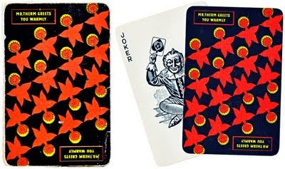
Remember our post about our vintage, Mr Therm playing cards (above)?
Well, I was recently asked by Mikey Ashworth if I would add it to his Mr Therm - the little gas man! Flickr pool which has a great selection of Mr Therm merchandise and promotional items (like the matchbooks and fridge badge below) as well as a bit of history behind the campaign.


It's not a large group, but it's definitely worth a look.
Fridge badge image copyright I like.
Matchbook image copyright Dan Chamberlain.
https%3A%2F%2Fwww.deliciousindustries.com%2Fmr-therm-the-little-gas-man
Delicious+Industries%3A+Mr+Therm+-+the+little+gas+man%21
From the reference box #69
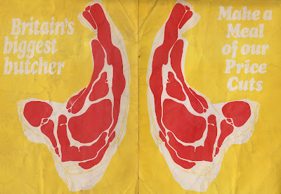
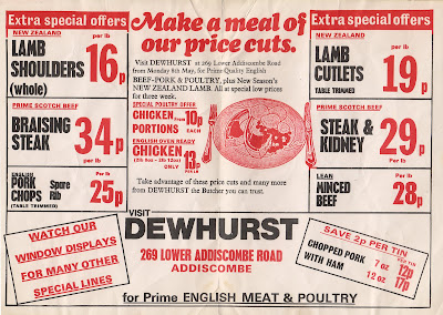
#69 - Dewhurst Butchers leaflet - 'Make a meal of our price cuts'. I picked up this leaflet at a boot sale for free along with loads of other ephemera that a stall holder was left with at the end of the day!
I love the bright yellow front and how it contrasts with the big red chunk of meat. It's a very functional design - there's loads of information and offers thrown in there but it's easy to read. It's not an amazing design by a long way, but it works, it's interesting and it definitely has a certain charm - I think that's why I like it.
I'm guessing, looking at the prices, that it's from the early 80's when high street butchers were still common and the competition was strong. I don't know why, but I do find it funny that butchers used to put out leaflets.
Dig deep into the reference box here, for more interesting ephemera and vintage design.
https%3A%2F%2Fwww.deliciousindustries.com%2Ffrom-the-reference-box-69
Delicious+Industries%3A+From+the+reference+box+%2369
From the reference box # 68
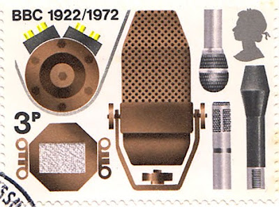

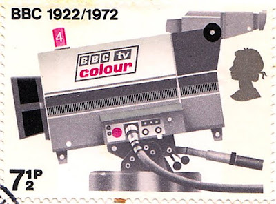

#68 - set of 4 stamps celebrating 50 years of the BBC (1922 - 1972).
Designed by David Gentleman and released on 13 September 1972, these stamps have great illustrations of equipment significant in the history of broadcasting; 3p - Microphones, 5p - Horn Loudspeaker, 7 1/2p - TV Camera and 9p - Oscillator and spark transmitter (Marconi/Kemp experiments 1897).
Here are the first day covers for each stamp, which are also pretty cool...

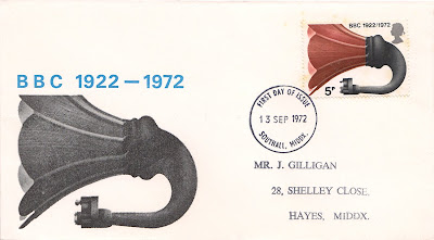

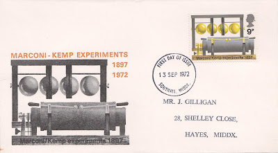
See more David Gentleman designed stamps from the reference box here.
https%3A%2F%2Fwww.deliciousindustries.com%2Ffrom-the-reference-box-68
Delicious+Industries%3A+From+the+reference+box+%23+68
More Saul Bass Matchbooks

It was a while back when I posted about a lucky blogger finding some of these wonderful Hunt-Wesson matchbooks, designed by Saul Bass on a flea market. Well I still haven't found any at my local boot sale, but design:related member Karen Horton has just found almost a full set (14 of the 16 and lots of doubles)...
"while rummaging the Chelsea Flea Market with no particular agenda, I had a hunch I recognized a few Saul Bass designs peering out of a randomly assorted box. What made the Saul Bass designs stand out instantly is that they were the only matchbook covers in a pile of hundreds sans advertising-related text or graphics."


Nice one Karen, that's a great collection - I'm not jealous in the slightest (well maybe a little!)
Via Notcot.
https%3A%2F%2Fwww.deliciousindustries.com%2Fmore-saul-bass-matchbooks
Delicious+Industries%3A+More+Saul+Bass+Matchbooks
Mac Fisheries


If you remember our post about Hans Schleger then you will hopefully recall his wonderful work for Mac Fisheries. During the mid 50's he created most of the marketing and promotional items for the company.
The photomontage style he used for their poster campaigns still looks really fresh and I love how the logo is incorporated into the lobster and salmon posters.
I had no idea though just how huge Mac Fisheries were and that they not only sold fish, but also poultry, frozen and tinned foods. There's a great website all about the company which includes a 'paraphernalia' section with loads of Schleger designed items including these great poultry posters...


food packaging...
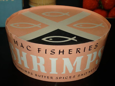

and weirdly, some round playing cards?!...

The site was compiled and is run by Colin French. It's a great resource and well worth a look. Thanks Colin for sharing all this information!
Images copyright Mac Fisheries.
Via the great Quad Royal.
https%3A%2F%2Fwww.deliciousindustries.com%2Fmac-fisheries
Delicious+Industries%3A+Mac+Fisheries
Howdoos

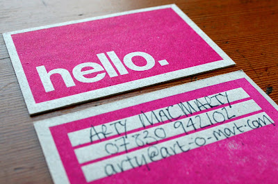
Yay! Our Howdoos have just come back from the printers.
Howdoos are business cards with blanks on the reverse ready to be personalised. There are currently two designs - hello in bright pink...

and nice to meet you in black...
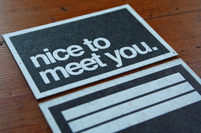
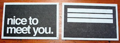
Both cards are hand letter-pressed onto grey board, so the print has lots of lovely texture and they smell delicious!
We'll be selling them in packs of ten from next week, so watch this space.
https%3A%2F%2Fwww.deliciousindustries.com%2Fhowdoos
Delicious+Industries%3A+Howdoos
Alice in Wonderland Adaptations

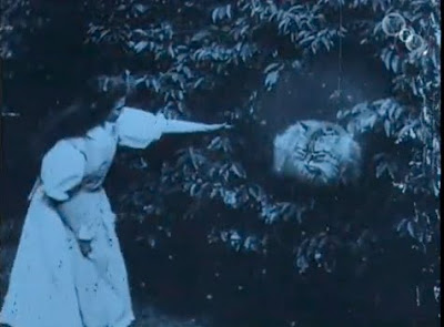
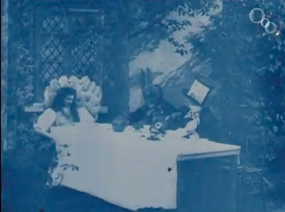


Everyone seems Alice in Wonderland crazy at the minute with the release of Tim Burton's long awaited 3D version of this Lewis Caroll classic and The British Film Institute are no exeption.
To celebrate the Tim Buton release at IMAX, The British Film Institute are showing the following adaptations; the 1933 Paramount version, Dennis Potter's 'Alice' (1965), Jonathan Miller's BBC adaptation (1966), 'Dreamchild' (1985 - made using Jim Hensen's Creature Shop creations) and Jan Svankmajer’s 'Alice' (1988).
They have also released the recently restored, footage of the very first Alice in Wonderland film from 1903 (screen grabs above) created just 37 years after the the novel was written. Donated to the BFI in the early 60's the film was in a very poor condition, but it's still really interesting to watch...
"Directed by Cecil Hepworth and Percy Stow, and was based on Sir John Tenniel's original illustrations. With a running time of just 12 minutes (eight of which survive), this 1903 film was the longest produced in England at that time and it represented a major investment for the pioneering Hepworth Studios that produced it. Some might venture to say it was the Avatar of its day."
There was no sound on the original film, so the piano accompaniment, 'Jill in the Box' was added after restoration to compliment the story. Read more about the restoration here.
All images and film copyright The British Film Institute.
Via Notcot and Cakehead Loves Evil.
https%3A%2F%2Fwww.deliciousindustries.com%2Falice-in-wonderland-adaptations
Delicious+Industries%3A+Alice+in+Wonderland+Adaptations
Cover Me Badd Fake Book Cover Competition


Our friends over at Sell! Sell! are running a design competition to create the final cover in their Cover Me Badd set of fake book covers.
"Reading the latest Dan Brown, or Ukrainian Tractor Drivers Go Bananas? Or perhaps Confessions Of A Shopaholic, or something like Gareth Gates' Autobiography (is there such a thing?)? Worry not about being looked down upon by your snooty fellow travelers for your populist or hurredly chosen reading matter. Simply slip a Cover Me Badd over your book and read happily."
The set so far includes covers to make you look intellectual (War & Peace Translated Into Mandarin), clever (Space Science 4, An Expert's Textbook), down right scary (Serial Killing For The Intermediate, A Hands On User Guide) and a little bit weird (Mummy's the Word, Living with the Oedipus Complex).
It's a great idea and if you want to be part of it, here are the competition details:
DESIGN A COVER ME BADD, WIN FRIENDS AND HARD CASH
Packs of our Cover Me Badd fake book covers will be hitting the stores later this year. But first, we'd thought we'd offer the chance to you, our dear reader to enter your own. Simply come up with an idea for a name, or even design a fake book cover, and send it to us at doubles[at]sellsell[dot]co[dot]uk - The chosen entry will be included in our launch pack, and of course the winner will not only garner massive fame and what the Americans call Kudos (aftershave, I think), but also a share of what we are cautiously estimating to be an obscene amount of profit. So get your designing and writing fingers out. The closing date is March 31st.
Read more about Cover Me Badd covers here.
Images copyright Sell! Sell!
https%3A%2F%2Fwww.deliciousindustries.com%2Fcover-me-badd-fake-book-cover-competition
Delicious+Industries%3A+Cover+Me+Badd+Fake+Book+Cover+Competition
Dutch Architecture Stamps


I saw this set of Dutch Architecture stamps on Design Related the other day and they reminded me of the Modern University Building set (1971) I posted about last week.
This set was released in 1969 and designed by Rein (R.J.) Draijer to celebrate 20th Century Dutch Architecture and Architects. They depict:
12 - Villa Huis Ter Heide Building, Utrecht - R. van 'T Hoff, 1915
15 - Woonhuis (Rietveld Schroëder House), Utrecht - G. Rietveld, 1924
20 - Eerste Openluchtschool (Open Air School), Amsterdam - J. Duiker, 1930
25 - Burgerweeshuis (Amsterdam Orphanage), Amsterdam - Aldo van Eyck, 1960
45 - The Congresgebouw's Building, Gravenhage (The Hague) - J. J. P. Oud, 1969
The stamps themselves are beautifully designed but look even better on the First Day cover postcards. The bold illustrations and blocks of colour really stand out against the black and white photographs of the actual buildings.

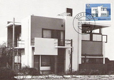


Stamp images copyright Design Related. First Day cover images copyright Frans van Vorstenbos.
Via Vintage Postage Stamps.
https%3A%2F%2Fwww.deliciousindustries.com%2Fdutch-architecture-stamps
Delicious+Industries%3A+Dutch+Architecture+Stamps
From the reference box # 67

#67 - His Master's Voice Gramophone record. This is a late 30's/early 40's recording of Tchaikovsky's Romeo and Juliet (part 3 &4) composed and conducted by Serge Koussevitzky and played by theThe Boston Symphony Orchestra which first premiered in 1938.
I didn't know much about gramophone records at all, but thanks to Earl Okin's informative site, I've discovered that the red label on this record gives an indication of the quality of the record and the artist. The best artists/most expensive records of the time had red labels, the next level down had black labels and the cheapest records had brown or plum labels. You can also see that, 'The Grampaphone Co Ltd.' (the original name before they bought the rights to the iconic Nipper and 'His Master's Voice' trademark) was still printed at the bottom of the labels along with the recording angel trademark, which was still used and preferred in some countries as the main graphic.
I bought this record for one reason only and that is the quality of the print. It's only 2 colour, but has such a gorgeous feel. You can see the indentation left from the press, the colour is really vibrant and there's a bit of overprint in areas - everything I love about real print. The logos and graphics look really good in two colour against the natural colour stock too. I especially like the '£' and record graphics.
See more from the reference box here.
https%3A%2F%2Fwww.deliciousindustries.com%2Ffrom-the-reference-box-67
Delicious+Industries%3A+From+the+reference+box+%23+67
Welcome
Welcome to the Delicious Industries blog. We're an independent design studio based in Brighton, UK and this is our scrapbook packed full of design, illustration, photography & typography inspiration. Check out our work here.
Links
DELICIOUS FRIENDS
DELICIOUS FAVOURITES
- 50 Watts
- Acejet 170
- Grain Edit
- It's Nice That
- National Geographic Found
- Notcot
- Pretty Clever
- Retronaut
- So Much Pileup
- We Love Typography
- Another Mag


