Blog: March 2009
Lisa Jones Screen Prints

We are massive fans of Lisa Jones cards and illustrations, and were thrilled to see she is now doing screen prints (50 x 70cm) - 'Night Owl' and 'Town'.
They're available from Lisa Jones Studio, Elphicks and our favourite local gallery, Castor + Pollux.
See more Lisa Jones work here.
Images copyright Lisa Jones.
https%3A%2F%2Fwww.deliciousindustries.com%2Flisa-jones-screen-prints
Delicious+Industries%3A+Lisa+Jones+Screen+Prints
From the reference box #37

# 37 - 60's & 70's US Road Maps
I came across these at the weekend. This Gulf one is my favourite - I'm loving the big GULF graphic on the front and inside it has these lovely illustrations of "a host of good Gulf products, all topnotch quality!"

I think the Gulf one is probably from the 60's, but this Union Oil one is from 1973. I'm already a fan of the 76 ball graphic and I really like the arrow design on the front. Definitely good finds in my book!

https%3A%2F%2Fwww.deliciousindustries.com%2Ffrom-the-reference-box-37
Delicious+Industries%3A+From+the+reference+box+%2337
Contact Card Game

Present & Correct have a copy of the Contact Card Game available.
"Perhaps tube maps inspired this collectible game, very popular with children and lovers of graphics alike. Originally made in the 70s, designed in London, it's a very simple creation. The 2"x2" cards can be placed in an infinite variety of ways to make the coolest patterns! "
It's boxed and comes with it's original instructions. More information here.
Images copyright Present & Correct.
https%3A%2F%2Fwww.deliciousindustries.com%2Fcontact-card-game
Delicious+Industries%3A+Contact+Card+Game
I want this book!

I was over at Sell! Sell! towers earlier today and saw them posting about this book, Corporate Diversity: Swiss Graphic Design and Advertising by Geigy, 1940 - 1970 published by Lars Müller and the Museum für Gestaltung Zuurich. I've posted about Geigy before here, but I've never seen this book and it's fantastic!
The work throughout is simple and striking - quite rightly the book relates Geigy's house style to other influential advertising and design of the era, for example Olivetti, and as you can see they were definitely along the same lines.

These ads were designed by Giovanna Pintori who worked at the Italian company Olivetti for 27 years!
See more images from Corporate Diversity at Sell! Sell!.
https%3A%2F%2Fwww.deliciousindustries.com%2Fi-want-this-book
Delicious+Industries%3A+I+want+this+book%21
'Gentry' Mens Fashion Magazine
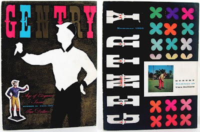
I love the colour and typography on these covers of Gentry - a men's fashion magazine from the 50's.
Published by Reporter Publications and founded by William C. Segal it covered fashion, style, sports and art, but for some reason it only ran for 22 issues.
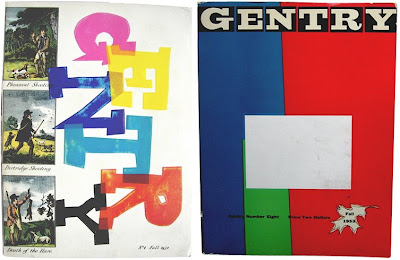
There's currently a full set available on Ebay for $599!! and some individual issues available here.
https%3A%2F%2Fwww.deliciousindustries.com%2Fgentry-mens-fashion-magazine
Delicious+Industries%3A+%26%23039%3BGentry%26%23039%3B+Mens+Fashion+Magazine
Helvetica Logos

Most designers love a bit of Helvetica now and again even though we all know it's widely over used. It's a typeface chameleon and can work in any scenario - it's simple, elegant, strong, authoritive and still looks modern fifty years down the line!
Web Designer Depot have gathered together a collection of '40 excellent logos created with Helvetica'. It's interesting to see them all together. Here are my favourites - the rest can be seen here.


All logos are the copyright of the individual companies.
Via Coudal.
https%3A%2F%2Fwww.deliciousindustries.com%2Fhelvetica-logos
Delicious+Industries%3A+Helvetica+Logos
Congratulations Sell! Sell!

Our friends at Sell! Sell! are celebrating their blogs 1st birthday this week. It's a great resource of design/illustration and photography tip bits mixed up with some interesting thoughts on the world of advertising - here's to another successful year!
https%3A%2F%2Fwww.deliciousindustries.com%2Fcongratulations-sell-sell
Delicious+Industries%3A+Congratulations+Sell%21+Sell%21
From the reference box #36

#36 - Carriageway markings: Do you know them?
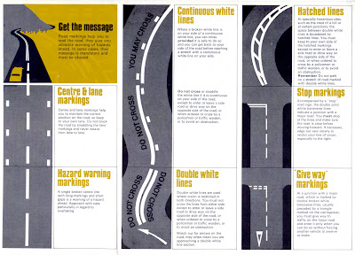
This highway code supplement is a new addition to the reference box. I love how the lines of the road markings create really graphic illustrations and how they've used only the colours of the black tarmac and the road marking colours - bold yellow and white.
When I bought it I found this smaller leaflet, 'Stop Accidents' tucked away inside sporting a bit of great Saul Bass-esque type.
So there we have it, #36 - Highway Code supplement. Have a look through the other reference box items here.
https%3A%2F%2Fwww.deliciousindustries.com%2Ffrom-the-reference-box-36
Delicious+Industries%3A+From+the+reference+box+%2336
Illustrator Paul Thurlby
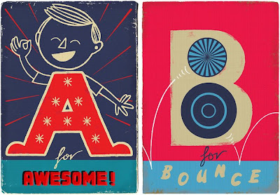
Paul Thurlby is a Buckinghamshire based, freelance illustrator. He's got loads of great work in his portfolio all with a slightly vintage/retro feel.
This alphabet has to be my favourite set - I love the colour combos on the E and F, especially the bright red on the lion.
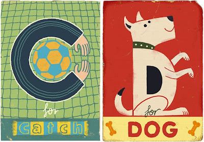
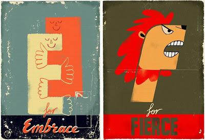
See the more of the alphabet and of Paul's work here.
Images copyright Paul Thurlby.
https%3A%2F%2Fwww.deliciousindustries.com%2Fillustrator-paul-thurlby
Delicious+Industries%3A+Illustrator+Paul+Thurlby
Charley Harper's Studio

I just came across these fantastic images of illustrator Charley Harper in his Cincinnati home/studio. They were taken by designer, printmaker and journalist Harmen Liemburg when he visited Harper in 2006.
Harper's illustration style was clean and minimal. His work can easily be recognised by the simplistic forms of nature and wildlife, so I was absolutely shocked when I saw how packed and untidy his studio was!


I love the little details in these images that give a little glimpse into his life at 84 - the electric typewriter on the desk even though this was only 3 years ago, the dried up leaves taped onto the wall for reference and most of all his cat nestled amongst the piles of his work.
More posts about Charley Harper's work can be found here, here and here.
Images copyright Harmen Liemburg.
Via Woodward Design.
https%3A%2F%2Fwww.deliciousindustries.com%2Fcharley-harpers-studio
Delicious+Industries%3A+Charley+Harper%26%23039%3Bs+Studio
From the reference box #35

Disque de controle de stationnement - a French parking control probably from the early 50's for 'Zone Bleue', which according to the very detailed map included part of the Champs-Élysée.
It has 'Matin' (Morning) 'Heure d'arrivee' (arrival time) and 'stationnement autorisé' (parking authorised till) times on one side of the dial and 'Apres -Midi' (afternoon) times on the reverse.
All the 'Heure d'arrivee' are in blue type and some have either a blue or red dot screen behind them, I'm not sure what that is indicating, but it looks good. The 'stationnement autorisé' are all in bold, red type that's much bigger than the arrival times.
I'm not sure if it's sponsored by Citroën, whether they produced them or whether they are just advertising on it, but I really like the old logo and graphic on there.
I love this little piece of ephemera, it's a great addition to the reference box and to my moving dial/wheel collection - #35 - Disque de controle de stationnement
Checkout the rest of the reference box items here.
https%3A%2F%2Fwww.deliciousindustries.com%2Ffrom-the-reference-box-35
Delicious+Industries%3A+From+the+reference+box+%2335
A year of Delicious posts…

Here's a selection of our favourite posts from the last year, enjoy:
Which? Covers (can now also be seen on our Flickr)
Wilhelm Ostwald's Color Helm
Vintage Zodiac Posters
Found Type at the De La Warr Pavilion
https%3A%2F%2Fwww.deliciousindustries.com%2Fa-year-of-delicious-posts
Delicious+Industries%3A+A+year+of+Delicious+posts%26%238230%3B
Our 1st birthday!

Yep - this day one year ago saw the very first post on the Delicious Blog.
The time has flown by, but we've loved every minute of it and are looking forward to another exciting year in Bloggersville. Hope you guys have enjoyed it just as much!
I think this calls for a celebratory cupcake
https%3A%2F%2Fwww.deliciousindustries.com%2Four-1st-birthday
Delicious+Industries%3A+Our+1st+birthday%21
Your vote counts!!


Our friends at Sell!Sell! are battling it out over the next 2 weeks in the CBS London Creative Challenge with great campaigns for Fentimans and the charity Crisis.
For 2 weeks, two agency's campaigns are pitched against each other on London Buses. The 'challenge' is to receive the most online votes in a 2 week period. Voting is limited to 1 per person per day, but everyone is eligible.
I really want the Fentimans ad to win, it's a great product and I love how the product has been tied in with the media in a fun way!
Vote here - thanks
https%3A%2F%2Fwww.deliciousindustries.com%2Fyour-vote-counts
Delicious+Industries%3A+Your+vote+counts%21%21
A Very Smart Young Man
They've got a great selection of his new prints in stock at the moment, which are definitely worth checking out, but this is an old favourite that we've had our eye on for a while. Finally it's ours
https%3A%2F%2Fwww.deliciousindustries.com%2Fa-very-smart-young-man
Delicious+Industries%3A+A+Very+Smart+Young+Man
Welcome

Welcome to the Delicious Industries blog. We're an independent design studio based in Brighton, UK and this is our scrapbook packed full of design, illustration, photography & typography inspiration. Check out our work here.
Links
DELICIOUS FRIENDS
DELICIOUS FAVOURITES
- 50 Watts
- Acejet 170
- Grain Edit
- It's Nice That
- National Geographic Found
- Notcot
- Pretty Clever
- Retronaut
- So Much Pileup
- We Love Typography
- Another Mag


