Blog: February 2009
Remember these?

They're Letraset drawers, for keeping all your Letraset sheets clean and tidy. No design studio was complete without a set in the 70's and 80's!
I found this set at Present & Correct. They're so retro looking, surely there must be a modern day use for them - stationary storage, as an in & out tray perhaps or even a cool place to actually keep all the scraps of Letraset you just can't part with despite having not used it for a decade??
By the way, if you are one of the designers with stacks of half used sheets it's about time you put them to use - remember our post about Marcus Fischer's Alphabirds?
Images copyright Present & Correct.
https%3A%2F%2Fwww.deliciousindustries.com%2Fremember-these
Delicious+Industries%3A+Remember+these%3F
Keep Calm and Carry On

I've had a Keep Calm and Carry On reproduction wartime poster for a good few years now and although every person I know now has one too, I still love it - the graphics, the colours, the big type and the straight talking, nonsense message - what's not to like, but it was only recently I found out the story behind the original poster from an article on the BBC News:
"In 1939, with war against Germany looming, the Government designed three posters to steady the public's resolve and maintain morale. These featured the crown of King George VI set against a bold red background, and three distinctive slogans - 'Freedom is in Peril', 'Your Courage, Your Cheerfulness, Your Resolution Will Bring Us Victory', and 'Keep Calm and Carry On'.
Two-and-a-half million copies of 'Keep Calm' were printed, to be distributed in the event of a national catastrophe, but remained in storage throughout the war".
It's thought that the unused poster were pulped and only an odd few are known to still exist. One of those being the poster Stuart Manley, an antique book dealer found in a box of books bought at auction, and the one that started this worldwide obsession with the message.
Stuart Manley's bookshop, Barter Books now sell reproductions of all 3 posters (seen above) on their Ebay store.
You can read the full BBC article here.
Images copyright Barter Books.
https%3A%2F%2Fwww.deliciousindustries.com%2Fkeep-calm-and-carry-on
Delicious+Industries%3A+Keep+Calm+and+Carry+On
From the reference #34
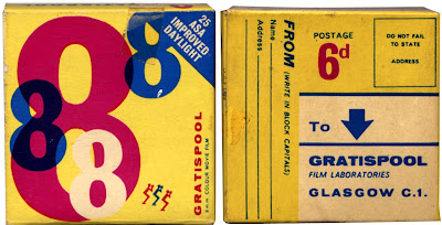
Big numbers, bright colours and big arrows, what hasn't this 8mm colour film packaging got??
I think it's from the 60s' or maybe even the late 50's, but the colours and the design are so 80's. You can only just make it out on the pic, but all the 8's are overprinted and the design on the reverse is really quite modern and I'm loving the big arrow.
#34 - vintage 8mm colour film packaging
Have a look through the rest of our reference box here.
https%3A%2F%2Fwww.deliciousindustries.com%2Ffrom-the-reference-34
Delicious+Industries%3A+From+the+reference+%2334
Auto Type II


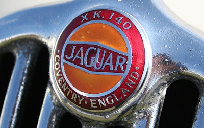


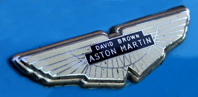


Check out the first batch Auto Type here.
https%3A%2F%2Fwww.deliciousindustries.com%2Fauto-type-ii
Delicious+Industries%3A+Auto+Type+II
The Color Helm

I bought this a couple of weeks ago, purely to go in my moving wheel/dial collection. Little did I know it had so much history.
The Color Helm: Guide to correct color combinations was produced by Ostwald Color Standards in the 1940’s. It was available in Professional, Spectrum, Student (which is the one I have), Womens’s Wearing Apparel and Interior Decorator’s models. Promising to be “Your answer to every color problem”!

It’s based on Ostwald’s Color System developed by Wilhelm Ostwald and “presents the fundamental laws of color and demonstrates them”. It basically shows a full spectrum of colour combinations with tints and darks in the exact percentage chosen. I haven’t quite figured out everything it does yet, but it came in the original box with it’s instructions, so it shouldn’t be too hard to figure out.
It turns out Wilhelm Ostwald has quite a history too... He was a Latvian/German Physical Chemist and natural philosopher, who won the Nobel Prize in 1909 for work on catalysis and chemical equilibrium and originated the process for preparing Nitric Acid.
However he also did outstanding work systemising colour and developed the Ostwald Colour System’. His colour circle consisted of a sequence of 24 hues, divided into 8 groups of 3 (yellow, orange, red, purple, blue, turquoise, seagreen and leaf green) and was first published in 1916 as ‘Die Farbenfibel’ – The Colour Primer. He also published a periodical, 'Die Farbe', which translates simply as, ‘Colour’.
Ostwald tried to standardise colour schemes through measurement and hoped to establish laws of colour harmony that would be adopted by schools, factories and art institutions worldwide.
His colour system was widely used for a few decades, but eventually proved too rigid to incorporate new colours as pigments and dyes of greater saturation were introduced onto the market.
The hunt's now on to find more of the Color Helm models!
https%3A%2F%2Fwww.deliciousindustries.com%2Fthe-color-helm
Delicious+Industries%3A+The+Color+Helm
Buchstabenmuseum - The Museum of Letters

These fabulous letters and many, many more can be seen at Buchstabenmuseum, the Museum of Letters in Berlin - they've been salvaging used letters and signage for the last 4 years.

To view the full collection book an appointment the next time you are in Berlin, or take a look at Core77's wonderful, sneak preview pics.
Images copyright Core77.
Via Sell!Sell!
https%3A%2F%2Fwww.deliciousindustries.com%2Fbuchstabenmuseum-the-museum-of-letters
Delicious+Industries%3A+Buchstabenmuseum+-+The+Museum+of+Letters
Andy Smith Book Covers

We're big fans of illustrator Andy Smith's work, so when he added us as a new contact on Flickr we had a good old snoop around his photostream and look what we found - a fantastic collection of all the book covers he's designed.


There's quite a few and they make a great set, bursting with bold colours and fun type - these are just a few of my favourites.
All images copyright Andy Smith.
https%3A%2F%2Fwww.deliciousindustries.com%2Fandy-smith-book-covers
Delicious+Industries%3A+Andy+Smith+Book+Covers
Classic Logos
The classic Penguin logo we all know and love was originally designed by 21 year old office worker, Edward Young in 1934. He was sent to London Zoo by the publisher, Allan Lane to sketch penguins, which formed the early logo. It was 15 years later (in 1949) that the Jan Tschibold version was created.
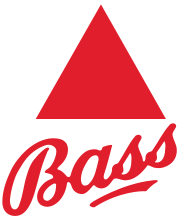
British brewery, Bass boast that their red triangle is, 'The World's most famous trademark' and although there is no proof of this, it was the first British Registered Trademark.
Guinness first used the O'Neill harp (or Brian Boru harp) alongside their signature in 1862. It originally had 27 strings, but for design reasons this number was reduced over time first to 18, in the 50's and finally to 10 in the 60's.
When Ireland became an independent nation in 1922 they chose the O'Neil harp as the official Irish symbol, however because of copyright issues they had to reverse their version.
The winged-foot synonymous with Goodyear was originally inspired by a statue of Mercury in founder, Frank A Seiberling's childhood home. It has been their trademark since 1900.
You know how hard it is to come up with names for things, well, French petrol company Elf turned to a computer to choose their name. Elf was chosen from 8,253,000 three, four and five-letter combinations. Their simple, bold logo was then designed by Jean-Roger Rioux in 1966.
For more information about the history and background to classic logos and trademarks, have a look at Marks of Excellence: The history and taxonomy of trademarks. It really is a great book.
All information from Marks of Excellence.
https%3A%2F%2Fwww.deliciousindustries.com%2Fclassic-logos
Delicious+Industries%3A+Classic+Logos
Alternative Valentine Gifts
First up is this fantastic poster for the Ettore Sotass designed, Olivetti 'Valentine' typewriter. Available as a limited edition of 1000 exclusively at the Design Museum.
Secondly this great Ace of Hearts tea-towel. Ok, so maybe a tea-towel isn't the most romantic of gifts, but Manicule's giant playing card design certainly is fun and look, it has hearts and everything - perfect...

Rob Ryan had to be on the list, his prints always have an air of romance about them and he's even created one especially for the occasion (below right). Both these prints and more are available from Soma.
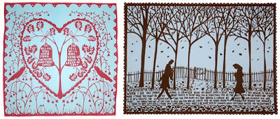
And finally, you can't beat a bit of Marvin Gaye to get you in the mood for love, so these lyrical prints are just perfect. It's Pop, It's Art was a collaborative project between London design studio Airside and EMI Publishing UK - "built upon a love of both music and art".
Below left, lyrics to Marvin Gaye's - What's Going on? and below right lyrics to Primal Scream's - Come Together. Both available in the sale at Soma!

https%3A%2F%2Fwww.deliciousindustries.com%2Falternative-valentine-gifts
Delicious+Industries%3A+Alternative+Valentine+Gifts
Vintage Valentines

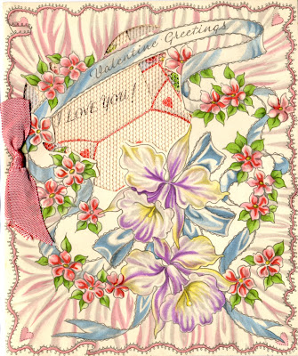

Getting you all in the mood for tomorrow, here are some vintage Valentine's Day cards. They're so delicate, and beautifully decorated with lace, foil and ribbon - I'm guessing they are from the 30's or 40's but not really sure.
I bought them in a little box at a boot sale, along with a couple of handmade cards, and the engagement card and gift tag (below) from the same era.
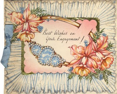

For more vintage design and ephemera have a look through our Reference Box!
https%3A%2F%2Fwww.deliciousindustries.com%2Fvintage-valentines
Delicious+Industries%3A+Vintage+Valentines
Vintage Typewriter Ribbon TIns


Thanks to Ryan at Sell! Sell! for the link to these great old Typewriter Ribbon tins - they are part of Uppercase's collection on Flickr.

They're really gorgeous items that look fantastic as a group - the graphics, typography and bold colours, just make them so interesting.
I'm sure I have some of these somewhere, I'll have to try and route them out!
Images copyright Uppercase.
https%3A%2F%2Fwww.deliciousindustries.com%2Fvintage-typewriter-ribbon-tins
Delicious+Industries%3A+Vintage+Typewriter+Ribbon+TIns
Alpha-Robot

How cute is this Alpha-Robot - I love the ears! He's from a collection of hand-pulled screenprints available at Bold & Noble, many of which are typographic including the one below, a modern version of the iconic 'LOVE' graphic, that would make a great Valentine's Day gift...

Images copyright Bold & Noble.
https%3A%2F%2Fwww.deliciousindustries.com%2Falpha-robot
Delicious+Industries%3A+Alpha-Robot
Sellotape® Tins


I found these old Sellotape® tins at the weekend. To think Sellotape® was packaged in such an extravagant way seems crazy these days, but they are gorgeous and I love the giant 'S' on the front.
I was told they were from the 60's, but after some research I actually think they are from the mid to late 50's. These product pics (below) are from the 60's, showing the original self-adhesive tape in mostly blister-pack style packaging or sold individually from large tin tubes. There are some tins on the bottom row of the display rack, so it's my guess they were being phased out by the early 60's.

The display box (below left) is from the 60's and shows some of the new product range available from Sellotape® - Masking, Insulating and Double-sided tape, "Tapes for the Handyman". The box below right shows the more modern looking 70's packaging for the original clear tape.

The ads below ran throughout the 60's to advertise this new range of DIY tapes in DIY magazine and Practical Householder.
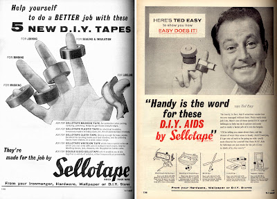

For more information about the history of the Sellotape® brand go here and for more info about the history of sticky tape see here.
Product display images copyright Sellotape.
https%3A%2F%2Fwww.deliciousindustries.com%2Fsellotape-tins
Delicious+Industries%3A+Sellotape%C2%AE+Tins
It's a Stamp World
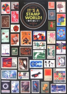
Viewers Like U have come across a few copies of this great out-of-print Japanese book, It's a Stamp World an amazing collection of stamps from around the world including designs by Aicher, Bruna.


These very kind people are selling off their spare copies here for $50 including postage (not sure if this includes to the UK), hopefully they have some left!
Images copyright Viewers Like U.
https%3A%2F%2Fwww.deliciousindustries.com%2Fits-a-stamp-world
Delicious+Industries%3A+It%26%23039%3Bs+a+Stamp+World
Branding in Arabic
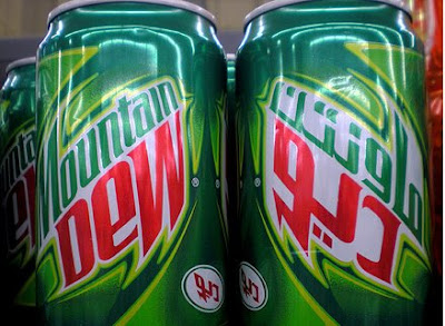
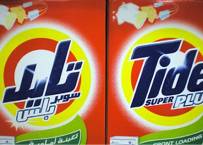
I saw these yesterday on Graphicology, they are photos taken in Dubai of products branded in both English and Arabic. The packaging designs are nothing to write home about, they are just your regular, cheesy supermarket packages, but I find the way some of them have translated their branding into Arabic really interesting. Of course Arabic is a phonetic language and I think the best of these packages are the ones were the branding has been mirrored to reflect this.
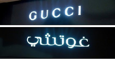
There are also some pics of store signage, which are equally as interesting. I really like the look of the Arabic GUCCI with all the dots.
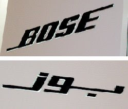
Images copyright Graphicology.
Via Notcot.
https%3A%2F%2Fwww.deliciousindustries.com%2Fbranding-in-arabic
Delicious+Industries%3A+Branding+in+Arabic
Welcome
Welcome to the Delicious Industries blog. We're an independent design studio based in Brighton, UK and this is our scrapbook packed full of design, illustration, photography & typography inspiration. Check out our work here.
Links
DELICIOUS FRIENDS
DELICIOUS FAVOURITES
- 50 Watts
- Acejet 170
- Grain Edit
- It's Nice That
- National Geographic Found
- Notcot
- Pretty Clever
- Retronaut
- So Much Pileup
- We Love Typography
- Another Mag


