Blog: October 2009
Let Children Learn

Why are UK stamps never as gorgeous as this set from the Netherlands? I love everything about them - the type, the colours and the illustration style.
Designed and illustrated by Christian Borstlap these fun, colourful stamps are entitled, 'Laat kinderen leren' or 'Let Children Learn'. The campaign also includes a sweet animation by Paul Postma (can be seen here) and a postcard booklet, both using Christian's stamp illustrations...


For more of Christian's great work check out his website.
Images copyright Christian Borstlap.
Via the fabulous Stickers and Stuff.
https%3A%2F%2Fwww.deliciousindustries.com%2Flet-children-learn
Delicious+Industries%3A+Let+Children+Learn
Houlton-Gate: Fentimans Fights Back!
"The Aroostook Substance Abuse Prevention Coalition, the Maine Alliance to Prevent Substance Abuse, the Maine Attorney General's Office, and Houlton Police Chief Butch Asselin have all got involved.
Officials from the Aroostook Substance Abuse Prevention Coalition (ASAP) and the Maine Alliance to Prevent Substance Abuse (MAPSA) have maintained that the beverage should be classified as imitation liquor since learning that a Houlton High School student brought a bottle of the lemonade to school several weeks ago."
In light of all the hoo-ha our good friends over at Sell! Sell! have helped their clients create an appropriate response (above).
Nice work Sell! Sell! it's brilliant and right on the nail with the tone-of-voice. Of course under age drinking has to be taken very seriously, but there are limits afterall there is trace alcohol in toothpaste, mouthwash and a million other everyday products, all of which are freely available to under 21s.
All the Maine officials seem to have succeeded in doing, is bringing Fentimans, a small Northern England soft drinks company, to the world stage and boosting their US orders considerably!
You can read the full story here.
https%3A%2F%2Fwww.deliciousindustries.com%2Fhoulton-gate-fentimans-fights-back
Delicious+Industries%3A+Houlton-Gate%3A+Fentimans+Fights+Back%21
Autumn print from Hero
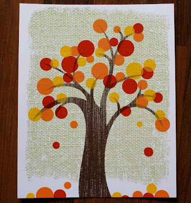
I love this new Autumn print from Hero Design Boutique, I think it totally captures the spirit of the season.
Beth at Hero says, "Autumn is my favorite season of them all. I love all the colors, the brisk air and the smell of the drying leaves. Every year I find myself in the most wonderful mood come mid October! This year I finally decided to capture that feeling in a print".
The prints are limited edition 5 color, 8" x 10" screen prints, printed on Accent Opaque Smooth White 100# and signed by the lovely folk over at Hero.
This print, and other great silk screen posters from Hero are available here and here.
Image copyright Hero Design Boutique.
https%3A%2F%2Fwww.deliciousindustries.com%2Fautumn-print-from-hero
Delicious+Industries%3A+Autumn+print+from+Hero
From the reference box #59
Issued on 5 October 1983, they're not very old, but the illustration style and colours really caught my eye. They were designed by Andrew Restall DA to illustrate the different kinds of local 'fairs'; Merry-go-round (16p), Big wheel, Helter skelter and Performing animals (20 1/2p), Sode-shows (28p) and Early produce fairs (31p).
The contrast between the 3 fairground/circus style ones in the bright oranges and pinks and the produce fairs one in natural greens and browns is great, but it's the details I'm drawn to in these particular stamps - the little cat in the foreground of the 31p one and the little pelican in the foreground of the 20 1/2p one.
For more wonderful stamps and items of vintage ephemera you might like to have a dig around in here.
https%3A%2F%2Fwww.deliciousindustries.com%2Ffrom-the-reference-box-59
Delicious+Industries%3A+From+the+reference+box+%2359
Lubalin Now!

Lubalin Now is the, "inaugural exhibition in the newly re-located Herb Lubalin Study Center of Design and Typography" in New York.
Herb Lubalin's wonderfully elaborate and stylized typography will be exhibited alongside the work it has influenced from internationally recognized, contemporary designers such as Marian Bantjes, Non-Format, Rick Valicenti and Marcus Eriksson.
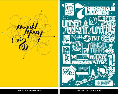

"On view in Cooper Union’s new gallery, the installation includes recent posters, publications, and motion graphics by internationally recognized graphic designers that spotlight an emerging trend toward expressive lettering and typography.
Original sketches, magazines, logotypes, and posters selected from the Lubalin Center Archive will illuminate Lubalin’s influence on contemporary graphic design."
The exhibition, curated by Mike Essl and Alexander Tochilovsky, runs from 5 November - 8 December 2009 and is free to all you lucky peeps in NY - I'm not jealous at all!
Images copyright of the individual designers.
'Lubalin Now' logo copyright Justin Thomas Kay.
Via Grain Edit.
https%3A%2F%2Fwww.deliciousindustries.com%2Flubalin-now
Delicious+Industries%3A+Lubalin+Now%21
Vintage UNO!
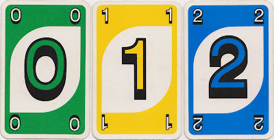
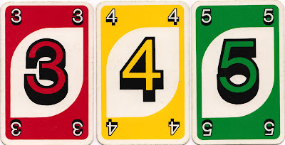


Well, maybe not vintage yet, being from 1985, but well on it's way! I bought this game of UNO a few weeks back because I loved it's goofy numbers with their thick black outlines and shadows against the white leaf shape. They look more 70's than 80's to me, but maybe the design just hadn't changed much since the late 1970's.
https%3A%2F%2Fwww.deliciousindustries.com%2Fvintage-uno
Delicious+Industries%3A+Vintage+UNO%21
From the reference box # 58
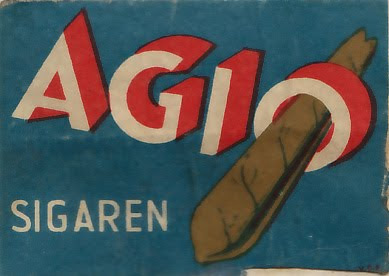
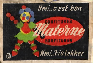
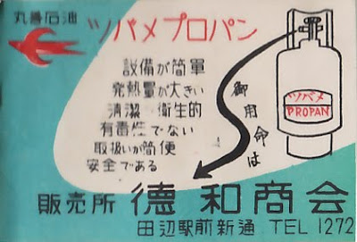
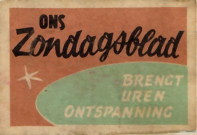

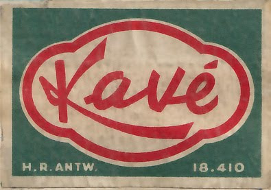

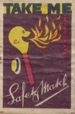
#58 - Vintage matchbook covers. These are a selection from the collection I bought a couple of weeks ago. They're a great mixture, originating from the UK, Germany, Norway, France and China - it's really interesting how similar the styles are.
The best type for me is the 'AGIO' on the first one and the number '8' on the 'Darcy' one, but they've all got charm in their own way, be it their colour palate, typography, design or illustration style. I never get bored of looking at them.
https%3A%2F%2Fwww.deliciousindustries.com%2Ffrom-the-reference-box-58
Delicious+Industries%3A+From+the+reference+box+%23+58
Vintage Reading Posters
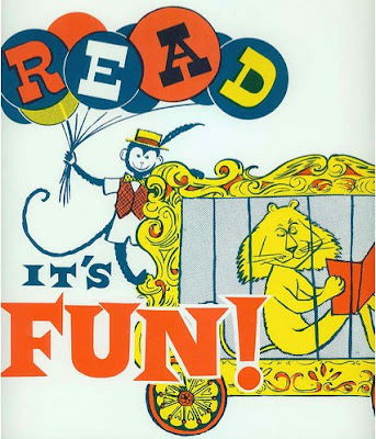
I have a thing about vintage circus posters - the colours, the graphics, the type - what's not to like! These posters, particularly the top one have all the same elements, so I'm now on a mission to find some of my own.
Images copyright doe-c-doe.
https%3A%2F%2Fwww.deliciousindustries.com%2Fvintage-reading-posters
Delicious+Industries%3A+Vintage+Reading+Posters
The Graphic Eye
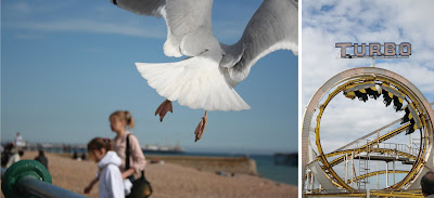
Finally we got our hands on the great new Rotovision book, The Graphic Eye by Stefan G. Bucher which showcases, 'Photographs by International graphic designers'.
Big thanks to Stefan and his team for including our images (above) in the book it's an honor to have them published along side the work of great designers like Ed Fella.
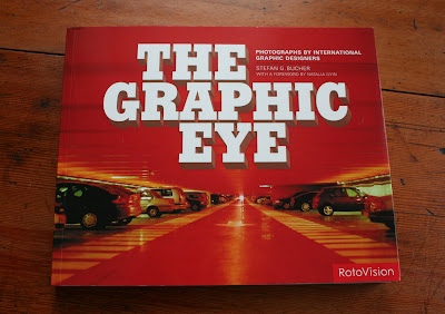


Huge congrats also to our friends at Sell! Sell! who had three of their great Polaroids published in this book too (below).

https%3A%2F%2Fwww.deliciousindustries.com%2Fthe-graphic-eye
Delicious+Industries%3A+The+Graphic+Eye
NYC Subway Destination Scroll Prints
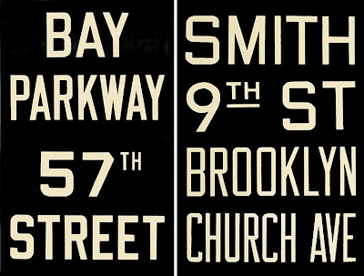

Winter Works on Paper have a wonderful selection of these c.1940 NYC Subway Destination Scrolls that can be ordered as 30 x 19" prints. The type and numbers are gorgeous and with all that black, they certainly have loads of impact - perfect for any studio or apartment.
Seeing these reminded me of the London Bus Blinds I posted about a while back which would also make an excellent talking point in the home or studio.
Images copyright Winter Works on Paper.
Via ffffound.
https%3A%2F%2Fwww.deliciousindustries.com%2Fnyc-subway-destination-scroll-prints
Delicious+Industries%3A+NYC+Subway+Destination+Scroll+Prints
From the reference box # 57
I don't know the exact date of this set, but I suspect they're from the mid 60's. "UPRAWIAJ SPORT" translates to read, "I DO SPORTS", so I wonder if they're some kind of government campaign encouraging exercise and sports (ironic I know on a matchbox, probably used by a smoker).
Whatever their reason for being, I'm drawn to the simplicity of the single colours and the strength of the shapes created by the bold silhouettes. It's the little things that I really love though, like the visible crop marks in some of the corners.
I'll post the rest of the collection over the next few weeks, meanwhile check out my other posts about matchbook labels:
From the reference box #11
From the reference box #23
From the reference box #39
From the reference box #42
Czech Matchbook Labels
Japanese Match Labels
Matchbook Covers
Mystery Parcel
Saul Bass Designed Matchbooks
Volkswagen Matchbooks
https%3A%2F%2Fwww.deliciousindustries.com%2Ffrom-the-reference-box-57
Delicious+Industries%3A+From+the+reference+box+%23+57
Web Museum of Wood Types & Ornaments


The lovely people at Unicorn Graphics have put together a fantastic Web Museum of Wood Types & Ornaments showcasing a selection of specimen catalogues, borders, cuts and engraved woodblocks.
Their mission is to, "gather, save, preserve, and interpret wood types and information about them" to educate future generations, "on the beauties of wood types and engraved blocks".
They've already succeeded in educating me - I'm a massive fan of wood type blocks, but had never really considered the circumstances in which they first came about, but now I know: "As the demand for broadsides increased during first years of the nineteenth century, the need for the process of producing large letters cheaply arose. Wood was a logical material choice because of its ready availability, lightness, and proven printing qualities. In 1827, Darius Wells of New York City first found the means to mass produce wood letters. In March of 1828, first wood type catalogue was published by Wells".
It's an amazing resource and I can't wait to go through all the content, so far I've only had enough time to look through a couple of the catalogues. That's my weekend planned out!
Images copyright Unicorn Graphics.
https%3A%2F%2Fwww.deliciousindustries.com%2Fweb-museum-of-wood-types-ornaments
Delicious+Industries%3A+Web+Museum+of+Wood+Types+%26amp%3B+Ornaments
Andy Smith's Blue Inks
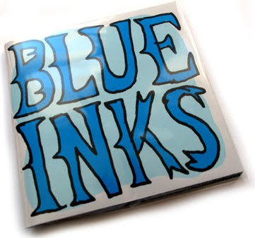
Big thanks to illustrator Andy Smith for sending us a copy of 'Blue Inks', his new limited edition screen printed book, we're very honored and we love it!
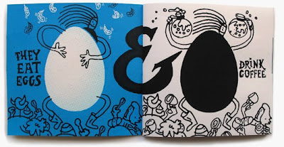

The 30 page book is packed with fantastic typography and illustration throughout as it, "follows the exploits of a gang of colour specific creatures" - very niche, but very funny. My favourite scene has to be the blue inks' fight with some magentas (below)!

'Blue Inks' and loads more of Andy's wonderful illustrations are available here. Also check out the work he's just completed with our friends Sell! Sell! for Fish4 here.
Images copyright Andy Smith.
https%3A%2F%2Fwww.deliciousindustries.com%2Fandy-smiths-blue-inks
Delicious+Industries%3A+Andy+Smith%26%23039%3Bs+Blue+Inks
Yee-Haw Industries at Chelsea Market

Tennessee letterpress studio, Yee-Haw Industries have taken over Chelsea Market in the meat-packing district of Manhattan with their wonderful prints and posters until January 2010.
"Over 100 letterpress pieces all hand-printed from wood cuts & antique type", are said to "adorn the vast and cavernous Chelsea Market".
These sneak peak images from Design:Related show how great the exhibition sits in this urban, industrial space against the bare-brick walls and exposed columns. I really need a trip to NYC!


Images copyright Design:Related.
VIa Notcot.
https%3A%2F%2Fwww.deliciousindustries.com%2Fyee-haw-industries-at-chelsea-market
Delicious+Industries%3A+Yee-Haw+Industries+at+Chelsea+Market
From the reference box # 56
I came across this festive beauty at the weekend and love how the plane silhouettes and dials have been used to create the Christmas tree and baubles - simple, but effective.
* I'm going to have another go at finding this designer and I'll update the post if I have any success.
https%3A%2F%2Fwww.deliciousindustries.com%2Ffrom-the-reference-box-56
Delicious+Industries%3A+From+the+reference+box+%23+56
Welcome
Welcome to the Delicious Industries blog. We're an independent design studio based in Brighton, UK and this is our scrapbook packed full of design, illustration, photography & typography inspiration. Check out our work here.
Links
DELICIOUS FRIENDS
DELICIOUS FAVOURITES
- 50 Watts
- Acejet 170
- Grain Edit
- It's Nice That
- National Geographic Found
- Notcot
- Pretty Clever
- Retronaut
- So Much Pileup
- We Love Typography
- Another Mag


