Blog: Magazine
The birth of Windfall magazine
Back in 2008 I posted about Windfall magazine (the predecessor to Apple User) after finding a few copies on a boot sale. The post sparked comments from quite a few of the original Windfall editorial team adding their recollections. Fast-forward to earlier this year and I had the pleasure of receiving an email from Peter F Bramfeld, sharing with me his memories of the birth of Windfall magazine, the people involved in its early development and some of his collection of early Apple marketing.
Here's the story in Peter's own words...
Hello all,
I have just stumbled across this thread and feel that I can add some background to what has already been quoted above [comments on the original post], as I am 75 years old I thought I should attempt to make this contribution before life takes its natural course.
Early 1980 whilst I was working as an experimental officer at UMIST, I received funding to purchase a personal computer. Everyone else had gone for Commodore pets, but I was attracted by the ease of interfacing external devices to the Apple 2, so I use my funding to buy an Apple.
At that time there was a national Commodore user's club, but there was no such organisation for the users of Apple, so I decided that I would start one, the Manchester Evening News got hold of the activity, via the PR department of the University, which resulted in the rather grandiose headline in the evening news "Manchester University shows American company how to use their technology".
I decided that I would advertise for Apple users to attend an evening meeting at the University so we could have a meeting of minds, at that meeting I suggested a subscription of £10 a year to the user group, for which each member would receive a monthly magazine.
The initial meeting far exceeded our expectations, and it was attended by over 200 people, at the end of the meeting I had loads of money, but an obligation to publish a magazine.
I was supported in my endeavours by my good friend and fellow university employee, Max Parrott, Max and I struggled to write the first couple of monthly magazines. In the audience had been one Derek Meakin, he approached us and said he would produce the magazine for nothing if we would supply the editorial, well this was Manna from Heaven, in addition we were both offered a fee of £100 a month for our trouble, life is too good to be true!
In the fullness of time I left the university, and joined Derek making as editor-in-chief, and from the beginning of Windfall grew a computer specific magazine stable of I think seven titles.
As to who deserves the accolade of the person responsible for the magazine, I feel that belongs to myself, and my colleague Max Parrott. David was the first editor and indeed was responsible for setting the editorial tone which was very successful in ensuring the magazine appealed to a wide readership.
If anyone would like to contact me as a consequence of this posting I would love to hear from them.
Peter F Brameld
If any of the original team wish to contact Peter, please get in touch with me and I will pass along his details as he has requested.
Three reasons to visit the De La Warr Pavillion this weekend
1. Bridget Riley - The Curve Paintings 1961 - 2014
Not long left now to see this wonderful exhibition of paintings and studies spanning Bridget Riley’s 50 year career all, “illustrating the artist’s close dedication to the interaction of form and colour by looking at a single motif” - the curve.
The exhibition coincides with the start of celebrations marking 80 years of the Pavillion becoming the first public modernist building in the UK and has been curated to “directly connect with the building’s elegant architecture, opening out the interior space towards the sea”.
The exhibition runs until 6 September 2015 (free entry).
2. Towards an alternative history of graphic design: Schmuck, POP, bRian, Assembling
A slice of graphic design history from the late 60s to the mid 70s, shown through the development of four innovative publications; Schmuck, POP, bRian and Assembling - all created by artists with no design or typographic training, who embraced technological developments and exploited them to publish their own content.
“Artists were now in control of content and the form of a publication could be explored, creating a new energy and enthusiasm for print.”
The exhibition runs until the 4 October 2015 (free entry).
3. The Cream Teas
As gallery cafes go, this one is pretty special. There’s nothing better than one of their homemade scones, a bit of clotted cream, a dollop of jam and a lovely pot of tea sat out on their first floor terrace overlooking the sea.
John Hanna tableware
 Do you remember the Country Fair covers we posted a while back, with the John Hanna animal illustrations?
Graphis Magazine
I've always been a fan of Graphis magazine and Walter Herdeg, so it was great to stumble upon these Graphis covers on Designers books, many of which I hadn't seen before. They're all fantastic, but it's the really bold, bright ones (above) that I'm most drawn to.
These beauties are from the personal collection of designer and art director, Sébastien Hayez who has 83 issues of Graphis and 15 Graphis annuals! You can see his full collection here along with lots and lots of other coveted design books - thanks for sharing Sébastien.
All images copyright Sébastien Hayez.
More Country Fair covers
Remember our post about Country Fair: The monthly journal of the open air? Well we've just uploaded lots more of the gorgeously illustrated 50's & 60's covers to Flickr.
As it's July 1st, the covers above are from July issues only, but you can see the full collection here.
If you like these it's quite likely you'll like these and these!
From the reference box #110
#110 - Printing Ephemera circa, 1965. I came across a bundle of old printers booklets ata boot sale recently, they were only a couple of pounds so I couldn't resist.
The stash included 3 x 1965 copies of Reproductions Review (August, September & December issues), 6 x copies of Inklings: Coates Bulletin for Printers (June & December 1965, March, September & December 1967, June 1969 issues) and a copy of 'acid' paper and ink drying produced by The British Federation of Master Printersin August 1965 as no.4 in their 'production aids for the printing industry' series.
It's really interesting to read about the new printing techniques and machines available in the mid 1960's. These two ads in particular, from Reproductions Review made me smile...
There's lots more vintage ephemera in our reference box, so have a root around it here.
From the reference box # 99

#99 - Cats and kittens: The magazine for every cat-lover, September 1947. Who can resist cats and kittens? Not me that's for sure, so imagine my delight finding cat related ephemera!
I've been unable to find out much about this monthly publication (other than there is a publication by the same name still going strong today, but in the US). I've found references to this Rolls House Published version dating back to the early 30's, but unfortunately I can't find an exact launch date.
Anyway, even without all the history, it's great that back in the 30's and 40's people loved their cats so much there was a need for a monthly publication and how great is that 'kitten' type?
Check out some of the wonderful cat related ads below...


There are lots more items in our reference box, have a root here.
And watch out for #100, it's going to be a special one!
Gebrauchsgraphik Magazine


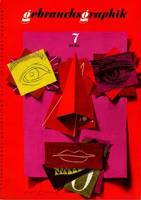
Some lovely Tuesday inspiration in the form of Gebrauchsgraphik: International Advertising Art covers. Gebrauchsgraphik or 'Commercial Arts' magazine was a German design and graphics publication founded in 1923 by Professor H. K. Frensel.
There are lots of examples of Gebrauchsgraphik covers on line, the ones above are from; A Journey Around My Skull, Webdesigner Depot, Bust Bright's Flickr, Aqua Velvet and Designers Books.
If Vintage magazine covers are your thing, you light like the following posts:
Which?
Modern Packaging
Country Fair and more Country Fair
Holiday
Opus International
Fortune
Juana Gaita
Gentry
Scienza e Vita
Walter Allner: Modern Packaging


I thought these covers for Modern Packaging seemed familiar and then I discovered they were designed by Walter Allner, the art director of Fortune magazine 1962 - 1974.
I love the Fortune covers, and these are equally as fabulous with their big blocks of colour, strong use of black and the simplified graphic illustrations.
The Modern Packaging covers above range from 1955 - 1963 so there must have been some overlap when Allner was working at Fortune magazine and still creating the Modern Packaging covers. His motto was, "Raise the aesthetic standard - the public is more perceptive than you think".
These covers are part of the Rochester Institute of Technology's (RIT) Walter Allner collection donated by the man himself. The RIT have a great online Graphic Design Archive (GDA) showcasing and preserving "the work of significant American graphic designers active from the 1920s to the 1950s", including Saul Bass, Alvin Lustig and Paul Rand.
Via Aqua Velvet.
HOWDOOS in Stylist Magazine
Huge thanks to Stylist magazine for featuring our HOWDOOS in 'The Style List' of their latest issue (no.46, 22 September 2010).
HOWDOOS are hand letter-pressed business cards with a greeting on the front and 3 blank spaces on the back ready for your personal details. Available in 2 designs; 'hello' in hot pink and 'nice to meet you' in black.
Get yours now from our Etsy store.
Holiday Magazine Covers
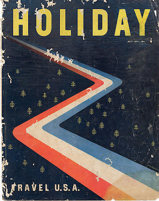
The fabulous Gono have all the covers from 1946 - 1968, many are photographic, but there are quite a few graphic ones as above - check them out here.
Holiday was a US travel magazine from 1928 - 1977, first published by the AAA (American Automobile Association) until the mid 40's when it was sold to Curtis Publishing Company who ran the magazine until 1977 when it was sold to Travel magazine who merged it with their publication to form Travel Holiday.
Via Covenger + Kester.
More Country Fair Magazines


Remember the Country Fair Magazines I posted about last year, well this weekend I was lucky enough to find a few more!
These new issues also have beautifully illustrated and graphic covers. There are four Jonny Hanna covers (October 1956, July 1957, November 1957 and June 1958) and one by children's book illustrator, John Lobban (the orange bat one - April 1958).
I can't wait to find more of these - fingers crossed I'll be lucky again soon.
If you liked these you may also like my collection of Which? Magazine covers and Do It Yourself Annuals.
New look NME


Yesterday saw the launch of a new look NME. The publication has a new editor and to mark the start of this new era has undergone a major revamp including an updated identity/masthead.
To celebrate the launch, this weeks issue is available in a choice of 10 different covers. Artists gracing the 10 covers are: Jack White, Florence And The Machine, LCD Soundsystem, Rihanna, Kasabian, Laura Marling, Foals, MIA, Biffy Clyro and Magnetic Man.
"We’ve brought together a really varied group of musicians from global icons like Jack White and Rihanna, innovators like MIA and LCD Soundsystem to exciting newcomers in the form of dubstep supergroup Magnetic Man," explained NME editor Krissi Murison.
I haven't seen any of the inside pages yet, but I think the new cover design is much cleaner and looks a lot more sophisticated than the previous style (below), so definitely a change for the better in my opinion.

Images copyright NME.
December Which? Covers


Well Christmas is almost upon us, so here are some December Which? covers, 1965 to 1974 from my collection for a bit of seasonal design inspiration.
See more Which? covers on Flickr or checkout these posts for more information:
Which? Magazine
More Which? Covers
Banks & Miles
Q&A with John Miles
From the reference box # 56
I came across this festive beauty at the weekend and love how the plane silhouettes and dials have been used to create the Christmas tree and baubles - simple, but effective.
* I'm going to have another go at finding this designer and I'll update the post if I have any success.
Welcome

Welcome to the Delicious Industries blog. We're an independent design studio based in Brighton, UK and this is our scrapbook packed full of design, illustration, photography & typography inspiration. Check out our work here.
Links
DELICIOUS FRIENDS
DELICIOUS FAVOURITES
- 50 Watts
- Acejet 170
- Grain Edit
- It's Nice That
- National Geographic Found
- Notcot
- Pretty Clever
- Retronaut
- So Much Pileup
- We Love Typography
- Another Mag


