art direction, design + typography
Blog: November 2009
MINDTHEGAP
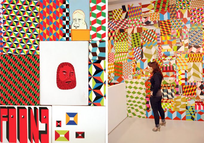
mindthegap is the inaugural exhibition of Prism, an architecturally designed three-storey exhibition space and bookshop (below right) located on Sunset Boulevard, LA.
"The mission of the project space is to become a cornerstone of artistic experimentation, carving a new niche for the arts here in Southern California. The long-term exhibition program, featuring national and international artists, promises to be vibrant and thought-provoking as it works with creative minds to cultivate a challenging and diverse aesthetic experience for the public."
mindthegap features the work of 2 exceptional artists; Barry McGee (above) - husband of the late Margaret Kilgallen, a San Francisco based artist, "first known as 'Twist', the moniker under which he attained cult status among his peers as a graffiti writer" and Philip Frost (below left) - a self-taught artist and sculptor, "who began his career in the early '90s by aggressively blanketing New York City's streets and doorways with strips of brightly colored wheat-pasted posters".

Both Mcgee and Frost create strikingly bold, bright pieces - together their work will make a stunning exhibition. I just wish it was a bit nearer to the UK!
mindthegap is running until 20 February 2010.
Images copyright the artists from Prism and Keep Left.
Via Keep Left.
https%3A%2F%2Fwww.deliciousindustries.com%2Fmindthegap
Delicious+Industries%3A+MINDTHEGAP
Enzo Mari's Nature Series


They're simple, graphic, bold and bright - typical of Mari's work. I saw them recently in a local design store and they are fantstic at full scale, but they can be bought online here.
Enzo Mari is an iconic product, furniture & puzzle designer, artist, writer and teacher born in Italy in 1932. To find out more about this wonderful Italian designer, there's a great biography here.
Images copyright Enzo Mari.
https%3A%2F%2Fwww.deliciousindustries.com%2Fenzo-maris-nature-series
Delicious+Industries%3A+Enzo+Mari%26%23039%3Bs+Nature+Series
Lydia Meiying

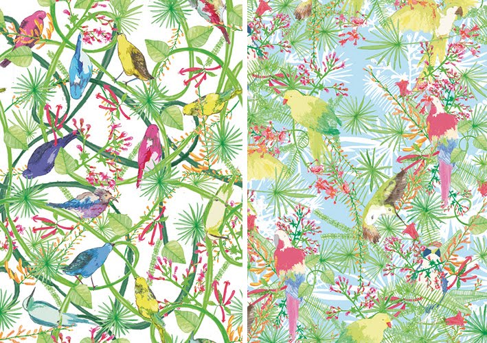
Surface pattern designer and illustrator Lydia Meiying has some gorgeous prints on her website and in her Etsy store. Most are bright, colourful and incredibly detailed with exotic birds, flora and fauna - they scream Summer, holidays and cocktails, but some like the berries one (below left) are more subtle and delicate with a wonderful retro feel.

Images copyright Lydia Meiying.
Lydia is represented by Juna Studio, New York.
https%3A%2F%2Fwww.deliciousindustries.com%2Flydia-meiying
Delicious+Industries%3A+Lydia+Meiying
From the reference box #61


#61 - 4 British stamps commemorating Racket Sports; Lawn tennis (8 1/2p), Table tennis (10p), Squash (11p), Badminton (13p). Issued on the 12 January 1977, this set was designed by Andrew Restall, but in a totally different, much bolder illustration style to this set he designed in 1983. I personally prefer this more graphic style with the silhouetted figures and bright, blocks of colour, although I'm not sold on the colour combinations.
The best thing about these stamps for me though, is how they show the paths of the balls and the shuttlecock - it's really interesting to track their movements throughout a game and to see which games are faster as their paths are more direct with less curves and more bounces.
Take a look at more reference box items here.
https%3A%2F%2Fwww.deliciousindustries.com%2Ffrom-the-reference-box-61
Delicious+Industries%3A+From+the+reference+box+%2361
Margaret Kilgallen aka META / Matokie Slaughter

A couple of weeks ago I watched Beautiful Losers, a short film by Aaron Rose documenting the NYC art and graffiti scene in early 90's and celebrating, "the spirit behind one of the most influential cultural moments of a generation".
There are many talented artists in the film including Shepard Fairey, Barry McGee, Jo Jackson and Mike Mills, but for me it was Margaret Kilgallen's work that really stood out. I had seen some of it before, but had no idea who was behind it. The giant, typographic murals really struck me, they're fantastic - the colours, the scale and the typefaces, I just love them.


Her work was heavily influenced by American folk art which can be seen in the illustrations and colour palettes. She valued craftmanship and loved old hand-painted shop signs, something that clearly inspired her murals.
"I like things that are handmade and I like to see people's hand in the world, anywhere in the world; it doesn't matter to me where it is. And in my own work, I do everything by hand. I don't project or use anything mechanical, because even though I do spend a lot of time trying to perfect my line work and my hand, my hand will always be imperfect because it's human. And I think it's the part that's off that's interesting, that even if I'm doing really big letters and I spend a lot of time going over the line and over the line and trying to make it straight, I'll never be able to make it straight. From a distance it might look straight, but when you get close up, you can always see the line waver. And I think that's where the beauty is."
Margaret did many colaborations with other artists in the film including her husband, Barry Mcgee. She was also a grafitti artist on the freight trains, influenced by Hobo tradition, she worked under the tags 'Meta' and 'Matokie Slaughter'.
Sadly in 2001 Margaret Kilgallen died aged 33 of breast cancer just weeks after giving birth to her daughter, Asha. She was a talented and inspirational artist and I'm so pleased to have found her work. I really want to see it in the flesh and retrospectives do pop up now and again, but until then this Flickr group has a great collection of her work.
Images copyright the authors - from the Margaret Kilgallen Flickr.
https%3A%2F%2Fwww.deliciousindustries.com%2Fmargaret-kilgallen-aka-meta-matokie-slaughter
Delicious+Industries%3A+Margaret+Kilgallen+aka+META+%2F+Matokie+Slaughter
Mexico Exporta


I love these stamps over on the wonderful, So Much Pileup. They were issued in 1975 to celebrate Mexico's exports.
I love the simple illustration style and single colour print - I always think single and 2 colour print is more effective than full colour and these stamps demonstrate that beautifully.
Images copyright So Much Pileup.
https%3A%2F%2Fwww.deliciousindustries.com%2Fmexico-exporta
Delicious+Industries%3A+Mexico+Exporta
Bruno Munari's Più e meno [Plus and minus]

I saw this great game, Pié e Meno or Plus and Minus, in a local design shop this week. It's a reprint of a Bruno Munari and Giovanni Belgrano collaborative game originally produced in 1970.
The game consists of 72 cards, 48 of which have transparent backgrounds. The cards can be superimposed to create new images and, "stimulate the child’s creative capacities" - the more the layers, the more complex the image. I know lots of adults that would enjoy this game as much as any child though - me for one!


It's available to buy online from the publisher, Corraini and also here.
Images copyright Corraini.
https%3A%2F%2Fwww.deliciousindustries.com%2Fbruno-munaris-piu-e-meno-plus-and-minus
Delicious+Industries%3A+Bruno+Munari%26%23039%3Bs+Pi%C3%B9+e+meno+%5BPlus+and+minus%5D
The Visual Miscellaneum

I can't wait to get my hands on a copy of this info graphics book from Harper Collins, it looks fantastic.
The Visual Miscellaneum: A colourful guide to the world's most consequential trivia (or Information is Beautiful as it will be known in the UK) is the baby of London based author, writer, blogger and designer, David McCandless, a self-confessed fan of, "anything strange and interesting".
Here are some preview pics from Information is Beautiful. It's definitely my kind of book - loads of big graphics and very little text.


It was released in the states yesterday and can be bought here, but in the UK we have to wait until 4 February 2010! It can be pre-ordered here though.
Images copyright David McCandless.
Via Notcot.
https%3A%2F%2Fwww.deliciousindustries.com%2Fthe-visual-miscellaneum
Delicious+Industries%3A+The+Visual+Miscellaneum
60's Porsche Service Books


I'm loving the colour palettes and graphics on these Porsche Service Books from the 60's - such an unexpected source of inspiration!
In fact most of the Porsche marketing materials from this era were really well designed. Grain Edit recently posted these fantastic Porsche posters designed by Erich Strenger and Volz...

Europa-Bergmeister, 1966. Design by Volz

Championnat d’Europe de la Montagne, 1960

Gloved Hands on Wheel, c1961. Design by Erich Strenger

Rennsportyahr, 1967. Design by Volz
Service Book images from Old Auto Radio.
Top poster from AUSmotive all other posters from VP Racing - via Grain Edit.
https%3A%2F%2Fwww.deliciousindustries.com%2F60s-porsche-service-books
Delicious+Industries%3A+60%26%23039%3Bs+Porsche+Service+Books
From the reference box # 60


#60 - Europa, Games and Toys - set of 4 commemorative, Royal Mail Stamps first issued on 16 May 1989.
I know, more stamps, but they are very nice ones. I seem to have been buying loads of them recently - I can't help myself!
This bold and colourful set were designed by Dan Fern. Each stamp celebrates a different types of toys or games; 19p - ToyTrains & Airplanes, 27p - Building Blocks, 32p - Dice & Board Games, 35p - Toy Robots & Doll's Houses.
I really love the geometric illustration style combined with the really bright colours and thick black outlines - how cute is the robot face peeking out of the last one?
One thing on these stamps that I haven't come across before is the 'Europa' graphic under the Queen's head. It turns out that 'Europa' stamps are produced once every year and have been since 1956. They are stamps designed around a common theme in a number of countries at the same time. Originally they represented the 6 founding members of the European Coal and Steel Community (ECSC), then from 1959 the European Conference of Postal and Telecommunications Administrations (CEPT) and since 1993, PostEurop. Occassional issues, have seen all the countries involved issue the same stamp design, for example in 1984 to celebrate the 25th Anniversary of CEPT and in 2000 to celebrate the new millenium.
More stamps and wonderful pieces of ephemera can be found here.
https%3A%2F%2Fwww.deliciousindustries.com%2Ffrom-the-reference-box-60
Delicious+Industries%3A+From+the+reference+box+%23+60
Happy Birthday Hello Kitty!

This week marks the 35th birthday of one of my favourite characters, Hello Kitty. Now doesn't she look good for 35?
Hello Kitty was designed for Sanrio by Ikuko Shimizu. She was first introduced to the Japanese public on a small vinyl purse in 1974 and to the US public a few years later in 1976. The start of what they describe as a, "global Hello Kitty phenomenon", and who could disagree? Over the last 35 years many fictional characters have come and gone, but Hello Kitty is still going strong - stronger in fact!
To celebrate, Sanrio have teamed up with Jamie Rivadeneira, owner of pop-culture shop, JapanLa, to create a three week long exhibition, 'Three Apples Art Show' - "a multi-dimensional exhibition and celebration of all things Hello Kitty; the first ever event of its kind in the US!"
It incorporates an art exhibition showcasing one-of-a-kind Hello Kitty inspired pieces created by 80+ contemporary artists, a pop-up shop and unique product/design displays including a retrospective of products and collaborations from the last 35 years.
The event is currently running at the Royal, T café, shop and art space in Culver City, CA until 15 November.
For those of us that can't hop over to the West coast to see the exhibition, there are loads of 35th anniversary products available here.
Image copyright Sanrio.
https%3A%2F%2Fwww.deliciousindustries.com%2Fhappy-birthday-hello-kitty
Delicious+Industries%3A+Happy+Birthday+Hello+Kitty%21
Auto Type IV


More lovely car emblems and graphics to add to my collection. The top one is particularly significant for me as Leyland is my home town - a town built on the success of vehicles like this old bus. Shame they don't make bus logos (or in fact buses) like this anymore!
If Auto type is your thing, check out previous posts here, here and here or take a look at my dedicated Flickr group.
https%3A%2F%2Fwww.deliciousindustries.com%2Fauto-type-iv
Delicious+Industries%3A+Auto+Type+IV
Welcome

Welcome to the Delicious Industries blog. We're an independent design studio based in Brighton, UK and this is our scrapbook packed full of design, illustration, photography & typography inspiration. Check out our work here.
Links
DELICIOUS FRIENDS
DELICIOUS FAVOURITES
- 50 Watts
- Acejet 170
- Grain Edit
- It's Nice That
- National Geographic Found
- Notcot
- Pretty Clever
- Retronaut
- So Much Pileup
- We Love Typography
- Another Mag