art direction, design + typography
Blog: Design
More Vintage Packaging


There's nothing better on a Monday morning than some vintage packaging! This wonderful selection is from Neato Coolville's Vintage Packaging Flickr set.
My favourite is the little 1960's box for Rediplete Pediatric Syrup (above) made by Merck Sharp & Dohme - it's such a clever, fun design.
It's a great collection, which is definitely worth a look. Here are a few more that caught my eye...
My favourite is the little 1960's box for Rediplete Pediatric Syrup (above) made by Merck Sharp & Dohme - it's such a clever, fun design.
It's a great collection, which is definitely worth a look. Here are a few more that caught my eye...


https%3A%2F%2Fwww.deliciousindustries.com%2Fmore-vintage-packaging
Delicious+Industries%3A+More+Vintage+Packaging
The Movie Title Stills Collection


The Movie Title Stills Collection is a fantastic online resource for movie titles and end frames. Collated by designer Christian Annyas, the collection ranges from the early 1920's to the present day and can be viewed by decade or by 'Western' and 'Film Noir' genres.
There's plenty to look through - some are old classics, others are more obscure, some are bold and minimal, others are charmingly ornate, but they all have great typography. Enjoy.
Via our friends, Sell! Sell!
Images copyright The Movie Title Stills Collection.
https%3A%2F%2Fwww.deliciousindustries.com%2Fthe-movie-title-stills-collection
Delicious+Industries%3A+The+Movie+Title+Stills+Collection
From the reference box #101


#101 - Vintage tins. There can never be enough vintage tins in the reference box! My favourite of this little lot is the John Bull, Mend-a-tear one (top) with it's stripey-edged lid. You can't really tell in the pic, but it has a lovely pale grey background. I really love the Ogden's and Bondman type too.
If vintage tins and ephemera are your thing - make a cup of tea, grab a biscuit and have a root through our reference box.
https%3A%2F%2Fwww.deliciousindustries.com%2Ffrom-the-reference-box-101
Delicious+Industries%3A+From+the+reference+box+%23101
Auto Type XI


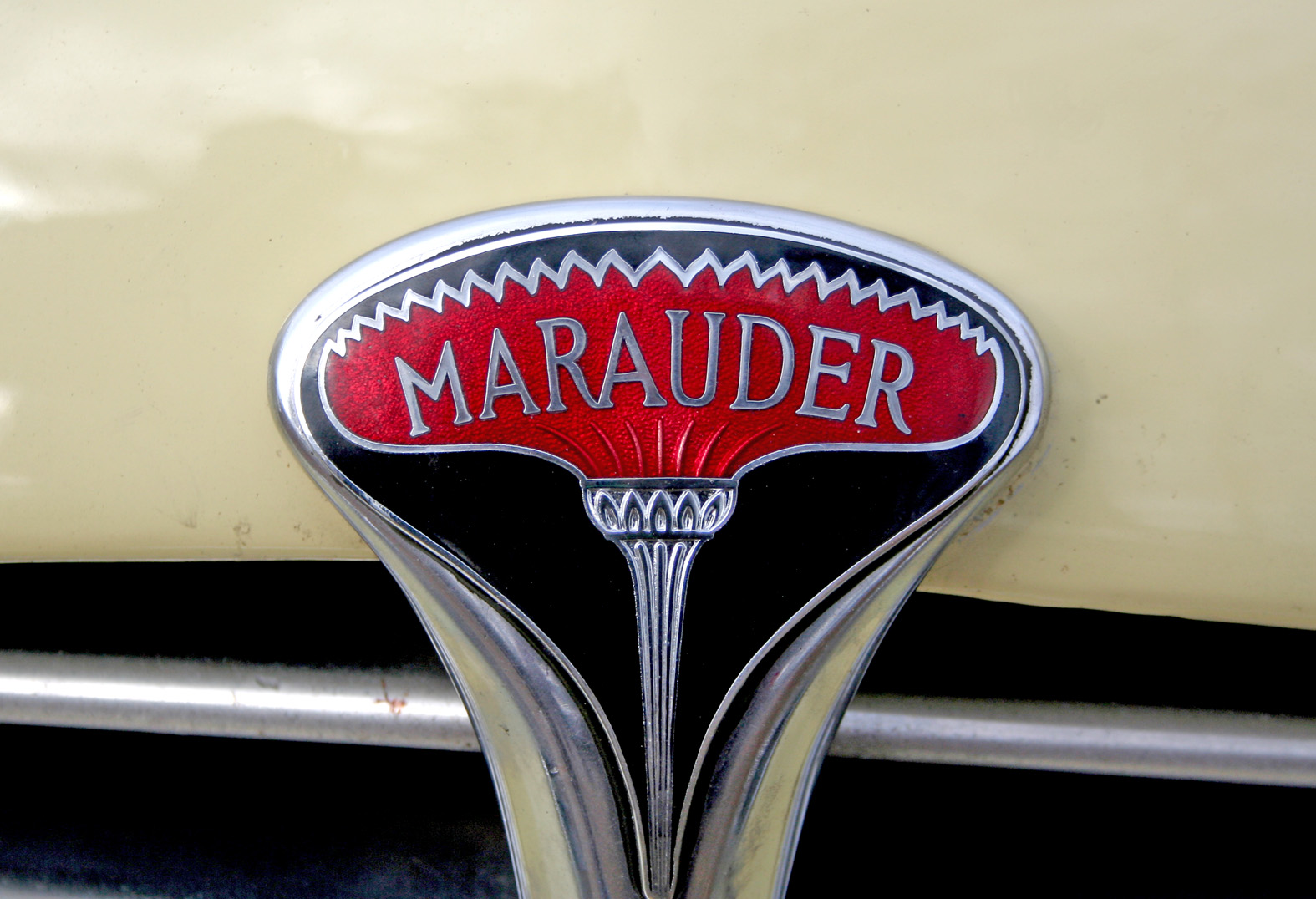


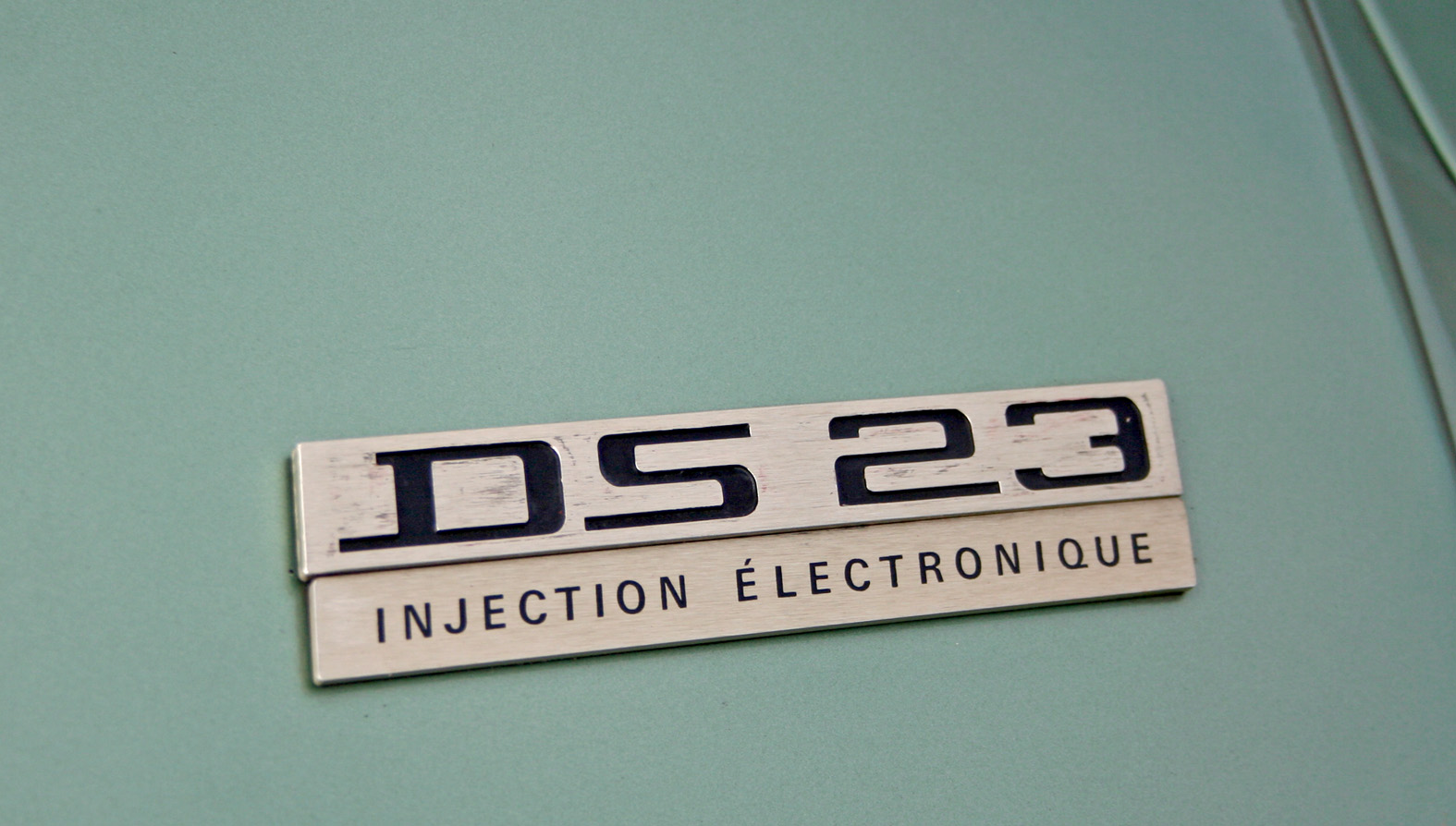


Auto Type XI - more fabulous Auto Type, taken on Sunday at the first Goodwood Breakfast Club of the year. The sun was shining and as you can see it brought out some mighty fine automobiles.
See lots more Auto Type and Automobilia here.
https%3A%2F%2Fwww.deliciousindustries.com%2Fauto-type-xi
Delicious+Industries%3A+Auto+Type+XI
Otl Aicher's Munich 1972 Olympic Graphics


What a lovely way to start the week - looking through a collection of Otl Aicher's, Munich 1972 Olympic graphics!
We're all familiar with the bright and colourful Munich 1972 Olympic branding, but it's rare to see so much of it in one place. This website has a huge range of items designed by Aicher and his team including memorabilia, posters, programmes, pin badges, match books, medals, publications and stationery. It really is a fantastic resource, the items above are only a small selection.
All images copyright 1972 Munich Olympics.
Via Wanken.
https%3A%2F%2Fwww.deliciousindustries.com%2Fotl-aichers-munich-1972-olympic-graphics
Delicious+Industries%3A+Otl+Aicher%26%23039%3Bs+Munich+1972+Olympic+Graphics
The AT Open House

Each weekend throughout the Festival artists around the city open their doors to the public creating, "a great opportunity to view unique work in artists’ homes and studios and to buy directly from the artist or maker".
AT Open House (April and Tim's lovely 3 storey home and garden) will be open weekends 12-6 showing a feast of textiles, knitted jewellery, prints, paper ephemera, vintage fashion and art from the likes of Jonny Hannah, Winsome & Saucy, Mark Pavey and Alice Pattullo.
There'll be something for everyone, from a vintage tea shop, to a knitting room, outdoor poetry readings, and even a vintage boudoir. It's very exciting and we're thrilled to be involved.
The AT Open House blog will be up and running very shortly for regular updates, but in the meantime you can see the full list of participants, join the mailing list and find out more here.
https%3A%2F%2Fwww.deliciousindustries.com%2Fthe-at-open-house
Delicious+Industries%3A+The+AT+Open+House
From the reference box #100!!

#100 - Make Do and Mend, WWII booklet. I promised something special for number 100, and I don't think this will disappoint. It's an original Board of Trade, booklet published in 1943 as part of their 'Make Do and Mend' campaign.
The Board of Trade produced many leaflets and booklets during WWII. This one was specifically designed to:
• Keep clothes looking trim as long as they have to last
• Renovate children's outgrown clothes so cleverly that none is ever wasted
• Turn every scrap of good material you possess to advantage
• Keep your household linen in good repair
• Make do with things you already have instead of buying new
Clothes rationing was introduced in June 1941 and originally allocated 66 coupons per person. By 1943 the number of coupons had been reduced to 60 per person and emphasis put on the maintenance and care of clothing and household linens - cue the Make Do and Mend campaign.
There are 29 illustrations throughout the booklet including these lovely section headings...


I was lucky enough to pick up this original booklet for 50p!! But if you would like one, the Ministry of Information have published reproductions of all their wartime information publications in the, 'Historic Booklet Series'. This one can be purchased here. Also there's a great article about clothing rations during WWII here if you would like to know more.
https%3A%2F%2Fwww.deliciousindustries.com%2Ffrom-the-reference-box-100
Delicious+Industries%3A+From+the+reference+box+%23100%21%21
John Hollows Superior Alcoholic Ginger Beer

Congrats to our friends over at Sell! Sell! for creating the fabulous branding and advertising for Fentiman's new Alcoholic Ginger Beer - John Hollows.
Research is my favourite part of a project, so I loved reading about the branding and how it developed through their research into Fentiman's and Hollow's brewing history.
The advertising is bold and fun, challenging the 'fake' ginger wine-based or flavoured lager ginger beers of the competition and warning customers, 'Beware of imitations'...

And to promote the new drink in pubs and bars, they've created the 'not a genuine ginger?' beermat - perfectly designed to disguise yourself as a true ginger...

Read more about the project here.
Images copyright Sell!Sell!
https%3A%2F%2Fwww.deliciousindustries.com%2Fjohn-hollows-superior-alcoholic-ginger-beer
Delicious+Industries%3A+John+Hollows+Superior+Alcoholic+Ginger+Beer
P&O Menus & Entertainment Programmes

P&O Entertainment Programme, Dorrit Dekk.

P&O Entertainment Programme, Dorrit Dekk. 1962.

P&O Entertainment Programme, Dorrit Dekk. 1962.

P&O Gala Menu, Daphne Padden. 1962.

P&O Entertainment Programme, Daphne Padden. Circa 1950's.

P&O Gala Menu, Daphne Padden. 1958.

P&O Entertainment Programme, Daphne Padden. 1959.

P&O Menu/Entertainment Programme cover, Daphne Padden.

P&O Gala Menu, Daphne Padden. 1956.
Here's a bit of inspiration for a dreary, wet Wednesday morning.
I first saw a P&O Entertainment Programme designed by Dorrit Dekk over on Quad Royal and was instantly drawn to the bright, graphic illustrations/collages.
On further investigation I found Bonito Club's Flickr and yet more fabulous P&O covers (Menus and Entertainment Programmes) from the late 50's and early 60's. All the ones I've seen were designed by either Daphne Padden or Dorrit Dekk, but I'm not sure if they created all the covers during this period.
There must be hundreds more in existence, as it seems the designs changed every year and each P&O liner had different designs. I'll have to keep my eye out for some of these on Ebay!
If you like this post, chances are you'll also like these:
Gebrauchsgraphik Magazine
Modern Packaging
Holiday Magazine
Country Fair Magazine
Which? Magazine
Mac Fisheries
Images copyright Quad Royal and Bonito Club.
https%3A%2F%2Fwww.deliciousindustries.com%2Fpo-menus-entertainment-programmes
Delicious+Industries%3A+P%26amp%3BO+Menus+%26amp%3B+Entertainment+Programmes
Don't drain my anti-freeze!

"Don't drain my anti-freeze it protects my engine, winter and summer"
I snapped this Shell sticker last Summer - the cute little chappie was on the front screen of a very old car and by the looks of it, he'd been there for quite some time.
If found type/old signage is your thing, check out previous posts here.
https%3A%2F%2Fwww.deliciousindustries.com%2Fdont-drain-my-anti-freeze
Delicious+Industries%3A+Don%26%23039%3Bt+drain+my+anti-freeze%21
From the reference box # 99
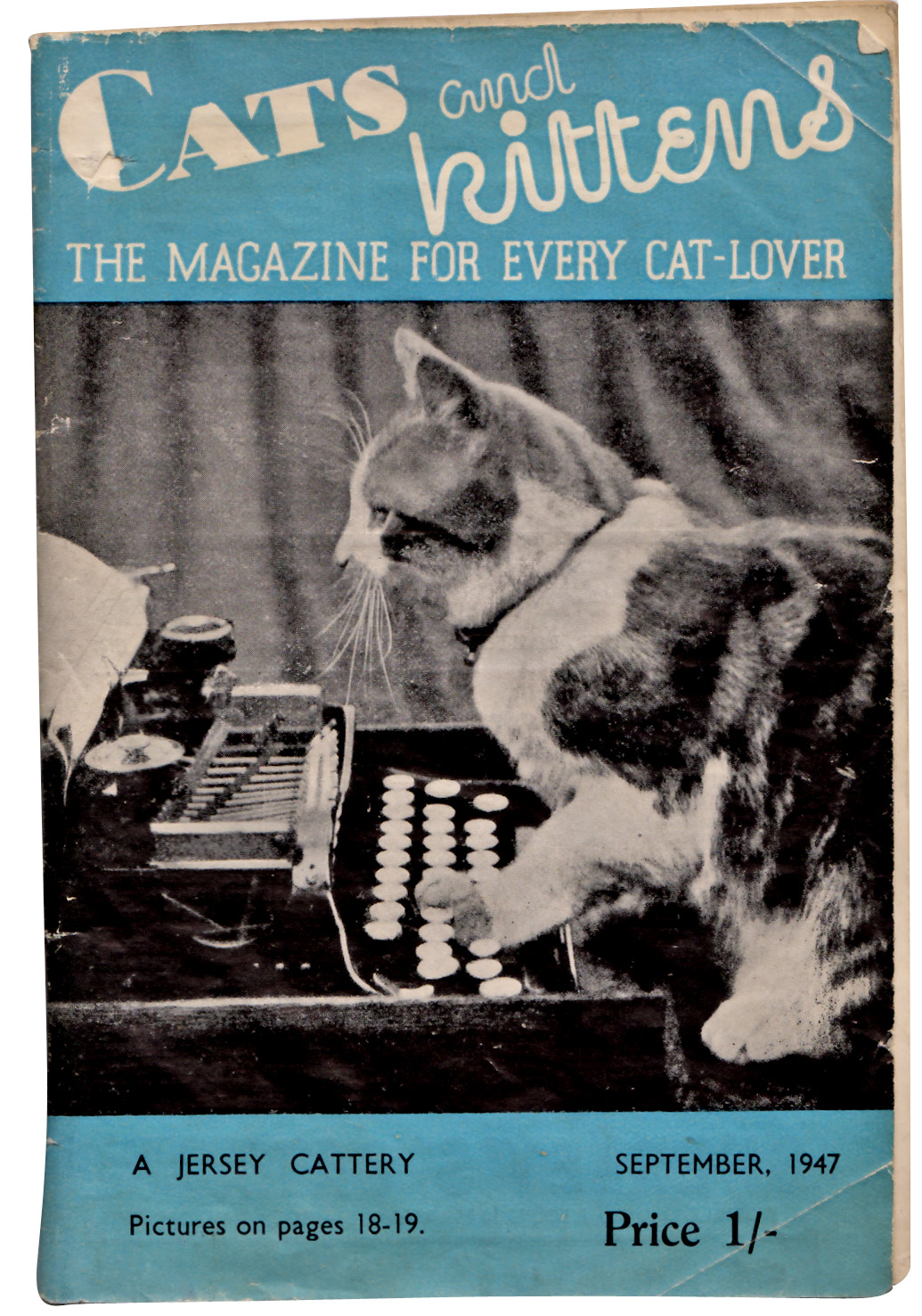
#99 - Cats and kittens: The magazine for every cat-lover, September 1947. Who can resist cats and kittens? Not me that's for sure, so imagine my delight finding cat related ephemera!
I've been unable to find out much about this monthly publication (other than there is a publication by the same name still going strong today, but in the US). I've found references to this Rolls House Published version dating back to the early 30's, but unfortunately I can't find an exact launch date.
Anyway, even without all the history, it's great that back in the 30's and 40's people loved their cats so much there was a need for a monthly publication and how great is that 'kitten' type?
Check out some of the wonderful cat related ads below...


There are lots more items in our reference box, have a root here.
And watch out for #100, it's going to be a special one!
https%3A%2F%2Fwww.deliciousindustries.com%2Ffrom-the-reference-box-99
Delicious+Industries%3A+From+the+reference+box+%23+99
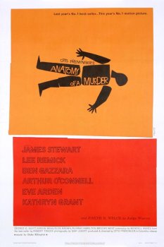
Bass Notes: The film posters of Saul Bass

Much of his work was for the film industry and throughout the 60's Bass famously worked with film directors Martin Scorsese, Alfred Hitchcock and Otto Preminger producing iconic film posters. Posters we are now going to get the chance to see again thanks to Kemistry Gallery, London.
Bass Notes: The film posters of Saul Bass is a collection of film posters, title credits and film festival posters from the Lloyd Northover donation to the British Film Institute. I'm not sure which posters will be in the exhibition and I can't wait to find out, but to get you in the mood here's a selection of the classics...


https%3A%2F%2Fwww.deliciousindustries.com%2Fbass-notes-the-film-posters-of-saul-bass
Delicious+Industries%3A+Bass+Notes%3A+The+film+posters+of+Saul+Bass
Giant Sellotape Tin


The vintage Sellotape tins have become a bit of an obsession and I now have quite a collection including this fabulous example. It's a large (165mm [6.5"] high & 120mm [4 5/8"] diameter) tubular tin designed to hold a stack of 12 individual tins.
I think this is how they were sold to retailers/trade, so I don't think they were ever available to the general public unless they were buying 12 rolls!
I love this tape on the side with the contents information on...

This was the only large Sellotape tin I had ever seen on Ebay but this current listing has 8 tins in total, 2 of which are like this. I desperately want the two with the black stripes on, but I'm holding back. I think there's a limit to the number of Sellotape tins any one person should own and I've definitely already passed it, especially as I bought an older version of this one last night! (below).

https%3A%2F%2Fwww.deliciousindustries.com%2Fgiant-sellotape-tin
Delicious+Industries%3A+Giant+Sellotape+Tin
Gebrauchsgraphik Magazine


Some lovely Tuesday inspiration in the form of Gebrauchsgraphik: International Advertising Art covers. Gebrauchsgraphik or 'Commercial Arts' magazine was a German design and graphics publication founded in 1923 by Professor H. K. Frensel.
There are lots of examples of Gebrauchsgraphik covers on line, the ones above are from; A Journey Around My Skull, Webdesigner Depot, Bust Bright's Flickr, Aqua Velvet and Designers Books.
If Vintage magazine covers are your thing, you light like the following posts:
Which?
Modern Packaging
Country Fair and more Country Fair
Holiday
Opus International
Fortune
Juana Gaita
Gentry
Scienza e Vita
https%3A%2F%2Fwww.deliciousindustries.com%2Fgebrauchsgraphik-magazine
Delicious+Industries%3A+Gebrauchsgraphik+Magazine
Mmmmmm cheese…


I love a collection, and one that combines cheese and design just has to be worth a post! These wonderful cheese labels circa 1957 are part of a collection large found in a scrapbook on Ebay and featured in Culture Magazine.
Read the full story over on Design Observer.
Images copyright Culture Magazine.
https%3A%2F%2Fwww.deliciousindustries.com%2Fmmmmmm-cheese
Delicious+Industries%3A+Mmmmmm+cheese%26%238230%3B
Welcome

Welcome to the Delicious Industries blog. We're an independent design studio based in Brighton, UK and this is our scrapbook packed full of design, illustration, photography & typography inspiration. Check out our work here.
Links
DELICIOUS FRIENDS
DELICIOUS FAVOURITES
- 50 Watts
- Acejet 170
- Grain Edit
- It's Nice That
- National Geographic Found
- Notcot
- Pretty Clever
- Retronaut
- So Much Pileup
- We Love Typography
- Another Mag