Blog: Design
Retro Lolly Prints by Emily Turner

When I first saw Emily Turner's retro lolly prints I was immediately struck by childhood memories of running down the street to the ice cream van!
The simplicity of the illustrations with the red and blue print gives them a wonderful nostalgic feel, I'm sure having one on the studio wall would make it feel like Summer every day.

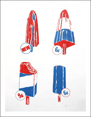

All above prints are available for £20 from FRANK and The Print Block (who are having a Christmas sale on December 4 if you're in the area).
https%3A%2F%2Fwww.deliciousindustries.com%2Fretro-lolly-prints-by-emily-turner
Delicious+Industries%3A+Retro+Lolly+Prints+by+Emily+Turner
Vintage coupons


This is what I love about blogs - turning the computer on in morning and being greeted with gorgeous images. These fabulous 50's and 60's coupons are from Roadsidepictures 'Vintage Coupon' Flickr set. Such a great collection and just the inspiration I need on a miserable Monday morning!
Via the wonderful Words & Eggs.
https%3A%2F%2Fwww.deliciousindustries.com%2Fvintage-coupons
Delicious+Industries%3A+Vintage+coupons
Auto Type IX


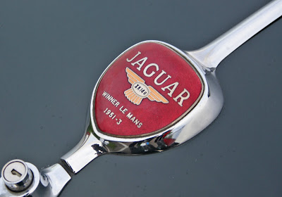


Goodwood Breakfast Clubs are always a great place to find fabulous auto type and this morning didn't disappoint. I give you Auto Type part IX!
See more Auto Type here.
https%3A%2F%2Fwww.deliciousindustries.com%2Fauto-type-ix
Delicious+Industries%3A+Auto+Type+IX
Pirelli wonderfulness!

Pirelli scooter - Max Huber, 1957.
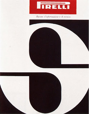
Pirelli magazine cover - Giulio Confalonieri and Ilio Negri, 1959.

Pneumatici Pirelli - Agenzia Centro, 1964.

Pirelli magazine page design - Giulio Confalonieri and Ilio Negri, 1959

"il pneumatico che morde la strada'"(the tire that bites the road) ad - Paul Engelmann, 1952.

"per l'inverno il pneumatico inverno", Pirelli brochure cover, 1952.
More fabulous Pirelli graphics from Pop Design's Flickr. I love 50's and 60's Pirelli's marketing, it's so simple and graphic - very less is more, which I'm a big fan of!
Images copyright Pop Design.
https%3A%2F%2Fwww.deliciousindustries.com%2Fpirelli-wonderfulness
Delicious+Industries%3A+Pirelli+wonderfulness%21
Citroen Ephemera
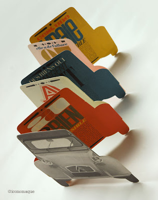
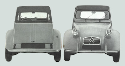

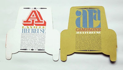


Really loving these 60's Citroen promotional booklets designed by Parisian studio, Delpire over on Grain Edit. They were created by the father of Francois-Charles (iconomaque) who worked at the studio in the 60's and were discovered whilst he was sorting through his father's studio.
What a great bit of ephemera to start the day with!
Via Sell! Sell!
Images copyright iconomaque.
https%3A%2F%2Fwww.deliciousindustries.com%2Fcitroen-ephemera
Delicious+Industries%3A+Citroen+Ephemera
From the reference box #91


#91 - Vintage fasteners. I love these 50's Snap Fastener and Hooks & Eyes cards from "World Famed", Newey's - "If it fastens Newey's make it!".
They're only small cards, but they have some great type...
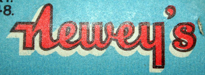
and some lovely print...
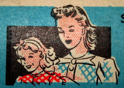
Think I feel another collection coming on!
There are 90 more wonderful items tucked away in our reference box - take a look here.
https%3A%2F%2Fwww.deliciousindustries.com%2Ffrom-the-reference-box-91
Delicious+Industries%3A+From+the+reference+box+%2391
Christie's Travel and Vintage Poster Auction
Olivetti Divisumma (above top) by Herbert Bayer (1953) is lot number 252. It's a linen-backed, lithographic print (71 x 51cm) classed as A- condition with an estimation of £1000-£1500.
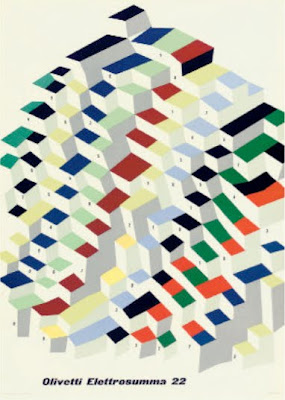
Olivetti Elettrosumma 22 (above bottom) by Giovanni Pintori is lot number 255. This lithographic print (70 x 49 cm) printed by Arti Grafiche M & G Pirovano in 1956 is not backed, but is classed as A condition and has an estimation of £600-£800.
Find more sale information here. Happy bidding!
Images copyright Christie's.
Via Quad Royal.
https%3A%2F%2Fwww.deliciousindustries.com%2Fchristies-travel-and-vintage-poster-auction
Delicious+Industries%3A+Christie%26%23039%3Bs+Travel+and+Vintage+Poster+Auction
Vintage coffee tins


I love these 40's and 50's coffee tins from Roadsidepictures' (US photographer, Allen) collection of vintage packaging and advertising on Flickr. There's so much to look at, this is definitely one of those sets you need a lot of time and a cuppa to really enjoy.
Allen says he's always enjoyed, "photographing old neon signs, cars, motels, gas stations, roadside attractions and suburban life" - all of which can be seen in his Flickr sets.
See more vintage packaging here, here and here or have a rumage through our reference box here.
Images copyright Allen at Roadsidepictures.
Via Notcot.
https%3A%2F%2Fwww.deliciousindustries.com%2Fvintage-coffee-tins
Delicious+Industries%3A+Vintage+coffee+tins
SR692: Swissair - The Ultimate Fansite


I can't get enough of all the wonderful Swissair design and print on SR692: Swissair - The Ultimate Fansite. They have a massive collection of Swissair printed ephemera including posters, tickets, calenders, publications, postcards, annual reports, time tables and route maps, as well as a very informative history of the brand and logo.
Above are a selection of the more graphic route map and time table covers. They're all really fantastic, but my favourites are the ones using the Reudi Bircher designed plane graphic logo of the 50's and 60's.
Huge thanks to Darren for sending me a link to Wanken, which led me to this great site.
Images copyright SR692.
https%3A%2F%2Fwww.deliciousindustries.com%2Fsr692-swissair-the-ultimate-fansite
Delicious+Industries%3A+SR692%3A+Swissair+-+The+Ultimate+Fansite
From the reference box #89


#89 - Philips 'Philishave' instruction booklet. Such a great little 2 colour booklet and as you would expect from a Philips instruction booklet, the design is functional, clean and simple. For such a tiny booklet there are loads of illustrations and photos too, but I bought it purely for the arrows on the cover!
I'm guessing it's circa 1960 - according to the Philips website, the 'Philishave' shaver was first introduced in the 50's and as this one has new 'floating head' technology I would think it came slightly later.
For more random ephemera, have root around our reference box here.
https%3A%2F%2Fwww.deliciousindustries.com%2Ffrom-the-reference-box-89
Delicious+Industries%3A+From+the+reference+box+%2389
Auto Type VIII


A few lovely additions to my Auto Type collection, taken at Goodwood Revival last weekend. I love the mix of the super rare and the more everyday cars - the 'Tourino Superleggera Milano' crest and badge has to be a favourite.
To see more Auto Type, check out previous posts here or view our Flickr set here.
https%3A%2F%2Fwww.deliciousindustries.com%2Fauto-type-viii
Delicious+Industries%3A+Auto+Type+VIII
HOWDOOS in Stylist Magazine
Huge thanks to Stylist magazine for featuring our HOWDOOS in 'The Style List' of their latest issue (no.46, 22 September 2010).
HOWDOOS are hand letter-pressed business cards with a greeting on the front and 3 blank spaces on the back ready for your personal details. Available in 2 designs; 'hello' in hot pink and 'nice to meet you' in black.
Get yours now from our Etsy store.
https%3A%2F%2Fwww.deliciousindustries.com%2Fhowdoos-in-stylist-magazine
Delicious+Industries%3A+HOWDOOS+in+Stylist+Magazine
Gastrotypographicalassemblage at Kemistry Gallery
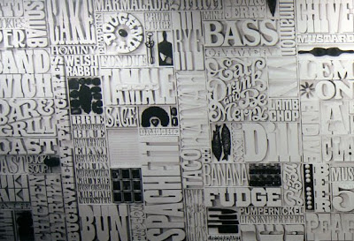
Well not the actual wall panels we posted about here, but a half-size photographic reproduction of this a 35 x 8ft typographic masterpiece. Gastrotypographicalassemblage was created by Lou Dorfsman for the wall of the CBS cafeteria circa 1966 and included the names of every food item available in the cafeteria at that time.
"We were allowed to have all the spreads and, a 10x8 black and white negative of the entire wall taken on the day it was unveiled. From this we worked with a company called VGL and printed it up at half scale (we couldn't fit full scale in the gallery) and had it stretched by AP Fitzpatrick. For a 45 year old negative the quality we have got from the blowup without any retouching is fantastic."
Gastrotypographicalassemblage: The Designs of Lou Dorfsman is an exhibition at Kemistry Gallery, London celebrating the print and advertising work Dorfsman produced during his time at CBS (1946 - 1987) originally as an art director and later as senior vice president and creative director for marketing communications and design.
The exhibition runs until 30 October 2010 and includes more than 60 original pieces as well as a short film about the Gastrotypographicalassemblage narrated by Dorfsman himself.

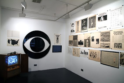
Images copyright Kemistry Gallery, taken by Christian Carlsson.
Via CR Blog.
https%3A%2F%2Fwww.deliciousindustries.com%2Fgastrotypographicalassemblage-at-kemistry-gallery
Delicious+Industries%3A+Gastrotypographicalassemblage+at+Kemistry+Gallery
From the reference box # 88

#88 - Getaway Peak Miles Check. It's been a while since I've bought a vintage dial, but I found this beauty at the weekend and couldn't resist.
It was produced by National (a petrol station chain) and BP as a useful conversion guide. On the front the yellow dial helps drivers calculate the average speed required to achieve a certain number of miles in a specific time. Whilst on the reverse it gives a 'see-at-a-glance' list of conversions from metric and English stocking sizes to Gallons and Litres, to help you 'cruise your way through the metric system'.
I'm not sure of the exact date, but an educated guess would be late 70's when the UK announced it was to drop the use of non-metric measures. Although it wasn't mandatory until the mid 90's I imagine the announcement created widespread panic with companies using it to their advantage for their marketing.
If vintage dials and auto ephemera are your cup of tea, there are lots more examples nestled away in our reference box - check it out here.
https%3A%2F%2Fwww.deliciousindustries.com%2Ffrom-the-reference-box-88
Delicious+Industries%3A+From+the+reference+box+%23+88
Julia Trigg at Castor + Pollux
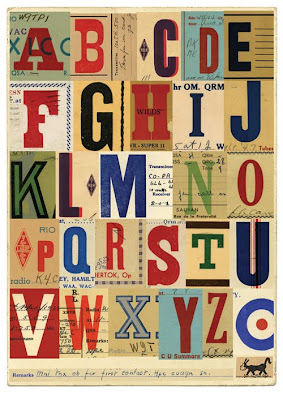
"These amateur hams could have been the first 'techno geeks', making contact with each other through radio, long before telephone was accessible.
They sent each other signals using a type of morse code called Quebec Sign Language and developed their own shorthand - a kind of early text language. They would send each other these letterpress printed 'QSL' cards via post to confirm receipt of the signals - eventually all over the world."
The exhibition previews on Friday and will be open to the public from 18 September to 17 October 2010.
Images copyright Julia Trigg.
https%3A%2F%2Fwww.deliciousindustries.com%2Fjulia-trigg-at-castor-pollux
Delicious+Industries%3A+Julia+Trigg+at+Castor+%2B+Pollux
Welcome
Welcome to the Delicious Industries blog. We're an independent design studio based in Brighton, UK and this is our scrapbook packed full of design, illustration, photography & typography inspiration. Check out our work here.
Links
DELICIOUS FRIENDS
DELICIOUS FAVOURITES
- 50 Watts
- Acejet 170
- Grain Edit
- It's Nice That
- National Geographic Found
- Notcot
- Pretty Clever
- Retronaut
- So Much Pileup
- We Love Typography
- Another Mag


