Blog: Design
Store Front: The Disappearing Face of Old New York
I love these pics over on How to be a Retronaut. They're taken from Store Front: The Disappearing Face of Old New York by James and Karla Murray, the result of years of photographing and "faithfully documenting the generations-old stores and shop windows of New York's neighbourhoods".
When it was published in 2009 the Murray's estimated that a third of the stores photographed had already closed, so I wonder how many are still open now, or even still standing? It's sad to think of those beautiful old signs being torn down as they add such character to a street, so much nicer than the bland plastic signage we see so much of today.
It's not just in New York either, it's the same story in every city - regeneration, redevelopment it's a never-ending cycle and I know it boosts the local economies, creates jobs and is good for the community, but I like the faded glory.
Two of my favourite places are Manchester and Blackpool, UK - purely for the charm and character of the old buildings and abandoned signage hidden in the back streets.
All images taken from Store Front:The Disappearing Face of Old New York. Copyright James & Karla Murray.
Published by Gingko Press.
https%3A%2F%2Fwww.deliciousindustries.com%2Fstore-front-the-disappearing-face-of-old-new-york
Delicious+Industries%3A+Store+Front%3A+The+Disappearing+Face+of+Old+New+York
From the reference box # 111
#111 - Vintage Lemon drink labels.
I've already posted about the lime drink and orange drink labels I bought as part of a collection, so here are the lemon ones; C&C (Cantrell & Cochrane) Lemonade, 'new' Kia-Ora Low calorie Lemon Drink and Sunparlor Lemonade with 'New turn off cap!'.
There's something about the print quality and design on these labels that really appeals to me. Sunparlor is my favourite of this bunch - I Just love the slightly off set startburst and the weird centred, but to the right contents info.
https%3A%2F%2Fwww.deliciousindustries.com%2Ffrom-the-reference-box-111
Delicious+Industries%3A+From+the+reference+box+%23+111
More Country Fair covers
Remember our post about Country Fair: The monthly journal of the open air? Well we've just uploaded lots more of the gorgeously illustrated 50's & 60's covers to Flickr.
As it's July 1st, the covers above are from July issues only, but you can see the full collection here.
If you like these it's quite likely you'll like these and these!
https%3A%2F%2Fwww.deliciousindustries.com%2Fmore-country-fair-covers
Delicious+Industries%3A+More+Country+Fair+covers
From the reference box #110
#110 - Printing Ephemera circa, 1965. I came across a bundle of old printers booklets ata boot sale recently, they were only a couple of pounds so I couldn't resist.
The stash included 3 x 1965 copies of Reproductions Review (August, September & December issues), 6 x copies of Inklings: Coates Bulletin for Printers (June & December 1965, March, September & December 1967, June 1969 issues) and a copy of 'acid' paper and ink drying produced by The British Federation of Master Printersin August 1965 as no.4 in their 'production aids for the printing industry' series.
It's really interesting to read about the new printing techniques and machines available in the mid 1960's. These two ads in particular, from Reproductions Review made me smile...
There's lots more vintage ephemera in our reference box, so have a root around it here.
https%3A%2F%2Fwww.deliciousindustries.com%2Ffrom-the-reference-box-110
Delicious+Industries%3A+From+the+reference+box+%23110
Daphne Padden Original Sketches
Cute, original illustrations and sketches by designer Daphne Padden in the 1970's, bought from her estate sale (she died in 2009) by the very lucky Quad Royal.
They discovered she did quite a lot of packaging design in the 70's, mainly for M&S (or St Michael as it was back then) and kept the original design sketches as well as the finished packaging which is really great to see.
I love seeing the original sketches more than the finished design - they have so much more character. So thanks Quad Royal for sharing your bounty!
Quad Royal have been researching and championing Daphne Padden's design work for some time, so there's lots more to read see here and here.
Images copyright Quad Royal.
https%3A%2F%2Fwww.deliciousindustries.com%2Fdaphne-padden-original-sketches
Delicious+Industries%3A+Daphne+Padden+Original+Sketches
Sunny Side Up
The exhibition will include 12 new large, hand-screenprints featuring "bold statements, strange visitors, warnings from gurus, the thoughts of CaptainScott and other random themes", new 3d arrows, moose heads, totes and stickers all in the distinctive Andy Smith illustration and lettering style.
All the artwork in the show will be available online too, so don't worry if like me you can't make it over to Bristol for the show.
For more info visit Soma, or see teaser images of Andy's new work here.
Image copyright Andy Smith.
https%3A%2F%2Fwww.deliciousindustries.com%2Fsunny-side-up
Delicious+Industries%3A+Sunny+Side+Up
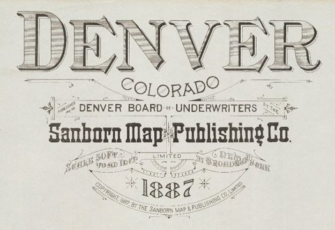
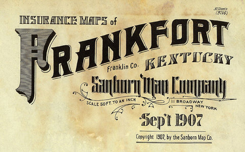
Sanborn Fire Insurance Map Lettering
I found these great lettering details from Sanborn Fire Insurance Maps over on BibliOdyssey. They've collected them from map and map publications dated between 1880 and 1920.
After completing a successful commission preparing insurance maps for the Aetna Insurance Company, surveyor D. A. Sanborn saw their value to the fire insurance industry and established D. A. Sanborn National Insurance Diagram Bureau in New York City,1867.
The lettering above shows how each town/city had a uniquely designed heading, title page or legend. They remind me of the very elaborate Carte-de-Visite reverses of the same period. I find it interesting that in the late 1800's, companies here in the UK and in the US were producing similar style lettering designs.
Reading some of the typographers comments on BibliOdyssey, I learned the difference between Lettering (hand-lettering created a purpose, not using pre-designed fonts), Typography (arranging pre-designed fonts) and Calligraphy (hand-lettering with a pen or brush). I did know the calligraphy definition but had never really given much thought to what was defined as 'lettering' or 'typography' - you learn something new everyday!
Images copyright BibliOdyssey.
Via FFFFound.
https%3A%2F%2Fwww.deliciousindustries.com%2Fsanborn-fire-insurance-map-lettering
Delicious+Industries%3A+Sanborn+Fire+Insurance+Map+Lettering
Displacement - new work by Mark Havens
I bet you can't guess what these images are?
No idea?
They're large photographic prints of the vintage model car decal sheets you probably had as a child - "tiny snapshots of color and shape that over time become elemental symbols and glyphs in the personal mythologies unique to each of us".
Seeing these tiny decals exploded to such a large scale really exaggerates the print quality and colour creating a wonderful patina and a warm feeling of nostalgia.
Displacement - new work by Mark Havens is currently showing at JAGR: Projects Philadelphia, until the end of July 2011.
Images copyright Mark Havens. Via The Chicane.
https%3A%2F%2Fwww.deliciousindustries.com%2Fdisplacement-new-work-by-mark-havens
Delicious+Industries%3A+Displacement+-+new+work+by+Mark+Havens
MOMA's Department of Advertising & Graphic Design
MOMA's Department of Advertising and Graphic Design (their in-house design team) have launched a portfolio site showcasing a selection of their recent exhibition design, advertising and print.
It's really interesting to see how they use the gallery space for each exhibition and how well they design the info graphics/signage to enhance the visitor experience and compliment each artists work. I also love that they've commissioned traditional billboard artists too!
I've always wanted to visit MOMA, but after seeing these pics I want to go even more.
Images copyright Museum of Modern Art.
Via Swissmiss.
https%3A%2F%2Fwww.deliciousindustries.com%2Fmomas-department-of-advertising-graphic-design
Delicious+Industries%3A+MOMA%26%23039%3Bs+Department+of+Advertising+%26amp%3B+Graphic+Design
Vintage typewriter logo decals
He has the most amazing typewriter based Flickr sets I've seen - vintage typewriters, their marketing materials, instruction booklets, advertising as well as collections of British, American and German typewriter ribbon tins.
A real feast of graphics that will keep you staring at your screen for hours!
Images copyright Georg Sommeregger.
Via @shelfappeal
https%3A%2F%2Fwww.deliciousindustries.com%2Fvintage-typewriter-logo-decals
Delicious+Industries%3A+Vintage+typewriter+logo+decals
From the reference box # 109

#109 - Fly BEA Map of Copenhagen. I picked up this little gem at the weekend. It was the detailed cover illustration that first caught my eye - it reminded me of the E-boy cityscapes.
The leaflet was a complimentary guide given to passengers of BEA when traveling to Denmark's capital city in 1964. It folds out to a large map on one side and is packed with tourist information on the other.
It opens portrait, to a gorgeously graphic map and suggested places to see from 'Kongens Nytorv (The King's New Market) to Tivoli...

Or opens landscape to reveal a 'Railway Skeleton Map of City, Suburban and Districts Services with Connections'. I love the 'S' graphic with the wings and crown...

and on the back has a handy currency guide...

BEA operated domestic and European flights from airports across the UK from 1946 to 1974 when they merged with their parent company BOAC (British overseas Airways Corporation), Cambrian Airways and Northeast Airlines to become British Airways.
Whilst researching BEA, I found some great old adverts from the late 50's and 60's here and also a selection of timetables from the same period here.
https%3A%2F%2Fwww.deliciousindustries.com%2Ffrom-the-reference-box-109
Delicious+Industries%3A+From+the+reference+box+%23+109
Erik Nitsche for General Dynamics
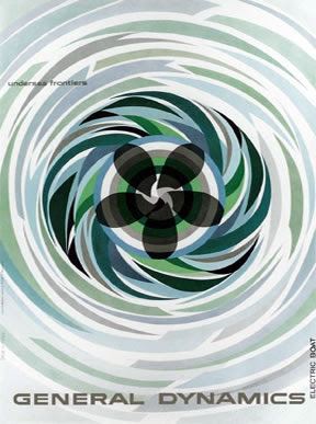
I saw a great collection of General Dynamics posters over on Words & Eggs created by late Erik Nitsche - graphic designer/art director for the General Dynamics in the late 50's.
Nitsche was responsible for all General Dynamics brand communication from 1953 - 1960. He brought an optimistic, modern dynamic to the brand and produced bold, graphic designs which can be seen in the selection of posters (above), in these adverts...
and in these annual report covers...
Images sourced here, here and here.
Copyright held by image owners.
https%3A%2F%2Fwww.deliciousindustries.com%2Ferik-nitsche-for-general-dynamics
Delicious+Industries%3A+Erik+Nitsche+for+General+Dynamics
From the reference box # 108


#108 - Vintage French, Lait En Poudre (powdered milk) tin. This delightful 300g tin of powdered milk was produced by the Société France-Lait in St Martin Belle-Roche.
I love it's 2 colour print and the overprint created by the dark green on the excess pale green around the pale green type and graphics. I also like the little factory graphic on the France graphic.
Too pretty (and big) for the reference box, this one lives happily on the plan chest in the window enjoying admiring glances from passers-by.
See more vintage packaging and ephemera here.
https%3A%2F%2Fwww.deliciousindustries.com%2Ffrom-the-reference-box-108
Delicious+Industries%3A+From+the+reference+box+%23+108
AT Open House - Last Weekend!

AT Open House (42 Hendon St, Brighton) will be opening it's door 12-6pm, Saturday and Sunday for the last weekend of the Artist's Open Houses. We'll be down there tomorrow so if you're in the neighbourhood drop in and say hello.
There's plenty to see (and buy), it's 10 minutes from the seafront and there will be lots of lovely tea and cake - what more could you want from a day out?
Don't worry if you can't make it though, the web shop will remain open for a couple more weeks so you won't totally miss out!
https%3A%2F%2Fwww.deliciousindustries.com%2Fat-open-house-last-weekend
Delicious+Industries%3A+AT+Open+House+-+Last+Weekend%21
Amelia's Compendium of Fashion Illustration
Amelia is big on the values of social media and it's importance to the fashion industry - I agree and think the same goes for any designers and illustrators. I was amused to realise that I actually knew more about social media than the young, newly graduated fashion students also present, who didn't really know what Twitter was nevermind be on it!
Amelia's Magazine was first published in May 2004 and over the following 4 years Amelia produced 10 successful issues all championing the work of up and coming fashion illustrators, ethical fashion designers and ways to create a more sustainable future for our planet. In 2008, Amelia decided to cease publishing the magazine and concentrate all her efforts on it's fast-growing website, where Amelia's Magazine still lives on.
Amelia's compendium of Fashion follows the success of her first book, Amelia's Anthology of Illustration and "brings together the best illustration from Amelia’s Magazine alongside the best new ethical fashion designers". It showcases the work of 30 illustrators, features interviews about their design practice and profiles almost 50 of the very best ethical fashion designers working today including Fifi Bijoux, Minna, Partimi Prophetik and Ute Decker.
It's a really gorgeous book, packed full of inspiration and ideas - definitely one for the coffee table!
Keep up with Amelia's comings and goings by following Amelia Gregory and Amelia's Magazine on Twitter.
https%3A%2F%2Fwww.deliciousindustries.com%2Famelias-compendium-of-fashion-illustration
Delicious+Industries%3A+Amelia%26%23039%3Bs+Compendium+of+Fashion+Illustration
Welcome
Welcome to the Delicious Industries blog. We're an independent design studio based in Brighton, UK and this is our scrapbook packed full of design, illustration, photography & typography inspiration. Check out our work here.
Links
DELICIOUS FRIENDS
DELICIOUS FAVOURITES
- 50 Watts
- Acejet 170
- Grain Edit
- It's Nice That
- National Geographic Found
- Notcot
- Pretty Clever
- Retronaut
- So Much Pileup
- We Love Typography
- Another Mag


