art direction, design + typography
Blog: Design
LA Artist David Buckingham


It's the first time I've seen David's work and now I'm desperate to see one of his shows. His pieces are fantastic. They're created from cut and welded scrap/ found metal and they're amazingly big, bold and brash. Many incorporate lines from films or song lyrics, and others are pop-art style typographic and graphic masterpieces. And when I say big, I mean big...


All images copyright David Buckingham.
https%3A%2F%2Fwww.deliciousindustries.com%2Fla-artist-david-buckingham
Delicious+Industries%3A+LA+Artist+David+Buckingham
From the reference box # 115

It's not very often you see a beautifully designed text book cover, so this language book with it's subdued colour palate and bold, geometric shapes really jumped out at me.
I love the contrast between the simple cover design and the detailed Berlitz schools logo - you never know, it might even help to improve my German!
Dig deep in the reference box for more delicious design and ephemera!
https%3A%2F%2Fwww.deliciousindustries.com%2Ffrom-the-reference-box-115
Delicious+Industries%3A+From+the+reference+box+%23+115
Smells I Like by Gordon Stowell


Illustrator and cartoonist Gordon Stowell sadly died in 2003. He sold his first cartoon to a newspaper in 1942 aged only 14. Throughout his very long career he wrote and illustrated many children's books (including the one above published by AR Mowbray & Co Ltd. in 1969) and had his cartoons published regularly in the likes of Private Eye and Punch magazines - he believed, "cartoons could put over serious subjects".
There are 8 more books in this range, so the search is on - not sure how many of them I'll be able to pick up for 20p though!
https%3A%2F%2Fwww.deliciousindustries.com%2Fsmells-i-like-by-gordon-stowell
Delicious+Industries%3A+Smells+I+Like+by+Gordon+Stowell
From the reference box # 114


See more reference box goodies here.
https%3A%2F%2Fwww.deliciousindustries.com%2Ffrom-the-reference-box-114
Delicious+Industries%3A+From+the+reference+box+%23+114
Auto Type XVI


As ever, some wonderfully rare examples with many Italian marques today.
See our full Auto Type collection on Flickr here or look through other Automobilia posts here.
https%3A%2F%2Fwww.deliciousindustries.com%2Fauto-type-xvi
Delicious+Industries%3A+Auto+Type+XVI
Similarities


As Bob says, "They are presented without judgement as to the motives of their creators. The viewers of the pieces can form their own opinion(s) about what they see". It must have taken him a long time to gather so many examples and he must have a very in-depth knowledge of design history!
I find it really interesting to see the original designs, when often you didn't even know the current one wasn't the original. It reminds me when I was younger and loved a new song in the charts, only for my dad to say the original version was better!
I came across this Flickr set via Quad Royal, who has posted a great article about The Sunday TImes poster (immediately above) and the other posters in the 1960's campaign.
Images copyright Bob cruthers.
https%3A%2F%2Fwww.deliciousindustries.com%2Fsimilarities
Delicious+Industries%3A+Similarities
From the reference box # 113

The two above are new additions; a complimentary Washington DC Map and Visitor's Guide from Exxon (the parent company of Esso & Mobil), 1977 (left) and a complimentary Arizona - New Mexico Tourgide Map from Gulf, 1965 (right).
The Gulf one also has a map of the United States on the reverse with little crosses and notes in all the states the original owner had visited - I love details like this on old ephemera!
See more vintage maps and ephemera here.
https%3A%2F%2Fwww.deliciousindustries.com%2Ffrom-the-reference-box-113
Delicious+Industries%3A+From+the+reference+box+%23+113
Should I work for free?

I think every studio and freelance designer should have a copy on the wall by the phone. It's not only a lovely 5-colour letterpress print but very sound advice to boot!
See the full version here and purchase the print here.
Copyright Jessica Hische.
https%3A%2F%2Fwww.deliciousindustries.com%2Fshould-i-work-for-free
Delicious+Industries%3A+Should+I+work+for+free%3F
Revolutionary Film Posters


The exhibition comprises of 95 posters including works from Alexander Rodchenko, 'The Stenberg Brothers' (Georgii & Vladimir) and Alexander Naumov. Many of which are the only known surviving examples and have never before been publicly exhibited.
"Reacting to the chaos of the Russian Revolution, the Constructivists sought order and felt it their civic duty to engineer a more stable and harmonious society."
I love the bold colours and dynamic compositions. It's such a shame I've only just found out about it. Don't worry though if you missed it too, all the posters along with photos of the exhibition can be seen here.
Images taken from Tony Shafrazi Gallery.
Via MUBI.
https%3A%2F%2Fwww.deliciousindustries.com%2Frevolutionary-film-posters
Delicious+Industries%3A+Revolutionary+Film+Posters
More Racing Numbers


https%3A%2F%2Fwww.deliciousindustries.com%2Fmore-racing-numbers
Delicious+Industries%3A+More+Racing+Numbers
F & F: Flowers and Fleurons

John has a passion for typography and letterpress. His home is shared with two letterpress machines; 1906 Harrild platen and a vintage 1965 Vandercook, as well as trays of vintage wood and metal type all used to create limited edition prints.
He's known in the industry for producing large scale prints, the most popular of which are his shipping forecasts, the first of which, 'Sailing By' was selected for the New North Press, Reverting to Type exhibition in London, 2010 (Mini versions are available here).
I met John at the AT Open House during the Brighton Festival and he kindly gave me one of his magnificent business cards - surely this is the longest business card on record!


https%3A%2F%2Fwww.deliciousindustries.com%2Ff-f-flowers-and-fleurons
Delicious+Industries%3A+F+%26amp%3B+F%3A+Flowers+and+Fleurons
From the reference box # 112


#112 - Vintage 'The Young Artist' Watercolours. I picked this little beauty up on a boot sale for a bargain 20p and even though I only bought if for the lovely box, it has a full set of watercolours still inside - shame I can't paint!
The packaging and colour palate screams 1950's (1957 it seems) and I love the paintbrush graphic. All-in-all a very well spent 20p.
See more fabulous vintage packaging and ephemera in our reference box.
https%3A%2F%2Fwww.deliciousindustries.com%2Ffrom-the-reference-box-112
Delicious+Industries%3A+From+the+reference+box+%23+112
Vintage bread wrappers


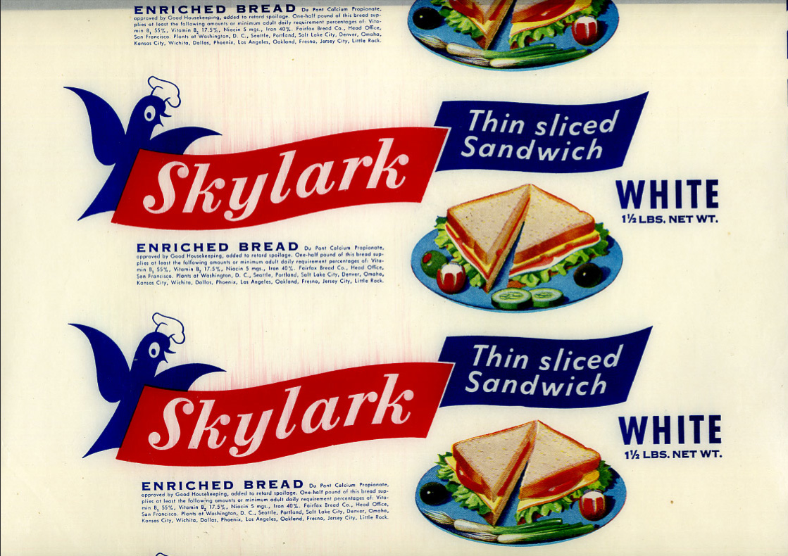


Bread used to be packaged in a waxed paper and sealed at either end with a sticker (in fact in the UK some brands still use the waxed paper, but heat sealed with a glue at the ends instead of with stickers).
These fine examples are waxed, bread wrappers from the 40's & 50's. I think the Victory Vitality Bread is my favourite because if it's simplicity, although the Skylark is giving it a run for it's money (it's that little chef hat on the skylark graphic!).
Se more of the collection here.
Via the How to be a Retronaut.
https%3A%2F%2Fwww.deliciousindustries.com%2Fvintage-bread-wrappers
Delicious+Industries%3A+Vintage+bread+wrappers
Auto Type XV


See the full collection here.
https%3A%2F%2Fwww.deliciousindustries.com%2Fauto-type-xv
Delicious+Industries%3A+Auto+Type+XV
Auto Type XIIII


These are only half the auto type pics I took in one day - more to come later in the week!
View our full collection here and if you're a bit of a petrol head on the quiet, check out the beauties over on Super Ninety.
https%3A%2F%2Fwww.deliciousindustries.com%2Fauto-type-xiiii
Delicious+Industries%3A+Auto+Type+XIIII
Welcome

Welcome to the Delicious Industries blog. We're an independent design studio based in Brighton, UK and this is our scrapbook packed full of design, illustration, photography & typography inspiration. Check out our work here.
Links
DELICIOUS FRIENDS
DELICIOUS FAVOURITES
- 50 Watts
- Acejet 170
- Grain Edit
- It's Nice That
- National Geographic Found
- Notcot
- Pretty Clever
- Retronaut
- So Much Pileup
- We Love Typography
- Another Mag