art direction, design + typography
Blog: Design
From the reference box #98


#98 - Hurtigruten Coastal Express leaflet. I think this lovely leaflet is from the late 60's or early 70's. It's dual language (Norwegian?/ English) and gives all the on-board information passengers require for the trip.
The Hutigruten Coastal Express Service is a breathtaking 12 day voyage up the coast of Norway. It starts at Bergen, works it's way up to Kirkenes and then returns to Bergen taking in the gorgeous landscapes, ports and nature along the way.
The leaflet itself isn't that exciting, but the graphics are fantastic. They look like tissue paper collages, but whether they actually are I'll never know. The lobster is definitely my favourite by far.
There's lots more fabulous ephemera in the reference box, make a cup of tea and have a dig around here.
https%3A%2F%2Fwww.deliciousindustries.com%2Ffrom-the-reference-box-98
Delicious+Industries%3A+From+the+reference+box+%2398
HOWDOOS now on Folksy!
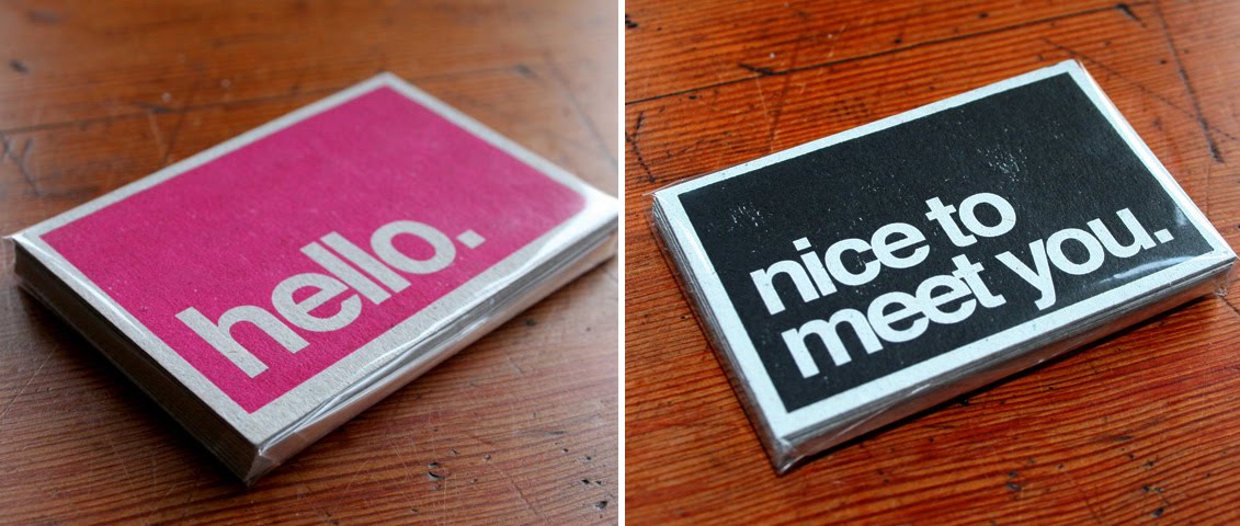
Our HOWDOOS - hand letter-pressed, personalisable business cards are now available on Folksy and Etsy. Get yours now!
Find out more about HOWDOOS here.
https%3A%2F%2Fwww.deliciousindustries.com%2Fhowdoos-now-on-folksy
Delicious+Industries%3A+HOWDOOS+now+on+Folksy%21
From the reference box # 97

#97 - Hoffmann's die-cut advertising cat, circa 1930's. This cat is way too cute to be put away in the reference box so he lives on my desk. His front legs pull forwards so that he can stand up, but he's very small for a point of sale and he has a card around his neck that reads, "HOFFMANN'S Reis-Stärke mit der katze" ("Hoffmann's rice starch, with the cat"). I did read that he's a bookmark, and he would do the job well, but I'm not convinced that was his original purpose.
Hoffmann's were a German starch factory just outside Salzuflen founded in 1850. They're cat logo (below) designed by illustrator Flinzer Fedor became a registered trademark in 1876. The cat was used as it portrays cleanliness. Hoffmann's really loved the cat as an icon and it's said on their 100th anniversary they decorated a cat on a pedestal in the factory grounds and in 1988 a giant cat was paraded through Salzuflen to celebrate the 500th anniversary of the freedom of the city. A 2 metre high statue of the cat was also taken to events during the 1930's!
There's lots more vintage advertising and packaging in the Reference box - check it out here.
https%3A%2F%2Fwww.deliciousindustries.com%2Ffrom-the-reference-box-97
Delicious+Industries%3A+From+the+reference+box+%23+97
Harper, Harper, Harper!

How lucky am I? Look at the fabulous birthday gift I received at the weekend.
It's an original Harper, Harper, Harper poster created in 1977 to promote an exhibition of paintings and drawings by Edie, Brett and Charles Harper at the Frame House Gallery, Louisville, Kentucky.
The ladybird is a classic Charley Harper illustration and one he used regularly, so it's great to have a piece that incorporates it.
This poster and many other great Harper prints/posters are now available from Castor + Pollux, Brighton who are now an official Charley Harper retailer!
https%3A%2F%2Fwww.deliciousindustries.com%2Fharper-harper-harper
Delicious+Industries%3A+Harper%2C+Harper%2C+Harper%21
From the reference box #96

It's a very thick paper bag designed to carry home your ice-cream. I have no idea what year it's from, but I would guess at mid 60's or even early 70's judging by the design and print quality.
Have a good old rummage around the rest of our reference box here.
https%3A%2F%2Fwww.deliciousindustries.com%2Ffrom-the-reference-box-96
Delicious+Industries%3A+From+the+reference+box+%2396
Walter Allner: Modern Packaging


I thought these covers for Modern Packaging seemed familiar and then I discovered they were designed by Walter Allner, the art director of Fortune magazine 1962 - 1974.
I love the Fortune covers, and these are equally as fabulous with their big blocks of colour, strong use of black and the simplified graphic illustrations.
The Modern Packaging covers above range from 1955 - 1963 so there must have been some overlap when Allner was working at Fortune magazine and still creating the Modern Packaging covers. His motto was, "Raise the aesthetic standard - the public is more perceptive than you think".
These covers are part of the Rochester Institute of Technology's (RIT) Walter Allner collection donated by the man himself. The RIT have a great online Graphic Design Archive (GDA) showcasing and preserving "the work of significant American graphic designers active from the 1920s to the 1950s", including Saul Bass, Alvin Lustig and Paul Rand.
Via Aqua Velvet.
https%3A%2F%2Fwww.deliciousindustries.com%2Fwalter-allner-modern-packaging
Delicious+Industries%3A+Walter+Allner%3A+Modern+Packaging
From the reference box #95

#95 - Vintage Ryvita paper bag. I'm guessing that these bags were used to buy individual Ryvitas before they were available in packs.
It's definitely post World War II, probably early 50's as it states, 'Made in Poole, Dorset' - the new factory location after the original Birmingham one was bombed during the war.
I love the print quality, yes it is a bit blobby in places, but I like that and I also really like the shopping list element on the back. It's interesting to see vintage packaging encouraging re-cycling and re-use, almost like we've done a full circle!
Don't forget to have a root through our other reference box items, you never know what you might find!
https%3A%2F%2Fwww.deliciousindustries.com%2Ffrom-the-reference-box-95
Delicious+Industries%3A+From+the+reference+box+%2395
Auto Type X


Happy New Year!
What better way to kick off 2011 than with some fabulous Auto type taken at the Brooklands' New Year's Day meet.
Brooklands Museum stands on part of the historic Brooklands Motor Course - the first purpose built race track in Britain, constructed in 1907 by Hugh Locke King. They have some really good Motorsport and Aviation exhibits including a full size Concorde complete with an onboard flight simulator.
Check out all our Auto Type and Automobilia posts here.
https%3A%2F%2Fwww.deliciousindustries.com%2Fauto-type-x
Delicious+Industries%3A+Auto+Type+X
From the reference box # 94


#94 - More vintage Christmas cards! A seasonal treat from the reference box today, Christmas cards from the 50's and early 60's - more from the great scrapbook collection I posted about last year.
I'm immediately attracted to the big bold, bright ones like the bells (top) but some of the subtler designs have such intricate detail it's hard to pick a favourite. For example, the second one down with the robins, has a tiny 1952 calendar under the post box and the last one is covered in tiny embossed snowflakes. Print finishing like that would cost a fortune these days!
https%3A%2F%2Fwww.deliciousindustries.com%2Ffrom-the-reference-box-94
Delicious+Industries%3A+From+the+reference+box+%23+94
Reverting to Type


"Reverting to Type is an exhibition of contemporary letterpress practitioners, showcasing how a centuries-old craft is being reinvented for modern day usage."
The exhibition, curated by Graham Bignell founder of artisan letterpress print studio New North Press and designer Richard Ardagh, includes work from some of our favourites; Hatch Show Print, Occasional Print Club and the one I'm most excited about - Yee Haw! Industries.
Much of the featured work will be available to buy along with a series of collaboration prints from New North Press. Standpoint Gallery will also be running an Adana press so visitors can hand-print personalised Christmas cards!
The exhibition is open 10-6 everyday up to 24 December 2010 and then after a Christmas break, runs from 4 - 22 January 2011.
Images copyright Standpoint Gallery.
https%3A%2F%2Fwww.deliciousindustries.com%2Freverting-to-type
Delicious+Industries%3A+Reverting+to+Type
Castor + Pollux web shop

Our lovely friends at Castor + Pollux have just launched their new website and online shop with a great selection of limited edition prints, books, jewellery, stationery and pottery from artists including Rob Ryan, Paul Catherall, Charley Harper and Jonathon Adler.
Buy online before 21 December 2010 and receive a £10 gift voucher for every £50 you spend!
https%3A%2F%2Fwww.deliciousindustries.com%2Fcastor-pollux-web-shop
Delicious+Industries%3A+Castor+%2B+Pollux+web+shop
Up There
I love this little video, 'Up There' directed by Malcolm Murray. It's a blatant Stella advertisement, but good on them for supporting traditional artisans.
The painting of large scale advertising is more of a dying art than hand-painting signage. I found it really interesting to see how it's done and to hear about the artists keeping it well and truly alive. You would definitely have to love your job to work in those conditions and train as an apprentice for that length of time though.
It's such a shame we don't have it here in the UK, I would pay much more attention to adverts if they'd been hand-painted on location.
Produced by Mekanism. Music by The Album Leaf.
Based on an original concept by Mother.
Via O+G Blog
https%3A%2F%2Fwww.deliciousindustries.com%2Fup-there
Delicious+Industries%3A+Up+There
Blackout Blisters this weekend!

Print Club's annual Blisters exhibition is almost here. Blackout Blisters opens Friday 3 December at 6pm - just in time for you to buy all those loved ones a great signed and limited edition print for Christmas!
Prints from 40 artists including Ben Eine, Jamie Reid, Pure Evil and Si Scott will be on sale in editions of 40 for £40!
"All work in the exhibition will include a glow-in-the-dark element and the venue (a rather wonderful old warehouse in dalston - MC Motors, Dalston) will be plunged into darkness at various points during the opening night so the assembled can see the posters in all their glory."
The exhibition will be at MC Motors, Dalston from 3 - 5 December and will then move to Print Club's Brick Lane gallery.
Find out more here.
https%3A%2F%2Fwww.deliciousindustries.com%2Fblackout-blisters-this-weekend
Delicious+Industries%3A+Blackout+Blisters+this+weekend%21
From the reference box # 93

#93 - Vintage IGARD Lens packaging. I love combination of the large red 'Z' and the dark olive green on this packaging. I think it's from the late 50's/early 60's.
IGARD was a division of COIL (Combined Optical Industries Ltd.), manufacturers of low vision products established in 1936 by Arthur Kingston and still in existence. Throughout the 40's and 50's they were world leaders in plastic lenses, "The company pioneered techniques in the precision moulding of plastic optics using injection and compression moulding".
The light-weight, shatterproof plastic created by COIL was the result of UK developments in acrylic (polymethyl-methacrylate) for aircraft windshields before and during WWII.
See more fabulous items in our reference box here.
https%3A%2F%2Fwww.deliciousindustries.com%2Ffrom-the-reference-box-93
Delicious+Industries%3A+From+the+reference+box+%23+93
Richard Hambleton - The Godfather of Street Art


For those who don't know, Richard Hambleton is a New York artist (originally from Canada) dubbed 'The Godfather of Street Art' and the source of Banksy's early inspiration. He first made his name in the late 70's with his Mass Murder Concept public art - fake crime scenes (chalked outlines splashed with red paint) followed by his Shadowman paintings in the early 80's (life-sized silhouettes painted around NYC). The Shadownman work later developed into the 'Marlboro man' - a mysterious rodeo man riding a bucking horse.
This retrospective is curated by Vladimir Restoin-Roitfield and Andy Valmorbida in association with Giorgio Armani. It includes 25 pieces which are previously unseen including 'Horse & Rider' - a re-visit to the themes of the Marlboro Man era.
The exhibition closes on the 3 December concluding it's world tour, so be sure to take time out from the Christmas shopping and pop in!
Images copyright Richard Hambelton.
https%3A%2F%2Fwww.deliciousindustries.com%2Frichard-hambleton-the-godfather-of-street-art
Delicious+Industries%3A+Richard+Hambleton+-+The+Godfather+of+Street+Art
Welcome

Welcome to the Delicious Industries blog. We're an independent design studio based in Brighton, UK and this is our scrapbook packed full of design, illustration, photography & typography inspiration. Check out our work here.
Links
DELICIOUS FRIENDS
DELICIOUS FAVOURITES
- 50 Watts
- Acejet 170
- Grain Edit
- It's Nice That
- National Geographic Found
- Notcot
- Pretty Clever
- Retronaut
- So Much Pileup
- We Love Typography
- Another Mag