Blog: Typography
The Little Library of Record Sleeves


Record Envelope: The Little Library of Record Sleeves is illustrator Kavel Rafferty's website for her fantastic collection of vintage 45rpm record sleeves.
All the sleeves are great designs, with bold, bright colours and are categorised into sections such as one & two colour print, animals, circles, typography and photographic.
Via Sell! Sell!
All images copyright Record Envelope.
https%3A%2F%2Fwww.deliciousindustries.com%2Fthe-little-library-of-record-sleeves
Delicious+Industries%3A+The+Little+Library+of+Record+Sleeves
Reclaimed SALE sign
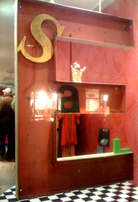
Wandering through Covent Garden last night I saw this SALE sign in a shop window. My camera phone pic doesn't really do it justice, but you get the idea.
It was 4 reclaimed signage letters composed in and around a giant 'E' to read 'SALE'. After passing shop upon shop with sale signs in the window, it was refreshing to see one showing a bit originality.
https%3A%2F%2Fwww.deliciousindustries.com%2Freclaimed-sale-sign
Delicious+Industries%3A+Reclaimed+SALE+sign
Saks Fifth Avenue hire Shepard Fairey!

Saks Fifth Avenue have hired Shepard Fairey and Studio Number One employee Cleon Peterson to design their Spring marketing campaign. In true Fairey style it has more than a touch of Constructivism about it and although the propaganda style ads have been seen many times before, I think it works.
It's bold, striking and straight to the point, the exact requirements of any marketing campaign and poster design. The image is strong and the style carries through well to the packaging.

How clever (and ballsy) of Saks to get Fairey on board after the success and free publicity generated by his recent Obama poster campaign and for putting their faith in what he could do for them. Terron E. Schaefer, the senior vice president for marketing at Saks told the NY Times, “What we do every day, really, is propaganda”.
I hope it's sucessful and encourages other companies to take a more inspiring marketing route and put themselves out there a bit more. If nothing else, it gets you noticed!
Images copyright Saks Fifth Avenue, from NY Times.
Via Notcot.
https%3A%2F%2Fwww.deliciousindustries.com%2Fsaks-fifth-avenue-hire-shepard-fairey
Delicious+Industries%3A+Saks+Fifth+Avenue+hire+Shepard+Fairey%21
Alphabet Trucks & Abandoned Gasoline Stations
He has also created a limited edition set of 26 Abandoned Gasoline Station postcards. Without the fuel pumps etc... you can really appreciate the architecture of the buildings, even though they look a bit out of place in the landscape.
Both editions are limited to 500 and available here.
Via Inspire Me Now.
https%3A%2F%2Fwww.deliciousindustries.com%2Falphabet-trucks-abandoned-gasoline-stations
Delicious+Industries%3A+Alphabet+Trucks+%26amp%3B+Abandoned+Gasoline+Stations
Design Magazine

Design was launched in 1949 by the Council of Industrial Design (later to become the Design Council); a body set up in 1944 by the British Government to, “to promote by all practicable means the improvement of design in the products of British industry”. Published monthly and distributed Internationally, Design soon became highly influential.
I picked up 4 copies in a local secondhand store just before Christmas; September & November '73 and February & July '75. The covers aren't great for these issues, but the content is fantastic.
The adverts ooze Seventies style. They are mainly for office furniture, but I found a couple of Letraset ones which made me smile - I like what they did with the 8/g. I miss Letraset!

There are loads of really interesting articles which I'll scan and post soon, but as a taster here's one from the February 1975 issue discussing Coca-Cola and the, "fantastic momentum of the coke image" and how it, "outpowers its fizzy raison d'êtrê". (Click on the images to read the full article).


By far the funniest ads I found in these publications were the classifieds - not sexist or ageist at all - oh how times have changed!

All images and publication content copyright of Design and the Design Council.
https%3A%2F%2Fwww.deliciousindustries.com%2Fdesign-magazine
Delicious+Industries%3A+Design+Magazine
24 Delicious Days of Advent - #17

A gorgeous number 17 - Girard Alphabet Blocks by House Industries.

Fun and functional, brightly coloured alphabet blocks created by House Industries in collaboration with the estate of the late designer, Alexander Girard.
The 28 wooden blocks are made from replenishable, kiln-dried basswood and printed with non-toxic, child friendly inks. The blocks feature "alphabets based on the forthcoming Alexander Girard font collection and a cleverly-adapted House Industries factory logo puzzle".
A great gift for children or adults alike and available here.
Image copyright House Industries.
https%3A%2F%2Fwww.deliciousindustries.com%2F24-delicious-days-of-advent-17
Delicious+Industries%3A+24+Delicious+Days+of+Advent+-+%2317
24 Delicious Days of Advent - #7

This book is probably on every designers Christmas wishlist (unless of course they're lucky enough to already own it!).
It's 'Herb Lubalin; Art Director, Graphic Designer and typographer', a retrospective of his lifes work, crammed full of his wonderful typography, Avant Garde spreads and iconic logos.


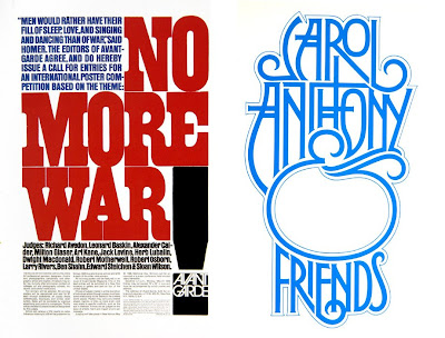
I have found a few copies for sale but they're not cheap! A bit more affordable though, is the Japanese, Idea Magazine #329 with a special feature on the 'Typo-Graphics of Herb Lubalin'. Understandably it's a sought after issue, but it covers a large amount of Herb's renowned typography and design and is only 39.50 Euro (thanks to Ryan at Sell! Sell! for this great tip-off).
There's also a great tribute to Herb Lubalin's work online here.
Images from Typogabor.
https%3A%2F%2Fwww.deliciousindustries.com%2F24-delicious-days-of-advent-7
Delicious+Industries%3A+24+Delicious+Days+of+Advent+-+%237
24 Delicious Days of Advent - #5

An appropriate No. 5 - Jonathan Borofsky's, 'Big 5' from the Number 3253776, 1990.

It's a 78" x 59 3/4", 1 color woodcut/relief from an edition of 25. There's something very beautiful about giant type, especially in black and white, unfortunately though it's $2800!
Interior image copyright Christine Lane Interiors.
Big 5 image copyright Gemini G.E.L. and Jonathan Borofsky.
https%3A%2F%2Fwww.deliciousindustries.com%2F24-delicious-days-of-advent-5
Delicious+Industries%3A+24+Delicious+Days+of+Advent+-+%235
While we're on a type theme…

I've just bought a set of these Type Trumps from Face 37. They're really great and at £9.99 they're a super stocking filler for any designer.


Via Notcot.
Images copyright Face 37.
https%3A%2F%2Fwww.deliciousindustries.com%2Fwhile-were-on-a-type-theme
Delicious+Industries%3A+While+we%26%23039%3Bre+on+a+type+theme%26%238230%3B
24 Delicious Days of Advent - #3

Now this wasn't on the original list of Delicious things, but I saw it today and really want one - it's a Sharpie pen designed by Plexifilm to only write in Helvetica!

You can't actually buy one, as they are only available as a free gift with any purchase from the 'Helvetica' merchandise range while stocks last, but unfortunately I can't find any mention of them now so it looks like they have already sold out.


It is sold with a warning though - "If you are John Downer or Marian Bantjes then the pen will actually write in Helvetica. Otherwise, your results may vary. Do not swallow. Keep away from open flame and co-workers. May cause drowsiness".
Via the fabulous Hero Blog.
https%3A%2F%2Fwww.deliciousindustries.com%2F24-delicious-days-of-advent-3
Delicious+Industries%3A+24+Delicious+Days+of+Advent+-+%233
From the reference box #28
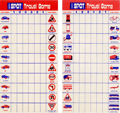
Long before portable DVD Players and Nintendo DS, the I-SPOT Travel Game was at the forefront of in-car entertainment.
From the typography and the models of cars, I'm guessing these examples are from the 70's. The simple, 2 colour illustrations are great, especially the cars and I particularly like the Dr Who style police box - I don't think I've ever seen one of those!
So #28 - a fabulous pair of I-Spot Travel Game cards.
Take a look through our reference box here.
https%3A%2F%2Fwww.deliciousindustries.com%2Ffrom-the-reference-box-28
Delicious+Industries%3A+From+the+reference+box+%2328
Type Tea Towels

I love these Tea Towels, they're so nice I want to frame the big 't' and put it on the wall!
Via SwissMiss.
https%3A%2F%2Fwww.deliciousindustries.com%2Ftype-tea-towels
Delicious+Industries%3A+Type+Tea+Towels
SIGNS by Mark Pawson

An Exhibition of 12 New Limited Edition Ready To Hang Signs and some Jewellery is Mark Pawson's latest exhibition that runs from 7 November - 23 December at Tatty Devine's Brick Lane store.
The signs are perspex, laser-cut and etched at Tatty Devine then glued together by Pawson. They have a great nostalgic feel that Pawson attributes to the, "curious, limited sort of retro colour palette" that the perspex/acrylic is available in.
He has also been bust making 12 invitational 'ready-to-hang' signs which have been sent out to press and magazines promoting the exhibition:

Via and images from Creative Review.
https%3A%2F%2Fwww.deliciousindustries.com%2Fsigns-by-mark-pawson
Delicious+Industries%3A+SIGNS+by+Mark+Pawson
1950's Automotive Industry logos


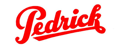


The Chilton's Motor Age publications not only have great covers but they are packed with great adverts and typography for automotive companies and parts manufacturers. I love how 50's they all are and how great the typography is - above are my favourites, but if I had to only pick one, it would be the top one (Wix).
https%3A%2F%2Fwww.deliciousindustries.com%2F1950s-automotive-industry-logos
Delicious+Industries%3A+1950%26%23039%3Bs+Automotive+Industry+logos
Chilton's Motor Age Covers


Whoo hoo! These arrived today - I bought them a few weeks ago and actually forgot about them, so it was a very nice surprise when they arrived this morning.
They are Chilton's Motor Age covers from 1958. The designs are really modern and graphic. I especially like the gauges on the November cover and the giant 59's used for December's.
Reading some of the articles and seeing no cover price, I get the impression it was a trade publication sent out to mechanics and car dealers (I could be wrong about this so if you know different please let me know).
https%3A%2F%2Fwww.deliciousindustries.com%2Fchiltons-motor-age-covers
Delicious+Industries%3A+Chilton%26%23039%3Bs+Motor+Age+Covers
Welcome

Welcome to the Delicious Industries blog. We're an independent design studio based in Brighton, UK and this is our scrapbook packed full of design, illustration, photography & typography inspiration. Check out our work here.
Links
DELICIOUS FRIENDS
DELICIOUS FAVOURITES
- 50 Watts
- Acejet 170
- Grain Edit
- It's Nice That
- National Geographic Found
- Notcot
- Pretty Clever
- Retronaut
- So Much Pileup
- We Love Typography
- Another Mag


