Blog: Typography
New Andy Smith Prints

Andy Smith's newsletter hit my inbox this morning with a great selection of his new work, including some new screenprints now available on his website.
These two are my favourites, I love the giant arrow - it's brown and pink so definitely hits all the right buttons and the chicken, well who doesn't like a big - err - chicken?!
Images copyright Andy Smith.
https%3A%2F%2Fwww.deliciousindustries.com%2Fnew-andy-smith-prints
Delicious+Industries%3A+New+Andy+Smith+Prints
A very special Type Specimen Book

I thought I had a few really great type specimen books until i saw this example at the weekend - it is absolutely stunning!
It belongs to NY designer, James Phillips Williams (JP), the man behind amassblog and a one time student of the great Paul Rand at the Yale School of Art. Both were avid collectors and fans of Jan Tschichold's work and became great friends. One day Mr Rand brought out this book to show JP, and revealed that it's previous owner had been the man himself - Jan Tschichold! He then gave the book to JP and said, "Enjoy, as I have".
Can you believe that not only is this a fantastic type specimen book, but it's also been owned by 2 of the most influential designers and typographers of the 20th Century! Thanks JP for sharing such a magnificent book with such a great history.


Images copyright amassblog.
Via Hi + Low.
https%3A%2F%2Fwww.deliciousindustries.com%2Fa-very-special-type-specimen-book
Delicious+Industries%3A+A+very+special+Type+Specimen+Book
Derek Yaniger
Originally from Arkansas, Yaniger now lives in Georgia designing and printing his own work which is regularly published in Atomic, Barracuda and Car Kulture Deluxe. Over the years he's also created illustrations for companies like Marvel Comics and the Cartoon network.
The exciting news for us is that Yaniger's Wildsville exhibition, is coming to our favourite local gallery, Castor + Pollux on the 26 June and running until 20 July. The exhibition will contain a selection of old and new prints and will have signed copies of his new book, 'Wildsville; the art of Derek Yaniger' available too!
As the man himself says, "Should be a jolly big hoot! Be there if ya’ can, man".
Images copyright Derek Yaniger.
https%3A%2F%2Fwww.deliciousindustries.com%2Fderek-yaniger
Delicious+Industries%3A+Derek+Yaniger
Nursery Rhymes

Sub-Studio have created these great 2 colour screen prints of 3 classic nursery rhymes; The Crooked Man, Rally! and Rain, Rain, Go Away. They're currently available for pre-order here and will ship early June.
Images copyright Sub-Studio.
Via Notcot.
https%3A%2F%2Fwww.deliciousindustries.com%2Fnursery-rhymes
Delicious+Industries%3A+Nursery+Rhymes
Saul Bass designed Matchbooks

I love these matchbooks found at a flea market by the very lucky Mary & Matt. They were designed for US food company Hunt-Wessen by the wonderful Saul Bass Associates, who also created their company logo in 1964...
I saw the full set of matchbooks for the first time at the Design Museum's Saul Bass exhibition in 2004 and remember thinking how great it would be to find some at a carboot sale. It just goes to show it can happen!
Matchbook image copyright Mary & Matt.
Via Oh Joy!
https%3A%2F%2Fwww.deliciousindustries.com%2Fsaul-bass-designed-matchbooks
Delicious+Industries%3A+Saul+Bass+designed+Matchbooks
More Which? covers


Finally I got round to scanning in more of the Which? magazines I bought last year. For those that don't know Which? is the monthly publication of the Consumers’ Association, designed by great British design duo Colin Banks and John Miles (co-founders of Banks & Miles) between 1964 and 1993.
I've now scanned in covers up to 1975 - it's taken a while I know, but they're worth the wait. It's great to see the development over the years and from one decade to the next. They definitely illustrate a social history of product development and consumer habits. They'll be uploaded to the Flickr group later this evening.
Read the previous post about Which? Magazine here and find out more about designers Banks & Miles here.
https%3A%2F%2Fwww.deliciousindustries.com%2Fmore-which-covers
Delicious+Industries%3A+More+Which%3F+covers
From the reference box #40

Pretty new to the reference box is this 1973 guide to the Jungfrau railway in Interlaken, Switzerland. As you would expect from a piece of Swiss design of this era, it's packed full of wonderful logos, typography and adverts.
This centre spread map has the only colour print throughout and just look how slick their chosen palate works with the black & white graphics and illustrations.

Here are a selection of my favourites...


Click here to see what other delights are hiding in our reference box.
https%3A%2F%2Fwww.deliciousindustries.com%2Ffrom-the-reference-box-40
Delicious+Industries%3A+From+the+reference+box+%2340
Steve Lambert's - Everything you want, right now!

Steve Lambert's solo show, Everything you want, right now! is currently running at LA's Charlie James Gallery until 6 June.
"Lambert takes on the vernacular of commercial signage, with a regional emphasis unique to Los Angeles. Visually, he is interested in what makes certain styles of signage feel so innately familiar, and in the methods that signage employs to grab our attention".
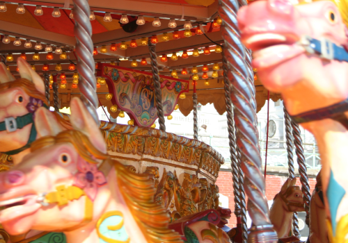
I love the look of the fairground style signs with their flashing light bulbs and quirky messages...


Images copyright Steve Lambert and Charlie James Gallery.
Via SwissMiss.
https%3A%2F%2Fwww.deliciousindustries.com%2Fsteve-lamberts-everything-you-want-right-now
Delicious+Industries%3A+Steve+Lambert%26%23039%3Bs+-+Everything+you+want%2C+right+now%21
This is a bullshit free zone.

Thanks Sell! Sell! for the lovely, straight talking poster we received today - it will definitely feel at home in the Delicious studio.
Read more about it here, and email doubles@sellsell.co.uk for your own copy.
https%3A%2F%2Fwww.deliciousindustries.com%2Fthis-is-a-bullshit-free-zone
Delicious+Industries%3A+This+is+a+bullshit+free+zone.
Think of your own ideas
https%3A%2F%2Fwww.deliciousindustries.com%2Fthink-of-your-own-ideas
Delicious+Industries%3A+Think+of+your+own+ideas
From the reference box #39


A cool Air Europe matchbook from the 70's - "It's nice to fly with friends."
Loving the red and orange combo, especially the stripes!
Have a look through the rest of our reference box here.
https%3A%2F%2Fwww.deliciousindustries.com%2Ffrom-the-reference-box-39
Delicious+Industries%3A+From+the+reference+box+%2339
70's Posters

I came across the Montague Projects blog yesterday which is a great blog, packed full of inspiring design including this wonderful collection of 70's posters recovered from his parents basement. See the full collection here.
Images copyright Montague Projects Blog.
https%3A%2F%2Fwww.deliciousindustries.com%2F70s-posters
Delicious+Industries%3A+70%26%23039%3Bs+Posters
Damn Everything But The Circus

Sister Mary Corita Kent became a nun in the Order of the Immaculate Heart of Mary, LA in 1936. She first exhibited her work in the early 50's and became a prominent artist in the 60's often creating subversive and political pieces.
"I am not brave enough to not pay my income tax and risk going to jail. But I can say rather freely what I want to say with my art."
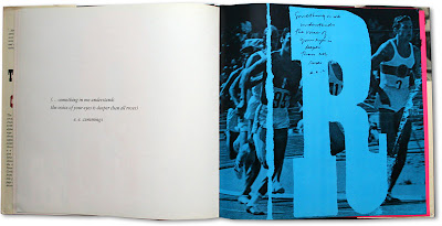
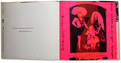
Damn Everything But The Circus was her 6th book and was published after she left the Order to pursue her love of art. The book is full of gorgeous large type and bright colours used to illustrate the inspirational quotes chosen by Corita which run throughout.


I've never seen this book or Corita's work before, but I'm hooked - I think it's fantastic. Those of you with cash burning a hole in your pockets might be interested to know that there's currently a copy available here.
Find out more about Sister Mary Corita Kent here.
Images copyright Watson Bookworks.
Via Hi + Low.
https%3A%2F%2Fwww.deliciousindustries.com%2Fdamn-everything-but-the-circus
Delicious+Industries%3A+Damn+Everything+But+The+Circus
Ampersand Marquee Light

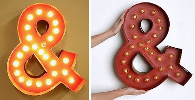
How great is this fairground style light from Urban Outfitters?? I love it's quirkiness and the fact that it kind of looks homemade.
It's one of their Marquee Lights (they also do an @ sign) only available online with shipping restricted to mainland US. Unfortunately they don't seem to be listed on the UK site for some reason.
They should create a full alphabet in the same style, that would be really cool, although at $178 each it could get pricey to spell out anything!
Images copyright Urban Outfitters.
Via Hell Yeah Dude.
https%3A%2F%2Fwww.deliciousindustries.com%2Fampersand-marquee-light
Delicious+Industries%3A+Ampersand+Marquee+Light
Type Nesting

I love Type Nesting - two of my favourite things, birds and type!
Dubi Kaufmann trawls the internet looking for photos of birds nesting in signs and posts them on Type Nesting in the hope of seeing a pattern and determining which letter they prefer.
To date it's the counters in capital A's and R's that seem more popular, but the cap B's aren't far behind.
Images fromType Nesting.
Via Swissmiss.
https%3A%2F%2Fwww.deliciousindustries.com%2Ftype-nesting
Delicious+Industries%3A+Type+Nesting
Welcome

Welcome to the Delicious Industries blog. We're an independent design studio based in Brighton, UK and this is our scrapbook packed full of design, illustration, photography & typography inspiration. Check out our work here.
Links
DELICIOUS FRIENDS
DELICIOUS FAVOURITES
- 50 Watts
- Acejet 170
- Grain Edit
- It's Nice That
- National Geographic Found
- Notcot
- Pretty Clever
- Retronaut
- So Much Pileup
- We Love Typography
- Another Mag


