Blog: Inspiration
Which? Magazine


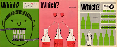
I had a great find at the car boot sale on Saturday - a big box of Which? magazines from 1960 to 1981. There are a couple of years missing and quite a few of the 'Money Which?' and 'Motoring Which?' supplements are missing, but as a collection they are well worth the £10 I paid!
Above are a selection of the covers, they are really great, I personally prefer the more graphic ones, but there are some more photographic and also some which are more illustrative. They are quite text heavy inside, but remain clean and un-cluttered, with some lovely typography. Also because of all the comparisons and tests that they run, almost every issue has a really well-designed chart, graph, diagram or illustration making them valuable reference.


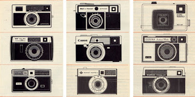
I will eventually scan in all the covers and create a 'Which? Covers' Flickr group, so watch this space!
https%3A%2F%2Fwww.deliciousindustries.com%2Fwhich-magazine
Delicious+Industries%3A+Which%3F+Magazine
Oh I do like to be beside the seaside…
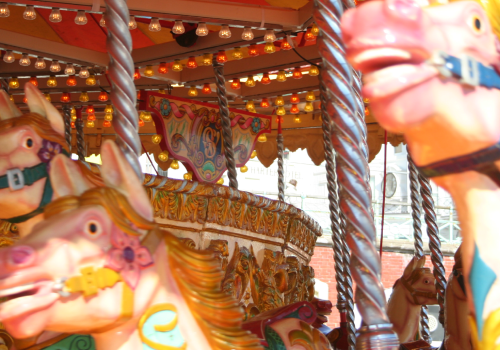
At this time of year Brighton is in full swing with the seafront and pier, in particular looking fabulously tacky and fun, so I decided to share some seaside inspiration for everyone to enjoy...


https%3A%2F%2Fwww.deliciousindustries.com%2Foh-i-do-like-to-be-beside-the-seaside
Delicious+Industries%3A+Oh+I+do+like+to+be+beside+the+seaside%26%238230%3B
Charley Harper 1922 - 2007

I came across the fabulous work of the late illustrator, Charley Harper today and I can't believe I haven't seen it before!
Harper was born on a farm in West Virginia, which is said to have been the true inspiration behind his work. He later moved to Cincinnati where he studied, and later taught at the Art Academy of Cincinnati.
Many of his illustrations are of wildlife, and in particular birds, so it's no surprise he worked with many nature related organisations throughout his career, including the Cincinnati Zoo and the Everglades National Park. He also illustrated many books and is especially well known for his illustrations in, 'The Golden Book of Biology' and in, 'Betty Crocker Dinner for Two'
His modernist style creates simplistic, graphic images, that are colourful and bold. Harper summed up his style by saying, "When I look at a wildlife or nature subject, I don't see the feathers in the wings, I just count the wings. I see exciting shapes, color combinations, patterns, textures, fascinating behaviour and endless possibilities for making interesting pictures".
To see more of Charley Harper's work, checkout the 'Charley Harper Illustrations Fanclub' Flickr group, or have a look at the selection of limited edition prints for sale at Gallery One.
Image copyright Charley Harper.
https%3A%2F%2Fwww.deliciousindustries.com%2Fcharley-harper-1922-2007
Delicious+Industries%3A+Charley+Harper+1922+-+2007
A Delicious day out - part 1


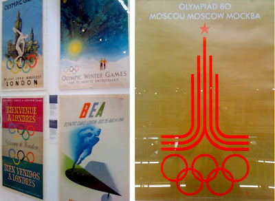
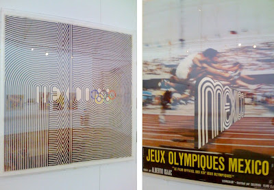

Every now and again I like to take a day off to take in some culture, so yesterday I visited the Museum of Childhood to see the 'Century of the Olympic Poster' exhibition (see my original post about this exhibition here). The posters are fantastic, the exhibition takes you chronologically through the collection, from 1851, to the London bid posters and then finally to the London 2012 logo. Most can be dated by the design alone, in particular the David Hockney and Roy Lichtenstein ones for the Los Angeles 1984 Olympics, as they are sooo 80's.
For me, the best by far is the Mexico'68 Olympic logo and poster. It is one of my all-time favourite pieces of design and it was great to see it in the flesh and especially to see the fluro pink and green version which I had never seen before.
What I found really interesting is the mixture of poster designs for each Games, some Games had 2 or 3 totally different styled posters, as though a different person had designed each one with no consideration of the others, whereas the best years had a very obvious style, even though different artist and designers had been invited to create them.
I hope that the organisers of London 2012 have seen this exhibition and understand that getting a branding company or a big name ad agency is not necessarily the best way to create a successful and memorable Games marketing campaign. Instead inviting people like, Damien Hirst, Banksy, Martin Parr or Bridget Riley - world renowned artists, designers and photographers to create a truly British campaign would create enormous media interest and create a campaign, modern and true to the diversity & creativity of the UK. Because at the moment the 2012 logo would look right at home on the 1984 LA Games posters and does not inspire anything vaguely British or modern.
https%3A%2F%2Fwww.deliciousindustries.com%2Fa-delicious-day-out-part-1
Delicious+Industries%3A+A+Delicious+day+out+-+part+1
Matchbook covers

These fabulous matchbook covers are part of the Flickr group, 'Mid Century Modern - Sticker, Label + Stamp', administered Grain Edit. There are over 700 images in the group, mainly originating from Eastern Europe. The graphics are really simple and have a great print quality. They would definitely be a valuable addition to the Delicious reference box - I need to start a search!
Via Grain Edit.
https%3A%2F%2Fwww.deliciousindustries.com%2Fmatchbook-covers
Delicious+Industries%3A+Matchbook+covers
Gastrotypographicalassemblage!
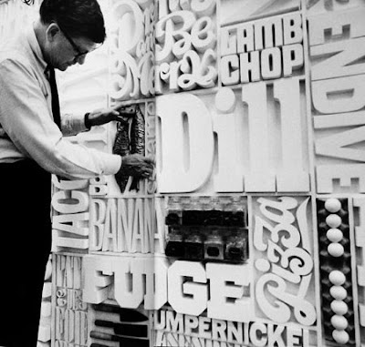

This is the 35 x 8ft, typographical wall of the CBS Building cafeteria circa. 1966, created by Lou Dorfsman. It was removed in the 80's, but this 9 panel masterpiece is now being lovingly restored by New York designer, Nick Fasciano and the Center for Design Study.
Information from The AIGA Journal of Design.
https%3A%2F%2Fwww.deliciousindustries.com%2Fgastrotypographicalassemblage
Delicious+Industries%3A+Gastrotypographicalassemblage%21
Welcome
Welcome to the Delicious Industries blog. We're an independent design studio based in Brighton, UK and this is our scrapbook packed full of design, illustration, photography & typography inspiration. Check out our work here.
Links
DELICIOUS FRIENDS
DELICIOUS FAVOURITES
- 50 Watts
- Acejet 170
- Grain Edit
- It's Nice That
- National Geographic Found
- Notcot
- Pretty Clever
- Retronaut
- So Much Pileup
- We Love Typography
- Another Mag

