art direction, design + typography
Blog: Typography
Displacement - new work by Mark Havens


No idea?
They're large photographic prints of the vintage model car decal sheets you probably had as a child - "tiny snapshots of color and shape that over time become elemental symbols and glyphs in the personal mythologies unique to each of us".
Seeing these tiny decals exploded to such a large scale really exaggerates the print quality and colour creating a wonderful patina and a warm feeling of nostalgia.
Displacement - new work by Mark Havens is currently showing at JAGR: Projects Philadelphia, until the end of July 2011.
Images copyright Mark Havens. Via The Chicane.
https%3A%2F%2Fwww.deliciousindustries.com%2Fdisplacement-new-work-by-mark-havens
Delicious+Industries%3A+Displacement+-+new+work+by+Mark+Havens
Dana Tanamachi's Chalk Lettering


This fantastic chalk lettering is the handy work of Brooklyn based graphic designer, Dana Tanamachi. Her chalky masterpieces have adorned the walls of The Ace Hotel, NY, The Wes Anderson, Brooklyn and Google's NYC offices among many more.
I love her type choices and I'm amazed at the amount of detail and definition she can get from a piece of chalk! As you can see in these time-lapse films she works completely freehand, sketching and re-sketching to get the desired design (see below).
I would be terrified of smudging it right at the end, or of someone else smudging it! Although that vulnerability does add to their charm.


https%3A%2F%2Fwww.deliciousindustries.com%2Fdana-tanamachis-chalk-lettering
Delicious+Industries%3A+Dana+Tanamachi%26%23039%3Bs+Chalk+Lettering
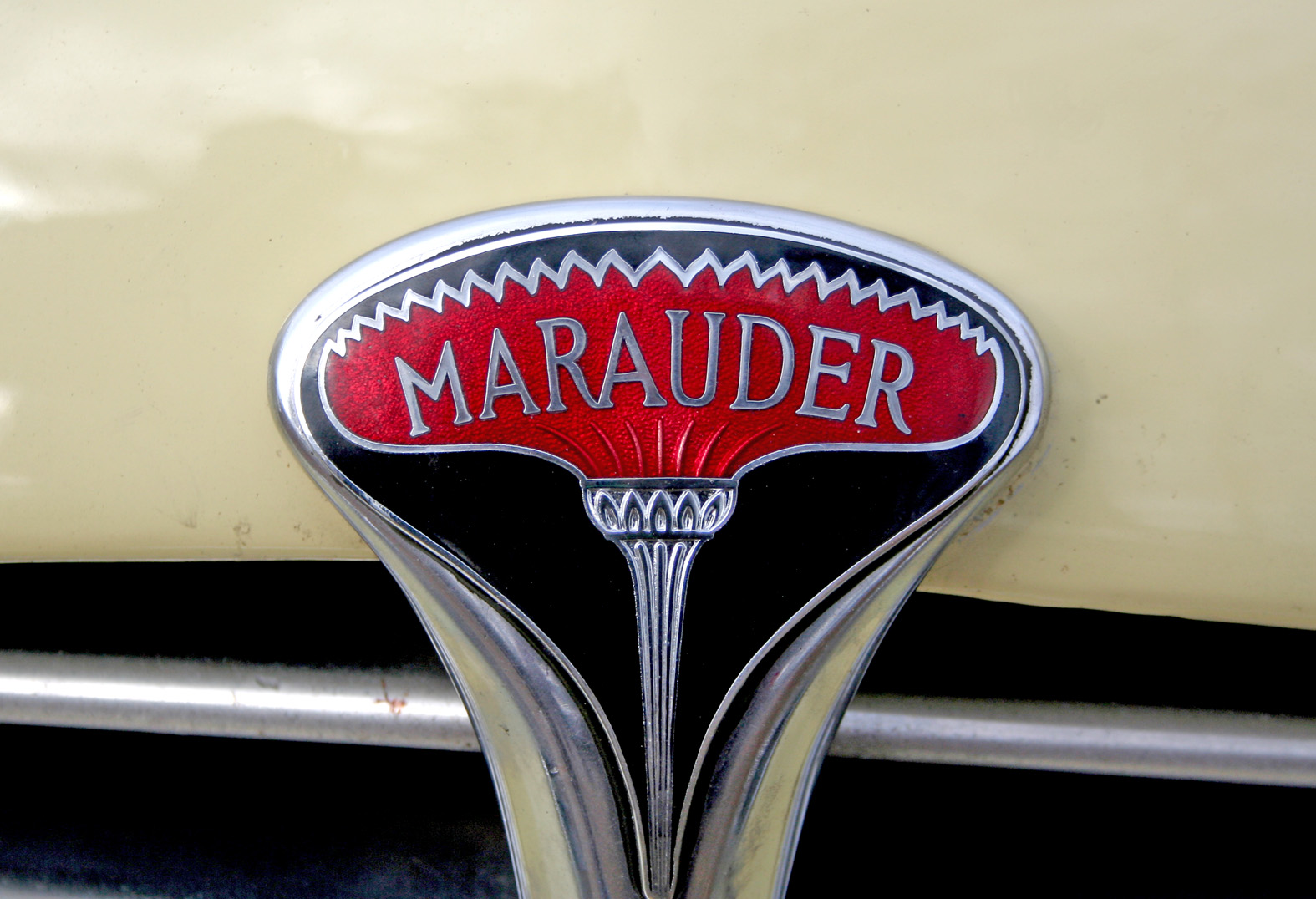
Auto Type XII


Auto Type XII - Some fine new additions to our collection - loving the quirky Corsair typeface (top).
We've now got quite a collection - if Auto Type does it for you check out the full set here or if the cars themselves are more your bag, hop over to our sister blog Super Ninety.
https%3A%2F%2Fwww.deliciousindustries.com%2Fauto-type-xii
Delicious+Industries%3A+Auto+Type+XII
Wim Crouwel: A Graphic Odyssey


The Design Museum, London are currently showing the UK's first retrospective of Dutch designer Wim Crouwel's work, Wim Crouwel: A Graphic Odyssey. An exhibition showcasing posters, print, typography and exhibition design from his 60 year of his career.
Crouwel is recognised for his love of grids and typographic systems to create dynamic, experimental work. "Regarded as one of the leading designers of the twentieth century, Crouwel embraced a new modernity to produce typographic designs that captured the essence of the emerging computer and space age of the early 1960s".
Wim Crouwel: A Graphic Odyssey runs until 3 July 2011. A set of 5 limited edition 'C' prints (above) designed exclusively for the Design Museum by Spin are available here throughout the exhibition.
Images copyright of the Design Museum.
https%3A%2F%2Fwww.deliciousindustries.com%2Fwim-crouwel-a-graphic-odyssey
Delicious+Industries%3A+Wim+Crouwel%3A+A+Graphic+Odyssey
The Movie Title Stills Collection


The Movie Title Stills Collection is a fantastic online resource for movie titles and end frames. Collated by designer Christian Annyas, the collection ranges from the early 1920's to the present day and can be viewed by decade or by 'Western' and 'Film Noir' genres.
There's plenty to look through - some are old classics, others are more obscure, some are bold and minimal, others are charmingly ornate, but they all have great typography. Enjoy.
Via our friends, Sell! Sell!
Images copyright The Movie Title Stills Collection.
https%3A%2F%2Fwww.deliciousindustries.com%2Fthe-movie-title-stills-collection
Delicious+Industries%3A+The+Movie+Title+Stills+Collection
Auto Type XI


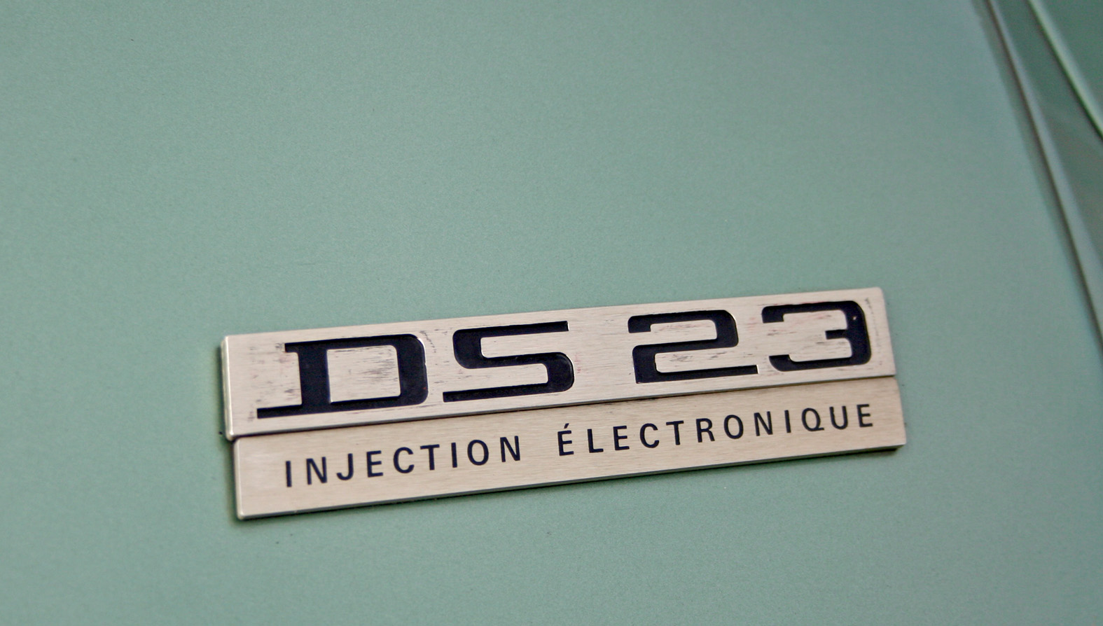


Auto Type XI - more fabulous Auto Type, taken on Sunday at the first Goodwood Breakfast Club of the year. The sun was shining and as you can see it brought out some mighty fine automobiles.
See lots more Auto Type and Automobilia here.
https%3A%2F%2Fwww.deliciousindustries.com%2Fauto-type-xi
Delicious+Industries%3A+Auto+Type+XI
Burning Love - Jonny Hannah at Castor + Pollux

Burning Love is illustrator, Jonny Hannah's Valentine's exhibition currently showing at the fabulous Castor + Pollux until the 13 March.
Mr Hannah himself curated the exhibition and hung the work which includes lots of lovely screen prints, lino prints, hand drawn type and cut out letters (see pics below). I couldn't make it to the private view, but I'm really looking forward to seeing it this weekend.
Mr Hannah himself curated the exhibition and hung the work which includes lots of lovely screen prints, lino prints, hand drawn type and cut out letters (see pics below). I couldn't make it to the private view, but I'm really looking forward to seeing it this weekend.


I love Jonny Hannah's prints and already have a few myself. They always make me smile with their quirky typography and funny illustrations.


Images copyright Jonny Hannah, taken from Castor + Pollux.
https%3A%2F%2Fwww.deliciousindustries.com%2Fburning-love-jonny-hannah-at-castor-pollux
Delicious+Industries%3A+Burning+Love+-+Jonny+Hannah+at+Castor+%2B+Pollux
Auto Type X


Happy New Year!
What better way to kick off 2011 than with some fabulous Auto type taken at the Brooklands' New Year's Day meet.
Brooklands Museum stands on part of the historic Brooklands Motor Course - the first purpose built race track in Britain, constructed in 1907 by Hugh Locke King. They have some really good Motorsport and Aviation exhibits including a full size Concorde complete with an onboard flight simulator.
Check out all our Auto Type and Automobilia posts here.
https%3A%2F%2Fwww.deliciousindustries.com%2Fauto-type-x
Delicious+Industries%3A+Auto+Type+X
Reverting to Type


"Reverting to Type is an exhibition of contemporary letterpress practitioners, showcasing how a centuries-old craft is being reinvented for modern day usage."
The exhibition, curated by Graham Bignell founder of artisan letterpress print studio New North Press and designer Richard Ardagh, includes work from some of our favourites; Hatch Show Print, Occasional Print Club and the one I'm most excited about - Yee Haw! Industries.
Much of the featured work will be available to buy along with a series of collaboration prints from New North Press. Standpoint Gallery will also be running an Adana press so visitors can hand-print personalised Christmas cards!
The exhibition is open 10-6 everyday up to 24 December 2010 and then after a Christmas break, runs from 4 - 22 January 2011.
Images copyright Standpoint Gallery.
https%3A%2F%2Fwww.deliciousindustries.com%2Freverting-to-type
Delicious+Industries%3A+Reverting+to+Type
Up There
I love this little video, 'Up There' directed by Malcolm Murray. It's a blatant Stella advertisement, but good on them for supporting traditional artisans.
The painting of large scale advertising is more of a dying art than hand-painting signage. I found it really interesting to see how it's done and to hear about the artists keeping it well and truly alive. You would definitely have to love your job to work in those conditions and train as an apprentice for that length of time though.
It's such a shame we don't have it here in the UK, I would pay much more attention to adverts if they'd been hand-painted on location.
Produced by Mekanism. Music by The Album Leaf.
Based on an original concept by Mother.
Via O+G Blog
https%3A%2F%2Fwww.deliciousindustries.com%2Fup-there
Delicious+Industries%3A+Up+There
Auto Type IX


Goodwood Breakfast Clubs are always a great place to find fabulous auto type and this morning didn't disappoint. I give you Auto Type part IX!
See more Auto Type here.
https%3A%2F%2Fwww.deliciousindustries.com%2Fauto-type-ix
Delicious+Industries%3A+Auto+Type+IX
Pirelli wonderfulness!

Pirelli scooter - Max Huber, 1957.

Pirelli magazine cover - Giulio Confalonieri and Ilio Negri, 1959.

Pneumatici Pirelli - Agenzia Centro, 1964.

Pirelli magazine page design - Giulio Confalonieri and Ilio Negri, 1959

"il pneumatico che morde la strada'"(the tire that bites the road) ad - Paul Engelmann, 1952.

"per l'inverno il pneumatico inverno", Pirelli brochure cover, 1952.
More fabulous Pirelli graphics from Pop Design's Flickr. I love 50's and 60's Pirelli's marketing, it's so simple and graphic - very less is more, which I'm a big fan of!
Images copyright Pop Design.
https%3A%2F%2Fwww.deliciousindustries.com%2Fpirelli-wonderfulness
Delicious+Industries%3A+Pirelli+wonderfulness%21
From the reference box #92

#92 - Vintage paper dice. I love this new addition to the reference box. I think it's from the late 40's or early 50's when there was a shortage of materials.
I'm sure I have another one somewhere, but I can't find it - I'll have to have a root around in the reference box myself and see if it turns up!
https%3A%2F%2Fwww.deliciousindustries.com%2Ffrom-the-reference-box-92
Delicious+Industries%3A+From+the+reference+box+%2392
Citroen Ephemera


Really loving these 60's Citroen promotional booklets designed by Parisian studio, Delpire over on Grain Edit. They were created by the father of Francois-Charles (iconomaque) who worked at the studio in the 60's and were discovered whilst he was sorting through his father's studio.
What a great bit of ephemera to start the day with!
Via Sell! Sell!
Images copyright iconomaque.
https%3A%2F%2Fwww.deliciousindustries.com%2Fcitroen-ephemera
Delicious+Industries%3A+Citroen+Ephemera
From the reference box #91


#91 - Vintage fasteners. I love these 50's Snap Fastener and Hooks & Eyes cards from "World Famed", Newey's - "If it fastens Newey's make it!".
They're only small cards, but they have some great type...

and some lovely print...

Think I feel another collection coming on!
There are 90 more wonderful items tucked away in our reference box - take a look here.
https%3A%2F%2Fwww.deliciousindustries.com%2Ffrom-the-reference-box-91
Delicious+Industries%3A+From+the+reference+box+%2391
Welcome

Welcome to the Delicious Industries blog. We're an independent design studio based in Brighton, UK and this is our scrapbook packed full of design, illustration, photography & typography inspiration. Check out our work here.
Links
DELICIOUS FRIENDS
DELICIOUS FAVOURITES
- 50 Watts
- Acejet 170
- Grain Edit
- It's Nice That
- National Geographic Found
- Notcot
- Pretty Clever
- Retronaut
- So Much Pileup
- We Love Typography
- Another Mag