art direction, design + typography
Blog: Typography
Chocolate Week


No, I haven't made it up. This week is National Chocolate Week (11-17 October), "a time of pure indulgence involving the country's best chocolatiers and chocolate shops holding events all over the UK".
So to celebrate I thought I'd share with you my best chocolatey find - chocolate type (above) from The Letteroom made using original Dutch moulds. These delicious looking letters are 17cm high and weigh in at 200 grams each. Now that's a lot of chocolate!
Each letter is available in either white, milk, dark or strawberry flavoured chocolate and can be personalised with wording or a pattern. They also sell mini (4cm high) letters for the less greedy!
Images copyright The Letteroom.
https%3A%2F%2Fwww.deliciousindustries.com%2Fchocolate-week
Delicious+Industries%3A+Chocolate+Week
Vintage coffee tins


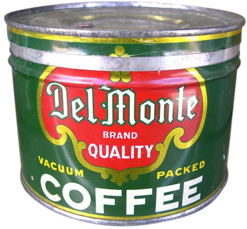

I love these 40's and 50's coffee tins from Roadsidepictures' (US photographer, Allen) collection of vintage packaging and advertising on Flickr. There's so much to look at, this is definitely one of those sets you need a lot of time and a cuppa to really enjoy.
Allen says he's always enjoyed, "photographing old neon signs, cars, motels, gas stations, roadside attractions and suburban life" - all of which can be seen in his Flickr sets.
See more vintage packaging here, here and here or have a rumage through our reference box here.
Images copyright Allen at Roadsidepictures.
Via Notcot.
https%3A%2F%2Fwww.deliciousindustries.com%2Fvintage-coffee-tins
Delicious+Industries%3A+Vintage+coffee+tins
SR692: Swissair - The Ultimate Fansite


I can't get enough of all the wonderful Swissair design and print on SR692: Swissair - The Ultimate Fansite. They have a massive collection of Swissair printed ephemera including posters, tickets, calenders, publications, postcards, annual reports, time tables and route maps, as well as a very informative history of the brand and logo.
Above are a selection of the more graphic route map and time table covers. They're all really fantastic, but my favourites are the ones using the Reudi Bircher designed plane graphic logo of the 50's and 60's.
Huge thanks to Darren for sending me a link to Wanken, which led me to this great site.
Images copyright SR692.
https%3A%2F%2Fwww.deliciousindustries.com%2Fsr692-swissair-the-ultimate-fansite
Delicious+Industries%3A+SR692%3A+Swissair+-+The+Ultimate+Fansite
Patrick Hruby


He's just completed this great ABC book for Ammo too...


Via Ffffound.
https%3A%2F%2Fwww.deliciousindustries.com%2Fpatrick-hruby
Delicious+Industries%3A+Patrick+Hruby
Auto Type VIII


A few lovely additions to my Auto Type collection, taken at Goodwood Revival last weekend. I love the mix of the super rare and the more everyday cars - the 'Tourino Superleggera Milano' crest and badge has to be a favourite.
To see more Auto Type, check out previous posts here or view our Flickr set here.
https%3A%2F%2Fwww.deliciousindustries.com%2Fauto-type-viii
Delicious+Industries%3A+Auto+Type+VIII
Gastrotypographicalassemblage at Kemistry Gallery

Well not the actual wall panels we posted about here, but a half-size photographic reproduction of this a 35 x 8ft typographic masterpiece. Gastrotypographicalassemblage was created by Lou Dorfsman for the wall of the CBS cafeteria circa 1966 and included the names of every food item available in the cafeteria at that time.
"We were allowed to have all the spreads and, a 10x8 black and white negative of the entire wall taken on the day it was unveiled. From this we worked with a company called VGL and printed it up at half scale (we couldn't fit full scale in the gallery) and had it stretched by AP Fitzpatrick. For a 45 year old negative the quality we have got from the blowup without any retouching is fantastic."
Gastrotypographicalassemblage: The Designs of Lou Dorfsman is an exhibition at Kemistry Gallery, London celebrating the print and advertising work Dorfsman produced during his time at CBS (1946 - 1987) originally as an art director and later as senior vice president and creative director for marketing communications and design.
The exhibition runs until 30 October 2010 and includes more than 60 original pieces as well as a short film about the Gastrotypographicalassemblage narrated by Dorfsman himself.


Images copyright Kemistry Gallery, taken by Christian Carlsson.
Via CR Blog.
https%3A%2F%2Fwww.deliciousindustries.com%2Fgastrotypographicalassemblage-at-kemistry-gallery
Delicious+Industries%3A+Gastrotypographicalassemblage+at+Kemistry+Gallery
Julia Trigg at Castor + Pollux


"These amateur hams could have been the first 'techno geeks', making contact with each other through radio, long before telephone was accessible.
They sent each other signals using a type of morse code called Quebec Sign Language and developed their own shorthand - a kind of early text language. They would send each other these letterpress printed 'QSL' cards via post to confirm receipt of the signals - eventually all over the world."
The exhibition previews on Friday and will be open to the public from 18 September to 17 October 2010.
Images copyright Julia Trigg.
https%3A%2F%2Fwww.deliciousindustries.com%2Fjulia-trigg-at-castor-pollux
Delicious+Industries%3A+Julia+Trigg+at+Castor+%2B+Pollux
Flickr updates


We've finally got organised and updated our Flickr sets with more Auto Type, Matchbook labels and Racing numbers as well as adding a Vintage stamp set. Check them all out here.
https%3A%2F%2Fwww.deliciousindustries.com%2Fflickr-updates
Delicious+Industries%3A+Flickr+updates
Auto Type VII


Auto Type VII - more fabulous typography and graphics from a selection of very worthy vehicles.
See Auto Type I-VI here or check out our Flickr set here.
https%3A%2F%2Fwww.deliciousindustries.com%2Fauto-type-vii
Delicious+Industries%3A+Auto+Type+VII
Jay B Sauceda Photography


Great photos of traditional sign writing by Texan photographer, Jay B Sauceda - I love that feeling of faded glory they portray.
"Before there was vinyl printing there were big brick walls and craftsmen who covered said walls with their commercial artwork. This is my ever growing collection of those that I find while on the road."
Check out more of Jay's images here.
Via Oh Joy.
Images copyright Jay B Sauceda.
https%3A%2F%2Fwww.deliciousindustries.com%2Fjay-b-sauceda-photography
Delicious+Industries%3A+Jay+B+Sauceda+Photography
Vintage Milk Bottles
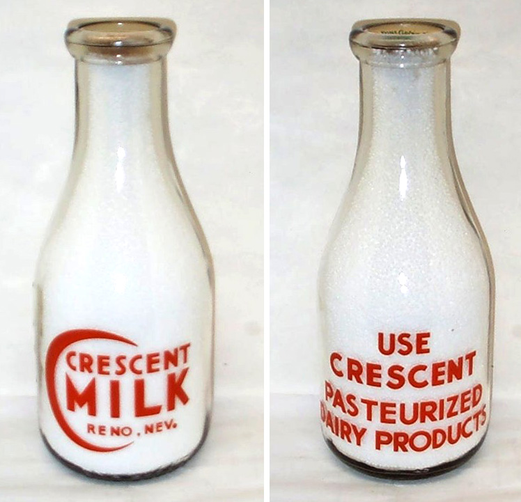


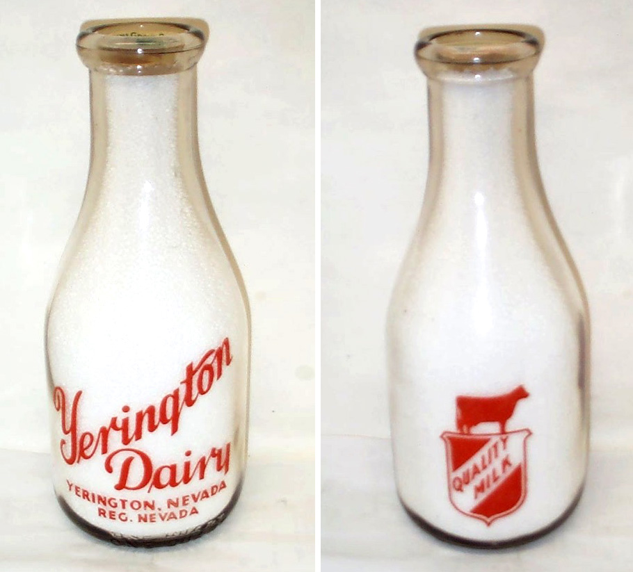


Who knew milk bottles could be so gorgeous, this lovely collection belongs to milk bottle collector and member of The National Association of Milk Bottle Collectors, Bill Kaiser. He has pages of bottles, the ones above are just a selection.
All the bottles have great graphics and decorative type, my personal favourites are the Crescent Milk graphic and the United Dairy type. It must have been lovely to start the day with one of these fine bottles on the table and don't forget how fabulous the bottle tops also used to be.
All the bottles above are available for sale on Got Milk Bottles. There is no mention of date, but my guess would be that they're from the 40's and 50's (I could however be very wrong!).
All images copyright Bill Kaiser.
https%3A%2F%2Fwww.deliciousindustries.com%2Fvintage-milk-bottles
Delicious+Industries%3A+Vintage+Milk+Bottles
PROSIGN - traditional signwriters


I've known of Prosign (Neil and Mandy Melliard) for a few years now and even been lucky enough to have my car signwritten by Neil! They're renowned in car and racing circles for their amazing work hand painting and pinstriping hot rods, race cars and promotional vehicles (above).
But I wasn't aware until today when I checked out their blog that they also do shop facias and window signage. In fact Neil has been working on window signage for Adidas in their Carnaby Street store earlier this month.
There's something lovely about a real hand-painted sign that other more modern techniques can never replicate. Here are some of the fabulous shops he's painted recently...


All images copyright Prosign.
https%3A%2F%2Fwww.deliciousindustries.com%2Fprosign-traditional-signwriters
Delicious+Industries%3A+PROSIGN+-+traditional+signwriters
Found Type #5


Some lovely found type from around the Delicious studio (top to bottom; 50's 'break glass' fire alarm, 'D' marked weight, vintage 'Halfords' oil can, vintage metal 'Shell' sign and nameplate from 50's/60's Vandome & Hart Ltd. scales)
See more found type posts here.
https%3A%2F%2Fwww.deliciousindustries.com%2Ffound-type-5
Delicious+Industries%3A+Found+Type+%235
Tiny Sellotape® Tins


The bottom one is of the same era as my others but the top one is much earlier - the logo has an outline so you can actually see how the Sellotape® logo started out (made up from a ribbon of tape). The logo/brand name 'Sellotape' has not yet been registered as a Trademark and the company name on the side of the tin is Adhesive Tapes Ltd., not Sellotape Products Ltd. as it is on the later ones. I love how it describes what Sellotape® does too, again indicating that it is an early tin, "No moistening" and "Adheres at touch".

If you're craving more information about Sellotape®, there's a brief history of the brand here.
https%3A%2F%2Fwww.deliciousindustries.com%2Ftiny-sellotape-tins
Delicious+Industries%3A+Tiny+Sellotape%C2%AE+Tins
Made by Cows


It's not very often I look at an advert and think the typography is good, in fact it's extremely rare, but I saw the new 'Made by Cows' Anchor Butter campaign this morning and was pleasantly surprised. The type is researched, considered and well composed - a refreshing change.
The ads created by CHI are reminiscent of the late 1800's/early 1900's ads which were painted directly onto the sides of buildings. Alison Carmichael was commissioned by the agency to replicate the hand-painted type of this era, which explains the good type!
From the information I've seen it's hard to know whether the ads were painted on a wall and then photographed and the photos are been used as the 48 sheets (which I suspect will be the case) or if they've actually been painted onto walls in a few locations across the country which would make for a much more impressive campaign and add to the authenticity.
It just shows what can be achieved when designers and typographers are part of the process!
Via CR Blog.
https%3A%2F%2Fwww.deliciousindustries.com%2Fmade-by-cows
Delicious+Industries%3A+Made+by+Cows
Welcome

Welcome to the Delicious Industries blog. We're an independent design studio based in Brighton, UK and this is our scrapbook packed full of design, illustration, photography & typography inspiration. Check out our work here.
Links
DELICIOUS FRIENDS
DELICIOUS FAVOURITES
- 50 Watts
- Acejet 170
- Grain Edit
- It's Nice That
- National Geographic Found
- Notcot
- Pretty Clever
- Retronaut
- So Much Pileup
- We Love Typography
- Another Mag