art direction, design + typography
Blog: Typography
New Sell! Sell! Website
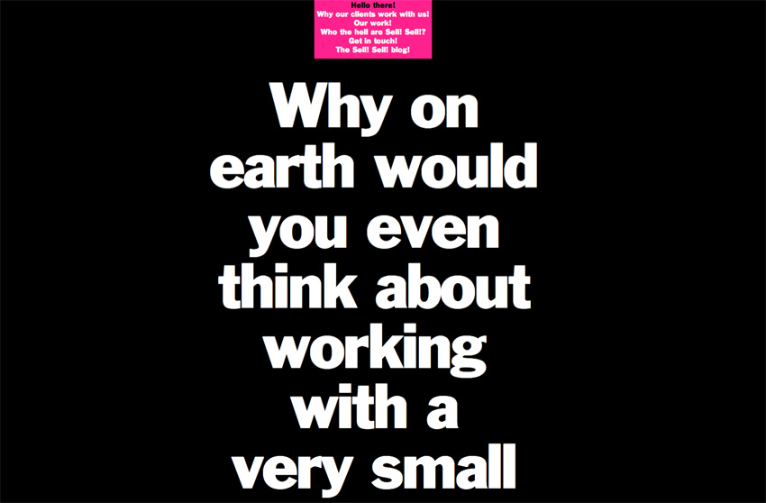


Our friends over at Sell! Sell! have just finished their new website and it’s definitely worth a look. As you can see it’s not what you will have come to expect from a creative agency, but since they write as much as they design & create I think it’s a refreshing idea and one that pushes the value of copy to the fore.
The copy is written in a way that keeps you reading without realising it - there’s also a more immediate navigation for the more traditionalists, but I quite enjoyed the journey through the site via the copy. It’s a very bold approach, but I think it really works and obviously I can’t help but love the big bold type!
Take a look here.
https%3A%2F%2Fwww.deliciousindustries.com%2Fnew-sell-sell-website
Delicious+Industries%3A+New+Sell%21+Sell%21+Website
Auto Type VI


I warned you the Auto Type posts would be more frequent now the show season has started! So here is #VI, a selection taken at the fabulous Goodwood Festival of Speed.
See Auto Type posts I-V and more Automobilia here.
https%3A%2F%2Fwww.deliciousindustries.com%2Fauto-type-vi
Delicious+Industries%3A+Auto+Type+VI
TypArchive


I came across a great site, TypArchive totally by accident yesterday and what a joy! It's a collection of found type and signage, focusing mainly on hand-painted signage from around the world but also includes quite a lot of auto type and neon.
The idea, "is to amass a comprehensive global collection of a high-quality images and produce hard-copy volumes". I hope it works out - that would be one cool reference book!
If signage is your thing, chances are you'll find this, this and this rather interesting too.
Images copyright the individual photographers. All from TypArchive.
https%3A%2F%2Fwww.deliciousindustries.com%2Ftyparchive
Delicious+Industries%3A+TypArchive
Auto Type V


I thought it was about time we saw some more fabulous Auto type, so here we have Auto Type V. These are the most recent additions to my collection, but as the show season really starts to kick in I'm sure I'll have more to share very soon!
If you missed our previous Auto Type posts you can see them here, here, here and here or check out our Flickr set. If race numbers are more your thing you'll definitely like these too.
https%3A%2F%2Fwww.deliciousindustries.com%2Fauto-type-v
Delicious+Industries%3A+Auto+Type+V
Soccer Aid World Cup 2010 Poster

As football fever takes hold I'm relieved to finally see a well-designed World Cup fixtures poster.
Created for Soccer Aid (raising money for Unicef) by David Watson it was designed as, "an antidote to the newspaper wall charts and pull outs". So if anyone in your studio/ home insists on putting up a wall chart or poster, you should insist that it's this one!
Each poster costs £7 + pp and all money is donated to Soccer Aid.
Get yours here.

Images copyright David Burton.
Via Wallpaper*.
https%3A%2F%2Fwww.deliciousindustries.com%2Fsoccer-aid-world-cup-2010-poster
Delicious+Industries%3A+Soccer+Aid+World+Cup+2010+Poster
From the reference box # 76


I love the typography on the backs of these cards, they're always so decorative and detailed. Interestingly (although maybe not to everyone) 3 of the above cards (top 3) are from the same studio, W. Gothard in Wakefield so you can see the progression of the design. I don't know for sure, but I'm guessing the more elaborate design (top) is the earlier card and the simpler, more minimal design (third down) is the later card.
I'll upload these asap to my vintage photographic card Flickr set.
https%3A%2F%2Fwww.deliciousindustries.com%2Ffrom-the-reference-box-76
Delicious+Industries%3A+From+the+reference+box+%23+76
Don't Worry Be Happy Prints now on Etsy!

Printed using vintage wood block letters and black ink onto 150gsm Canford paper they're available in an assortment of fabulous colours...

The prints are an edition of only 10 and each one comes numbered, signed and dated.
If you like these, you may also like our HOWDOOS!
https%3A%2F%2Fwww.deliciousindustries.com%2Fdont-worry-be-happy-prints-now-on-etsy
Delicious+Industries%3A+Don%26%23039%3Bt+Worry+Be+Happy+Prints+now+on+Etsy%21
From the reference box # 75


#75 - Vintage American milk bottle caps. The reference box has been seeing a lot of action this last few weeks and these are a couple of the new additions. I love the worn-off print on the bottom one and the typefaces on both are gorgeous - especially the 'milk' one.
For those that don't know the perforated circle in the middle was designed to be punched out using a straw.
https%3A%2F%2Fwww.deliciousindustries.com%2Ffrom-the-reference-box-75
Delicious+Industries%3A+From+the+reference+box+%23+75
Andy Smith Newspaper

I was very excited last week when the postie delivered a big white envelope with an Andy Smith illustration on the back (even though it had been screwed up to fit it in the postbox!). It was his new promotional newspaper created by the Newspaper Club in an edition of 500!
The paper is a collection of 12 posters created originally by Andy as silkscreen prints. Some are old favourites and a few are new (to me anyway), but they're all fantastic. I especially love the cover (above) with the fading effect.


Thanks Andy!
https%3A%2F%2Fwww.deliciousindustries.com%2Fandy-smith-newspaper
Delicious+Industries%3A+Andy+Smith+Newspaper
International Exhibition of Calligraphy


These beautiful examples of calligraphy are part of the International Exhibition of Calligraphy. An exhibition started in St. Petersburg, 2008 by MVK (International Exhibition Company) aiming to, "reveal the cultural and educational value of calligraphy pursuing a personality intellectual development".
Last year saw a second exhibition held in Moscow and this year (September 10-12th, 2010) it will be showcased in Velikiy Novgorod - quite a symbolic venue for Russian calligraphy.
"The chronicled history of Velikiy Novgorod dates back to the origin of Old Rus. The script culture arose with arrival of Christianity. Novgorod Psalter is the oldest book of Rus’. It is a tiny script book consisting of bound wooden tablets created between old 900’s and early 1000’s. It was Veliky Novgorod where the birchbark manuscripts (the written records of XI-XV centuries) testifying to the high literacy of the Novgorod population were found."
The exhibition organisers are then hoping to initiate the International Exhibition of Calligraphy in all the major cities of the world starting with Paris, New York and Jerusalem. Fingers crossed it will make it to the UK at some point.
Images copyright the International Exhibition of Calligraphy.
Via Ephemera Assemblyman.
https%3A%2F%2Fwww.deliciousindustries.com%2Finternational-exhibition-of-calligraphy
Delicious+Industries%3A+International+Exhibition+of+Calligraphy
New look NME


Yesterday saw the launch of a new look NME. The publication has a new editor and to mark the start of this new era has undergone a major revamp including an updated identity/masthead.
To celebrate the launch, this weeks issue is available in a choice of 10 different covers. Artists gracing the 10 covers are: Jack White, Florence And The Machine, LCD Soundsystem, Rihanna, Kasabian, Laura Marling, Foals, MIA, Biffy Clyro and Magnetic Man.
"We’ve brought together a really varied group of musicians from global icons like Jack White and Rihanna, innovators like MIA and LCD Soundsystem to exciting newcomers in the form of dubstep supergroup Magnetic Man," explained NME editor Krissi Murison.
I haven't seen any of the inside pages yet, but I think the new cover design is much cleaner and looks a lot more sophisticated than the previous style (below), so definitely a change for the better in my opinion.

Images copyright NME.
https%3A%2F%2Fwww.deliciousindustries.com%2Fnew-look-nme
Delicious+Industries%3A+New+look+NME
Farmers' Market Prints from Yee-Haw Industries


I love everything about these hand letter-pressed posters from Yee-haw Industries for the Knoxville Tennessee Regional & Organic Farmers' Market - the type setting, the fonts, the design and the giant, vegetable illustrations.
They're all available* from their Etsy store, be warned though, there are lots of great prints and posters in there - you will want to buy everything!
* UK peeps check out the shipping policies as there is a minimum order (but that shouldn't be a problem!)
Images copyright Yee-Haw Industries.
https%3A%2F%2Fwww.deliciousindustries.com%2Ffarmers-market-prints-from-yee-haw-industries
Delicious+Industries%3A+Farmers%26%23039%3B+Market+Prints+from+Yee-Haw+Industries
How to Work Better

*We just been informed that this was written by Fischli and Weiss and designed by James Goggin - thanks Dick.
Via Inspiration Resource.
Via Inspiration Resource.
https%3A%2F%2Fwww.deliciousindustries.com%2Fhow-to-work-better
Delicious+Industries%3A+How+to+Work+Better
Vintage Castrol Tins

Remember this post about a vintage oil can Flickr group? Well since then I've been on a look out for some of my own - so far I've found these little beauties. I love the old scripted Castrol logo on the middle and right tins.
According to Castrol this logo was introduced in 1946 and used until 1958 when the one on the left tin replaced it. Here's the Castrol logo evolution, I think it's a shame they didn't stick with the 50's/60's branding as it has much more impact than the ultra-modern (yet already dated looking) ones in use since 2001.

1917 and 1929

1946 and 1958

1968 and the 100 year celebration logo in 1999

2001 and 2006
Check out more vintage oil loveliness here, here and here.
All logo images copyright Castrol.
https%3A%2F%2Fwww.deliciousindustries.com%2Fvintage-castrol-tins
Delicious+Industries%3A+Vintage+Castrol+Tins
Helvetica Cookie Cutters!


Loving these Helvetica cookie cutters designed and created by Beverly Hsu last year. Rumour has it that she's trying to put them into production so we can all have lovely Helvetica cookies to munch on!
Images copyright Beverly Hsu.
Via NotCot.
https%3A%2F%2Fwww.deliciousindustries.com%2Fhelvetica-cookie-cutters
Delicious+Industries%3A+Helvetica+Cookie+Cutters%21
Welcome

Welcome to the Delicious Industries blog. We're an independent design studio based in Brighton, UK and this is our scrapbook packed full of design, illustration, photography & typography inspiration. Check out our work here.
Links
DELICIOUS FRIENDS
DELICIOUS FAVOURITES
- 50 Watts
- Acejet 170
- Grain Edit
- It's Nice That
- National Geographic Found
- Notcot
- Pretty Clever
- Retronaut
- So Much Pileup
- We Love Typography
- Another Mag