art direction, design + typography
Blog: Typography
Vintage VW Bus Signage


These old VW buses are taken from the pages of an old dealer brochure over on Cartype. They have some great colour combos and some even greater signwriting - encompassing 2 of my favourite things, hand-painted signage and old Volkswagens!
Big thanks to Ryan at Sell! Sell! for the link, we love it.
Images are originally from the great VW split bus site, Vintage Bus.
https%3A%2F%2Fwww.deliciousindustries.com%2Fvintage-vw-bus-signage
Delicious+Industries%3A+Vintage+VW+Bus+Signage
Educational Stamps - Israel 1972


I found these gorgeous Israeli stamps on a great blog, Words and Eggs. They were issued in 1972 to celebrate the countries rise in educational standards and illustrate stages of education (above - top to bottom):
Elementary school - "The beginning of wisdom is this: get wisdom..." (Proverbs 4:7)
Secondary school - "Train upon a child in the way he should go..." (Proverbs 22:6)
Vocational training - "... but all study of the law without labor comes to naught at the last..." (Pirkei Aboth 2)
Academic training - "...but you shall meditate on it day and night..." (Joshua 1:8)
Big thanks to Kickcan & Conkers for pointing us to this great blog.
Images copyright The Israel Philatelic Federation (IPF).
https%3A%2F%2Fwww.deliciousindustries.com%2Feducational-stamps-israel-1972
Delicious+Industries%3A+Educational+Stamps+-+Israel+1972
Great signage

I saw this over on On Aime Se Promener and love it - a wonderfully simple, well executed idea for an Opticians (Dunscombe Opticians, Bristol, UK).
Image copyright On Aime Se Promener.
Via Inspire me, now!
https%3A%2F%2Fwww.deliciousindustries.com%2Fgreat-signage
Delicious+Industries%3A+Great+signage
Margaret Kilgallen aka META / Matokie Slaughter

A couple of weeks ago I watched Beautiful Losers, a short film by Aaron Rose documenting the NYC art and graffiti scene in early 90's and celebrating, "the spirit behind one of the most influential cultural moments of a generation".
There are many talented artists in the film including Shepard Fairey, Barry McGee, Jo Jackson and Mike Mills, but for me it was Margaret Kilgallen's work that really stood out. I had seen some of it before, but had no idea who was behind it. The giant, typographic murals really struck me, they're fantastic - the colours, the scale and the typefaces, I just love them.


Her work was heavily influenced by American folk art which can be seen in the illustrations and colour palettes. She valued craftmanship and loved old hand-painted shop signs, something that clearly inspired her murals.
"I like things that are handmade and I like to see people's hand in the world, anywhere in the world; it doesn't matter to me where it is. And in my own work, I do everything by hand. I don't project or use anything mechanical, because even though I do spend a lot of time trying to perfect my line work and my hand, my hand will always be imperfect because it's human. And I think it's the part that's off that's interesting, that even if I'm doing really big letters and I spend a lot of time going over the line and over the line and trying to make it straight, I'll never be able to make it straight. From a distance it might look straight, but when you get close up, you can always see the line waver. And I think that's where the beauty is."
Margaret did many colaborations with other artists in the film including her husband, Barry Mcgee. She was also a grafitti artist on the freight trains, influenced by Hobo tradition, she worked under the tags 'Meta' and 'Matokie Slaughter'.
Sadly in 2001 Margaret Kilgallen died aged 33 of breast cancer just weeks after giving birth to her daughter, Asha. She was a talented and inspirational artist and I'm so pleased to have found her work. I really want to see it in the flesh and retrospectives do pop up now and again, but until then this Flickr group has a great collection of her work.
Images copyright the authors - from the Margaret Kilgallen Flickr.
https%3A%2F%2Fwww.deliciousindustries.com%2Fmargaret-kilgallen-aka-meta-matokie-slaughter
Delicious+Industries%3A+Margaret+Kilgallen+aka+META+%2F+Matokie+Slaughter
60's Porsche Service Books


I'm loving the colour palettes and graphics on these Porsche Service Books from the 60's - such an unexpected source of inspiration!
In fact most of the Porsche marketing materials from this era were really well designed. Grain Edit recently posted these fantastic Porsche posters designed by Erich Strenger and Volz...

Europa-Bergmeister, 1966. Design by Volz

Championnat d’Europe de la Montagne, 1960

Gloved Hands on Wheel, c1961. Design by Erich Strenger

Rennsportyahr, 1967. Design by Volz
Service Book images from Old Auto Radio.
Top poster from AUSmotive all other posters from VP Racing - via Grain Edit.
https%3A%2F%2Fwww.deliciousindustries.com%2F60s-porsche-service-books
Delicious+Industries%3A+60%26%23039%3Bs+Porsche+Service+Books
Auto Type IV


More lovely car emblems and graphics to add to my collection. The top one is particularly significant for me as Leyland is my home town - a town built on the success of vehicles like this old bus. Shame they don't make bus logos (or in fact buses) like this anymore!
If Auto type is your thing, check out previous posts here, here and here or take a look at my dedicated Flickr group.
https%3A%2F%2Fwww.deliciousindustries.com%2Fauto-type-iv
Delicious+Industries%3A+Auto+Type+IV
Lubalin Now!

Lubalin Now is the, "inaugural exhibition in the newly re-located Herb Lubalin Study Center of Design and Typography" in New York.
Herb Lubalin's wonderfully elaborate and stylized typography will be exhibited alongside the work it has influenced from internationally recognized, contemporary designers such as Marian Bantjes, Non-Format, Rick Valicenti and Marcus Eriksson.


"On view in Cooper Union’s new gallery, the installation includes recent posters, publications, and motion graphics by internationally recognized graphic designers that spotlight an emerging trend toward expressive lettering and typography.
Original sketches, magazines, logotypes, and posters selected from the Lubalin Center Archive will illuminate Lubalin’s influence on contemporary graphic design."
The exhibition, curated by Mike Essl and Alexander Tochilovsky, runs from 5 November - 8 December 2009 and is free to all you lucky peeps in NY - I'm not jealous at all!
Images copyright of the individual designers.
'Lubalin Now' logo copyright Justin Thomas Kay.
Via Grain Edit.
https%3A%2F%2Fwww.deliciousindustries.com%2Flubalin-now
Delicious+Industries%3A+Lubalin+Now%21
Vintage UNO!


Well, maybe not vintage yet, being from 1985, but well on it's way! I bought this game of UNO a few weeks back because I loved it's goofy numbers with their thick black outlines and shadows against the white leaf shape. They look more 70's than 80's to me, but maybe the design just hadn't changed much since the late 1970's.
https%3A%2F%2Fwww.deliciousindustries.com%2Fvintage-uno
Delicious+Industries%3A+Vintage+UNO%21
Vintage Reading Posters


I have a thing about vintage circus posters - the colours, the graphics, the type - what's not to like! These posters, particularly the top one have all the same elements, so I'm now on a mission to find some of my own.
Images copyright doe-c-doe.
https%3A%2F%2Fwww.deliciousindustries.com%2Fvintage-reading-posters
Delicious+Industries%3A+Vintage+Reading+Posters
NYC Subway Destination Scroll Prints


Winter Works on Paper have a wonderful selection of these c.1940 NYC Subway Destination Scrolls that can be ordered as 30 x 19" prints. The type and numbers are gorgeous and with all that black, they certainly have loads of impact - perfect for any studio or apartment.
Seeing these reminded me of the London Bus Blinds I posted about a while back which would also make an excellent talking point in the home or studio.
Images copyright Winter Works on Paper.
Via ffffound.
https%3A%2F%2Fwww.deliciousindustries.com%2Fnyc-subway-destination-scroll-prints
Delicious+Industries%3A+NYC+Subway+Destination+Scroll+Prints
Web Museum of Wood Types & Ornaments


The lovely people at Unicorn Graphics have put together a fantastic Web Museum of Wood Types & Ornaments showcasing a selection of specimen catalogues, borders, cuts and engraved woodblocks.
Their mission is to, "gather, save, preserve, and interpret wood types and information about them" to educate future generations, "on the beauties of wood types and engraved blocks".
They've already succeeded in educating me - I'm a massive fan of wood type blocks, but had never really considered the circumstances in which they first came about, but now I know: "As the demand for broadsides increased during first years of the nineteenth century, the need for the process of producing large letters cheaply arose. Wood was a logical material choice because of its ready availability, lightness, and proven printing qualities. In 1827, Darius Wells of New York City first found the means to mass produce wood letters. In March of 1828, first wood type catalogue was published by Wells".
It's an amazing resource and I can't wait to go through all the content, so far I've only had enough time to look through a couple of the catalogues. That's my weekend planned out!
Images copyright Unicorn Graphics.
https%3A%2F%2Fwww.deliciousindustries.com%2Fweb-museum-of-wood-types-ornaments
Delicious+Industries%3A+Web+Museum+of+Wood+Types+%26amp%3B+Ornaments
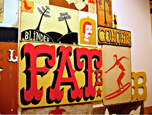
Yee-Haw Industries at Chelsea Market

Tennessee letterpress studio, Yee-Haw Industries have taken over Chelsea Market in the meat-packing district of Manhattan with their wonderful prints and posters until January 2010.
"Over 100 letterpress pieces all hand-printed from wood cuts & antique type", are said to "adorn the vast and cavernous Chelsea Market".
These sneak peak images from Design:Related show how great the exhibition sits in this urban, industrial space against the bare-brick walls and exposed columns. I really need a trip to NYC!


Images copyright Design:Related.
VIa Notcot.
https%3A%2F%2Fwww.deliciousindustries.com%2Fyee-haw-industries-at-chelsea-market
Delicious+Industries%3A+Yee-Haw+Industries+at+Chelsea+Market
Race numbers


This weekend I had a fabulous time at Goodwood Revival watching vintage motor racing. I love classic cars and seeing them race is amazing, but I always find myself looking at the race numbers and wondering how/why they choose particular fonts. Above are a selection of my favourites.
I have more Auto type posts here, here and here.
https%3A%2F%2Fwww.deliciousindustries.com%2Frace-numbers
Delicious+Industries%3A+Race+numbers
Designer Wood Blocks

If It's Hip, It's Here have rounded up a great selection of designer, wood blocks from architectural building blocks, to the more traditional typographic alphabet style.
It's not too surprising that the typographic ones appeal to me the most. The ones above especially caught my eye with their winning combination of simple graphic illustrations and eclectic mix of typestyles. They're available from notNeutral, the fabulous online store from LA based, Rios Clementi Hale Studios.
Another set that I hadn't seen before was this Neutraface Slab one from House Industries showcasing the different weights of their Neutraface font on each face.

Top images copyright notNeutral. Bottom images copyright House Industries.
Via Notcot.
https%3A%2F%2Fwww.deliciousindustries.com%2Fdesigner-wood-blocks
Delicious+Industries%3A+Designer+Wood+Blocks
Paul Thurlby Alphabet prints


Remember our post about illustrator Paul Thurlby and his gorgeous alphabet prints? Well Paul has been in touch to tell us the alphabet is now complete. The new prints are every bit as good as the earlier ones - more great colour combos, the same vintage/retro feel and some fun typography!
Each print is a signed and numbered limited edition of 200, and at the minute you can get 3 for the price of 2, so check out the Alphabet Shop.
Images copyright Paul Thurlby.
https%3A%2F%2Fwww.deliciousindustries.com%2Fpaul-thurlby-alphabet-prints
Delicious+Industries%3A+Paul+Thurlby+Alphabet+prints
Welcome

Welcome to the Delicious Industries blog. We're an independent design studio based in Brighton, UK and this is our scrapbook packed full of design, illustration, photography & typography inspiration. Check out our work here.
Links
DELICIOUS FRIENDS
DELICIOUS FAVOURITES
- 50 Watts
- Acejet 170
- Grain Edit
- It's Nice That
- National Geographic Found
- Notcot
- Pretty Clever
- Retronaut
- So Much Pileup
- We Love Typography
- Another Mag