Blog: Typography
Oil!


Who would of thought that a mundane object like an oil can could be so cool?
The cans above are from '83's Flickr group, Oil! A collection of vintage oil cans belonging to his dad. The typography, graphics and colours on each can are great and together they make a really interesting collection. This is only a portion of the full collection too, so I'm looking forward to seeing this set grow.
Images copyright '83.
Via Bad Banana.
https%3A%2F%2Fwww.deliciousindustries.com%2Foil
Delicious+Industries%3A+Oil%21
Alexey Brodovitch Spreads
Anyway, I came accross these Harper's Bazaar spreads art directed by Alexey Brodovitch and was totally shocked by how dynamic and experimental they are. I'm familiar with the covers he art directed, as they're probably his most famous works, but I've never before seen his page layouts which really show the true depths of his talent.
Carmel Snow the editor-in-chief who hired Brodovitch, hoped his unique design style would refresh the magazine and set it apart from it's rivals, "I saw a fresh, new conception of layout technique that struck me like a revelation: pages that "bled" beautifully cropped photographs, typography and design that were bold and arresting". Taken from 'The world of Carmel Snow'' by Carmel Snow & Mary Louise Aswell, McGraw-Hill, 1962.
It's a shame fashion mags these days don't aspire to this level of design. They seem to achieve great heights with photography, but they leave little room for design with almost every inch of the page plastered in content. I think these spreads really show the value of white space and composition - less is more, people!
Images taken from Iconofgraphics.
https%3A%2F%2Fwww.deliciousindustries.com%2Falexey-brodovitch-spreads
Delicious+Industries%3A+Alexey+Brodovitch+Spreads
Auto Type III


More auto type - emblems, badges and signwriting from the 1066 Cruisers, Mid-Summer Picnic yesterday. I really like the 'Futura' badge from a 1964 Ford Falcon, especially the 'F'. I'll be uploading them to the Flickr group asap.
More auto type here and here. And some automotive industry logos from the 50's here.
https%3A%2F%2Fwww.deliciousindustries.com%2Fauto-type-iii
Delicious+Industries%3A+Auto+Type+III
From the reference box #47

#47 - a Swiss letterhead from the 60's. I'm terrible at languages but I think the letter is in German and I'm pretty sure the 'V+S' is a tourist board logo. However I could be totally wrong, so if you have any info please get in touch.
I found it nestled amongst some bits of ephemera I bought a few weeks ago and really loved the logo, it's such a funny choice of typeface for such an official looking letter, but I think it's great. I especially like how the '+' has been reversed out of the 'V' to create the national flag - simple but effective!
If vintage design and ephemera do it for you, check out what else is in our reference box here.
https%3A%2F%2Fwww.deliciousindustries.com%2Ffrom-the-reference-box-47
Delicious+Industries%3A+From+the+reference+box+%2347
Seb Lester Prints
Seb originally studied graphic design at Central Saint Martin's, before specialising in typography and has created typefaces used by Dell, Intel and the New York Times. "Seb is passionate about letterforms which form the basis for his pieces. He brings letters to life with his animated illustration style and bold sense of humour." from the press release for his up and coming exhibition.
You can check out his work in person next month if you're in the Newcastle area as his new exhibition previews at the Electrik Sheep Gallery on 6 August. It should be a cracking show.
Images copyright Seb Lester.
https%3A%2F%2Fwww.deliciousindustries.com%2Fseb-lester-prints
Delicious+Industries%3A+Seb+Lester+Prints
Paul Rand Book Covers

Paul Rand is one of my favourite designers of all time and I love looking at his work. The last time I ventured over to his commemorative website it was incomplete, but now it's all there in the gallery; logos, posters, advertising, packaging and book covers, there's almost too much to look at!
I love his book cover design and as I'm working on some myself at the minute I thought I'd share my inspiration...


The whole collection of Paul Rand's work can be seen here. It's constantly being updated as more and more examples are found and documented.
Images copyright Paul-Rand.com
https%3A%2F%2Fwww.deliciousindustries.com%2Fpaul-rand-book-covers
Delicious+Industries%3A+Paul+Rand+Book+Covers
Bauhaus-Era Postcard

Had to post this, it's a Bauhaus-era postcard found by jp of Amass Blog on Ebay! The '3' is just gorgeous - the geometric shapes and the orange, I just love it.
Image copyright Amass Blog.
https%3A%2F%2Fwww.deliciousindustries.com%2Fbauhaus-era-postcard
Delicious+Industries%3A+Bauhaus-Era+Postcard
Typographic jewellery
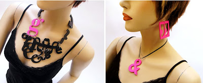
I just came across the work of Berdene du Toit on The Ampersand and I love it - type and jewellery - what's not to like?
Canadian based Berdene handcrafts each letterform out of MDF, sands it down and then sprays or paints it to give the desired finish. Her pieces vary from single letterform earings/necklaces to elaborate multi-piece designs (as above). These long chains (below) are my favourite though, particularly the yellow one with the little dangling 'i'.
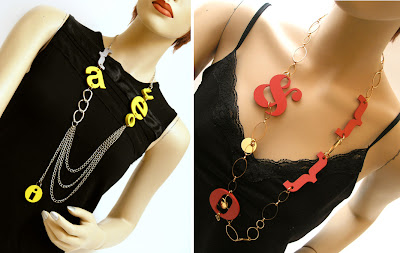
Checkout the full range of Berdene's fabulous jewellery here.
Images copyright Berdene du Toit.
Via The Ampersand.
https%3A%2F%2Fwww.deliciousindustries.com%2Ftypographic-jewellery
Delicious+Industries%3A+Typographic+jewellery
Secret Blisters 09 - Posters Now Online!

Print Club London have put the remaining Secret Blisters 09 posters in their online store and don't worry, all the artists have now been revealed!
Contributing artists include Anthony Burrill, Andy Smith, Si Scott, Jon Burgerman, Steve Wilson, Richard Hogg and Eine.
Above from left to right is work by Anthony Burrill, Abi Williams and Andy Smith.
Images copyright of the artists.
https%3A%2F%2Fwww.deliciousindustries.com%2Fsecret-blisters-09-posters-now-online
Delicious+Industries%3A+Secret+Blisters+09+-+Posters+Now+Online%21
From the reference box # 45

#45 - Vintage photographic studio cards. Photographic studios in the late 19th and early 20th century would hand these out as a kind of business card to advertise their work and show clients their proofs.
They're a thick board with rounded corners and often have gold, printed edges. Intricately designed studio details are printed on the reverse and a photographic image (usually a very serious portrait) is glued to the front - a contrast I just love. Some cards also had foil blocking and debossing on the fronts to embellish the studio name.
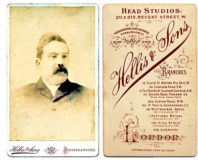
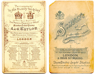
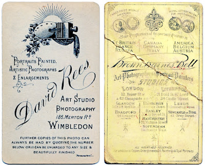
If you like these, check out our other reference box items here!
https%3A%2F%2Fwww.deliciousindustries.com%2Ffrom-the-reference-box-45
Delicious+Industries%3A+From+the+reference+box+%23+45
Clothing Labels

There's a fun collection of clothing labels over on World Famous Design Junkies. Inspired by Kindra Murphy's collection they have searched the internet and put together a virtual collection of their own.
The type has a great quality to it which I really love and although the designs might not be amazing, they all have a certain charm.


Images from World Famous Design Junkies.
Via Notcot.
https%3A%2F%2Fwww.deliciousindustries.com%2Fclothing-labels
Delicious+Industries%3A+Clothing+Labels
General Pattern Prints
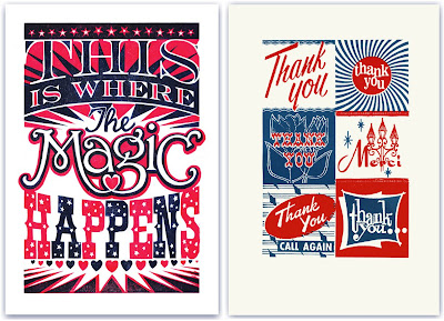
London based, General Pattern have some great linocuts and screen prints available from illustrator James Brown, that would liven up any studio or lounge.
All the prints are fun and quirky with gorgeous typography and lots of attention to detail, but unfortunately my favourite 2, the 'Thank You' (above right) and 'Tigers' (below left) have already sold out!
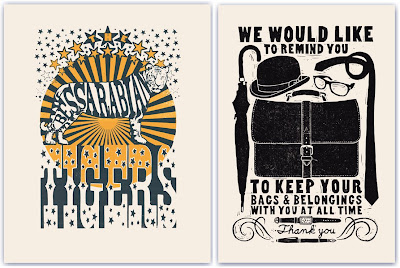
Keep up-to-date with the goings on at General Pattern and watch out for new prints on their blog.
Images copyright General Pattern.
https%3A%2F%2Fwww.deliciousindustries.com%2Fgeneral-pattern-prints
Delicious+Industries%3A+General+Pattern+Prints
Q&A with Mike Daines
For the second of our Q&A posts, we have the delight in introducing Mike Daines, internationally known typographic communicator.
Mike has had an award-winning career in design and typography, which started in the early 70’s when he graduated for the London School of Printing and began work at the London Letraset studios. Whilst at Letraset he designed many typefaces, including Hawthorn and University Roman, as well as creating baseline magazine.
baseline was first published in 1979 by Letraset as their house typographic journal – a vehicle to showcase their typefaces to typesetting manufacturers and therefore only published when new material was available (which for the first 10 years was about one per year).
Mike designed and edited the first issue and edited subsequent issues overseeing contributions from guest designers and typographers including Banks & Miles (who designed the first colour issue - no.8 in 1986), Milton Glaser and Eric Spiekermann who edited and designed issues 6 and 7. Mike remained at baseline until 2007, after being co-owner and co-editor with Hans Dieter Reichert since 1995.
It’s through his involvement in baseline that I knew of him. baseline was one of those publications that as a student I couldn’t afford and used to spend ages in the college library or WH Smiths reading it. So when Mike got in touch, I couldn’t wait to ask him a couple of questions:
Is there one issue of Baseline that stands out for you as a favourite, either for content, design, the typeface or for the people you worked with?
I have a few favourites, but forced to choose, I’d settle for issue 20, because of the contents. The late Alan Fletcher gave us one of his tip-offs, about a rare collection of artworks by E McKnight Kauffer, hidden under a bed in Ladbroke Grove (it’s a long story, told in the magazine). I am a big fan of Kauffer, since college days, and we published some wonderful rare images. Plus early showings of the work of the now very famous Stefan Sagmeister; brilliant photos of disappearing Spanish signs by John Chippindale, and on and on….

What inspired the design for the very first issue of Baseline?
The brief was for a very ‘European’ look, seeing Herb Lubalin’s U&lc magazine as a direct competitor. Hence A4 as the first format, two colours, and a deliberately ‘cool’ typography – Futura, thin rules and lots of white space. Later it became big, full-colour and more vigorous, of course.
How do you think computer technology has affected design and typography over the years, and do you think it has had a positive effect?
How long have you got? Like other typographers of my generation I applaud the advances in technology (and currently work mainly with e-documents), while regretting the loss of some of the ‘filters’ imposed by the old structures; attention to type selection and letterspacing, for example. This can be countered by education, (and designers involving themselves in template creation), but carelessly fitting type into text boxes doesn’t constitute typographic design.
In your view, how might design/typography publications need to change in the future to stay ahead of the game, and ahead of the blogs?
There will always be a primary place for printed documents, and not just as objects, but the key thing is that form should follow function – instant communication in e-documents; moving images in interactive media and e-zines and so on. The key remains clear communication through good design…
and lastly…
What was the last typeface you used and for what purpose?
I am currently working with Rotis (Semisans) in various weights, in a series of publications (and e-publications) for a London firm of stockbrokers. Otl Aicher’s Rotis family broke some new ground, and isn’t the most beautiful of typefaces, but it’s good for providing a contrast to the ubiquitous Arial and Times that abound in financial publications.
We'd just like to say a huge thank you to Mike for all his help and for taking the time to answer our questions!
https%3A%2F%2Fwww.deliciousindustries.com%2Fqa-with-mike-daines
Delicious+Industries%3A+Q%26amp%3BA+with+Mike+Daines
Allan Sanders

I came across the work of Brighton based illustrator, Allan Sanders recently and just love his retro style. He describes it as being, "concerned with simple 'everyman' characters as they try to take on the world".
Allan's illustrations are packed full of detail and a sense of fun. They mix quirky typography and sophisticated illustrations which create that happy, nostalgic feel.


Although as a Lancashire lass myself I think I need to have words about this one - what are you trying to say Allan??

You can see more of Allan's great work over on Loopland, his lovely website, on his blog or on Flickr.
Images copyright Allan Sanders.
https%3A%2F%2Fwww.deliciousindustries.com%2Fallan-sanders
Delicious+Industries%3A+Allan+Sanders
Type Tees

da da da studio have a large selection of type t-shirts on their website, including a classic, Cooper Black, Avant Garde Medium, Frutiger Black, Futura Medium and of course, everyone's favourite Helvetica Bold! I love the attention to detail and the fun little label in the collar.
Images copyright da da da studio.
Via Fleuron.
https%3A%2F%2Fwww.deliciousindustries.com%2Ftype-tees
Delicious+Industries%3A+Type+Tees
Welcome
Welcome to the Delicious Industries blog. We're an independent design studio based in Brighton, UK and this is our scrapbook packed full of design, illustration, photography & typography inspiration. Check out our work here.
Links
DELICIOUS FRIENDS
DELICIOUS FAVOURITES
- 50 Watts
- Acejet 170
- Grain Edit
- It's Nice That
- National Geographic Found
- Notcot
- Pretty Clever
- Retronaut
- So Much Pileup
- We Love Typography
- Another Mag


