art direction, design + typography
Made by Cows


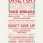
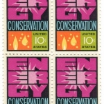
It's not very often I look at an advert and think the typography is good, in fact it's extremely rare, but I saw the new 'Made by Cows' Anchor Butter campaign this morning and was pleasantly surprised. The type is researched, considered and well composed - a refreshing change.
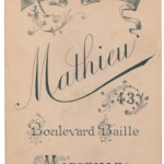
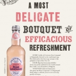
The ads created by CHI are reminiscent of the late 1800's/early 1900's ads which were painted directly onto the sides of buildings. Alison Carmichael was commissioned by the agency to replicate the hand-painted type of this era, which explains the good type!
From the information I've seen it's hard to know whether the ads were painted on a wall and then photographed and the photos are been used as the 48 sheets (which I suspect will be the case) or if they've actually been painted onto walls in a few locations across the country which would make for a much more impressive campaign and add to the authenticity.
It just shows what can be achieved when designers and typographers are part of the process!
Via CR Blog.
https%3A%2F%2Fwww.deliciousindustries.com%2Fmade-by-cows
Delicious+Industries%3A+Made+by+Cows
Welcome

Welcome to the Delicious Industries blog. We're an independent design studio based in Brighton, UK and this is our scrapbook packed full of design, illustration, photography & typography inspiration. Check out our work here.
Links
DELICIOUS FRIENDS
DELICIOUS FAVOURITES
- 50 Watts
- Acejet 170
- Grain Edit
- It's Nice That
- National Geographic Found
- Notcot
- Pretty Clever
- Retronaut
- So Much Pileup
- We Love Typography
- Another Mag