Blog: Design
Javier Mariscal: Drawing Life 2009

The Design Museum, London are currently exhibiting the first UK retrospective of Javier Mariscal - Spanish artist, designer, sculptor, illustrator, interior designer and furniture designer - "one of the world's most innovative and original designers of our time".
Javier Mariscal was born in Valencia in 1950, but moved to Barcelona to live and work in 1970 were he opened Estudio Mariscal in 1989. Throughout his career Mariscal has created mascots for the Barcelona Olympic Games in 1992 ('Cobi' - below) and for the Hanover 2000 Expo in 1995 ('Twipsy'), he created the now famous diary room chair for the second year of Channel 4's 'Big Brother' in 2001, designed the popular 'Alexandra Armchair' as part of the Amorosos Furniture Collection for Moroso and created identities for the Swedish Socialist Party 'Socialdemkraterna', Barcelona Zoo, and London post-production company, Framestore.

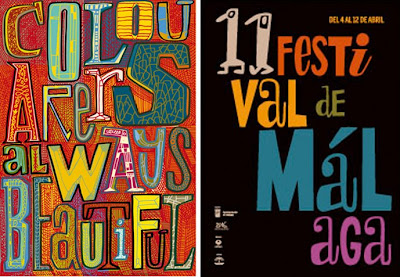
Mariscal has such a huge body of work that the exhibition should be fantastic - apparently there's an entrance tunnel displaying 640 examples of his work from the last 30 years (including typefaces) and on the exterior of the Design Museum he has created a giant typographic mural, "showcasing his unique vision and signature design style".

The exhibition runs until 1 November 2009 and has it's very own blog to keep everyone up-to-date with the goings on.
Images copyright Javier Mariscal.
https%3A%2F%2Fwww.deliciousindustries.com%2Fjavier-mariscal-drawing-life-2009
Delicious+Industries%3A+Javier+Mariscal%3A+Drawing+Life+2009
Penguin Group Logo Develpment
It's really interesting seeing the development over the 70 years of such iconic logos, so I’ve put them in chronological order to make it easier to see the changes. Amongst them is the initial Penguin logo created by office junior, Edward Young in 1935 taken from his penguin sketches at London Zoo and the versions created by the legendary Jan Tschihold (Head of Design, 1946-49). Enjoy...

1. Penguin, 1935. 33. Penguin, 1935. 26. Pelican, 1937. 48. Penguin, 1937. 18. Pelican, 1937. 8. Penguin, 1938. 31. Penguin, 1938. 45. King Penguin, 1939. 10. Puffin, 1940. 4. Puffin, 1941.

15. Puffin, 1941. 28. Penguin, 1944. 40. Penguin, 1945. 32. Penguin, 1945. 27. Ptarmigan, 1945. 3. Penguin, 1946. 6. Penguin, 1946. 12. Penguin, 1947. 37. Penguin, 1947. 41. Penguin, 1947.

7. Porpoise, 1948. 9. King Penguin, 1948. 11. Pelican, 1948. 17. Pelican, 1948. 20. Penguin, 1948. 34. King Penguin, 1948. 35. Puffin, 1948. 36. Penguin, 1948. 43. Penguin, 1948. 46. Pelican, 1948.

13. Penguin, 1949. 24. Penguin, 1949. 30. Pelican, 1949. 14. Penguin, 1950. 25. Pelican History of Art, 1953. 22. Puffin, c.1959. 44. Peregrine, 1962. 42. Peacock, c.1963. 21. Penguin Education,1967. 5. Allen Lane, 1967.

39. Puffin, 2003. 2. Puffin, 1968. 19. Kestrel, 1970. 47. Kestrel, 1970. 16. Penguin, c.1987. 23. Allen Lane, 2003. 29. Penguin, 2003. 38. Puffin, 2003.
Logos/Trademarks copyright Penguin Group.
https%3A%2F%2Fwww.deliciousindustries.com%2Fpenguin-group-logo-develpment
Delicious+Industries%3A+Penguin+Group+Logo+Develpment
Clothing Labels

There's a fun collection of clothing labels over on World Famous Design Junkies. Inspired by Kindra Murphy's collection they have searched the internet and put together a virtual collection of their own.
The type has a great quality to it which I really love and although the designs might not be amazing, they all have a certain charm.


Images from World Famous Design Junkies.
Via Notcot.
https%3A%2F%2Fwww.deliciousindustries.com%2Fclothing-labels
Delicious+Industries%3A+Clothing+Labels
General Pattern Prints
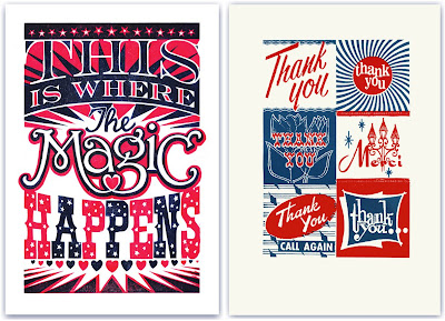
London based, General Pattern have some great linocuts and screen prints available from illustrator James Brown, that would liven up any studio or lounge.
All the prints are fun and quirky with gorgeous typography and lots of attention to detail, but unfortunately my favourite 2, the 'Thank You' (above right) and 'Tigers' (below left) have already sold out!
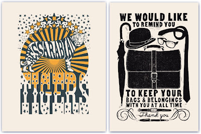
Keep up-to-date with the goings on at General Pattern and watch out for new prints on their blog.
Images copyright General Pattern.
https%3A%2F%2Fwww.deliciousindustries.com%2Fgeneral-pattern-prints
Delicious+Industries%3A+General+Pattern+Prints
From the reference box #44

#44 - British Gas 'Mr Therm' playing cards.
Mr Therm was designed in 1932 by Eric Fraser, I'm not sure what year these cards are from though. They say, 'Mr.Therm greets you warmly' and he does - I love the little glowing smiley face. A bargain for 50p!
Have a look at other reference box items here.
https%3A%2F%2Fwww.deliciousindustries.com%2Ffrom-the-reference-box-44
Delicious+Industries%3A+From+the+reference+box+%2344
Q&A with Mike Daines
For the second of our Q&A posts, we have the delight in introducing Mike Daines, internationally known typographic communicator.
Mike has had an award-winning career in design and typography, which started in the early 70’s when he graduated for the London School of Printing and began work at the London Letraset studios. Whilst at Letraset he designed many typefaces, including Hawthorn and University Roman, as well as creating baseline magazine.
baseline was first published in 1979 by Letraset as their house typographic journal – a vehicle to showcase their typefaces to typesetting manufacturers and therefore only published when new material was available (which for the first 10 years was about one per year).
Mike designed and edited the first issue and edited subsequent issues overseeing contributions from guest designers and typographers including Banks & Miles (who designed the first colour issue - no.8 in 1986), Milton Glaser and Eric Spiekermann who edited and designed issues 6 and 7. Mike remained at baseline until 2007, after being co-owner and co-editor with Hans Dieter Reichert since 1995.
It’s through his involvement in baseline that I knew of him. baseline was one of those publications that as a student I couldn’t afford and used to spend ages in the college library or WH Smiths reading it. So when Mike got in touch, I couldn’t wait to ask him a couple of questions:
Is there one issue of Baseline that stands out for you as a favourite, either for content, design, the typeface or for the people you worked with?
I have a few favourites, but forced to choose, I’d settle for issue 20, because of the contents. The late Alan Fletcher gave us one of his tip-offs, about a rare collection of artworks by E McKnight Kauffer, hidden under a bed in Ladbroke Grove (it’s a long story, told in the magazine). I am a big fan of Kauffer, since college days, and we published some wonderful rare images. Plus early showings of the work of the now very famous Stefan Sagmeister; brilliant photos of disappearing Spanish signs by John Chippindale, and on and on….

What inspired the design for the very first issue of Baseline?
The brief was for a very ‘European’ look, seeing Herb Lubalin’s U&lc magazine as a direct competitor. Hence A4 as the first format, two colours, and a deliberately ‘cool’ typography – Futura, thin rules and lots of white space. Later it became big, full-colour and more vigorous, of course.
How do you think computer technology has affected design and typography over the years, and do you think it has had a positive effect?
How long have you got? Like other typographers of my generation I applaud the advances in technology (and currently work mainly with e-documents), while regretting the loss of some of the ‘filters’ imposed by the old structures; attention to type selection and letterspacing, for example. This can be countered by education, (and designers involving themselves in template creation), but carelessly fitting type into text boxes doesn’t constitute typographic design.
In your view, how might design/typography publications need to change in the future to stay ahead of the game, and ahead of the blogs?
There will always be a primary place for printed documents, and not just as objects, but the key thing is that form should follow function – instant communication in e-documents; moving images in interactive media and e-zines and so on. The key remains clear communication through good design…
and lastly…
What was the last typeface you used and for what purpose?
I am currently working with Rotis (Semisans) in various weights, in a series of publications (and e-publications) for a London firm of stockbrokers. Otl Aicher’s Rotis family broke some new ground, and isn’t the most beautiful of typefaces, but it’s good for providing a contrast to the ubiquitous Arial and Times that abound in financial publications.
We'd just like to say a huge thank you to Mike for all his help and for taking the time to answer our questions!
https%3A%2F%2Fwww.deliciousindustries.com%2Fqa-with-mike-daines
Delicious+Industries%3A+Q%26amp%3BA+with+Mike+Daines
Which iphone case?
For the designer...

'Curated by Arkitip' have the best of the graphic cases and the most fun ones. Above left features work from New York-based studio HunterGatherer and above right features original artwork from Dutch artist Parra. Both can be bought here.
"Curated by Arkitip is a project designed for Incase, aimed at delivering artistically embellished Apple© products to users who have an appreciation for the creative arts and technology".
For the fashionista...

A bit of luxury and drama - these textured cases from Ultra-case would look at home in any designer handbag. Not sure I can get on board with the snake skin though.
For the thrill-seeker...
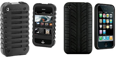
Durable rubber cases, molded to give extra protection and better grip. Above left is extreme sports manufacturer Oakley's offering and above right is the Vroom case from Case-mate. These cases are crying out to be hurtled down a mountain or screeched around a race track - bit too manly for me, although the Vroom one is also available in red and yellow!
For the brave...

Cases to get you noticed -scarily I think these two cases are actually my favourite. They're from Incase who have the best range of colours including metallics and fluorescents - there really is one to match every 80's outfit you own!
And finally, for those who like dressing-up...

Not sure why you would want to make your beautifully designed iphone look like something else, but if you do there are some options out there.
For example, above left is the Homade ChocoCase to disguise your iphone as a bar of chocolate (why??) available here and above right is the elusive Gameboy iphone cover, which has apparently been spotted in Japan, but no-one knows (or can find out) where to buy one. If you really want one of these though, you could do what GeekMorgan did and print out your own lifesize Gameboy front and stick it inside a clear case!
https%3A%2F%2Fwww.deliciousindustries.com%2Fwhich-iphone-case
Delicious+Industries%3A+Which+iphone+case%3F
From the reference box #43
I bought this purely for the cover, the rest of the publication is black & white and very editorial with a simple grid layout. The cover though is really great, I love it - the big bands of colour, the negative space creating the large wing/fuselage shape and the colourful graphics showing the different plane models. It's a very modern, clean design and totally different to the other issues that were also for sale, but unfortunately there is no mention of who designed or art directed it.
So there we have it #43 - the cover of 'The Aeroplane and Astronaughtics', 22nd Feb, 1962. Have a look at No's 1-42 here.
https%3A%2F%2Fwww.deliciousindustries.com%2Ffrom-the-reference-box-43
Delicious+Industries%3A+From+the+reference+box+%2343
Type Tees

da da da studio have a large selection of type t-shirts on their website, including a classic, Cooper Black, Avant Garde Medium, Frutiger Black, Futura Medium and of course, everyone's favourite Helvetica Bold! I love the attention to detail and the fun little label in the collar.
Images copyright da da da studio.
Via Fleuron.
https%3A%2F%2Fwww.deliciousindustries.com%2Ftype-tees
Delicious+Industries%3A+Type+Tees
Stefan Kanchev
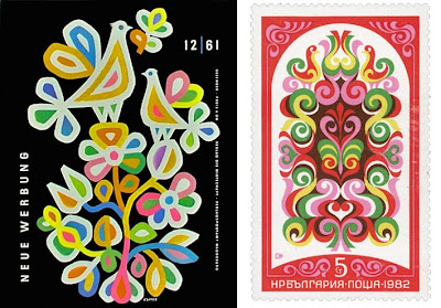
I came across the work of Bulgarian designer Stefan Kanchev through an image posted on Dropular. Once on his website I couldn’t believe how much of his work I was already familiar with from years of flicking through trademark and logo books.
Stefan Kanchev was born in Kalofer, Bulgaria in 1915. He initially studied classically as a mural painter, but throughout his career worked in many different areas of applied graphics. All Kanchev’s work draws inspiration from folk art and traditions - a flowing, organic feel, simple shapes and clean composition.

He is probably best known for his command of logo and trademark design, which was celebrated in 1994 when he was recognised at the 1st International Logo Conference, Ostend, Belgium as one of the ten best masters of logos in the world, ranking alongside the likes of Paul Rand and Saul Bass.
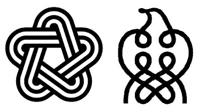
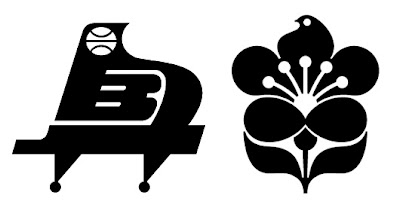
Stefan Kanchev died aged 86 in 2001 leaving behind a an amazing collection of work. There's a dedicated website of his life’s work, and although the English translation isn’t complete yet, there are lots and lots of images and graphics to look through.
Images copyright Stefan Kanchev.
https%3A%2F%2Fwww.deliciousindustries.com%2Fstefan-kanchev
Delicious+Industries%3A+Stefan+Kanchev
1956 Olivetti Advert
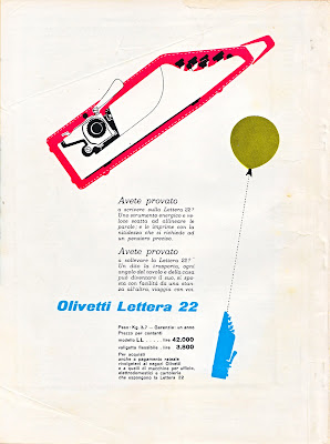
This Olivetti advert designed by Giovanni Pintori is for the portable, Olivetti Lettera 22. I love the dynamic of the illustrations demonstrating it's lightweight, 'portable' qualities.
I found it on the back cover of an Italian Science magazine, 'Scienza e Vita' from 1956 that I've had for years. Shame I didn't buy more of them!
https%3A%2F%2Fwww.deliciousindustries.com%2F1956-olivetti-advert
Delicious+Industries%3A+1956+Olivetti+Advert
We're in Print!

Well, our business card is! It's featured in 'Business Cards 3: Designs on Saying Hello' from LK Publishing and has a whole page to itself.
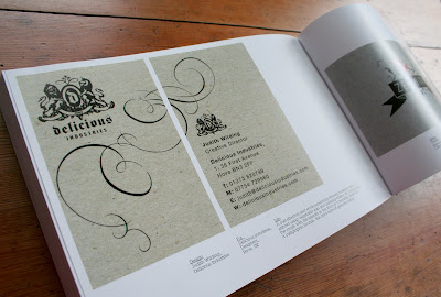
It's in great company too - our friends Sell! Sell! are also in it (yes, I have nicked their pics) as are some of our favourite illustrators, Andy Smith and Richard Hogg.
Big thanks to Liz Farrelly and Michael Dorrian for featuring our card and congratulations on another great book.
https%3A%2F%2Fwww.deliciousindustries.com%2Fwere-in-print
Delicious+Industries%3A+We%26%23039%3Bre+in+Print%21
Q&A with John Miles
Last week I had the wonderful pleasure of exchanging emails with typographer and designer, John Miles, co-founder of Banks & Miles.
After chancing upon my Which? magazine collection, he emailed to tell me that a full collection of the magazines can be seen at Reading University in the B&M archive and that he was glad I liked them so much as the Consumers' Association were, "a great client to work for". Banks & Miles of course designed all the Which? covers from 1968 to 1988.
I was thrilled to hear from such a great designer and took him up on his offer of more information, by asking a few questions about his time working on the Which? covers:
Where did the inspiration for the covers come from?
At the time you are so absorbed in meeting the deadline that you don't think about where it is all coming from (an experience I am sure we share).
Looking back I don't remember much in the way of inspiration but there were a number of limitations which drove us in a certain direction. We had only black and spot colour so we couldn't rely on full colour or graphic effects.
How did the design process work?
All designs for both cover and text pages had to be agreed with the client using hand-drawn finished roughs which meant we all had drawing skills of some sort.
So really everything depended on the idea in your head which took graphic form through the end of a pencil. Lots of thumbnails which threw up both good and terrible ideas but in the end one usually surfaced and we agreed 'that's it'.
One huge advantage, which I don't think we fully appreciated at the time, was that the magazine was available to members by direct mail only so we were not under pressure to make the covers look like every other magazine competing on the book stalls. And the marketing men weren't blaming the covers if membership numbers fluctuated (In fact during this period the membership was growing steadily).
We worked directly with the editors who were invariably supportive and encouraging and a joy to work with.
Which is your favourite cover?
I am not sure I have a favourite – there are a few I would rather forget – but I always had a soft spot for 'Fly killers' (the fly in a parachute) and 'Sun glasses' (the lady sunbathing with the sunglasses in the bra position).

Hopefully Q&A's will become a regular feature - it's so interesting finding out a bit more about how people work and their inspirations.
So John, if you are reading this, thank you so much for your wonderful insight into the Which? covers and thank you for taking the time to answer my questions. It's been a pleasure!
https%3A%2F%2Fwww.deliciousindustries.com%2Fqa-with-john-miles
Delicious+Industries%3A+Q%26amp%3BA+with+John+Miles
New Andy Smith Prints

Andy Smith's newsletter hit my inbox this morning with a great selection of his new work, including some new screenprints now available on his website.
These two are my favourites, I love the giant arrow - it's brown and pink so definitely hits all the right buttons and the chicken, well who doesn't like a big - err - chicken?!
Images copyright Andy Smith.
https%3A%2F%2Fwww.deliciousindustries.com%2Fnew-andy-smith-prints
Delicious+Industries%3A+New+Andy+Smith+Prints
A very special Type Specimen Book

I thought I had a few really great type specimen books until i saw this example at the weekend - it is absolutely stunning!
It belongs to NY designer, James Phillips Williams (JP), the man behind amassblog and a one time student of the great Paul Rand at the Yale School of Art. Both were avid collectors and fans of Jan Tschichold's work and became great friends. One day Mr Rand brought out this book to show JP, and revealed that it's previous owner had been the man himself - Jan Tschichold! He then gave the book to JP and said, "Enjoy, as I have".
Can you believe that not only is this a fantastic type specimen book, but it's also been owned by 2 of the most influential designers and typographers of the 20th Century! Thanks JP for sharing such a magnificent book with such a great history.


Images copyright amassblog.
Via Hi + Low.
https%3A%2F%2Fwww.deliciousindustries.com%2Fa-very-special-type-specimen-book
Delicious+Industries%3A+A+very+special+Type+Specimen+Book
Welcome
Welcome to the Delicious Industries blog. We're an independent design studio based in Brighton, UK and this is our scrapbook packed full of design, illustration, photography & typography inspiration. Check out our work here.
Links
DELICIOUS FRIENDS
DELICIOUS FAVOURITES
- 50 Watts
- Acejet 170
- Grain Edit
- It's Nice That
- National Geographic Found
- Notcot
- Pretty Clever
- Retronaut
- So Much Pileup
- We Love Typography
- Another Mag


