Blog: Design
70's Hungarian Stamp
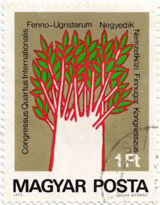
How cool is the tree illustration on this Hungarian stamp from 1975. The red and green print works really well against the neutral background and I love it when the overprint is visible.
I think the illustrator is Olah Gyorgy (bottom right on the stamp), although all I can find out about him was that he was a Hungarian, Nobel-prize winning Chemist - so maybe he isn't the illustrator??
See more of my favourite stamps here, here and here.
https%3A%2F%2Fwww.deliciousindustries.com%2F70s-hungarian-stamp
Delicious+Industries%3A+70%26%23039%3Bs+Hungarian+Stamp
Think of your own ideas
https%3A%2F%2Fwww.deliciousindustries.com%2Fthink-of-your-own-ideas
Delicious+Industries%3A+Think+of+your+own+ideas
The Colour of Money
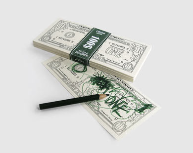

I love these colour-in one dollar bills from Atypyk - not quite making you own money, but not far off! Such a simple, fun idea.
They come in packs of 100 for 9 Euro.
Images copyright Atypyk.
Via Inspire Me Now.
https%3A%2F%2Fwww.deliciousindustries.com%2Fthe-colour-of-money
Delicious+Industries%3A+The+Colour+of+Money
From the reference box #39


A cool Air Europe matchbook from the 70's - "It's nice to fly with friends."
Loving the red and orange combo, especially the stripes!
Have a look through the rest of our reference box here.
https%3A%2F%2Fwww.deliciousindustries.com%2Ffrom-the-reference-box-39
Delicious+Industries%3A+From+the+reference+box+%2339
70's Posters

I came across the Montague Projects blog yesterday which is a great blog, packed full of inspiring design including this wonderful collection of 70's posters recovered from his parents basement. See the full collection here.
Images copyright Montague Projects Blog.
https%3A%2F%2Fwww.deliciousindustries.com%2F70s-posters
Delicious+Industries%3A+70%26%23039%3Bs+Posters
Ampersand Marquee Light
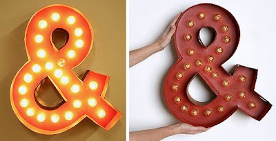
How great is this fairground style light from Urban Outfitters?? I love it's quirkiness and the fact that it kind of looks homemade.
It's one of their Marquee Lights (they also do an @ sign) only available online with shipping restricted to mainland US. Unfortunately they don't seem to be listed on the UK site for some reason.
They should create a full alphabet in the same style, that would be really cool, although at $178 each it could get pricey to spell out anything!
Images copyright Urban Outfitters.
Via Hell Yeah Dude.
https%3A%2F%2Fwww.deliciousindustries.com%2Fampersand-marquee-light
Delicious+Industries%3A+Ampersand+Marquee+Light
Paul Catherall Lino Prints

These architectural prints could easily be mistaken for vintage prints, but they are in fact the new works of illustrator Paul Catherall.
His prints are bold and striking and depict famous architectural structures from around the world in a very clean, precise way. His work is influenced by commercial art of the 50's and 60's which is probably why I like it so much.
"Catherall displays an expert eye for composition and colour; and great draughtsmanship, achieving ultimately a delicate balance between classic commercial design and contemporary urban landscape. His linocuts have become synonymous with Transport for London and Tate Modern."
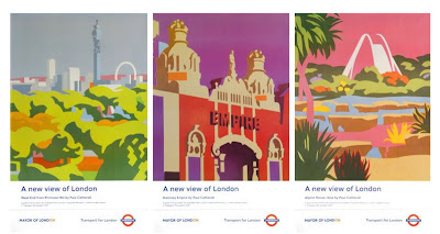
The architectural prints are currently available at Castor + Pollux, Brighton and the London Transport posters are available here.
Images copyright Paul Catherall.
https%3A%2F%2Fwww.deliciousindustries.com%2Fpaul-catherall-lino-prints
Delicious+Industries%3A+Paul+Catherall+Lino+Prints
Happy Easter!


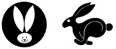
Here's a selection of our favourite 60s/70s chick and bunny graphics to get you in the Easter mood. Hope you all enjoy the long weekend - see you back here Tuesday!
Graphics from Trademarks & Symbols, Yasaburo Kuwayama and Trademarks of the 60s & 70s, Tyler Blik.
https%3A%2F%2Fwww.deliciousindustries.com%2Fhappy-easter1
Delicious+Industries%3A+Happy+Easter%21
The Art of Necessity

There's an interesting article on the CR Blog about 'The Art of Necessity' - the ingenuity of Spanish printers in the early 1930's when avant-garde had spread through Europe into Spain.
The small print shops had to find ways of creating this new look with no new resources, so they imitated the style using the bullets, dingbats, rules and ornaments from their existing type trays and transformed them into new typefaces and illustrations creating the modern look of the avant-garde.
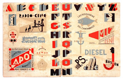
Read the full article here.
Images copyright CR Blog.
https%3A%2F%2Fwww.deliciousindustries.com%2Fthe-art-of-necessity
Delicious+Industries%3A+The+Art+of+Necessity
Vintage Ephemera on Flickr

These cool bits of ephemera are from HA! Designs Flickr group - Vintage Ephemera. A collection of items discovered whilst clearing out their Grandpa's house.
There are loads of random items; tins, adverts, playing cards, packaging, coupons, instruction booklets and greetings cards. It's interesting to see what their Grandpa thought was worth keeping for all these years.


Images copyright HA! Designs.
https%3A%2F%2Fwww.deliciousindustries.com%2Fvintage-ephemera-on-flickr
Delicious+Industries%3A+Vintage+Ephemera+on+Flickr
Golden Gems
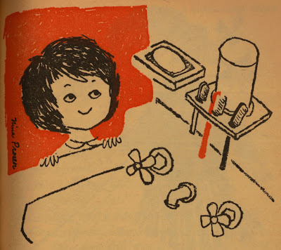
I discovered Golden Gems quite recently and I love it! It's an inspirational blog packed full of modern & vintage illustration along with a selection of Little Golden Books.
All the books have been lovingly scanned for our pleasure. I really love the illustrations from the 1961 'Humpty Dumpty's Magazine' (above and below), especially the animals with their speech bubbles.
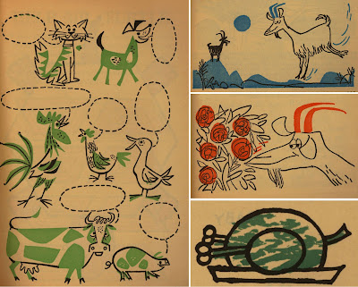
Check out the rest of this book and many, many more here.
Images copyright Golden Gems.
https%3A%2F%2Fwww.deliciousindustries.com%2Fgolden-gems
Delicious+Industries%3A+Golden+Gems
Mystery parcel

It's always nice to get an unexpected parcel in the post, but even more exciting when it's full of vintage ephemera - especially matchbooks! So a very big thank you to Jack Hooker for sending us a great selection.
Here are a few of my favourites. I especially like the Air India one and it's actually made of wood, the P&O one has different destinations stamped into the bottom of each match (which can just be made out in the pic) and I love the VIA one with 'Bon Voyage!' printed on the inside.


They will all be added to my Flickr group asap.
https%3A%2F%2Fwww.deliciousindustries.com%2Fmystery-parcel
Delicious+Industries%3A+Mystery+parcel
The Wonderful Work of Tad Carpenter

Big thanks to Tad Carpenter for his email and kind words about our blog.
You might remember some of Tad's work from the Grain Edit Giveaway - his illustrations are bold and bright with a good sprinkling of quirky, fun typography.
'HI' (above) is acrylic on wood, but much of his work is silk screened at Vahalla Studios - a business he shares with Dan Padavic producing gig posters and "other awesome silkscreen goodies".

Have a look at Tad's portfolio here, check out his blog, or stop by his online store which is packed full of his lovely prints.
Images copyright Tad Carpenter.
https%3A%2F%2Fwww.deliciousindustries.com%2Fthe-wonderful-work-of-tad-carpenter
Delicious+Industries%3A+The+Wonderful+Work+of+Tad+Carpenter
Lisa Jones Screen Prints

We are massive fans of Lisa Jones cards and illustrations, and were thrilled to see she is now doing screen prints (50 x 70cm) - 'Night Owl' and 'Town'.
They're available from Lisa Jones Studio, Elphicks and our favourite local gallery, Castor + Pollux.
See more Lisa Jones work here.
Images copyright Lisa Jones.
https%3A%2F%2Fwww.deliciousindustries.com%2Flisa-jones-screen-prints
Delicious+Industries%3A+Lisa+Jones+Screen+Prints
From the reference box #37

# 37 - 60's & 70's US Road Maps
I came across these at the weekend. This Gulf one is my favourite - I'm loving the big GULF graphic on the front and inside it has these lovely illustrations of "a host of good Gulf products, all topnotch quality!"

I think the Gulf one is probably from the 60's, but this Union Oil one is from 1973. I'm already a fan of the 76 ball graphic and I really like the arrow design on the front. Definitely good finds in my book!

https%3A%2F%2Fwww.deliciousindustries.com%2Ffrom-the-reference-box-37
Delicious+Industries%3A+From+the+reference+box+%2337
Welcome
Welcome to the Delicious Industries blog. We're an independent design studio based in Brighton, UK and this is our scrapbook packed full of design, illustration, photography & typography inspiration. Check out our work here.
Links
DELICIOUS FRIENDS
DELICIOUS FAVOURITES
- 50 Watts
- Acejet 170
- Grain Edit
- It's Nice That
- National Geographic Found
- Notcot
- Pretty Clever
- Retronaut
- So Much Pileup
- We Love Typography
- Another Mag


