Blog: Design
Defiant Youth - New Shepard Fairey print
Don't think I'll be attempting to buy this one - it's not one of my favourites, but I'm sure it'll be a sound investment for those that do.
Image copyright OBEY.
Via OMG Posters.
https%3A%2F%2Fwww.deliciousindustries.com%2Fdefiant-youth-new-shepard-fairey-print
Delicious+Industries%3A+Defiant+Youth+-+New+Shepard+Fairey+print
Dick Bruna Stamps

Dick Bruna has designed some fabulous stamps over the years, mainly for Japan and mostly of Miffy, but I really like these Nederland ones released in 1969.
From a little research I think they are either celebrating Childrens' songs or Child welfare. The use of colour in solid blocks is classic Bruna - I love the little red faces of the singing children, although they do look like they could explode at any minute!
More Dick Bruna loveliness here, here, here and here.
https%3A%2F%2Fwww.deliciousindustries.com%2Fdick-bruna-stamps
Delicious+Industries%3A+Dick+Bruna+Stamps
Derek Yaniger
Originally from Arkansas, Yaniger now lives in Georgia designing and printing his own work which is regularly published in Atomic, Barracuda and Car Kulture Deluxe. Over the years he's also created illustrations for companies like Marvel Comics and the Cartoon network.
The exciting news for us is that Yaniger's Wildsville exhibition, is coming to our favourite local gallery, Castor + Pollux on the 26 June and running until 20 July. The exhibition will contain a selection of old and new prints and will have signed copies of his new book, 'Wildsville; the art of Derek Yaniger' available too!
As the man himself says, "Should be a jolly big hoot! Be there if ya’ can, man".
Images copyright Derek Yaniger.
https%3A%2F%2Fwww.deliciousindustries.com%2Fderek-yaniger
Delicious+Industries%3A+Derek+Yaniger
Good Magazine - Info Graphic Archive

Good Magazine has created a Flickr group archive of all the great info graphics and diagrams they've published in past issues.
It's a great collection and a really useful resource.


Images copyright Good Magazine.
Via Notcot.
https%3A%2F%2Fwww.deliciousindustries.com%2Fgood-magazine-info-graphic-archive
Delicious+Industries%3A+Good+Magazine+-+Info+Graphic+Archive
International Labour Organisation Stamp

I found a strip of these stamps at the weekend and just loved the industrial graphic softened by the pink, violet and purple colour palate.
They're English stamps celebrating the 50th anniversary of the International Labour Organisation, 1919 - 1969.
"The ILO was founded in 1919, in the wake of a destructive war, to pursue a vision based on the premise that universal, lasting peace can be established only if it is based upon decent treatment of working people. The ILO became the first specialized agency of the UN in 1946".
In 1969, it's 50th anniversary year, the ILO also won the Nobel Peace Prize.
https%3A%2F%2Fwww.deliciousindustries.com%2Finternational-labour-organisation-stamp
Delicious+Industries%3A+International+Labour+Organisation+Stamp
From the reference box #42

#42 - Czech matchbook covers.
I think they're celebrating something on the 1st May - Karviná II? or is that the brand name?? who knows. What I love about them is how wonderfully Constructivist they look. The 2 colours and the bold graphics of machinery and tools are fantastic.
Does anyone know if there are more in this set?
https%3A%2F%2Fwww.deliciousindustries.com%2Ffrom-the-reference-box-42
Delicious+Industries%3A+From+the+reference+box+%2342
Nursery Rhymes

Sub-Studio have created these great 2 colour screen prints of 3 classic nursery rhymes; The Crooked Man, Rally! and Rain, Rain, Go Away. They're currently available for pre-order here and will ship early June.
Images copyright Sub-Studio.
Via Notcot.
https%3A%2F%2Fwww.deliciousindustries.com%2Fnursery-rhymes
Delicious+Industries%3A+Nursery+Rhymes
From the reference box #41

I found these at the weekend at a flea market for a £1 - a deck of CP Air (Canadian Pacific Airlines) Playing Cards for inflight entertainment. I love the corporate orange and how simple they are - very minimalist.
So, #41 - Deck of CP Air Playing Cards.
For more reference box goodies have a look here.
https%3A%2F%2Fwww.deliciousindustries.com%2Ffrom-the-reference-box-41
Delicious+Industries%3A+From+the+reference+box+%2341
Saul Bass designed Matchbooks

I love these matchbooks found at a flea market by the very lucky Mary & Matt. They were designed for US food company Hunt-Wessen by the wonderful Saul Bass Associates, who also created their company logo in 1964...
I saw the full set of matchbooks for the first time at the Design Museum's Saul Bass exhibition in 2004 and remember thinking how great it would be to find some at a carboot sale. It just goes to show it can happen!
Matchbook image copyright Mary & Matt.
Via Oh Joy!
https%3A%2F%2Fwww.deliciousindustries.com%2Fsaul-bass-designed-matchbooks
Delicious+Industries%3A+Saul+Bass+designed+Matchbooks
More Which? covers


Finally I got round to scanning in more of the Which? magazines I bought last year. For those that don't know Which? is the monthly publication of the Consumers’ Association, designed by great British design duo Colin Banks and John Miles (co-founders of Banks & Miles) between 1964 and 1993.
I've now scanned in covers up to 1975 - it's taken a while I know, but they're worth the wait. It's great to see the development over the years and from one decade to the next. They definitely illustrate a social history of product development and consumer habits. They'll be uploaded to the Flickr group later this evening.
Read the previous post about Which? Magazine here and find out more about designers Banks & Miles here.
https%3A%2F%2Fwww.deliciousindustries.com%2Fmore-which-covers
Delicious+Industries%3A+More+Which%3F+covers
Illustrator Jenn Ski

I love the colour palettes Jenn Ski uses in her work - they create a lovely nostalgic and retro feel. Her gorgeous illustrations and collages are inspired by her love of modern and mid century design and effortlessly combine bold colours, delicate illustration, patterns and textures. I particularly like the A B C giclée prints (above).
See more of Jenn's work here and check out her studio blog here.
Images copyright Jenn Ski.
https%3A%2F%2Fwww.deliciousindustries.com%2Fillustrator-jenn-ski
Delicious+Industries%3A+Illustrator+Jenn+Ski
Flavor Paper Wallcoverings

Flavor Paper produce hand-printed vintage, contemporary, and custom wallpapers in the most fantastic and unique designs. From intricate flock patterns to crazy geometric patterns they all have a modern twist - the devil's in the details, as they say!
Via Poppytalk.
https%3A%2F%2Fwww.deliciousindustries.com%2Fflavor-paper-wallcoverings
Delicious+Industries%3A+Flavor+Paper+Wallcoverings
From the reference box #40

Pretty new to the reference box is this 1973 guide to the Jungfrau railway in Interlaken, Switzerland. As you would expect from a piece of Swiss design of this era, it's packed full of wonderful logos, typography and adverts.
This centre spread map has the only colour print throughout and just look how slick their chosen palate works with the black & white graphics and illustrations.

Here are a selection of my favourites...


Click here to see what other delights are hiding in our reference box.
https%3A%2F%2Fwww.deliciousindustries.com%2Ffrom-the-reference-box-40
Delicious+Industries%3A+From+the+reference+box+%2340
Dick Bruna Book Covers

Present & Correct have a set of 3 Dick Bruna designed books available in their online store. The graphics are great - big and bold - exactly what you would expect from Mr Bruna!
See more Dick Bruna items here and here.
https%3A%2F%2Fwww.deliciousindustries.com%2Fdick-bruna-book-covers
Delicious+Industries%3A+Dick+Bruna+Book+Covers
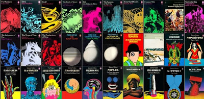
The Art of Penguin Science Fiction

The Art of Penguin Science Fiction is the website of James Pardey showcasing a collection of over 150 Penguin Science Fiction covers.
James explains, "The purpose of the website is to complement a series of articles I've written for the Penguin Collector's Society on the history and cover art of science fiction published by Penguin Books from 1935 to 1977".
See the full collection here - it really is impressive to see them all together.
Images copyright Penguin books.
Via Noisy Decent Graphics.
https%3A%2F%2Fwww.deliciousindustries.com%2Fthe-art-of-penguin-science-fiction
Delicious+Industries%3A+The+Art+of+Penguin+Science+Fiction
Welcome

Welcome to the Delicious Industries blog. We're an independent design studio based in Brighton, UK and this is our scrapbook packed full of design, illustration, photography & typography inspiration. Check out our work here.
Links
DELICIOUS FRIENDS
DELICIOUS FAVOURITES
- 50 Watts
- Acejet 170
- Grain Edit
- It's Nice That
- National Geographic Found
- Notcot
- Pretty Clever
- Retronaut
- So Much Pileup
- We Love Typography
- Another Mag


