Blog: Design
Found Type #4


It's been a while since we had some found type, so here's a selection from vintage packaging to bus numbers. Enjoy...
Look at more delicious found type here.
https%3A%2F%2Fwww.deliciousindustries.com%2Ffound-type-4
Delicious+Industries%3A+Found+Type+%234
International Design Reference


Yesterday I came across a Alki1 (Maryellen McFadden's) fantastic Flickr photostream and could easily have spent all day looking through it.
It's one of the largest collections of International design reference I've seen in one place; Cuban design (above), Russian, Italian, American, Japanese, British, Swiss and Polish (below) design alongside iconic examples of DaDa, Constructivist, Bauhaus and Modernist design.

There really is something here for everyone and I can't wait to sit down over the weekend and have a really good look. Thanks so much Maryellen McFadden for sharing all this.
Images Alki1.
https%3A%2F%2Fwww.deliciousindustries.com%2Finternational-design-reference
Delicious+Industries%3A+International+Design+Reference
From the reference box #55


#55 - Set of 4 UK postage stamps commemorating the ‘Centenary of the first Telephone call by Alexander Graham Bell’, issued 10 March 1976 and designed by Philip Sharland.
Each stamp depicts a different kind of person in society using the telephone - a Housewife (8 1/2p), Policeman (10p), District Nurse (11p) and an industrialist (13p).
The bright, blocks of colour and simplified graphic illustrations make these stamps really pop. I love the fact that they’ve put a mini in the background of the nurse one – such a stereotype!
My set, particularly the policeman, are covered in postmarks, the set below doesn't have any so you can really see how great the designs are.
To see what other wonders the reference box holds look here.
https%3A%2F%2Fwww.deliciousindustries.com%2Ffrom-the-reference-box-55
Delicious+Industries%3A+From+the+reference+box+%2355
Race numbers


This weekend I had a fabulous time at Goodwood Revival watching vintage motor racing. I love classic cars and seeing them race is amazing, but I always find myself looking at the race numbers and wondering how/why they choose particular fonts. Above are a selection of my favourites.
I have more Auto type posts here, here and here.
https%3A%2F%2Fwww.deliciousindustries.com%2Frace-numbers
Delicious+Industries%3A+Race+numbers
Polish Book Covers


I found this great collection of Polish book covers over on the wonderful A Journey Round My Skull. The graphics, typography and colours are fantastic. I love the 'KASK' type (it reminds me a bit of A Clockwork Orange) and the swallow illustration which reminds me of Charley Harper's style.
Images copyright A Journey Round My Skull.
https%3A%2F%2Fwww.deliciousindustries.com%2Fpolish-book-covers
Delicious+Industries%3A+Polish+Book+Covers
Designer Wood Blocks

If It's Hip, It's Here have rounded up a great selection of designer, wood blocks from architectural building blocks, to the more traditional typographic alphabet style.
It's not too surprising that the typographic ones appeal to me the most. The ones above especially caught my eye with their winning combination of simple graphic illustrations and eclectic mix of typestyles. They're available from notNeutral, the fabulous online store from LA based, Rios Clementi Hale Studios.
Another set that I hadn't seen before was this Neutraface Slab one from House Industries showcasing the different weights of their Neutraface font on each face.

Top images copyright notNeutral. Bottom images copyright House Industries.
Via Notcot.
https%3A%2F%2Fwww.deliciousindustries.com%2Fdesigner-wood-blocks
Delicious+Industries%3A+Designer+Wood+Blocks
Pirelli

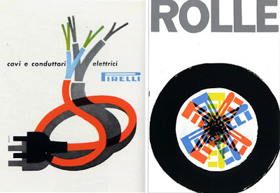
Whilst searching for Stile Industria covers for our previous post I stumbled across the inspirational Flickr group of Pop Design. Laura's collection of Italian graphics is definitely worth a look, she has some great work from iconic Italian designers.
I particularly like the Pirelli marketing, all the items are so well designed and really striking, but these are my favourites; 'cavi e conduttori elettrici', an ad designed by Bonini in 1957 advertising Pirelli cables (above left) and a poster designed by Bob Noorda in 1959 (above right) advertising Pirelli tyres.
Images copyright Pop Design.
https%3A%2F%2Fwww.deliciousindustries.com%2Fpirelli
Delicious+Industries%3A+Pirelli
Stile Industria

I first saw a copy of Italian design magazine, Stile Industria at Modernism 101 (issue 2) and have since searched for more cover examples. The only ones I found were the ones above; issue 1 (left) and issue 21 (right), but where are the rest?
Stile Industria was published in conjunction with Domus magazine to promote Italian industrial design and establish an international reputation. It was edited throughout it's relatively short life (1954 - 63) by iconic designer Alberto Rossell which explains the great covers.
Images from Pop Design (left) and Grain Edit (right).
https%3A%2F%2Fwww.deliciousindustries.com%2Fstile-industria
Delicious+Industries%3A+Stile+Industria
From the reference box #54


#54 - Centenary of the Universal Postal Union (1874 - 1974) commemorative stamps issued on the 12th June 1974.
They set was designed by illustrator Rosalind Dease. Each stamp celebrates a different service; 3 1/2p - P&O packet steamer Peninsular 1888, 5 1/2p - First official airmail Coronation 1911 (Farman H.F III biplane), 8p - Airmail blue van and postbox 1930, 10p - Imperial Airways flyingboat (Short S.21 Flying Boat Maia) 1937.
The simplicity of the silhouette style illustrations on the white backgrounds is refreshing and creates a fresh, clean look. I also like how the miniature postmarks add a flash of contrasting colour to brighten up the designs.
For more great stamp designs and other gorgeous items of ephemera take time to sift through the rest of our reference box.
https%3A%2F%2Fwww.deliciousindustries.com%2Ffrom-the-reference-box-54
Delicious+Industries%3A+From+the+reference+box+%2354
Alan Heighton

These wonderful illustrations are the work of the very talented, Doncaster based illustrator and designer Alan Heighton.
Since graduating from the University of Salford in 2001 he has produced work for Dazed & Confused, The Arctic Monkeys, Arkitip, Financial TImes and is a regular contributor to The Guardian.
Alan describes his work as, "between a childs, an adult and the fashion world, often with mixed messages peppered with wit". I love the fun, playful feel to his illustrations, they make you smile at a glance, but make you smile more the longer you look and the more details you take in.


Follow the 'life and times' of Alan and his work on his great blog.
Images copyright Alan Heighton.
https%3A%2F%2Fwww.deliciousindustries.com%2Falan-heighton
Delicious+Industries%3A+Alan+Heighton
Futurama - Ride into tomorrow!

This is a brochure produced in 1963 to stimulate interest in the General Motors-sponsored, 'Futurama' exhibit at the 1964/5 New York World's Fair.
It was actually Futurama II, an updated version of the popular 'Futurama' ride and exhibit at the 1939/40 event. It promised visitors a "ride into tomorrow" and portrayed what life would be like in 2004. I love the artists impressions of the exhibits and rides - I wonder if it actually looked this way when completed??
I found this on the wonderful Kickcan and Conkers, but if you fancy it for your ephemera collection it can be bought over at PaperHistory.


Images copyright PaperHistory.
Via Kickcan and Conkers.
https%3A%2F%2Fwww.deliciousindustries.com%2Ffuturama-ride-into-tomorrow
Delicious+Industries%3A+Futurama+-+Ride+into+tomorrow%21
Look for the Union Label


I just saw these over on Sell! Sell!, they're a collection of North American, classic and contemporary Union Labels from Look for the Union Label, an online exhibition celebrating Union logos and Emblems. They have been collected together by Jeff Rosen and Susan Parker Sherwood from the Labor Archives and Research Center at San Francisco State University.
"The union label is an imprint or design fixed in plain view on any item, as evidence that is was produced by union labor". The first national Union Label was first adopted in 1880. Seeing a Union Label on a product is, “emblematic of a high standard of living, of tolerable conditions of employment, of those conditions surrounding working men and women which makes for a higher and better standard of living”.
I love to see black and white logos and the detail on some of these is fantastic. Take a look at the full collection here along with some ephemera and some advertising.
Images copyright Look for the Union Label.
Via Sell! Sell!
https%3A%2F%2Fwww.deliciousindustries.com%2Flook-for-the-union-label
Delicious+Industries%3A+Look+for+the+Union+Label
Buffalo Prints

Hero Design Studio have just finished a great set of 4 limited edition posters for Buffalo Rising. They were commissioned, "to create, design and print four distinct Buffalo-themed prints. The results are four unique, beautiful, hand-crafted prints which capture different parts of the Buffalo identity".
Above are my favourite two - the typography and bold colours are great and I really love the industrial style graphics of the 'steel' one. Each print is a 16" x 20" screenprint in an edition of 150 and can be bought here or in person at Hero Boutique, 93 Allen Street in Buffalo, NY.
Images copyright Hero Design Studio.
https%3A%2F%2Fwww.deliciousindustries.com%2Fbuffalo-prints
Delicious+Industries%3A+Buffalo+Prints
Czech Matchbook Labels

I'm a sucker for matchbook labels and this Czechoslovakian set are just great - I really like the thick black outline on the vegetables. I think they translate to say, "The progress and preparing meals - don't cook too long, well but quickly wash vegetables and use stainless tools".
Via Found in Mom's Basement.
https%3A%2F%2Fwww.deliciousindustries.com%2Fczech-matchbook-labels
Delicious+Industries%3A+Czech+Matchbook+Labels
From the reference box # 53


#53 - British Post Office Technology Stamps, 1969. I love this set of stamps designed by legendary stamp designer, David Gentleman. They were issued in October 1969 to celebrate Post Office Technologies; the National Grid, Telecommunications - International Subscriber Dialing, Telecommunications - Pulse Code Modulation and Postal Mechanisation - Automatic Sorting.
David Gentleman has created over 100 British stamp designs over the last 40 years. This bold and bright set demonstrates a classic 'Gentleman' technique - when designing individual stamps he considers the effect of the overall sheet of stamps. If you look at the designs above, each has an element that bleeds off so when multiples of the same stamp are placed together (ie. on a sheet) the pattern is continuous. Simple, but effective!
If you like these I'm pretty sure you'll like these Jerzy Karo and Peter Murdoch designed stamps too.
https%3A%2F%2Fwww.deliciousindustries.com%2Ffrom-the-reference-box-53
Delicious+Industries%3A+From+the+reference+box+%23+53
Welcome

Welcome to the Delicious Industries blog. We're an independent design studio based in Brighton, UK and this is our scrapbook packed full of design, illustration, photography & typography inspiration. Check out our work here.
Links
DELICIOUS FRIENDS
DELICIOUS FAVOURITES
- 50 Watts
- Acejet 170
- Grain Edit
- It's Nice That
- National Geographic Found
- Notcot
- Pretty Clever
- Retronaut
- So Much Pileup
- We Love Typography
- Another Mag


