art direction, design + typography
Blog: Design
From the reference box #73

#73 - Wonder Atlas; An atlas for the air-age (the new up-to-date edition). It cost me 50p and the guy I bought it off looked at me as though I was mad, but it's worth every penny. Just look at the cover for a start with all it's 50's loveliness - I do love a turquoise and a red together too.
There are 24 full colour (up-to-date) maps inside including political, distance by air from London, average distance from a railway in different countries, seaway and airway versions, as well as a 4 page centre supplement of black an white photographs showing cities of the Commonwealth.
It was printed by LP - The Literary Press Ltd. in London (you can see their owl logo with the words, 'In knowledge lies wisdom' on the cover above) on a Collins Clear-Type Press and is a late 50's edition, from 1959 (I think).
Check out more of our reference box items here - I'm sure you'll like what you find!
https%3A%2F%2Fwww.deliciousindustries.com%2Ffrom-the-reference-box-73
Delicious+Industries%3A+From+the+reference+box+%2373
HOWDOOS ARE BACK IN STOCK!

The first batch of our HOWDOOS - business cards for everyone + anyone, flew out the door at an unexpected speed, but don't worry if you missed out as our Etsy store is now fully stocked again!
HOWDOOS are hand letter-pressed business cards with a greeting on the front and 3 blank spaces on the back ready for your personal details. For more information see our earlier post here.
https%3A%2F%2Fwww.deliciousindustries.com%2Fhowdoos-are-back-in-stock
Delicious+Industries%3A+HOWDOOS+ARE+BACK+IN+STOCK%21
Energy Conservation stamp, 1974

The stamp was designed by Robert W. Bode and issued on 23 September 1974 to promote the importance of Energy Conservation and to coincide with the 9th World Energy Conference: 'The Economic and Environmental Challenges of Future Energy Requirements', held in Detroit, Michigan from 23-27 September.
I love the big, bold pink 'ENERGY' type (pink & orange are one of my favourite colour combos) - what's not to like!
Whilst doing some research I found a cool 70's poster on Etsy that features this stamp.
Image copyright Karen Horton. Via Vintage Postage Stamps.
https%3A%2F%2Fwww.deliciousindustries.com%2Fenergy-conservation-stamp-1974
Delicious+Industries%3A+Energy+Conservation+stamp%2C+1974
Andy Smith Newspaper

I was very excited last week when the postie delivered a big white envelope with an Andy Smith illustration on the back (even though it had been screwed up to fit it in the postbox!). It was his new promotional newspaper created by the Newspaper Club in an edition of 500!
The paper is a collection of 12 posters created originally by Andy as silkscreen prints. Some are old favourites and a few are new (to me anyway), but they're all fantastic. I especially love the cover (above) with the fading effect.


Thanks Andy!
https%3A%2F%2Fwww.deliciousindustries.com%2Fandy-smith-newspaper
Delicious+Industries%3A+Andy+Smith+Newspaper
International Exhibition of Calligraphy


These beautiful examples of calligraphy are part of the International Exhibition of Calligraphy. An exhibition started in St. Petersburg, 2008 by MVK (International Exhibition Company) aiming to, "reveal the cultural and educational value of calligraphy pursuing a personality intellectual development".
Last year saw a second exhibition held in Moscow and this year (September 10-12th, 2010) it will be showcased in Velikiy Novgorod - quite a symbolic venue for Russian calligraphy.
"The chronicled history of Velikiy Novgorod dates back to the origin of Old Rus. The script culture arose with arrival of Christianity. Novgorod Psalter is the oldest book of Rus’. It is a tiny script book consisting of bound wooden tablets created between old 900’s and early 1000’s. It was Veliky Novgorod where the birchbark manuscripts (the written records of XI-XV centuries) testifying to the high literacy of the Novgorod population were found."
The exhibition organisers are then hoping to initiate the International Exhibition of Calligraphy in all the major cities of the world starting with Paris, New York and Jerusalem. Fingers crossed it will make it to the UK at some point.
Images copyright the International Exhibition of Calligraphy.
Via Ephemera Assemblyman.
https%3A%2F%2Fwww.deliciousindustries.com%2Finternational-exhibition-of-calligraphy
Delicious+Industries%3A+International+Exhibition+of+Calligraphy
Vintage Luggage Labels


I love these vintage luggage labels from rosiesnumberoneboy's Flickr set, especially the BOAC one - such lovely designed items, "from the great days of travel"!
Images copyright rosiesnumberoneboy.
https%3A%2F%2Fwww.deliciousindustries.com%2Fvintage-luggage-labels
Delicious+Industries%3A+Vintage+Luggage+Labels
From the reference box #72


#72 - Danish Industry or 'Dansk Industri' Stamps from 1968. From what I have discovered, they were designed by R. Nellemann and engraved by Polish born, Czeslaw Slania - apparently the world's most famous engraver!
"Engraving is an art process where lines, dots and dashes are cut into a soft metal plate with a tool called a burin. The engraving is done life size and in mirror reverse. Up to 10 lines per millimeter are cut at depths varying from 0.01 to 0.08 mm to give the effects of shadows, highlights and contours. Because engraving requires long years of study and an extended apprenticeship, it is used for high security documents such as postage stamps and banknotes."
You can actually see the dots and lines if you look closely at the stamps. I love the contrast between the graphics on the stamps (above) which are very simplistic and minimal next to the illustrations on the First Day Covers which are very sketchy and detailed...


The quote above is taken from Collecting the works of Czeslaw Slania a site dedicated to Slania's work. Check it out for more information about his career or about engraving.
https%3A%2F%2Fwww.deliciousindustries.com%2Ffrom-the-reference-box-72
Delicious+Industries%3A+From+the+reference+box+%2372
Another Sellotape tin!

This weekend I found another Sellotape® tin (full of vintage cream and pearl buttons which was a bonus!) at a boot sale. This one seems slightly later than the other two I have (below) as it has metric measurements as the main dimensions rather than in brackets as previously.
Metrication started formally here in the UK in 1965, so this tin is probably from the mid to late 60's. I actually now think the other tins are likely to be from the early 60's as I first thought, and not the late 50's.
Have you spotted the slight change on the new tin too? A very small detail, but they've added a hyphen to 'self-adhesive' and have also rounded down the millimeter measurement from 25.4mm to 25mm on the 1" x 72 yds tins.


Check out my earlier post on Sellotape® tins, a bit of Sellotape® history and a selection of old adverts here.
https%3A%2F%2Fwww.deliciousindustries.com%2Fanother-sellotape-tin
Delicious+Industries%3A+Another+Sellotape+tin%21
From the reference box #71

#71 - Mapa de communicaciones, Espana or Map of Spain. I was surprised to see this was printed in 1984. I would definitely have guessed at mid 70's with it's black background and bold graphic.
I have no idea what the graphic is meant to be, but I like it all the same!
There are 70 other wonderful items in the reference box - have a root here.
I have no idea what the graphic is meant to be, but I like it all the same!
There are 70 other wonderful items in the reference box - have a root here.
https%3A%2F%2Fwww.deliciousindustries.com%2Ffrom-the-reference-box-71
Delicious+Industries%3A+From+the+reference+box+%2371
The Bottle Cap Man


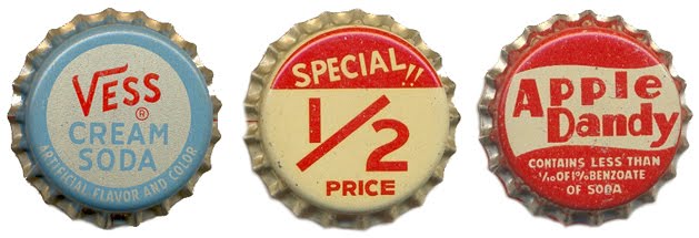
Doing some research yesterday I came across The Bottle Cap Man a website devoted to, you guessed it - bottle caps or crowns. The site, run by Kenny Yohn in Kansas City is a great resource for collectors and an amazing source of inspiration.
Kenny has an absolutely massive collection of beer and soda caps dating back to the 50's, the ones above are only a tiny selection from one of the soda sections. I haven't even looked through the beer ones yet - there literally are hundreds.
I feel a new collection coming on!
Images copyright The Bottle Cap Man.
https%3A%2F%2Fwww.deliciousindustries.com%2Fthe-bottle-cap-man
Delicious+Industries%3A+The+Bottle+Cap+Man
New look NME


Yesterday saw the launch of a new look NME. The publication has a new editor and to mark the start of this new era has undergone a major revamp including an updated identity/masthead.
To celebrate the launch, this weeks issue is available in a choice of 10 different covers. Artists gracing the 10 covers are: Jack White, Florence And The Machine, LCD Soundsystem, Rihanna, Kasabian, Laura Marling, Foals, MIA, Biffy Clyro and Magnetic Man.
"We’ve brought together a really varied group of musicians from global icons like Jack White and Rihanna, innovators like MIA and LCD Soundsystem to exciting newcomers in the form of dubstep supergroup Magnetic Man," explained NME editor Krissi Murison.
I haven't seen any of the inside pages yet, but I think the new cover design is much cleaner and looks a lot more sophisticated than the previous style (below), so definitely a change for the better in my opinion.

Images copyright NME.
https%3A%2F%2Fwww.deliciousindustries.com%2Fnew-look-nme
Delicious+Industries%3A+New+look+NME
Urban Outfitters + Society6 Print Shop

Urban Outfitters and international artist community Society6 have collaborated to present Print Shop - a curated selection of Society6 favourites available in 3 different print sizes, laptop skins or iphone/ipod skins.


Images copyright of the individual artists from Society6.
https%3A%2F%2Fwww.deliciousindustries.com%2Furban-outfitters-society6-print-shop
Delicious+Industries%3A+Urban+Outfitters+%2B+Society6+Print+Shop
Howdoos now on Etsy!

Remember our post about howdoos - business cards for everyone + anyone? Well, they're finally packed up and ready to ship.
howdoos are hand letter-pressed business cards with a greeting on the front and 3 blank spaces on the back ready for your personal details.
There are currently 2 designs; 'hello' in hot pink and 'nice to meet you' in black. Both are now available in packs of 10 from our new Etsy store!


https%3A%2F%2Fwww.deliciousindustries.com%2Fhowdoos-now-on-etsy
Delicious+Industries%3A+Howdoos+now+on+Etsy%21
Be Kind To Books!


The Works Projects Administration (WPA), previously called the Works Progress Administration were, according to the wisdom that is Wikipedia, "the largest New Deal agency, employing millions to carry out public works projects, including the construction of public buildings and roads, and operated large arts, drama, media, and literacy projects. It fed children and redistributed food, clothing, and housing. Almost every community in the United States had a park, bridge or school constructed by the agency, which especially benefited rural and Western populations."
These posters and many more including one of Milton Glaser's iconic 'Dylan' posters and a 1970's Eric Strenger Porsche poster, are due to be auctioned off at New York's, Swann Galleries Auction, May 3rd 2010 (Sale 2213, Modernist Posters). I could spend a serious amount of money at this auction, so it's probably a good job I'm on the other side of the pond!
All images copyright Swann Galleries.
https%3A%2F%2Fwww.deliciousindustries.com%2Fbe-kind-to-books
Delicious+Industries%3A+Be+Kind+To+Books%21
From the reference box #70


#70 - Commemorative, sailing themed stamps from the UK designed by Andrew Restall MISA and released on June 11 1975
These bold, colourful stamps illustrate Sailing Dinghies (7p), Racing Keel Boats (8p), Cruising Yachts (10p) and Multihulls (12p).
Below is the First Day Cover that my set came on...

See more Andrew Restall designed stamps from the reference box here, here and here.
https%3A%2F%2Fwww.deliciousindustries.com%2Ffrom-the-reference-box-70
Delicious+Industries%3A+From+the+reference+box+%2370
Welcome

Welcome to the Delicious Industries blog. We're an independent design studio based in Brighton, UK and this is our scrapbook packed full of design, illustration, photography & typography inspiration. Check out our work here.
Links
DELICIOUS FRIENDS
DELICIOUS FAVOURITES
- 50 Watts
- Acejet 170
- Grain Edit
- It's Nice That
- National Geographic Found
- Notcot
- Pretty Clever
- Retronaut
- So Much Pileup
- We Love Typography
- Another Mag