art direction, design + typography
Blog: Design
From the reference box # 79

The Fischer Autolicht (above) is a spare for a 50's/60s Helphos spotlight. It's so gorgeous - simple 2 colour, with the 50's type and the bulb graphic.
However, the Neon Crucifix* (below) is my favourite - how many neon crucifix bulbs have you ever seen?? The packaging is fantastic and looking at the type I'm guessing it's also from the 50's/60's. Such a random item it's hard not to love it.
*update to this post*
After a bit of research I've discovered that these neon crucifix bulbs are manufactured for churches and are still available (although not in red as the one above or with the retro packaging) here.


If you like looking at random vintage items of ephemera, take a look through the rest of our reference box.
*Big thanks to Carl Rush of Crush for giving me the neon crucifix a few years ago!
*Big thanks to Carl Rush of Crush for giving me the neon crucifix a few years ago!
https%3A%2F%2Fwww.deliciousindustries.com%2Ffrom-the-reference-box-79
Delicious+Industries%3A+From+the+reference+box+%23+79
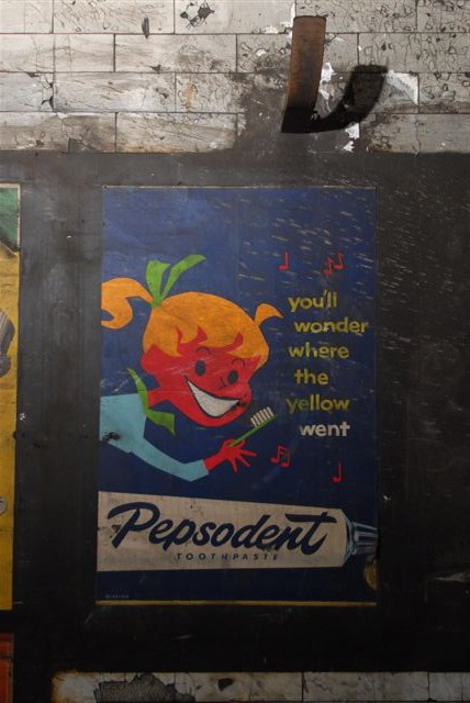
50's Posters discovered at Notting Hill Gate Tube

How fantastic are these vintage posters discovered in the depths of Notting Hill Gate Tube Station during some recent maintenance work?
In 1959 Notting Hill Gate Tube Station underwent modernisation - the original passenger lifts were replaced with escalators and the passages to the old lifts were sealed off and long forgotten.
That is until recently, when they were rediscovered along with these wonderful advertising posters still very much in tact. What a great find!
Hopefully they'll be saved and put on display in the London Transport Museum (fingers crossed), but at present they remain in-situ and this section of the station remains closed to the public :(
Huge thanks to Mike Ashworth, Design & Heritage Manager of London Underground for sharing these pics!


Via Kuriositas.
Images copyright Mike Ashworth.
https%3A%2F%2Fwww.deliciousindustries.com%2F50s-posters-discovered-at-notting-hill-gate-tube
Delicious+Industries%3A+50%26%23039%3Bs+Posters+discovered+at+Notting+Hill+Gate+Tube
Soccer Aid World Cup 2010 Poster

As football fever takes hold I'm relieved to finally see a well-designed World Cup fixtures poster.
Created for Soccer Aid (raising money for Unicef) by David Watson it was designed as, "an antidote to the newspaper wall charts and pull outs". So if anyone in your studio/ home insists on putting up a wall chart or poster, you should insist that it's this one!
Each poster costs £7 + pp and all money is donated to Soccer Aid.
Get yours here.

Images copyright David Burton.
Via Wallpaper*.
https%3A%2F%2Fwww.deliciousindustries.com%2Fsoccer-aid-world-cup-2010-poster
Delicious+Industries%3A+Soccer+Aid+World+Cup+2010+Poster
Nobrow Gallery


Nobrow have just dropped us a note to tell us about their new gallery (above) in fashionable Shoreditch, London!
Nobrow started in 2008 as an "independent publishing platform for illustration and the graphic arts that would showcase some of the best talent out there today, whether fresh out of college or from the ranks of well seasoned veterans".
They're inaugral exhibition Dungeons and Desktops runs until 22 July and is showcasing the wonderful work of illustrator Jack Teagle.
"Dungeons and Desktops is an exhibition that seamlessly melds the worlds of the fantastic and mundane, a cornucopia of staplers and swords, benefits and beasts, hair monsters and HR managers."
Prints, sculptures and original works from their catalogue of published illustrators and artists including Richard Hogg, Joe Crocker and Blexbolex (below) are also available in the gallery.


All images copyright Nobrow.
https%3A%2F%2Fwww.deliciousindustries.com%2Fnobrow-gallery
Delicious+Industries%3A+Nobrow+Gallery
Vintage Auto Posters


These gorgeous posters are from the wonderful Vintage Auto Posters, "Since 1980, Everett Anton Singer has been supplying international collectors with the most diverse and highest quality selection of authentic vintage automotive posters".
There are hundreds of posters on the site from general 50's, 60's and 70's auto event posters to posters advertising specific marques including Porsche, Mercedes and Ferrari.
The best thing about this site is that all the posters are for sale. Prices are available on request though, which probably means they're out of my current budget - but I can dream!
Check out more posts full of automobilia here.
Images copyright Vintage Auto Posters.
https%3A%2F%2Fwww.deliciousindustries.com%2Fvintage-auto-posters
Delicious+Industries%3A+Vintage+Auto+Posters
From the reference box # 78

#78 - Newton Oils sign. I've had this sign for years, it's not very big (24cm diameter) and only cardboard but I love it! It's the very pointy arrow, which seems quite ornate for an oil sign and the orange outlined type that do it for me.
I'd always thought it was from the late 50's, but after a bit of research it seems Newton Oils was only established in 1961, so I'm guessing it's probably from around that time.
There are lots more interesting items in the reference box - have a rummage here.
https%3A%2F%2Fwww.deliciousindustries.com%2Ffrom-the-reference-box-78
Delicious+Industries%3A+From+the+reference+box+%23+78
From the reference box # 77


#77 - More matchbooks! Here's a selection of 70's and early 80's matchbooks I managed to get my hands on last week at an autojumble?!
The typography is great, especially on the BEA and Berni logos, but most of all I'm loving the thick black outline of the Wesson illustrations and the delicate skier illustrations on the Wyoming one.
This collection is getting pretty big these days - check out more here, here and here.
https%3A%2F%2Fwww.deliciousindustries.com%2Ffrom-the-reference-box-77
Delicious+Industries%3A+From+the+reference+box+%23+77
Spring clean!

These gorgeous polishing dusters/mops for use on cars and furniture are from the 50's and part of my growing Automobilia collection. The 'mop' heads are inside the tins to protect them (they're impregnated with polish) and the wooden handles stick out of the top.
The type is very 50's, especially the 'Handimop' font and I love the illustrations of the man cleaning his car and the woman polishing the table!

For more fabulous Automobilia have a look here, here and here.
https%3A%2F%2Fwww.deliciousindustries.com%2Fspring-clean
Delicious+Industries%3A+Spring+clean%21
Mullard Valves Tested

This wonderful 50's sign makes me smile every morning, so I thought I'd share it with you guys for some Monday inspiration.
It's the printed glass from the front of an illuminated, Mullard's advertising sign given to me by my uncle when he closed his old electrical shop. I just love everything about it - especially the 'Valves Tested' type and the little man's quiff!
https%3A%2F%2Fwww.deliciousindustries.com%2Fmullard-valves-tested
Delicious+Industries%3A+Mullard+Valves+Tested
From the reference box # 76


I love the typography on the backs of these cards, they're always so decorative and detailed. Interestingly (although maybe not to everyone) 3 of the above cards (top 3) are from the same studio, W. Gothard in Wakefield so you can see the progression of the design. I don't know for sure, but I'm guessing the more elaborate design (top) is the earlier card and the simpler, more minimal design (third down) is the later card.
I'll upload these asap to my vintage photographic card Flickr set.
https%3A%2F%2Fwww.deliciousindustries.com%2Ffrom-the-reference-box-76
Delicious+Industries%3A+From+the+reference+box+%23+76
From the reference box # 75


#75 - Vintage American milk bottle caps. The reference box has been seeing a lot of action this last few weeks and these are a couple of the new additions. I love the worn-off print on the bottom one and the typefaces on both are gorgeous - especially the 'milk' one.
For those that don't know the perforated circle in the middle was designed to be punched out using a straw.
https%3A%2F%2Fwww.deliciousindustries.com%2Ffrom-the-reference-box-75
Delicious+Industries%3A+From+the+reference+box+%23+75
From the reference box # 74

Above is a pic of the whole collection and below are some pics of my favourites covers (please excuse the crappy iPhone pics, I'll scan them all in asap and add them to my Flickr set).


https%3A%2F%2Fwww.deliciousindustries.com%2Ffrom-the-reference-box-74
Delicious+Industries%3A+From+the+reference+box+%23+74
More Country Fair Magazines


Remember the Country Fair Magazines I posted about last year, well this weekend I was lucky enough to find a few more!
These new issues also have beautifully illustrated and graphic covers. There are four Jonny Hanna covers (October 1956, July 1957, November 1957 and June 1958) and one by children's book illustrator, John Lobban (the orange bat one - April 1958).
I can't wait to find more of these - fingers crossed I'll be lucky again soon.
If you liked these you may also like my collection of Which? Magazine covers and Do It Yourself Annuals.
https%3A%2F%2Fwww.deliciousindustries.com%2Fmore-country-fair-magazines
Delicious+Industries%3A+More+Country+Fair+Magazines
Paul Catherall at Castor + Pollux


We're big fans of his work and can't wait to see the exhibition which includes a print of Brighton's infamous Embassy Court building (top), which is available at the special price of £250 (unframed) when ordered before the 15 May or bought at the private view evening.
The private view on the evening of Friday 14 May kicks off the exhibition which will then run from 15 May - 20 June.
See more work from Paul Catherall here.
Images copyright Paul Catherall, taken from Castor + Pollux.
https%3A%2F%2Fwww.deliciousindustries.com%2Fpaul-catherall-at-castor-pollux
Delicious+Industries%3A+Paul+Catherall+at+Castor+%2B+Pollux
Political Party Logos


Labour proved the most fruitful with the discovery of 3 different logos; the original, 'Liberty' logo (top) in use up to the early 80's, the first rose logo (above centre) and the current graphic rose (immediately above).
I also came across this old ad which I quite like...

I wasn't quite so successful in the Conservative or Tory party search and only turned up the old torch graphic...

and the current tree graphic, which I find weird as green is the predominant colour and not blue..
This search did remind me of the classic Saatchi ad (below) though, which I hadn't seen for a long time.


If anyone has more information about party logo developments, please let me know. In the meantime - Happy Voting!
Images copyright of the individual parties.
Images copyright of the individual parties.
https%3A%2F%2Fwww.deliciousindustries.com%2Fpolitical-party-logos
Delicious+Industries%3A+Political+Party+Logos
Welcome

Welcome to the Delicious Industries blog. We're an independent design studio based in Brighton, UK and this is our scrapbook packed full of design, illustration, photography & typography inspiration. Check out our work here.
Links
DELICIOUS FRIENDS
DELICIOUS FAVOURITES
- 50 Watts
- Acejet 170
- Grain Edit
- It's Nice That
- National Geographic Found
- Notcot
- Pretty Clever
- Retronaut
- So Much Pileup
- We Love Typography
- Another Mag