Blog: Design
Serie Waves Surfart - Tom Veiga
I’m loving the simplicity of these Tom Veiga Surfart posters, they’re very beautiful and fresh looking.
Serie Waves is a collection of work, “inspired by the sensations and feelings that the sea wind, the sun's heat and movement of the waves pass”. They bring together Veiga’s passion for design and his love of surfing, “each wave has a shape, color, a feature unique, and it all inspired me to reflect the beauty of the sea and the waves through the design”.
Check out the Serie Waves Blog for a sneaky peak at new work and information about future exhibitions.
If surf art is your thing, take a look at our surf photography posts here, here and here.
Images copyright Tom Veiga.
Via NotCot.
https%3A%2F%2Fwww.deliciousindustries.com%2Fserie-waves-surfart-tom-veiga
Delicious+Industries%3A+Serie+Waves+Surfart+-+Tom+Veiga
From the reference box # 65


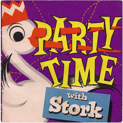
#65 – Cook books from The Stork Cookery Service - ‘Stork Goes Continental’, 1954 and ‘Party Time with Stork’, 1958.
I love the little Stork Magarine recipe booklets and after buying these two recently I decided to find out more about them. Unilever have a little bit of history here...
“Stork was first introduced as a branded margarine in the 1920. In the 1930's, Stork taste tests began on Radio Lyons. Advertising campaigns included "The Energy Giver" to dispel thoughts that margarine was unhealthy. The Stork Cookery Service was launched in 1939 to help housewives discover cooking with margarine when food rationing began.”
When rationing ended in 1954, Stork and The Stork Cookery Service reappeared in the marketplace and over the following 20 years they produced a huge range of booklets and books with instructions and recipes for all ages and all levels of experience; from ‘How to make a Sandwich’ to ‘The Art of Icing’.
Some of the recipes in the party one sound really good, I might have to get my pinny on and bake some cakes this weekend!
If you like these, I’m sure you’ll like the other items in our reference box – have a root here.
https%3A%2F%2Fwww.deliciousindustries.com%2Ffrom-the-reference-box-65
Delicious+Industries%3A+From+the+reference+box+%23+65
Great Valentine's Day Cards

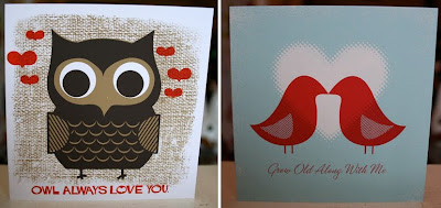
There's still time to buy those Valentine's cards! To help you along, here are some of our favourites...
For our US friends, Hero Design Studio have some great hand-printed cards (above) in their Etsy store including a pack of 12 (4 designs, below) for those with more than one love in their life!

And for those in the UK, Soma Gallery have a large selection of fabulous Lisa Jones cards (below).


https%3A%2F%2Fwww.deliciousindustries.com%2Fgreat-valentines-day-cards
Delicious+Industries%3A+Great+Valentine%26%23039%3Bs+Day+Cards
How to Work Better
*We just been informed that this was written by Fischli and Weiss and designed by James Goggin - thanks Dick.
Via Inspiration Resource.
Via Inspiration Resource.
https%3A%2F%2Fwww.deliciousindustries.com%2Fhow-to-work-better
Delicious+Industries%3A+How+to+Work+Better
Crayon Rings by Timothy Liles

How great are these Crayon Rings by Timothy Liles?
I love the idea of being able to draw with big bold, bright rings. They're aesthetically pleasing and functional - the perfect combination!


Get yours here .
Images copyright Designboom.
Via Designboom News.
https%3A%2F%2Fwww.deliciousindustries.com%2Fcrayon-rings-by-timothy-liles
Delicious+Industries%3A+Crayon+Rings+by+Timothy+Liles
Saul Bass: Making money v's Quality work
Words of wisdom from the wonderful Saul Bass - Monday inspiration!
More Saul Bass inspiration here and here.
Copyright Prof. Archie Boston.
Via Hero Design Studio.
https%3A%2F%2Fwww.deliciousindustries.com%2Fsaul-bass-making-money-vs-quality-work
Delicious+Industries%3A+Saul+Bass%3A+Making+money+v%26%23039%3Bs+Quality+work
Vintage Castrol Tins

Remember this post about a vintage oil can Flickr group? Well since then I've been on a look out for some of my own - so far I've found these little beauties. I love the old scripted Castrol logo on the middle and right tins.
According to Castrol this logo was introduced in 1946 and used until 1958 when the one on the left tin replaced it. Here's the Castrol logo evolution, I think it's a shame they didn't stick with the 50's/60's branding as it has much more impact than the ultra-modern (yet already dated looking) ones in use since 2001.

1917 and 1929

1946 and 1958

1968 and the 100 year celebration logo in 1999

2001 and 2006
Check out more vintage oil loveliness here, here and here.
All logo images copyright Castrol.
https%3A%2F%2Fwww.deliciousindustries.com%2Fvintage-castrol-tins
Delicious+Industries%3A+Vintage+Castrol+Tins
Helvetica Cookie Cutters!


Loving these Helvetica cookie cutters designed and created by Beverly Hsu last year. Rumour has it that she's trying to put them into production so we can all have lovely Helvetica cookies to munch on!
Images copyright Beverly Hsu.
Via NotCot.
https%3A%2F%2Fwww.deliciousindustries.com%2Fhelvetica-cookie-cutters
Delicious+Industries%3A+Helvetica+Cookie+Cutters%21
From the reference box #64


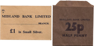
#64 - Banking Money bags/pockets for Barclays Bank Ltd., Lloyds Bank Ltd. and Midland Bank Ltd. (now HSBC). I picked these up at the weekend from a local flea market. They came in a bundle with a few of each one, most of which are unused.
I think they're from the early 70's as here in the UK we went decimal in 1971, losing the pound, shilling and pence in favour of just pounds and pence with an 18 month change-over period. This bundle of bags includes both decimal and pre-decimal nominations so I'm guessing they are from this change-over period.
The little 25p one at the bottom is my favourite, partly becasue of the big, thick black number 25 and partly because I miss 1/2 pence pieces!
Check out more wonderful items in the reference box here.
https%3A%2F%2Fwww.deliciousindustries.com%2Ffrom-the-reference-box-64
Delicious+Industries%3A+From+the+reference+box+%2364
Educational Stamps - Israel 1972


I found these gorgeous Israeli stamps on a great blog, Words and Eggs. They were issued in 1972 to celebrate the countries rise in educational standards and illustrate stages of education (above - top to bottom):
Elementary school - "The beginning of wisdom is this: get wisdom..." (Proverbs 4:7)
Secondary school - "Train upon a child in the way he should go..." (Proverbs 22:6)
Vocational training - "... but all study of the law without labor comes to naught at the last..." (Pirkei Aboth 2)
Academic training - "...but you shall meditate on it day and night..." (Joshua 1:8)
Big thanks to Kickcan & Conkers for pointing us to this great blog.
Images copyright The Israel Philatelic Federation (IPF).
https%3A%2F%2Fwww.deliciousindustries.com%2Feducational-stamps-israel-1972
Delicious+Industries%3A+Educational+Stamps+-+Israel+1972
Letterheady

Letterheady is a great website run by Shaun Usher showcasing interesting letterhead designs, mainly it seems from famous people, offices and corporations. Shaun describes it as, "an online homage to offline correspondence; specifically letters. However, here at Letterheady we don't care about the letter's content. Just its design." What a wonderful resource for ephemera geeks and designers.
There's a good range too- some of the designs are simple and to the point whilst others like the Barnum's one (above) are fantastically elaborate. Here are my favourites:


Images copyright Letterheady.
Via our friends at Sell! Sell!
https%3A%2F%2Fwww.deliciousindustries.com%2Fletterheady
Delicious+Industries%3A+Letterheady
A Collection a Day, 2010


Artist and illustrator Lisa Congdon has started A Collection a Day 2010, a blog showcasing random objects from her personal or imagined collections. Lisa is going to post a collection everyday for exactly one year - quite a task!
"Since I was a young girl, I have been obsessed both with collecting and with arranging, organizing and displaying my collections. This is my attempt to document my collections, both the real and the imagined".
It's a great idea for a blog - I love collections. There are already some interesting items up there, so hopefully it will become a good source of inspiration on a daily basis.
Images copyright A Collection a Day, 2010.
Via the wonderful Kickcan and Conkers.
https%3A%2F%2Fwww.deliciousindustries.com%2Fa-collection-a-day-2010
Delicious+Industries%3A+A+Collection+a+Day%2C+2010
Hobo Symbology


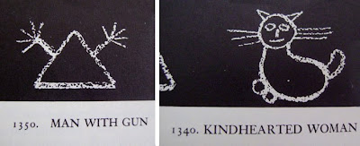
I love these hobo symbols, they form such a basic signage system, simple and effective. It was developed by hobos in the 1950's who communicated with each other by drawing these images on the street in chalk.
You may remember a reference to them in Mad Men when a Hobo drew the 'Dishonest Man' symbol on the gate of the young Don Draper's house in a flashback scene.
The whole set can be seen over on World Famous Design Junkies.
Images copyright World Famous Design Junkies.
Via Notcot.
https%3A%2F%2Fwww.deliciousindustries.com%2Fhobo-symbology
Delicious+Industries%3A+Hobo+Symbology
December Which? Covers


Well Christmas is almost upon us, so here are some December Which? covers, 1965 to 1974 from my collection for a bit of seasonal design inspiration.
See more Which? covers on Flickr or checkout these posts for more information:
Which? Magazine
More Which? Covers
Banks & Miles
Q&A with John Miles
https%3A%2F%2Fwww.deliciousindustries.com%2Fdecember-which-covers
Delicious+Industries%3A+December+Which%3F+Covers
Half price posters!

There's some great half price posters over on Bandito Design Co. in their Christmas sale. These are my favourites - $10 each - bargain!
Images copyright Bandito Design Co.
Via Stickers and Stuff.
https%3A%2F%2Fwww.deliciousindustries.com%2Fhalf-price-posters
Delicious+Industries%3A+Half+price+posters%21
Welcome

Welcome to the Delicious Industries blog. We're an independent design studio based in Brighton, UK and this is our scrapbook packed full of design, illustration, photography & typography inspiration. Check out our work here.
Links
DELICIOUS FRIENDS
DELICIOUS FAVOURITES
- 50 Watts
- Acejet 170
- Grain Edit
- It's Nice That
- National Geographic Found
- Notcot
- Pretty Clever
- Retronaut
- So Much Pileup
- We Love Typography
- Another Mag


