From the reference box # 77
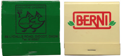

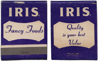
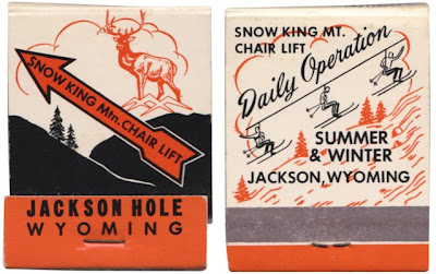

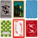
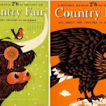
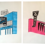
#77 - More matchbooks! Here's a selection of 70's and early 80's matchbooks I managed to get my hands on last week at an autojumble?!
The typography is great, especially on the BEA and Berni logos, but most of all I'm loving the thick black outline of the Wesson illustrations and the delicate skier illustrations on the Wyoming one.
This collection is getting pretty big these days - check out more here, here and here.
https%3A%2F%2Fwww.deliciousindustries.com%2Ffrom-the-reference-box-77
Delicious+Industries%3A+From+the+reference+box+%23+77
Welcome
Welcome to the Delicious Industries blog. We're an independent design studio based in Brighton, UK and this is our scrapbook packed full of design, illustration, photography & typography inspiration. Check out our work here.
Links
DELICIOUS FRIENDS
DELICIOUS FAVOURITES
- 50 Watts
- Acejet 170
- Grain Edit
- It's Nice That
- National Geographic Found
- Notcot
- Pretty Clever
- Retronaut
- So Much Pileup
- We Love Typography
- Another Mag


