Sanborn Fire Insurance Map Lettering
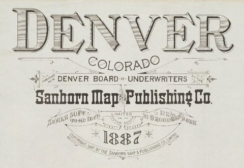
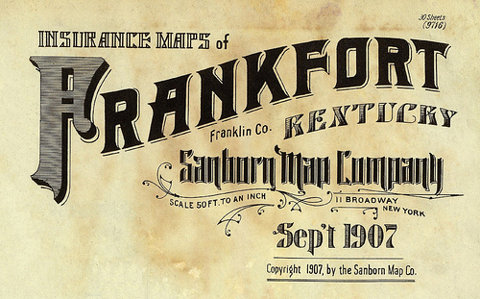
I found these great lettering details from Sanborn Fire Insurance Maps over on BibliOdyssey. They've collected them from map and map publications dated between 1880 and 1920.
After completing a successful commission preparing insurance maps for the Aetna Insurance Company, surveyor D. A. Sanborn saw their value to the fire insurance industry and established D. A. Sanborn National Insurance Diagram Bureau in New York City,1867.
The lettering above shows how each town/city had a uniquely designed heading, title page or legend. They remind me of the very elaborate Carte-de-Visite reverses of the same period. I find it interesting that in the late 1800's, companies here in the UK and in the US were producing similar style lettering designs.
Reading some of the typographers comments on BibliOdyssey, I learned the difference between Lettering (hand-lettering created a purpose, not using pre-designed fonts), Typography (arranging pre-designed fonts) and Calligraphy (hand-lettering with a pen or brush). I did know the calligraphy definition but had never really given much thought to what was defined as 'lettering' or 'typography' - you learn something new everyday!
Images copyright BibliOdyssey.
Via FFFFound.
https%3A%2F%2Fwww.deliciousindustries.com%2Fsanborn-fire-insurance-map-lettering
Delicious+Industries%3A+Sanborn+Fire+Insurance+Map+Lettering
Welcome

Welcome to the Delicious Industries blog. We're an independent design studio based in Brighton, UK and this is our scrapbook packed full of design, illustration, photography & typography inspiration. Check out our work here.
Links
DELICIOUS FRIENDS
DELICIOUS FAVOURITES
- 50 Watts
- Acejet 170
- Grain Edit
- It's Nice That
- National Geographic Found
- Notcot
- Pretty Clever
- Retronaut
- So Much Pileup
- We Love Typography
- Another Mag


