Blog: Advertising
From the reference box #103
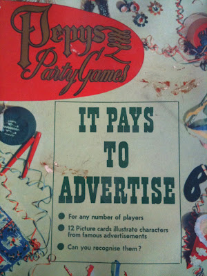
#103 - Vintage Pepys Party Game (Castell Brothers) 'It Pays to Advertise'.
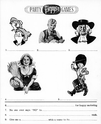
This quirky game has been in the reference box for quite a while and unfortunately most of the cards are missing. As far as I can tell it's from the late 50's, players had to write down the product the characters are associated with as well as filling in the missing words in the famous slogans.
So, are you ready for a just-for-fun Friday game (answers on Monday)...

https%3A%2F%2Fwww.deliciousindustries.com%2Ffrom-the-reference-box-103
Delicious+Industries%3A+From+the+reference+box+%23103
Your Bets Mate
Our friends Sell! Sell! have just launched a great TV campaign, 'Your Bets Mate' for the new Racing Post App.
The 3 ads - 'Lederhosen', 'Snake charmer' (above) and 'cow' feature quirky clips of Getty library footage pieced together with shot scenes that match closely (but not that closely!).
They're a refreshing change, entertaining and funny - check out the full campaign here.
https%3A%2F%2Fwww.deliciousindustries.com%2Fyour-bets-mate
Delicious+Industries%3A+Your+Bets+Mate
No time for average Joes!

Our lovely friends over at Sell! Sell! are on the look out for a new account/project manager. They're after someone with zero to two years experience, but don't have time for average Joes.
If this sounds like the job for you, read more about it here and download an application form here.
Good luck!
https%3A%2F%2Fwww.deliciousindustries.com%2Fno-time-for-average-joes
Delicious+Industries%3A+No+time+for+average+Joes%21
John Hollows Superior Alcoholic Ginger Beer

Congrats to our friends over at Sell! Sell! for creating the fabulous branding and advertising for Fentiman's new Alcoholic Ginger Beer - John Hollows.
Research is my favourite part of a project, so I loved reading about the branding and how it developed through their research into Fentiman's and Hollow's brewing history.
The advertising is bold and fun, challenging the 'fake' ginger wine-based or flavoured lager ginger beers of the competition and warning customers, 'Beware of imitations'...

And to promote the new drink in pubs and bars, they've created the 'not a genuine ginger?' beermat - perfectly designed to disguise yourself as a true ginger...

Read more about the project here.
Images copyright Sell!Sell!
https%3A%2F%2Fwww.deliciousindustries.com%2Fjohn-hollows-superior-alcoholic-ginger-beer
Delicious+Industries%3A+John+Hollows+Superior+Alcoholic+Ginger+Beer
Words of Wisdom!
I read a great post, Wisdom On Writing By The Great Drayton Bird over on the Sell! Sell! Blog at the weekend. Now I'm normally all about the pictures, but I found it really interesting and great advice for anyone that writes, be it for a living, for pleasure or just when blogging.
I highly recommend everyone reads the full post, but here are some of the top tips:
Read any popular novel, newspaper or magazine. They are written for people who are not clever, or not concentrating. Words, sentences and paragraphs are very short. And here are some other suggestions.
1. A heading must make the reader want to find out more, and not reveal so much they might not feel they need to read it.
2. Try to avoid 'we' instead of 'I' - the writing most likely to be read is me to you. People don't relate to organisations.
3. Count the number of "you" words - yours and your - versus "me" words - I, us, our, ours and we. The ratio should be at least 2:1, preferably 3:1.
4. Use "carrier" words and phrases at the beginnings of sentences to keep people reading. Such as Moreover, That is why, In addition, What's more, On top of that, Also and And. These tell your reader there is more to come. And forget what your teacher told you: "And" is often used to start sentences in The Bible.
5. You can also use questions at the ends of sentences or paragraphs. Why is this?
6. Because which you have to read on to get the answers (and if you notice, the end of point 5 and start of this point demonstrate what I mean).
George Orwell's "1984" and "Animal Farm" were gripping parables about the nightmare of totalitarianism. In an essay he gave six rules for better writing.
1. Never use a metaphor, simile or other figure of speech which you are used to seeing in print.
People get used to them and they fail to take them in. Say something fresh or different. Don't say "at the end of the day" - say "in the end"; don't say "put it to the acid test" - say "test thoroughly". "Cutting edge" or "state of the art" mean "newest"
2. Never use a long word where a short one will do.
Complimentary - Free
Anticipate - Expect
Expectation - Hope
Authored - Wrote
Transportation - Car
Purchase - Buy
Ameliorate - Improve
Lifestyle - Life
Marketplace - Market
3. If you can cut a word out, always do so.
"Miss out on" should be "miss"
"Male personnel" is "men"
"For free" is "free"
"Crisis situation" is "crisis"
"Meal solution" is "meal" or "recipe"
"Research process" is usually "research"
"Station stop" is "station" or "stop"
4. Never use the passive where you can use the active.
Active is always shorter. A biblical example is "Esau was slain by Jacob" - better as "Jacob slew Esau".
5. Never use a foreign phrase, a scientific word, or a jargon word if you can think of an everyday English equivalent.
"Interface" works better as "talk with"
"Core competencies" means "what we do best"
"Easy to use" beats "user-friendly"
"Mission statement" is "our aim"
"This is a non-smoking environment" is "No smoking"
6. Break any of these rules sooner than say anything outright barbarous.
I have two suggestions besides making sure you write as simply as possible.
Before you start, write a simple, logical structure for what you want to say. Then draft - and revise until you're 100% sure anyone can understand it.
A friend once gave me a recipe for this which delighted me. "Show it to an idiot," he instructed, "Get them to read it, and ask if they understand".
https%3A%2F%2Fwww.deliciousindustries.com%2Fwords-of-wisdom
Delicious+Industries%3A+Words+of+Wisdom%21
New Fentimans ads
Love these ads our friends at Sell! Sell! have just finished for Fentimans, the makers of botanically brewed beverages to advertising their Ginger Beer (above), Victorian Lemonade (below) and Curiosity Cola (below). They're simple and funny - we'd expect nothing less!
"With this campaign we wanted to do a couple of things - obviously introduce Fentimans to the (still too many) people who haven't heard of them at all, to explain what makes their products special and different to normal soft drinks, and to do it all in a way that felt right for Fentimans. Fentimans are a real family business, dating back to 1905, with a cracking product. So we wanted to kind of get out of the way, and let them speak to people honestly and directly about their product."
Find out more here.
https%3A%2F%2Fwww.deliciousindustries.com%2Fnew-fentimans-ads
Delicious+Industries%3A+New+Fentimans+ads
Pirelli wonderfulness!

Pirelli scooter - Max Huber, 1957.
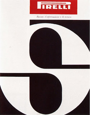
Pirelli magazine cover - Giulio Confalonieri and Ilio Negri, 1959.

Pneumatici Pirelli - Agenzia Centro, 1964.

Pirelli magazine page design - Giulio Confalonieri and Ilio Negri, 1959

"il pneumatico che morde la strada'"(the tire that bites the road) ad - Paul Engelmann, 1952.

"per l'inverno il pneumatico inverno", Pirelli brochure cover, 1952.
More fabulous Pirelli graphics from Pop Design's Flickr. I love 50's and 60's Pirelli's marketing, it's so simple and graphic - very less is more, which I'm a big fan of!
Images copyright Pop Design.
https%3A%2F%2Fwww.deliciousindustries.com%2Fpirelli-wonderfulness
Delicious+Industries%3A+Pirelli+wonderfulness%21
An Open Letter to All of Advertising and Marketing

Very funny post over on Sell! Sell! - I couldn't agree more with Brian.
https%3A%2F%2Fwww.deliciousindustries.com%2Fan-open-letter-to-all-of-advertising-and-marketing
Delicious+Industries%3A+An+Open+Letter+to+All+of+Advertising+and+Marketing
Made by Cows


It's not very often I look at an advert and think the typography is good, in fact it's extremely rare, but I saw the new 'Made by Cows' Anchor Butter campaign this morning and was pleasantly surprised. The type is researched, considered and well composed - a refreshing change.
The ads created by CHI are reminiscent of the late 1800's/early 1900's ads which were painted directly onto the sides of buildings. Alison Carmichael was commissioned by the agency to replicate the hand-painted type of this era, which explains the good type!
From the information I've seen it's hard to know whether the ads were painted on a wall and then photographed and the photos are been used as the 48 sheets (which I suspect will be the case) or if they've actually been painted onto walls in a few locations across the country which would make for a much more impressive campaign and add to the authenticity.
It just shows what can be achieved when designers and typographers are part of the process!
Via CR Blog.
https%3A%2F%2Fwww.deliciousindustries.com%2Fmade-by-cows
Delicious+Industries%3A+Made+by+Cows
New Sell! Sell! Website


Our friends over at Sell! Sell! have just finished their new website and it’s definitely worth a look. As you can see it’s not what you will have come to expect from a creative agency, but since they write as much as they design & create I think it’s a refreshing idea and one that pushes the value of copy to the fore.
The copy is written in a way that keeps you reading without realising it - there’s also a more immediate navigation for the more traditionalists, but I quite enjoyed the journey through the site via the copy. It’s a very bold approach, but I think it really works and obviously I can’t help but love the big bold type!
Take a look here.
https%3A%2F%2Fwww.deliciousindustries.com%2Fnew-sell-sell-website
Delicious+Industries%3A+New+Sell%21+Sell%21+Website
Make Your Own Brand Advertisement

I love this generic advertising script on the Sell! Sell! Blog.
"Make Your Own Brand Advertisement script. Simply fill in the gaps, and hey presto! Big brand ad a-gogo!"
It's funny and cringe worthy at the same time - way too many TV and Radio scripts following this kind of formula and not in a tongue-in-cheek way. I can't believe they're giving away work that some agencies charge thousands for!
https%3A%2F%2Fwww.deliciousindustries.com%2Fmake-your-own-brand-advertisement
Delicious+Industries%3A+Make+Your+Own+Brand+Advertisement
From the reference box #48

#48 - Sunlight Soap Packaging. This Sunlight Soap packaging has unfortunately been opened out and the ends of the box are missing which is a shame. But the pic below shows how the complete pack should look...

When I bought it I estimated it was probably from the 50’s, however after a bit of research it seems it is much older. According to the Unilever timeline they introduced ‘Sunlight Flakes’ in 1899 and then changed their name to ‘LUX Flakes’ in 1900. This box advertises the ‘NEW Sunlight Flakes’ (in the yellow sash) and therefore must be from 1899!
Sunlight Soap was originally produced in 1884 by Lever Brothers, UK. It was designed for general household use and in particular washing clothes, making it “one of the first examples of a cleaning product being produced as a consumer commodity”, says Wikipedia. It was also one of the earliest internationally-marketed branded products!
These days Sunlight Soap has been replaced by man-made detergents in the laundry business, but it’s still available as a hand-wash soap in some European countries and is still a leading brand of dish-washing soap in Canada!
Complete package images from Advertising Antiques.
https%3A%2F%2Fwww.deliciousindustries.com%2Ffrom-the-reference-box-48
Delicious+Industries%3A+From+the+reference+box+%2348
Festival of Britain Guide, 1951
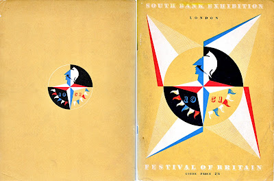
I've seen loads of these Festival of Britain guides for sale in the past, but for some reason they've always had pages or bits of pages hacked out of them. Finally though, I found this one in perfect condition.
The cover's my favourite part of the guide. It's a natural coloured, thick paper with a 4-colour print including white. White litho must have been quite unusual in the early 50's, but it looks great and really helps showcase the Festival logo - an iconic Britannia emblem designed by offical war poster artist, Abram Games (seen above on the cover).
The Festival of Britain was a national festival launched in May 1951 to promote better British design, construction and engineering, to create a national feeling of progress and to boost British moral. It was also a centenary celebration of the Great Exhibition held in 1851.
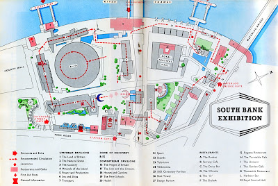
Exhibitions were held throughout the country, but the main venue was on the South Bank in London at a specially designed site developed by architect Hugh Casson and his appointed team. The team aimed to introduce the idea of urban design and showcase the principles intended to be used in the re-building of London; elevated walkways, modernist style architecture and multi-level buildings. Sadly though, only The Royal Festival Hall still remains.
Here's a plan of the South Bank Centre site:
Here's a selection of the adverts throughout the guide - the BOAC/BEA (below) is really great.
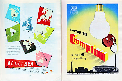
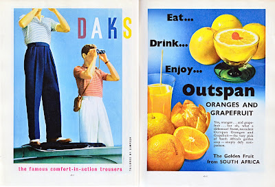
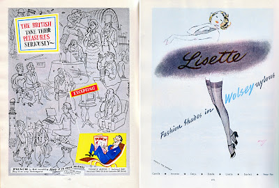
FInd out more about the festival here.
https%3A%2F%2Fwww.deliciousindustries.com%2Ffestival-of-britain-guide-1951
Delicious+Industries%3A+Festival+of+Britain+Guide%2C+1951
This is a bullshit free zone.

Thanks Sell! Sell! for the lovely, straight talking poster we received today - it will definitely feel at home in the Delicious studio.
Read more about it here, and email doubles@sellsell.co.uk for your own copy.
https%3A%2F%2Fwww.deliciousindustries.com%2Fthis-is-a-bullshit-free-zone
Delicious+Industries%3A+This+is+a+bullshit+free+zone.
I want this book!

I was over at Sell! Sell! towers earlier today and saw them posting about this book, Corporate Diversity: Swiss Graphic Design and Advertising by Geigy, 1940 - 1970 published by Lars Müller and the Museum für Gestaltung Zuurich. I've posted about Geigy before here, but I've never seen this book and it's fantastic!
The work throughout is simple and striking - quite rightly the book relates Geigy's house style to other influential advertising and design of the era, for example Olivetti, and as you can see they were definitely along the same lines.

These ads were designed by Giovanna Pintori who worked at the Italian company Olivetti for 27 years!
See more images from Corporate Diversity at Sell! Sell!.
https%3A%2F%2Fwww.deliciousindustries.com%2Fi-want-this-book
Delicious+Industries%3A+I+want+this+book%21
Welcome
Welcome to the Delicious Industries blog. We're an independent design studio based in Brighton, UK and this is our scrapbook packed full of design, illustration, photography & typography inspiration. Check out our work here.
Links
DELICIOUS FRIENDS
DELICIOUS FAVOURITES
- 50 Watts
- Acejet 170
- Grain Edit
- It's Nice That
- National Geographic Found
- Notcot
- Pretty Clever
- Retronaut
- So Much Pileup
- We Love Typography
- Another Mag

