San Francisco Zoo - Critter Quest


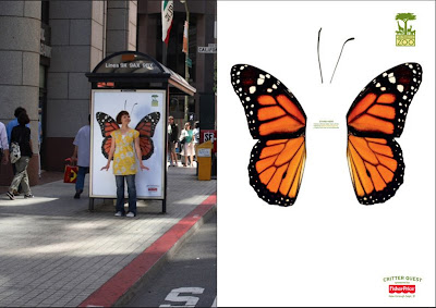
I love these new ads for San Francisco Zoo by BBDO West also in SF. It is such a simple, fun idea - interactive ads in their most basic form!
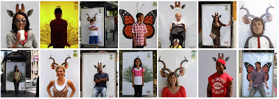
The campaign is designed to 'get people connected' with the zoo, and the idea is for people to stand in front of the bus shelter posters, get someone to take their pic and then upload it to the website gallery for a chance to have your pic used on a print ad for the zoo. The campaign was only launched at the start of the month and there are already thousands of very funny pics in the gallery...

Definitely one of those ideas that I wish was mine!
Images from Coloribus.
https%3A%2F%2Fwww.deliciousindustries.com%2Fsan-francisco-zoo-critter-quest
Delicious+Industries%3A+San+Francisco+Zoo+-+Critter+Quest
The Launch of the Pleasure Bus Tour

The Pleasure Bus Mobile Art Gallery and shop is heading to Art Vinyl, 13 Broadway Market, London on Wednesday 13 August, 5-10pm for Disco, Daftness, Doodling and free Corona!
There'll be limited edition prints, t-shirts and postcards to buy, so if you can't make this stop watch out for the next location.
https%3A%2F%2Fwww.deliciousindustries.com%2Fthe-launch-of-the-pleasure-bus-tour
Delicious+Industries%3A+The+Launch+of+the+Pleasure+Bus+Tour
Betty Crocker's Dinner for Two Cook Book
After trawling the internet I found a first edition, first printing (1958) copy on Ebay and yesterday it arrived. It is in mint condition and the illustrations are all I hoped they would be - simple, kitsch and very elegant!


It is also full of these wonderfully kitsch still life, food photographs which is a bonus!

https%3A%2F%2Fwww.deliciousindustries.com%2Fbetty-crockers-dinner-for-two-cook-book
Delicious+Industries%3A+Betty+Crocker%26%23039%3Bs+Dinner+for+Two+Cook+Book
Wall Letters

These metal letters from Urban Outfitters are fantastic. They are quite large at 6 x 10 x 1" and are available in some cool colours for only $14 each + postage. The have a built-in bracket on the reverse for hanging and the website says they come in different styles, although there is only one style shown.
Now I can find them on the US website, but not on the Uk site?? So maybe they are only available in Uk stores and not online?
You could always have a look in antique shops and on car boot sales to try and find some secondhand signage. Used letters generally have a nice patina which adds character, the only downside is that you can't always get the letters you want in the same style. Here are a couple of mine...

https%3A%2F%2Fwww.deliciousindustries.com%2Fwall-letters
Delicious+Industries%3A+Wall+Letters
Routemasters: Last Stop!


Thanks to photographer, Ralf Obergfell for the info about, 'Routemasters: Last Stop!' a collaborative photography project between himself and Jet. The project is, 'a unique record of the Routemaster's final months. Through a mixture of still lifes, portrait and documentary photography' recently exhibited in the London Transport Museum and now available in a book by the same title.
The Routemaster buses lined London streets for 50 years until they were taken out of service at the end of 2005. Ralf and Jet have spent 18 months on the buses, mainly on the no. 19 and no. 38, capturing the comings and goings of their daily routes; the drivers, the passengers, the conductors and the buses themselves.
Their images are a great record of this design classic, they show the charm and character of these old buses. I can't see anyone being too upset when their replacements - the 'bendy buses' - eventually leave the London streets!
Images copyright Ralf Obergfell & Jet.
https%3A%2F%2Fwww.deliciousindustries.com%2Froutemasters-last-stop
Delicious+Industries%3A+Routemasters%3A+Last+Stop%21
Oh I do like to be beside the seaside…
At this time of year Brighton is in full swing with the seafront and pier, in particular looking fabulously tacky and fun, so I decided to share some seaside inspiration for everyone to enjoy...


https%3A%2F%2Fwww.deliciousindustries.com%2Foh-i-do-like-to-be-beside-the-seaside
Delicious+Industries%3A+Oh+I+do+like+to+be+beside+the+seaside%26%238230%3B
From the reference box #18

This is a Gleem Toothpaste sample pack from the 50's. I didn't know much about Gleem when I bought it, I just like the print and the overlapping to get the brown/dark red colour - very simple, but effective.
I have since found out (through the fountain of knowledge that is Wikipedia) that Gleem was made by Procter & Gamble and was first introduced in 1952 (in the packaging above). 'Compton Advertising Inc.' (now part of Saatchi & Saatchi NY) co-ordinated the advertising for the first Gleem campaign (Ads 1 + 2 below) which was included in the 'League Against Obnoxious TV Commercials' list of 'terrible 10' in May 1963. Needless to say by 1969 the brand was flagging, so the advertising account was moved to 'Wells, Rich, Greene' (Ad 3 below) where it remained until 1976 when it was transferred to 'Leo Burnett', Chicago (Ad 4 below).

As far as I am aware Gleem is still available from some stores in the US, but it never seemed to really hold a big share of the toothpaste market, which is a shame because it packaging at least was great. Below is another sample pack found on Flickr (I think from the 60's) along with the packaging as it stands today.

#18 - 1950's Gleem toothpaste sample pack
https%3A%2F%2Fwww.deliciousindustries.com%2Ffrom-the-reference-box-18
Delicious+Industries%3A+From+the+reference+box+%2318
Eureka Tower Carpark signage


This has to be the best signage I have seen for a long time. It is a way-finding system developed by designer, Axel Peemoeller for Melbourne Carpark, 'Eureka Tower'.
The system works by having giant letters painted on the walls and floor, that appear distorted close up, but when seen from a distance, as you are driving through the carpark, they are perfectly legible. The perspective is carefully calculated to produce the largest, most legible sign from the correct angle.
It reminded me of pavement drawings by Julian Beever I saw a while ago which use perspective and distance in the same way, but in his case to create 3D illusions.


Eureka Tower images copyright Axel Peemoeller
Pavement art images copyright Julian Beever
https%3A%2F%2Fwww.deliciousindustries.com%2Feureka-tower-carpark-signage
Delicious+Industries%3A+Eureka+Tower+Carpark+signage
ART-O-MART

Art-O-Mart is our new sister blog, focused on great art, design & photography - inspirational work from established artists & fresh new talent, must-see exhibitions and info on where to buy great stuff.
The Art-O-Mart online store will soon be opening for business too, selling limited edition prints, photography, vintage posters and specialist magazines.
If you are a photographer, designer, printmaker or artist and would like your work showcased on the Art-O-Mart blog send samples of your work to featureme [at] art-o-mart.com
https%3A%2F%2Fwww.deliciousindustries.com%2Fart-o-mart
Delicious+Industries%3A+ART-O-MART
Vintage Tube & Routemaster Signage

Pedlars is wonderful online shop, with an equally fabulous Notting Hill store. They sell prints, clothing, cool pieces of homeware and vintage paraphernalia. At the moment they have a great selection of vintage tube and Routemaster signs, which are definitely worth a look.
Now I love signs and they don't come much more iconic than the London underground signs - they are a classic piece of design. The ones above were used as temporary signage during maintenance works until about 30 years ago, but are now framed and ready to hang on your studio wall - now how cool would it be to own a genuine tube sign?
Likewise, the type on the old Routemaster bus signs was fantastic, so simple and classic looking. Now that the Routemasters are redundant, the familiar number & destination blinds have been rescued and given a new lease of life, framed or made into light boxes by the lovely people at Pedlars.
Images from the Pedlars online store.
https%3A%2F%2Fwww.deliciousindustries.com%2Fvintage-tube-routemaster-signage
Delicious+Industries%3A+Vintage+Tube+%26amp%3B+Routemaster+Signage
Kids with Cameras


Kids with Cameras was founded by NY photographer Zana Briski in 2002 as a result of her work teaching photography to the children of Calcutta's red light district. She realised that photography ignited their imagination and helped to build their confidence - ultimately it had the power to transform their lives.
In 1997 Zana went to Calcutta to photograph the real lives of the prostitutes there. During her stay she became familiar with the children, and their interest in her camera inspired her to teach them photography to see the world through their eyes. From 2000 to 2003 she ran photography workshops teaching the children basic techniques and giving them a safe place to learn and enjoy themselves. The images produced where fantastic and gave a unique account of Bengali life. Kids with Cameras raises money and awareness for these children through print sales, world-wide exhibitions, film festivals and a book of their work, published in 2004.
The story of these children and their new found photography skills was documented by Zana and filmmaker, Ross Kauffman to create the film, 'Born into Brothels', which won 25 major awards including the 2005 Academy Award for Best Documentary Feature.
To date, successful workshops have been developed in Jerusalem, Haiti and Cairo. For more information about the current projects, events and exhibitions or to buy prints of the children's images visit Kids with Cameras.
Images copyright Kids with Cameras.
https%3A%2F%2Fwww.deliciousindustries.com%2Fkids-with-cameras
Delicious+Industries%3A+Kids+with+Cameras
From the reference box #17


The Practical Householder, January 1961. This is great publication, packed full of adverts, and I mean packed full - the first article starts on page 25, before that it is just pages of mainly mono ads selling anything from sheds to chandeliers.
There is a 'test report' for a fast-boiling kettle - 'the latest edition to the housewife's time-saving equipment', a heat controlled iron and a multi-purpose tool for house and garden.
The illustrations, typography and graphics are fantastic reference, but the best things about this magazine are the many 'DIY/How to' pages. In this issue alone there are instructions on 'how to make'; a table for occasions (see above), a perspex fruit trough, a veneered light (see above), pelmets & curtains, a stow-away top for table tennis, a fold-away linen bin, a selection of children's wooden toys, a storm door, a cocktail bar, a wrought iron balustrade, lattice steps 'for the housewife', a birdcage suspension bar and a nursery chair. As well as how to re-cover a three-piece suite, prevent condensation, hide a waterpipe and hang a kitchen cupboard!
Did a 1960's man really have enough spare time in a month to make all those things? If so. where did all the time go, I don't think I have time to make even one of those things in a month - or is it a case of the women doing so much that the men really didn't have anything to do except play at DIY?
So quite a packed #17 - The Practical Householder, January 1961
https%3A%2F%2Fwww.deliciousindustries.com%2Ffrom-the-reference-box-17
Delicious+Industries%3A+From+the+reference+box+%2317
Charley Harper 1922 - 2007

I came across the fabulous work of the late illustrator, Charley Harper today and I can't believe I haven't seen it before!
Harper was born on a farm in West Virginia, which is said to have been the true inspiration behind his work. He later moved to Cincinnati where he studied, and later taught at the Art Academy of Cincinnati.
Many of his illustrations are of wildlife, and in particular birds, so it's no surprise he worked with many nature related organisations throughout his career, including the Cincinnati Zoo and the Everglades National Park. He also illustrated many books and is especially well known for his illustrations in, 'The Golden Book of Biology' and in, 'Betty Crocker Dinner for Two'
His modernist style creates simplistic, graphic images, that are colourful and bold. Harper summed up his style by saying, "When I look at a wildlife or nature subject, I don't see the feathers in the wings, I just count the wings. I see exciting shapes, color combinations, patterns, textures, fascinating behaviour and endless possibilities for making interesting pictures".
To see more of Charley Harper's work, checkout the 'Charley Harper Illustrations Fanclub' Flickr group, or have a look at the selection of limited edition prints for sale at Gallery One.
Image copyright Charley Harper.
https%3A%2F%2Fwww.deliciousindustries.com%2Fcharley-harper-1922-2007
Delicious+Industries%3A+Charley+Harper+1922+-+2007
Jeremyville in Brighton

'My Summer in Brighton', Jeremyville's first Brighton show, kicks off on 5 August and runs until 7 September at Castor & Pollux.
Jeremyville is an Australian illustrator/artist/animator who splits his time between his homeland and NY. He wrote and produced, 'Vinyl Will Kill', the first designer toy book in the World and has featured in more recent titles including,'Kidrobot' and 'Pictoplamsa'.
His unique illustrations are quirky and intriguing, there is always lots to look at and much attention to detail. Jeremyville has worked with clients such as Converse, Adidas, Coca-cola and MTV to name but a few, so to see his work in Brighton will be fantastic.
More fantastic though, is that he has produced a limited edition A2 screenprint to celebrate this show and his time in Brighton (above right). There are only 50 signed copies available which will go on sale 1 August for £60 each. To reserve your copy, email april@castorandpollux.co.uk
A selection of his prints and other merchandise are also available on his website.
Images copyright Jeremyville.
https%3A%2F%2Fwww.deliciousindustries.com%2Fjeremyville-in-brighton
Delicious+Industries%3A+Jeremyville+in+Brighton
Transforming Tate Modern

Architects, Herzog & de Meuron have been working for the last 2 years on,'Transforming Tate Modern' - a project to develop the Tate Modern site and surrounding areas.
The pyramid-style extension will add over 5000m2 of extra gallery space, creating flexible exhibition spaces that will open into a large, column-free space to accommodate large-scale sculpture, seminar & learning space and areas of contemporary visual culture.
The development will also utilise the redundant oil tanks of the former Power Station by creating a unique environment for performance art, film and multi-media works.
Work will start mid 2009 and completion is scheduled in time for the 2012 London Olympics. I hope it's worth the wait! Tate Modern is one of my favourite London buildings and this development is going to make it even more spectacular.
Images copyright Hayes Davidson and Herzog & de Meuron. From Tate Modern website.
Via Mooch.
https%3A%2F%2Fwww.deliciousindustries.com%2Ftransforming-tate-modern
Delicious+Industries%3A+Transforming+Tate+Modern
Welcome

Welcome to the Delicious Industries blog. We're an independent design studio based in Brighton, UK and this is our scrapbook packed full of design, illustration, photography & typography inspiration. Check out our work here.
Links
DELICIOUS FRIENDS
DELICIOUS FAVOURITES
- 50 Watts
- Acejet 170
- Grain Edit
- It's Nice That
- National Geographic Found
- Notcot
- Pretty Clever
- Retronaut
- So Much Pileup
- We Love Typography
- Another Mag

