Blog: Reference box
From the reference box # 84


#84 - New Zealand First Day of Issue stamp set, 'Family Life'. Issued in April 1981 this set of stamps depicted various activities of family life:
20c - Family life: At Play
"Participation of the whole family in some recreational activity whether it be an organised sport or a carefree game, as well as being fun, can help to develop good relationships between family members."
25c - Family life: Young and Old
"Despite the difference in age, strong feelings and bonds usually spring up between the young and old. The relationship between the grandparents and grandchildren of the family can be beneficial to both. It usually helps them to understand different values and opinions."
30c - Family life: At Home
"Reading is an enjoyable pastime and when all the family are involved it can stimulate conversation, ideas and for the younger ones, learning."
35c - Family life: At Church
"Family life revolves around permanence and sanctity, personal growth, commitment, mutual understanding and inter-dependence."
They were designed by A Derrick, Invercargill and in the bottom right, "Each of the four stamps incorporated the Maori word "Whanau", which is universally known in Maoridom to mean the extended family".
I can't find any information about an illustrator so I assume derrick did the wonderful illustrations. I like the negative use of the white space to create the trees, lamp, bird cage and statue amongst bright backgrounds and really like the thick bold outlines that surround the family unit - very subtle emphasis of the theme.
There are lots more fabulous stamps in our reference box, have a rummage here.
Quotes taken from the New Zealand Post.
https%3A%2F%2Fwww.deliciousindustries.com%2Ffrom-the-reference-box-84
Delicious+Industries%3A+From+the+reference+box+%23+84
From the reference box # 83

#83 - Daiya Space Colt. This item is a studio favourite - a working, "friction sparking with siren" tin ray gun!
The Space Colt was manufactured in Japan by Daiya during the late 50's and early 60's. It's 16cm (approx 6.5") in length and when the trigger is pulled it makes a weird noise as the friction sparks light-up the red lens panels.
According to ray gun enthusiast Justin Pinochot it has "uninspired design", which I was quite offended by until I looked at others on his wonderful website. He has a massive archive of Japanese ray guns and describes the as, "The stuff of fancy, toy ray guns are powered by pure imagination, by our almost unlimited capacity to wonder. Yet they represent other things as well. They are weapons intended to protect us from our deepest fears of the dark unknown, and they remind us of our vulnerability in the face of an endless and mysterious cosmos. Ray guns are testimony to the fact that we often conceive of even the majesty of space as a backdrop for our conflicts and struggles, and that we finally set foot on the moon only as the result of a deadly, war-like, competitive "race" between two superpower nations".
Our example has definitely had an eventful life and came without packaging, but this is the box it would have originally come in. Loving the image of the spaceman!

See more reference box goodies here.
https%3A%2F%2Fwww.deliciousindustries.com%2Ffrom-the-reference-box-83
Delicious+Industries%3A+From+the+reference+box+%23+83
From the reference box # 82


#82 - Temporary Individual Liquor Permit. Issued on 13 December, 1943 by the Nova Scotia Liquor Commission in accordance with the provisions of The Nova Scotia Liquor Control Act, it's a temporary permit valid for only one month.
I love the red overprinted date in the top left corner and the little leather wallet it came in -it's a great bit of ephemera and one I was given!
There are lots more gorgeous items of ephemera in the reference box - take a look here.
https%3A%2F%2Fwww.deliciousindustries.com%2Ffrom-the-reference-box-82
Delicious+Industries%3A+From+the+reference+box+%23+82
From the reference box # 81


#81 - Small, round vintage tins; Ucal Brand's Zinc Ointment and Chesebrough-Pond's Vaseline. I love these little tins, especially the type on the Zinc Ointment one, it's very ornate in total contrast to the Vaseline one with it's functional, simplicity. Each tin is only 65mm (approx. 2.5") in diameter, but they look great on the book shelf.
As ever I've done a bit of research into the companies and found out that Chesebrough (originally an oil business, whose founder chemist Robert Augustus Chesebrough produced the first petroleum jelly in 1859) merged with Pond's Creams in 1955 to form Chesebrough-Pond's before being bought by Unilever in 1987. I've seen other Vaseline tins from the Chesebrough-Pond's era that definitely look older than this one, soa I'm guessing mine is from the late 60's or early 70's.
Unfortunately I can't find out anything about Ucal brand who manufactured the Zinc Ointment, other than they seemed to have produce a variety of Throat Lozenges, Pastilles and Health Salts in the late 50's.
For more reference box loveliness, have a root around here.
https%3A%2F%2Fwww.deliciousindustries.com%2Ffrom-the-reference-box-81
Delicious+Industries%3A+From+the+reference+box+%23+81
From the reference box # 80

#80 - BOAC First Day Cover, celebrating the their first flights between London and Mexico back in April 1966.
The stamps are not that spectacular, but the graphic on the envelope is great and caught my eye. The orange and blue are really strong and I love the BOAC logo.
I didn't realise when I bought it, but inside there's a card with information about the first flight and cover. Apparently all the First Day Covers travelled 6246 miles on a Boeing 707 for 14 hours 55 mins during the inaugural flights. What a well travelled First Day Cover!

See more items from our wonderful reference box here.
https%3A%2F%2Fwww.deliciousindustries.com%2Ffrom-the-reference-box-80
Delicious+Industries%3A+From+the+reference+box+%23+80
From the reference box # 79
The Fischer Autolicht (above) is a spare for a 50's/60s Helphos spotlight. It's so gorgeous - simple 2 colour, with the 50's type and the bulb graphic.
However, the Neon Crucifix* (below) is my favourite - how many neon crucifix bulbs have you ever seen?? The packaging is fantastic and looking at the type I'm guessing it's also from the 50's/60's. Such a random item it's hard not to love it.
*update to this post*
After a bit of research I've discovered that these neon crucifix bulbs are manufactured for churches and are still available (although not in red as the one above or with the retro packaging) here.

If you like looking at random vintage items of ephemera, take a look through the rest of our reference box.
*Big thanks to Carl Rush of Crush for giving me the neon crucifix a few years ago!
*Big thanks to Carl Rush of Crush for giving me the neon crucifix a few years ago!
https%3A%2F%2Fwww.deliciousindustries.com%2Ffrom-the-reference-box-79
Delicious+Industries%3A+From+the+reference+box+%23+79
From the reference box # 78

#78 - Newton Oils sign. I've had this sign for years, it's not very big (24cm diameter) and only cardboard but I love it! It's the very pointy arrow, which seems quite ornate for an oil sign and the orange outlined type that do it for me.
I'd always thought it was from the late 50's, but after a bit of research it seems Newton Oils was only established in 1961, so I'm guessing it's probably from around that time.
There are lots more interesting items in the reference box - have a rummage here.
https%3A%2F%2Fwww.deliciousindustries.com%2Ffrom-the-reference-box-78
Delicious+Industries%3A+From+the+reference+box+%23+78
From the reference box # 77


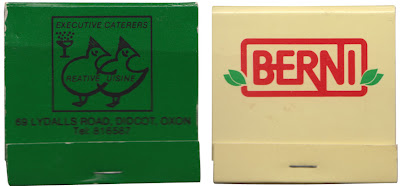
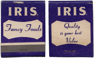
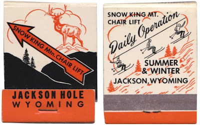
#77 - More matchbooks! Here's a selection of 70's and early 80's matchbooks I managed to get my hands on last week at an autojumble?!
The typography is great, especially on the BEA and Berni logos, but most of all I'm loving the thick black outline of the Wesson illustrations and the delicate skier illustrations on the Wyoming one.
This collection is getting pretty big these days - check out more here, here and here.
https%3A%2F%2Fwww.deliciousindustries.com%2Ffrom-the-reference-box-77
Delicious+Industries%3A+From+the+reference+box+%23+77
From the reference box # 76
I love the typography on the backs of these cards, they're always so decorative and detailed. Interestingly (although maybe not to everyone) 3 of the above cards (top 3) are from the same studio, W. Gothard in Wakefield so you can see the progression of the design. I don't know for sure, but I'm guessing the more elaborate design (top) is the earlier card and the simpler, more minimal design (third down) is the later card.
I'll upload these asap to my vintage photographic card Flickr set.
https%3A%2F%2Fwww.deliciousindustries.com%2Ffrom-the-reference-box-76
Delicious+Industries%3A+From+the+reference+box+%23+76
From the reference box # 75


#75 - Vintage American milk bottle caps. The reference box has been seeing a lot of action this last few weeks and these are a couple of the new additions. I love the worn-off print on the bottom one and the typefaces on both are gorgeous - especially the 'milk' one.
For those that don't know the perforated circle in the middle was designed to be punched out using a straw.
https%3A%2F%2Fwww.deliciousindustries.com%2Ffrom-the-reference-box-75
Delicious+Industries%3A+From+the+reference+box+%23+75
From the reference box # 74
Above is a pic of the whole collection and below are some pics of my favourites covers (please excuse the crappy iPhone pics, I'll scan them all in asap and add them to my Flickr set).
Thanks Dad!
https%3A%2F%2Fwww.deliciousindustries.com%2Ffrom-the-reference-box-74
Delicious+Industries%3A+From+the+reference+box+%23+74
From the reference box #73

#73 - Wonder Atlas; An atlas for the air-age (the new up-to-date edition). It cost me 50p and the guy I bought it off looked at me as though I was mad, but it's worth every penny. Just look at the cover for a start with all it's 50's loveliness - I do love a turquoise and a red together too.
There are 24 full colour (up-to-date) maps inside including political, distance by air from London, average distance from a railway in different countries, seaway and airway versions, as well as a 4 page centre supplement of black an white photographs showing cities of the Commonwealth.
It was printed by LP - The Literary Press Ltd. in London (you can see their owl logo with the words, 'In knowledge lies wisdom' on the cover above) on a Collins Clear-Type Press and is a late 50's edition, from 1959 (I think).
Check out more of our reference box items here - I'm sure you'll like what you find!
https%3A%2F%2Fwww.deliciousindustries.com%2Ffrom-the-reference-box-73
Delicious+Industries%3A+From+the+reference+box+%2373
From the reference box #72


#72 - Danish Industry or 'Dansk Industri' Stamps from 1968. From what I have discovered, they were designed by R. Nellemann and engraved by Polish born, Czeslaw Slania - apparently the world's most famous engraver!
"Engraving is an art process where lines, dots and dashes are cut into a soft metal plate with a tool called a burin. The engraving is done life size and in mirror reverse. Up to 10 lines per millimeter are cut at depths varying from 0.01 to 0.08 mm to give the effects of shadows, highlights and contours. Because engraving requires long years of study and an extended apprenticeship, it is used for high security documents such as postage stamps and banknotes."
You can actually see the dots and lines if you look closely at the stamps. I love the contrast between the graphics on the stamps (above) which are very simplistic and minimal next to the illustrations on the First Day Covers which are very sketchy and detailed...


The quote above is taken from Collecting the works of Czeslaw Slania a site dedicated to Slania's work. Check it out for more information about his career or about engraving.
https%3A%2F%2Fwww.deliciousindustries.com%2Ffrom-the-reference-box-72
Delicious+Industries%3A+From+the+reference+box+%2372
From the reference box #71

#71 - Mapa de communicaciones, Espana or Map of Spain. I was surprised to see this was printed in 1984. I would definitely have guessed at mid 70's with it's black background and bold graphic.
I have no idea what the graphic is meant to be, but I like it all the same!
There are 70 other wonderful items in the reference box - have a root here.
I have no idea what the graphic is meant to be, but I like it all the same!
There are 70 other wonderful items in the reference box - have a root here.
https%3A%2F%2Fwww.deliciousindustries.com%2Ffrom-the-reference-box-71
Delicious+Industries%3A+From+the+reference+box+%2371
From the reference box #70


#70 - Commemorative, sailing themed stamps from the UK designed by Andrew Restall MISA and released on June 11 1975
These bold, colourful stamps illustrate Sailing Dinghies (7p), Racing Keel Boats (8p), Cruising Yachts (10p) and Multihulls (12p).
Below is the First Day Cover that my set came on...

See more Andrew Restall designed stamps from the reference box here, here and here.
https%3A%2F%2Fwww.deliciousindustries.com%2Ffrom-the-reference-box-70
Delicious+Industries%3A+From+the+reference+box+%2370
Welcome

Welcome to the Delicious Industries blog. We're an independent design studio based in Brighton, UK and this is our scrapbook packed full of design, illustration, photography & typography inspiration. Check out our work here.
Links
DELICIOUS FRIENDS
DELICIOUS FAVOURITES
- 50 Watts
- Acejet 170
- Grain Edit
- It's Nice That
- National Geographic Found
- Notcot
- Pretty Clever
- Retronaut
- So Much Pileup
- We Love Typography
- Another Mag


