art direction, design + typography
Blog: Reference box
From the reference box # 99
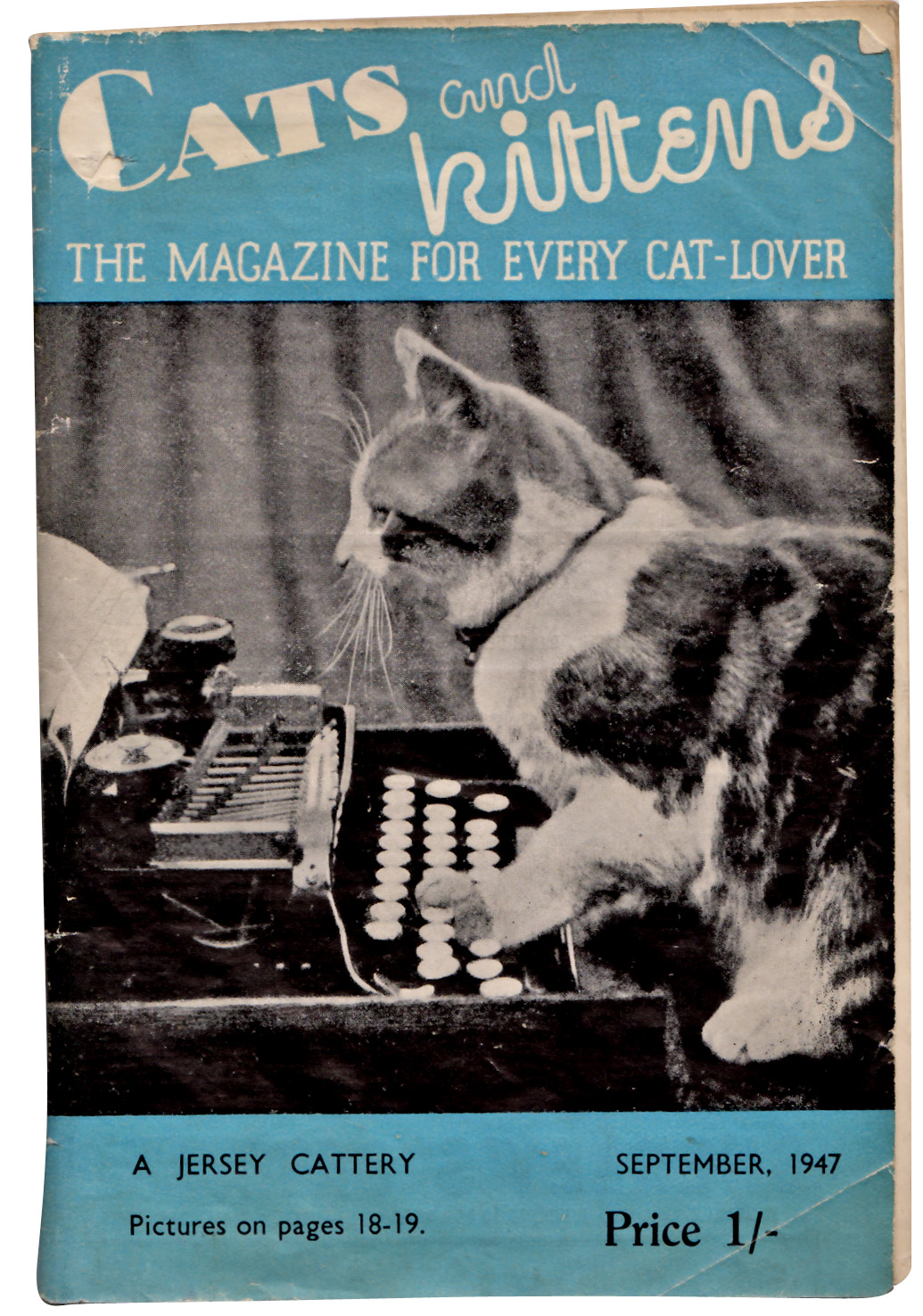
#99 - Cats and kittens: The magazine for every cat-lover, September 1947. Who can resist cats and kittens? Not me that's for sure, so imagine my delight finding cat related ephemera!
I've been unable to find out much about this monthly publication (other than there is a publication by the same name still going strong today, but in the US). I've found references to this Rolls House Published version dating back to the early 30's, but unfortunately I can't find an exact launch date.
Anyway, even without all the history, it's great that back in the 30's and 40's people loved their cats so much there was a need for a monthly publication and how great is that 'kitten' type?
Check out some of the wonderful cat related ads below...


There are lots more items in our reference box, have a root here.
And watch out for #100, it's going to be a special one!
https%3A%2F%2Fwww.deliciousindustries.com%2Ffrom-the-reference-box-99
Delicious+Industries%3A+From+the+reference+box+%23+99
From the reference box #98


#98 - Hurtigruten Coastal Express leaflet. I think this lovely leaflet is from the late 60's or early 70's. It's dual language (Norwegian?/ English) and gives all the on-board information passengers require for the trip.
The Hutigruten Coastal Express Service is a breathtaking 12 day voyage up the coast of Norway. It starts at Bergen, works it's way up to Kirkenes and then returns to Bergen taking in the gorgeous landscapes, ports and nature along the way.
The leaflet itself isn't that exciting, but the graphics are fantastic. They look like tissue paper collages, but whether they actually are I'll never know. The lobster is definitely my favourite by far.
There's lots more fabulous ephemera in the reference box, make a cup of tea and have a dig around here.
https%3A%2F%2Fwww.deliciousindustries.com%2Ffrom-the-reference-box-98
Delicious+Industries%3A+From+the+reference+box+%2398
From the reference box # 97

#97 - Hoffmann's die-cut advertising cat, circa 1930's. This cat is way too cute to be put away in the reference box so he lives on my desk. His front legs pull forwards so that he can stand up, but he's very small for a point of sale and he has a card around his neck that reads, "HOFFMANN'S Reis-Stärke mit der katze" ("Hoffmann's rice starch, with the cat"). I did read that he's a bookmark, and he would do the job well, but I'm not convinced that was his original purpose.
Hoffmann's were a German starch factory just outside Salzuflen founded in 1850. They're cat logo (below) designed by illustrator Flinzer Fedor became a registered trademark in 1876. The cat was used as it portrays cleanliness. Hoffmann's really loved the cat as an icon and it's said on their 100th anniversary they decorated a cat on a pedestal in the factory grounds and in 1988 a giant cat was paraded through Salzuflen to celebrate the 500th anniversary of the freedom of the city. A 2 metre high statue of the cat was also taken to events during the 1930's!
There's lots more vintage advertising and packaging in the Reference box - check it out here.
https%3A%2F%2Fwww.deliciousindustries.com%2Ffrom-the-reference-box-97
Delicious+Industries%3A+From+the+reference+box+%23+97
From the reference box #96

It's a very thick paper bag designed to carry home your ice-cream. I have no idea what year it's from, but I would guess at mid 60's or even early 70's judging by the design and print quality.
Have a good old rummage around the rest of our reference box here.
https%3A%2F%2Fwww.deliciousindustries.com%2Ffrom-the-reference-box-96
Delicious+Industries%3A+From+the+reference+box+%2396
From the reference box #95

#95 - Vintage Ryvita paper bag. I'm guessing that these bags were used to buy individual Ryvitas before they were available in packs.
It's definitely post World War II, probably early 50's as it states, 'Made in Poole, Dorset' - the new factory location after the original Birmingham one was bombed during the war.
I love the print quality, yes it is a bit blobby in places, but I like that and I also really like the shopping list element on the back. It's interesting to see vintage packaging encouraging re-cycling and re-use, almost like we've done a full circle!
Don't forget to have a root through our other reference box items, you never know what you might find!
https%3A%2F%2Fwww.deliciousindustries.com%2Ffrom-the-reference-box-95
Delicious+Industries%3A+From+the+reference+box+%2395
From the reference box # 94


#94 - More vintage Christmas cards! A seasonal treat from the reference box today, Christmas cards from the 50's and early 60's - more from the great scrapbook collection I posted about last year.
I'm immediately attracted to the big bold, bright ones like the bells (top) but some of the subtler designs have such intricate detail it's hard to pick a favourite. For example, the second one down with the robins, has a tiny 1952 calendar under the post box and the last one is covered in tiny embossed snowflakes. Print finishing like that would cost a fortune these days!
https%3A%2F%2Fwww.deliciousindustries.com%2Ffrom-the-reference-box-94
Delicious+Industries%3A+From+the+reference+box+%23+94
From the reference box # 93

#93 - Vintage IGARD Lens packaging. I love combination of the large red 'Z' and the dark olive green on this packaging. I think it's from the late 50's/early 60's.
IGARD was a division of COIL (Combined Optical Industries Ltd.), manufacturers of low vision products established in 1936 by Arthur Kingston and still in existence. Throughout the 40's and 50's they were world leaders in plastic lenses, "The company pioneered techniques in the precision moulding of plastic optics using injection and compression moulding".
The light-weight, shatterproof plastic created by COIL was the result of UK developments in acrylic (polymethyl-methacrylate) for aircraft windshields before and during WWII.
See more fabulous items in our reference box here.
https%3A%2F%2Fwww.deliciousindustries.com%2Ffrom-the-reference-box-93
Delicious+Industries%3A+From+the+reference+box+%23+93
From the reference box #92

#92 - Vintage paper dice. I love this new addition to the reference box. I think it's from the late 40's or early 50's when there was a shortage of materials.
I'm sure I have another one somewhere, but I can't find it - I'll have to have a root around in the reference box myself and see if it turns up!
https%3A%2F%2Fwww.deliciousindustries.com%2Ffrom-the-reference-box-92
Delicious+Industries%3A+From+the+reference+box+%2392
From the reference box #91


#91 - Vintage fasteners. I love these 50's Snap Fastener and Hooks & Eyes cards from "World Famed", Newey's - "If it fastens Newey's make it!".
They're only small cards, but they have some great type...

and some lovely print...

Think I feel another collection coming on!
There are 90 more wonderful items tucked away in our reference box - take a look here.
https%3A%2F%2Fwww.deliciousindustries.com%2Ffrom-the-reference-box-91
Delicious+Industries%3A+From+the+reference+box+%2391
From the reference box #90


#90 - Vintage throat lozenges circa 1950. I bought a few of these packages at a boot sale recently and have since found out a bit about the companies. Bradosol Antiseptic Lozenges are still available today, but these sample packs (above) are from when they were first introduced to the market in the early 50's by CIBA Laboratories, Horsham, England.
CIBA (Company for Chemistry Industry Basel or Gesellschaft für Chemische Industrie Basel) was a Swiss company started in the 1800's that first opened factories in the UK in 1911. It merged with Geigy in 1970 to create Ciba-Geigy Ltd and in 1996 they merged with Sandoz to form the pharmaceutical giant we know today as Novartis.
Here's an information booklet selling Bradosol, "to the Dental Profession".


I also found a sample/specimen pack of Collozets mouth and throat lozenges (below), "Manufactured in England by The Crookes Laboratories Limited, Park Royal, London".


I can't find out anything about Crookes Laboratories, but I did find this advert for Collozets from the late 50's...

If you want to see more delicious packaging and ephemera have a root around here.
https%3A%2F%2Fwww.deliciousindustries.com%2Ffrom-the-reference-box-90
Delicious+Industries%3A+From+the+reference+box+%2390
From the reference box #89


#89 - Philips 'Philishave' instruction booklet. Such a great little 2 colour booklet and as you would expect from a Philips instruction booklet, the design is functional, clean and simple. For such a tiny booklet there are loads of illustrations and photos too, but I bought it purely for the arrows on the cover!
I'm guessing it's circa 1960 - according to the Philips website, the 'Philishave' shaver was first introduced in the 50's and as this one has new 'floating head' technology I would think it came slightly later.
For more random ephemera, have root around our reference box here.
https%3A%2F%2Fwww.deliciousindustries.com%2Ffrom-the-reference-box-89
Delicious+Industries%3A+From+the+reference+box+%2389
From the reference box # 88

#88 - Getaway Peak Miles Check. It's been a while since I've bought a vintage dial, but I found this beauty at the weekend and couldn't resist.
It was produced by National (a petrol station chain) and BP as a useful conversion guide. On the front the yellow dial helps drivers calculate the average speed required to achieve a certain number of miles in a specific time. Whilst on the reverse it gives a 'see-at-a-glance' list of conversions from metric and English stocking sizes to Gallons and Litres, to help you 'cruise your way through the metric system'.
I'm not sure of the exact date, but an educated guess would be late 70's when the UK announced it was to drop the use of non-metric measures. Although it wasn't mandatory until the mid 90's I imagine the announcement created widespread panic with companies using it to their advantage for their marketing.
If vintage dials and auto ephemera are your cup of tea, there are lots more examples nestled away in our reference box - check it out here.
https%3A%2F%2Fwww.deliciousindustries.com%2Ffrom-the-reference-box-88
Delicious+Industries%3A+From+the+reference+box+%23+88
From the reference box # 87


#87 - British Discovery First Day Cover Stamps. Issued on 19 September 1967 this set of stamps commemorates, "four aspects of British discovery which have changed the course of modern living".
4d - Designed by Clive Abbott depicts a radar screen to pay tribute to Sir Robert Watson-Watt and his discovery and development of radar.
1/- Also designed by Abbott, celebrates Sir Alexander Fleming's discovery of penicillin and shows spores of penicillin.
1/6d - Designed by Richard Negus and Philip Sharland this stamp illustrates 2 jet engines on a VC10 aircraft to commemorate the invention of the jet engine by Sir Frank Whittle.
1/9d - Also designed by Richard Negus and Philip Sharland the final stamp in this set celebrates the work of John Logie baird and an invention we all enjoy - the television!
I always find it odd when different people design stamps in the same set as they always appear disjointed when put together with no consistency of type sizes, fonts, size of the Queens head or even overall layout/style.
Here's the First Day Cover Envelope (designed by David Gentleman) showing portraits of the inventors...


There are many more First Day Covers and stamps in the reference box - check them out here.
https%3A%2F%2Fwww.deliciousindustries.com%2Ffrom-the-reference-box-87
Delicious+Industries%3A+From+the+reference+box+%23+87
From the reference box # 86

#86 - Vintage Catarrh Pastilles packaging. I love the colour combo of this Boots packaging, not what you would expect for throat sweets.
I had thought it was circa 50's/60's but after looking at the Boots timeline I think it's more likely to be from the early 70's as it has both the original name 'Boots Pure Drug Company' and 'The Boots Company' (which it became in 1971) on it?? Still not convinced, but it's a great example never-the-less.
See more fabulous packaging and items of ephemera here.
https%3A%2F%2Fwww.deliciousindustries.com%2Ffrom-the-reference-box-86
Delicious+Industries%3A+From+the+reference+box+%23+86
From the reference box # 85

These gorgeous diagrams (below) are very detailed and printed on a fold out flap that can be veiwed at the same time as the written instructions.


https%3A%2F%2Fwww.deliciousindustries.com%2Ffrom-the-reference-box-85
Delicious+Industries%3A+From+the+reference+box+%23+85
Welcome

Welcome to the Delicious Industries blog. We're an independent design studio based in Brighton, UK and this is our scrapbook packed full of design, illustration, photography & typography inspiration. Check out our work here.
Links
DELICIOUS FRIENDS
DELICIOUS FAVOURITES
- 50 Watts
- Acejet 170
- Grain Edit
- It's Nice That
- National Geographic Found
- Notcot
- Pretty Clever
- Retronaut
- So Much Pileup
- We Love Typography
- Another Mag