Blog: Reference box
From the reference box #39


A cool Air Europe matchbook from the 70's - "It's nice to fly with friends."
Loving the red and orange combo, especially the stripes!
Have a look through the rest of our reference box here.
https%3A%2F%2Fwww.deliciousindustries.com%2Ffrom-the-reference-box-39
Delicious+Industries%3A+From+the+reference+box+%2339
From the reference box #38
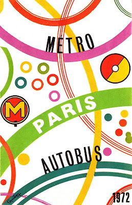
I love how the map graphics and colour coding have been used to create this funky cover. As you can see it's a Paris Metro & Autobus map from 1972.
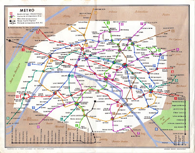
Inside it has 3 maps; a metro map of the full region...
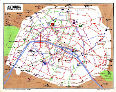
... an Autobus map of the central city...
... and a night Autobus map, again of the inner city area...
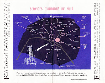
I also really like the unexpected use of the script font (used to mark the different areas within the city) it's a pleasant surprise.
All-in-all a nice little addition to the reference box. Have a delve in the box yourself here for a little Friday inspiration.
https%3A%2F%2Fwww.deliciousindustries.com%2Ffrom-the-reference-box-38
Delicious+Industries%3A+From+the+reference+box+%2338
From the reference box #37

# 37 - 60's & 70's US Road Maps
I came across these at the weekend. This Gulf one is my favourite - I'm loving the big GULF graphic on the front and inside it has these lovely illustrations of "a host of good Gulf products, all topnotch quality!"

I think the Gulf one is probably from the 60's, but this Union Oil one is from 1973. I'm already a fan of the 76 ball graphic and I really like the arrow design on the front. Definitely good finds in my book!

https%3A%2F%2Fwww.deliciousindustries.com%2Ffrom-the-reference-box-37
Delicious+Industries%3A+From+the+reference+box+%2337
From the reference box #36

#36 - Carriageway markings: Do you know them?
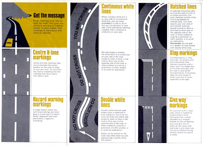
This highway code supplement is a new addition to the reference box. I love how the lines of the road markings create really graphic illustrations and how they've used only the colours of the black tarmac and the road marking colours - bold yellow and white.
When I bought it I found this smaller leaflet, 'Stop Accidents' tucked away inside sporting a bit of great Saul Bass-esque type.
So there we have it, #36 - Highway Code supplement. Have a look through the other reference box items here.
https%3A%2F%2Fwww.deliciousindustries.com%2Ffrom-the-reference-box-36
Delicious+Industries%3A+From+the+reference+box+%2336
From the reference box #35

Disque de controle de stationnement - a French parking control probably from the early 50's for 'Zone Bleue', which according to the very detailed map included part of the Champs-Élysée.
It has 'Matin' (Morning) 'Heure d'arrivee' (arrival time) and 'stationnement autorisé' (parking authorised till) times on one side of the dial and 'Apres -Midi' (afternoon) times on the reverse.
All the 'Heure d'arrivee' are in blue type and some have either a blue or red dot screen behind them, I'm not sure what that is indicating, but it looks good. The 'stationnement autorisé' are all in bold, red type that's much bigger than the arrival times.
I'm not sure if it's sponsored by Citroën, whether they produced them or whether they are just advertising on it, but I really like the old logo and graphic on there.
I love this little piece of ephemera, it's a great addition to the reference box and to my moving dial/wheel collection - #35 - Disque de controle de stationnement
Checkout the rest of the reference box items here.
https%3A%2F%2Fwww.deliciousindustries.com%2Ffrom-the-reference-box-35
Delicious+Industries%3A+From+the+reference+box+%2335
From the reference #34
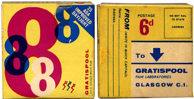
Big numbers, bright colours and big arrows, what hasn't this 8mm colour film packaging got??
I think it's from the 60s' or maybe even the late 50's, but the colours and the design are so 80's. You can only just make it out on the pic, but all the 8's are overprinted and the design on the reverse is really quite modern and I'm loving the big arrow.
#34 - vintage 8mm colour film packaging
Have a look through the rest of our reference box here.
https%3A%2F%2Fwww.deliciousindustries.com%2Ffrom-the-reference-34
Delicious+Industries%3A+From+the+reference+%2334
From the reference box #33

From the reference box #33 - War-time grocery bag and Motor Fuel Ration Book. The grocery bag (above) would have been used in local shops to hold small individual items. It's in really good condition and I love the text:
In "War Time" as in "Time of Peace", We aim to give Quality, Service, Satisfaction. The private trader considers you all the time.
It's funny how even back then value and importance of independent shops was being promoted.
In "War Time" as in "Time of Peace", We aim to give Quality, Service, Satisfaction. The private trader considers you all the time.
It's funny how even back then value and importance of independent shops was being promoted.

This Motor Ration Book is not quite as old as the grocery bag and from 1957. Booklets like this were given to customers when they bought a new vehicle and had to be transferred to the new owner if the vehicle was sold.
This booklet contains vouchers to receive free fuel for a motor car with an engine size of 2201cc and over. It has 42 x N vouchers and 21 x L vouchers which were meant to last for 6 months.
I wish I knew what car this originally came with - all I know is that the registration plate was TKL 400 and the booklet was issued on 27 April 1957 in Horsham, UK!
https%3A%2F%2Fwww.deliciousindustries.com%2Ffrom-the-reference-box-33
Delicious+Industries%3A+From+the+reference+box+%2333
From the reference box #32

From the reference box #32 - a Shell 'Signs of Welcome' tag. I'm not sure where these tags would have been found; maybe in hotels or at service stations, but I'm guessing it originated in the UK during the 60's.
It gives a list of European countries selling Shell Gasoline & Motor Oil and provides the brand name in each of those regions, "many miles from home, you will never be far from a Shell Service Station".
I like it for the little car graphic and the lovely big, rounded corners!
Check out more Reference Box items here.
https%3A%2F%2Fwww.deliciousindustries.com%2Ffrom-the-reference-box-32
Delicious+Industries%3A+From+the+reference+box+%2332
From the reference box #31


The '60 and '61 issues also have ads in for the new, DIY Gardener Annual which looks to have had equally great cover designs. I'll have to watch out for one of those.

So there we have it, #31 - DIY Annuals, 1959, 1960 & 1961.
https%3A%2F%2Fwww.deliciousindustries.com%2Ffrom-the-reference-box-31
Delicious+Industries%3A+From+the+reference+box+%2331
From the reference box #30

It's been a while since I've delved into the reference box, but finally here we have #30, a Practical Householder freebie from the 50's (I think) - Cost & Quantity Guide for Paints and Wallpapers.
Not only is the cover great, but inside it has 2 movable paper charts/calculators. This lovely dial is to help calculate the number of wallpaper rolls, border rolls and ceiling rolls for the given room size...

... and this sliding chart helps estimate the cost and required amount of paint for the average room. The sliding card is printed on both sides giving ceiling and indoor woodwork guides on one side and wall, external wood and ironwork guides on the other.

The back page gives preparation instructions along with hints and tips for perfect decorating...

So there we have it, #30 - Practical Householder Cost & Quantity guide for Paints and Wallpapers
Have a look at previous Reference box exhibits here!
https%3A%2F%2Fwww.deliciousindustries.com%2Ffrom-the-reference-box-30
Delicious+Industries%3A+From+the+reference+box+%2330
From the reference box #29
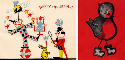

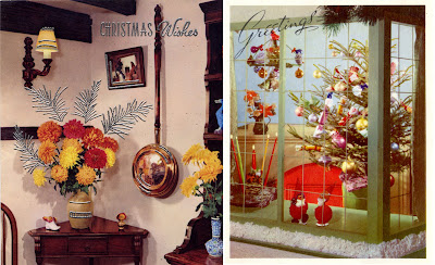
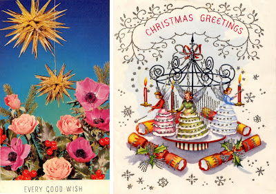
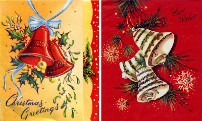

I bought them from a boot sale all taped into a scrapbook. There a quite a few more, but these are the best ones. My favourite is the robin, which I think was some kind of charity card designed by a child called, Marian.
The amount of detail is fantastic - many of them have foil blocking, glitter or embossing and are folded in an unusual way with print also on the inner.
A festive #29 - Vintage Christmas Cards, 1960 onwards
https%3A%2F%2Fwww.deliciousindustries.com%2Ffrom-the-reference-box-29
Delicious+Industries%3A+From+the+reference+box+%2329
From the reference box #28
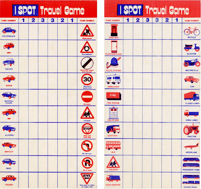
Long before portable DVD Players and Nintendo DS, the I-SPOT Travel Game was at the forefront of in-car entertainment.
From the typography and the models of cars, I'm guessing these examples are from the 70's. The simple, 2 colour illustrations are great, especially the cars and I particularly like the Dr Who style police box - I don't think I've ever seen one of those!
So #28 - a fabulous pair of I-Spot Travel Game cards.
Take a look through our reference box here.
https%3A%2F%2Fwww.deliciousindustries.com%2Ffrom-the-reference-box-28
Delicious+Industries%3A+From+the+reference+box+%2328
From the reference box #27
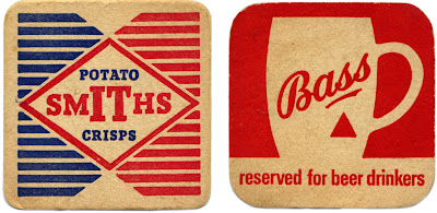
Two great beermats for two great British products; Bass Brewery and Smiths Potato Crisps.
Smiths Potato Crisps Company Ltd was a family business, formed in 1920 to bring crisps to the British masses. Mrs Smith washed, cut and fried the potatoes in the couple's North London garage. Frank Smith packaged them in greaseproof paper bags, added a twist of salt to flavour and then sold them from his pony and trap around London.
It's rumoured that during World War II, the women packing the blue sachets of salt in the crisps would sometimes pack little pieces of paper with their names and addresses on to draw the attention of any lonely soldiers!
Bass Brewery
The Bass & Co Brewery was established by William Bass in 1777 and was one of the first breweries in Burton upon Trent, UK - a town that became so popular with breweries over the years, that it is now known as a 'brewing town'. Bass was also one of the original FT 30 companies on the London Stock Exchange when the listing was established in 1935!
Not many people know that the Bass Red Triangle is one of the world's oldest logos and was the first trademark to be registered in Britain. The 1875 Trademarks Registration Act came into effect on 1 January 1876 and that New Year's Eve, a Bass employee waited overnight outside the registrar's office, in order to be the first to register a trademark the next morning. Bass actually got the first two registrations; the first was for the Bass Red Triangle (for their pale ale) and the second for the Bass Red Diamond (for their strong ale).
#27 - Bass and Smiths Potato Crisp beermats
https%3A%2F%2Fwww.deliciousindustries.com%2Ffrom-the-reference-box-27
Delicious+Industries%3A+From+the+reference+box+%2327
From the reference box #26


These luggage tags are from the 70's and came in the lot of free ephemera I got from the carboot sale the other week. I love the dense black type and the lovely red numbers on the first one and on the second it's the little, very detailed, plan of the plane that does it for me. If only the baggage handler had been more considerate all those years ago and not stuck a super sticky label over it!!
#26 - 70's luggage flight tags.
https%3A%2F%2Fwww.deliciousindustries.com%2Ffrom-the-reference-box-26
Delicious+Industries%3A+From+the+reference+box+%2326
From the reference box #25

“There’s a promise in a glass of Mackeson” beermat, I’m guessing from the 60’s. I really like the colours and the quality of the print, but it’s the type that stands out for me - it’s really dynamic and creates quite a modern looking layout. The unusual thing about it too is that the brand name does not appear in full on either side!
Mackeson's XXX is a dark sweet beer, known in the UK as a sweet stout or a milk stout as it is derived from milk and contains lactose and sugar.
According to Wikipedia, the Mackeson recipe has been around since 1801, long before milk stout was given a patent in 1875 and was originally brewed by Mackeson’s Brewery in Hythe, Kent, until it was purchased by Whitbread in the 1920’s.
Whitbread gave the brand the distribution and marketing it deserved turning it into the market leader for low alcohol content sweet dark beer - which seems like a very select category, but who am I to judge!
In 1950 a Mackeson tv ad showed Bernard Miles delivering one of the most long-lasting and memorable straplines of the time, informing viewers that Mackeson, “looks good, tastes good and, by golly it does you good”. Just how true that is, I’m not sure but they didn’t seem to worry too much about that back then.
These days Mackeson is owned by Whitbread, but brewed in 3 varieties by Young’s in their Ram Brewery, London ‘under supervision’ of Inbev; a 3.75% abv version for the UK, XXX version - 5% abv for the US market (brewed in Cincinnati, Ohio) and a XXX 4.9% abv version brewed by Carib Brewery, Trinidad for the local market, where it is marketed with the slogan "Take it to the Max" (at least they didn’t say - Macks!) to fitness conscious young men that enjoy socializing - still on the “it does you good” theme it seems.
Who would have guessed - all that from one tiny beermat!
#25 - Mackeson Beermat
https%3A%2F%2Fwww.deliciousindustries.com%2Ffrom-the-reference-box-25
Delicious+Industries%3A+From+the+reference+box+%2325
Welcome
Welcome to the Delicious Industries blog. We're an independent design studio based in Brighton, UK and this is our scrapbook packed full of design, illustration, photography & typography inspiration. Check out our work here.
Links
DELICIOUS FRIENDS
DELICIOUS FAVOURITES
- 50 Watts
- Acejet 170
- Grain Edit
- It's Nice That
- National Geographic Found
- Notcot
- Pretty Clever
- Retronaut
- So Much Pileup
- We Love Typography
- Another Mag


